Cat Dawson on Grace Hartigan

Grace Hartigan, Black Crows (Oranges No. 1), 1958, oil on paper, 45 x 35 inches (114.3 x 88.9 cm). University at Buffalo Art Galleries: Gift of the David K. Anderson Family, 2000. © Grace Hartigan Estate / Photo: Biff Henrich / IMG_INK

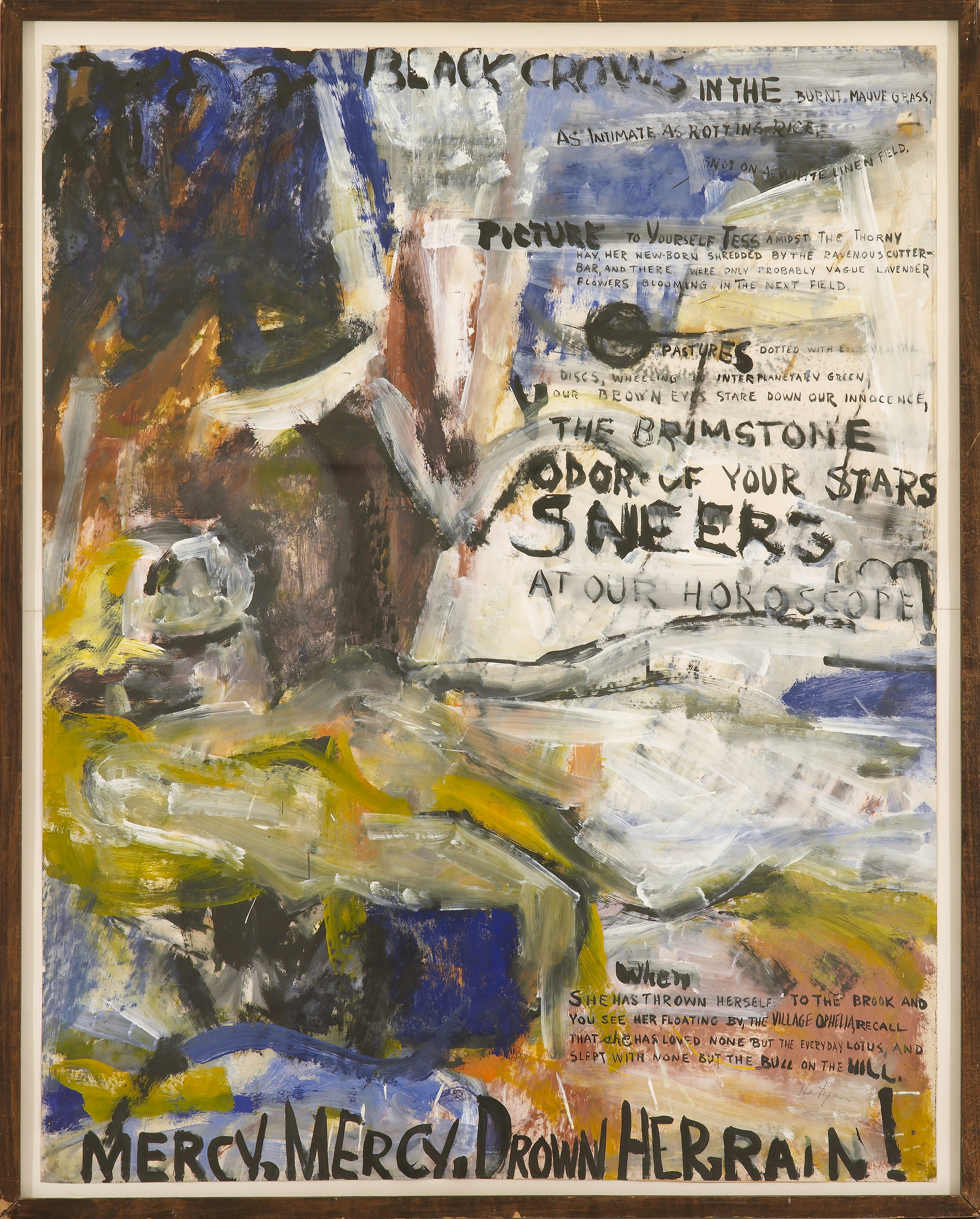
Perhaps the most striking thing about Grace Hartigan’s Black Crows (Oranges No. 1) (1958) is the tension between the gestural surface and the phrases that emerge from the background of the work, at times overtaking the paint. A busy abstract surface is characteristic of Hartigan’s style, but whereas in much of her other work she allows imagery to form, here Hartigan intersperses her painterly strokes with selections of text taken from Frank O’Hara’s “Oranges No. 1.” The poem is one in a collection of twelve published in 1949 by O’Hara, in response to which Hartigan produced twelve canvases, each featuring excerpted text from the corresponding poem.

One of the defining traits of Abstract Expressionism was the emphasis put on immediacy, and Hartigan’s gestural abstractions are a product of this era. In a parallel vein, O’Hara is known as a master of occasional poetry—the kind of thing jotted down on a cocktail napkin at a party just before a toast is to be given. His ability to infuse language with an acute sense of immanence and a breadth of emotion strikes a similar chord to that of Hartigan’s urgency. Close social and intellectual relationships between painters and poets during any given period have often proven professionally fruitful for both parties. The post-war period is particularly notable for a proliferation of these intimacies and the resulting work that grew out of them.

A 1957 poem by O’Hara entitled “Why I Am Not A Painter” opens with the lines, “I am not a painter, I am a poet. / Why? I think I would rather be / a painter, but I am not.” O’Hara goes on to describe working on his “Oranges” poems while his friend, the painter Michael Goldberg, works on a painting called Sardines (1955). As O’Hara tells it, both artist and poet begin with a word that serves as the title, but which does not figure prominently—or at all, in O’Hara’s case—within the finished work. This poem speaks to the close relationship between painter and poet, enumerating similarities in their intellectual approaches to their practice, while also making clear how these two artists, working in two mediums, ultimately produced two very different works.

O’Hara’s poem articulates the difference between painting and poetry as having to do with expressivity: “All that’s left is just / letters, “It was too much,” Mike says. / But me? (…) / There should be / so much more, not of orange, of / words, of how terrible orange is / and life.” O’Hara brings the tension between too much and not enough into the same field, suggesting that duality and contradiction are central to expressivity. By exploring the different valences of language across painting and poetry, we come to understand that though the two differ in some medium-specific ways, there is no hard and fast distinction between them. As often as difference is brought to bear as a way of producing hierarchies of value, when examined closely, it is not always so black and white.

Black Crows (Oranges No. 1) can be understood as a continuation of the conversation begun by Goldberg and O’Hara. Hartigan processes O’Hara’s poetry by augmenting the dimension and shape of the words, such that they seem to undulate with the flow of paint in three dimensions. Whereas O’Hara, in crafting a poem about difference, folds in Goldberg’s language relating to his own practice, Hartigan brings language out of O’Hara’s work and into the painterly realm. In Hartigan’s hands, O’Hara’s words become visually expressive in a manner more akin to painting than to poetry. The resulting painting, like O’Hara’s poem, works the divide between visual art and poetry, demonstrating difference while simultaneously showing the tenuousness of any distinctions that can be made.

Grace Hartigan

Grace Hartigan (b. 1922, Newark, NJ; d. 2008, Baltimore, MD) sought employment as a mechanical draughtsman when her first husband was drafted in World War II, and trained at the Newark College of Engineering. She took art courses from the painter Isaac Lane Muse and, in 1945, relocated with Muse to Manhattan. She quickly became associated with the New York School of Abstract Expressionist artists emerging in the 1940s and ‘50s. Her first group exhibition took place at the Samuel Kootz Gallery, New York (1950), while her first solo exhibition was held at Tibor de Nagy Gallery, New York (1951). In the early 1950’s, Hartigan began to collaborate with several poets: for example, her series entitled Oranges (1952-53) is based on a number of O’Hara’s prose poems. Hartigan was the only female artist included in The Museum of Modern Art’s touring exhibition entitled The New American Painting (1958-59). In the 1960s, Hartigan moved to Baltimore, Maryland: she became the Director of the Hoffberger Graduate School of Painting, Maryland Institute College of Art (1967-2008), and the Avery Chair of Bard College, Annandale-on-Hudson (1983). Other recent solo exhibitions were held at the Susquehanna Museum (2000); Amarillo Museum of Art, Texas (2008); and C. Grimaldis Gallery (2008, 2009). Hartigan’s work is included in the public collections of The Metropolitan Museum of Art, New York; The Museum of Modern Art, New York; the Philadelphia Museum of Art, Philadelphia; and the Walker Art Center, Minneapolis, among others.

Cat Dawson
Cat Dawson is a doctoral candidate (ABD) in Visual Studies at the University at Buffalo specializing in art of the American post-war postmodern. Her particular interests include the interplay between text and language, conceptual art and theories of the body, mid-century painting and the sexuality of abstraction, and psychoanalysis. Her dissertation is on sexuality and difference in American post-war painting.

Cat Dawson on Joe Brainard

Joe Brainard, Matches, 1975, mixed media collage with gouache, 6 ¾ x 4 ¾ inches (17.1 x 12.1 cm). © Estate of Joe Brainard and courtesy of Tibor de Nagy Gallery, New York / Photo: Ellen McDermott

Post-war America saw the notable development of many close relationships between painters and poets. Joe Brainard remains among the few figures of that fruitful period remembered for shifting deftly between visual and narrative media, and for playing both roles successfully. Living in New York City in the 1960s and ’70s, Brainard became part of a thriving group of creative thinkers – visual artists and poets, many of them gay men – whose very public work made intimate address its central concern. Yet legal and social mandate required these men to obfuscate the details of their most intimate associations and desires, lest they expose themselves as gay. Collage became a defining mode of expression for these artists.

We associate particular concepts with certain words and images, but the flexible medium of collage allows artists to recontextualize both image and text, producing new connections and meanings. Brainard’s Matches (1975) features a horseracing ticket pasted beneath a book of matches, mostly spent, with gouache dampening or accentuating particular elements of the composition. The combination of the spent matches and ticket imply the duration of an activity – perhaps a day at the track – and thus the artwork becomes an eminently recognizable record of a moment of leisure passed.

Joe Brainard, Untitled, 1978, graphite with acrylic on paper, 6 x 4 inches (15.2 x 10.2 cm). © Estate of Joe Brainard and courtesy of Tibor de Nagy Gallery, New York / Photo: Ellen McDermott

Brainard’s greatest strength lay in the production of artworks that, like Matches, suggest a familiarity or intimacy that cannot be completely articulated. In Untitled (1978), Brainard cultivates a sense of intimacy among artist, object, and audience with what appears to be an outgoing letter to a universal recipient – you. That the recipient of the letter is simply you implicates a romantic relationship, without regard to the gender of the recipient. This presents a subtle challenge to the fixedness of normative male–female sexuality. By producing a work that looks like a letter, Brainard situates himself within the vernacular of mail art – a network of mostly gay male artists and their patrons, which began to circulate small-scale work through the United States Postal Service during the post-war period. Untitled, in particular, points to the artist’s lasting interest in fostering community through communication, whether subtle or overt.

Joe Brainard, Untitled (XXX…), 1977, mixed media collage, 4 x 3 inches (10.2 x 7.6 cm). © Estate of Joe Brainard and courtesy of Tibor de Nagy Gallery, New York / Photo: Ellen McDermott

In Untitled (XXX…) (1977), Brainard has collaged a blue heart and a strip of handwritten X’s over assorted patterned papers. We assume that this strip of X’s stands in for an emotive message, but the meaning of this message is not communicated and cannot be accessed; the X’s only insinuate intimate expression to the viewer. The jumble of collaged papers serving as background displays both decorative floral patterns and straitlaced grids, a formal juxtaposition that produces a subtle tension underneath the opaque X’s. It is through careful consideration of these three works as a whole that we can come to understand how Brainard, engaged as he was with questions of language, intimacy, and communication, found the conceptual mobility of collage and universally-addressed language so compelling as he traversed the challenges of what could and could not be said.

Joe Brainard Biography

Joe Brainard (b. 1942, Salem, AR; d. 1994, New York, NY) was raised in Tulsa, Oklahoma. In high school, Brainard produced an art and literary magazine entitled The White Dove Review with Ron Padgett, Dick Gallup, Ted Berrigan and Patricia Mitchell. After graduation, Brainard was granted a full scholarship to attend the Dayton Art Institute, where he studied for a few months. Brainard first moved to New York City at the age of 19: he quickly became associated with a community of New York School poets and painters with whom he often collaborated artistically, including Frank O’Hara, Alex Katz, Jane Freilicher and, later, Andy Warhol and Jasper Johns. He most frequently collaborated with the writer Kenward Elmslie, his longtime partner. Brainard was selected by Larry Rivers to participate in a group show at the Finch College Museum (1964), and his first solo exhibition took place at the Alan Gallery, New York (1964). Other recent solo exhibitions were held at the Utah Museum of Fine Arts, Salt Lake City (1973); Fischbach Gallery, New York (1975, 2007); Tibor de Nagy Gallery, New York (1997, 2001, 2007, 2008, 2012); and the University of Buffalo Art Galleries, New York (2007). Brainard’s work may be found in the collections of the Berkeley Art Museum, the Harvard Art Museums/Fogg Museum, The Metropolitan Museum of Art, The Museum of Modern Art, and the Whitney Museum of American Art, among others. More information about his work can be found at www.joebrainard.org.

Cat Dawson Biography
Cat Dawson is a doctoral candidate (ABD) in Visual Studies at the University at Buffalo specializing in art of the American post-war postmodern. Her particular interests include the interplay between text and language, conceptual art and theories of the body, mid-century painting and the sexuality of abstraction, and psychoanalysis. Her dissertation is on sexuality and difference in American post-war painting.

Donna Gustafson: Erasure is a Point Between Absence and Presence

Elena del Rivero, Letter to Wynn Kramarsky, 1996, metallic gouache, graphite and typewriting on paper, 9 x 6 ½ inches (22.9 x 16.5 cm). © 2013 Artists Rights Society (ARS), New York / VEGAP, Madrid / Photo: Ellen McDermott

I’m interested this week in looking closely at artists who make a mark, then erase or cross it out. In this time and place of abundance, the purposeful act of removing, erasing, eliminating, crossing out, or discarding lines that have been drawn or written suggests any number of things. Are these instances of self-editing, thoughtful re-considerations, or a tantalizing tease? How does the act of erasing, concealing, or crossing out differ from an empty page or tabula rasa? How is the physical presence of that which once was different from that which has not yet become? A drawing or line of text that has been expressed and then removed leaves a trace that seems more poignant than the empty page. The temptation is always to try to read what has been excised, to reconstruct the drawing that has been erased, to imagine what lies beneath the censor’s black lines.  It strikes me as I write that the physical memory of clarifying thoughts is lost to me as I delete and rewrite this text on a computer screen, not physically making marks on paper.

Rauschenberg famously erased a drawing by Willem de Kooning in 1953; it is now in the collection of SFMOMA. Through what the museum’s website describes as “digital capture and process technologies” the museum has discovered the erasures that de Kooning himself enacted in the process of creating the original drawing. How does erasure measure against mark making?

The artists I am thinking about are Bronlyn Jones, Elena del Rivero, John Waters, Jón Laxdal, Christine Hiebert, and Molly Springfield.

Donna Gustafson is the Andrew W. Mellon Liaison for Academic Programs & Curator at the Zimmerli Art Museum. She is also a member of the graduate faculty in the Department of Art History at Rutgers.

Molly Springfield: Drawing with Words

William Anastasi, <em>Untitled (READING A LINE ON A WALL)</em>, 1967/1977
William Anastasi, Untitled (READING A LINE ON A WALL), 1967/1977, graphite on paper, 6 3/8 x 11 inches (16.2 x 27.9 cm). The Museum of Modern Art, New York. Gift of Sally and Wynn Kramarsky in honor of Maja Oeri. © William Anastasi / Photo: John Wronn

In reading the discussions so far, I’m struck by how little talk there has been about how much of the work in this exhibition functions as drawing.  That’s especially interesting to me because the work comes from a collection well known for its focus on the contemporary practice of drawing. So I’d like to talk about how the drawings in Art=Text=Art both exist within traditional parameters and expand the boundaries of drawing.

In his The Elements of Drawing (1885), John Ruskin—the father of modern drawing instruction—said that one of the acceptable aims for the serious drawing student was to “be able to set down clearly, and usefully, records of such things as cannot be described in words.” What would John Ruskin, with his Victorian notions of drawing, make of the drawings in Art=Text=Art? My guess is that he’d be fairly scandalized since what he has in mind are beautifully rendered images of important architecture and sublime landscapes drawn from life or faithfully copied from a master artist’s work.

But many of the drawings here are recording “such things as cannot be described in words.” They just happen to be doing so with words. I’m thinking of work like Susanna Harwood Rubin’s 102 boulevard Haussmann and William Anastasi’s Untitled (READING A LINE ON A WALL). At first glance they may seem like dry, conceptual statements. But those statements—carefully rendered in graphite using methods not so different from the ones Ruskin espouses in The Elements of Drawing—conjure real physical spaces within in the viewer’s mind. So could they be thought of as observational? In what other ways do the drawings in Art=Text=Art exist within and expand the traditional modes of drawing?

Molly Springfield (b. 1977, Columbia, SC) earned her BA magna cum laude from Queens College, Charlotte, North Carolina (1999). She received her Post-Baccalaureate Certificate from the Maryland Institute College of Art, Baltimore (2000), and her MFA from the University of California, Berkeley (2004). She took part in the Skowhegan School of Painting and Sculpture, Skowhegan, Maine (2006). Springfield was a resident at the Millay Colony for the Arts, Austerlitz, New York (2008). She has thrice received a Visual Artist Fellowship from the D.C. Commission on Arts & Humanities / National Endowment for the Arts (2009, 2011, 2014). Recent solo exhibitions have been held at Mireille Mosler, New York (2008); Steven Wolf Fine Arts, San Francisco (2009, 2013); Thomas Robertello Gallery, Chicago (2009, 2012); and the Center Art Gallery at Calvin College, Grand Rapids, Michigan (2011). Recent group exhibitions have been held at the Portland Museum of Art, Portland, Maine (2010); the University of Buffalo Art Gallery, Center for the Arts, Buffalo, NY (2012); the Indianapolis Museum of Art (2012); Tracy Williams, Ltd., New York, NY (2013); Galerie Thomas Zander, Cologne, Germany; and The Drawing Center, New York, NY (2013). Springfield lives and works in Washington, D.C., where she is a Professorial Lecturer in the Department of Art at American University. More information about her work can be found at www.mollyspringfield.com.

David Backer: Meaning, Pictures, and Reality

Mel Bochner, If the Color Changes…, 2003, monoprint with engraving and embossment on Twinrocker handmade paper, 2 ½ x 3 ½ inches (6.4 x 8.9 cm). Published by Two Palms, New York. Joel and Lila Harnett Print Study Center, University of Richmond Museums, Richmond, Virginia. Gift of Sally and Wynn Kramarsky, H2013.03.05. © Mel Bochner / Photo: Laura Mitchell
My question for this week’s discussion is about meaning, pictures, and reality. Given Mel Bochner’s explicit interest in Ludwig Wittgenstein–-and this exhibition’s general interest in language and art-–it could be interesting to (re)visit what Wittgenstein, early in his career, called the “picture theory of meaning.” The Internet Encyclopedia of Philosophy summarizes it well. “According to this theory propositions are meaningful insofar as they picture states of affairs or matters of empirical fact.” Wittgenstein writes as much in proposition 4.01 of his Tractatus Logico-Philosophicus.

“The proposition is a picture of reality. The proposition is a model of the reality as we think it is.”

We picture reality to ourselves-–that’s what it means to “make sense” in the picture theory of meaning. One interpretation of this theory, extremely significant for the history of science, is that “[a]nything normative, supernatural or (one might say) metaphysical must, it therefore seems, be nonsense.” (IEP) Since we can’t picture things that are “metaphysical,” like God, morals, or existence-as-such (things beyond what we can observe), then it is impossible to make sense when talking about them.

This is generally called “the problem of unobservables” and was present in the positivist and empiricist traditions both before and after Wittgenstein’s early work. A common response to this problem, and Wittgenstein’s view of it, is that the things we can’t observe–-God, morality, even knowledge itself–-seem very real to us, perhaps more real than the things we observe!

Here is a fascinating occasion of tension, particularly between art and text. On the one hand, the picture theory of meaning prioritizes images. Without images we can’t understand what we mean when we communicate with one another. On the other hand, this same theory rejects the possibility that we can make sense when communicating about what seems the most real: God, morality, and what it means to exist. My questions, huge as they may be, are: What is reality? Is it what we picture or what we observe? In other words, is it possible to make sense when speaking about things we can’t observe? What role do images play here?

David Backer is a writer and teacher living in Brooklyn. He is a Graduate Coordinator at New Community College, City University of New York. Backer also edits fictiondaily.org, and is pursuing a doctorate in Philosophy and Education at Teachers College, Columbia University, New York. He blogs at davidbacker.com.

Kate Scott: Organizing the World – Charts, Graphs, and Tables

The artworks featured in Art=Art=Text employ charts, graphs, and tables as structures for organizing both ideas and tangible things. In some cases, such as Christine Hiebert’s Brand Drawings (1998-1999), they reveal how humans organize the world around them. In others, such as Lawrence Weiner’s Polaris (1990), they show how extraordinarily relative our perception of the world is. And yet other works, like Alice Aycock’s Garden of Scripts (1986) adopt these devices for playful ends.

1. What can be considered a chart, graph, or table? How do the artists in this exhibition expand on traditional definitions of these tools?

2. Charts, graphs, and tables are modes of communication that are considered scientific and even objective, but many of the works in Art=Text=Art clearly reflect the subject positions and opinions of their creators. How do artists use these frameworks for persuasive ends, to change our perception of the ideas or objects within them?

Other relevant works include those by Carl Andre, Jill Baroff, Suzanne Bocanegra, Annabel Daou, Nancy Haynes, Mark Lombardi, and John Waters.

Kate Scott is a PhD candidate in the Department of Art History at Rutgers University, Newark, New Jersey, where she specializes in American art and the history of photography. She is a Graduate Curatorial Assistant at the Zimmerli Art Museum.

Julie Langsam on Mark Lombardi

Mark Lombardi, Casino Resort Development in the Bahamas c. 1955-89 (fourth version), 1995, graphite on paper, 24 x 53 inches (61 x 134.6 cm). © Mark Lombardi, Image courtesy Donald Lombardi and Pierogi Gallery / Photo: Ellen McDermott

I first saw Mark Lombardi’s work during the late 1990s in a group show at The Drawing Center in New York City.  I remember being immediately struck by the physical beauty of his drawings: the intricacy of the image; the delicacy and specificity of the line; the elegance of the overall web-like form. I also remember the jolt of excitement I felt when I realized that the labyrinthine arrangements of interconnected nodes and links were diagrams of the complex and often opaque recorded relationships between the rarefied worlds of banking, arms trade, finance, and politics.

Take a close look at Casino Resort Development in the Bahamas c. 1955-89 (fourth version) and Charles Keating–ACC-Lincoln Savings Irvine CA–Phoenix AZ ca. 1978-90 (fifth version), both of which Lombardi completed in 1995.  Each of the elements in this web refers to a real person, company, place, or relationship—all based on information that the artist gleaned exclusively from the public record. In their historical accuracy and grand scale, Lombardi’s works allude to the academic tradition of history painting exemplified throughout art history by artists from Raphael to Géricault. From 1994 until his death in 2000, Lombardi created many drawings like the two on view in this exhibition, yet the grand scale of the series takes nothing away from the individual relevance of each drawing. In fact, in some ways, the specificity of the information included in each piece lends a sense of both timeliness and timelessness to the work. These are all the same scandals—just called by different names.

Each time I view Lombardi’s work, I feel like a co-conspirator in Lombardi’s exposé of deceit, cover-ups, and corporate and government malfeasance. I am a voyeur observing Lombardi as he draws; in deciphering and displaying this information, he untangles a knot. The process is slow, painstaking, detailed, and laborious, yet ultimately fulfilling. In viewing these drawings I experience a sort of self-satisfaction, as if I am somehow taking part in the exposé. The corrupt Machiavellian networks and associations that Lombardi reveals are seductive in their complexity and their familiarity.

Mark Lombardi, Charles Keating, ACC, and Lincoln Savings c. 1978-90 (5th Version), 1995, graphite and colored pencil on paper, 28 ¼ x 44 inches (71.8 x 111.8 cm). The Museum of Modern Art, New York. Gift of Sally and Wynn Kramarsky, 2004. © Mark Lombardi, Image courtesy Donald Lombardi and Pierogi Gallery / Photo: Thomas Griesel

Language plays an interesting role in Lombardi’s work in terms of both his subject and his image. Words like intrigue, scheme, tangled, and convoluted describe the subject of the drawing but also refer to phrases such as “spinning a web” or “weaving a plot,” which in turn refer to the work as a whole image. This circling around and doubling up of meaning functions in much the same way as Lombardi’s network mapping, creating maze-like scaffolding on which the information rests. Likewise, words like strategy, systems, and hierarchy explain the nature of the content as well as the process by which it is visually organized.

That these “narrative structures” (to use Lombardi’s term) describe the nefarious interactions between myriad political, social, and economic forces does not interfere with the formal beauty of the drawings. Through the quality of the line, each drawing commands attention in a reserved, quiet, self-possessed manner. The images resemble abstractions of celestial diagrams or some form of archaic cartography. The obsessive nature of both research and process is evident; here, the artist acts as a filter for a vast quantity of esoteric data. In the end, the confluence of Lombardi’s single-mindedness and attention to detail, coupled with his subtle and sensitive handling of material and image, ultimately forms the basis of the stories he tells us—narratives that unfortunately never grow old.

Mark Lombardi Biography

Mark Lombardi (b. 1951, Syracuse, NY; d. 2000, Brooklyn, NY) earned his BA in Art History from Syracuse University, New York (1974). As an undergraduate, Lombardi served as Chief Researcher for the exhibition Teapot Dome to Watergate (1973), which prefigured his later drawings inspired by United States government scandals and abuses of power. Lombardi served as Assistant Curator at the Contemporary Arts Museum, Houston, Texas (1975) before opening a gallery called Square One, Houston, Texas. He then worked as a General Reference Librarian for the Fine Arts Department of the Houston Public Library, where he began a regional artist archive. Recent solo exhibitions featuring his work have been held at Galerie Thomas Schulte, Berlin (2007); Whitworth Art Gallery, Manchester, England (2007); De La Warr Pavilion, Bexhill on Sea, England (2007); Hatton Gallery, Newcastle University, England (2007); the Museum of Contemporary Art Leipzig, Germany (2008); and Pierogi, Brooklyn (2011). Recent group exhibitions have been held at James Cohan Gallery, New York (2007); the Queens Museum of Art, New York (2007); the House of World Cultures, Berlin (2007); The Kitchen, New York (2008); Daniel Weinberg Gallery, Los Angeles (2008); the John Michael Kohler Arts Center, Sheboygan, Wisconsin (2009); the Museum of Fine Arts, Houston (2009); The Museum of Modern Art, New York (2011); the Sharjah Biennial, United Arab Emirates (2011); the Mercosul Biennial, Porto Alegre, Brazil (2011); and dOCUMENTA (13), Kassel, Germany (2012). Director Mareike Wegener produced a documentary on Lombardi entitled Mark Lombardi: Death-Defying Acts of Art and Conspiracy (2012) that premiered in Germany, at the Brooklyn Film Festival, and at The Museum of Modern, New York.
Julie Langsam Biography
Julie Langsam is Assistant Professor at Mason Gross School of the Visual Arts, Rutgers University, New Brunswick, New Jersey. She is a painter whose work addresses issues of style, beauty, and idealization by combining images that reference the romantic sublime of the nineteenth century and the twentieth century’s utopian ideals of High Modernism. Langsam’s juxtaposition of iconographic architectural structures with backgrounds of broad, big sky landscapes associated with Hudson River School painters alludes to the relationship of the sensuous body with the rational mind. Langsam has had numerous exhibitions, including a solo museum show at Museum of Contemporary Art Cleveland, Ohio (2002). She is a recipient of the Pollock-Krasner Foundation Award, and is represented in many collections throughout the United States. Recent solo exhibitions have been held at Gallery Thomas Jaeckel, New York, Espai 8, Barcelona, and Reykjavik Art Gallery, Iceland. Among Langsam’s other activities, she is co-curator of such exhibitions as Arte Povera American Style: Funk, Play, Poetry & Labor, Cleveland Institute of Art, Ohio (2002) and It’s a Wonderful Life: Psychodrama in Contemporary Painting, Cleveland: SPACES, Ohio (2004). Langsam is the former Head of Painting and Director of the Kacalieff Visiting Artists & Scholars Endowment, Cleveland Institute of Art, Ohio. More information about her work can be found at http://julielangsam.com/.

Barry V. Qualls on Suzanne Bocanegra

Suzanne Bocanegra, Brushstrokes in a Victorian Flower Album: Long Headed Poppy, 2000, paper, wax and gouache on paper, 22 x 28 inches (55.9 x 71.1 cm). © Suzanne Bocanegra / Photo: Laura Mitchell

Suzanne Bocanegra’s Brushstrokes in a Victorian Flower Album: Long-Headed Poppy (2000) comes out of a long tradition of using flowers in painting as icons, each varietal indicating a certain psychological state.  In the fourth act of Shakespeare’s Hamlet, Ophelia says:

There’s fennel for you, and columbines; there’s rue for you, and here’s some for me; … O, you must wear your rue with a difference. There’s a daisy. I would give you some violets, but they wither’d all when my father died.

This passage, uttered in madness, suggests the power of flowers in the Renaissance imagination to signal states of feeling.  This “language of flowers” continued to influence the literary imagination for three more centuries.  In Victorian England, flower albums and discussions of the meanings of flowers were part of the publishing industry’s “keepsake” series, books intended to be studied and treasured and given as gifts.  There was also public discussion of the plants found in famous paintings like William Holman Hunt’s The Light of the World (1853-54), which shows Christ in a weed-filled garden knocking at a door covered with ivy—knocking at the closed door of the human heart.  Victorians knew that ivy signified dependence.  They knew that Ophelia’s daisy meant innocence and purity and that her fennel signified deceit.  The English Pre-Raphaelite painters, with their emphasis on an almost photographic fidelity to the natural world, filled their paintings with plants, assuming that most of their audience could “read” this language of flowers.  Indeed, so pervasive was the language of flowers in nineteenth-century English culture that there were gardens devoted to the plants mentioned in Shakespeare’s plays.  Such gardens you may find even today in England and America.

Bocanegra’s choice of Henry Terry’s A Victorian Flower Album from 1873 is telling indeed, as is her focus on Terry’s image of the red poppy.  Terry’s book is subtitled God’s Floral Gems, Glistening on the Verdant Face of Nature, Collected and Painted in the Summer Evenings of 1873 as a pleasing recreation.  For Terry, as for many of his contemporaries, God was evident in the beauties of nature, even if Darwin’s On the Origin of Species, published in 1859, had signaled a very different reading of the natural world.

Bocanegra’s contemporary drawing exists in tension with her Victorian sourcebook; it emerges strongly from a post-Darwinian world where nature is “red in tooth and claw,” as Tennyson feared.  Looking at this drawing, do you see the “verdant face of nature”?  Are the red poppies in this drawing signs of “God’s floral gems”?  Bocanegra has erased the religious super-structure of Terry’s original drawing.  And in choosing to depict the red poppy, she has invoked one of the most oft-used emblems of the nineteenth century.  To the Victorians the poppy signified pleasure, generally of a sensual nature.  The flower recalled Tennyson’s lotos-eaters, who were attracted to a land where it is “always afternoon,” where sensual experiences are all you need for life.  But here, some of Bocanegra’s poppies are upside down—for the Victorians, an emblem of the rejection of love.  Bocanegra’s assembly of small sheets with vertical red brushstrokes sends no clear signal of love or of a God-ordered universe.  Indeed, how do you “read” these marks? What do you “see” in the arrangement of fields of red lines in various shapes and sizes? Why might Bocanegra have placed these brushstrokes in the context of the nineteenth-century flower album, a treasured keepsake for the traditional Victorian?

Suzanne Bocanegra Biography

Suzanne Bocanegra (b. 1957, Houston, TX) earned her BFA from the University of Texas, Austin (1979) and her MFA from the San Francisco Art Institute, California (1984). She won the Prix de Rome (1990). She has been the recipient of grants and fellowships from the Pollock-Krasner Foundation (1988, 1990, 2003); the Marie Walsh Sharpe Arts Foundation (1993); the New York Foundation for the Arts (1989, 1993, 2001, 2005); the National Endowment for the Arts (1994); the Joan Mitchell Foundation (2001); the Tiffany Foundation (2001); and the Danish Arts Council (2007). Bocanegra recently has been featured in solo exhibitions at the World Financial Center Winter Garden, New York (2009); the Tang Teaching Museum and Art Gallery at Skidmore College, Saratoga Springs, NY (2010); and Site Santa Fe, Santa Fe, New Mexico (2011). Her lecture piece, When a Priest Marries a Witch, an Artist Talk by Suzanne Bocanegra Starring Paul Lazar, premiered at The Museum of Modern Art, New York (2010) and traveled to: the Wexner Center, Columbus, Ohio; the Tang Museum, Skidmore College, Saratoga Springs, New York; James Cohan Gallery, New York; the Performing Garage, New York; Princeton University, Princeton, New Jersey; the Prelude Theater Festival, New York; the Cynthia Woods Mitchell Center for Arts, Houston Museum of Fine Arts, Houston, Texas; the Fusebox Festival, Austin, Texas; and Mt. Tremper Arts, Mt. Tremper, New York. The lecture also opened for a week-long run at The Chocolate Factory Theater, New York (2011). Bocanegra’s large-scale performance piece, First Person Shooter, debuted at the Ohio State University, Columbus, Ohio (2011). Her most recent work, entitled Bodycast, an Artist Lecture by Suzanne Bocanegra starring Frances McDormand, premiered at the Carnegie Museum, Pittsburgh (2013) and traveled to: the Hammer Museum, Los Angeles; the Henry Museum, Seattle; Commonweal, Bolinas, California; and Next Wave Festival, the Brooklyn Academy of Music, Brooklyn, New York (2013). Bocanegra lives and works in New York City. More information about her work can be found at www.suzannebocanegra.com.
Barry V. Qualls Biography
Barry V. Qualls, former Vice President for Undergraduate Education at Rutgers University, New Brunswick, New Jersey, is a University Professor of English specializing in nineteenth-century British literature. He is the author of The Secular Pilgrims of Victorian Fiction: The Novel as Book of Life and of numerous articles and reviews on nineteenth-century English literature and on the Bible’s literary impact. Qualls was named the 2006 New Jersey Professor of the Year by the Carnegie Foundation for the Advancement of Teaching and the Council for Advancement and Support Education. During his many years of administration, Qualls continued to teach each term, stating: “I need to teach every semester. I’m not giving up teaching Victorian novels until retirement. From my high school years onwards, I never wanted to do anything other than teach Victorian literature.”

Emily Sessions: “Code”

Lawrence Weiner, Untitled, 1966, graphite and ink on brown paper, 11 1/16 x 8 3/8 inches (28.1 x 21.3 cm). © 2013 Lawrence Weiner / Artists Rights Society (ARS), New York / Photo: Johansen Krause

Building on Nathan Langston’s fascinating discussion of ekphrasis, the act of translation of ideas from the visual to the textual, I’d like to re-focus on his mention of “information.” As Nathan put it, “the very premise of the show concerns the relationship (or sometimes disconnect) between information communicated as text and information communicated visually. There are both differences and similarities between the ways these two forms convey information…”. I’d like to delve a little bit deeper into this idea of “information communicated visually.”

It’s a cliché by now to point out that we currently live our lives surrounded by “information,” right? We have Wikipedia at our fingertips and newsflashes beamed across our buildings. We have so much information available to us that we have to organize it into charts, graphs, and color-coded maps. This sea of visual information is only going to get deeper as we get closer to the November elections. We’ve all had to become experts at recognizing these charts and digesting them.

I’m interested in how these skills at extracting data from the visual translate when we turn our gaze to the art object. I’m especially interested in artists whose works use the trappings of the chart or the graph to encourage us to try to decode their work, only to frustrate us by not providing clear answers and data as such. My impression is that it’s this frustration of expectation that makes these works so powerful, though I’m still trying to puzzle out exactly how this works.

What do you think — is there an overlap in how we read a newspaper graph and how we read a work of art? Is there a difference between how we approach a drawing like Mark Lombardi’s or Lawrence Weiner’s and how we might approach another drawing? Do you try to read information into Stefana McClure’s and Stephen Dean’s work? Is that “reading” a part of the viewer’s experience of the work? How do these works, even at their most informational, manage to expand beyond the informational?

Emily Sessions (b. 1980, Philadelphia, PA) is a PhD student in the History of Art at Yale University, New Haven, Connecticut. She received her BA in Psychology and Anthropology from Brandeis University, Waltham, Massachusetts, and her MA in Art History from the Institute of Fine Arts, New York University. She has worked at such institutions as the Brooklyn Museum, New York; the Rose Art Museum, Brandeis University; and the Colección Patricia Phelps de Cisneros, New York. Sessions has published and presented on subjects ranging from medieval mappaemundi to relational aesthetics. She lives and works in New York City.

Patricia Brace: Word is a Two-Sided Act”

Nancy Haynes, memory drawing (John Cage + Merce Cunningham) from the autobiographical color chart series, 2010, printed labels and graphite on linen paper, 28 ½ x 24 ¼ inches (72.4 x 61.6 cm). © Nancy Haynes / Photo: Laura Mitchell

I would like to discuss the issues surrounding authorship and its relationship to public and private identity as raised by selected works in Art=Text=Art, including those by Nancy Haynes and Karen Schiff. What does it mean to credit an artist as the creator of an art object if that artist uses/adapts a text authored/originated by another? Or if an artist appropriates imagery produced by another? Or incorporates found objects/materials? What is the currency of a name and how does it vary depending on our public versus private identity?

Raised in rural Maine, Patricia Brace (b. 1983, Cherryfield, Maine) is an interdisciplinary artist whose work includes performance art, video, drawing, installation, and textiles. Her work addresses ideas of performativity and basic comparative psychology. In the past, Brace taught as a part-time lecturer at Mason Gross School of the Arts, at Rutgers University, New Brunswick, New Jersey. She is now working primarily as a performance artist in New York. Recently Brace’s work has been shown at White Box, Gary Snyder Project Space, and SOHO 20 in New York and Trestle Gallery in Brooklyn. She is the recipient of the Giza Daniels Endesha Award, the Ray Stark Film Prize, and the Leon Golub Scholarship. More information about Patricia’s work may be found at http://vimeo.com/m/patriciabrace.