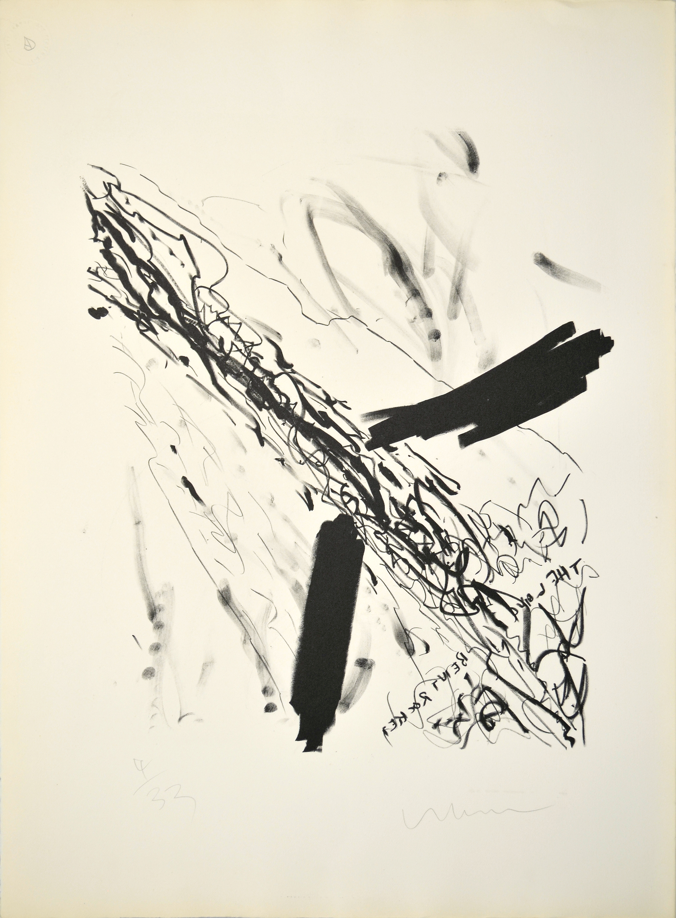
Long Bent Rocket (1960) is an early lithograph by Robert Whitman of a rocket moving through the air. Short, staccato lines constitute the body of the rocket, while dense marks extending from either side of the lower shaft suggest fins. The words the long bent rocket, framed by the fins below the length of the rocket, appear backwards—a result of the lithographic process—and long, airy lines surrounding the body of the rocket suggest movement.
Whitman surrounded himself with artists who, like him, were working partially in reaction to the work of Abstract Expressionism, which emphasized the direct connection between the hand of the artist and the surface of the work. This focus manifested itself in a wide variety of brushwork and mark-making techniques. Here, Whitman references the multiplicity of gestural strategies of Abstract Expressionism by making marks with a number of different tools, including lithographic crayons and his fingers. However, lithography is a multi-step process that builds significant distance between the hand of the artist and the finished product, presenting a challenge to Abstract Expressionist formal strategies.
Whitman is best known for his theatrical works, which he began making in the early 1960s, blending aspects of performance art and traditional theater with technological innovations involving sound and light. In 1967, along with Robert Rauschenberg, Billy Klüver, and Fred Waldhauer, Whitman founded Experiments in Art and Technology (E.A.T.), a group focused on bringing new technologies to artists looking to fold new media into their practice. The ongoing Space Race with the U.S.S.R. would have placed space technology at the forefront of American culture at this time, and images of rockets also appear in work by Whitman’s associates, including Rauschenberg’s Untitled (Mirror) (1952). Though Long Bent Rocket antedates the majority of Whitman’s mature oeuvre, we can understand this lithograph as a work through which the artist processed the movement that preceded him, while imagining his own role in formal and conceptual developments to come.
Robert Whitman Biography
Robert Whitman (b. 1935, New York, NY) received a BA in Literature at Rutgers, The State University of New Jersey, New Brunswick (1957), where his first solo exhibition was held in 1958. He studied Art History at Columbia University, New York (1958), and created and staged many of his first “Happenings” performances on the Lower East Side alongside artists like Allan Kaprow, Lucas Samaras, Red Grooms, Jim Dine, and Claes Oldenburg. Whitman co-founded the non-profit organization Experiments in Art and Technology (E.A.T.) (1966) with Billy Klüver, Fred Waldhauer, and Robert Rauschenberg. The most recent traveling retrospective on Whitman’s work opened at Dia:Chelsea, New York (2003). Recent solo exhibitions were held at the Williams Center for the Arts, Lafayette College, Easton, Pennsylvania (2007); PaceWildenstein, New York (2007); Eyebeam Art + Technology Center, New York (2012); and Broadway 1602, New York (2013). Whitman also made several films included in his work, such as Window (1963), Dressing Table (1964), Shower (1964), Sink (1964), and Room (1974). Whitman lives and works in Warwick, New York and is represented by Pace Gallery, New York.
Cat Dawson Biography
Cat Dawson is a doctoral candidate (ABD) in Visual Studies at the University at Buffalo specializing in art of the American post-war postmodern. Her particular interests include the interplay between text and language, conceptual art and theories of the body, mid-century painting and the sexuality of abstraction, and psychoanalysis. Her dissertation is on sexuality and difference in American post-war painting.
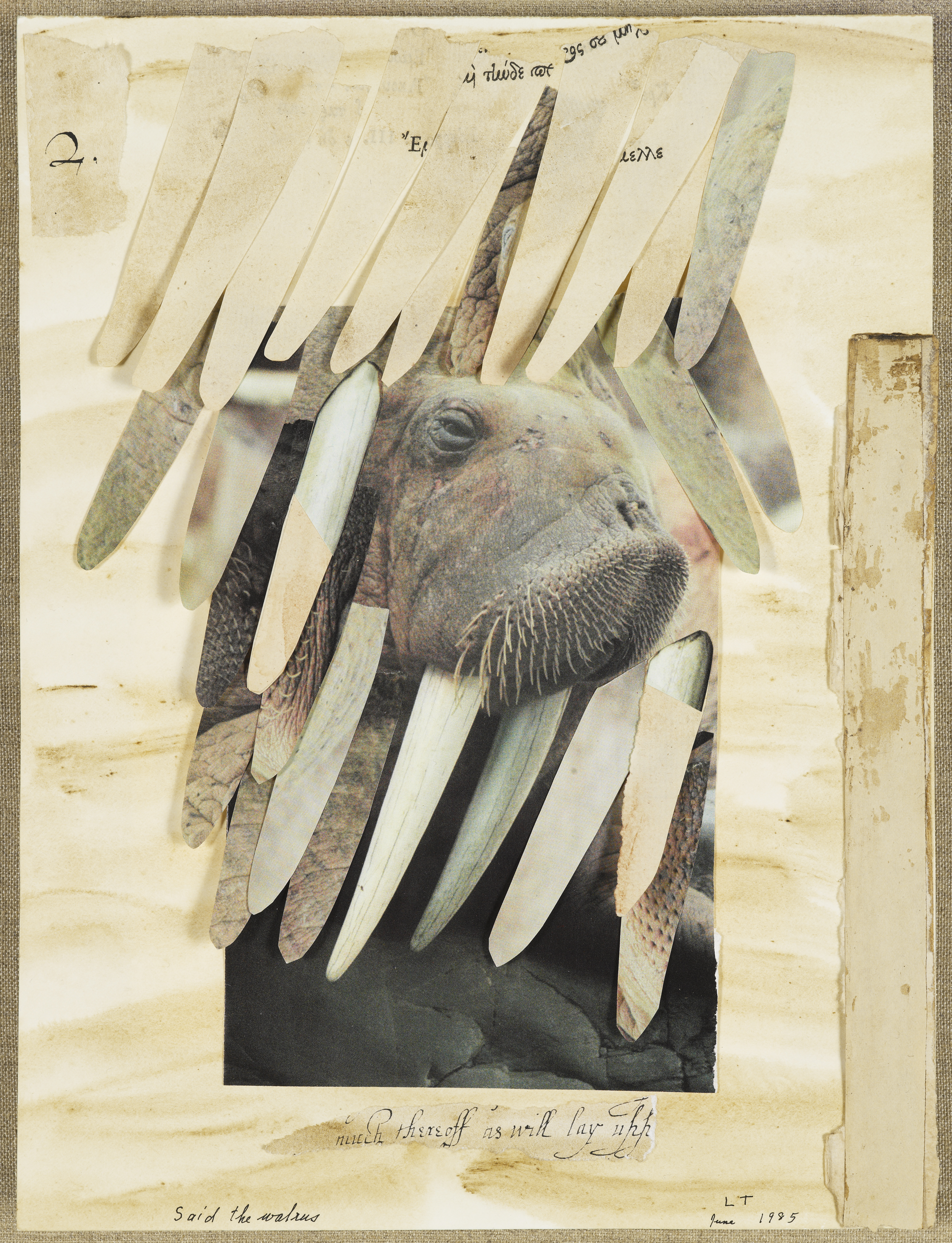
Said the Walrus to the Carpenter, It Would Be Very Nice (1985), a collage by Lenore Tawney, features an image of a walrus that protrudes through a curtain of oblong shapes. One of Tawney’s later collages, Said the Walrus is a reference in both title and subject to “The Walrus and the Carpenter,” a narrative poem from Lewis Carroll’s 1871 book Through The Looking Glass, which explores the theme of deception through meaning in language. In the poem, the Walrus uses word play to trick a spat of oysters into attending a feast at which they all are eaten. The Walrus in Carroll’s poem is complacent in carrying out his deceit, but he expresses reservation about the trickery in which he engages. By exposing the implications of the plot afoot, the Walrus becomes the mediator between the audience and the events in the story.
The image of a walrus in Tawney’s piece is framed by a cut-out square, which, in concert with the shapes collaged over the top, suggests a stage. Tawney’s contextualization of this image in a stage-like frame introduces an element of performance, a form of play between language and action. Play is associated with the mobility of meaning – the combination of two elements that are not usually put together – which presents a challenge to fixed meaning. Alternative meanings enable the possibility of difference, and the Walrus in this work is the character that exposes an alternative to the story: letting the oysters go, rather than perpetuating the trap.
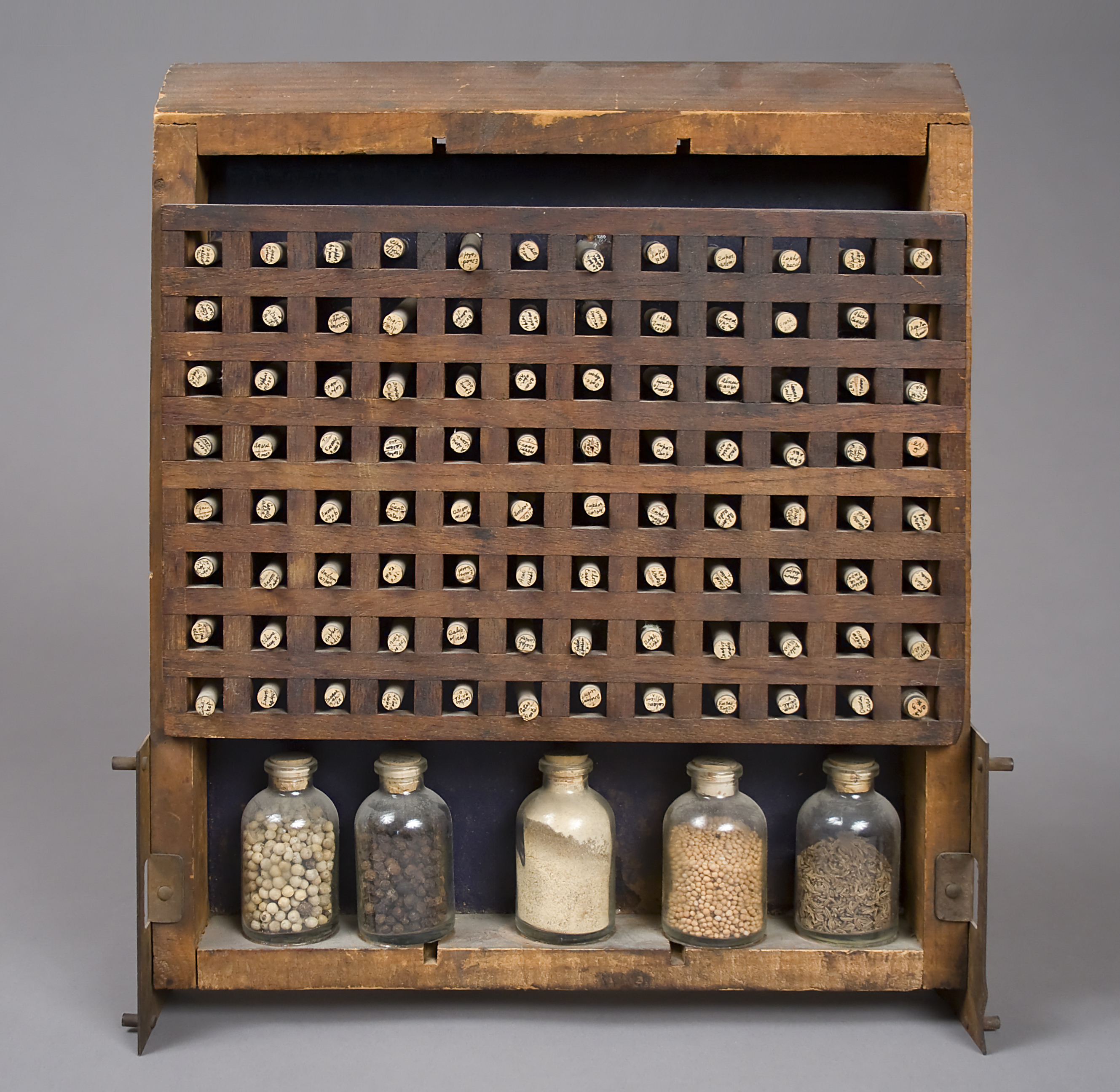
Challenges to authoritative meaning are common throughout Tawney’s work, and she often looked to artists around her for material, taking the formal strategies of others and processing them through her own personal referential vocabulary. A striking element of Tawney’s work is its almost diametric opposition, in its personal inflections, to that of her once-partner, Agnes Martin.1 One of the foremost figures in geometric abstraction in the post-war period, Martin’s artworks offer little in the way of external or personal referents beyond her meticulously handcrafted grids. Tawney’s Biblioteca Chemica (1966) consists of a wooden rack of square compartments filled with small vials of material. This work echoes Martin’s formal vocabulary, but in lieu of carefully rendered lines, Tawney employs a found object as the grid formation. The small vials, labeled by hand in tiny script, contained within infuse the work with a sense of the personal; we can read the artist’s handwriting on the tops of the rubber stoppers. By deploying handwriting and hand-collected materials alongside the grid—which is associated with uniformity and yet, somewhat paradoxically, is also the signature formal strategy of her once-partner—Tawney performs a complex conflation of the personal and the impersonal. Thus she makes the mechanisms that bridge or challenge distinctions between public and private meaning the subject of her work.
1. There is no evidence in the Lenore G. Tawney Foundation archives of the relationship between Lenore Tawney and Agnes Martin. However, given the social strictures of the time, such an omission is hardly surprising. Several other sources in the Smithsonian Institution’s Archives of American Art nonetheless address their relationship. For further information, please consult Jonathan D. Katz, “Agnes Martin and the Sexuality of Abstraction,” in Agnes Martin, eds. Lynne Cooke and Karen Kelly (New Haven: Yale University Press, 2012), 92-121.
Lenore Tawney Biography
Lenore Tawney (b. 1907, Lorain, OH; d. 2007, New York) was a student at the Institute of Design, Chicago (1946-1947). She studied tapestry at the Penland School of Crafts, North Carolina (1954) and then joined a community of artists working in Coenties Slip in Lower Manhattan. She studied gauze weaving with Lili Blumenau in New York (1961). During the mid-1960s, Tawney began to work in drawing, collage, and assemblage, a practice she continued throughout her life. She was an artist-in-residence at the University of Notre Dame, Indiana (1978), and at the Fabric Workshop, Philadelphia (1982). Tawney was a guest lecturer for Visual Arts and Fiber at The Banff Center, Alberta, Canada (1983), and a distinguished lecturer at the University of Arizona, Tucson (1987). She has received awards from the American Craft Council, the James Renwick Alliance, and the American Craft Museum, in addition to an honorary degree from the Maryland Institute College of Art, Baltimore. Her first major retrospective was held at the Museum of Arts and Design, New York (1990). Recent solo exhibitions were held at the Maryland Institute College of Art, Baltimore (2012-2013) and the University of the Arts, Philadelphia (2013). Her work is housed in the public collections of The Museum of Modern Art, New York; The Metropolitan Museum of Art, New York; The Art Institute of Chicago; and the Cooper-Hewitt National Design Museum, New York.
Cat Dawson Biography
Cat Dawson is a doctoral candidate (ABD) in Visual Studies at the University at Buffalo specializing in art of the American post-war postmodern. Her particular interests include the interplay between text and language, conceptual art and theories of the body, mid-century painting and the sexuality of abstraction, and psychoanalysis. Her dissertation is on sexuality and difference in American post-war painting.
References
There is no evidence in the Lenore G. Tawney Foundation archives of the relationship between Lenore Tawney and Agnes Martin. However, given the social strictures of the time, such an omission is hardly surprising. Several other sources in the Smithsonian Institution’s Archives of American Art nonetheless address their relationship. For further information, please consult Jonathan D. Katz, “Agnes Martin and the Sexuality of Abstraction,” in Agnes Martin, eds. Lynne Cooke and Karen Kelly (New Haven: Yale University Press, 2012), 92-121.
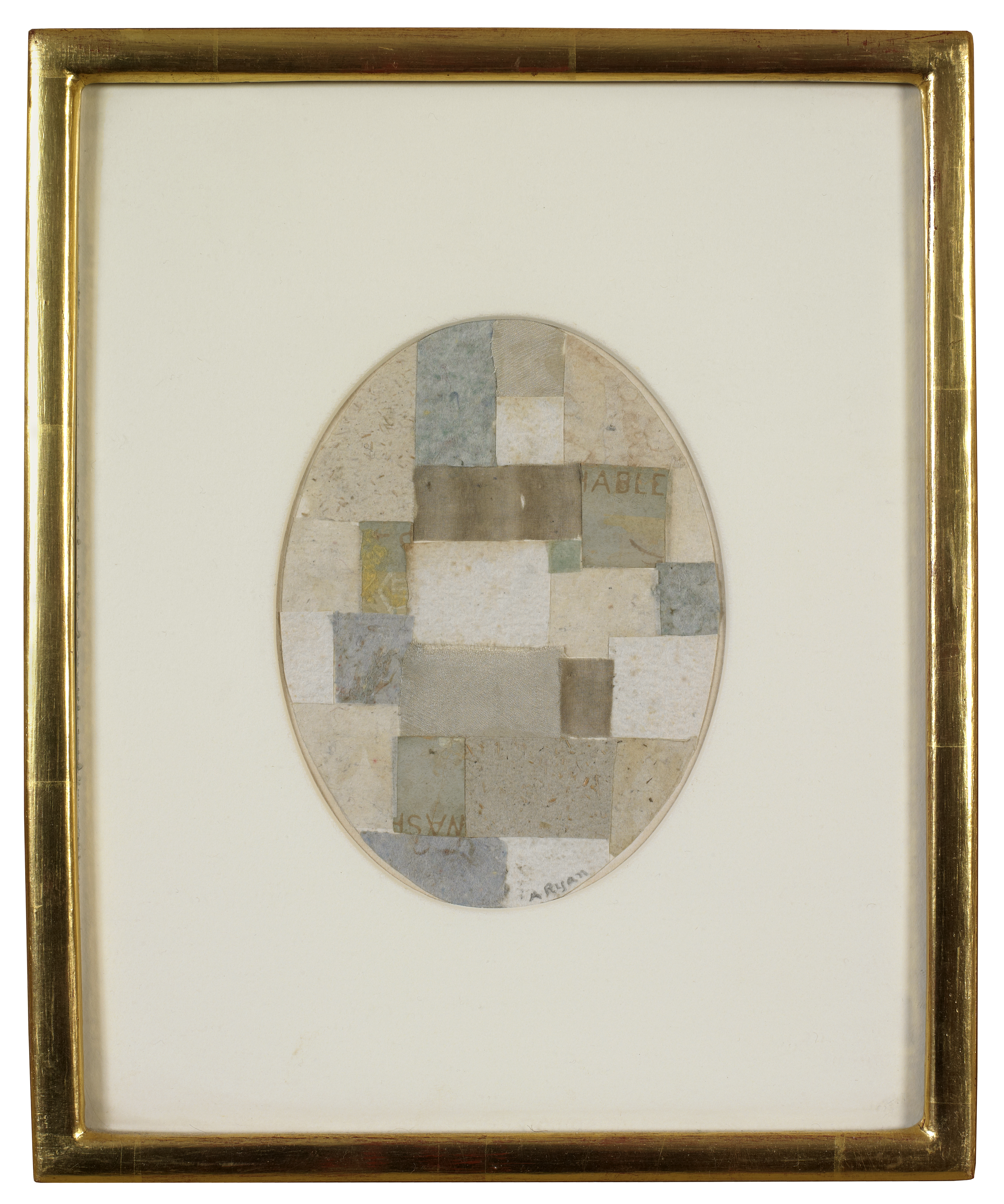
Poet, printmaker, author, and painter Anne Ryan is often associated with the early generation of New York abstraction. In 1941, Ryan joined Atelier 17, a famous printmaking workshop originally established by Stanley William Hayter in France in the 1930s and transferred to New York after the Second World War. It wasn’t until 1948, when Ryan was 58 years old, that she began working in her signature medium of collage.
It is said to have been an exhibition of the work of Kurt Schwitters that inspired Ryan’s shift in medium. Her early implementation of connotative found materials, such as postage stamps and photos, led to her use of rice papers and cloth. Paper and fabric are both employed in Ryan’s collage Untitled (Whites with Greens) (1952). This work falls in line with Ryan’s signature formal geometry and diminutive scale. The scraps of paper and cloth are interspersed in a way that resembles a quilt, with the words wash and able the only legible text in the work.
Ryan’s historical association with the New York School comes from a perceived investment in form and materiality, though her work’s particular evocation of domesticity, craft, and female labor places Ryan within a long lineage of feminist art practice. Though Ryan took up her preferred medium late in life, she managed to complete some four hundred collaged works between 1948 and her death in 1954.
Anne Ryan Biography
Anne Ryan (b. 1889, Hoboken, NJ; d. 1954, Morristown, NJ) began her only formal art training at Stanley William Hayter’s famous printmaking workshop Atelier 17, New York (1941). Her first solo painting exhibition was at the Pinacotheca Gallery, New York (1941), followed by other one-woman shows including at the Betty Parsons Gallery, New York (1950, 1954, 1955, 1970); the Walker Art Center, Minneapolis (1979); the Yale University Art Gallery, New Haven (1979); the Museum of Fine Arts, Houston (1980); and Washburn Gallery, New York (1985, 1989, 1991, 1998, 2008). A retrospective of her work was held at the Susan Teller Gallery (2007). Ryan’s work may be found in numerous public collections such as: the Brooklyn Museum, New York; the Metropolitan Museum of Art, New York; the Hirshhorn Museum and Sculpture Garden, Washington, D.C.; and the Whitney Museum of American Art, New York.
Maddie Phinney Biography
Maddie Phinney is a writer and editor based in Los Angeles. She received her MA from the University at Buffalo, New York (2014) and is currently Adjunct Instructor in the Department of Visual Studies. Her work centers on the art of identity and its critical reception, with particular attention paid to the politics of the AIDS epidemic in the US. Her writing has appeared in artcritical, V Magazine, Bomb, Nukta Art and others.
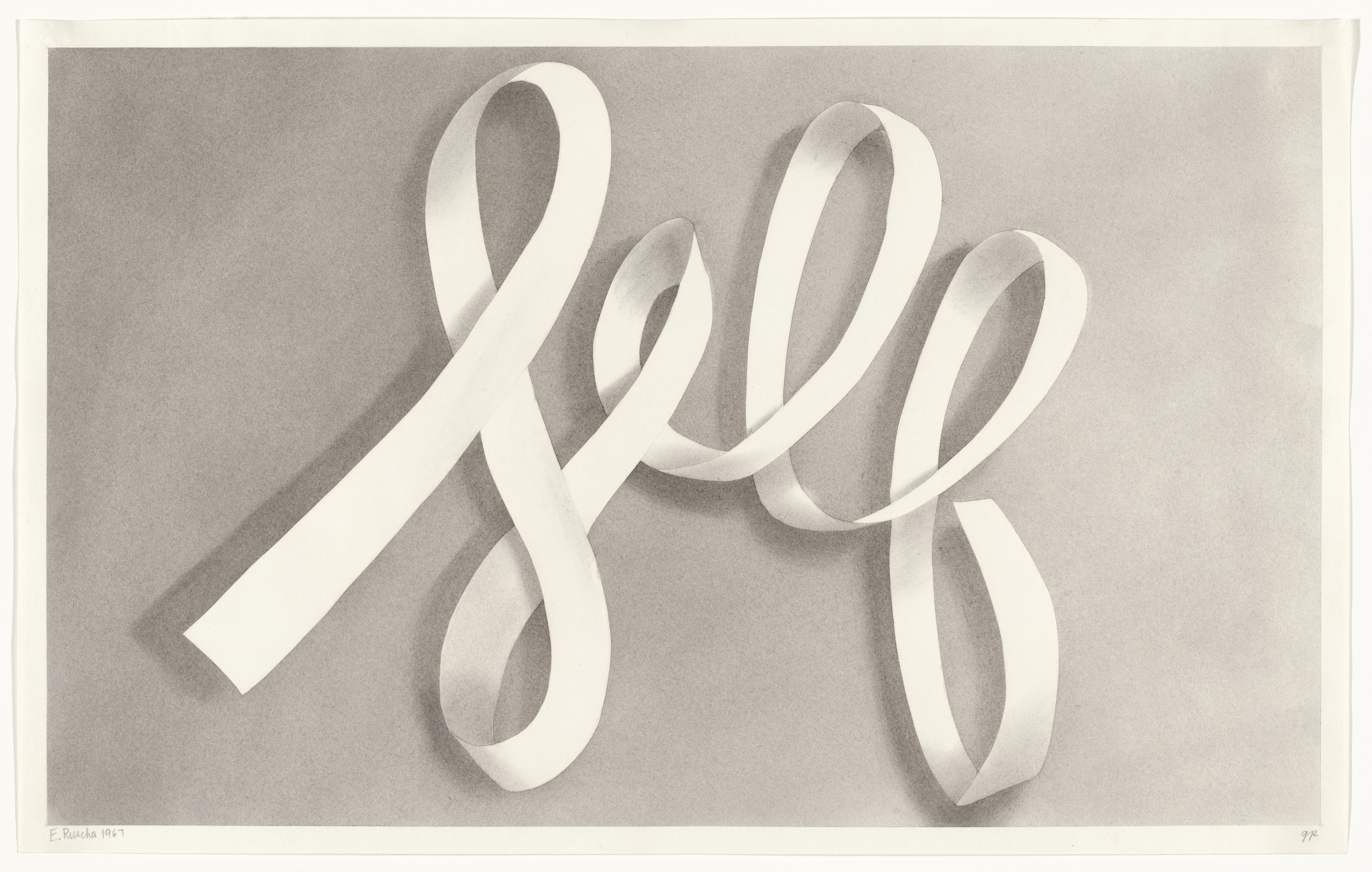
Ed Ruscha began his commentary on language as a system in the early 1960s, most often exploiting the connotative power of a single word as a means of commenting on the contingent relationship of form to content. Later in the 1970s, Ruscha began employing evocative phrases and sentences to point to cultural conventions, myths, or ideologies. Ruscha’s use of language is often analyzed in terms of the direct and immediately comprehensible imagery of Pop. Yet it is through the shifting interrelationship between form and content—between what is said and implied—that the artist examines the political power of language. Self (1967) is Ruscha’s earliest drawing in the exhibition, and it provides a useful point of departure in examining the power of the linguistic to evoke the relationship between individual and group identity.
In 1960s America, language began to re-enter the vocabulary of American artists, supplanting High Modernism’s four-decade promotion of abstraction. Pop is frequently theorized as an ironic response to Abstract Expressionism, which insisted on the autonomy of the image as evidence of the artist’s singular encounter with his materials.1 Pop images, when placed in dialogue with text, instead pointed to interpretative frames as referential and contingent, indicating our own deep engagement with popular culture. With Self, Ruscha enlists the political potential of Pop to speak to the constructedness of individual identity. By rendering the word Self in script, Ruscha gestures toward the autographic: the stable “truth” of the self as understood by High Modernism becomes a mere citation, a word, necessarily different in its shadings to anyone who reads it. By rendering the text in reserve and giving it the illusion of three-dimensionality, Ruscha turns this word into a scroll to be written on: the self as a screen. The drawing is part of Ruscha’s gunpowder series, which the artist began in the 1960s because he found graphite and charcoal lacking in their evocative potential. In 1967, at the height of the Vietnam War, Ruscha raises questions of individual responsibility for violence by illustrating the self with the materials of combat. In Self, text becomes image and image becomes text, allowing the word to act both as a physical object and as a conveyor of meaning.
1. Harold Rosenberg, “The American Action Painters,” Tradition of the New, originally in Art News 51/8, December 1952: 22.
Ed Ruscha Biography
Edward Ruscha (b. 1937, Omaha, NE) studied at the Chouinard Art Institute, Los Angeles (1960). He has received grants and fellowships from the National Council on the Arts (1967); the National Endowment for the Arts (1969, 1978); the Tamarind Lithography Workshop (1969); and the John Simon Guggenheim Memorial Foundation (1971). Ruscha has been awarded the Skowhegan School of Painting and Sculpture Award in Graphics (1974); the Achievement in Printmaking Award from the Graphic Arts Council, Los Angeles County Museum of Art (1988); and the Achievement in Visual Arts Award from the California Arts Council (1995). He was elected to the American Academy of Arts and Letters (2001) and was the United States representative at the 51st Venice Biennale (2005). A major exhibition of Ruscha’s work was organized by the Whitney Museum of American Art, New York (2004) and traveled to The Museum of Contemporary Art, Los Angeles, and to the National Gallery of Art, Washington, DC. A retrospective of his work took place at the Hayward Gallery, London (2009) and traveled to Haus der Kunst, Munich, and to Moderna Museet, Stockholm. Other recent solo and group exhibitions have been held at Wetterling Gallery, Stockholm (2010); Sprüth Magers, Berlin (2010); the Modern Art Museum of Fort Worth, Texas (2011); Gagosian Gallery, Beverly Hills, California (2011); the Hammer Museum, Los Angeles (2011); Kunsthaus Bregenz, Austria (2012); Peter Lund Gallery, Los Angeles (2012); Gagosian Gallery, New York (2012, 2014); the Los Angeles County Museum of Art, California (2012) and traveled to the Rose Art Museum of Brandeis University, Waltham, Massachusetts (2012); Brandhorst Museum, Munich, Germany (2013); Kunstmuseum Basel, Switzerland (2013); and The Getty Center, Los Angeles (2013). Ruscha lives and works in Los Angeles. More information about his work can be found at www.edruscha.com.
Maddie Phinney Biography
Maddie Phinney is a writer and editor based in Los Angeles. She received her MA from the University at Buffalo, New York (2014) and is currently Adjunct Instructor in the Department of Visual Studies. Her work centers on the art of identity and its critical reception, with particular attention paid to the politics of the AIDS epidemic in the US. Her writing has appeared in artcritical, V Magazine, Bomb, Nukta Art and others.
References
Harold Rosenberg, “The American Action Painters,” Tradition of the New, originally in Art News 51/8, December 1952: 22.
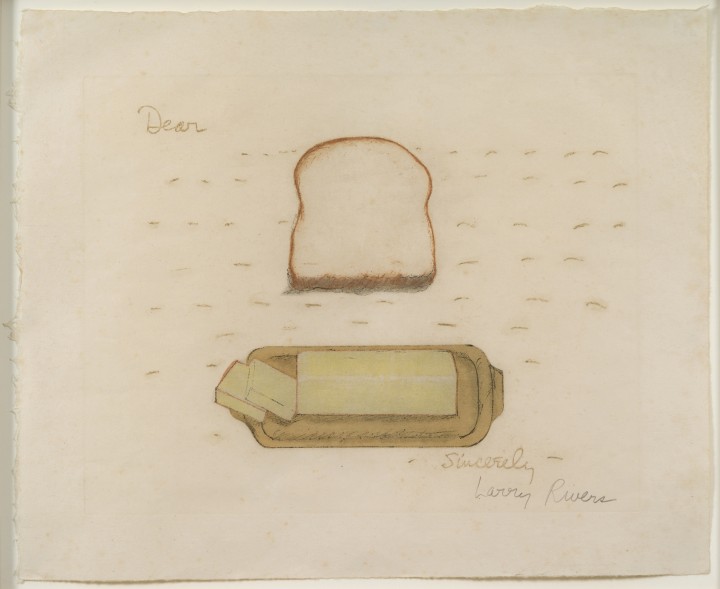
Larry Rivers’s etching and screenprint Bread and Butter (1974) takes the form of a letter, with the obligatory “Dear” and “Sincerely” bracketing a slice of bread, a stick of butter, and the dotted line that we conventionally associate with missing words. The term “bread-and-butter letter” is a colloquial expression, now largely fading, for a thank-you note sent in return for hospitality—something that’s done as a matter of course, like putting butter on your bread. The words bread and butter together evoke the quotidian, but the image Rivers presents is anything but. A kind of rebus, but a performatively incomplete one, it enfolds images into, or more precisely onto, an epistolary format that irritates our desire for narrative closure. While we can read the image, we can’t really understand it, and we cannot attribute any definitive meaning to it beyond its curious literalization of an old-fashioned phrase.
But Bread and Butter is theoretically sophisticated beneath its Pop surface. If a bread-and-butter letter is a requisite social nicety, then in some sense what that letter declares is less significant than the fact of its delivery. Rivers’s image thus asks whether a bread-and-butter letter that merely illustrates the bread and the butter sufficiently functions to fulfill this social duty. In this sense, Rivers’s print is a latter-day meditation on Jasper Johns’s iconic flag painting, which similarly asks whether a painting of an American flag is ontologically akin to an authentic flag, provided that it, too, presents the requisite red, white, and blue palette in the appropriate design.
Rivers’s larger career has tended to fall outside the usual frames for understanding the development of American art. He was a contemporary of the Abstract Expressionists but is more commonly regarded as part of a succeeding generation of Pop artists—this despite the fact that his first ostensibly Pop paintings date from the early ‘50s, a decade before Pop’s emergence. Rivers falls out of the frame stylistically, too, in that his work, especially early on, combined an Abstract Expressionist gestural brushiness with a realism so convincing it seemed to belong to another time. Rivers mingled two modes that were considered mortal enemies, a shotgun wedding through which he suggested that style was merely a means to an end—rather than the end itself, as it was then understood. Finally, Rivers parted company with his confederates in Abstract Expressionism by cultivating the ironic, jokey, dexterous patois of the largely gay circle surrounding his great friend and sometime lover Frank O’Hara.
O’Hara and Rivers were responsible for one of the great satires ever produced about Abstract Expressionism, particularly notable for having been written when the movement was in its prime. Their shared authorship of “How to Proceed in the Arts,” subtitled in mock seriousness, “A Detailed Study of the Creative Act,” resulted in a kind of post-Abstract Expressionist manifesto. Its repeated assaults on Abstract Expressionism from, as it were, within—the glib references to favorite buzz words, the undercutting of sacred tropes—served notice that what was once beleaguered had become the establishment. O’Hara and Rivers’s no-holds-barred satire took many of the most sacred precepts of Abstract Expressionism to task, such as the notion that if one is painting “in the moment,” then the picture should come forth holistically and spontaneously, and not as a matter of forethought, design, or calculation. Titled and conceived as a primer for avant-garde success, the article bears quoting in detail:
7. They say your walls should look no different than your work, but that is only a feeble prediction of the future. We know the ego is the true maker of history, and if it isn’t, it should be no concern of yours.
8. They say painting is action. We say remember your enemies and nurse the smallest insult….Be ready to admit that jealousy moves you more than art. They say action is painting. Well, it isn’t, and we all know Expressionism has moved to the suburbs.
9. If you are interested in schools, choose a school that is interested in you. Piero Della Francesca agrees with us when he says, “Schools are for fools.” We are too embarrassed to decide on the proper approach. However, this much we have observed: good or bad schools are insurance companies. Enter their offices and you are certain of a position….
13. Youth wants to burn the museums. We are in them–now what?…Embrace the Bourgeoisie. One hundred years of grinding our teeth have made us tired. How are we to fill the large empty canvas at the end of the large empty loft? You do have a loft, don’t you, man?
14. …We’re telling you to begin. Begin! Begin anywhere. Perhaps somewhere in the throat of your loud ass hole of a mother? O.K.? How about some red-orange globs mashed into your teacher’s daily and unbearable condescension. Try something that pricks the air out of a few popular semantic balloons; groping, essence, pure painting, flat, catalyst, crumb, and how do you feel about titles like “Innscape,” “Norway Nights and Suburbs,” “No. 188, 1959,” “Hey Mama Baby,” “Mondula,” or “Still Life with Nose”? Even it is a small painting, say six feet by nine feet, it is a start. If it is only as big as a postage stamp, call it a collage–but begin.1
In the face of the bombastic Sturm und Drang of ‘50s Abstract Expressionism, Rivers’s work was instead overtly domestic, featuring a rotating cast of his own family members, including his mother-in-law, Birdie, often depicted in the nude. Manifestly character studies, these domestic scenarios were joined by other works that ironized or undercut a great deal of the high seriousness of the art world at that time. For instance, many of the leading Abstract Expressionist artists gathered at a dive bar called the Cedar Tavern, where they drank heavily, fought often, and generally behaved rather differently from most assumptions regarding the private lives of those refined aesthetes we term artists. Rivers, in turn, made a painting called Cedar Bar Menu that punctured the mythic aura surrounding the tavern, pointing to the cheesy menu and, by extension, to the run-down, even squalid circumstances that obtained there.
By the late ‘50s, the deployment of text was a regular part of Rivers’s work, and such painting series as Lions on the Dreyfus Fund, or one comprising variations on the Camel cigarette package, underscored the inseparability of text within his art. Some paintings were even labeled as vocabulary lessons, offering the names for various parts of the human anatomy in, say, French, along with arrows pointing to the proper place on a nude figure. But the apogee of his work with language is arguably Stones, a lithographic series completed with Frank O’Hara, in which O’Hara’s poetry and Rivers’s imagery resonate in complex ways. Text began to play an even more significant role in a later series of highly politicized works that followed early clashes over the Civil Rights movement. For example, he made a painting with a black penis, a white penis, and a ruler—all of the same length—with text reading America’s No 1 Problem.
By the time he completed Bread and Butter, Rivers was viewed most centrally as a Pop artist, and the work betrays a Pop sensibility. But unlike other Pop artists such as Andy Warhol, Rivers’s hand is always evident in his work—a gestural holdover from and a tribute to his complicated relationship with Abstract Expressionism.
1. Frank O’Hara and Larry Rivers, “How to Proceed in the Arts,” Frank O’Hara Art Chronicles 1954-66:93, originally in Evergreen Review V, 19 (August 1961).
Larry Rivers Biography
Larry Rivers (b. 1923, Bronx, NY; d. 2002, Southampton, NY) enlisted in the United States Army Air Corps (1942), but was honorably discharged from the armed forces within a year. He briefly studied music theory and composition at the Juilliard School of Music, New York (1944). Rivers studied painting at Hans Hofmann’s School of Fine Arts, New York (1947-48), and received his BA in art education from New York University (1951). His first solo exhibition was held at the Jane Street Gallery, New York (1949), and his work was shown nearly annually at Tibor de Nagy Gallery, New York from 1951 to 1961. The first of several retrospectives on Rivers’s work opened at the Rose Art Museum, Brandeis University, Waltham, Massachusetts (1965) and traveled to: Pasadena Art Museum, Pasadena, California; The Jewish Museum, New York; The Detroit Institute of Arts; and The Minneapolis Institute of Arts. His work is represented by numerous museums around the world, including: The Art Institute of Chicago, Illinois; the Dallas Museum of Art, Texas; Los Angeles County Museum of Art, California; The Museum of Modern Art, New York; The Guggenheim Museum, New York; The Hirshhorn Museum & Sculpture Garden; the Tate Gallery, London; the Museo Rufino Tamayo, Mexico City; and the Museo de Arte Contemporaneo, Caracas. More information about his work can be found on http://www.larryriversfoundation.org/.
Jonathan D. Katz Biography
Jonathan D. Katz (b. 1958, St. Louis, MO) was the first full-time American academic to be tenured in the field of gay and lesbian studies. He founded and chaired both the Harvey Milk Institute, San Francisco, and the Queer Caucus for Art of the College Art Association. He co-founded Queer Nation, San Francisco, and the Gay and Lesbian Town Meeting, Chicago. As an Associate Professor at Yale University, New Haven (2002-06), Katz was Founding Director of its Lesbian and Gay Studies Program. He has been the Terra Foundation Senior Fellow at the Courtauld Institute of Art, London. Katz co-curated the exhibition Hide/Seek: Difference and Desire in American Portraiture, which opened at the Smithsonian National Portrait Gallery, Washington, D.C. (2010), and traveled to The Brooklyn and Tacoma Museums. Hide/Seek received the Best National Museum Show Award (2011) from the International Association of Art Critics, and its accompanying book was voted the best LGBT non-fiction (2011) by the American Library Association. Katz currently directs the doctoral program in Visual Studies at the University at Buffalo, New York. He is completing two new books, Art, Eros and the Sixties, and The Silent Camp: Jasper Johns, Robert Rauschenberg and the Cold War, to be published by the University of Chicago Press. His exhibition entitled Classical Nudes and the Making of Queer History is opening at the Leslie Lohman Museum for Gay and Lesbian Art, New York (2014), where Katz serves as President. His next major exhibition, ArtAIDSAmerica, opens at the Los Angeles Museum of Contemporary Art (2015) and will travel to four other museums across the United States.
References
Frank O’Hara and Larry Rivers, “How to Proceed in the Arts,” Frank O’Hara Art Chronicles 1954-66:93, originally in Evergreen Review V, 19 (August 1961).
The consensus culture of Cold War America demanded conformity to a narrow constellation of prescribed behaviors and beliefs. Fear of Communist infiltrators was widespread, making all forms of difference threatening. Homosexuals were singled out as particularly vulnerable to Communist blackmail and thus were considered inherently untrustworthy. The prevailing understanding of homosexuality at this time did not include notions of love, only of deviance. Words such as love, so innocent in a heterosexual framework, became tainted with political threat when employed in a homosexual context. It is little surprise that gay artists were at the vanguard of an art-making practice that was simultaneously resistant to dominant culture’s impositions of power and illegible as such.
In the midst of these social conditions, Abstract Expressionism was the prevailing artistic movement. It entailed the conflation of artist and viewer, in the form of an expression of the artist’s inner self that would be immediately and emotionally understood by the viewer. Planning was to be avoided, and spontaneity, accident, and improvisation were privileged as the unmediated expression of the artist’s psyche. The presumed direct correlation between artist and mark made the gestural brush stroke the hallmark of Abstract Expressionism: gesture and identity became discursively synonymous.
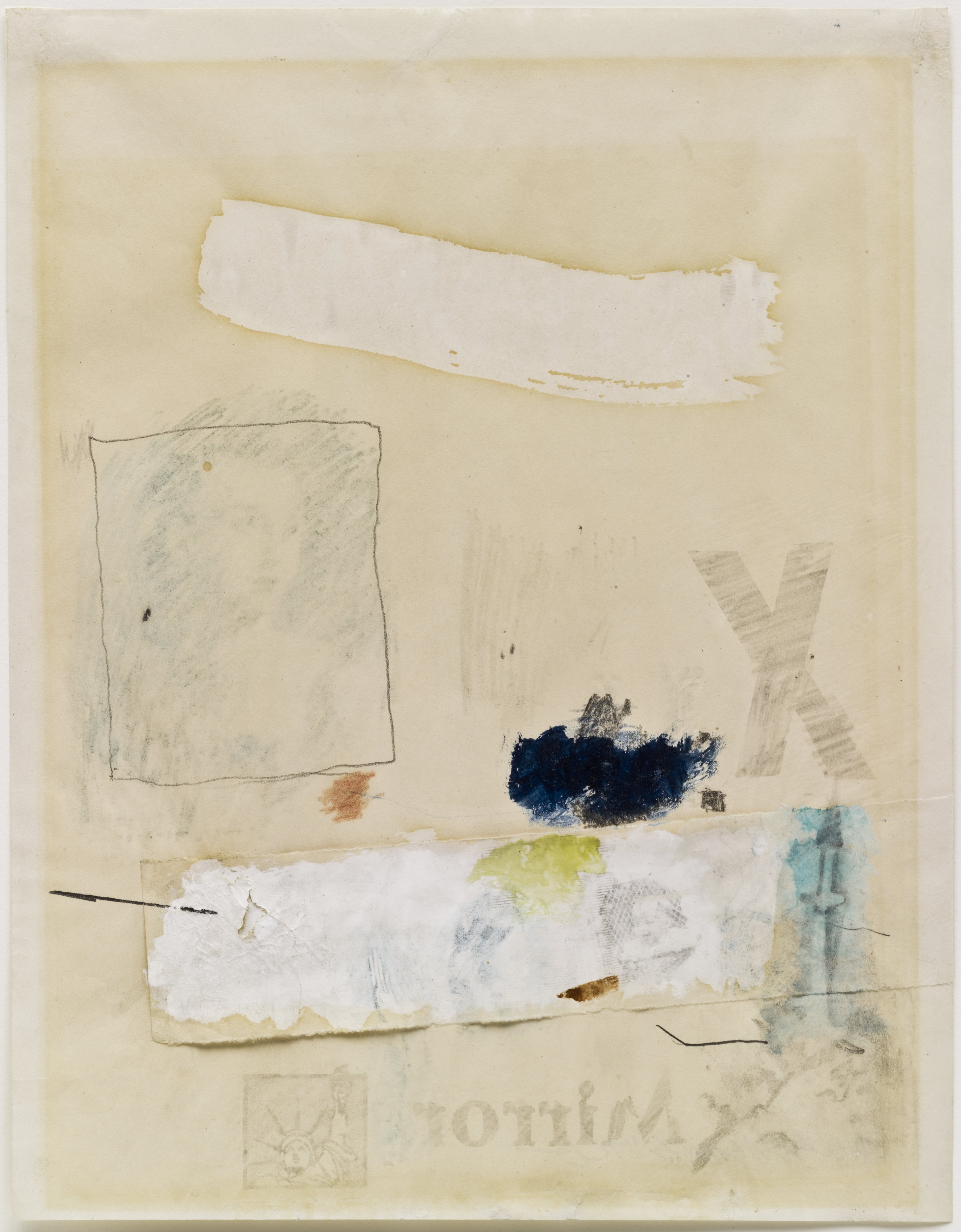
The critical reception of Abstract Expressionism made evident that not all artists can express equally. Personal expression for homosexual artists was dangerous, if not impossible, and challenging the presumption of a recoverable authorial presence became a centerpiece of their formal strategies. In refusing the formal qualities of Abstract Expressionism, gay artists sought to reject and reframe its ideological paradigms as well. In his 1952 work Untitled (Mirror), Robert Rauschenberg utilized a variety of techniques to create the image: oil and watercolor paints, pencil, collaged paper, crayon, and transfer drawings. A wide swath of white paint sweeps across the top of the canvas, below which a transfer drawing from an Old Master work has been framed in colored pencil. A collaged swatch of paper is the base for a variety of media: another solvent transfer, paint, crayon, and colored pencil. In presenting this diverse catalog of mark-making, Rauschenberg opens his canvas to multiple readings and refuses a singular organizing presence. He calls into question the privileging of one form of mark-making over another, challenging the Abstract Expressionist doctrine that valued the gestural mark above all else. That Rauschenberg’s image catalog was primarily drawn from other sources underscores the degree to which expression is always written in forms that originate outside of the self.
Among the solvent transfer images is one of a baby in a playpen. The baby may well be Rauschenberg’s son with Susan Weil, Christopher, who was born the year prior to this work, and who appears in other works such as Canyon (1959). Weil and Rauschenberg met at Black Mountain College, where he also met Cy Twombly; less than a year after he married Weil, Rauschenberg found himself falling in love with Twombly and left Weil and their infant son for a relationship with Twombly. By the time of Untitled (Mirror)’s creation, Rauschenberg and Weil were already separated. It was not an easy break, as Rauschenberg was torn by the conflict between the responsibility of marriage and family and following his heart. Thus even this image of a baby is made to mean multiply, standing as a symbol both of marriage and the heterosexual family unit, and of the dilemma the artist faced in wishing to live a life more true to himself, a life that meant being romantically involved with men.
Rauschenberg includes other images that similarly point to this dilemma, such as the solvent transfer of an Old Master Venus, which is a frequently recurring motif in Rauschenberg’s work. As Kenneth Bendiner notes, Rauschenberg reproduces a Cranach Venus in Levee (1955), a Titian in Odalisk (1955-58), a Velázquez in Barge (1962), a Michelangelo in Estate (1963), and a Rubens in Persimmon (1964), as well as others in Rebus (1955), Short Circuit (1955), Bicycle (1963), and Tracer (1964).1 Bendiner posits that the Venus transfers function “primarily as signs of love,”2 giving them an ironic twist considering Rauschenberg’s romantic interests.
The work’s title is drawn from a headline fragment from England’s daily tabloid, the Daily Mirror, and acts as a signpost to one of the work’s most significant thematics. Mirrors recur frequently in Rauschenberg’s work, adding layers of signification, whether within a transferred image, such as the fragment of Rubens’s Venus with a Mirror in Persimmon (1964); as an actual 3D object affixed to the surface, such as in Charlene (1954); or hanging from the work as in Minutiae (1954). At its most basic, the mirror is a trope of psychological self-awareness, from simple notions of self-reflection to Lacan’s Mirror stage, in which the child develops an awareness of its own subjectivity. For Rauschenberg, mirrors emphasize the individuated encounter rather than a universal or collective experience. In the works that include a physical mirror, the viewer’s reflection is incorporated into the surface of the works, materializing Rauschenberg’s emphasis on the centrality of the viewer. Moreover, since what is reflected changes with every viewing environment, Rauschenberg further destabilizes the idea of a work’s fixed and unchanging meaning, instead opening it up to an endless stream of potential significances. Finally, the mirror ironizes one of the prevailing ways in which homosexuality was then understood. Based on the Greek myth of Narcissus, who fell in love with his own image, Freud proposed that homosexuality was the result of a faulty object-choice in that the homosexual is attracted to someone whose gender matches his own: his mirror image.
As do many titles, the word Mirror serves as an organizing rubric guiding our contemplation of the work. As a word, Mirror is more noticeably reversed than some of the other pictorial elements, which spurs the viewer to consider the import of its reversal. Its adjacency calls our attention to the Statue of Liberty’s reversal, so subtle that one might not notice the flipped position of her arm holding the torch. Untitled (Mirror) is one of Rauschenberg’s earliest works using the solvent transfer method, which would soon become the bedrock of his artistic practice. This method involves the transfer of an image from a printed source – most frequently newspaper and magazines – which is soaked with xylene or other chemical solvents, laid onto a new surface, and rubbed with a burnishing tool, transferring the ink from the source to the receiver. The source image is reversed on the receiver, a consequence which is usually incidental and without any symbolic import. However, the reversal here of the Statue of Liberty—our nation’s symbol of hope, opportunity, and freedom—carries implications of the myriad ways in which those privileges are often denied gay and lesbian individuals.
Robert Rauschenberg (b. 1925, Port Arthur, TX; d. 2008, Captiva Island, FL) was renowned for his work in the 1950s period between Abstract Expressionism and Pop Art. Rauschenberg was studying pharmacology at the University of Texas, Austin when he was drafted into the U.S. Navy: he served as a neuropsychiatric technician in the U.S. Navy Hospital Corps, San Diego. He then studied at the Kansas City Art Institute (1947) and at the Académie Julian, Paris (1948). Rauschenberg returned to the United States to study under Josef Albers at Black Mountain College, Asheville, North Carolina (1948). He attended courses at the Arts Student League, New York (1949-1951) and had his first solo exhibition at the Betty Parsons Gallery, New York (1951). His first retrospective, organized by the Jewish Museum, New York (1963), was awarded the Grand Prize for painting at the 1964 Venice Biennale: other awards and honors include the National Medal of Arts Award, Washington, DC (1993); the Leonardo Da Vinci World Award of Arts, World Cultural Council, Museo del Palacio de Bellas Artes, Mexico City (1995); and the Lifetime Achievement Award in Contemporary Sculpture, International Sculpture Center, Washington, DC (1996). In 1966, Rauschenberg co-founded the non-profit organization Experiments in Art and Technology (E.A.T.) with Robert Whitman, Billy Klüver, and Fred Waldhauer. The Guggenheim Museum organized the largest retrospective of his work to date (1997), which traveled to the Menil Collection, Houston; Contemporary Arts Museum, Houston; the Museum of Fine Arts, Houston; Museum Ludwig, Cologne; and the Guggenheim Museum Bilbao. In 1998, The Vatican commissioned (and then refused) a Rauschenberg work based on the Apocalypse for Renzo Piano’s pilgrimage church in Foggia, Italy. More information may be found at http://www.rauschenbergfoundation.org/.
Sarah JM Kolberg Biography
Sarah JM Kolberg is a PhD candidate in the Department of Visual Studies at the University at Buffalo specializing in the American and French post-WWII period, with additional areas of focus in narratology, queer theory, and queer subjectivity in experimental film. Her dissertation will focus on the Nouveaux Réalistes. She has won numerous awards as both a writer and independent film producer, holds a joint MA in English and Film, and will complete her MFA in Media Study this year.
References
Kenneth Bendiner, “Robert Rauschenberg’s ‘Canyon’,” Arts 56 (1982): 57-59.
Kenneth Bendiner, “Robert Rauschenberg’s ‘Canyon’,” Arts 56 (1982): 57.
Throughout this exhibition, translation emerges as one of the central points of engagement for Conceptual and proto-Conceptual artists. To think through translation is to come to understand the complexities of communication: that some things can be transferred from one language to another, while other things cannot.
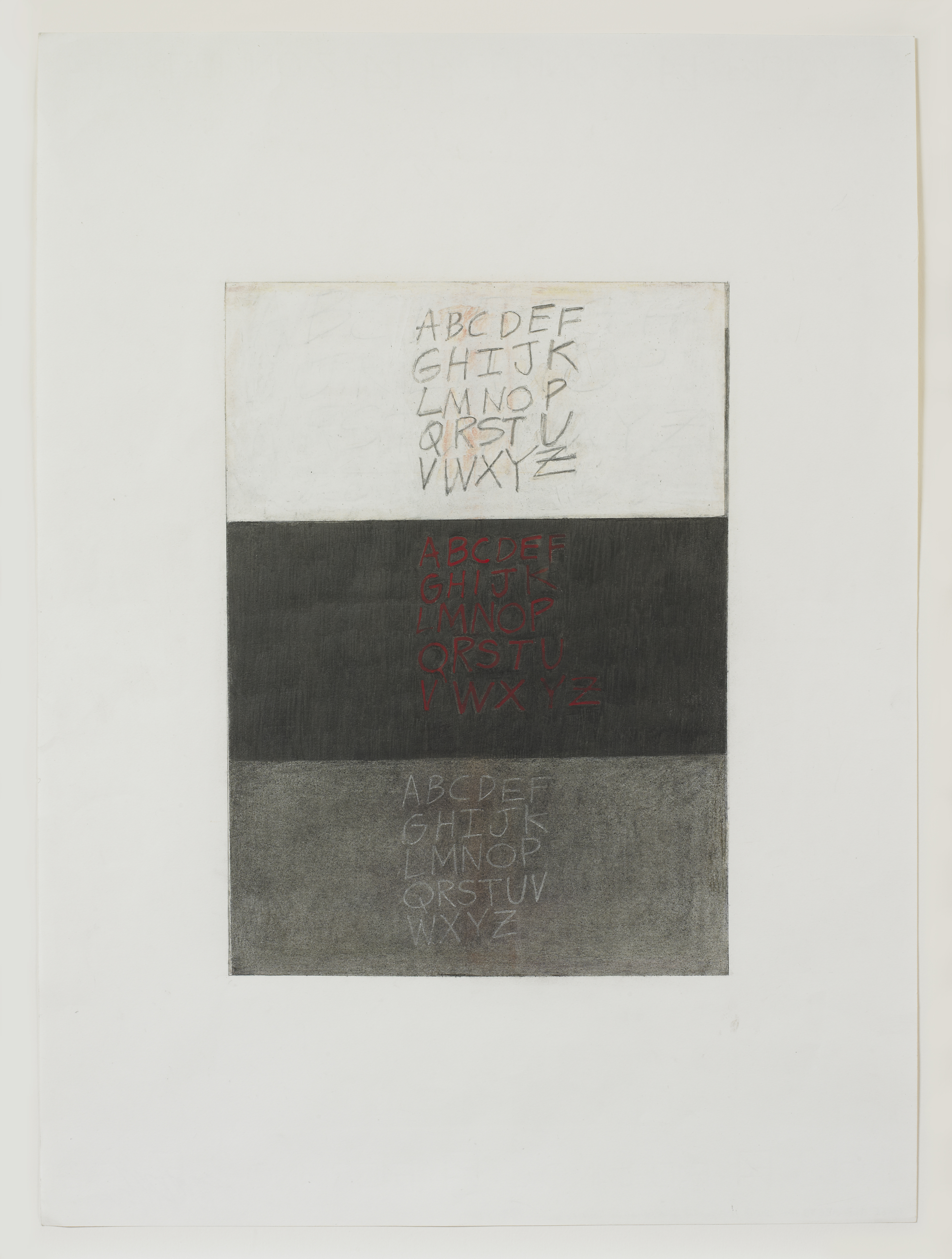
In Three Alphabets (2013), Gloria Ortiz-Hernández juxtaposes three versions of the English alphabet. The first is written in pencil on a ground of white oil pastel, the second in red pastel on charcoal, and the third in white pencil on charcoal. The upper register, which in its use of graphite on white recalls the work of Cy Twombly, suggests lightness in contradistinction to the middle register, which with its red and black palette stands in simple opposition to its neighbor. Ortiz-Hernández abuts two permutations of the same thing, revealing both similarity and the possibility of difference. The pale text on grey background found in the lower register serves to mediate the first and second alphabets, collapsing the two into one another.
This work is anachronistic, in that the play between the three alphabets harkens back to a time when translation across myriad languages was less consistent than it is today. Yet through her visual strategy of thesis/antithesis/synthesis, Ortiz-Hernández speaks to the continued relevance of dialectical speech and thinking, which remain integral to the process of meaning-making.
Gloria Ortiz-Hernández Biography
Gloria Ortiz-Hernández (b. 1943, Cali, Colombia) is an artist whose work has been shown in numerous museum exhibitions, most recently at the Davis Museum and Cultural Center, Wellesley, Massachusetts (2004); The University Galleries at Texas State University, San Marcos (2009); and the Katonah Museum of Art, Katonah, New York (2011). Recent group and solo exhibitions were held at Galería Casas Riegner, Bogotá, Colombia (2012); Josée Bienvenu Gallery, New York (2012); and artBO International Art Fair, Bogotá, Colombia (2012). Her work may be found in a variety of museum collections, including The Museum of Modern Art, New York; the Harvard Art Museums, Cambridge, Massachusetts; The Morgan Library and Museum, New York; Yale University Art Gallery, New Haven; the Seattle Art Museum, Washington; the Museum of Fine Arts, Houston; and the Museum of Fine Arts, Boston, among others. Ortiz-Hernández works in Bogotá and New York.
Cat Dawson Biography
Cat Dawson is a doctoral candidate (ABD) in Visual Studies at the University at Buffalo specializing in art of the American post-war postmodern. Her particular interests include the interplay between text and language, conceptual art and theories of the body, mid-century painting and the sexuality of abstraction, and psychoanalysis. Her dissertation is on sexuality and difference in American post-war painting.
While studying music theory at Yale under composer Paul Hindemith, William Kent became interested in sculpting, painting, and carving marble and wood. In the 1960s, he began making prints using large-scale discarded slate blackboards, which he sandblasted or carefully carved to create elegant bas-reliefs. It was also at this time that Kent developed a unique method of making monoprints using fabric. Shortly thereafter, he began exhibiting in commercial galleries and museums in New York City, and was featured in the 1966 Whitney Annual alongside Robert Rauschenberg, Jasper Johns, and Helen Frankenthaler.
In 1961, Kent became the first curator for the John Slade Ely House, a non-profit arts center in New Haven, Connecticut, which he opened up to artists year-round. However, Kent’s 1965 exhibition Sex and Violence, Or Erotic and Patriotic Prints created a scandal with the Ely House’s conservative trustees, and Kent was fired that same year. He retreated to a converted farmhouse in the small town of Durham, Connecticut, where he focused on printing until 1977, when he began sculpting wood exclusively.
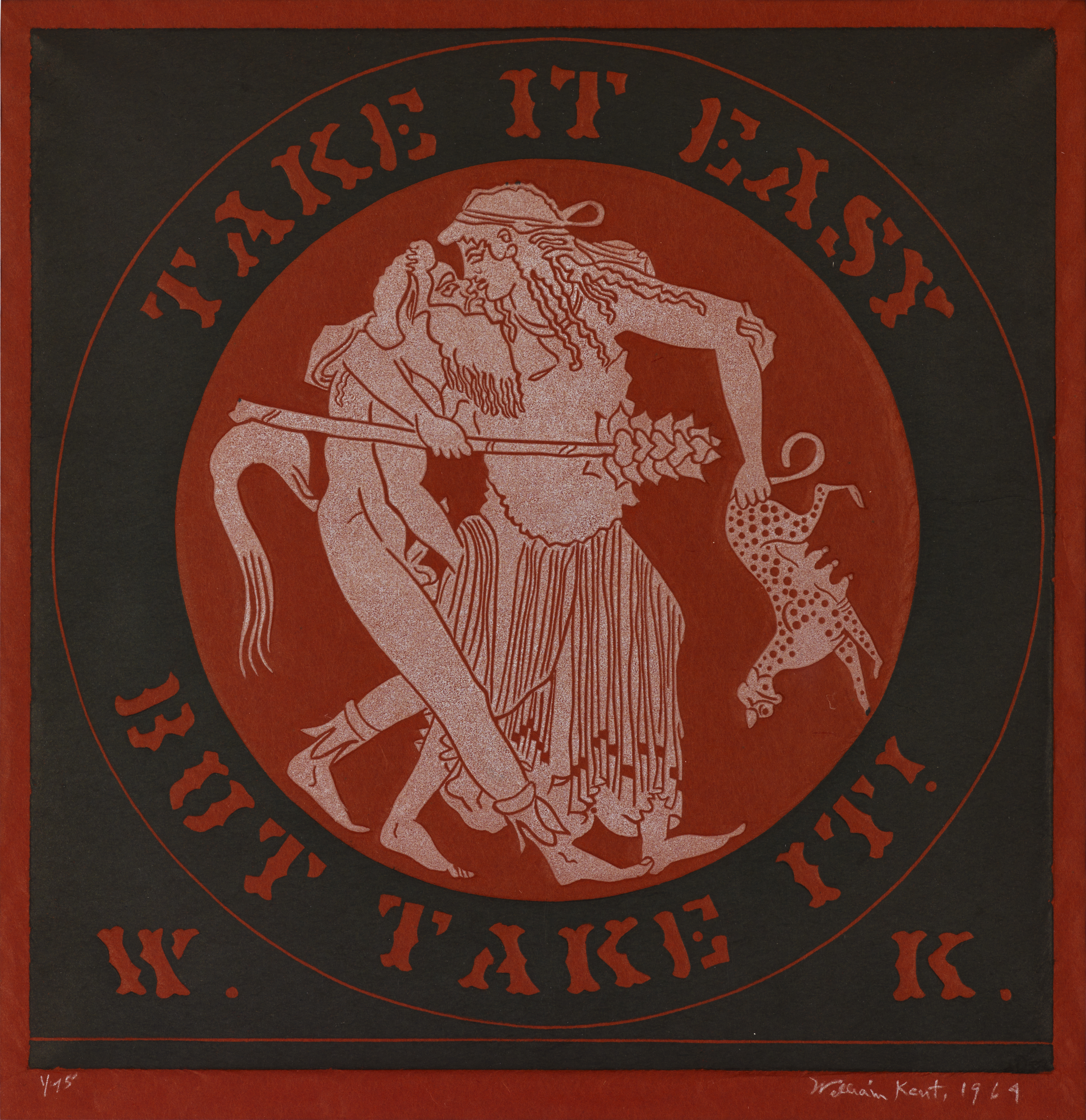
Take It Easy But Take It! (1964) is characteristic of Kent’s slate prints on rice paper. According to William Bendig of the Hollycroft Foundation, the text and title were most likely inspired by the Woody Guthrie song “Takin’ It Easy,” and the image appears to have been taken from an Athenian kylix by Makron. A maenad carries a thyrsus, a sort of magic wand, and embraces a satyr in an aggressive and erotic exchange. Kent often took from various sources to craft his evocative images, and this particular image of ancient Greek hedonism was a favorite of the artist’s.
William Kent Biography
William Kent (b. 1919, Kansas City, MO) received his BS from Northwestern University, Evanston, Illinois, and served in the United States Navy. He attended the Yale University School of Music, New Haven, Connecticut (1944-1947) and studied Music Theory and Composition with Paul Hindemith. The artist served as Curator of the John Slade Ely House Art Center, New Haven (1960-65) and as Founder and Secretary of Professional Artists of Connecticut (1962-1965). Kent received the Award for Artistic Excellence from the Arts Council of Greater New Haven (2009). Recent solo exhibitions were held at The York Square Gallery, New Haven (2000); Chase/Freedman Gallery, West Hartford, Connecticut (2003); Evergreen Woods, Branford, Connecticut (2005); Kehler Liddell Gallery, New Haven (2009); and the Museum of Sex, New York (2013). Recent group exhibitions took place at the Detroit Institute of Fine Arts, Michigan (2000); The Sculpture Mile, Madison, Connecticut (2001, 2005); the University of Michigan Museum of Art, Ann Arbor (2004); Mobile Alabama Museum (2005); Museum of Arts & Design, New York (2006); and the Lyman Allyn Art Museum, New London, Connecticut (2008). Kent’s work is included in the following selected public collections: the Smithsonian Institution; Memorial Art Gallery, Rochester University; Rose Art Museum, Brandeis University; Kalamazoo Institute of Arts; DeCordova Museum and Sculpture Park; the Brooklyn Museum; Princeton University Art Museum; New Britain Museum of American Art; and the Yale University Art Gallery. Prior to his death, Kent formed the William Kent Charitable Foundation. More information about his work and foundation can be found at http://williamkentfoundation.org/
Maddie Phinney Biography
Maddie Phinney is a writer and editor based in Los Angeles. She received her MA from the University at Buffalo, New York (2014) and is currently Adjunct Instructor in the Department of Visual Studies. Her work centers on the art of identity and its critical reception, with particular attention paid to the politics of the AIDS epidemic in the US. Her writing has appeared in artcritical, V Magazine, Bomb, Nukta Art and others.
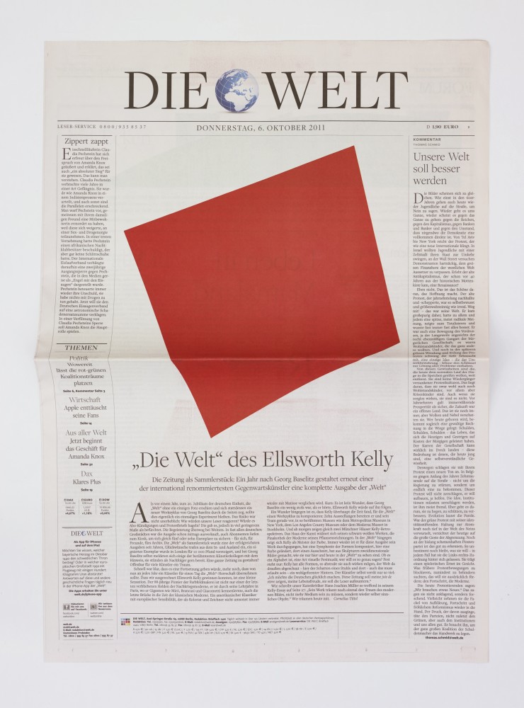
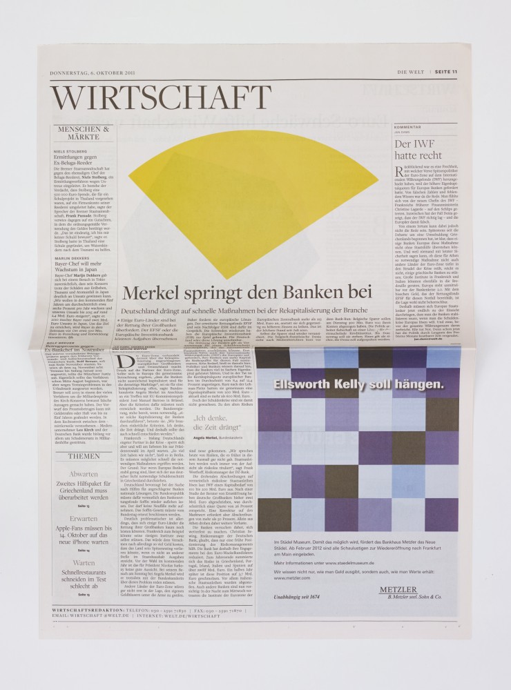
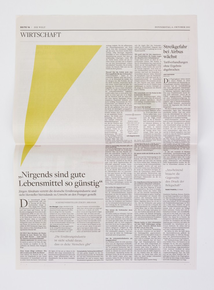
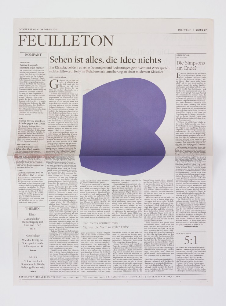
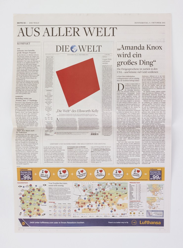
Ellsworth Kelly is famous for his work in hard-edge abstraction: primarily large shapes, often but not exclusively sculptural, sporting one uniform color surface—or sometimes two colors on adjacent shapes, which almost touch but never do. Hard-edge abstraction, in Kelly’s vernacular, is surprisingly sensual. The tension between a single color field and a wall, or between two sculptural shapes, suggests proximity with a prohibition against actual touching.
As part of a series organized by Die Welt, the leading conservative German newspaper, Kelly designed an edition of the paper to feature his signature abstract shapes where readily digestible photojournalistic images would usually be found. Images found in newspapers are customarily in conversation with text, often glimpsed as supplements rather than examined on their own. Photojournalism, however, is uniquely situated as the practice of capturing a precise moment and telling a story without words—an important component of reportage that, in daily periodicals such as Die Welt, might otherwise go unnoticed. Kelly’s intervention challenges the relationship between image and text in a specific context, while also raising questions about the ability of abstract art to speak directly to experience.
Unlike other queer artists of his generation, such as Robert Rauschenberg and Robert Indiana, who routinely incorporate language into their work, Kelly leaves his surfaces devoid of legible words or recognizable images. This marked absence gestures toward Kelly’s acute awareness of the risks taken in suggesting sexuality in his work, and this awareness serves as one explanation for his according decision to avoid suggestion wholesale. But in Die Welt, Kelly quite consciously brings his images into play with text, suggesting that his work need not contain words or pictures in order to speak volumes about society.
In placing abstract forms where we expect to find illustrative images, Kelly asks the viewer to consider how form, line, and color might resonate with people, and how it might formulate the information we use each day to understand one another and to make ourselves understood.
Ellsworth Kelly Biography
Ellsworth Kelly (b. 1923, Newburgh, NY) is regarded as one of the most important abstract painters, sculptors and printmakers working today. His career is marked by the independent route his art has taken from any formal school or art movement, and by his innovative contribution to 20th century painting and sculpture. Following two years of study at the Pratt Institute, Brooklyn, New York (1941-1942), Kelly served in the United States Army during World War II, and then resumed his education at the Boston Museum School (1946-1948). Kelly’s first one-man exhibition was at the Galerie Arnaud, Paris (1951). In recognition of his lifetime achievements and contributions, Kelly was promoted to Officier of the French Legion by the French Consulate. His first major retrospective exhibition was held at The Museum of Modern Art, New York (1973), followed by retrospectives at The Metropolitan Museum of Art, New York (1979); the Whitney Museum of American Art, New York (1982); and the Solomon R. Guggenheim Museum, New York (1996). Kelly’s works have been exhibited in conjunction with artists such as Cézanne and Beyond, the Philadelphia Museum of Art, Pennsylvania (2009); Monet and Abstraction, the Museo Thyssen-Bornemisza, Madrid (2009); Jean Auguste Dominique Ingres / Ellsworth Kelly, the Villa Medici’s Académie de France, Rome (2010); and Malevich and the American Legacy, Gagosian Gallery, New York (2011). Recent solo exhibitions were held in 2013 at The Phillips Collection, Washington, D.C.; The Museum of Modern Art, New York; Matthew Marks Gallery, New York; The Barnes Foundation, Philadelphia; Mnuchin Gallery, New York; and the Madison Museum of Contemporary Art, Madison, Wisconsin, traveling to Detroit Institute of Arts, Michigan. He lives and works in upstate New York.
Cat Dawson Biography
Cat Dawson is a doctoral candidate (ABD) in Visual Studies at the University at Buffalo specializing in art of the American post-war postmodern. Her particular interests include the interplay between text and language, conceptual art and theories of the body, mid-century painting and the sexuality of abstraction, and psychoanalysis. Her dissertation is on sexuality and difference in American post-war painting.
Ray Johnson’s BOO[K] (ca. 1955) exemplifies the intellectual investigation of many homosexual artists of the period—mobilizing words’ polysemic qualities to challenge and undermine dominant culture’s power to dictate meaning. An interest in the multiplicity of meanings is central to the work of Johnson’s fellow homosexual artists, such as Robert Rauschenberg, Jasper Johns, Robert Indiana, Jess, and Cy Twombly, for whom, in the highly homophobic atmosphere of the Cold War, the prospect of authorial expression was fraught with danger. As such, they created highly developed strategies for mediating expressivity—self-conscious strategies, which in every instance called into question the very notion of the authorial.
This hand-crafted artist’s book, consisting of cardboard-mounted collaged images and black and red inked letters on translucent cut paper. Johnson’s use of translucent paper allows words on underlying pages to show through both sides of the page, enabling readers to create their own readings; subverting the traditional notion that the author fixes the meaning and the reader merely receives it. In its ability to be read forward or backwards, and on multiple pages simultaneously, BOO[K] decenters the conventional linearity of reading. Alternate readings are always present, which one can either attend to or ignore.
Johnson called his collaged works moticos, an anagram of the word osmotic, which conveying ideas of permeability and transmission emphasizes the works’ fluid verbo-visual qualities. In BOO[K], Johnson employs the paper’s transparency to play with notions of primary and secondary content. For example, on the right-hand page, behind the words Mother has a picture book we can read the ghosted words from the following page: May I see and mother? We can interpret this phrase as a request to see mother’s book or as an inquiry about the presence of the mother. Through strategically placed cutouts, Johnson alternately obscures and reveals text, evoking a tension between hidden and visible meanings. On the right-hand page, a rectangular opening has been cut into the page such that the fragment boo, in red ink, is revealed from the underlying page, while the k, in black ink, is present on the topmost page. In dividing the word in this fashion, Johnson ironically echoes these artists’ lived experience: bifurcated and differently legible according to one’s point of view.
The use of language as a tool of power was viscerally palpable to Cold War-era homosexuals, for whom this identificatory label was not merely descriptive, but a scarlet letter used to police and persecute them. Certain terms, such as heterosexual, became coterminous with normalcy and others, such as homosexual, coterminous with deviance. Revealing the dynamics of the process by which these ideological mystifications took place was a central problematic for these artists. In making clear that words mean differently in different contexts, they sought ways to demonstrate that all such labels – and the qualities they name – are mythologized as natural and enduring, rather than being recognized as the shifting and arbitrary product of social construction. As Slavoj Žižek explains, “one of the fundamental stratagems of ideology is the reference to some self-evidence – ‘Look, you can see for yourself how things are!’ ‘Let the facts speak for themselves’ is perhaps the arch-statement of ideology – the point being, precisely, that facts never ‘speak for themselves’ but are always made to speak by a network of discursive devices.”1
BOO[K]’s physical qualities literalize these artists’ interests by showing how language itself is never fixed but instead a layering of meanings upon which the reader draws. BOO[K] is literally read through its pages, making visible the way in which a text always draws upon references that are external to it, becoming, as Roland Barthes claimed, a “tissue of citations.” By highlighting each individual’s agency in meaning-making, BOO[K] facilitates the reader’s recognition that vision is neither passive nor purely receptive—that what you see depends on where you sit. For homosexual artists in the Cold War consensus culture, this possibility was key toward their larger goal of destructuring a homophobic culture organized around a very particular angle of vision concerning the “natural.”
1. Slavoj Žižek, “The Spectre of Ideology” in Mapping Ideology, ed. Slavoj Žižek and Nicholas Abercrombie (London, Brooklyn: Verso, 2012), 11.
Ray Johnson Biography
Ray Johnson (b. 1927, Detroit, MI; d. 1995, Long Island, NY) studied at Black Mountain College, North Carolina (1945-1948). The most recent retrospective of Johnson’s work opened at Raven Row, London (2009), and traveled to Museu d’Art Contemporani de Barcelona. Recent solo exhibitions in 2014 have been held at Sidney Mishkin Gallery, Baruch College, New York; Museo Thyssen-Bornemisza, Madrid; and The Museum of Modern Art Library, New York. Group exhibitions have been held at Centre Georges Pompidou, Paris (2009); Max Ernst Museum, Brühl, Germany (2011); the Smithsonian Archives of American Art, Washington, D.C. (2011); Berkeley Art Museum, Berkeley, California (2012); the Walker Art Center, Minneapolis (2012); the Brooklyn Art Museum, New York (2012); the Pollock-Krasner House and Study Center, East Hampton, New York (2012); the Musée Denys-Puech, Rodez, France (2012); the Krannert Art Museum, Champaign, Illinois (2013); The Morgan Library & Museum, New York (2014); and Paul Kasmin Gallery, New York (2014). More information about his work can be found at www.rayjohnsonestate.com.
Sarah JM Kolberg Biography
Sarah JM Kolberg is a PhD candidate in the Department of Visual Studies at the University at Buffalo specializing in the American and French post-WWII period, with additional areas of focus in narratology, queer theory, and queer subjectivity in experimental film. Her dissertation will focus on the Nouveaux Réalistes. She has won numerous awards as both a writer and independent film producer, holds a joint MA in English and Film, and will complete her MFA in Media Study this year.
References
Slavoj Žižek, “The Spectre of Ideology” in Mapping Ideology, ed. Slavoj Žižek and Nicholas Abercrombie (London, Brooklyn: Verso, 2012), 11.