
Entering the New York art scene in 1966 as a young but confident critic, Mel Bochner wrote in a review of the Primary Structures exhibition at the Jewish Museum that, “such words as ‘form-content,’ ‘tradition,’ ‘classic,’ ‘romantic,’ ‘expressive,’ ‘experiment,’ ‘psychology,’ ‘analogy,’ ‘depth,’ ‘purity,’ ‘feeling,’ ‘space,’ ‘avant-garde,’ ‘lyric,’ ‘individual,’ ‘composition,’ ‘life and death,’ ‘sexuality,’ ‘biomorphic,’ ‘biographic’—the entire language of botany in art—can now be regarded as suspect. These words are not tools for probing but aspects of a system of moralistic restriction.”1 This observation marks the beginning of Bochner’s prolonged critical and creative investigation of the nature of language – its patterns and principles of classification and its problematic role in art. A key contributor to what is now known as Conceptual art, Bochner has attempted over the years to expand the use of empirical methodology beyond problems of physical environment and into the murky territory of conceptual space. Unlike Minimal artists like Donald Judd and Carl Andre, who stacked boxes and ordered bricks in serial arrangements to emphasize the artwork as a literal object, Bochner systematically dissected the components of language to reveal our dependency upon words as descriptors of what we see. Bochner distinguished himself from contemporaries like Joseph Kosuth and Lawrence Weiner by avoiding the then-prevailing tendency to champion ideas above art objects, a position that Bochner solidified with his 1969 declarative piece, Language Is Not Transparent (and its subsequent iteration as a painting in 1970). Such a statement underscores how acutely the physical manifestation of a word shapes its signification, necessarily affecting both the observation and apprehension of an artwork on the part of the viewer. The wide range of work by Bochner on view in this exhibition spans four decades of the artist’s career and includes painting, drawing, prints, and photography. Together the artworks highlight a relentless examination of the complex relationship between language and its own material form. Throughout, Bochner exposes gaps between our encounters with objects and the words we use to express both our experiences and our experiential referents.

The earliest drawing included here, Imagine the Enclosed Area Blue (Study for Installation, Yale, Norfolk) from 1968, demonstrates the artist’s attempts to contrast through drawing the physical space of text with the conceptual space of ideas. Though described as a study, the work was made prior to the installation of a wall painting at the Yale University Art Gallery in 1968, and it was intended as a set of precise instructions for the execution of the piece. Here, Bochner has recreated a flattened layout of the room on a sheet of commercial graph paper, scaling his measurements to correspond to the actual dimensions of the walls and ceiling. The drawing thus belongs to a category of work that Bochner would describe one year later, in a brochure for the 1969 exhibition American Drawings at Galerie Heiner Friedrich in Munich, as “diagrammatic drawing.”2 Bochner’s essay described a shift in artists’ attitudes toward the practice of drawing, noting that alongside “working drawings” and “finished drawings” a diagrammatic drawing is also “useful in the mapping of systems, plotting and recording of data, or conveyance of information pertinent to the installation.” Once regarded as merely support for installations, the function of these drawings demands to be reconsidered in light of his observations.
In this particular drawing, a blue square to the left and a white square with a rough blue border to the right indicate which areas may (or may not) be painted blue on the wall. Both squares contain the phrase imagine the enclosed area blue. To a viewer encountering the realized wall, the command is a riddle. Which area of the wall is the “enclosed” area? In this diagrammatic drawing, however, the verb “imagine” seems primarily to reference the visualization required for one to understand the work as it would be installed in real space. Bochner plays with the idea of the diagram as a work of art by exposing the multifaceted nature of the word “imagine.”
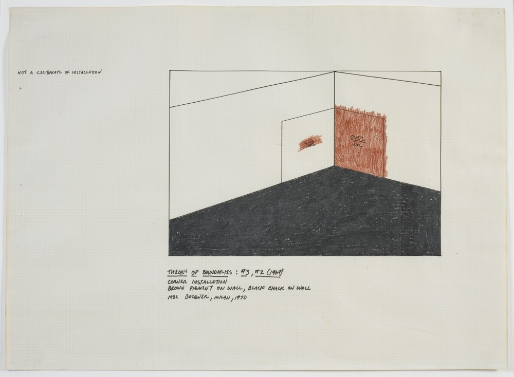
In comparison, Theory of Boundaries: #3, #2 (1970) would appear to be a similar type of diagrammatic installation drawing–were it not for the artist’s note in the upper left margin: “Not a certificate of installation.” Herein, Bochner approaches instead the informal attitude of the working drawing, making it clear that this is not a properly scaled map of the installation, but rather a creative tool meant to aid the artist in teasing out the idea. Despite Bochner’s inscribed caveat, the strong contrast of the red wall against the angular black fill of the floor–which together test the boundaries of the prepositions in and over–creates a powerful visual sensibility that allows the drawing to stand as a singular work. Bochner has been careful to point out that elements of working, finished, and diagrammatic drawings are not mutually exclusive.
Theory of Boundaries: #3, #2 belongs to a larger project installed for the first time in 1970 at the Jewish Museum in New York. In its original format, four large squares painted directly on the wall contained pairs of prepositions, arranged vertically in what the artist referred to as “language fractions.” The locations, such as over/in, were defined not by the words but by the implementation of pigment within and/or around each space. That same year, Bochner also published in Arts Magazine a page from his notes on Theory of Boundaries in an article titled “No Thought Exists Without a Sustaining Support,” in which he emphasized that boundaries, or enclosures, are described “conditions of positions,” and are therefore reflexively reliant upon language. However, our experience of these “conditions of positions” is quite different, as exemplified by the contrast between this drawing, Imagine the Enclosed Area Blue, and their respective installations. Both works typify the scrutiny that Bochner unleashed upon language in the late 1960s and early 1970s. Moreover, they both show that drawing formed an important link between text, vision, and experience, a filter through which to highlight the discrepancies between the language of ideas in two-dimensional space and their nonverbal nature in real space.
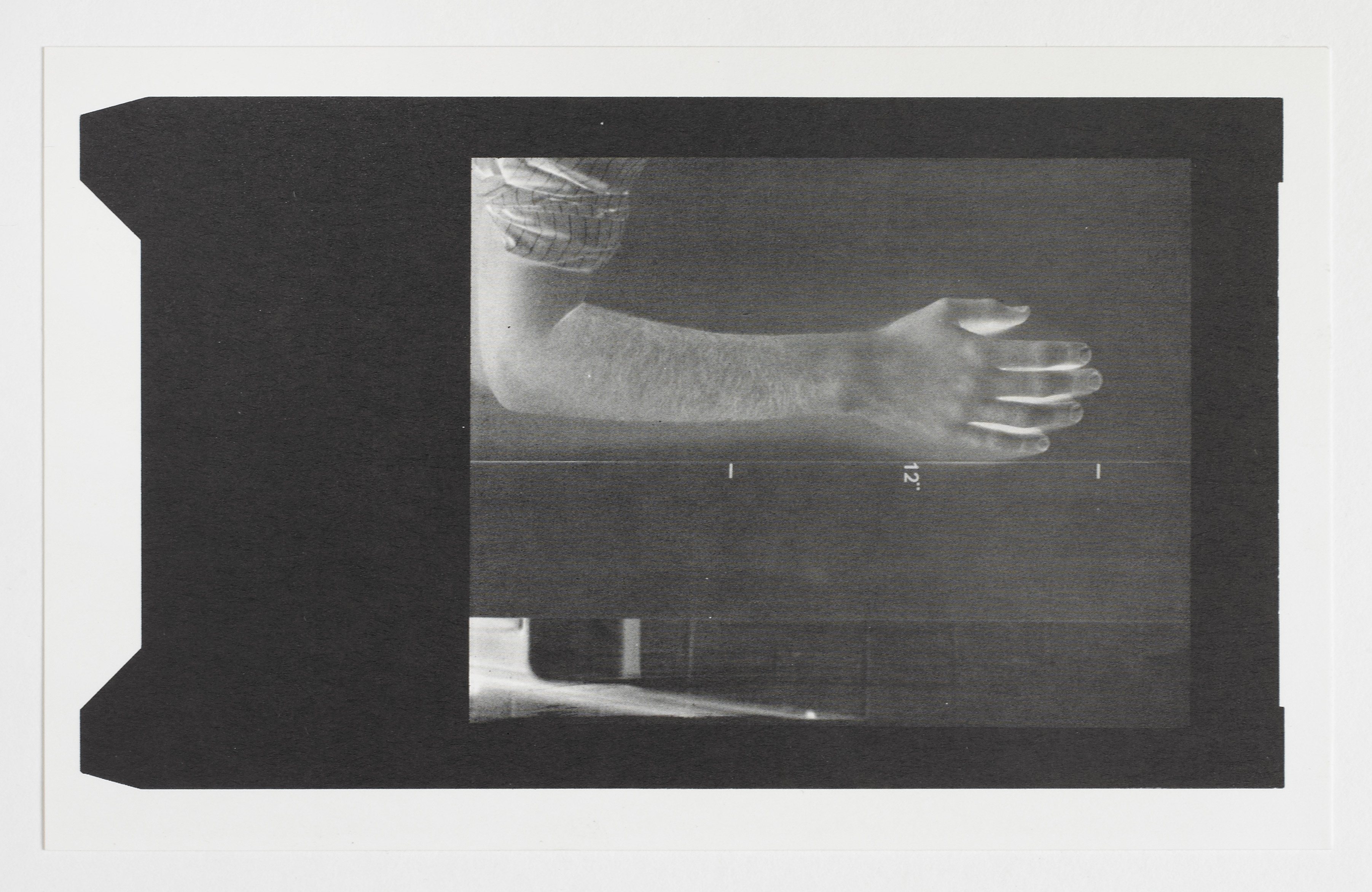
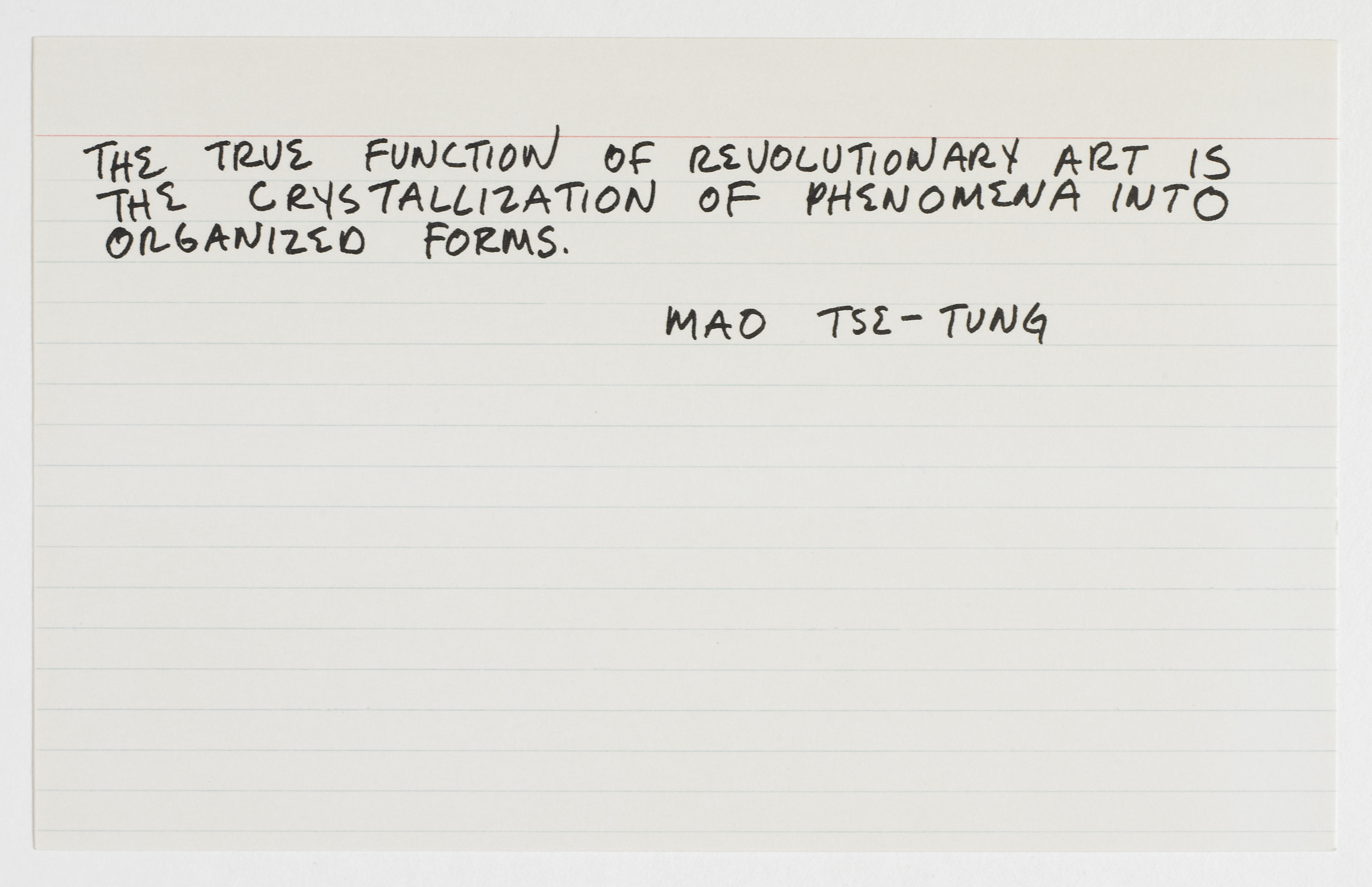
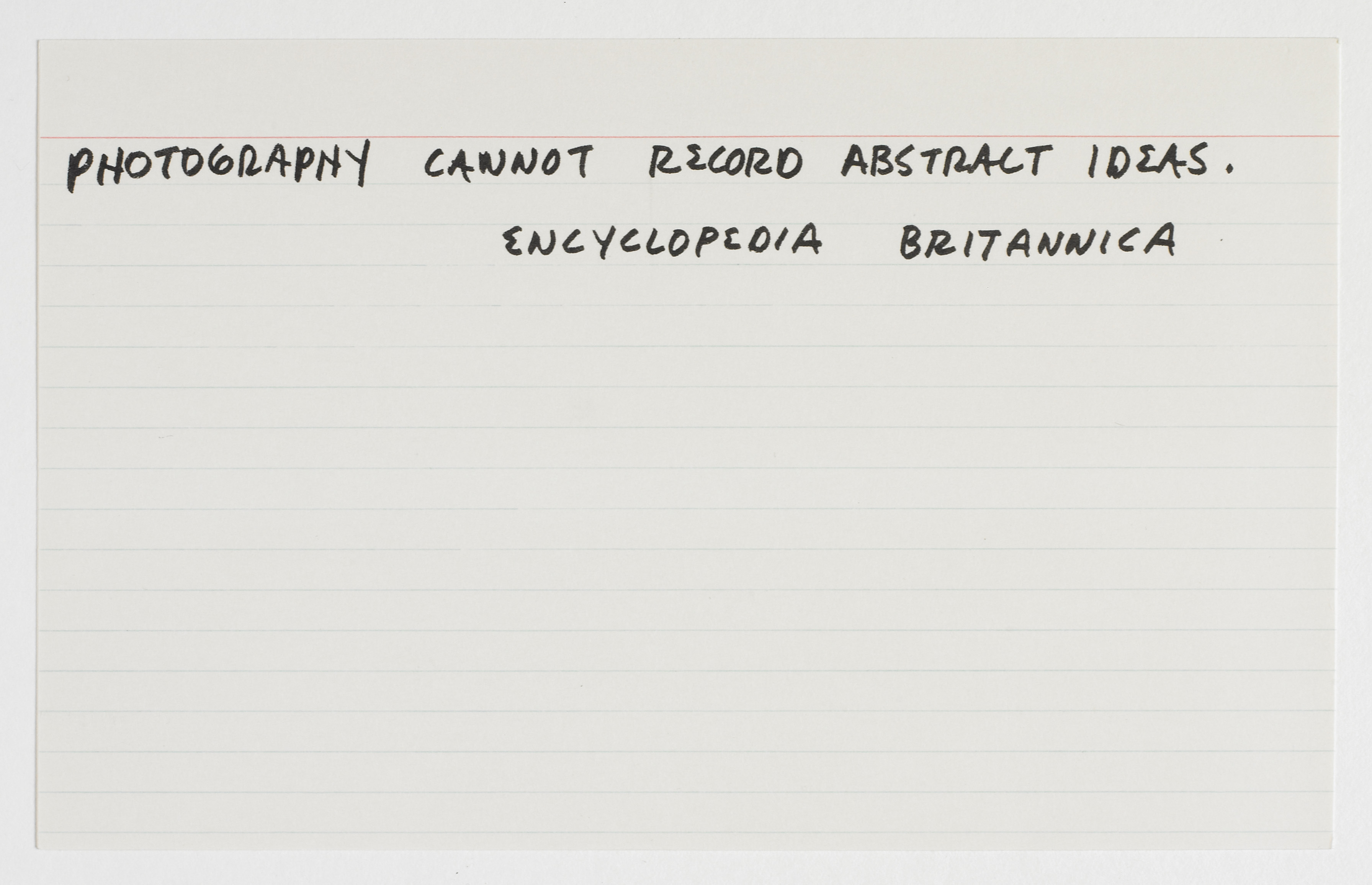
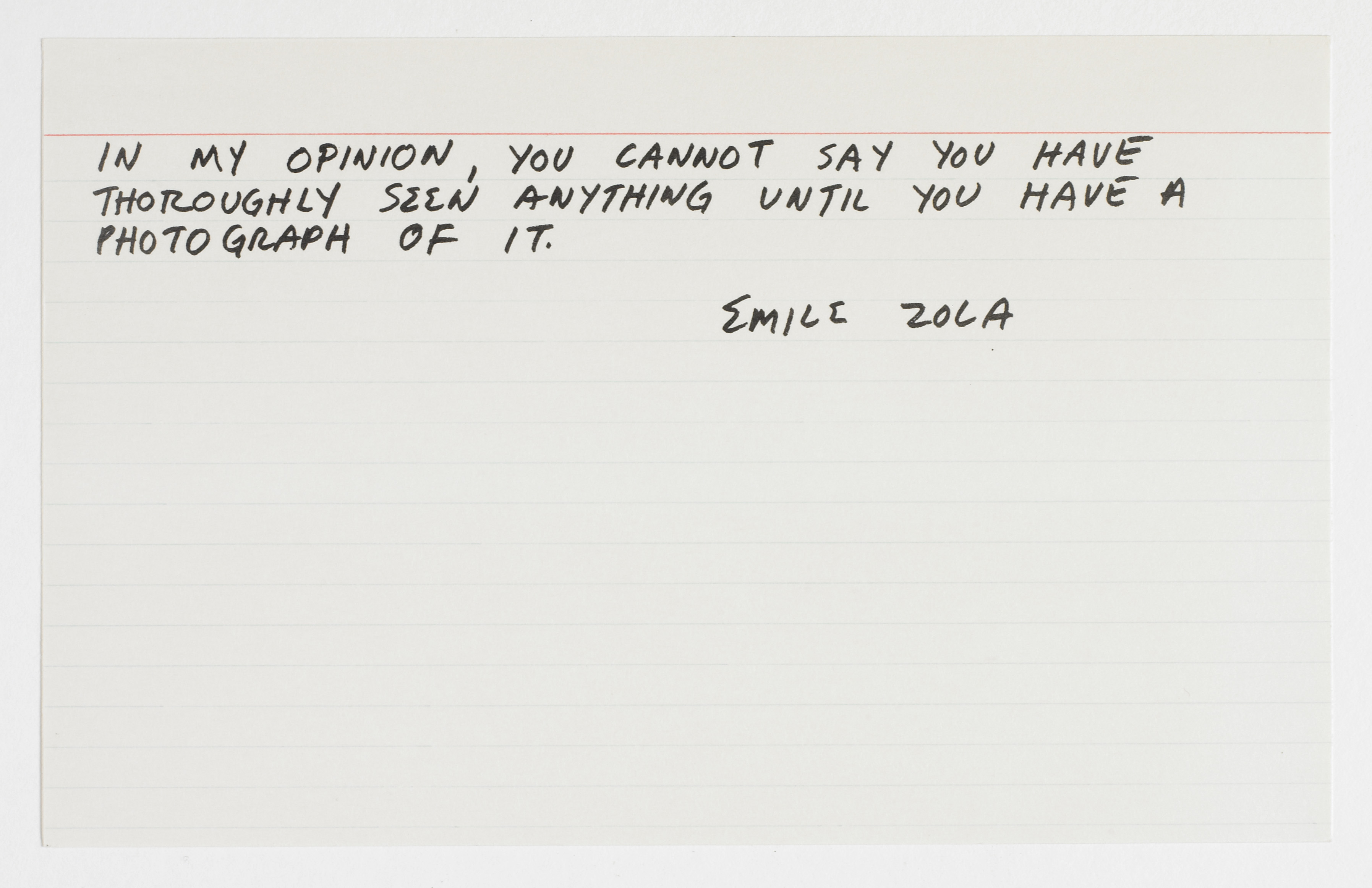
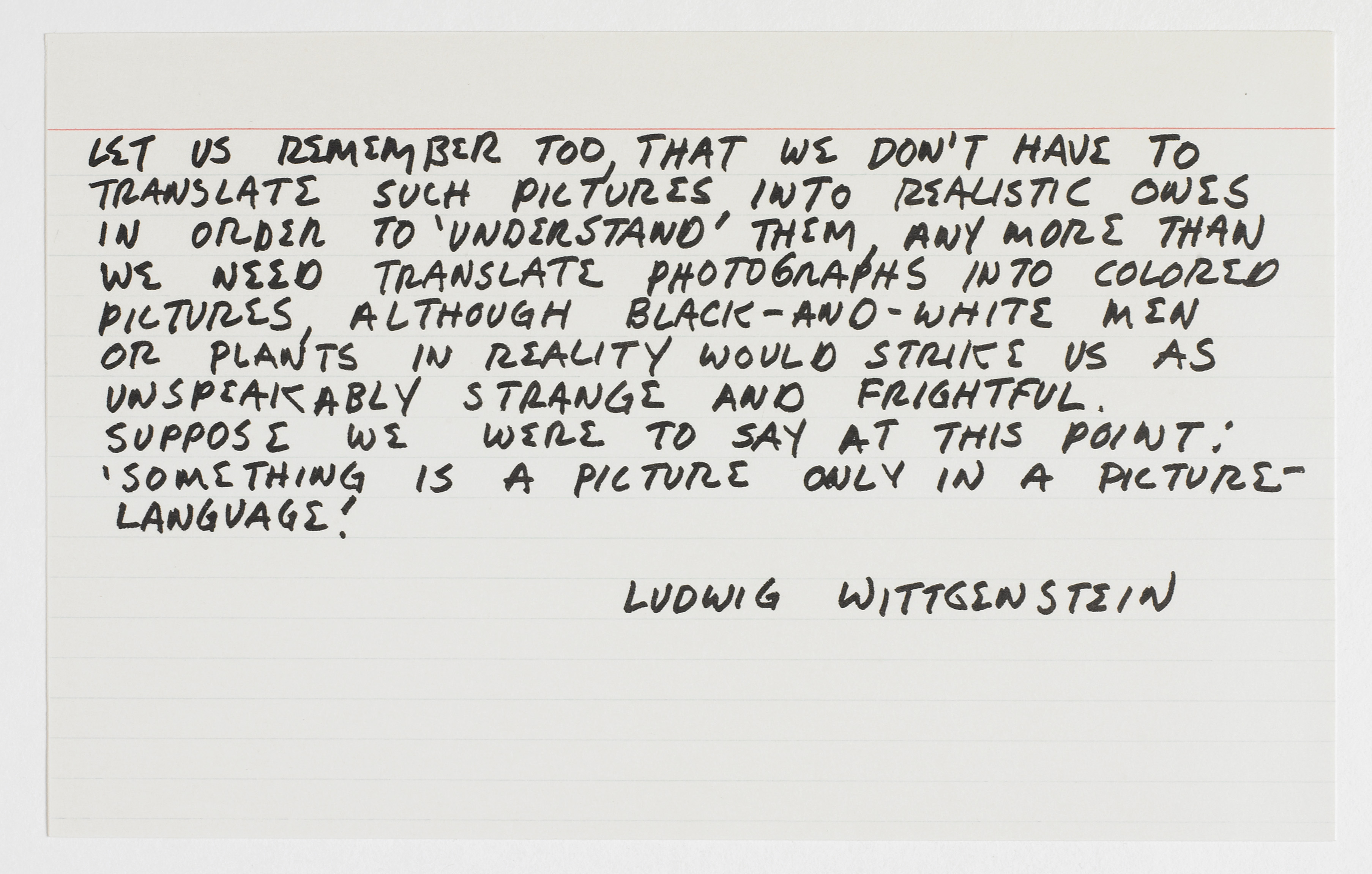
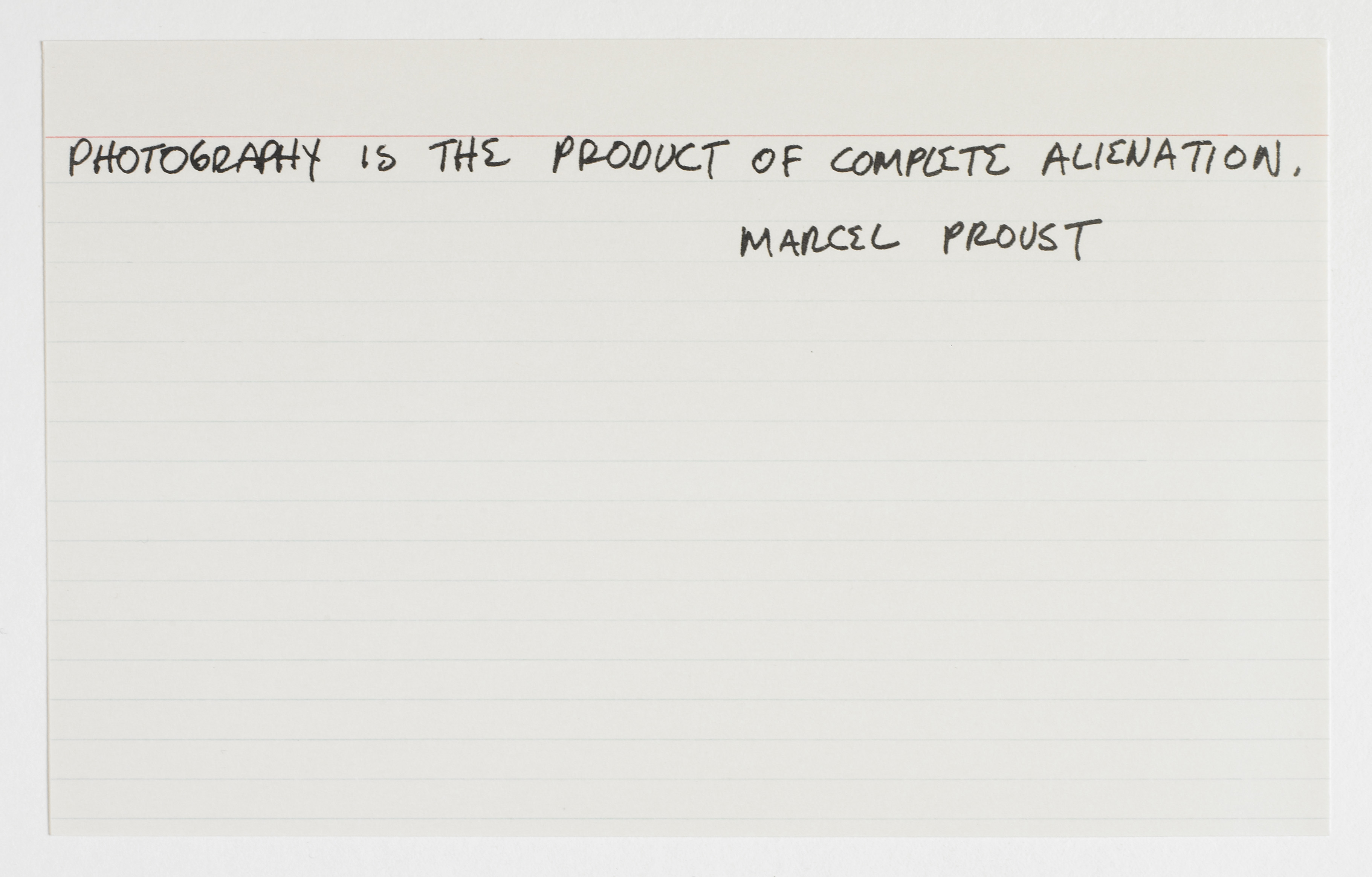
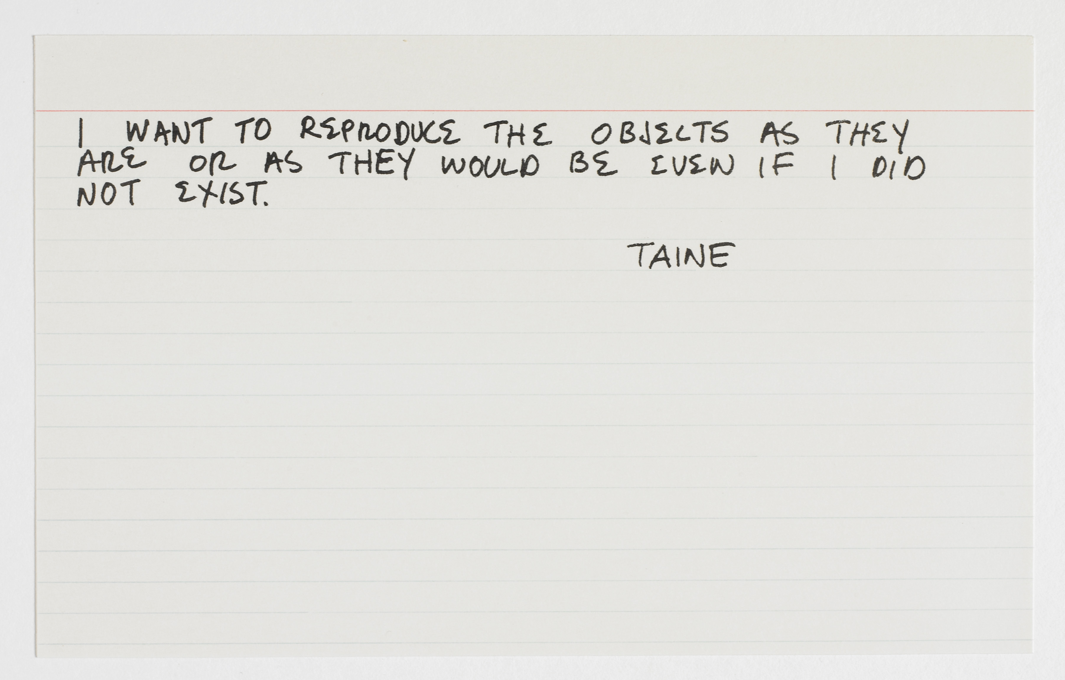
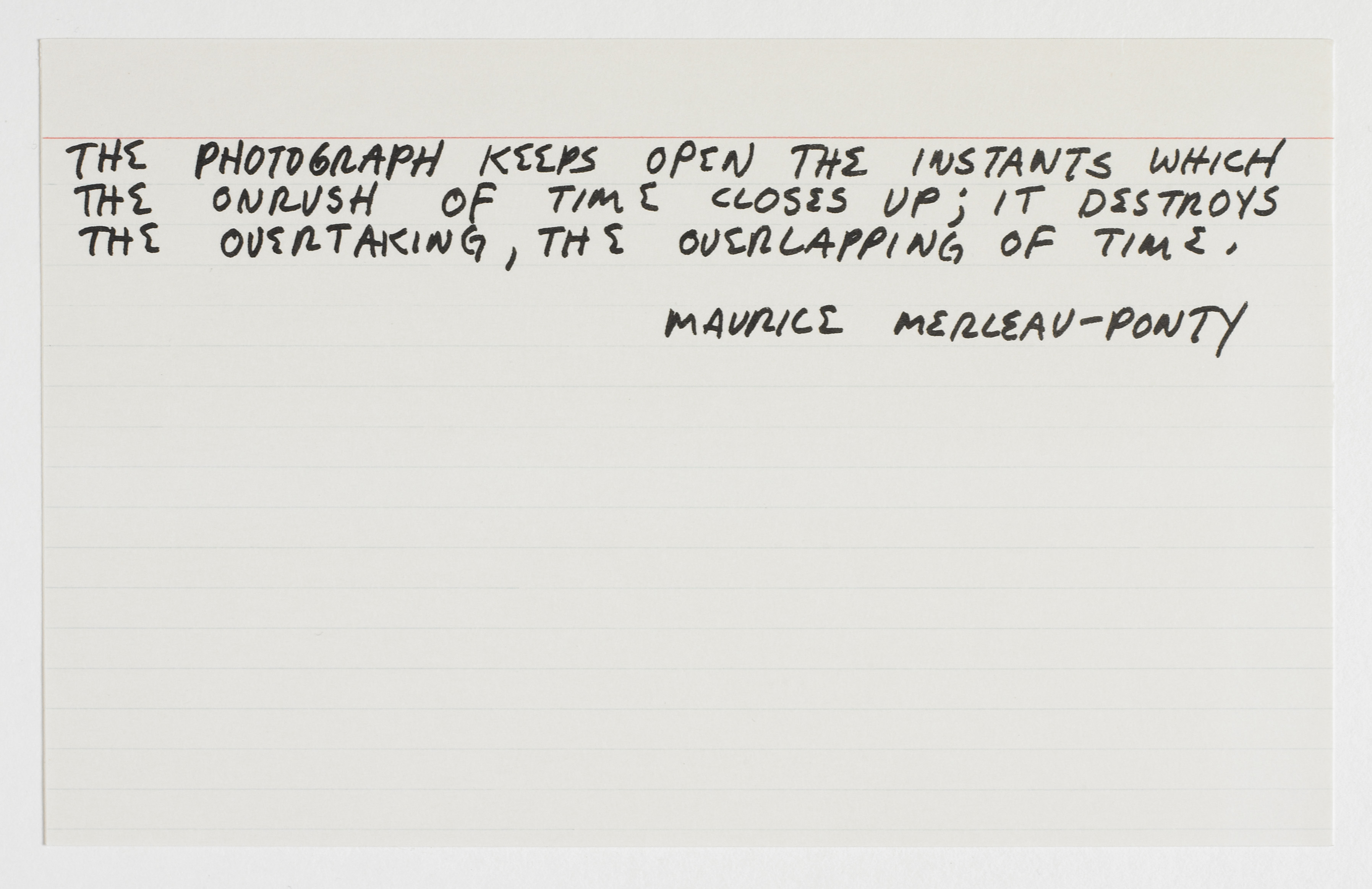
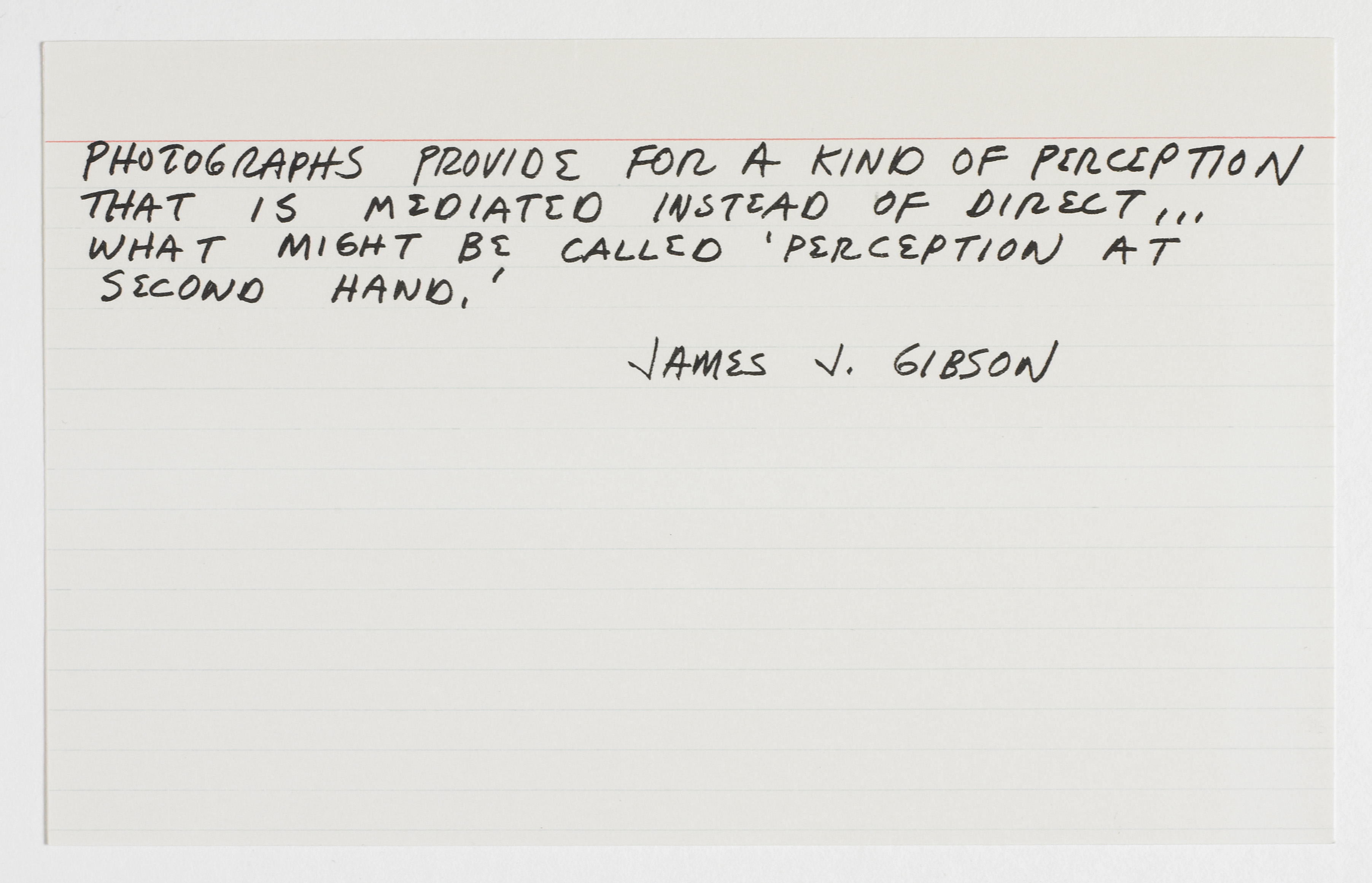
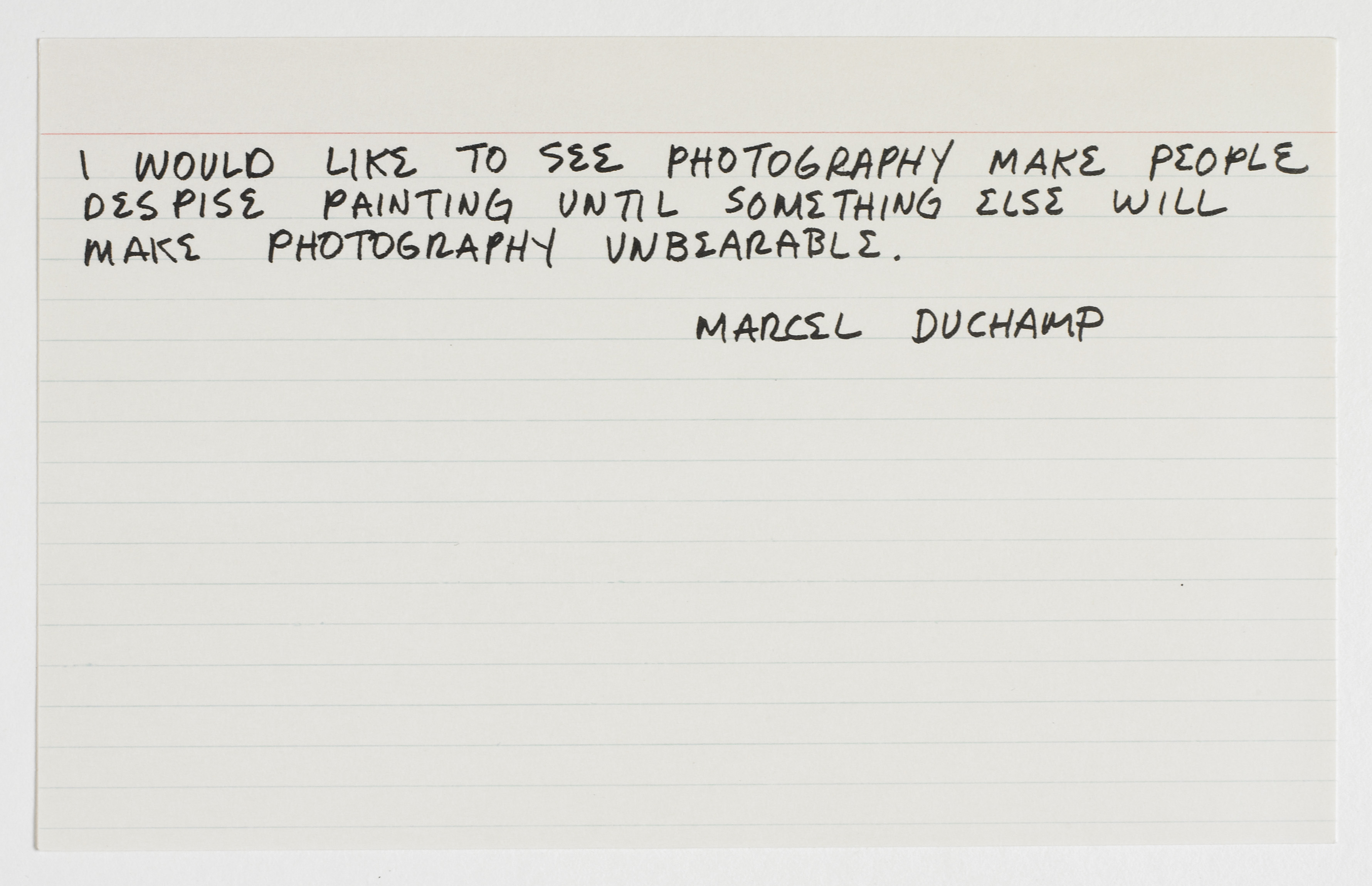
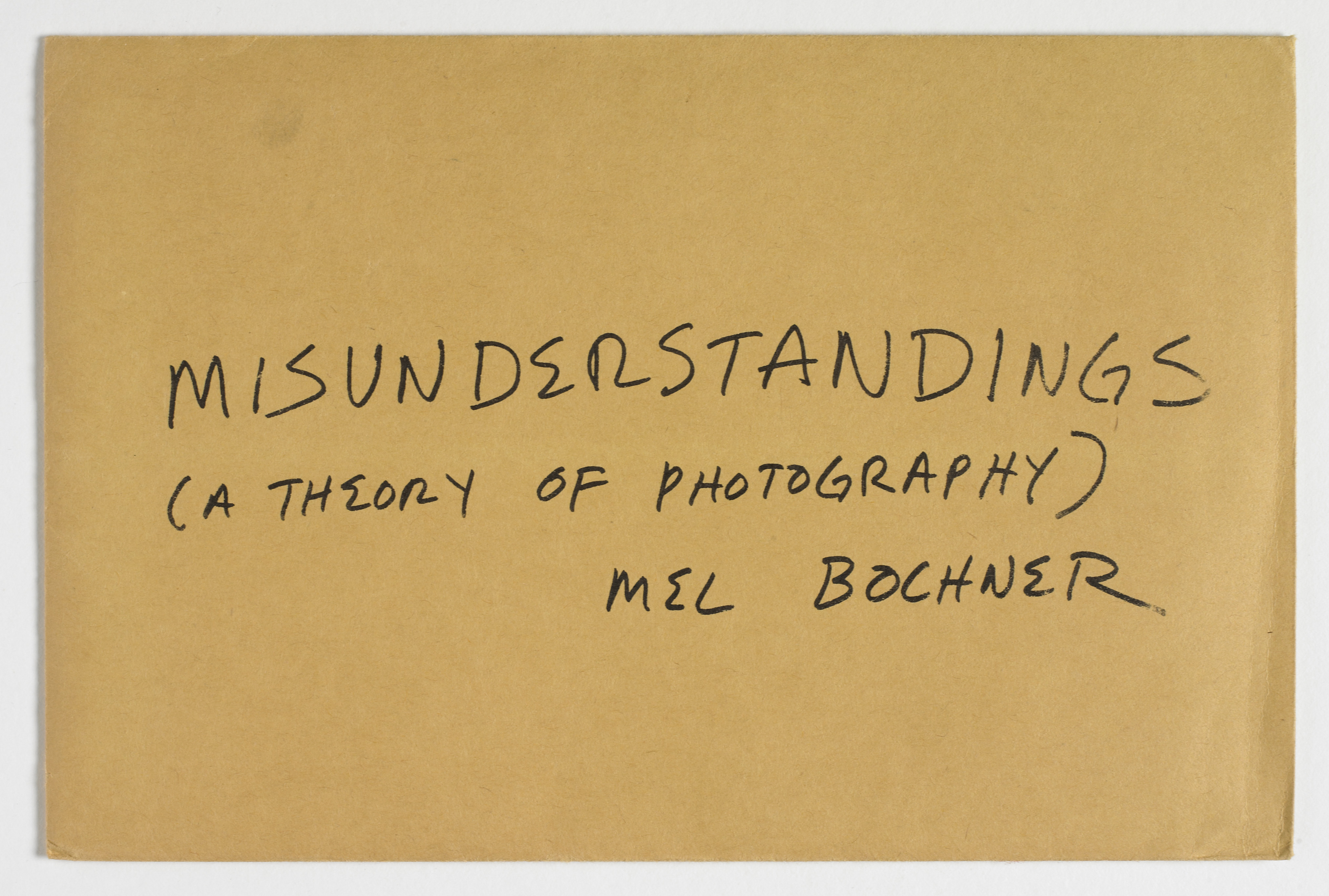
Mel Bochner, Misunderstandings (A Theory of Photography), 1970, portfolio of ten photo-offset prints on note cards in printed manila envelope, each 5 x 8 inches (12.7 x 20.3 cm). Published as part of ARTISTS & PHOTOGRAPHS by Multiples Inc., in association with Colorcraft Inc., New York. © Mel Bochner / Photo: Ellen McDermott
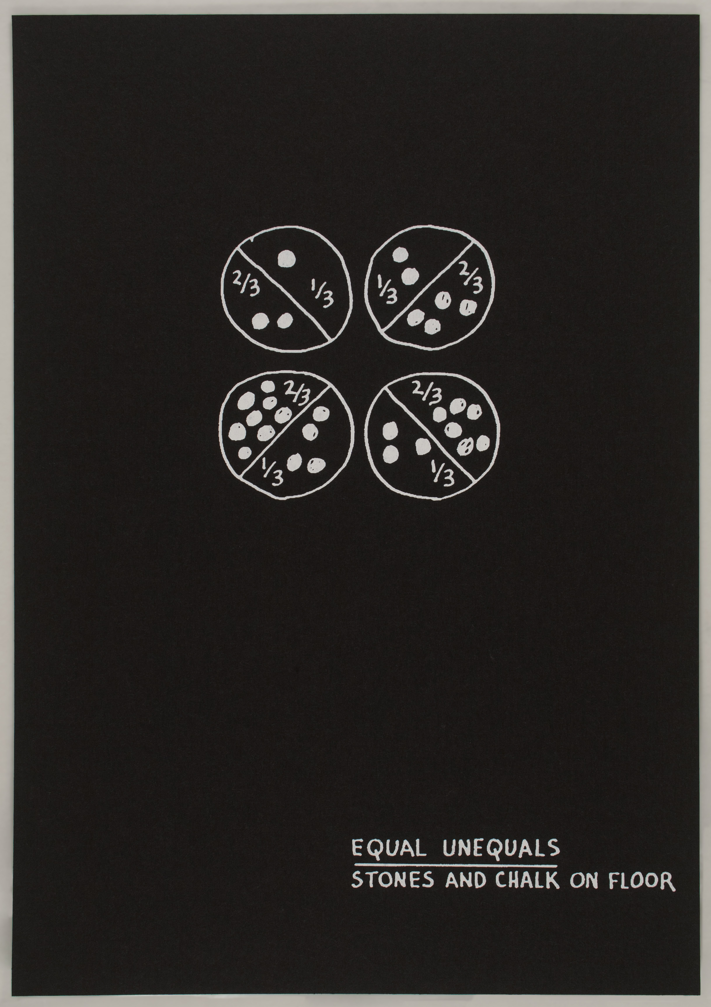
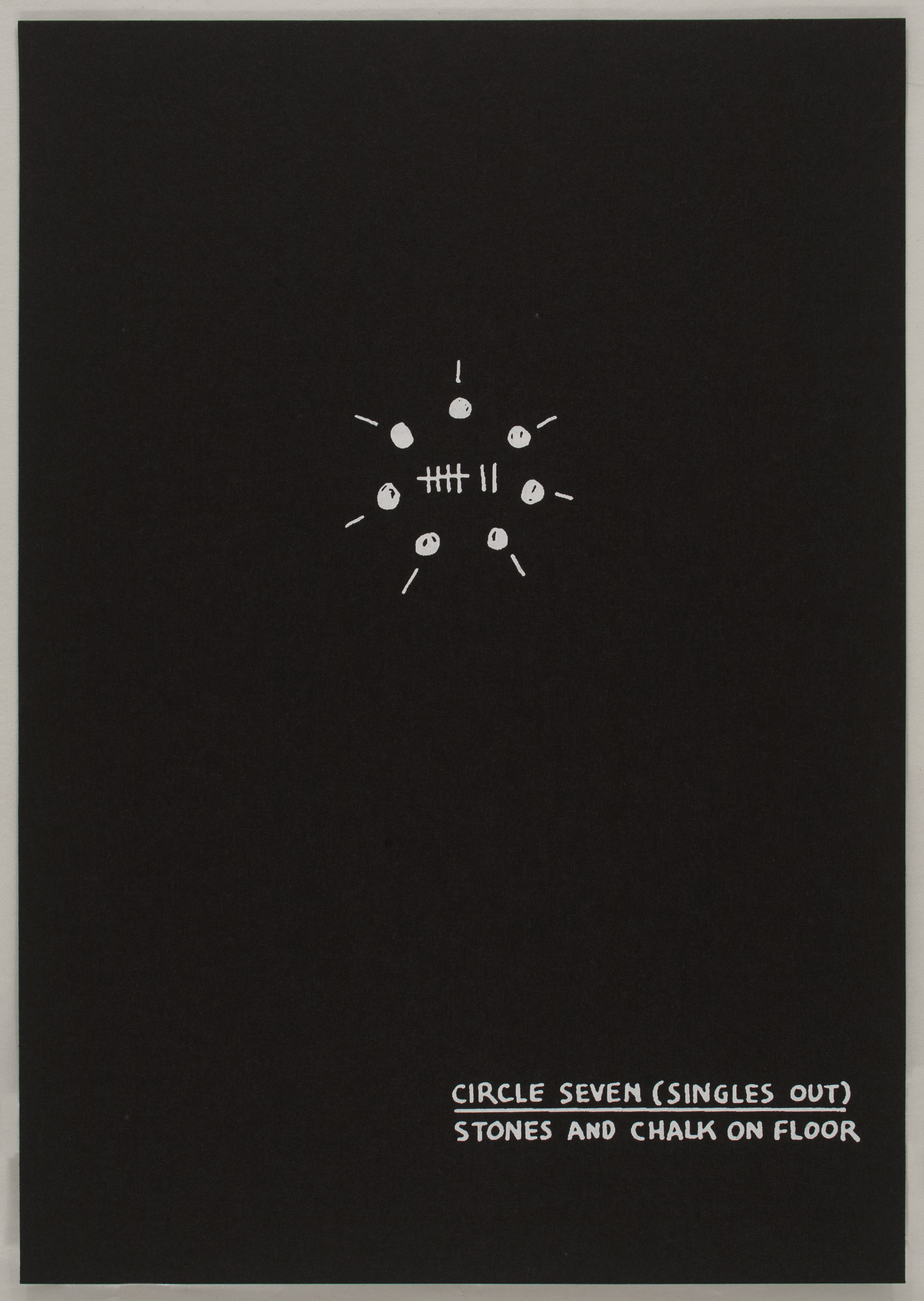
Bochner’s various “Theory of…” series have also examined painting, photography, and sculpture; Misunderstandings (A Theory of Photography) (1967-1970) and Primer (Twenty-One Demonstrations from a Theory of Sculpture [1969-1972] (1995) are additionally included here. Speaking about the series framework, Bochner has stated, “The ‘art’ is the demonstration of a network of supports that forms the system (the knowledge of it, in it).”3 Art, in other words, is achieved by exposing the rules or assumptions governing a given system–or, in this case, a given medium. Misunderstandings provides an important example of the artist’s desire to expose those subjective truths commonly accepted as objective principles; it also serves as a key reference to Bochner’s brief dalliance with photography–what he calls “the enemy of all of the values of late modernism.”4 A set of photo offset prints on ruled note cards kept in a manila envelope, Misunderstandings collects nine quotations about photography, each transcribed in Bochner’s handwriting and sourced from recognizable figures across a sampling of fields and time periods. The one exception is a card that features a negative image of the artist’s hand and forearm, which Bochner had previously used in his measurement series. Six of the quotations included are real passages from literature available on photography – which Bochner found largely unsatisfactory in answering the many questions posed by this complex medium – and three are fake quotes invented by the artist. Bochner describes this “act of forgery” as a way of automatically raising suspicions about the veracity of any of the statements. In doing so, he draws a parallel analogy between the falsehood of words and the falsehood of photography–the inherent illusion of pictorial space that a photographic picture represents. Misunderstandings thus attacks the Minimal mantra posed by Frank Stella – “what you see is what you see” – by drawing attention to the constructs of the system that produces the picture.


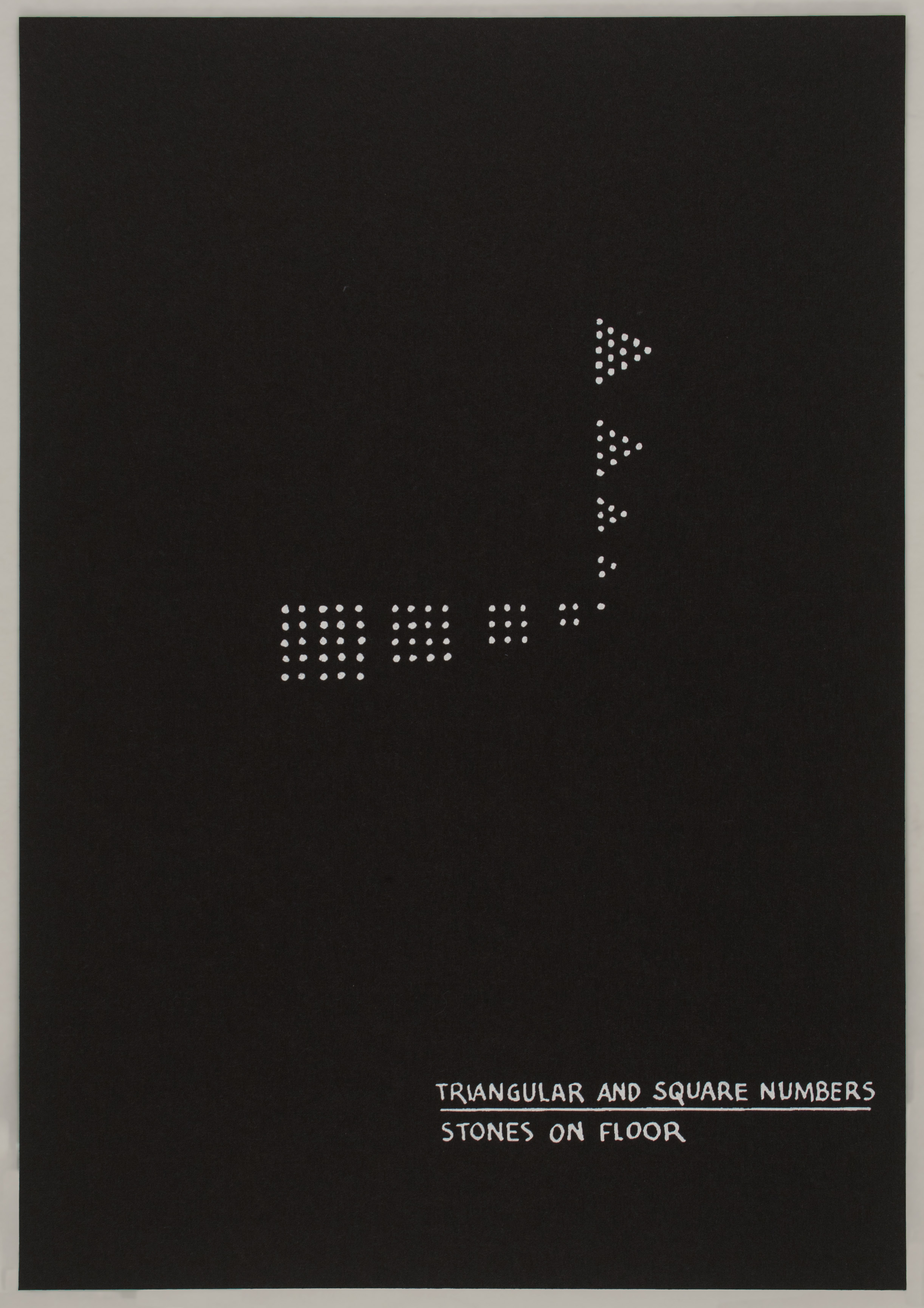

Mel Bochner, Primer (Twenty-One Demonstrations from A Theory of Sculpture [1969-1972]), 1995, portfolio of 21 screenprints in wooden box, 21 sheets, each 9 7/8 x 6 7/8 inches (25.1 x 17.5 cm). Published by Gallery 360, Tokyo, Japan. © Mel Bochner / Photo: Laura Mitchell
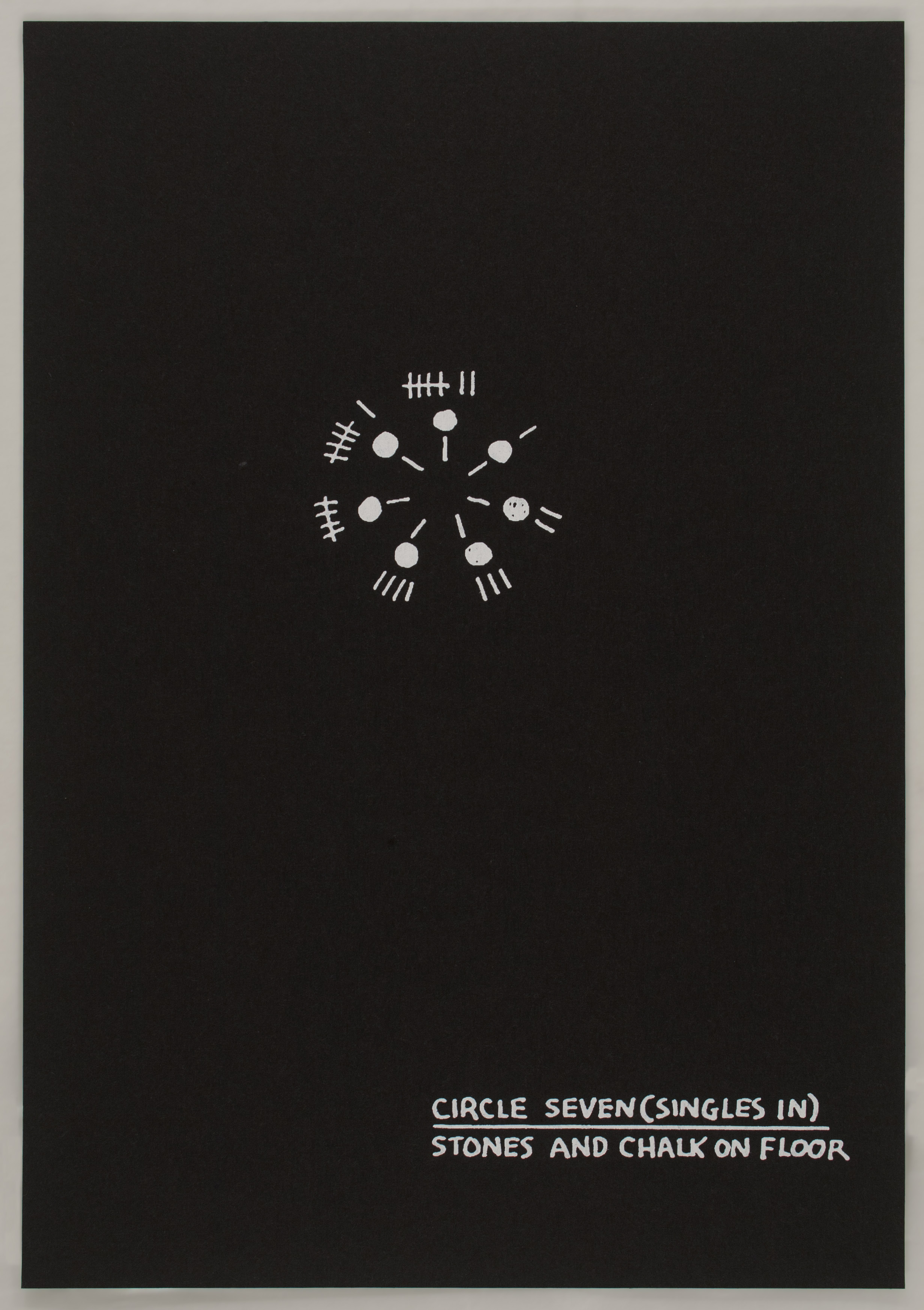
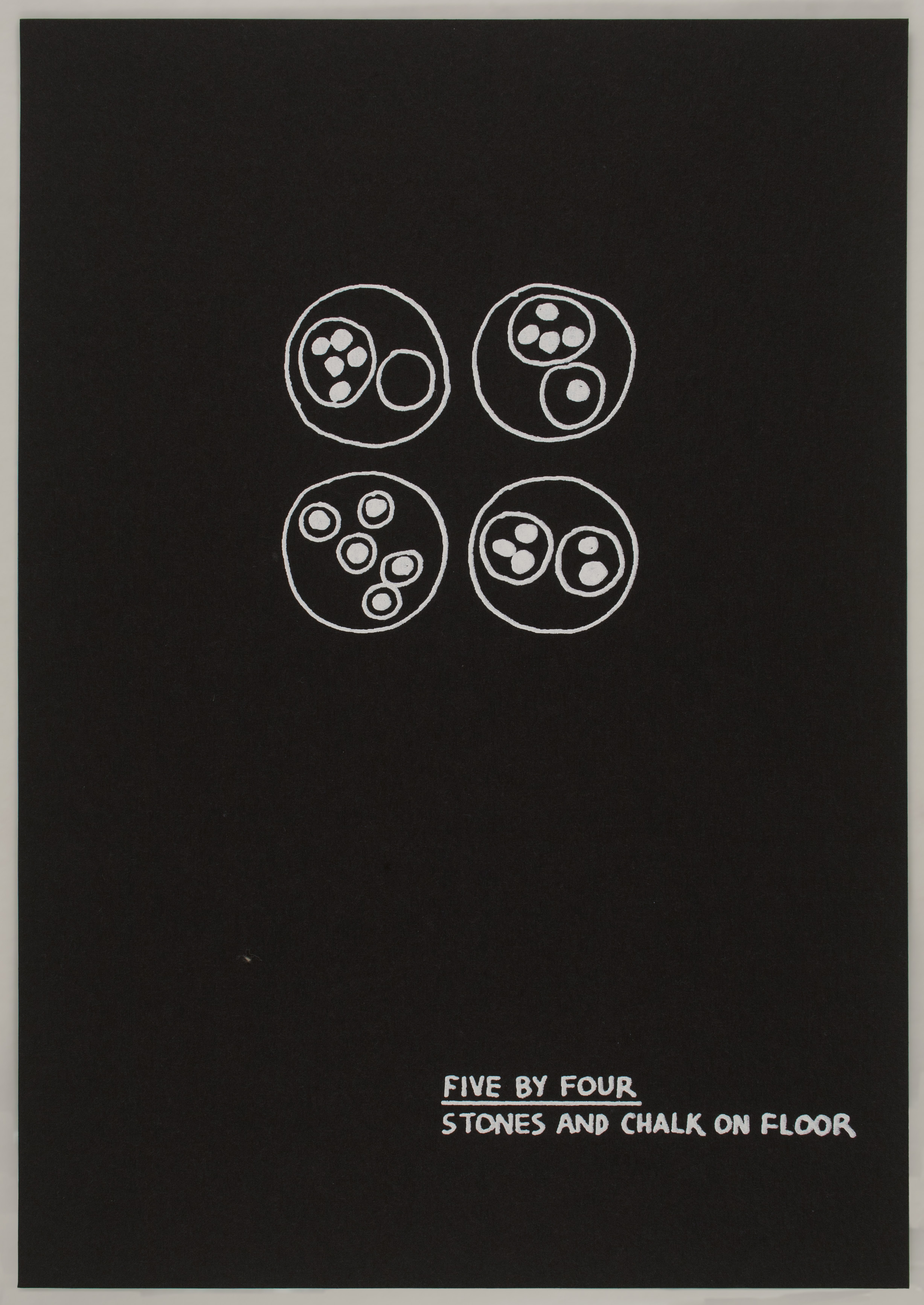
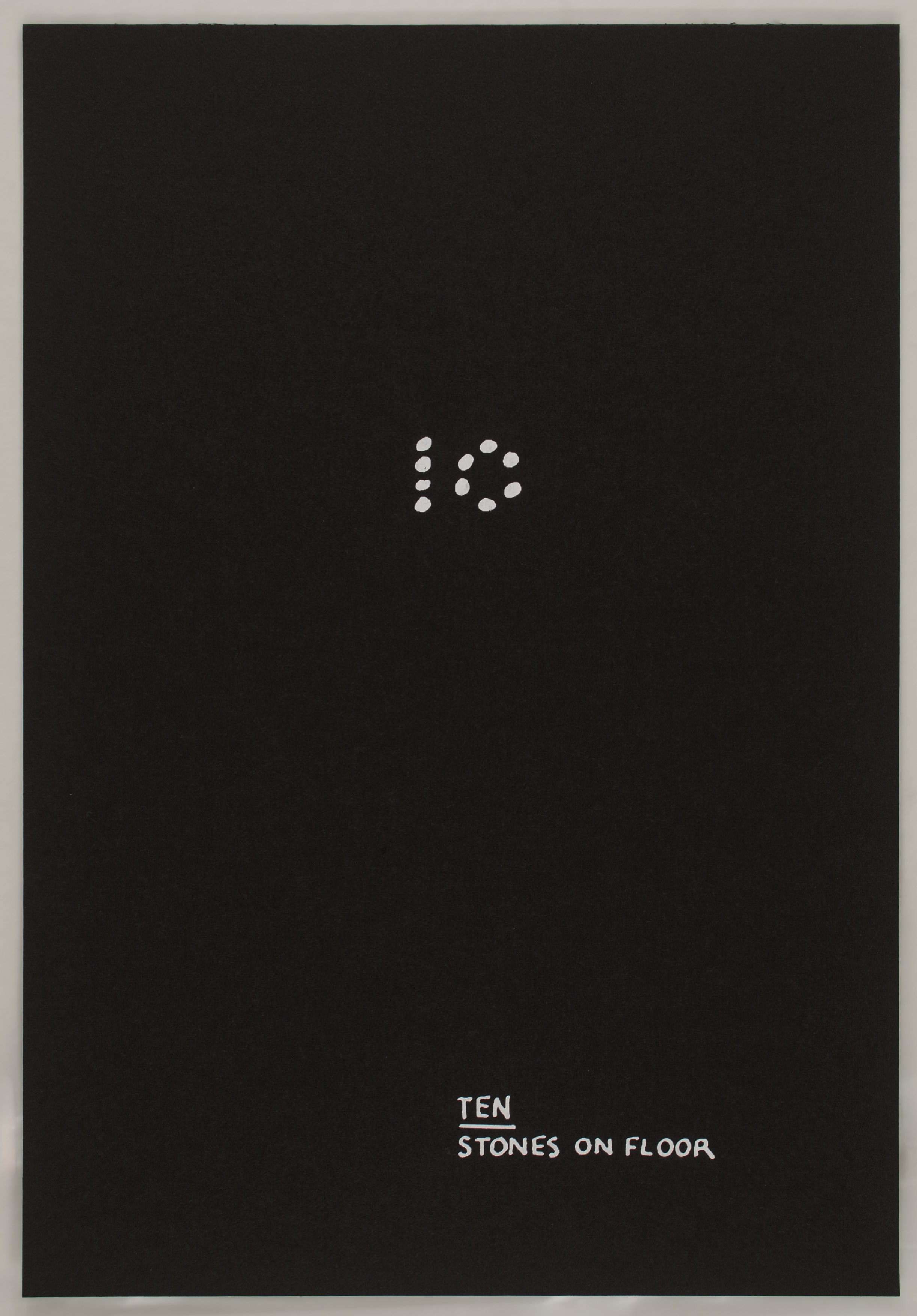
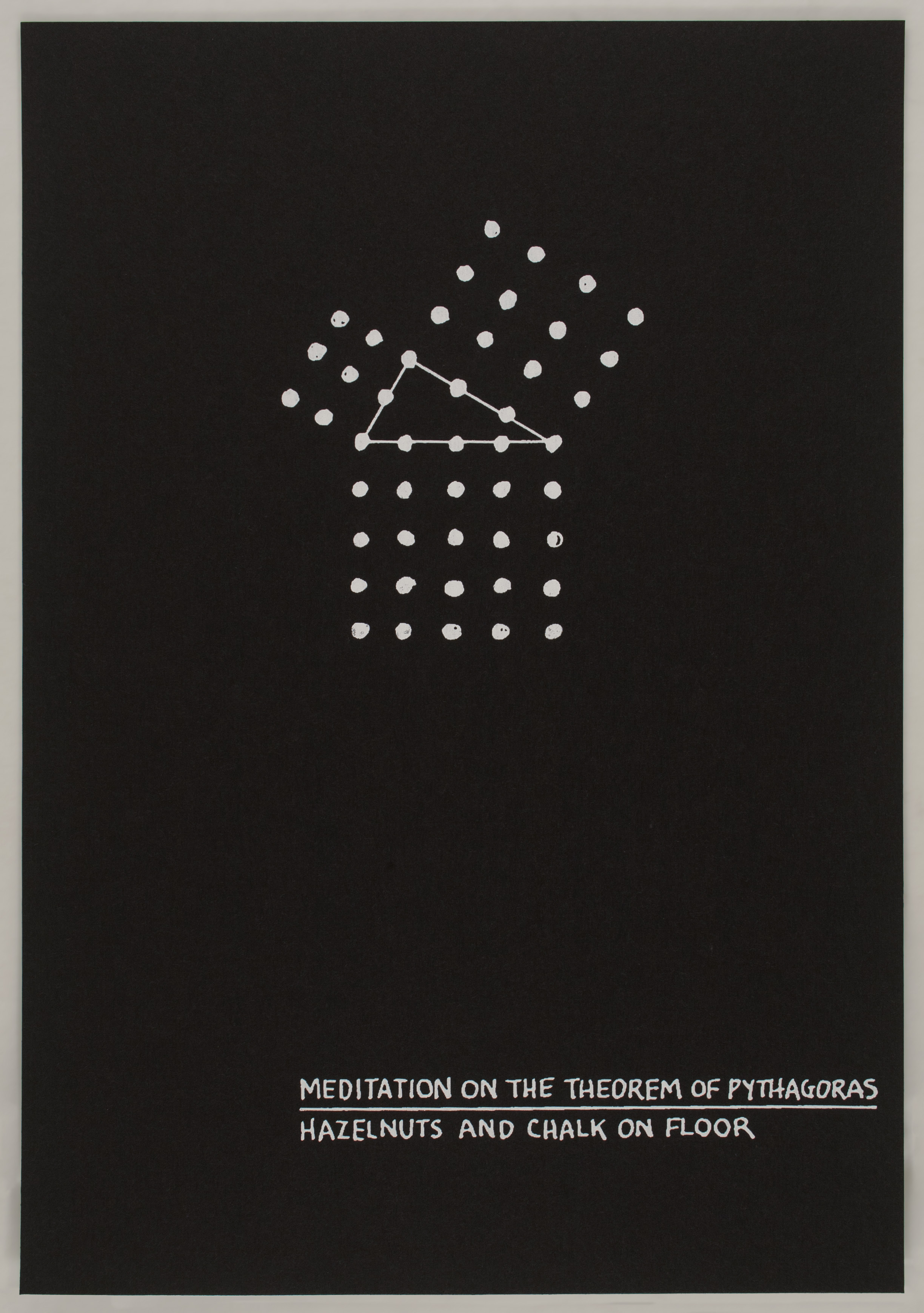
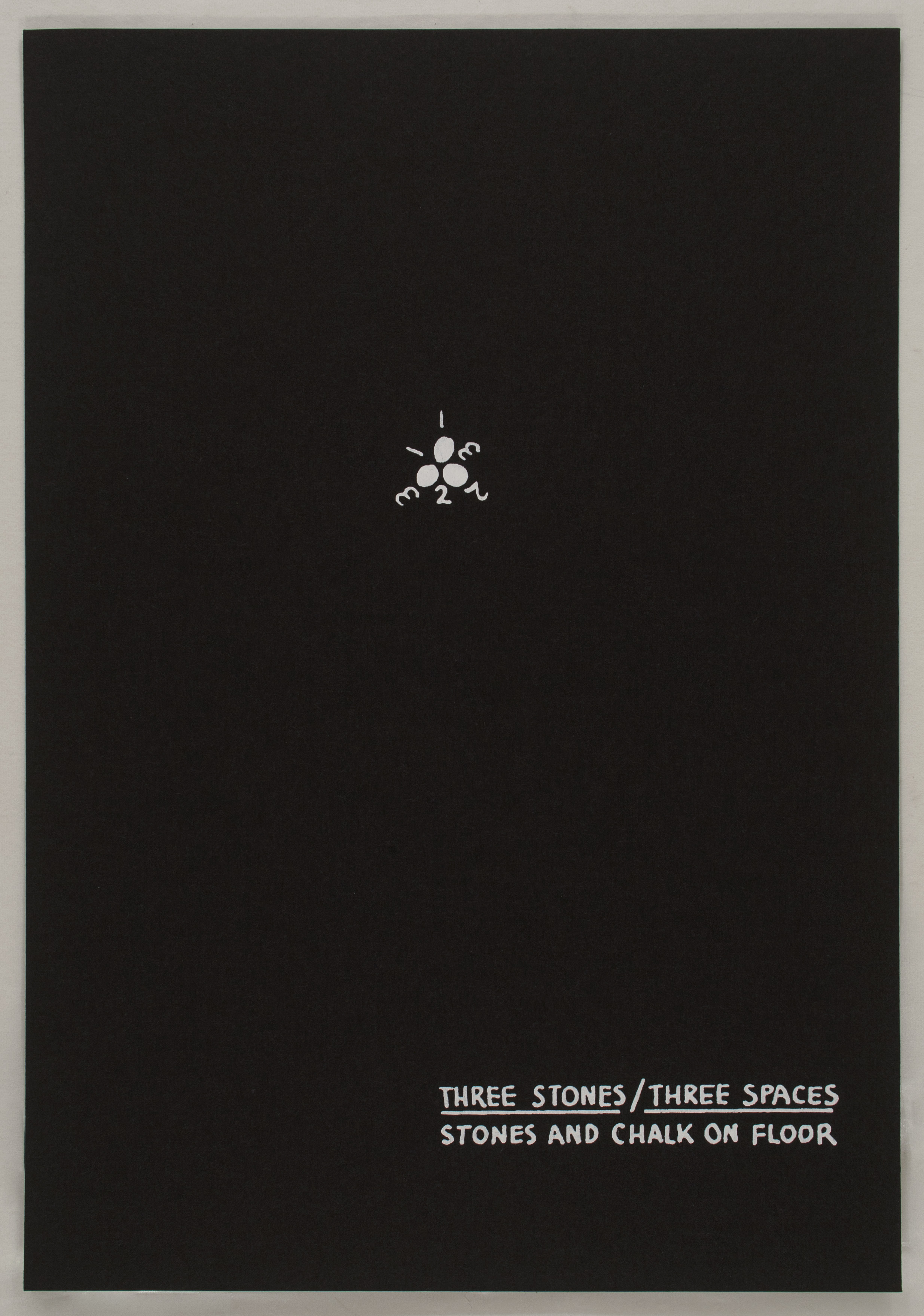
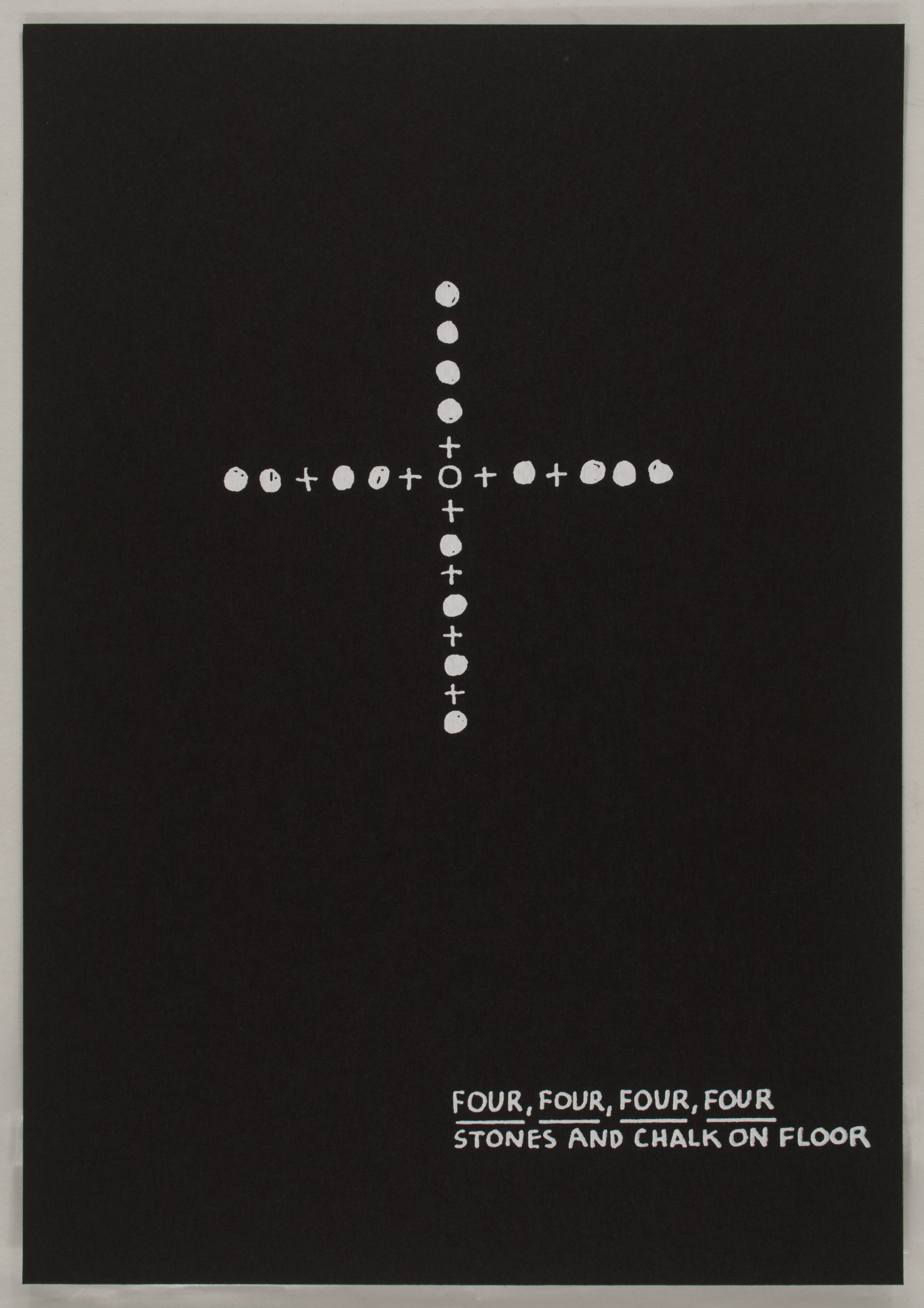
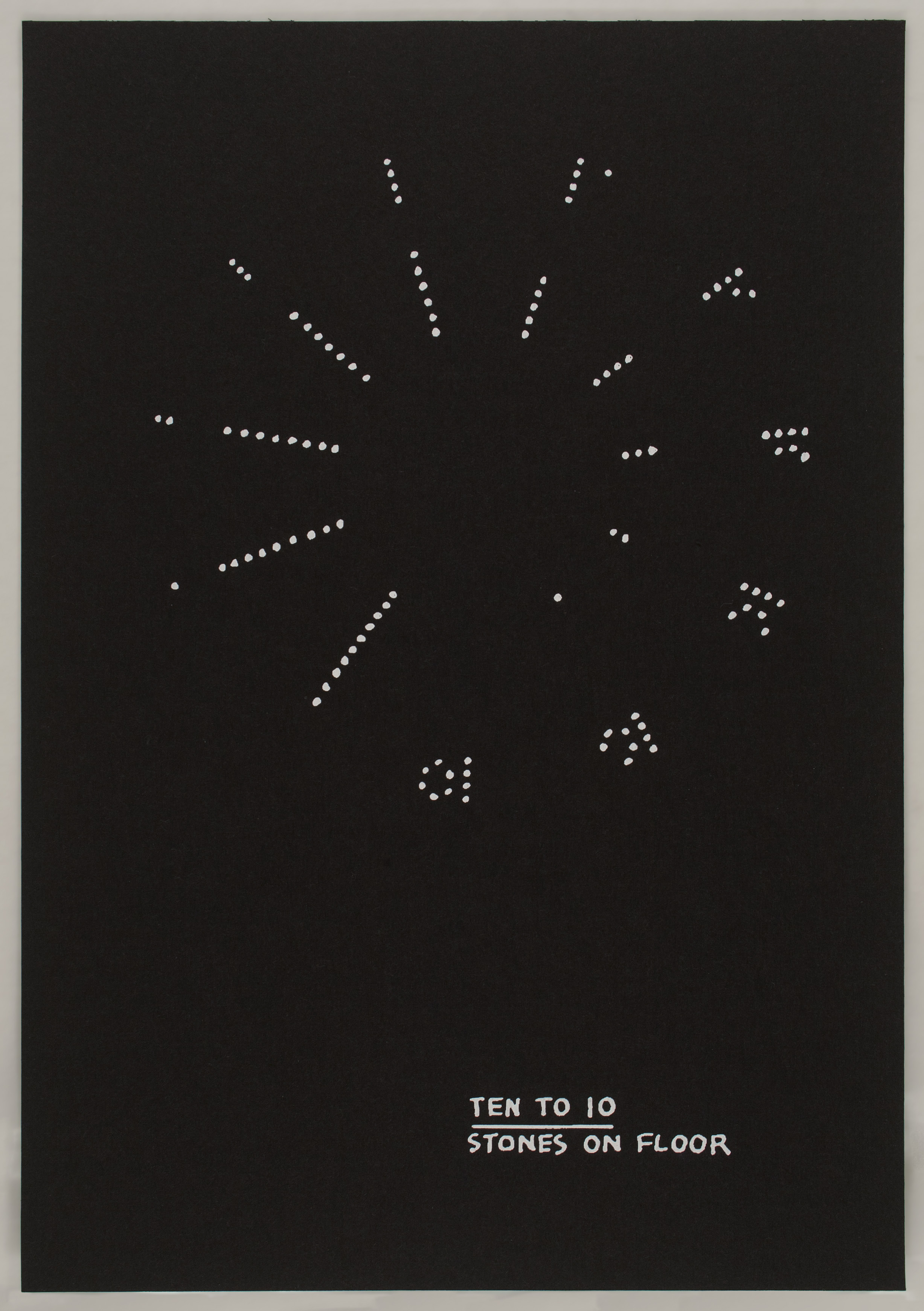
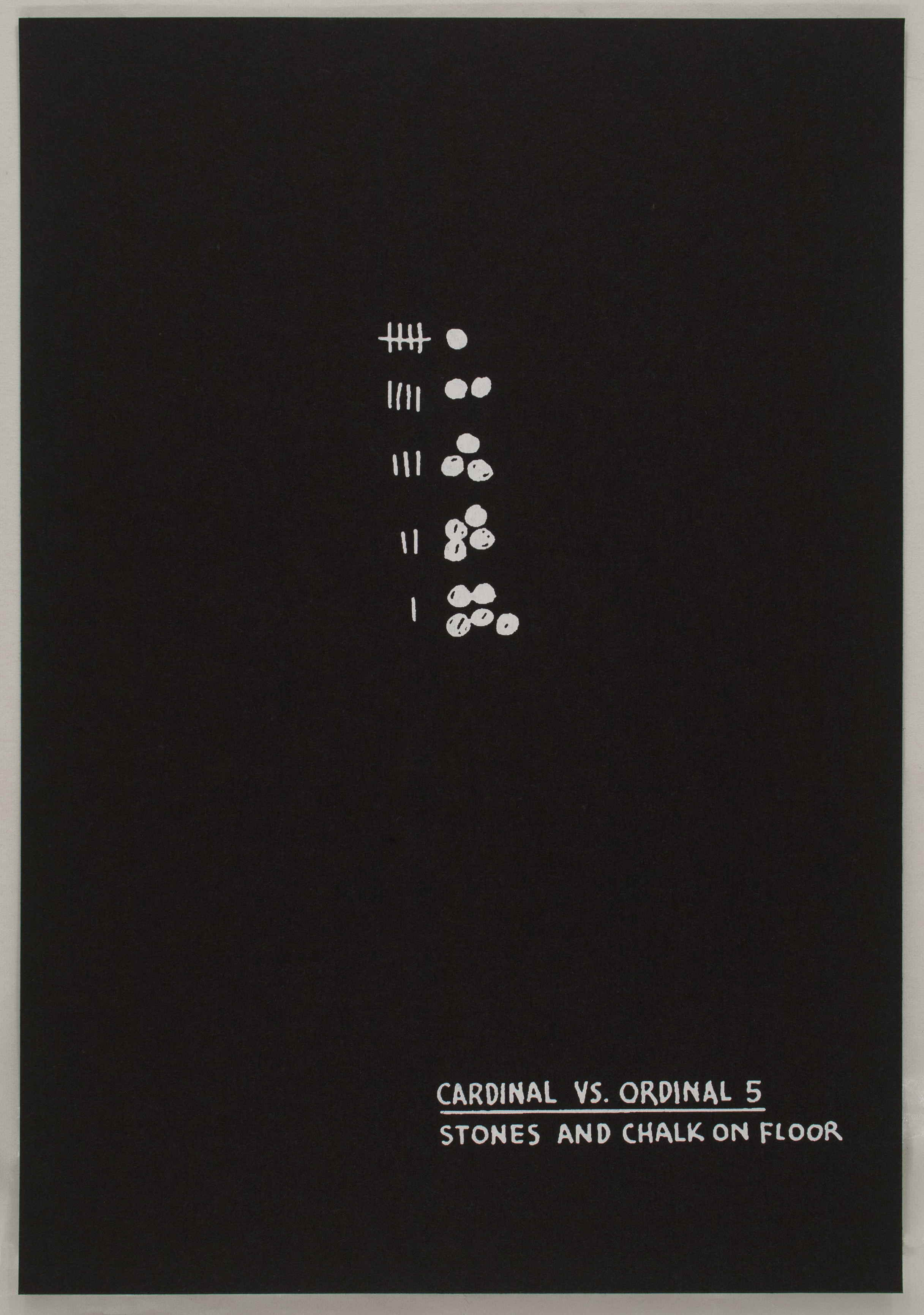
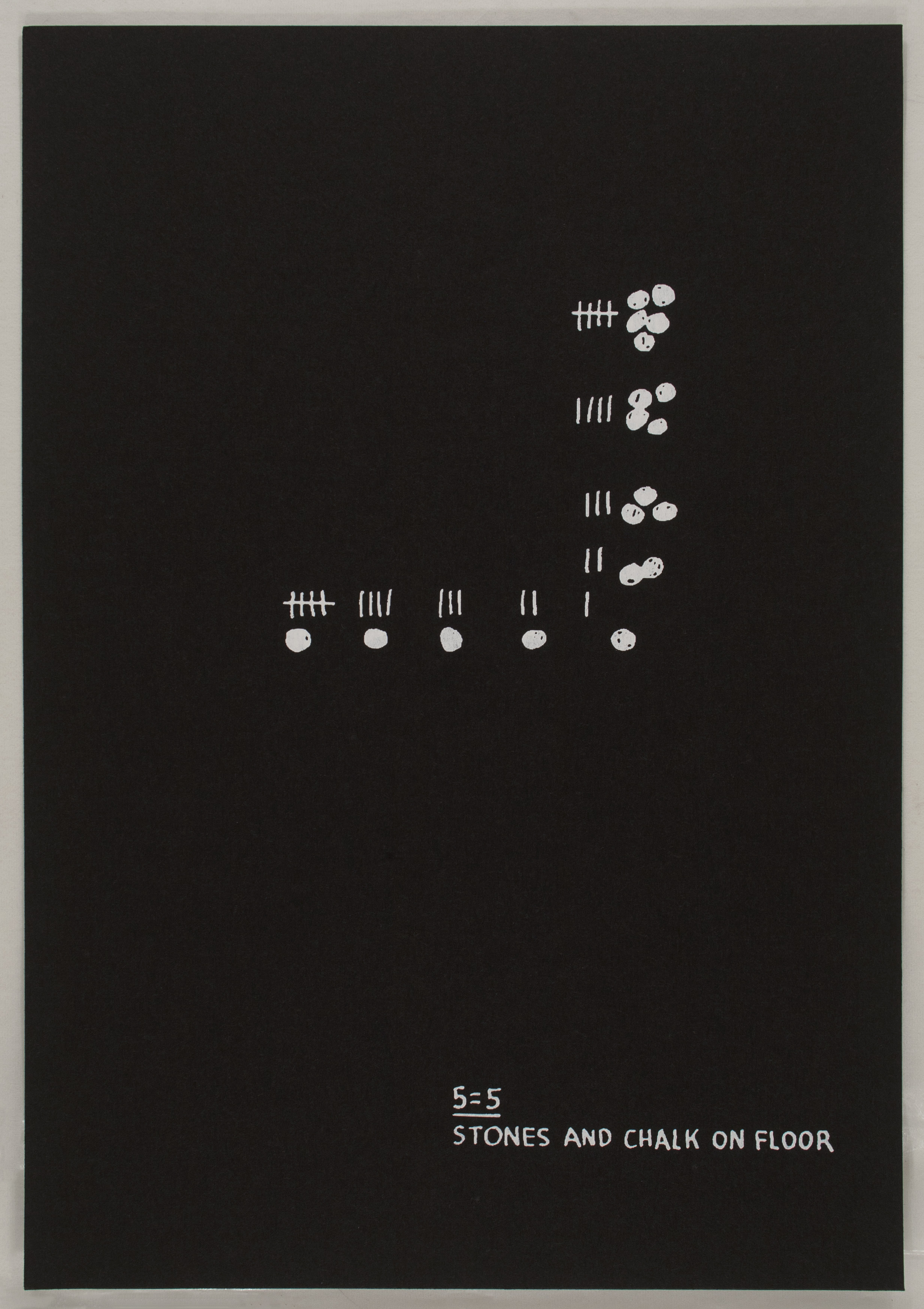
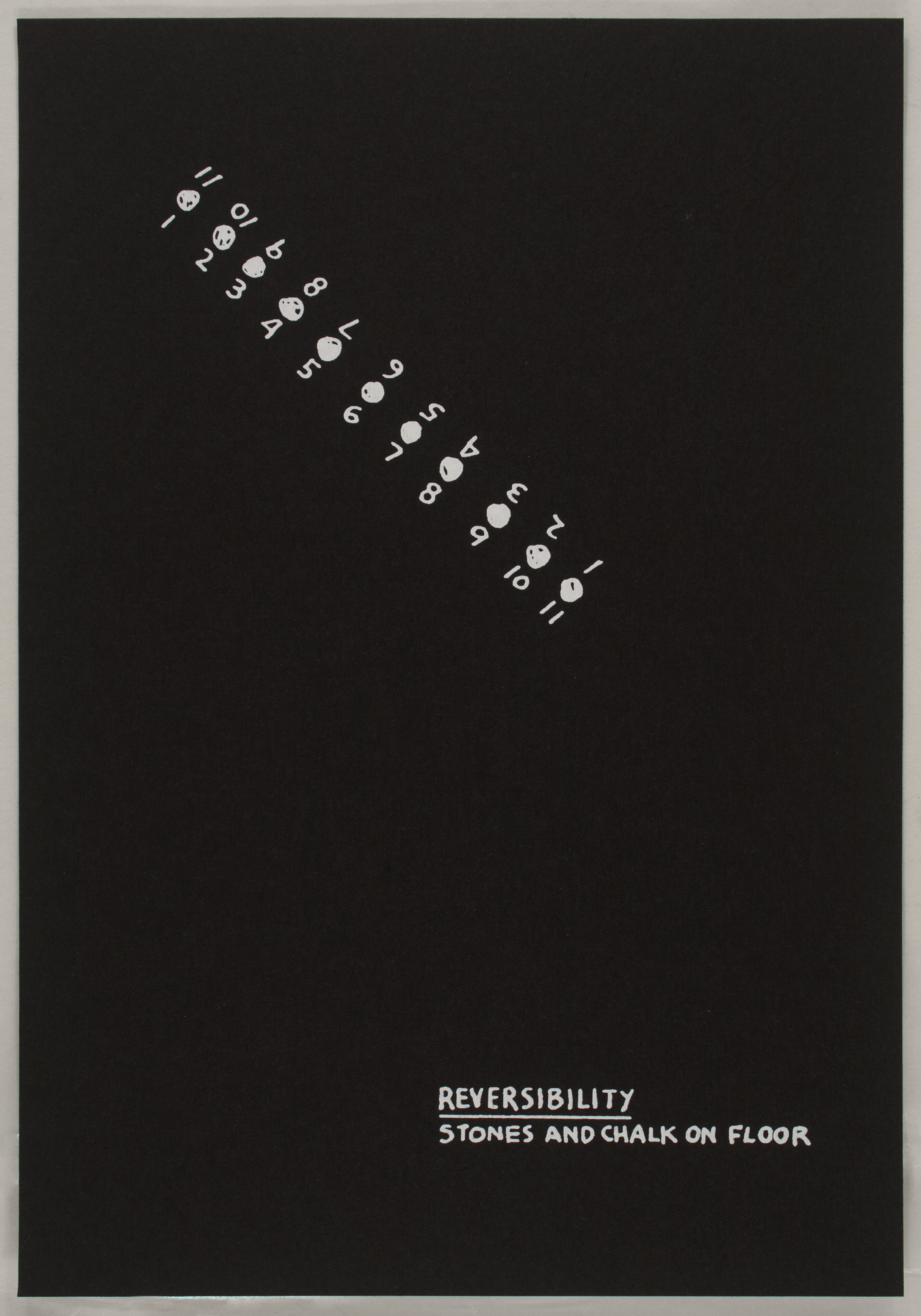
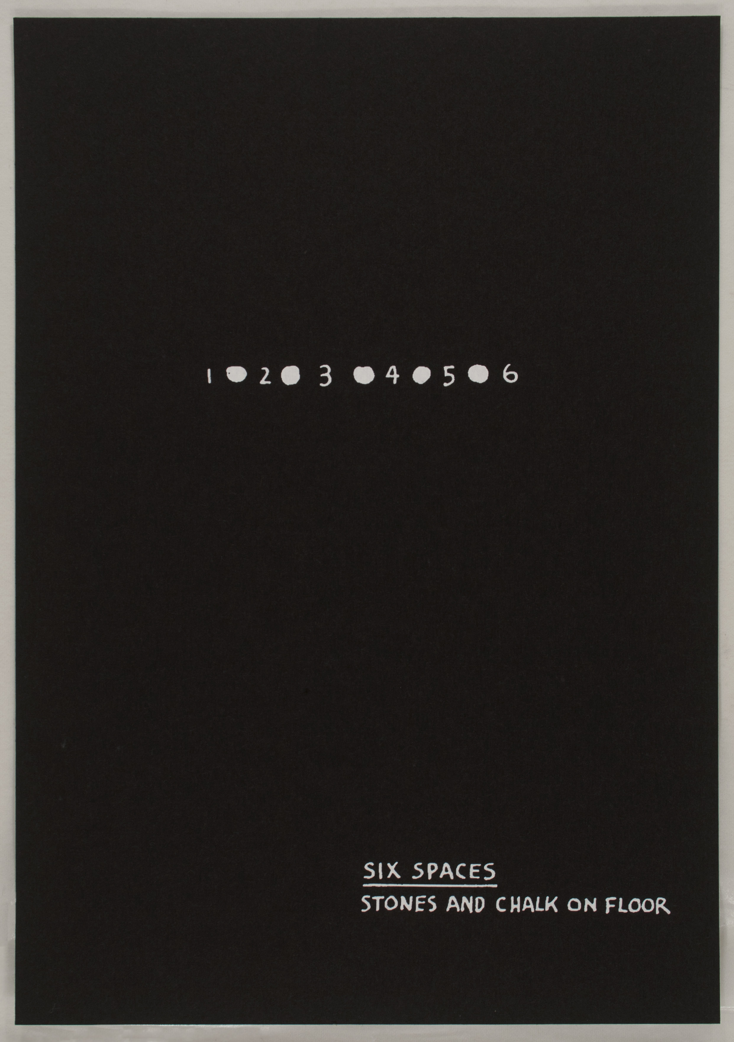
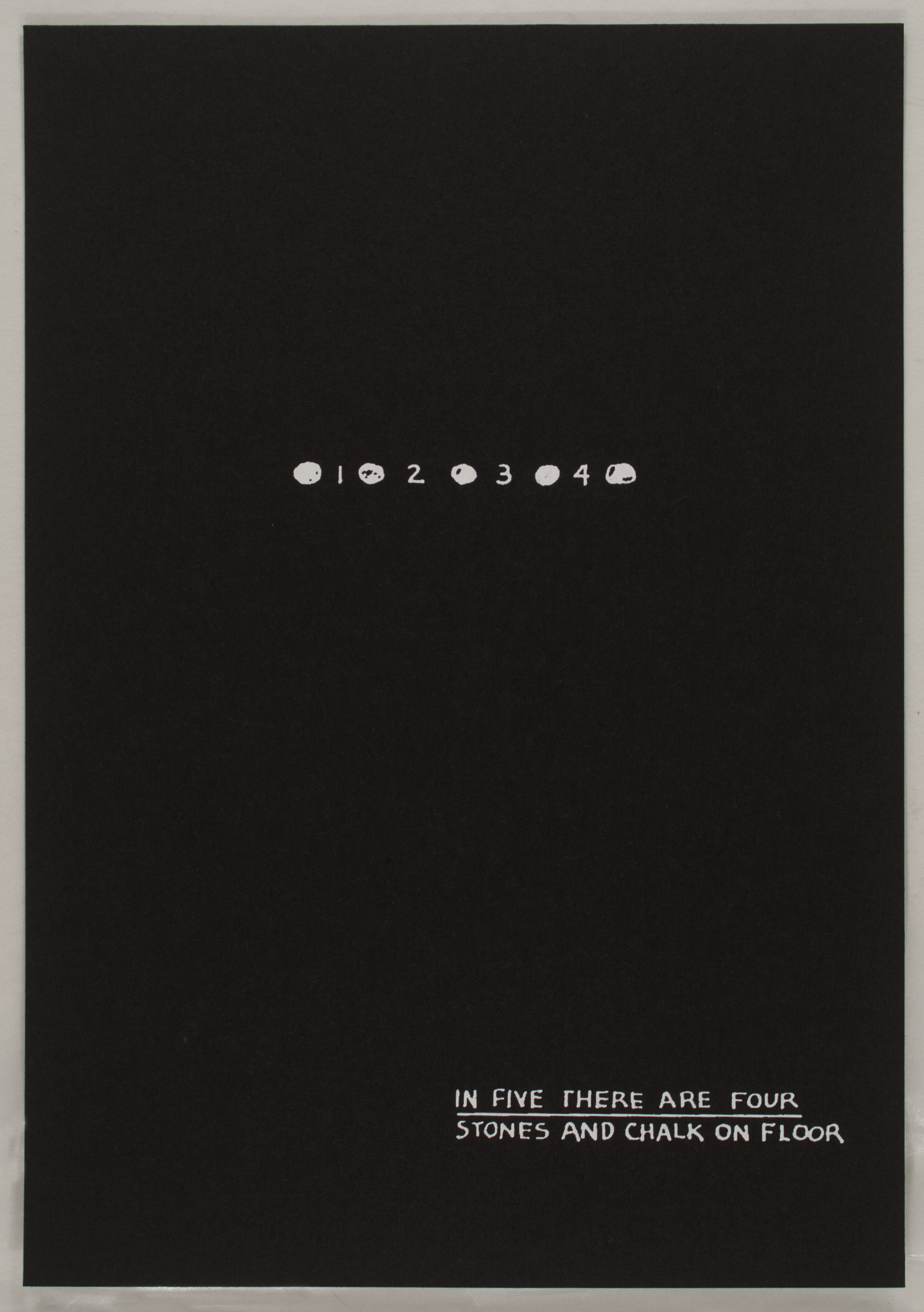
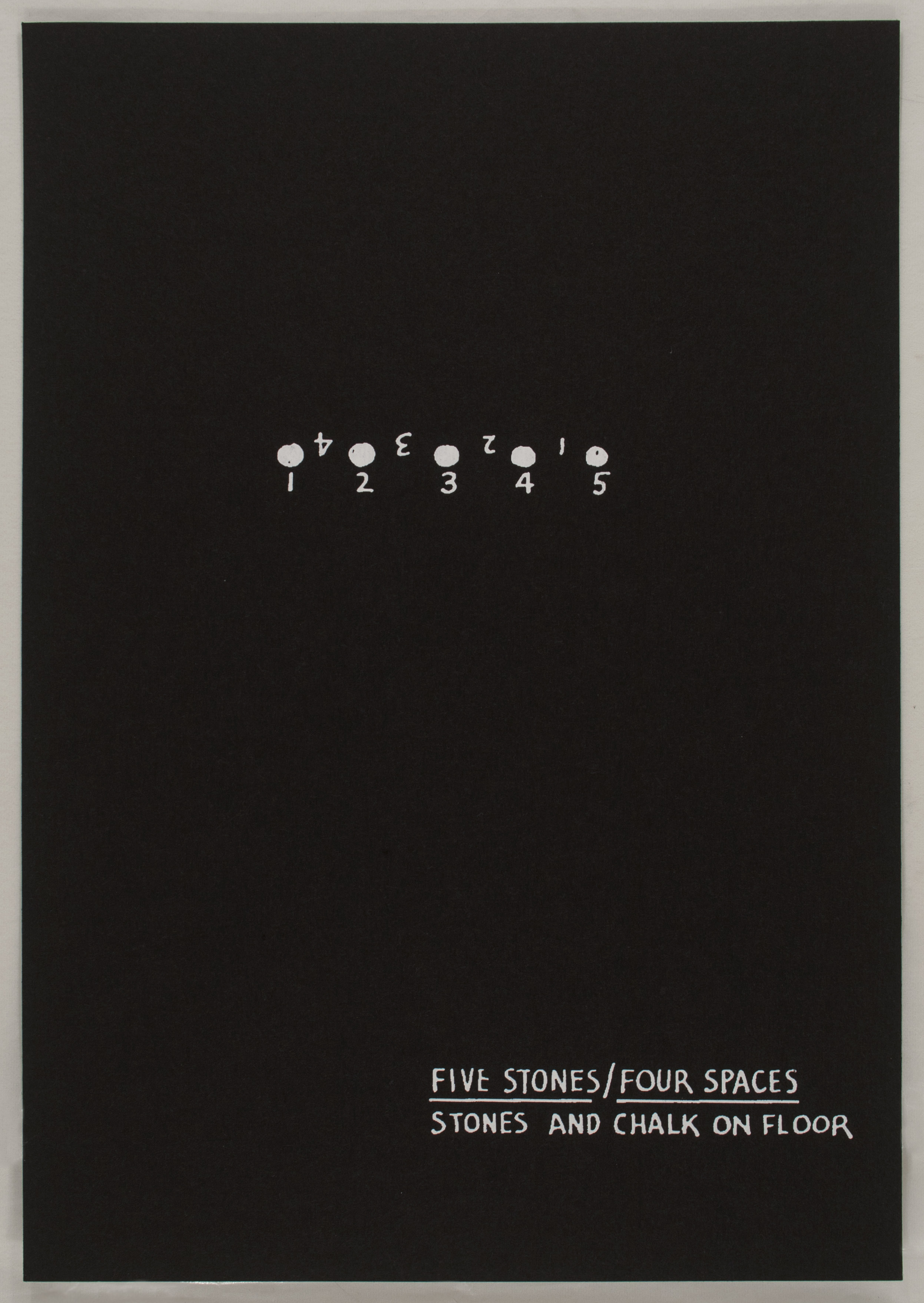
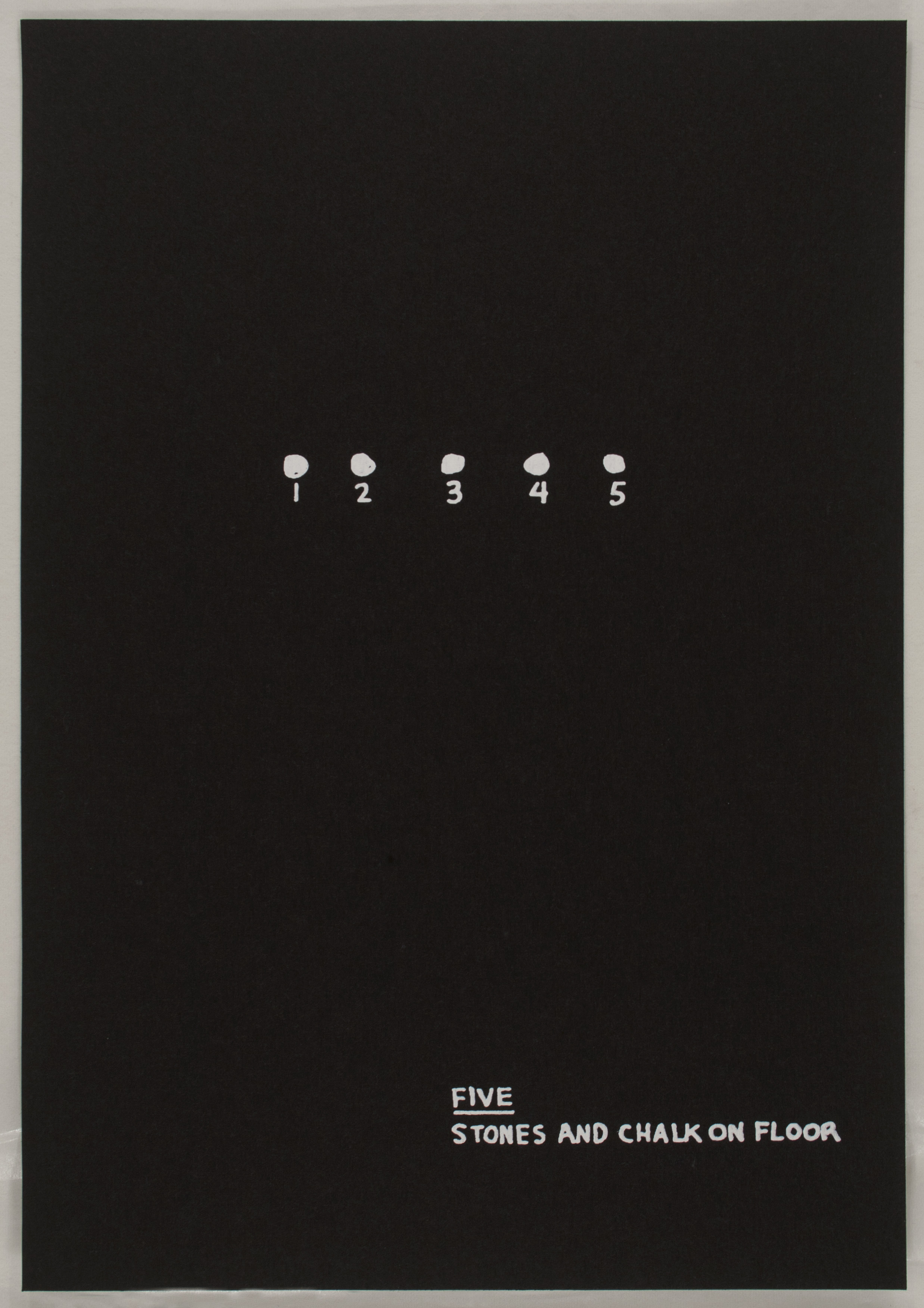
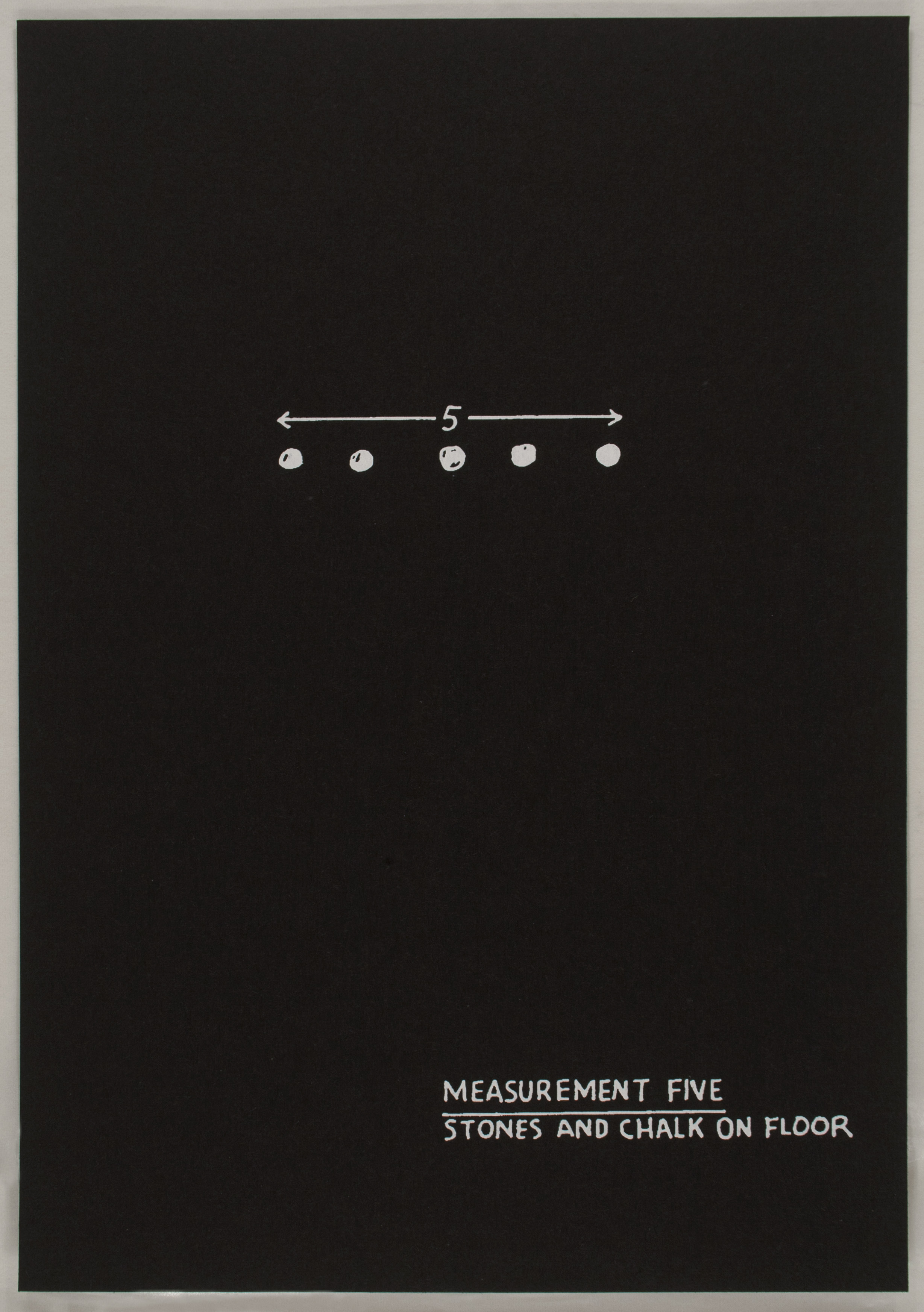
Primer also employs a compendium of images and texts engaged in the complication of ideas concerning medium specificity. Produced in 1995, this portfolio of 21 black-and-white screenprints documents a series of installations executed between 1969 and 1972, which were based in turn upon earlier drawings that comprised Bochner’s Theory of Sculpture series. Accordingly, each screenprint illustrates a previously realized arrangement of chalk and stone. The printed format here introduces a third element–information regarding the title and medium of the work featured on each sheet–which does not appear in the original installations. For example, in the print series, Plane marks three equidistant units, numbered 1, 2, and 3, and notes the use of hazelnuts on floor as opposed to stones. Primer exists both as a work in its own right and as a document of a previous artwork.
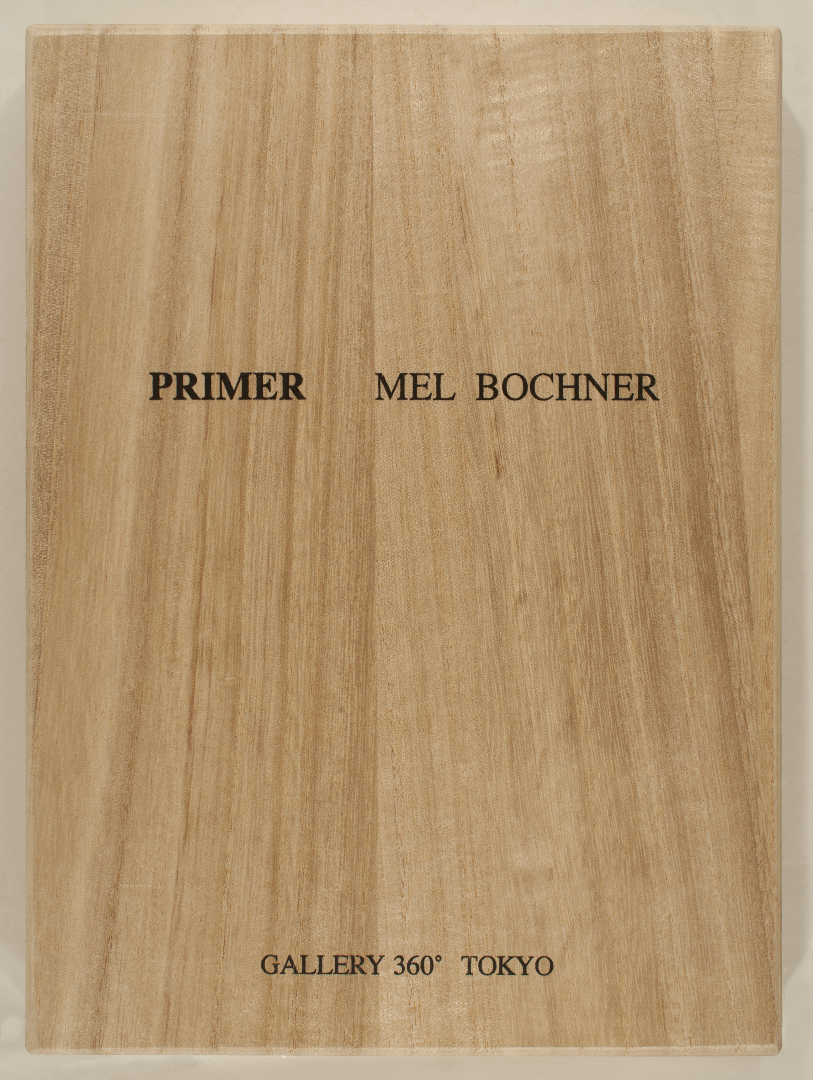
Approached in 1972 by an Italian publisher, who proposed creating a book from these early drawings, Bochner printed a few offset lithograph facsimiles as proof copies. The project was eventually completed for Flash Art Edizioni in 1973, but an irksome turn of events prevented it from being published. Bochner’s original idea drew inspiration from the Italian word abecedario, or ‘primer,’ an elementary tool used to teach the letters of the alphabet. Primer transfers the notion of basic education from the building units of language to the fundamental premises of sculpture explored in Theory of Sculpture. When in 1995 Bochner showed an old proof copy of Primer to Gallery 360 in Tokyo, his audience quickly offered to produce the work as a series of screenprints, publishing a limited edition of fifty copies, including the one currently on view.
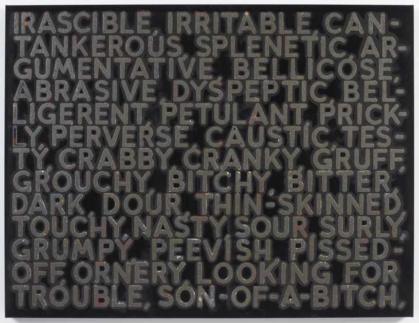
Primer is not the only work on view that engages with elements of a previous project. Indeed, Bochner has often returned to completed work in order to introduce a new component, such as color, or to examine the ways in which the meaning and context of language used in a particular work have changed over time. Consider the large monoprint Irascible (2006), produced by hydraulic press at Two Palms in New York, which features subtly colored derivatives of the title word spotlighted against a black velvet surface. A comma separates each synonym, effectively differentiating space on the picture plane as much as it imposes natural intervals in a reading of the text. These permutations range from the mild (cantankerous) to the acerbic (son-of-a-bitch). The idea of mining the thesaurus first occurred to Bochner in 1966 as a way of exploring portraiture without recourse to modes of traditional figuration. “The thesaurus represented another source of objectified language, a warehouse for words. I began by selecting a ‘key’ word to represent the portrait subject,” he recalls.5 Bochner’s subjects at that time included canonical artists like Eva Hesse and Robert Smithson. A 1995 retrospective of his artwork at the Yale University Art Gallery reanimated his interest in the thesaurus, but it was not until Bochner stumbled upon a 2002 edition of Roget’s Thesaurus that he felt compelled to analyze word relationships and their contingencies within the contemporary milieu. He was taken aback at the conspicuous obscenities (for example, the adjective bitchy) which were present in the new edition but presumably impermissible in 1966.6 As a result, the attending text in Irascible is imbued with meaning vis-à-vis the morphological shifting of language over time–a subtle response to the instability of cultural norms as manifested in the history of Roget’s publications. To underscore this temporal complexity, Bochner ends the last row of words in each contemporary thesaurus work with a comma, referencing the potentially infinite distortions of language to come.
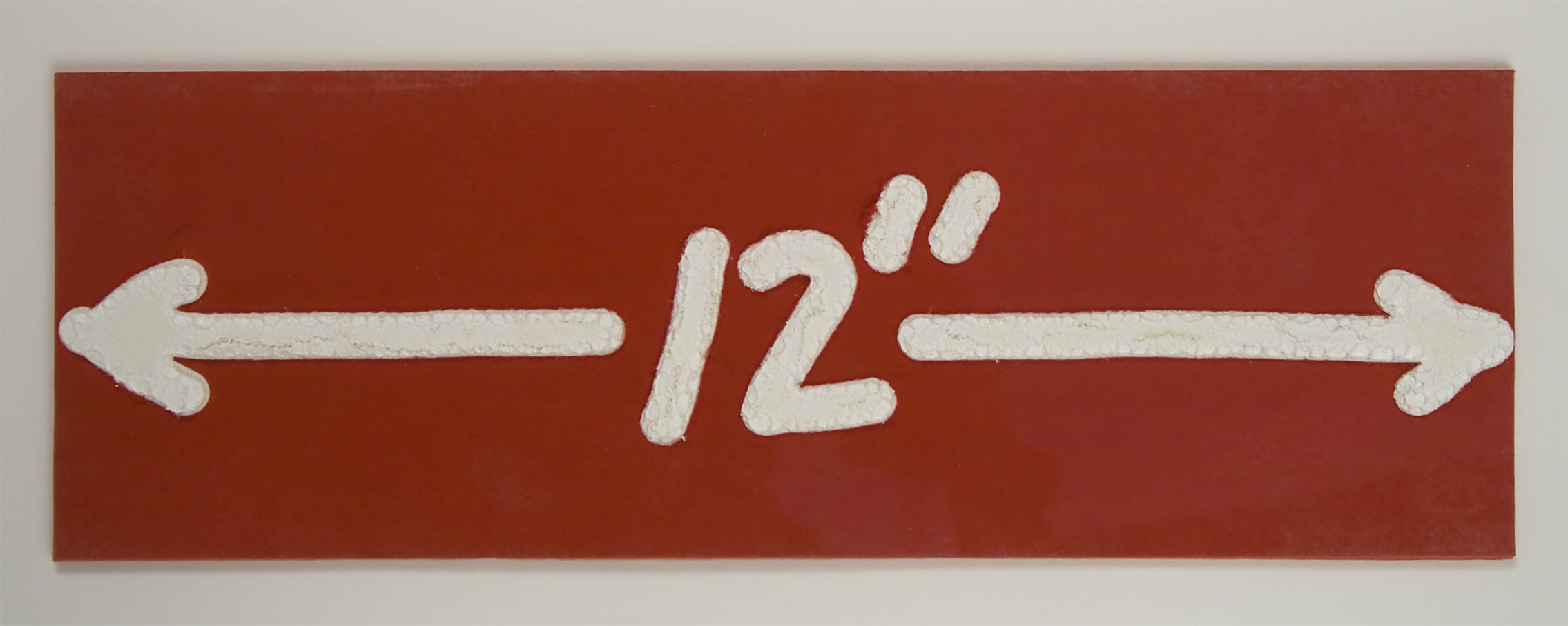
Two much later works shown in this group, both wood engravings with hand painting from 1997, complement Bochner’s early ideas about measurement and boundaries in both physical and conceptual spaces. By focusing more closely upon the literal relationship between text and meaning, 12” (1997) is exactly as the title suggests: a print measuring twelve inches wide, bearing an image of the number 12 followed by the symbol for inches, positioned squarely between two arrows extending in opposite horizontal directions. The embossed text takes on the quality of heavy white impasto, in stark contrast with the bright red surface upon which it sits. In 2 (12” x 12”), this image is repeated on eight identically sized sheets, each of which is then mounted to the backboard to create in the collective two large squares, side by side. Here, Bochner introduces a second color – or lack thereof – in the right square by substituting the red surface with black.
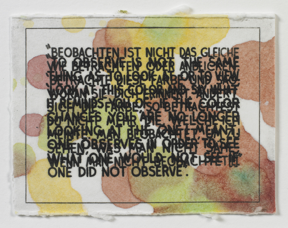
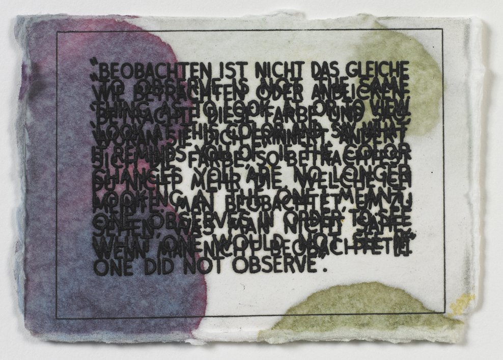
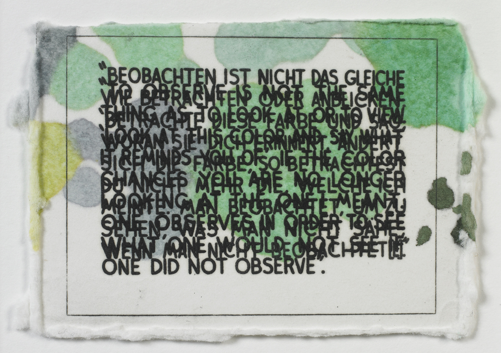
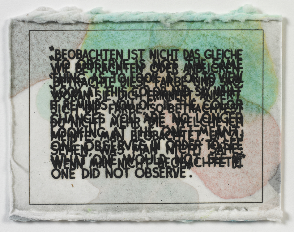
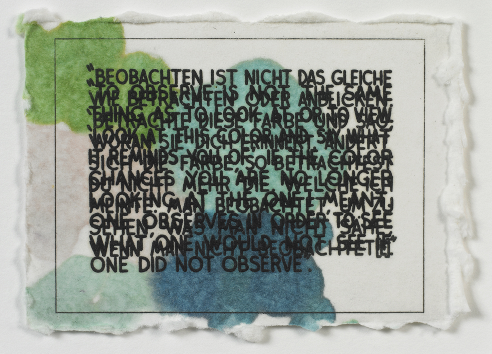
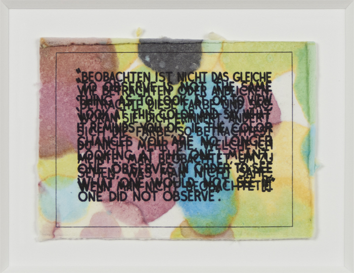
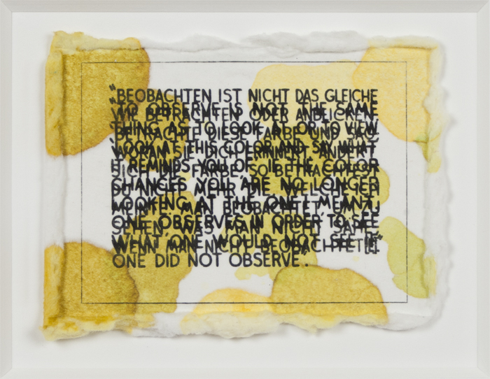
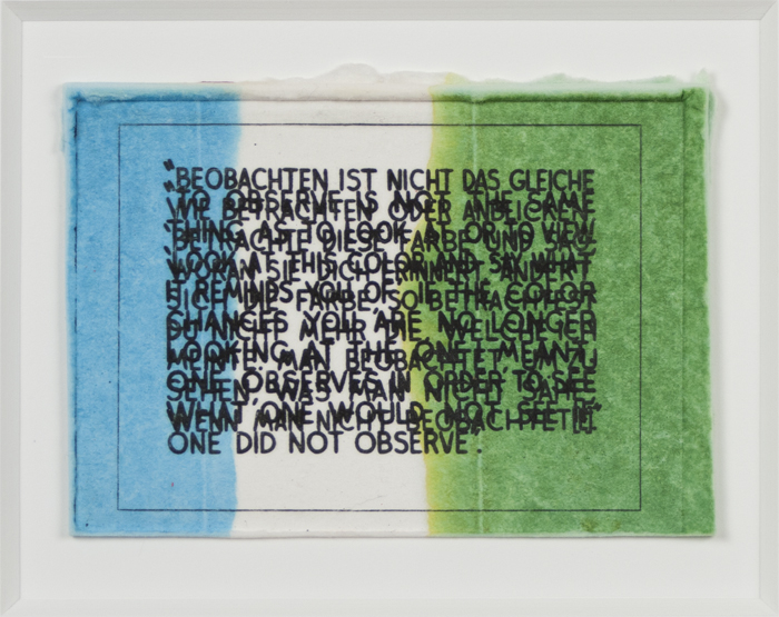
Mel Bochner, If the Color Changes…, 2003, monoprint with engraving and embossment on Twinrocker handmade paper, 2 ½ x 3 ½ inches (6.4 x 8.9 cm). Published by Two Palms, New York. © Mel Bochner / Photos: Ellen McDermott & Laura Mitchell
Color is the primary subject matter of another recent series by Bochner, titled If The Color Changes…, from which nine monotypes completed in 2003 are on display in this exhibition. The first iteration of this work, a large oil and acrylic painting from 1997 measuring 36 by 48 inches, has been diminished into comparably small printed works measuring only 2 ½ by 3 ½ inches. The text is a quotation drawn from the philosopher Ludwig Wittgenstein’s Remarks on Color (1950-51) and is rendered in discordant overlapping layers of both English and German translations. The difficulty of reading the phrase seems to represent the challenge referenced in the statement itself, that is, the impossibility of language to truthfully describe what one sees and what occurs in one’s mind: Look at this color and say what it reminds you of. If the color changes you are no longer looking at the one I meant. Executed in a multitude of monochrome and polychrome palettes, the softly textured paper surfaces evoke a congenial presence. Such ease of visual appeal remains in forcible opposition to the ruptured planes of text and their challenging proposition, all of which concludes in a denouement of paradox. Bochner affirms, “The series deals with the conflict between color-as-experience and color-as-grammar. The opticality of each painting’s color is intended to throw one’s eye and mind out of sync, slowing reading down, making you work to extract the meaning from the text.”7
Indeed, Bochner’s strength as a Conceptual artist (a designation he has avidly refuted) is located in his ability to blend the realm of the visible (color, line, shape) with the invisible (language, numbers) to show that the world before us is not always as it appears and that language is not interpreted through words alone. The title of this exhibition, Art=Text=Art, indicates a kind of closed loop connecting words and images: there can be no clear boundary or definite space where one ends and the other begins. The equal sign can be represented as a symbol or written as a word. Can the two forms be separated in our minds? Bochner would likely say no. Thus, Art=Text=Art just might be the best five- (or three-) word summary of Bochner’s artistic approach.
1. Mel Bochner, “Primary Structures,” Arts Magazine, (June 1966) 32-35. Here, Bochner intended to highlight the arbitrary and affective nature of terms that had dominated discussions of Abstract Expressionism, the prevailing art style up till the 1960s. Critic and art historian Barry Schwabsky confirms: “This could be read as nihilistic posturing, but only to say that sometimes nihilistic posturing is right: concepts that might have been useful at one time or another—and may become useful again—are always threatening to become restrictive contrivances.” In Barry Schwabsky, “Review: Words for Art”, Art in America (November 1999), accessed: http://www.artinamericamagazine.com/books/february-book-reviews/
2. Mel Bochner, “Anyone Can Learn to Draw”, published in the brochure for the exhibition American Drawings Galerie Heiner Friedrich, Munich, 1969 and reprinted in Mel Bochner, Drawings: 1966-1973 (New York: Lawrence Markey, 1998), 35-37.
3. Mel Bochner, “Three Statements for Data Magazine”, 1972, reprinted in Solar Systems and Rest Rooms: Writings and Interviews 1965-2007 (Cambridge, Mass.: MIT Press, 2008), 100.
4. Mel Bochner, “Misunderstandings (A Theory of Photography) (1967-1970)” in Solar Systems and Rest Rooms,180.
5. Mel Bochner, “An Interview with Mark Godfrey,” Frieze (November-December 2004) in Solar Systems and Rest Rooms, 191.
6. Ibid.
7. Mel Bochner, “Institutes of Fine Arts Lecture” in Solar Systems and Rest Rooms, 202.
Mel Bochner Biography