The limited box book was a kind of culmination, at that time, of my work. In preparing for the mid-career show at that time—it was early in the nineties—I selected from my whole work what I felt most behind, in a kind of narrative that I was forming about it. And that meant dropping away a lot of explorations that weren’t so productive and trying to make a kind of readable line through my work. In the case of selecting the limited edition work, I was thinking of picking works that were from each decade. So I started in 1969 and went on up to 2003, when this came out. The overriding idea of this monograph, which was called Nature, Change, and Indeterminacy, was that I picked works—and this was really the flow of my work, although it’s not the only aspect of it—that were indeterminate, meaning not fixed. However, on the other side, I’m a kind of schizophrenic artist: I do very prescribed works, paintings with pigment, that are very established and not meant to change, so there’s this kind of polarity, as Thomas McEvilley mentioned, of nature and culture. And I suppose in my own work there’s this dichotomy too between stability and the reverse. An [eighteenth-century] Japanese poet, Hakuin, outlined four other ingredients important to me in a work of art: clarity, simplicity, spontaneity, and precision. And I think about those very reduced and clear ingredients in a work of art. An artist of course is known for the quality of his refusals.
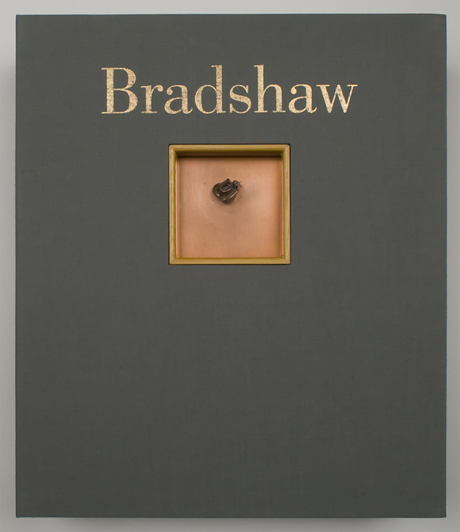
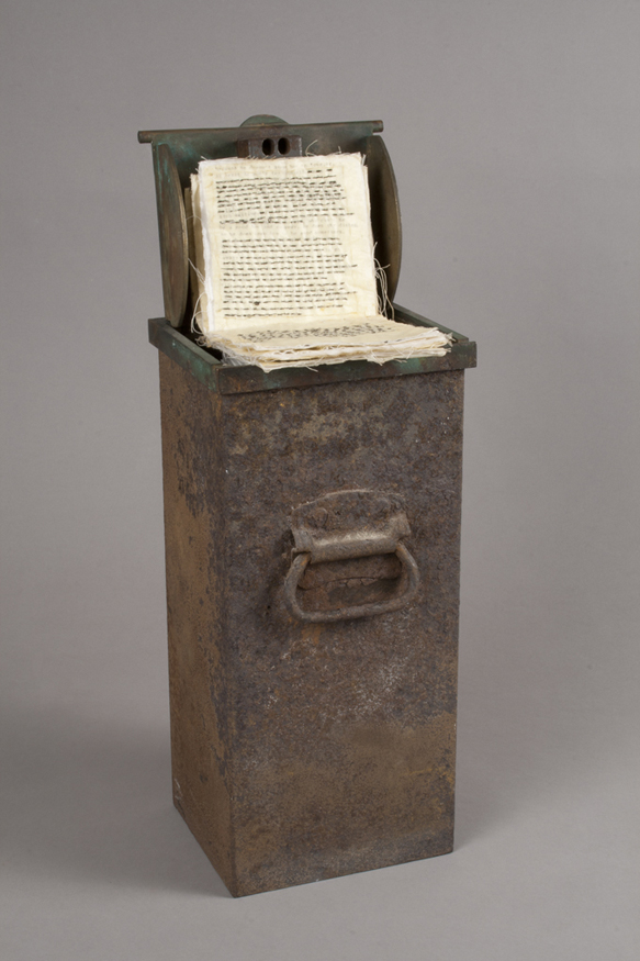
Dove Bradshaw’s portable retrospective from 2003, BRADSHAW: Limited Edition Box,1 undoubtedly elicits for the reader associations with Marcel Duchamp–associations readily acknowledged by the artist. Calling to mind Duchamp’s Boîte-en-valise (1935-41) and, to a lesser extent, his Large Glass (1915-23), Bradshaw reproduces her oeuvre for the collector, accompanied by Thomas McEvilley’s monograph on her work, The Art of Dove Bradshaw: Nature, Change and Indeterminacy. A self-proclaimed student of Duchamp, John Cage, and Eastern religion, Bradshaw advances and complicates this particular legacy, a legacy with which many artists who began their careers in the 1960s have historically grappled.
There is an overarching tension active in Bradshaw’s work, which is key to understanding the unique contribution of her oeuvre: namely its oscillation between nature and culture. McEvilley eloquently discusses this dichotomy in a conversation with John Cage, published in the monograph. Speaking of a piece in which Bradshaw had subjected a chessboard to a liver of sulfur treatment, which subsequently altered the work’s appearance as it was exposed to air over time, McEvilley states, “This is really what I see as a main theme of Dove’s work…the distinction between nature and culture. The grid of the chessboard signifies culture; the amorphous, changing, process-oriented, unpredictable and hence unknowable ground is nature. And it continues to change.”2
So to represent the sixties, and the very late tail end: I was an art student and I was fooling around with, at first, what were given to me as pets–birds, just as pets. And the first thing I did was to let them fly free in my apartment, and I noticed they were flying up on my books and destroying my cookbooks in the kitchen. And one day I was bicycling home from art school and saw a front wheel of a bicycle and thought, “Oh, it would make an interesting perch.” Of course I was very steeped in Duchamp—I grew up in New York, in Manhattan, and Duchamp’s bicycle wheel was on the ground floor, actually, at that time, as soon as you entered the museum. I was maybe pre-teens when I first saw it and was fascinated by it. And after that, in continuing, as I looked at Duchamp, I became very interested in this work. So the bicycle wheel I strung up horizontally through the axle and used it as a perch for the birds. And believe it or not, luckily, the birds actually flew right to it. And then, as they were hanging out on the wheel—and when they would fly onto it, it would spin and rotate, and I was thinking that it would be amusing to get a zen archer’s target. So I got…I actually couldn’t find a target, had no way to get one, so I thought I would just paint one. I knew what it looked like. And so I painted a black circle, a white one, and then a black outer circle, and painted my own target on canvas and then nailed it to my studio floor. In fact, that’s where I hung the wheel, in my apartment.
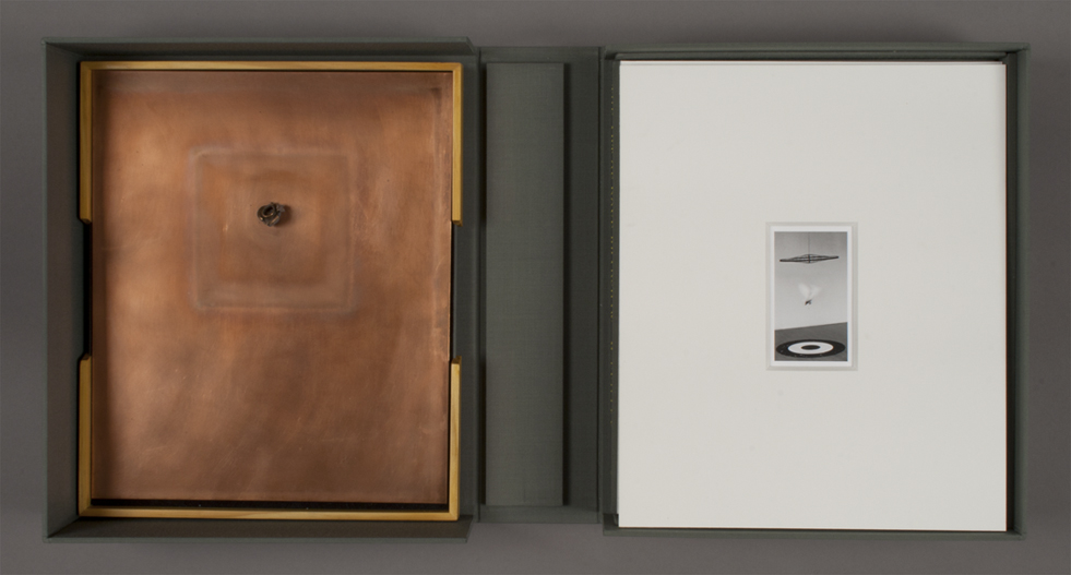
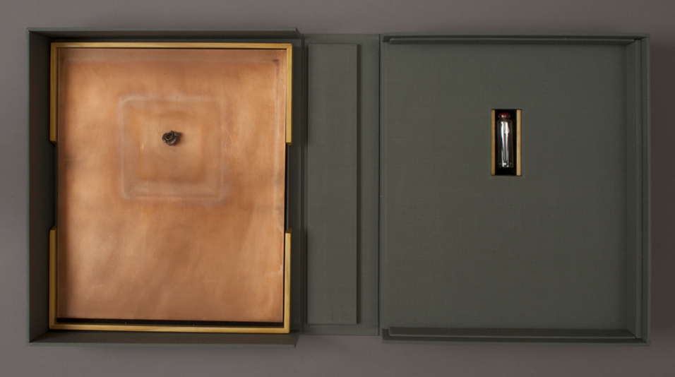
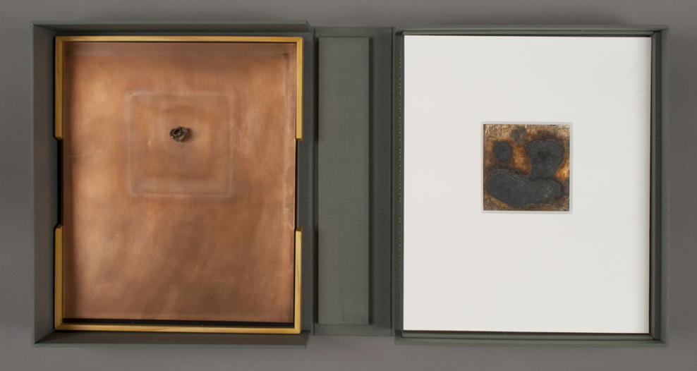
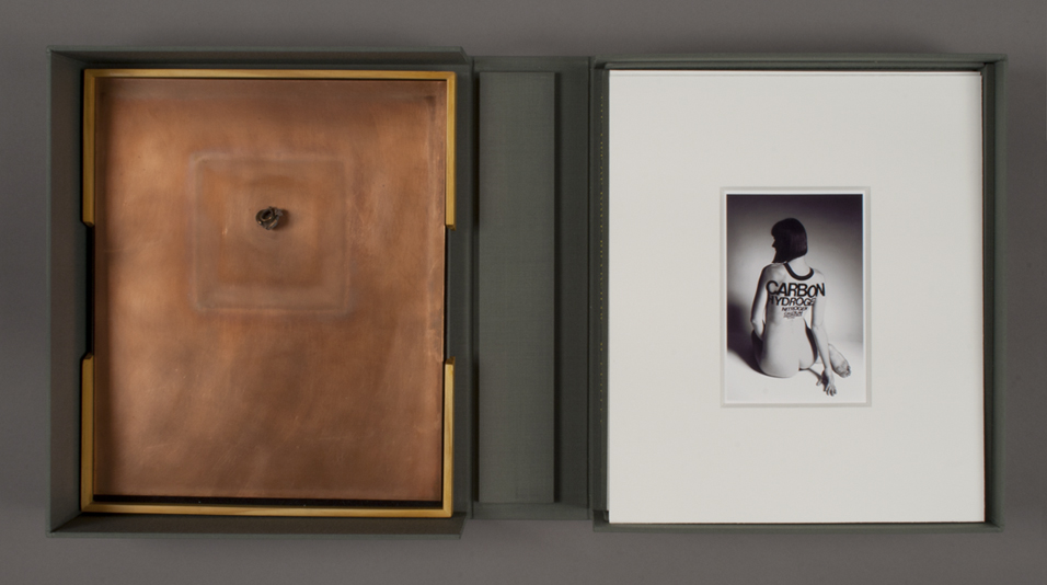
BRADSHAW provides a perfect example of the paradox of this distinction: while the subtitle of the monograph references “nature,” the presentation of the individual pieces in an archival box sometimes bows to the effects of nature and other times not. For instance, the copper plate behind Spent Bullet is partially exposed to the air and records an ever-changing imprint of that opening. The same is true for Contingency, since its chemistry is unfixed, as well as for Indeterminacy in regard to the use of unstable mercury. Other works, however, are rarefied by archival printing and mats or, in the case of the mercury, by encasement in a glass vial. Bradshaw thereby plays with the nature/culture distinction in each work.
Plain Air (1969-1991) is perhaps the most straightforward exploration of this paradox. This archival silver gelatin print captures the installation Bradshaw created by unleashing two mated pairs of birds in a room with a bicycle wheel hung from the ceiling and a Zen archer’s target nailed to the floor, recalling Dada and Neo-Dada emblems. In their dynamic movements among these symbols of human achievement, the birds perform, most literally, the oscillation between the poles of nature and culture. A similar flux can be observed in another photograph, Herself in the Element (2002), which presents a nude with her back to the viewer, calling to mind Man Ray’s Le Violin d’Ingres (1924). In place of Man Ray’s F-holes, however, painted on the woman’s back are the names of the chemical elements that compose the human body, in descending order by weight. The O around the woman’s neck denotes oxygen, followed by carbon, hydrogen, and so on, with the words becoming progressively smaller until they appear illegible (at this scale). The image of the woman’s back, which can be seen both to represent the unknowable ground of nature and to reference the Dada master’s photograph, is layered with another ambiguous nature/culture oscillation: the linguistic representation of the biological elements that constitute a human being.
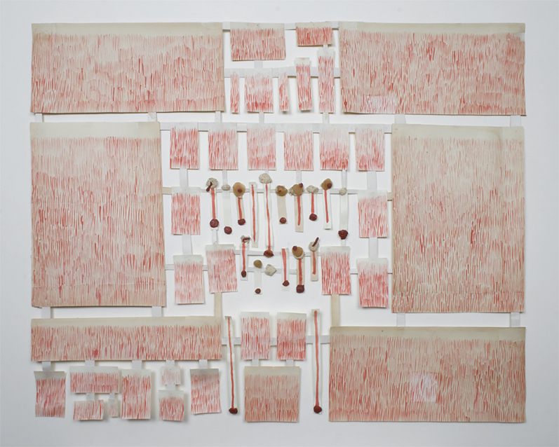
The next decade [the 1970s] was covered with a piece called Spent Bullet. And I was living up in Harlem and there was a police firing range on 100th Street. And I collected bullets from the range, and they were very beautiful. They hit a steel plate and ricochet on another steel plate, and then come into a sand pile to deaden any more movement. And the bullets themselves look like beautiful flowers that open up. Later, I actually made silver and gold earrings from the bullets. And this was a kind of anti-war statement in general. I was thinking that bullets could be turned into jewelry one at a time—of course a Utopian idea. The idea then for a copper sheet was to solder the copper to the copper and to expose the piece as kind of flower-like, something completely transformed from the violence that it implied.
In Spent Bullet (1969/2003), a copper-encased lead bullet that was shot is soldered onto a copper sheet, suggesting metaphors of natural beauty rather than of man-made destruction. It is a rare example of the artist’s political work, the Utopian desire for spent bullets to be retired as works of art or worn as jewelry. Contingency Pour (1984/2002), a study in the reaction of silver to liver of sulfur, is complicated and unpredictable; this work clearly identifies change. However, Contingency Pour is still encased in mat board, which protects the other works in the box from the volatile chemical, again leading us to consider how the box’s individual pieces are contained and displayed. Indeterminacy (1993) consists of seven drops of mercury floating in a glass vial sealed with wax. It is indeterminate in the sense that the mercury is not fixed, although a tiny tag affixed to the bottle, reminiscent of Lewis Carroll’s Alice in Wonderland, warns the viewer not to touch, ingest, or inhale, thus sealing and cordoning off what is naturally hazardous.
Then, early eighties, 1984 was the beginning of my work with silver and liver of sulfur. These were paintings and works on paper that I covered with thin leaf. I would cover these surfaces and then expose them to liver of sulfur. Liver of sulfur I learned about when I was in art school, in fact—it’s a patina for silver, to age it. But I noticed that it not only ages it immediately—sulfurizes it, turns it black—but it continues to change and is never stable. So my early works were just to give it a kind of aged atmosphere, and as a child I was very attracted to antiquity. Much more romantic and much more for the imagination to fill in. And so I think this whole attraction to decay, to leaving room for dreaming, in some way, attracted me. And it’s really intuitive. This is not an intellectual idea, destroying art, it was a kind of visceral response. So I began to do these pieces, and then as I noticed them changing I began to exploit that and try different surfaces. So in this limited box book, it’s the one particularly active piece. It just was a small square of silver [on which] I had used an eyedropper full of liver of sulfur and had injected the surface with it. And it changed quite a lot over the years and continues to. It was encased in a mat to protect the other works from wreckage.
In conversation with McEvilley about Bradshaw’s work, Cage notes how “Marcel Duchamp said, speaking of Utopia, that we won’t be able to reach it till we give up the notion of possession. And this work of Dove’s confronts possession completely.”3
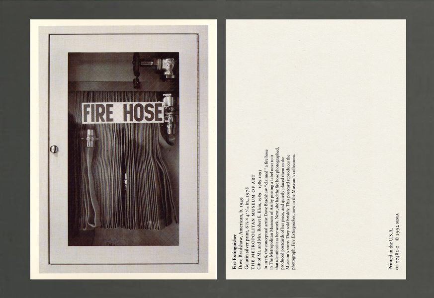
Well, the fire hose is really from the seventies and then 1992. And that consisted of a claimed object, again at the Metropolitan Museum. I had claimed a fire hose: as opposed to a “found object,” I coined the word “claimed” because it was already in an art context. And only this year, so we’re talking about some thirty-seven years after the initial claim, 1976, a label is being posted next to the fire hose, because in that period of time, the Met has acquired the work in their permanent collection. But in the meantime, what I did is that I photographed the fire hose, after I put my card up claiming it; they take it down, I put it up. And then one day I saw it was up, and at the slightest bit of encouragement I decided to take the next step, which was to photograph and make a postcard of my work at the Met. So I made a guerilla card and placed it in the twentieth-century rack amongst my peers—which were sold unblinkingly to me. Over time I stocked and re-stocked them, until some 600 had been sold. And then the Met, a couple of years later, acquired the original photograph to make their own legitimate postcard, which finally came out some fourteen years later in 1992, and that’s the card that’s encased in the box book.
As a multiple, BRADSHAW4 defies the aura of scarcity afforded a unique object, promoting a more democratic conception of possession since it is an edition of 40, albeit in limited supply. This possibility of multiple possession is played out most creatively in a piece included in the box, Performance (1976-1992), in which Bradshaw appropriated a standard fire hose inside the Metropolitan Museum of Art in New York as her own work. She then made a postcard out of its image, slipping a stack at a time amongst the postcards of her peers in the twentieth-century racks in the Museum gift shop. Though the staff knew it was not Museum-produced, they became complicit and sold Bradshaw’s postcard for years. The silver gelatin print used in this original postcard was eventually accessioned into the Museum’s collection, followed by the hose itself in 2007. This skewed notion of possession—that Bradshaw could “claim” a fire hose as her own art, have a self-published postcard sold to visitors in the gift shop, and in turn prompt the Museum to acquire the original photograph for its collection in order to produce its own postcard fourteen years later—represents a guerilla alternative to the traditional circuits of ownership and distribution. The Museum has since mounted a wall label next to the fire hose, identifying it as Bradshaw’s work and thus completing the circle.
For the 2000s was a photograph I called Oxygen at the time. It’s an image of a woman whose back is painted with the body elements in descending order by weight. So the O circles her neck and it’s three times the amount of oxygen that we have from carbon, which is next, and then hydrogen, and so on all the way down to trace elements, which you can barely read. It was related to a sculpture, and it was a sculptural idea that I had really as a young child, because I was thinking of our bodies and what elements we were made of.
BRADSHAW: Limited Edition Box ultimately complicates the dichotomies of nature versus culture and unique object versus multiple, all while challenging classic notions of possession and distribution. Like the wild birds flying between the bicycle wheel and the archer’s target, Bradshaw’s work is alive, even when contained in a closed box.
1. Public Collections: The Metropolitan Museum of Art, New York; The Whitney Museum of American Art, New York; The New York Public Library; The National Gallery, Washington, D.C.; The Art Institute of Chicago, Illinois; The Birmingham Museum of Art, Alabama; The San Francisco Museum of Modern Art, California; The Museum of Contemporary Art, Los Angeles.
2. Thomas McEvilley, “Dove Bradshaw: Works 1969-1993. A Conversation between John Cage and Thomas McEvilley” in The Art of Dove Bradshaw: Nature, Change, and Indeterminacy (New Jersey: Mark Batty Publisher, 2003), 83.
3. Ibid.
4. Each copy of BRADSHAW: Limited Edition Box contains in addition a “Special,” a seventh piece–a unique work added as each box is acquired.
Dove Bradshaw Biography
Dove Bradshaw (b. 1949, New York, NY) earned her BFA from the School of the Museum of Fine Arts, Boston (1974). She has been awarded the National Endowment of the Arts Award for Sculpture (1975) and the Pollock-Krasner Foundation Award for Painting (1985). Bradshaw has received grants from the New York State Council on the Arts through the Merce Cunningham Dance Company for décor and costumes (1987); the Furthermore Foundation for assistance with the publication of the monograph on her work by Thomas McEvilley (2003); and the Antarctic Artists and Writers Program of the National Science Foundation (2006). She has been an artist-in-residence at The Pier Arts Centre, Orkney, Scotland (1995); Sirius Arts Centre, Cobh, Ireland (2000); Niels Borch Jensen, Copenhagen (2001, 2008 and 2011); the Pont-Aven School of Contemporary Art, France (2007); and Palazzo Durini, Bolognano, Italy (2007). Bradshaw has had two mid-career exhibitions at The Museum of Contemporary Art, Los Angeles (1998), and at The Sidney Mishkin Gallery, Baruch College, City University of New York (2003). Her work Radio Rocks, commissioned by Lucrezia Durini, became a permanent work in the town of Bolognano, Italy (2006). Recent solo exhibitions have been held at Pierre Menard Gallery, Cambridge, Massachusetts (2008); Thomas Rehbein Galerie, Köln (2011); Larry Becker Contemporary Art, Philadelphia (2008, 2012); and Danese/Corey Gallery, New York (2014). Bradshaw has been included in many group exhibitions, most recently at the Solomon R. Guggenheim Museum, New York (2009); the Maryland Institute College of Art, Baltimore (2010); the Museum of Contemporary Art, Roskilde, Denmark (2011); the Chemical Heritage Foundation, Philadelphia (2011); the Esbjerg Kunstmuseum, Denmark (2012); Colorado College, Colorado Springs (2014); and Sandra Gering Gallery Inc., New York (2014). Her film SPACETIME (2011), scored to John Cage’s Ryoanji, was screened with a live performance by L’Ensemble Mesostics at the Conservatoire à Rayonnement Régional de Paris. Bradshaw presented a lecture at the Sorbonne on John Cage entitled Still Conversing with Cage (2012). Bradshaw lives and works in New York City. More information about her work can be found at www.dovebradshaw.com.
Anna Katherine Brodbeck Biography
Anna Katherine Brodbeck (b. 1985, Los Angeles, CA) is Assistant Curator at Carnegie Museum of Art. She holds a PhD from the Institute of Fine Arts, New York University, where she wrote her dissertation, entitled “Parallel Situations: Artur Barrio, Brazilian Art and International Exchange in the Post-Studio Era (1969-1974),” on Brazilian art of the late 1960s and early 1970s. She lives and works in New York City.
References
Public Collections: The Metropolitan Museum of Art, New York; The Whitney Museum of American Art, New York; The New York Public Library; The National Gallery, Washington, D.C.; The Art Institute of Chicago, Illinois; The Birmingham Museum of Art, Alabama; The San Francisco Museum of Modern Art, California; The Museum of Contemporary Art, Los Angeles.
Thomas McEvilley, “Dove Bradshaw: Works 1969-1993. A Conversation between John Cage and Thomas McEvilley” in The Art of Dove Bradshaw: Nature, Change, and Indeterminacy (New Jersey: Mark Batty Publisher, 2003), 83.
Thomas McEvilley, “Dove Bradshaw: Works 1969-1993. A Conversation between John Cage and Thomas McEvilley” in The Art of Dove Bradshaw: Nature, Change, and Indeterminacy (New Jersey: Mark Batty Publisher, 2003), 83.
Each copy of BRADSHAW: Limited Edition Box contains in addition a “Special,” a seventh piece–a unique work added as each box is acquired.
Entering the New York art scene in 1966 as a young but confident critic, Mel Bochner wrote in a review of the Primary Structures exhibition at the Jewish Museum that, “such words as ‘form-content,’ ‘tradition,’ ‘classic,’ ‘romantic,’ ‘expressive,’ ‘experiment,’ ‘psychology,’ ‘analogy,’ ‘depth,’ ‘purity,’ ‘feeling,’ ‘space,’ ‘avant-garde,’ ‘lyric,’ ‘individual,’ ‘composition,’ ‘life and death,’ ‘sexuality,’ ‘biomorphic,’ ‘biographic’—the entire language of botany in art—can now be regarded as suspect. These words are not tools for probing but aspects of a system of moralistic restriction.”1 This observation marks the beginning of Bochner’s prolonged critical and creative investigation of the nature of language – its patterns and principles of classification and its problematic role in art. A key contributor to what is now known as Conceptual art, Bochner has attempted over the years to expand the use of empirical methodology beyond problems of physical environment and into the murky territory of conceptual space. Unlike Minimal artists like Donald Judd and Carl Andre, who stacked boxes and ordered bricks in serial arrangements to emphasize the artwork as a literal object, Bochner systematically dissected the components of language to reveal our dependency upon words as descriptors of what we see. Bochner distinguished himself from contemporaries like Joseph Kosuth and Lawrence Weiner by avoiding the then-prevailing tendency to champion ideas above art objects, a position that Bochner solidified with his 1969 declarative piece, Language Is Not Transparent (and its subsequent iteration as a painting in 1970). Such a statement underscores how acutely the physical manifestation of a word shapes its signification, necessarily affecting both the observation and apprehension of an artwork on the part of the viewer. The wide range of work by Bochner on view in this exhibition spans four decades of the artist’s career and includes painting, drawing, prints, and photography. Together the artworks highlight a relentless examination of the complex relationship between language and its own material form. Throughout, Bochner exposes gaps between our encounters with objects and the words we use to express both our experiences and our experiential referents.
The earliest drawing included here, Imagine the Enclosed Area Blue (Study for Installation, Yale, Norfolk) from 1968, demonstrates the artist’s attempts to contrast through drawing the physical space of text with the conceptual space of ideas. Though described as a study, the work was made prior to the installation of a wall painting at the Yale University Art Gallery in 1968, and it was intended as a set of precise instructions for the execution of the piece. Here, Bochner has recreated a flattened layout of the room on a sheet of commercial graph paper, scaling his measurements to correspond to the actual dimensions of the walls and ceiling. The drawing thus belongs to a category of work that Bochner would describe one year later, in a brochure for the 1969 exhibition American Drawings at Galerie Heiner Friedrich in Munich, as “diagrammatic drawing.”2 Bochner’s essay described a shift in artists’ attitudes toward the practice of drawing, noting that alongside “working drawings” and “finished drawings” a diagrammatic drawing is also “useful in the mapping of systems, plotting and recording of data, or conveyance of information pertinent to the installation.” Once regarded as merely support for installations, the function of these drawings demands to be reconsidered in light of his observations.
In this particular drawing, a blue square to the left and a white square with a rough blue border to the right indicate which areas may (or may not) be painted blue on the wall. Both squares contain the phrase imagine the enclosed area blue. To a viewer encountering the realized wall, the command is a riddle. Which area of the wall is the “enclosed” area? In this diagrammatic drawing, however, the verb “imagine” seems primarily to reference the visualization required for one to understand the work as it would be installed in real space. Bochner plays with the idea of the diagram as a work of art by exposing the multifaceted nature of the word “imagine.”
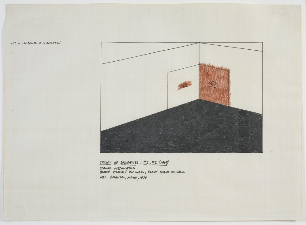
In comparison, Theory of Boundaries: #3, #2 (1970) would appear to be a similar type of diagrammatic installation drawing–were it not for the artist’s note in the upper left margin: “Not a certificate of installation.” Herein, Bochner approaches instead the informal attitude of the working drawing, making it clear that this is not a properly scaled map of the installation, but rather a creative tool meant to aid the artist in teasing out the idea. Despite Bochner’s inscribed caveat, the strong contrast of the red wall against the angular black fill of the floor–which together test the boundaries of the prepositions in and over–creates a powerful visual sensibility that allows the drawing to stand as a singular work. Bochner has been careful to point out that elements of working, finished, and diagrammatic drawings are not mutually exclusive. Theory of Boundaries: #3, #2 belongs to a larger project installed for the first time in 1970 at the Jewish Museum in New York. In its original format, four large squares painted directly on the wall contained pairs of prepositions, arranged vertically in what the artist referred to as “language fractions.” The locations, such as over/in, were defined not by the words but by the implementation of pigment within and/or around each space. That same year, Bochner also published in Arts Magazine a page from his notes on Theory of Boundaries in an article titled “No Thought Exists Without a Sustaining Support,” in which he emphasized that boundaries, or enclosures, are described “conditions of positions,” and are therefore reflexively reliant upon language. However, our experience of these “conditions of positions” is quite different, as exemplified by the contrast between this drawing, Imagine the Enclosed Area Blue, and their respective installations. Both works typify the scrutiny that Bochner unleashed upon language in the late 1960s and early 1970s. Moreover, they both show that drawing formed an important link between text, vision, and experience, a filter through which to highlight the discrepancies between the language of ideas in two-dimensional space and their nonverbal nature in real space.
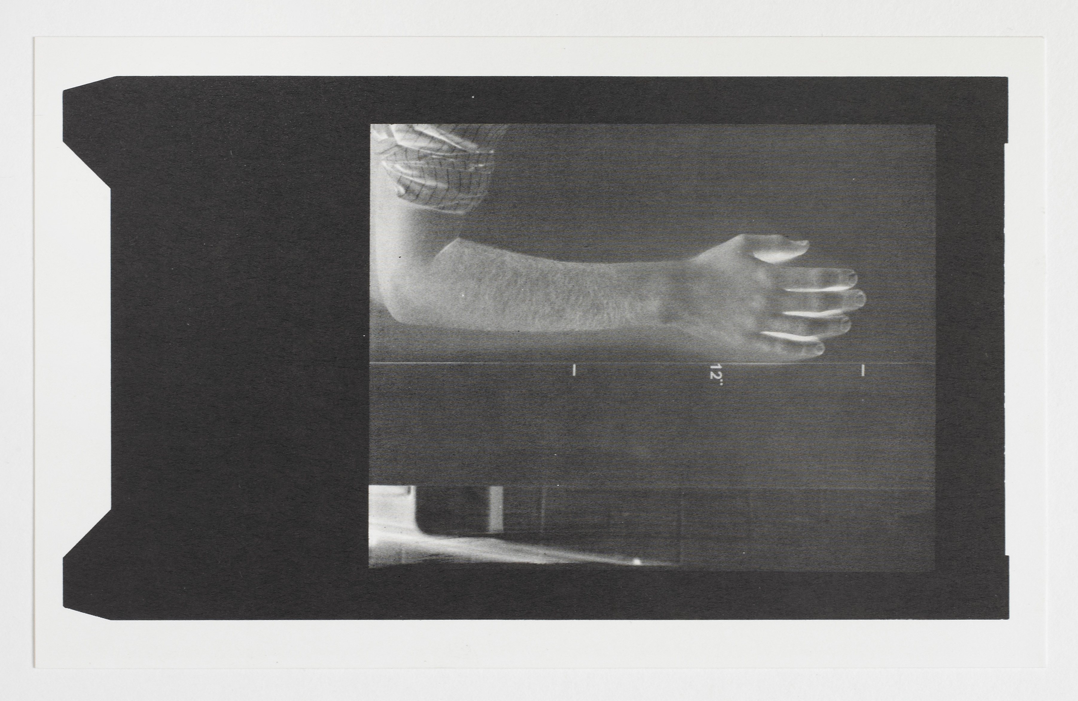
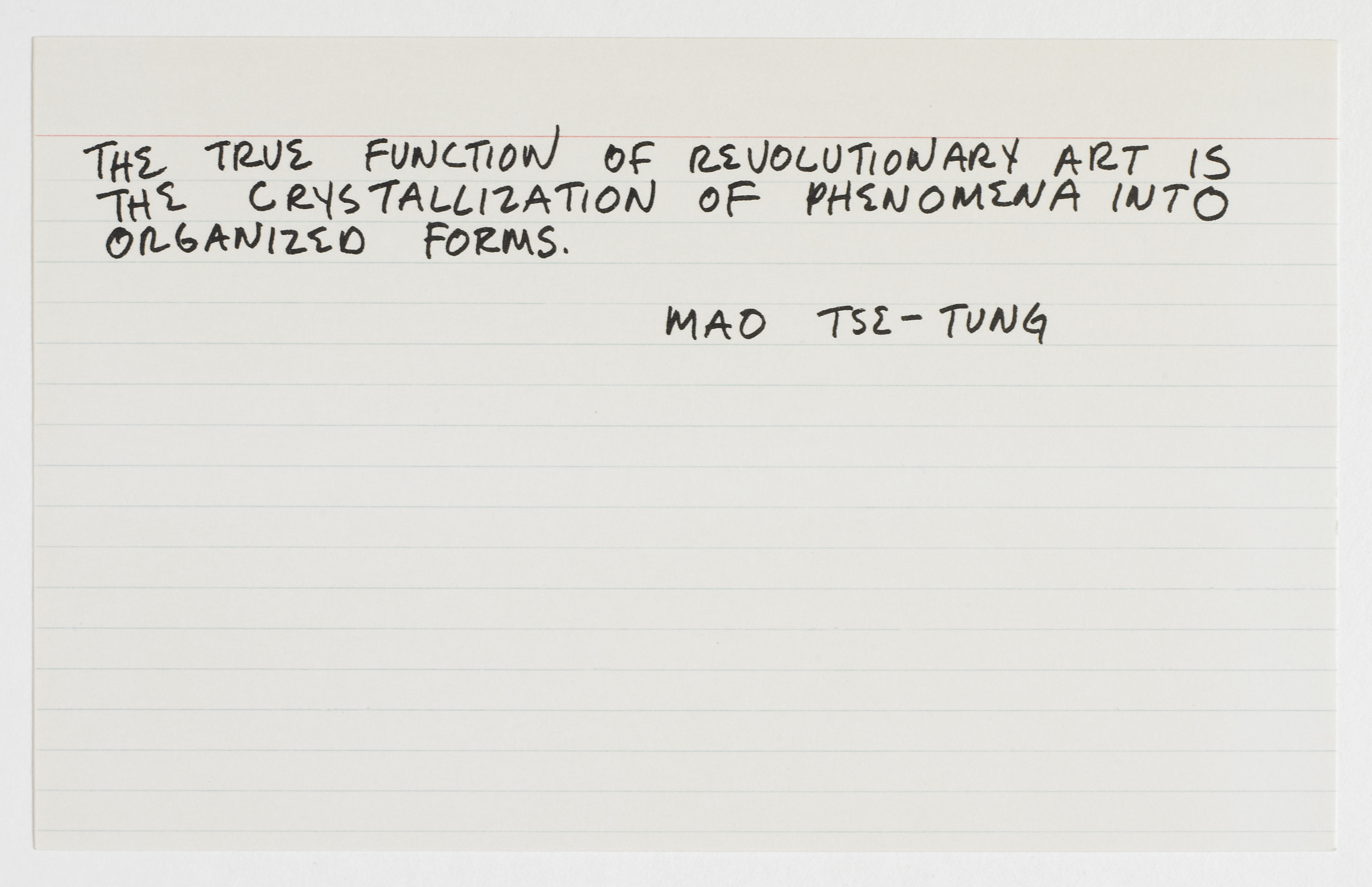
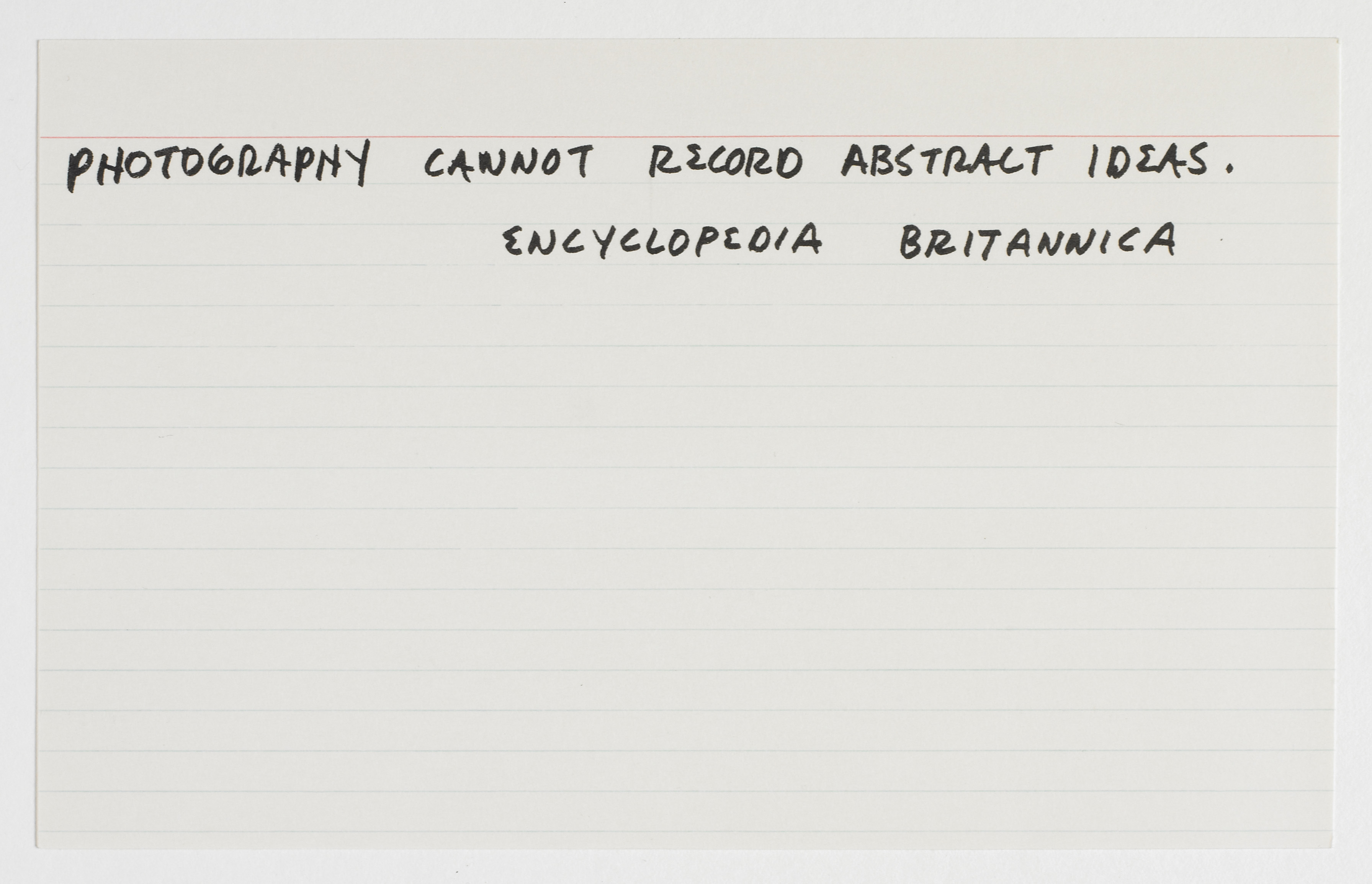
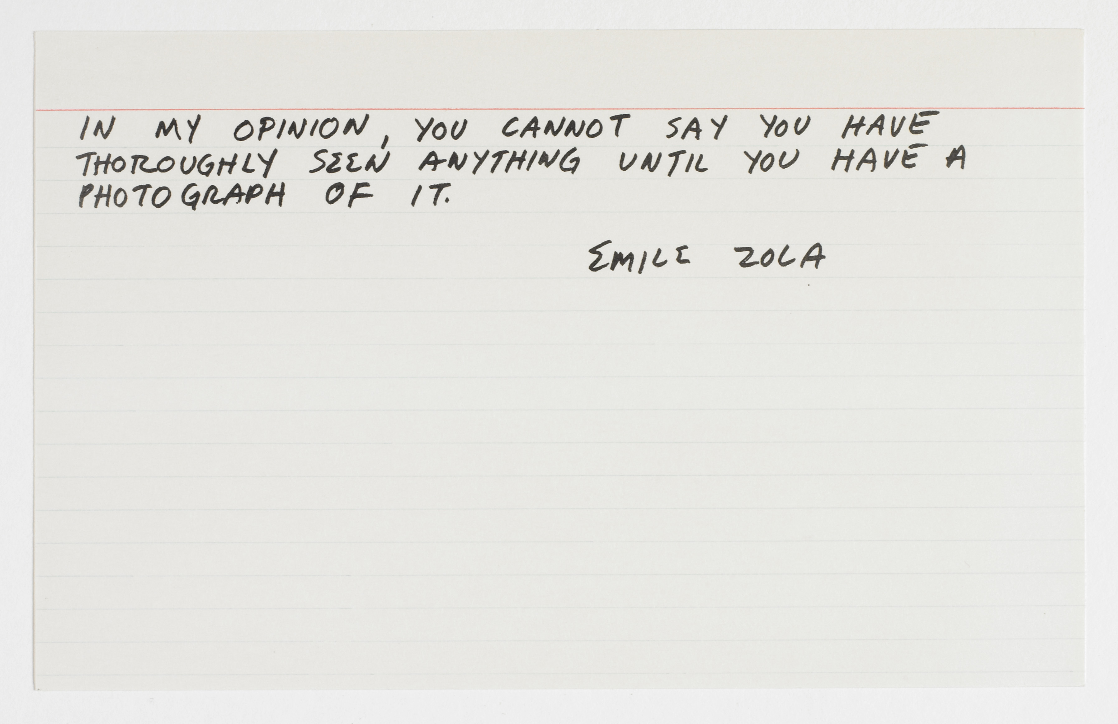
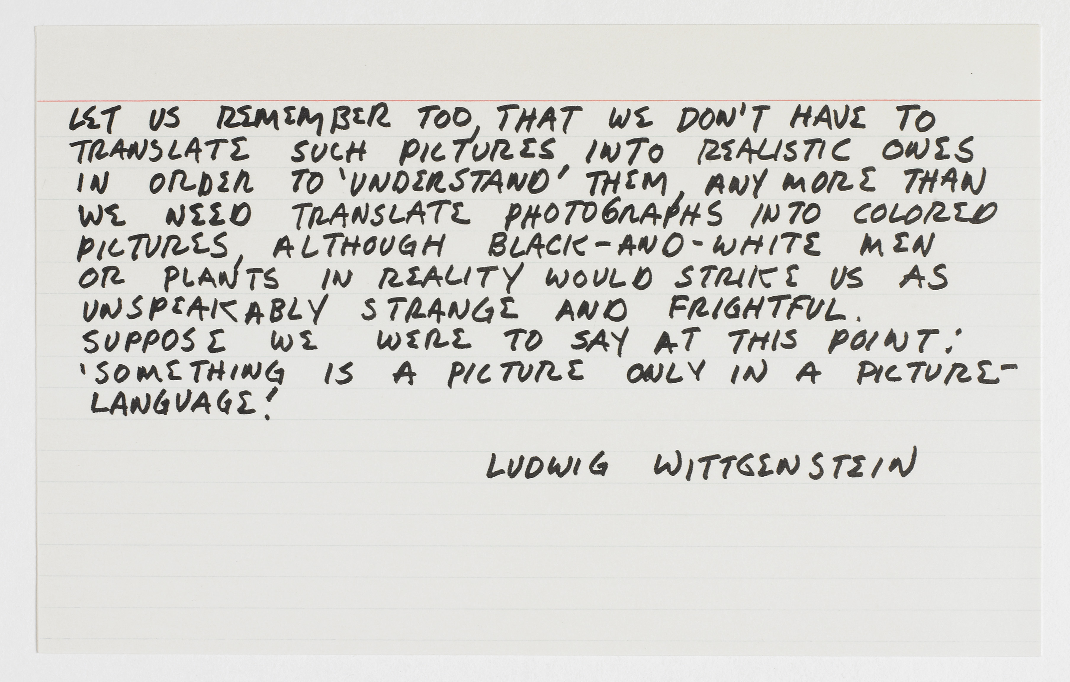
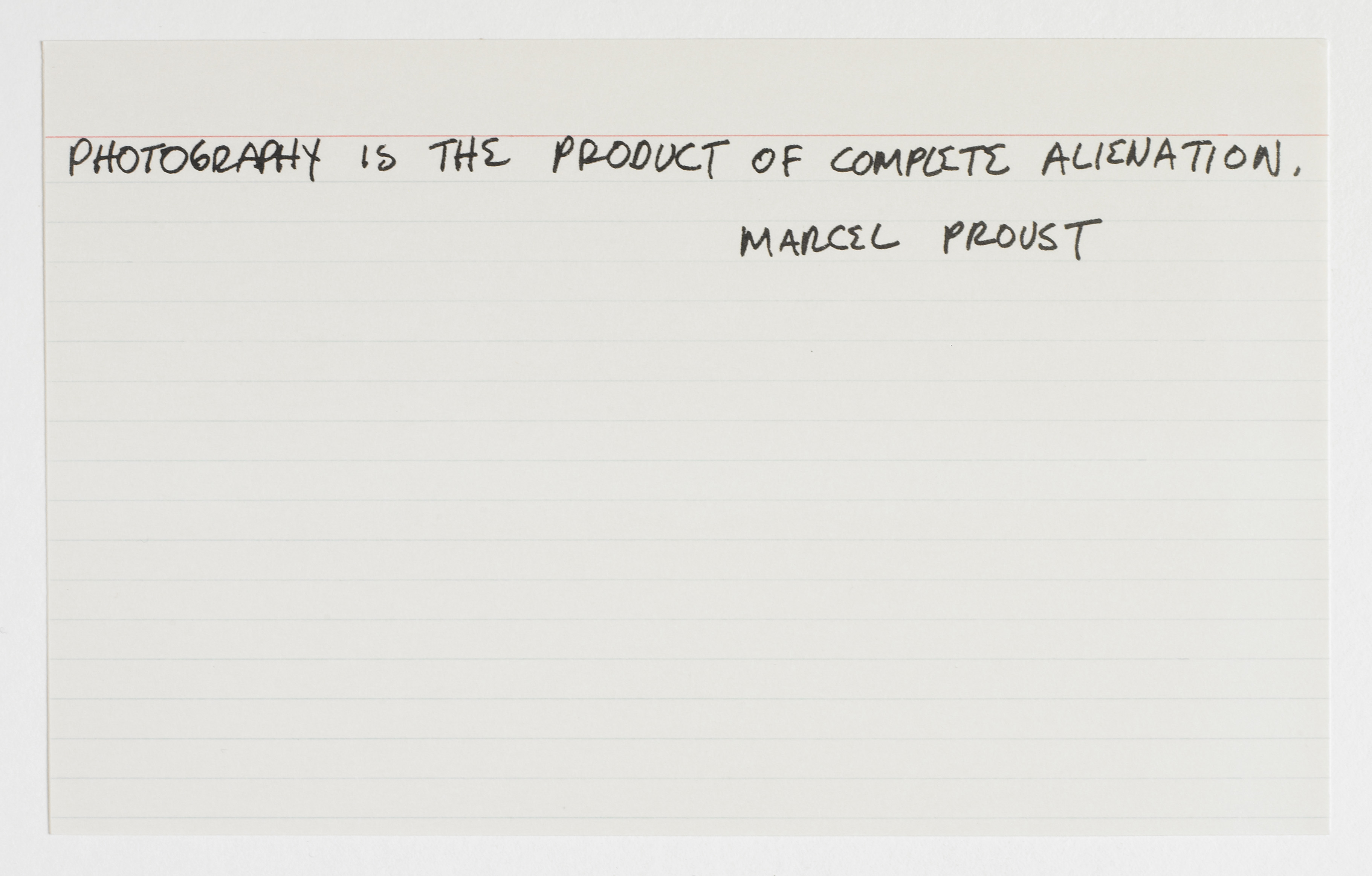
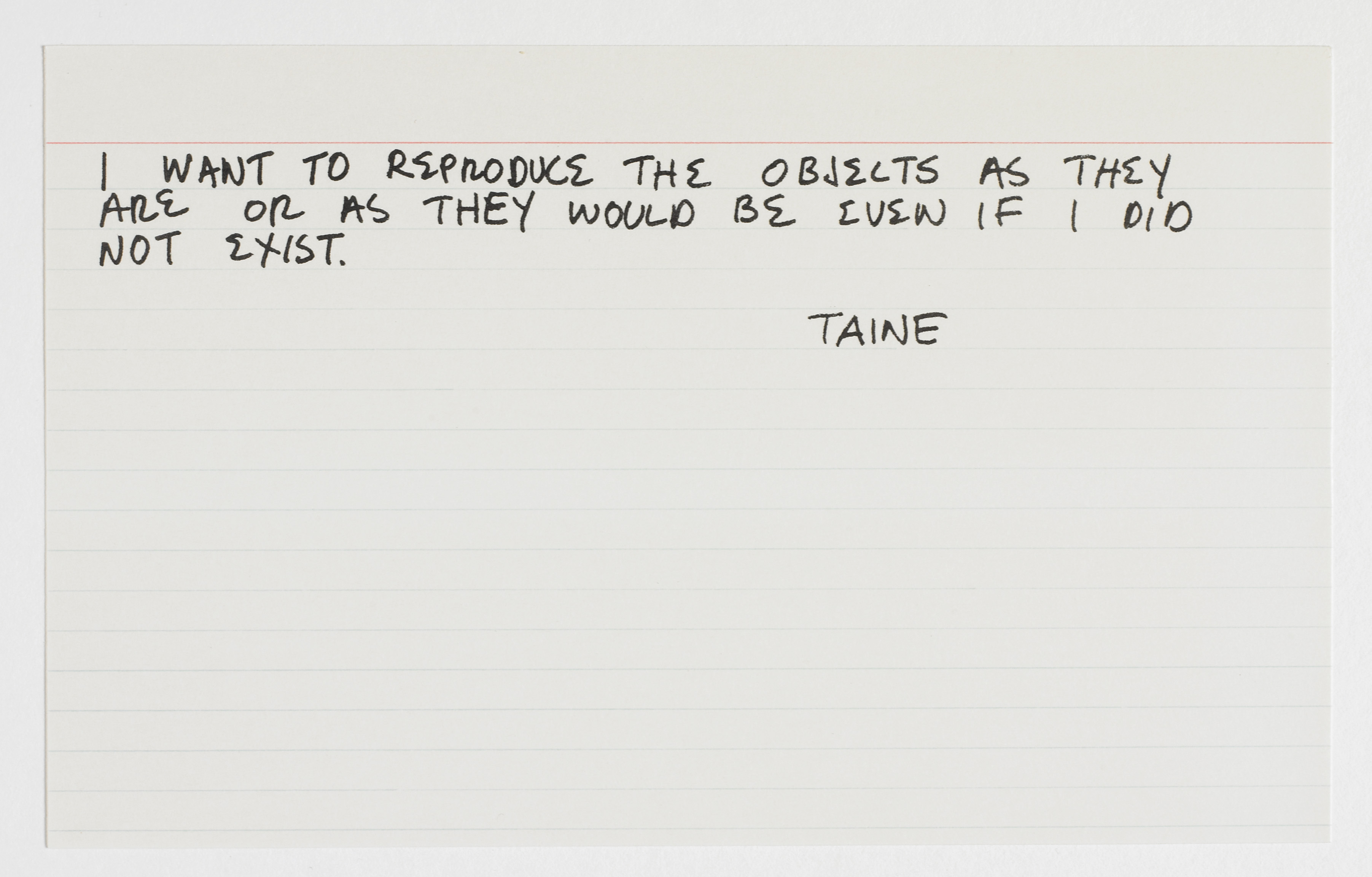
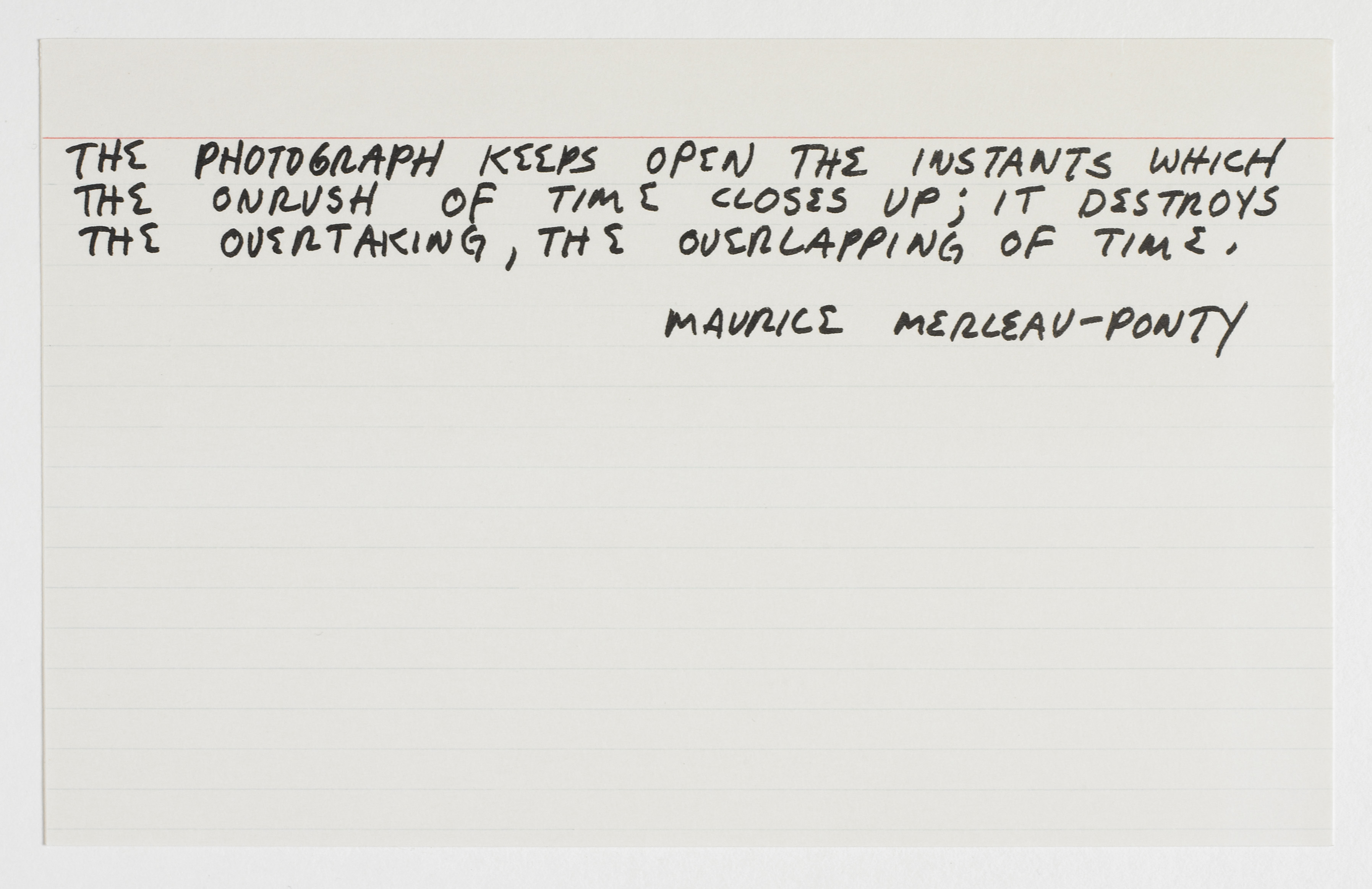
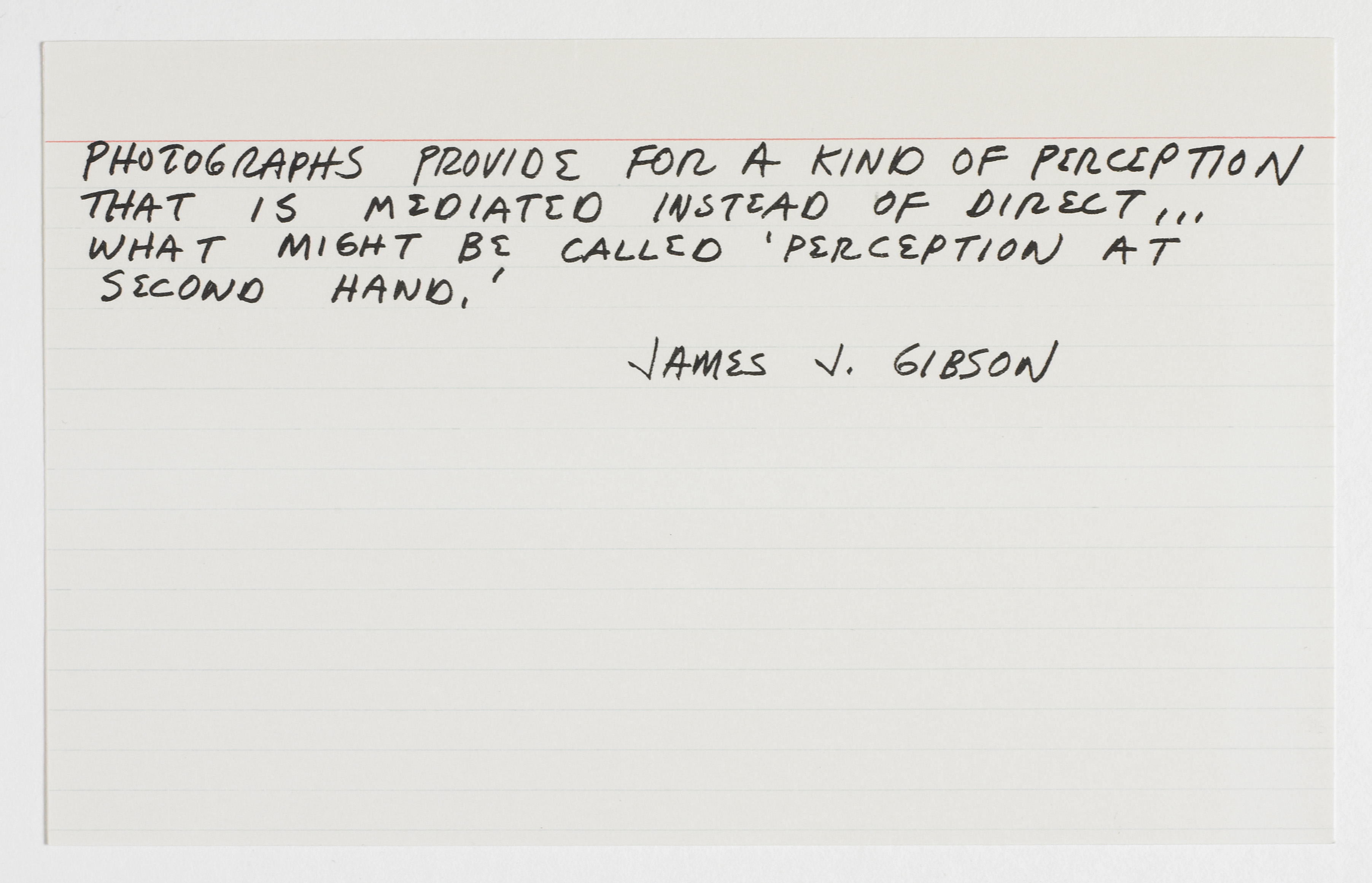
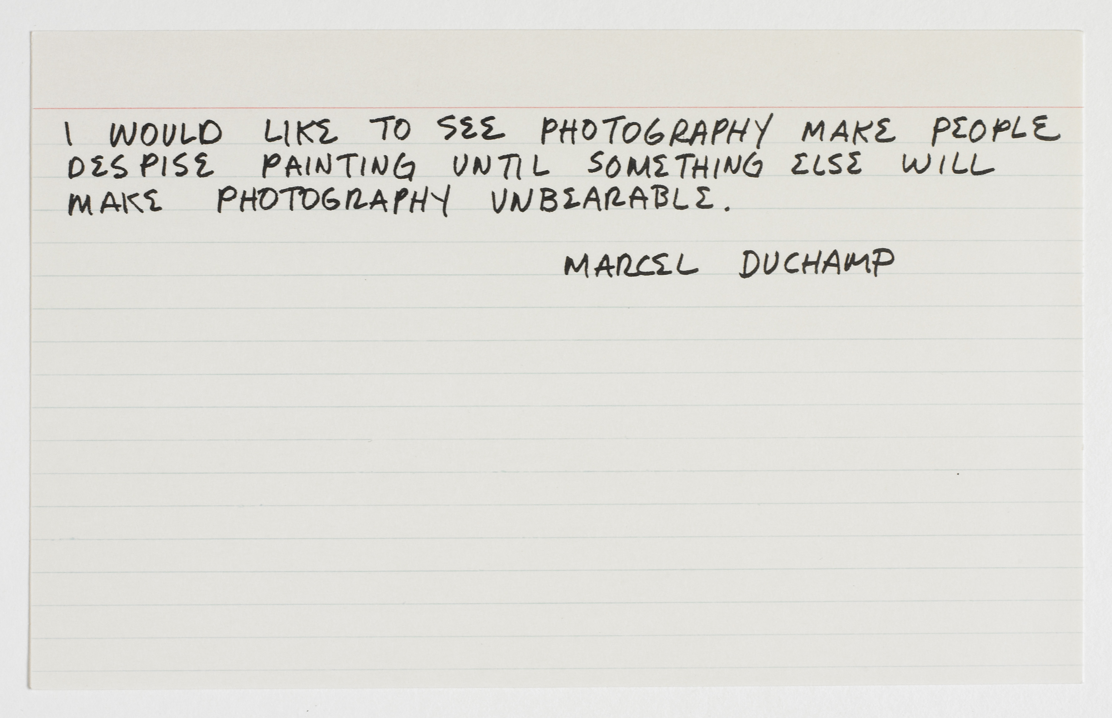
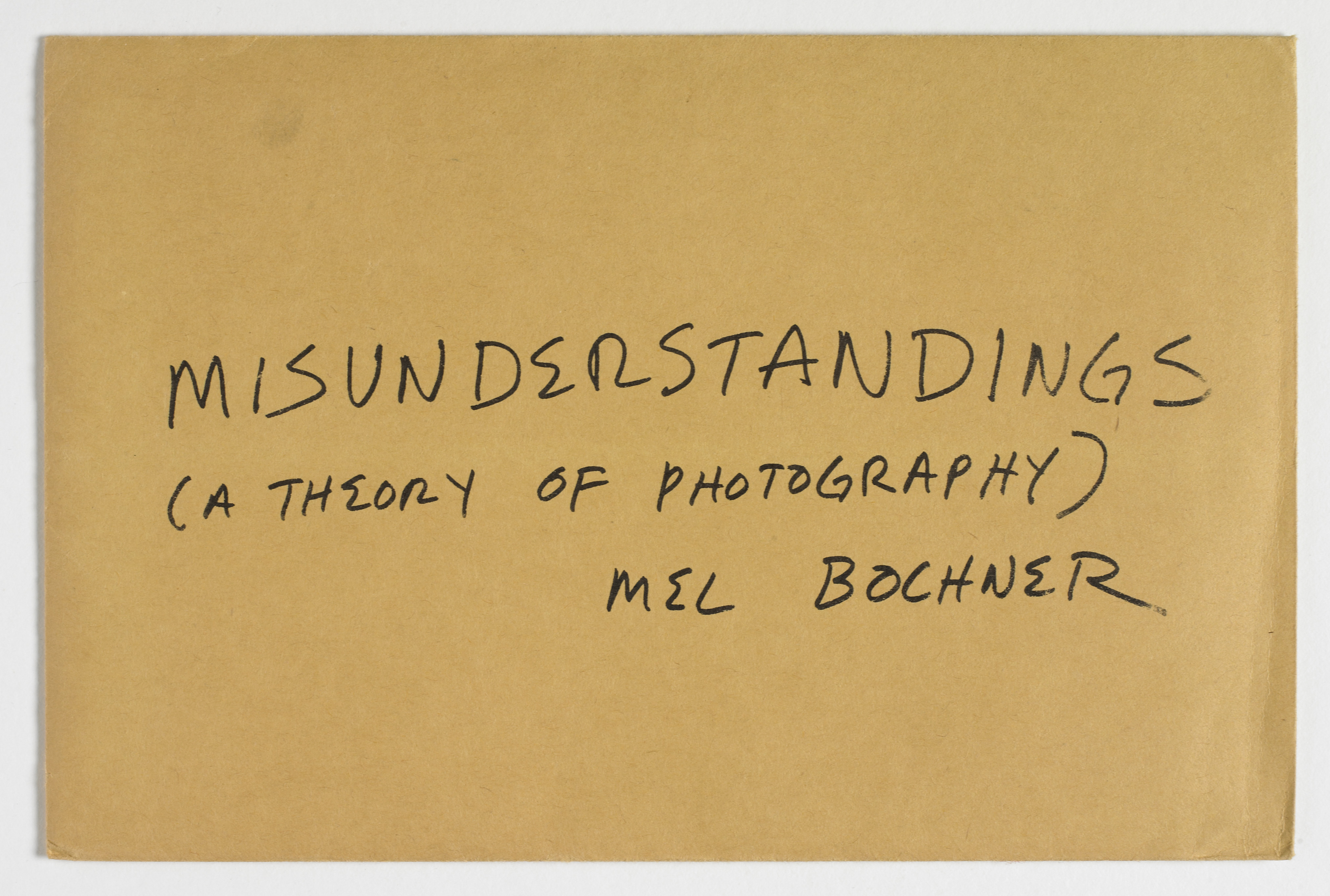
Bochner’s various “Theory of…” series have also examined painting, photography, and sculpture; Misunderstandings (A Theory of Photography) (1967-1970) and Primer (Twenty-One Demonstrations from a Theory of Sculpture [1969-1972] (1995) are additionally included here. Speaking about the series framework, Bochner has stated, “The ‘art’ is the demonstration of a network of supports that forms the system (the knowledge of it, in it).”3 Art, in other words, is achieved by exposing the rules or assumptions governing a given system–or, in this case, a given medium. Misunderstandings provides an important example of the artist’s desire to expose those subjective truths commonly accepted as objective principles; it also serves as a key reference to Bochner’s brief dalliance with photography–what he calls “the enemy of all of the values of late modernism.”4 A set of photo offset prints on ruled note cards kept in a manila envelope, Misunderstandings collects nine quotations about photography, each transcribed in Bochner’s handwriting and sourced from recognizable figures across a sampling of fields and time periods. The one exception is a card that features a negative image of the artist’s hand and forearm, which Bochner had previously used in his measurement series. Six of the quotations included are real passages from literature available on photography – which Bochner found largely unsatisfactory in answering the many questions posed by this complex medium – and three are fake quotes invented by the artist. Bochner describes this “act of forgery” as a way of automatically raising suspicions about the veracity of any of the statements. In doing so, he draws a parallel analogy between the falsehood of words and the falsehood of photography–the inherent illusion of pictorial space that a photographic picture represents. Misunderstandings thus attacks the Minimal mantra posed by Frank Stella – “what you see is what you see” – by drawing attention to the constructs of the system that produces the picture.
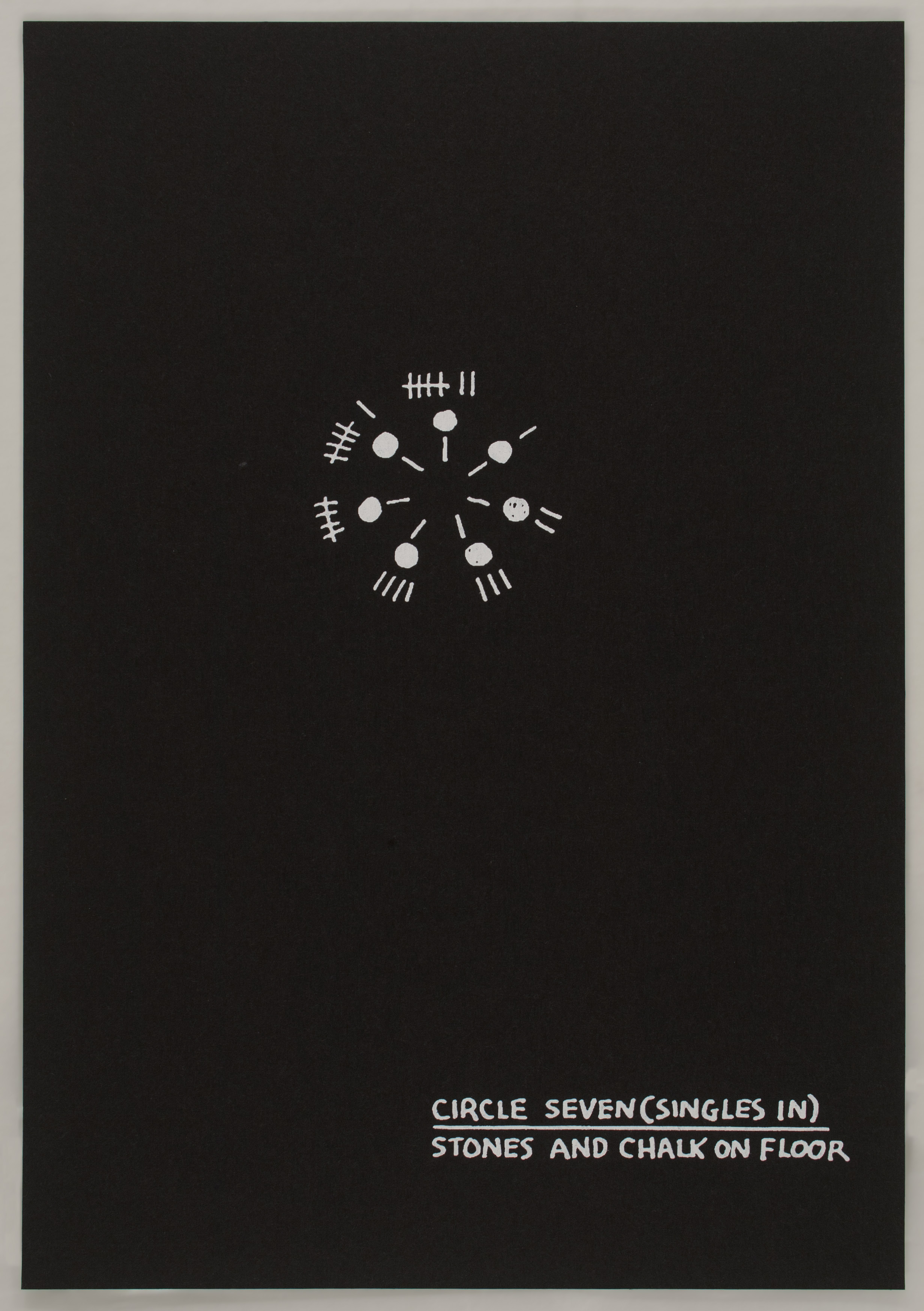
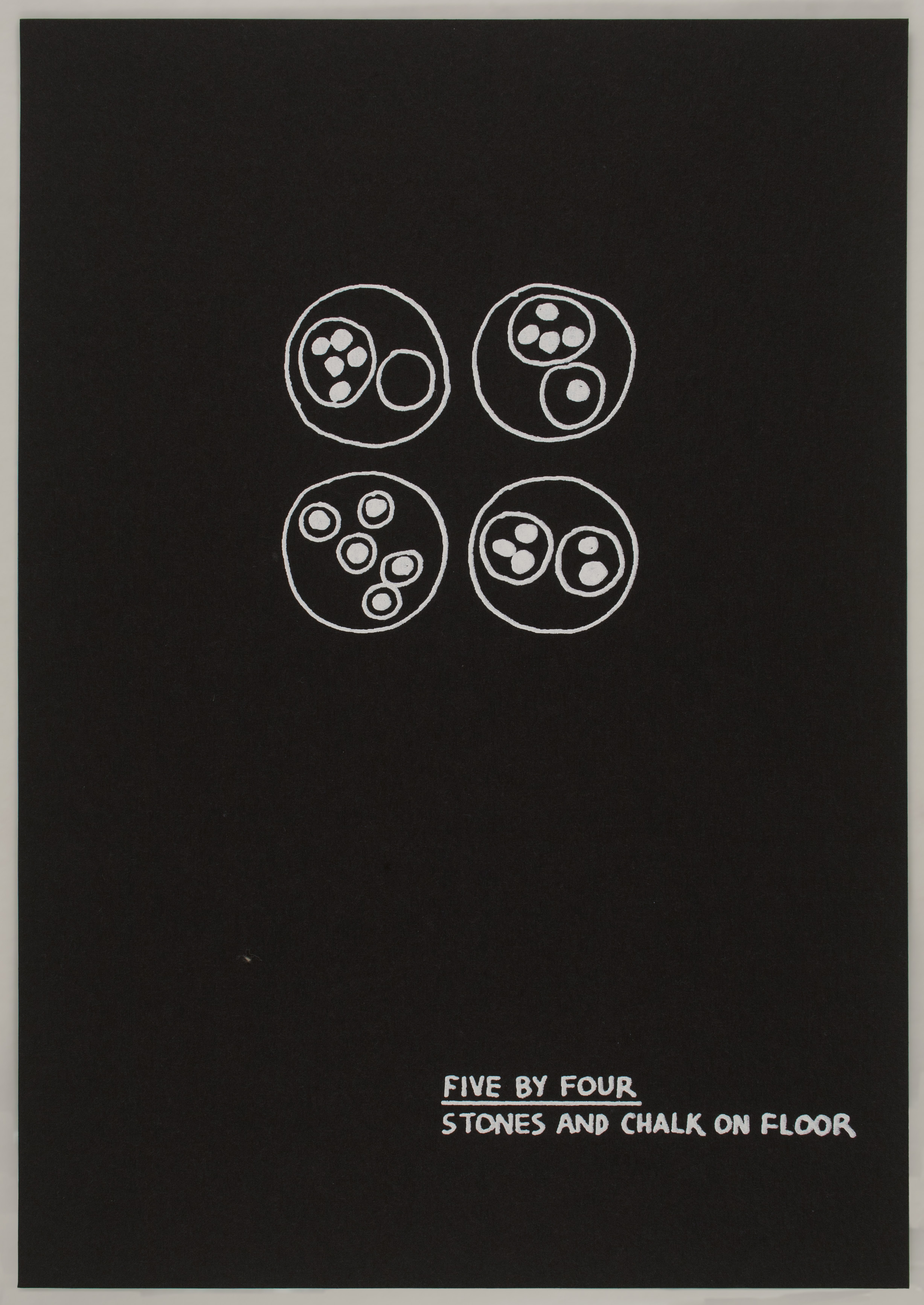
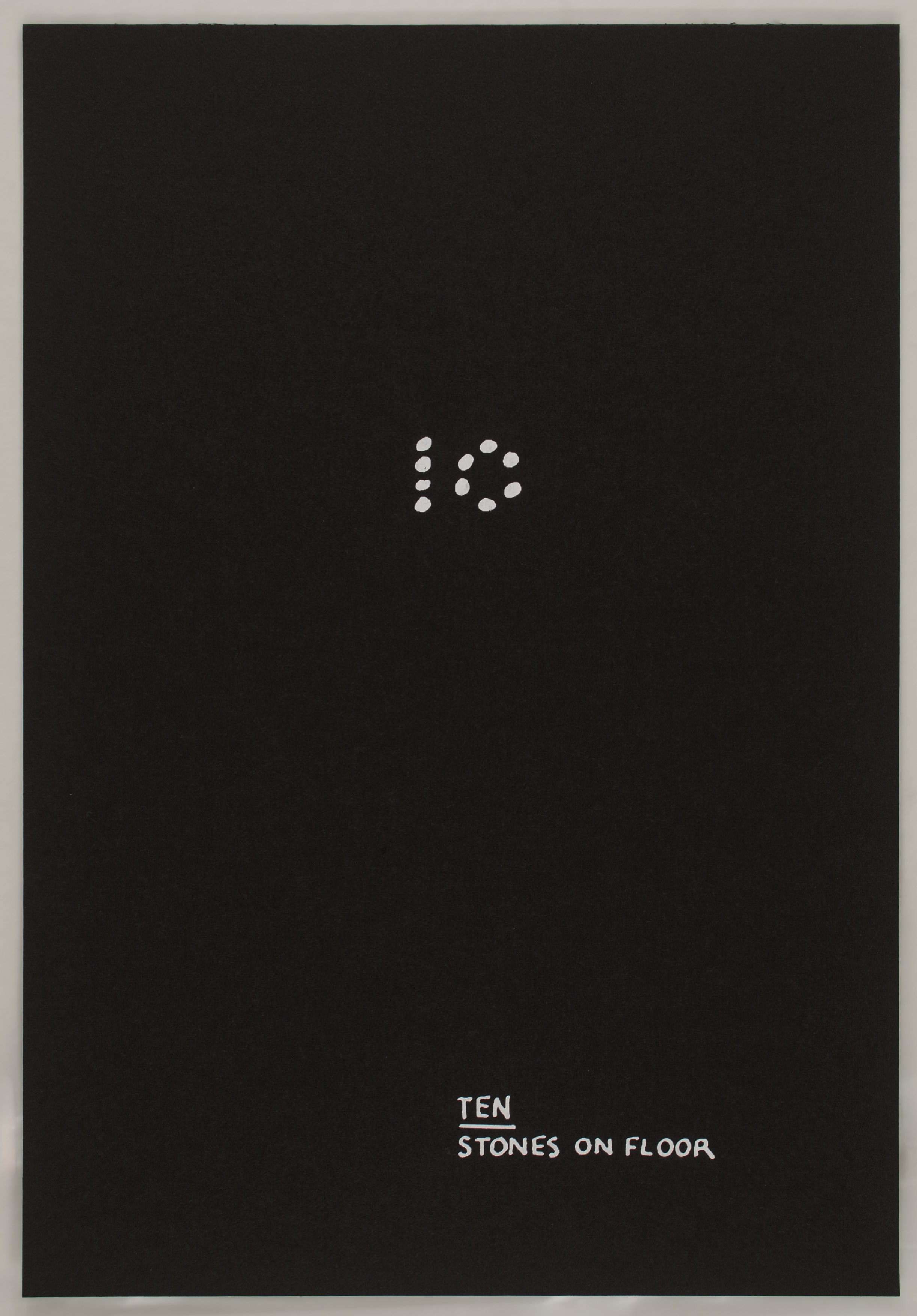
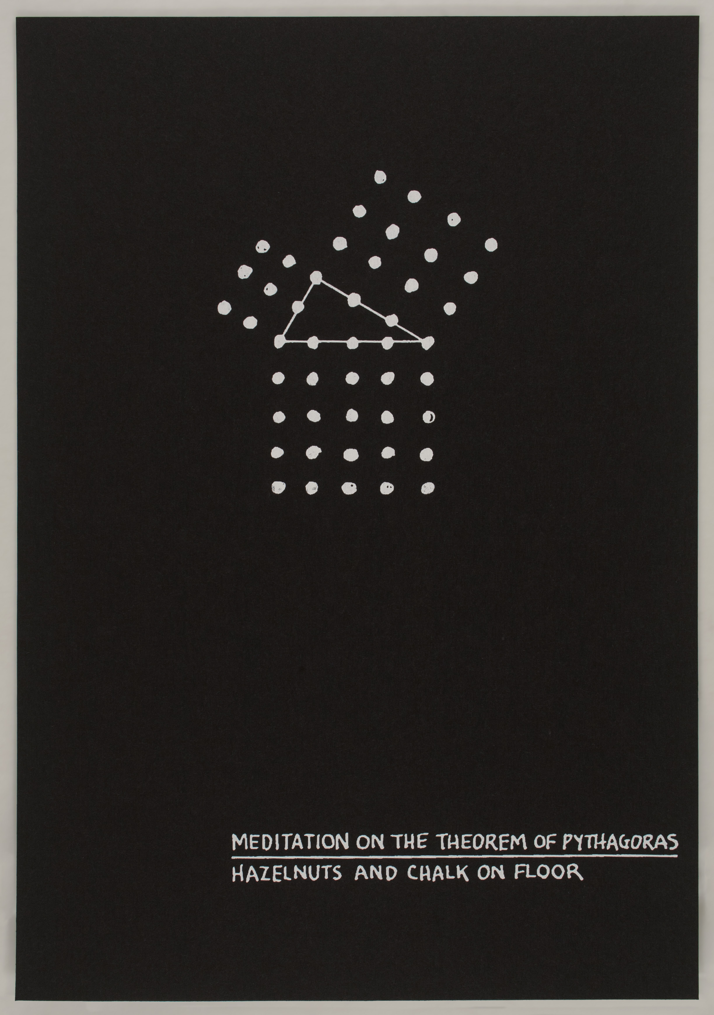
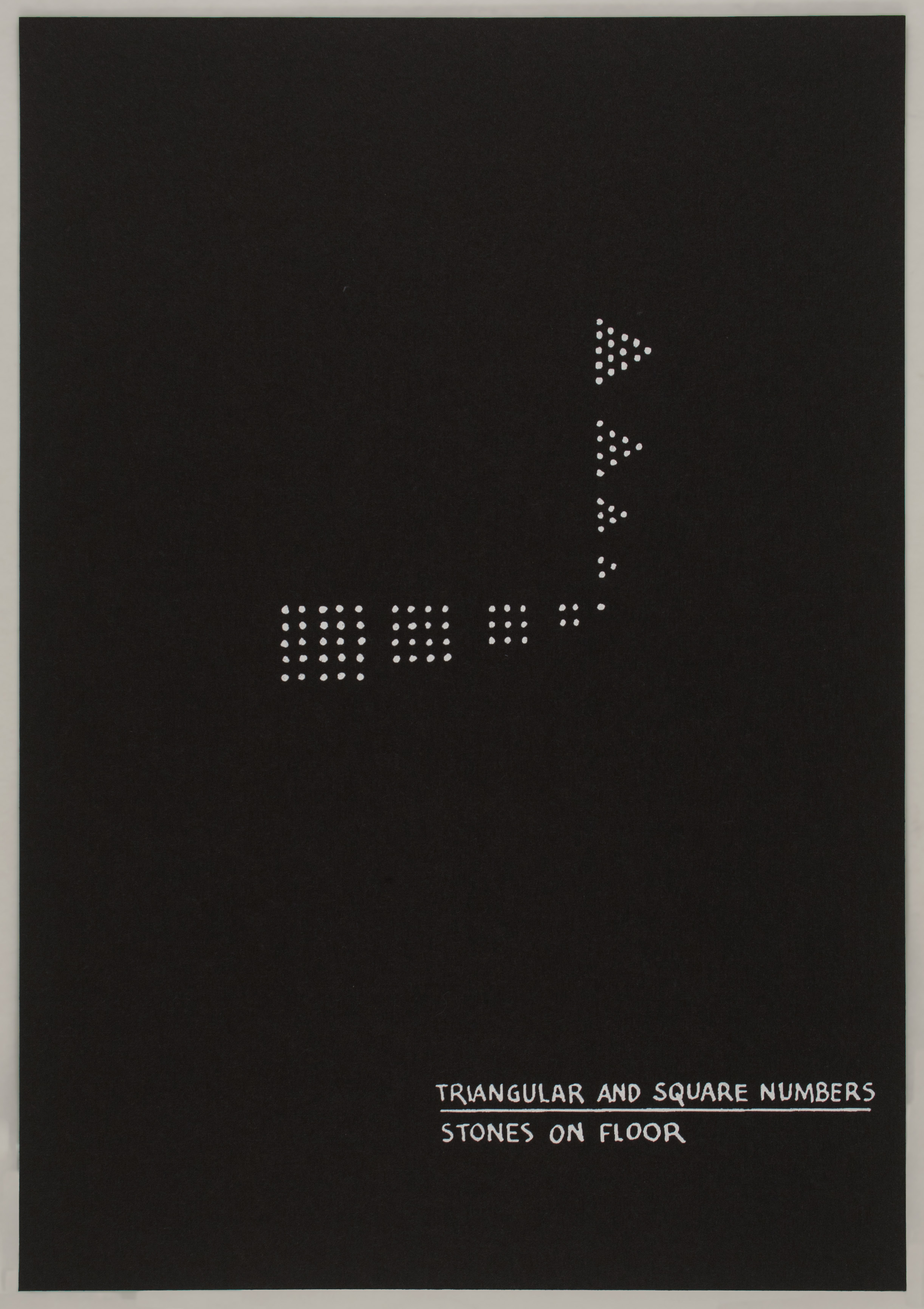
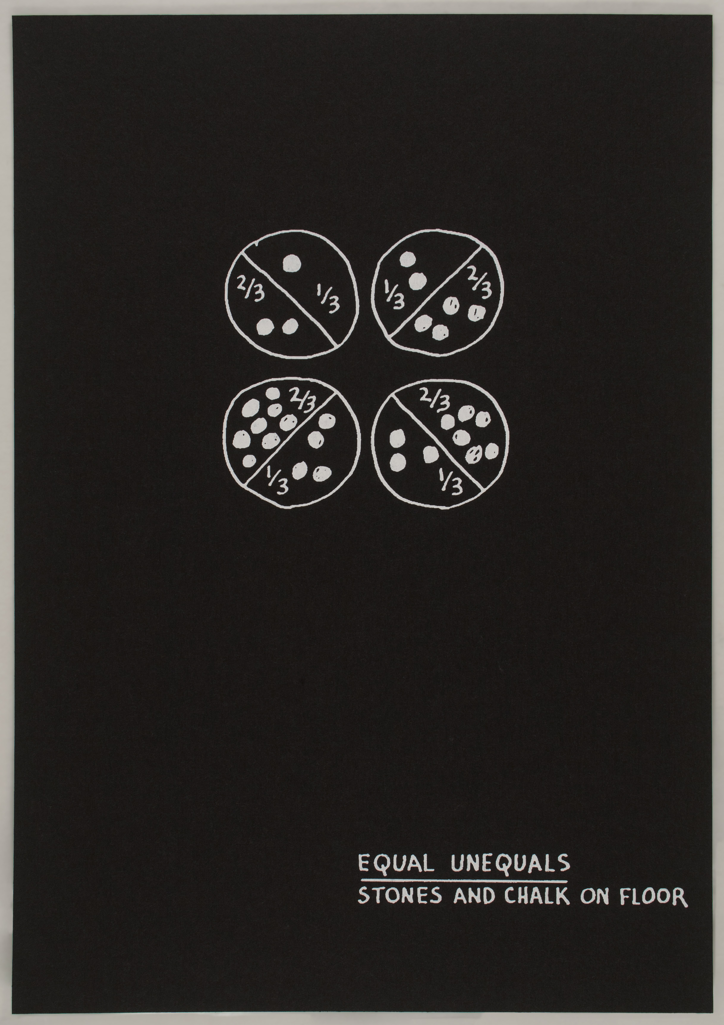
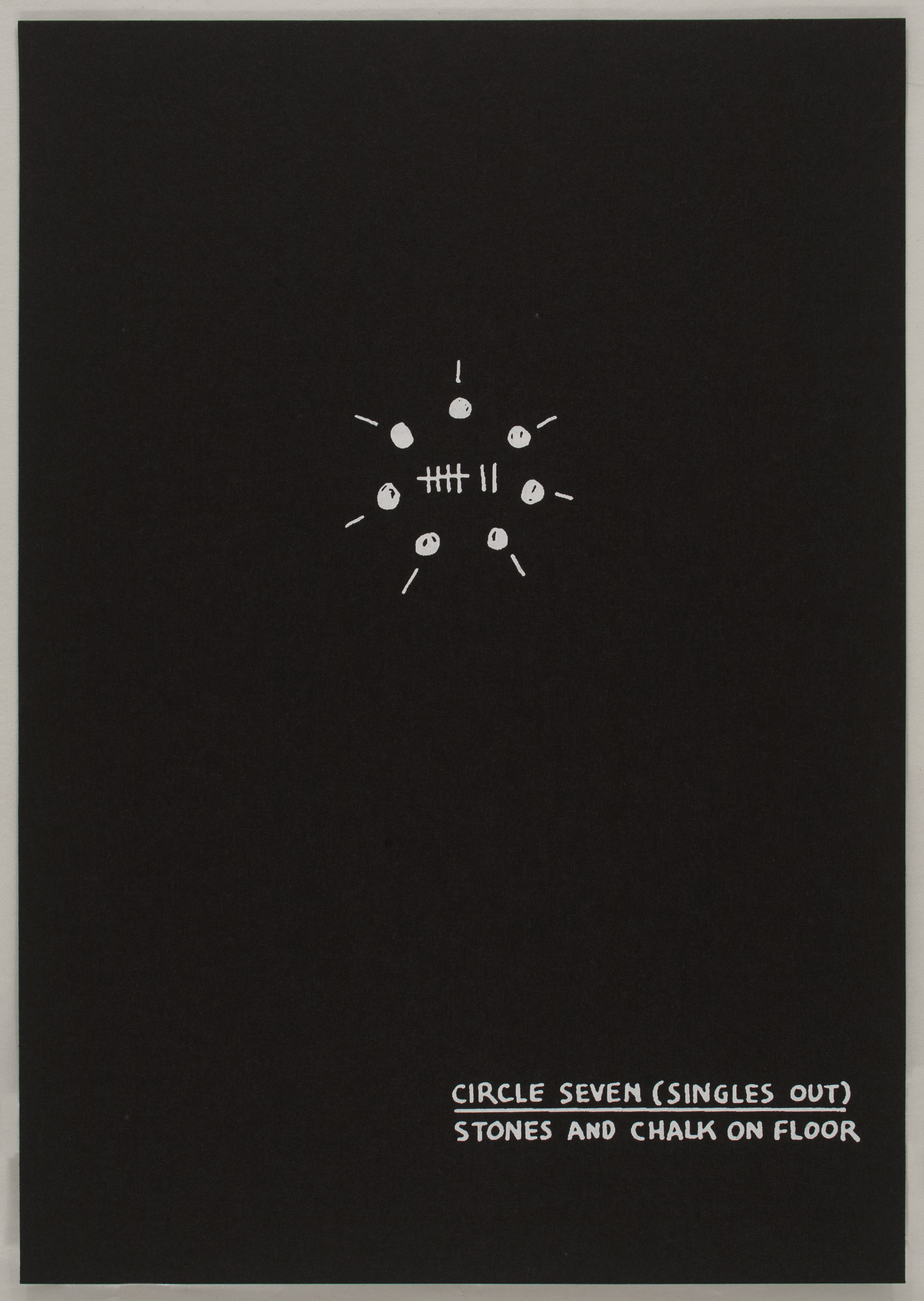
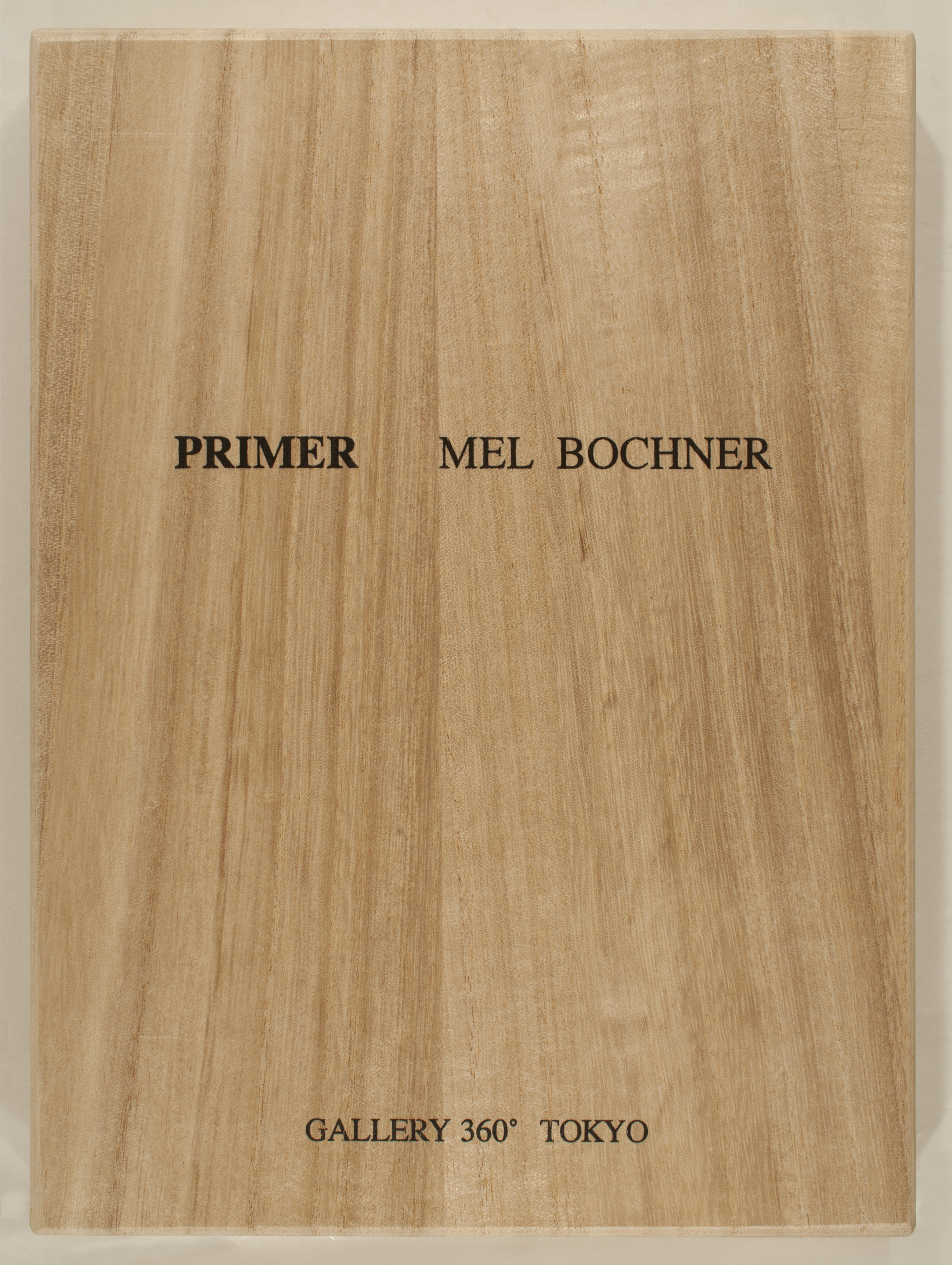
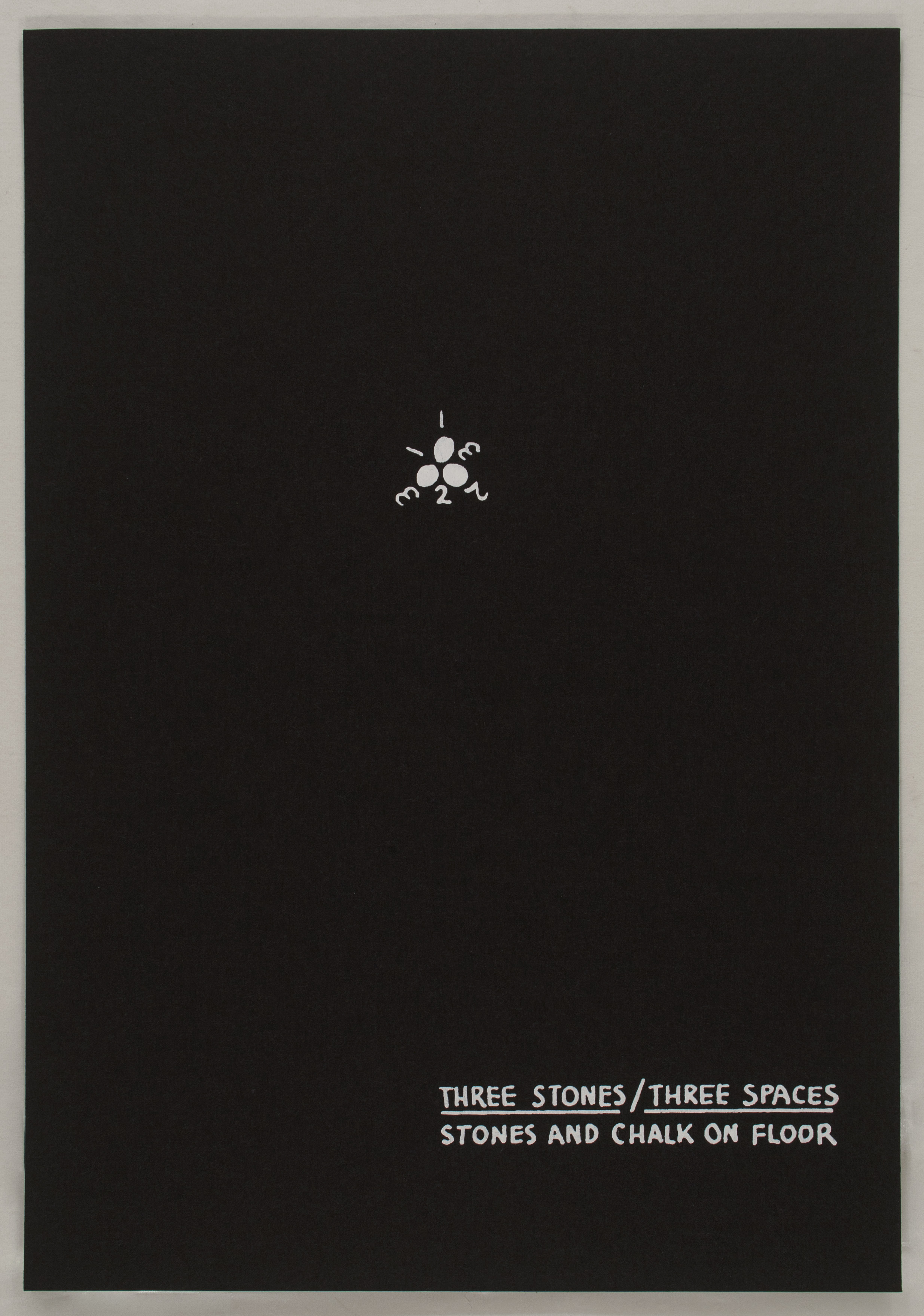
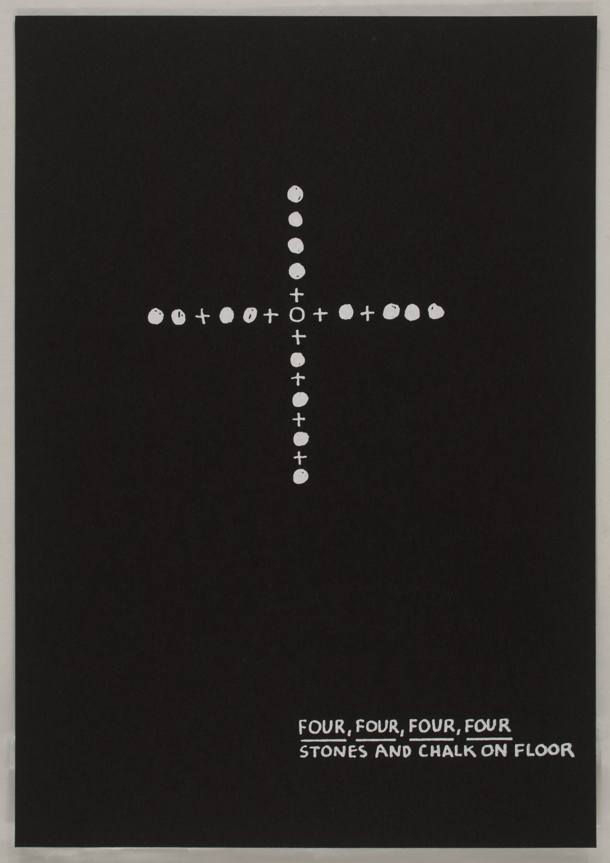
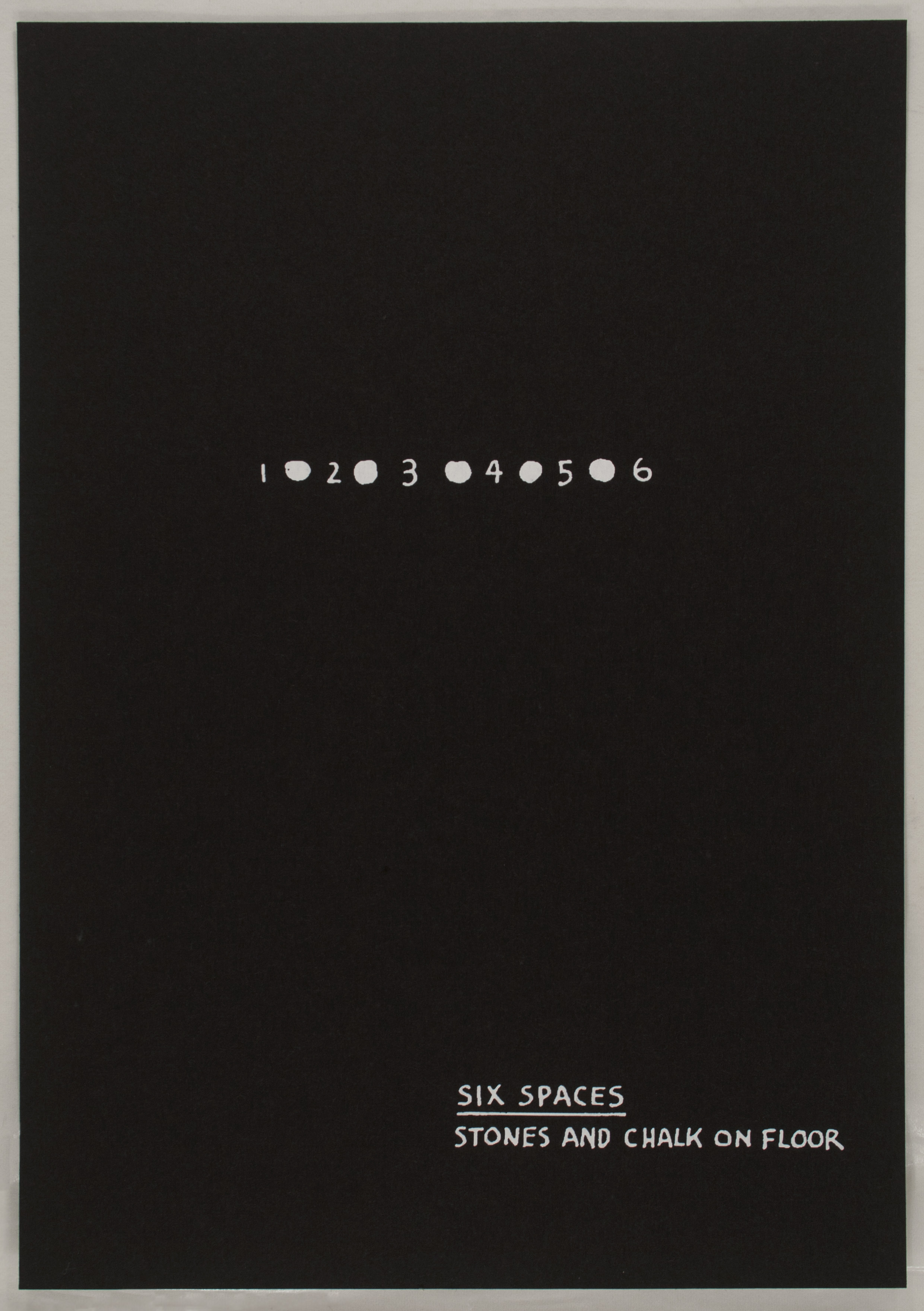
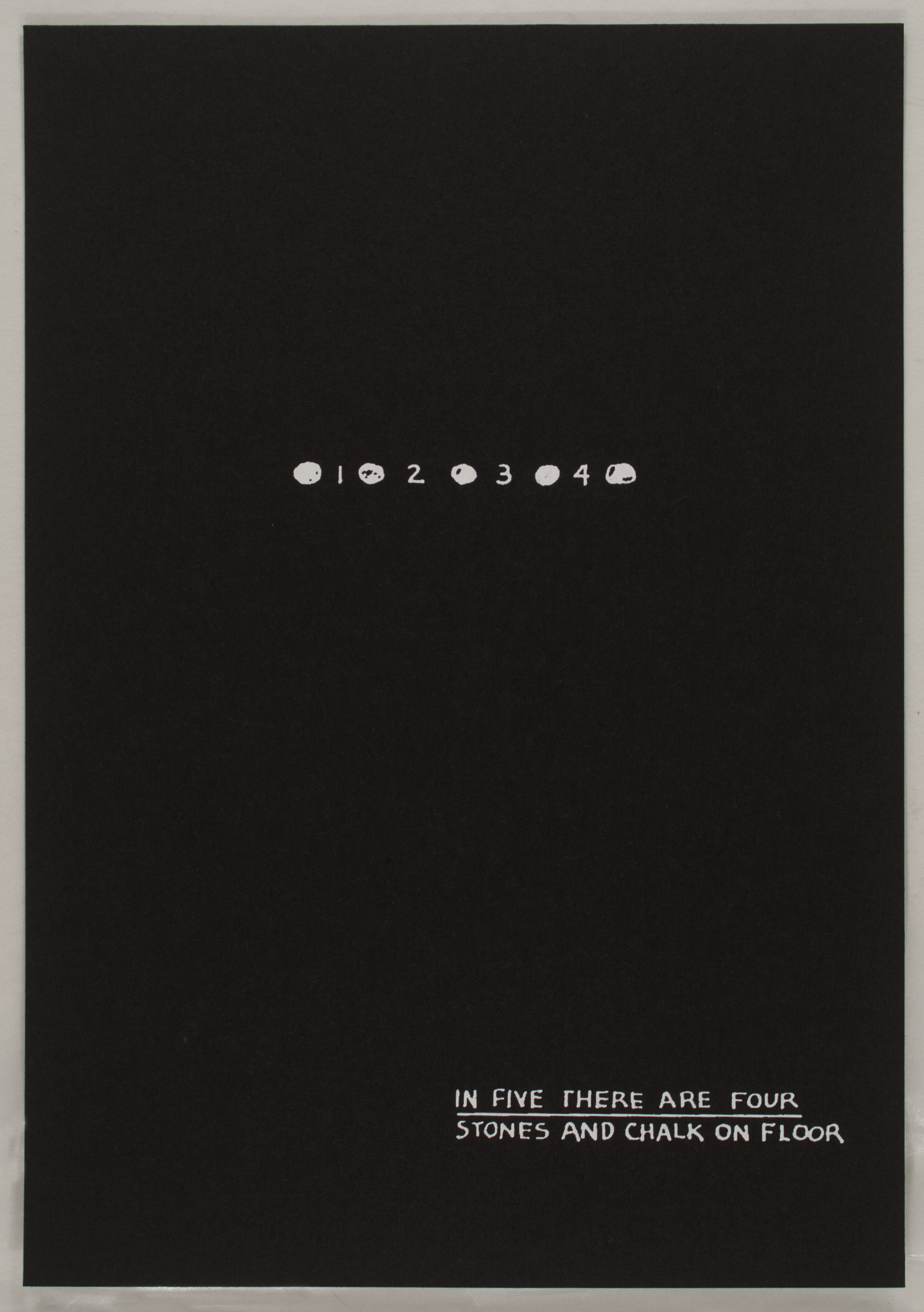
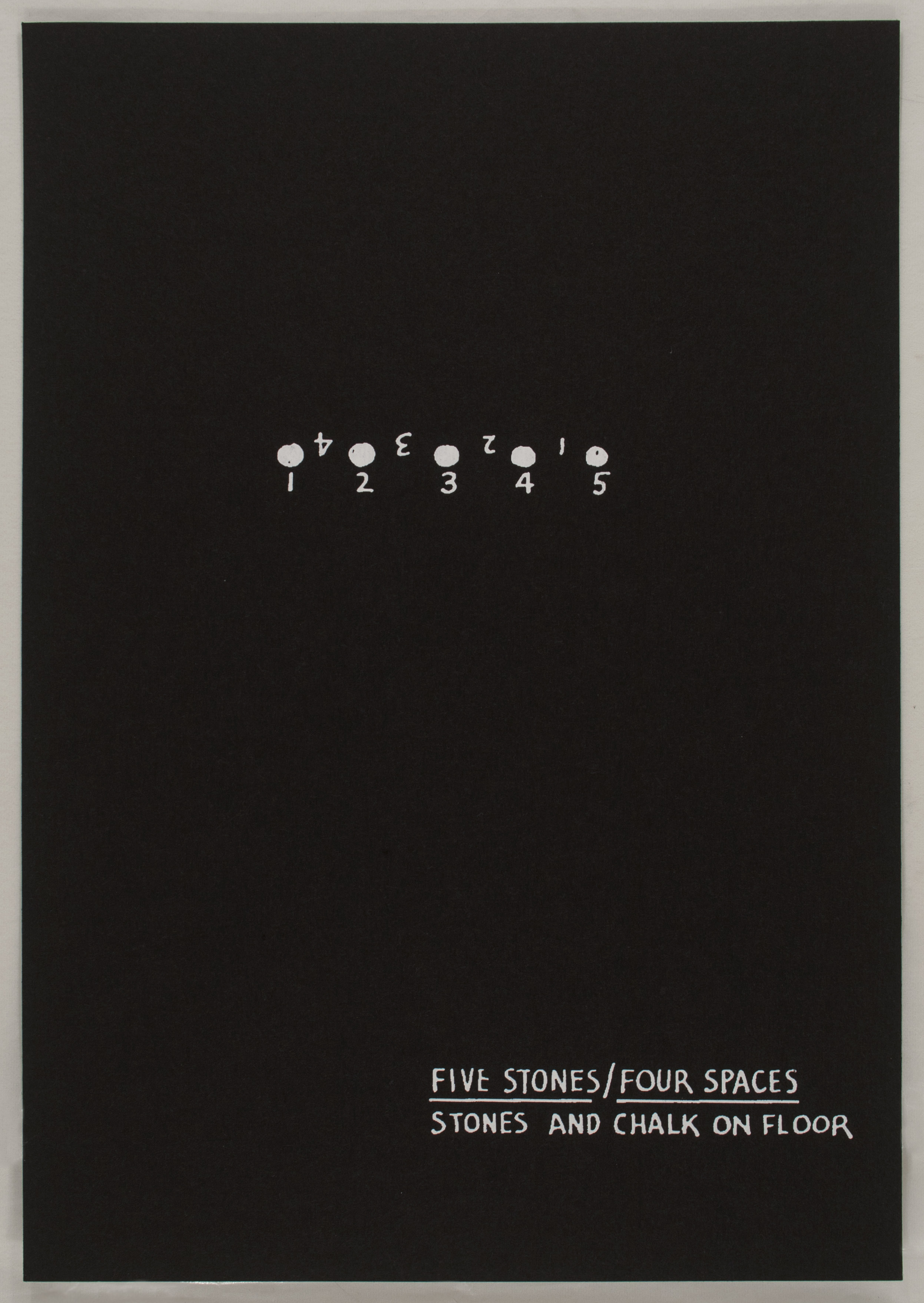
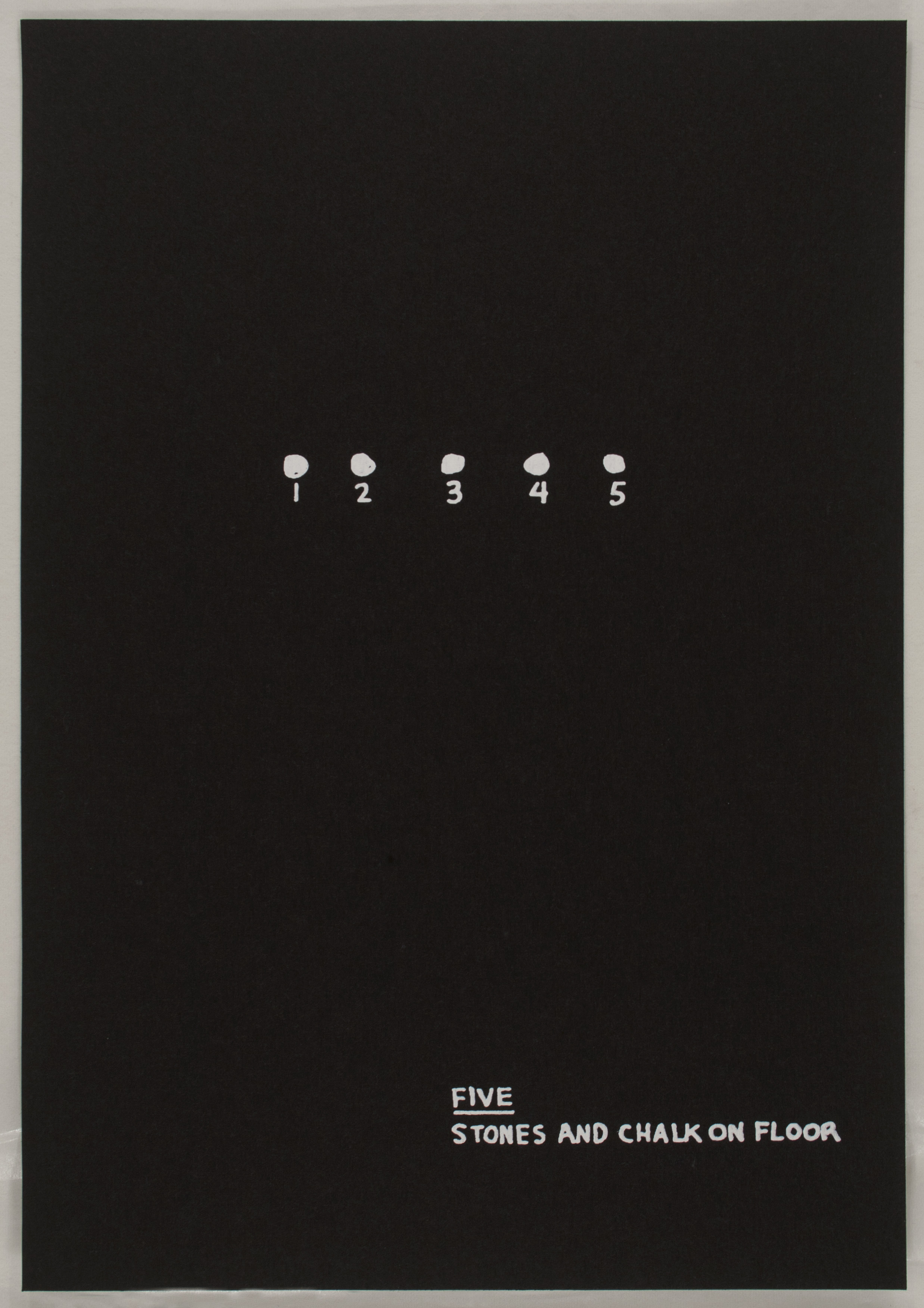
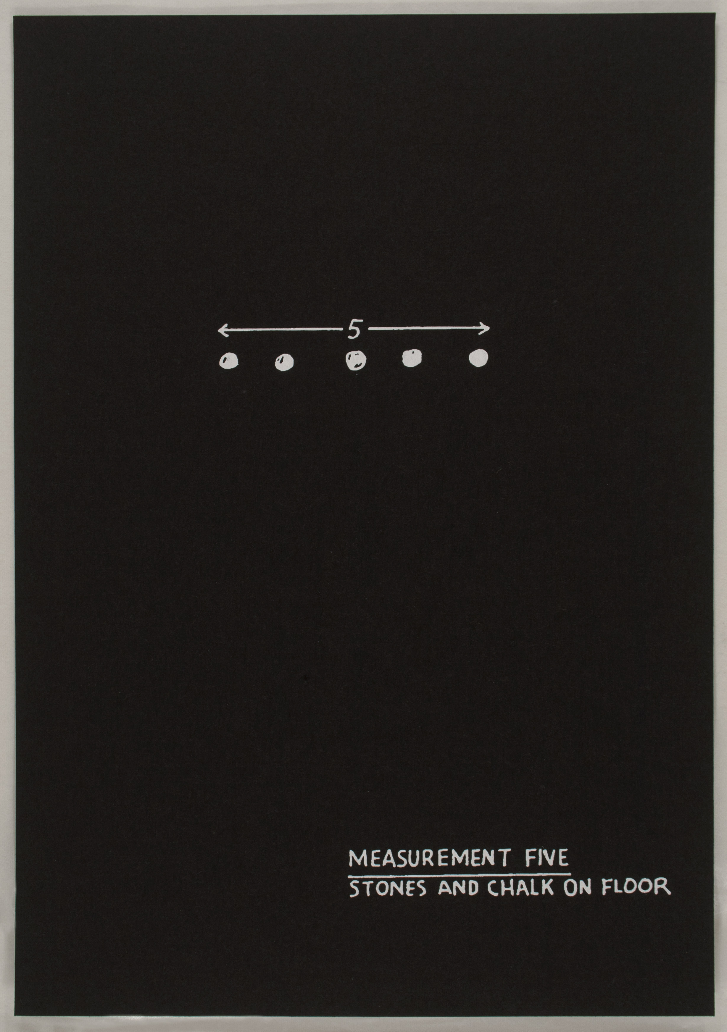
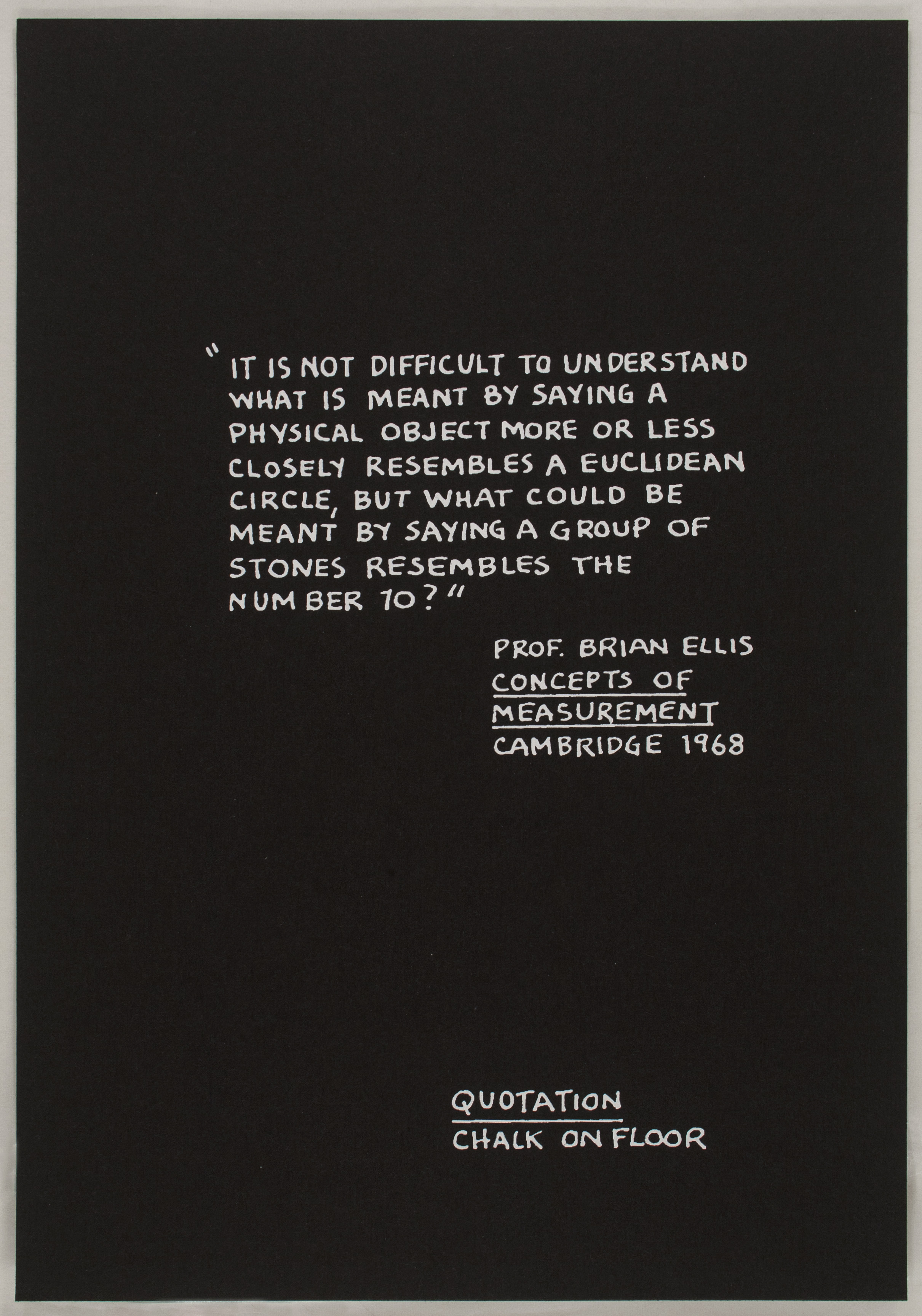
Primer also employs a compendium of images and texts engaged in the complication of ideas concerning medium specificity. Produced in 1995, this portfolio of 21 black-and-white screenprints documents a series of installations executed between 1969 and 1972, which were based in turn upon earlier drawings that comprised Bochner’s Theory of Sculpture series. Accordingly, each screenprint illustrates a previously realized arrangement of chalk and stone. The printed format here introduces a third element–information regarding the title and medium of the work featured on each sheet–which does not appear in the original installations. For example, in the print series, Plane marks three equidistant units, numbered 1, 2, and 3, and notes the use of hazelnuts on floor as opposed to stones. Primer exists both as a work in its own right and as a document of a previous artwork.
Approached in 1972 by an Italian publisher, who proposed creating a book from these early drawings, Bochner printed a few offset lithograph facsimiles as proof copies. The project was eventually completed for Flash Art Edizioni in 1973, but an irksome turn of events prevented it from being published. Bochner’s original idea drew inspiration from the Italian word abecedario, or ‘primer,’ an elementary tool used to teach the letters of the alphabet. Primer transfers the notion of basic education from the building units of language to the fundamental premises of sculpture explored in Theory of Sculpture. When in 1995 Bochner showed an old proof copy of Primer to Gallery 360 in Tokyo, his audience quickly offered to produce the work as a series of screenprints, publishing a limited edition of fifty copies, including the one currently on view.
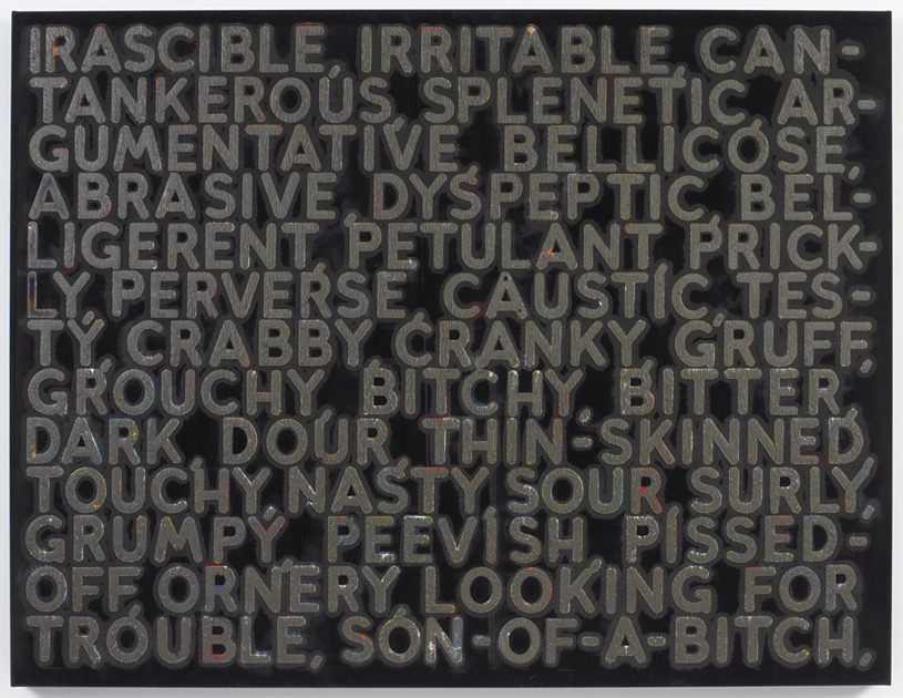
Primer is not the only work on view that engages with elements of a previous project. Indeed, Bochner has often returned to completed work in order to introduce a new component, such as color, or to examine the ways in which the meaning and context of language used in a particular work have changed over time. Consider the large monoprint Irascible (2006), produced by hydraulic press at Two Palms in New York, which features subtly colored derivatives of the title word spotlighted against a black velvet surface. A comma separates each synonym, effectively differentiating space on the picture plane as much as it imposes natural intervals in a reading of the text. These permutations range from the mild (cantankerous) to the acerbic (son-of-a-bitch). The idea of mining the thesaurus first occurred to Bochner in 1966 as a way of exploring portraiture without recourse to modes of traditional figuration. “The thesaurus represented another source of objectified language, a warehouse for words. I began by selecting a ‘key’ word to represent the portrait subject,” he recalls.5 Bochner’s subjects at that time included canonical artists like Eva Hesse and Robert Smithson. A 1995 retrospective of his artwork at the Yale University Art Gallery reanimated his interest in the thesaurus, but it was not until Bochner stumbled upon a 2002 edition of Roget’s Thesaurus that he felt compelled to analyze word relationships and their contingencies within the contemporary milieu. He was taken aback at the conspicuous obscenities (for example, the adjective bitchy) which were present in the new edition but presumably impermissible in 1966.6 As a result, the attending text in Irascible is imbued with meaning vis-à-vis the morphological shifting of language over time–a subtle response to the instability of cultural norms as manifested in the history of Roget’s publications. To underscore this temporal complexity, Bochner ends the last row of words in each contemporary thesaurus work with a comma, referencing the potentially infinite distortions of language to come.
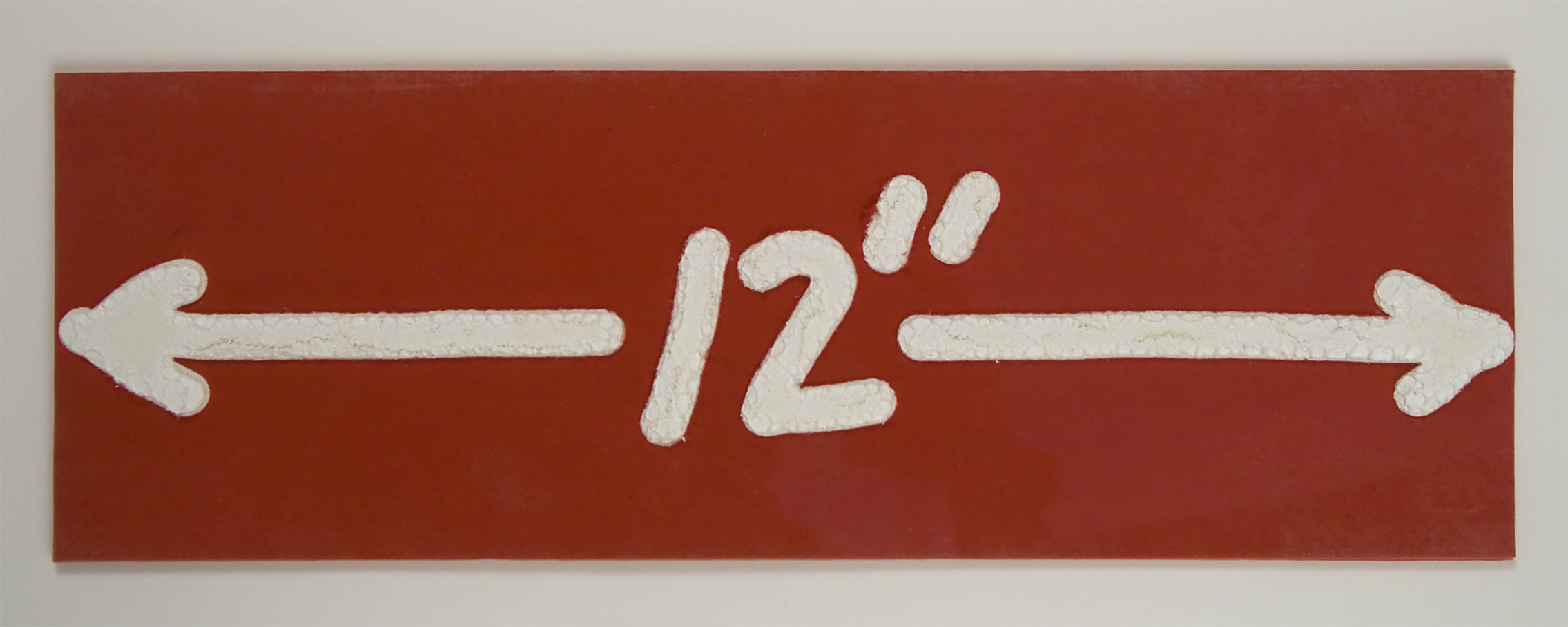
Two much later works shown in this group, both wood engravings with hand painting from 1997, complement Bochner’s early ideas about measurement and boundaries in both physical and conceptual spaces. By focusing more closely upon the literal relationship between text and meaning, 12” (1997) is exactly as the title suggests: a print measuring twelve inches wide, bearing an image of the number 12 followed by the symbol for inches, positioned squarely between two arrows extending in opposite horizontal directions. The embossed text takes on the quality of heavy white impasto, in stark contrast with the bright red surface upon which it sits. In 2 (12” x 12”), this image is repeated on eight identically sized sheets, each of which is then mounted to the backboard to create in the collective two large squares, side by side. Here, Bochner introduces a second color – or lack thereof – in the right square by substituting the red surface with black.
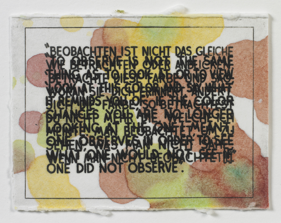
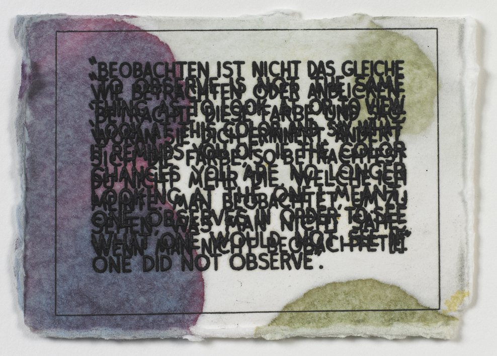
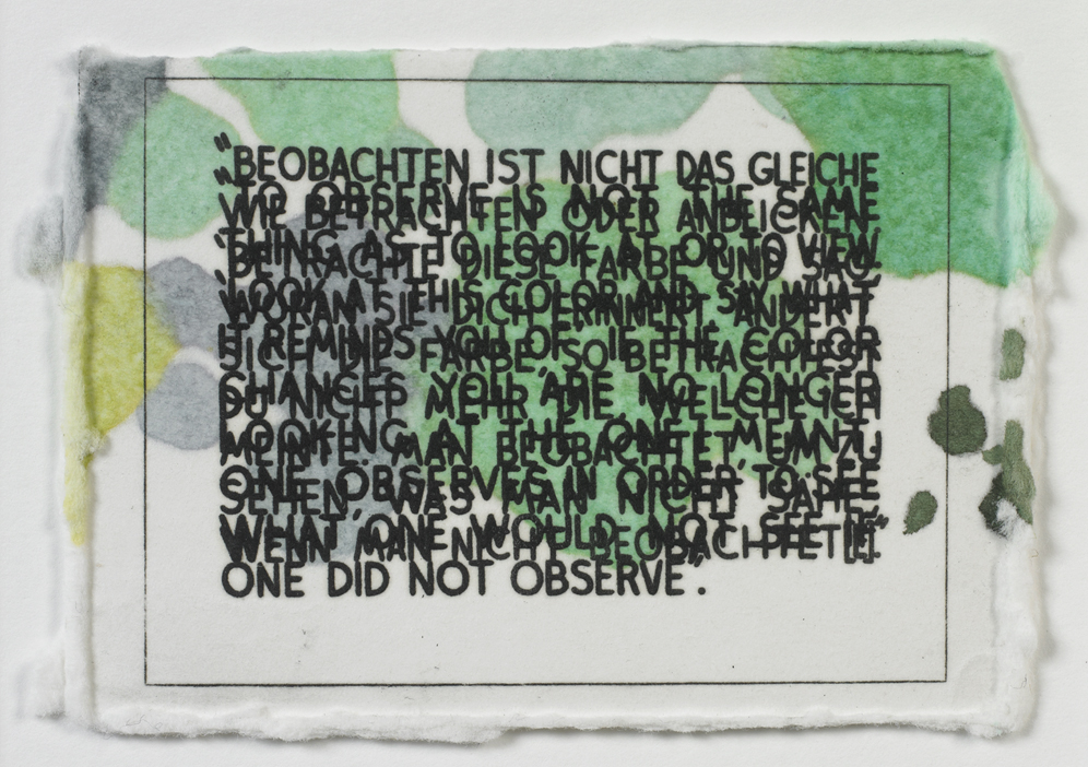
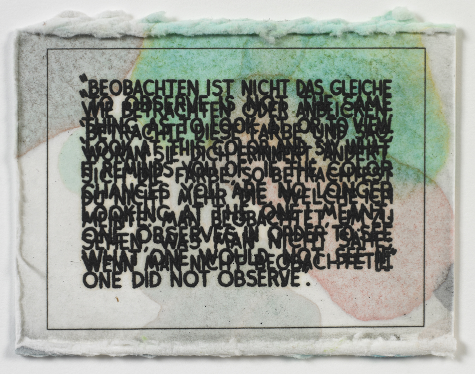
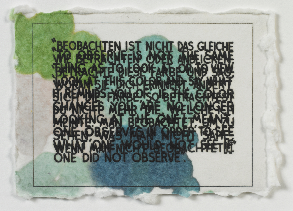
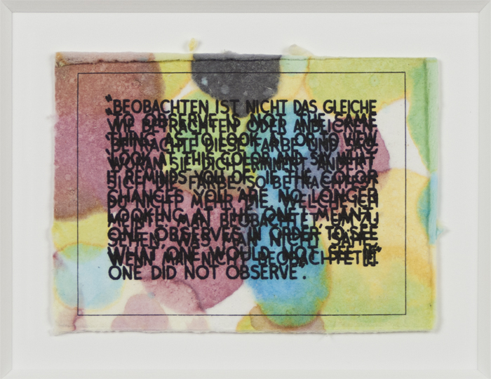
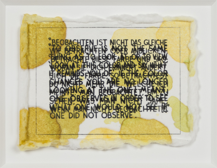
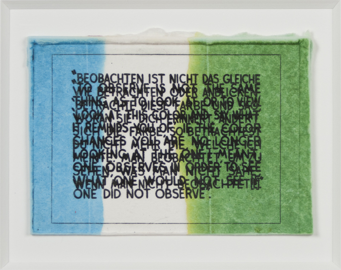
Color is the primary subject matter of another recent series by Bochner, titled If The Color Changes…, from which nine monotypes completed in 2003 are on display in this exhibition. The first iteration of this work, a large oil and acrylic painting from 1997 measuring 36 by 48 inches, has been diminished into comparably small printed works measuring only 2 ½ by 3 ½ inches. The text is a quotation drawn from the philosopher Ludwig Wittgenstein’s Remarks on Color (1950-51) and is rendered in discordant overlapping layers of both English and German translations. The difficulty of reading the phrase seems to represent the challenge referenced in the statement itself, that is, the impossibility of language to truthfully describe what one sees and what occurs in one’s mind: Look at this color and say what it reminds you of. If the color changes you are no longer looking at the one I meant. Executed in a multitude of monochrome and polychrome palettes, the softly textured paper surfaces evoke a congenial presence. Such ease of visual appeal remains in forcible opposition to the ruptured planes of text and their challenging proposition, all of which concludes in a denouement of paradox. Bochner affirms, “The series deals with the conflict between color-as-experience and color-as-grammar. The opticality of each painting’s color is intended to throw one’s eye and mind out of sync, slowing reading down, making you work to extract the meaning from the text.”7
Indeed, Bochner’s strength as a Conceptual artist (a designation he has avidly refuted) is located in his ability to blend the realm of the visible (color, line, shape) with the invisible (language, numbers) to show that the world before us is not always as it appears and that language is not interpreted through words alone. The title of this exhibition, Art=Text=Art, indicates a kind of closed loop connecting words and images: there can be no clear boundary or definite space where one ends and the other begins. The equal sign can be represented as a symbol or written as a word. Can the two forms be separated in our minds? Bochner would likely say no. Thus, Art=Text=Art just might be the best five- (or three-) word summary of Bochner’s artistic approach.
1. Mel Bochner, “Primary Structures,” Arts Magazine, (June 1966) 32-35. Here, Bochner intended to highlight the arbitrary and affective nature of terms that had dominated discussions of Abstract Expressionism, the prevailing art style up till the 1960s. Critic and art historian Barry Schwabsky confirms: “This could be read as nihilistic posturing, but only to say that sometimes nihilistic posturing is right: concepts that might have been useful at one time or another—and may become useful again—are always threatening to become restrictive contrivances.” In Barry Schwabsky, “Review: Words for Art”, Art in America (November 1999), accessed: http://www.artinamericamagazine.com/books/february-book-reviews/
2. Mel Bochner, “Anyone Can Learn to Draw”, published in the brochure for the exhibition American Drawings Galerie Heiner Friedrich, Munich, 1969 and reprinted in Mel Bochner, Drawings: 1966-1973 (New York: Lawrence Markey, 1998), 35-37.
3. Mel Bochner, “Three Statements for Data Magazine”, 1972, reprinted in Solar Systems and Rest Rooms: Writings and Interviews 1965-2007 (Cambridge, Mass.: MIT Press, 2008), 100.
4. Mel Bochner, “Misunderstandings (A Theory of Photography) (1967-1970)” in Solar Systems and Rest Rooms,180.
5. Mel Bochner, “An Interview with Mark Godfrey,” Frieze (November-December 2004) in Solar Systems and Rest Rooms, 191.
6. Ibid.
7. Mel Bochner, “Institutes of Fine Arts Lecture” in Solar Systems and Rest Rooms, 202.
Mel Bochner Biography
Mel Bochner (b. 1940, Pittsburgh, PA) received his BFA from the Carnegie Institute of Technology, Pittsburgh (1962). Recent solo exhibitions have been held at Peter Freeman, Inc., New York (2008, 2011, 2013); Rhona Hoffman Gallery, Chicago (2009); Marc Selwyn Fine Art, Los Angeles (2008, 2010, 2012); Galerie Nelson Freeman, Paris (2007, 2010); Fraenkel Gallery, San Francisco (2010); the National Gallery of Art, Washington, DC (2011); Whitechapel Gallery, London (2012); Quint Contemporary Art, La Jolla, California (2012); Haus der Kunst, Munich (2013); Museu de Serralves, Porto, Portugal (2013); and the Jewish Museum, New York (2014). A 2006 retrospective of his drawings opened at 560 Broadway, New York, and traveled to: the Birmingham Museum of Art, Alabama; the Weatherspoon Art Museum, University of North Carolina, Greensboro; and The San Diego Museum of Art, California. Bochner’s work has been included in group shows held at the Philadelphia Museum of Art, Pennsylvania (2010); the Smithsonian American Art Museum, Washington, DC (2010); the National Portrait Gallery, Washington, DC (2010); The Art Institute of Chicago (2011); Tate Liverpool, England (2011); the Tampa Museum of Art, Florida (2011); Hamburger Kunsthalle, Germany (2012); Museum Boijmans Van Beuningen, Rotterdam, The Netherlands (2012); the Mildred Lane Kemper Art Museum, St. Louis (2012); and Centre Pompidou, France (2014). Bochner lives and works in New York City. More information about his work can be found at www.melbochner.net.
Holly Shen Biography
Holly Shen is a Brooklyn-based arts curator, artist liaison, and writer. She currently is the Curator of Visual Arts at the Brooklyn Academy of Music. She has worked as a curator for Memorial Sloan-Kettering Cancer Center, in research and development at Arsy, Inc., and in collection management at the San Francisco Museum of Modern Art. Shen received her BA in Art History, Georgetown University, and her MA in Art History, Institute of Fine Arts, New York University.
References
Mel Bochner, “Primary Structures,” Arts Magazine, (June 1966) 32-35. Here, Bochner intended to highlight the arbitrary and affective nature of terms that had dominated discussions of Abstract Expressionism, the prevailing art style up till the 1960s. Critic and art historian Barry Schwabsky confirms: “This could be read as nihilistic posturing, but only to say that sometimes nihilistic posturing is right: concepts that might have been useful at one time or another—and may become useful again—are always threatening to become restrictive contrivances.” In Barry Schwabsky, “Review: Words for Art”, Art in America (November 1999), accessed: http://www.artinamericamagazine.com/books/february-book-reviews/
Mel Bochner, “Anyone Can Learn to Draw”, published in the brochure for the exhibition American Drawings Galerie Heiner Friedrich, Munich, 1969 and reprinted in Mel Bochner, Drawings: 1966-1973 (New York: Lawrence Markey, 1998), 35-37.
Mel Bochner, “Three Statements for Data Magazine”, 1972, reprinted in Solar Systems and Rest Rooms: Writings and Interviews 1965-2007 (Cambridge, Mass.: MIT Press, 2008), 100.
Mel Bochner, “Misunderstandings (A Theory of Photography) (1967-1970)” in Solar Systems and Rest Rooms, 180.
Mel Bochner, “An Interview with Mark Godfrey,” Frieze (November-December 2004) in Solar Systems and Rest Rooms, 191.
Mel Bochner ,“An Interview with Mark Godfrey,” Frieze (November-December 2004) in Solar Systems and Rest Rooms, 191.
Mel Bochner, “Institutes of Fine Arts Lecture” in Solar Systems and Rest Rooms, 202.
Suzanne Bocanegra is an avid collector of curious things. This tendency is particularly well evidenced by the two drawings included in this exhibition, Brushstrokes in a Victorian Flower Album: Long Headed Poppy (2000) and Drawing Everything in My House: Towels (2001). In the earlier drawing, Bocanegra has meticulously dissected the building blocks of the red poppy from Henry Terry’s A Victorian Flower Album, originally published in the late nineteenth century. In Bocanegra’s version, the individual brushstrokes comprising this flower are laid out across a series of white paper squares, which are then grouped together by size. Bocanegra is fascinated with the way information is organized and displayed, and she carefully arranges her drawings, with the precision of a library scientist. Here, this ordering is complicated by the abstract nature of the strokes themselves, encouraging us to consider what was lost through Bocanegra’s dissolution of the original into its most basic parts. Bocanegra has noted that she is interested in how new categorizations can change our initial perception of something. In this piece, she has created a unique taxonomy of brushstrokes for Terry’s botanical study, transforming the poppy into a meditation on the very process of drawing itself.
Drawing Everything in My House: Towels likewise explores the emergence of meaning through classification. This work is part of a larger series, “Drawing Everything in my House,” in which Bocanegra attempted the daunting task of documenting the never-ending accumulation of stuff in her home. Inspired in part by Jean-Baptiste-Siméon Chardin’s eighteenth-century domestic scenes and Giorgio Morandi’s early to mid-twentieth-century drawings of bottles, she divided the contents of her home by type in an effort to exert some measure of control over the volume of material by which she found herself surrounded as a young mother. The drawing included in this exhibition consists of thirty-five towels, each individually fashioned out of used paper, loosely outlined in ink, and held together by paper bands in an asymmetrical grid. While Bocanegra’s work often seems obsessive in scope, there is an austerity to her use of color and composition that echoes with minimalist undertones. The structure and palette of Drawing Everything in My House: Towels, for example, invoke the subtlety of an Agnes Martin painting, while Bocanegra’s interest in the process of collecting suggests a relationship with seriality. At the same time, these handmade collections also situate her work in dialogue with that of contemporary artist Mary Kelly and others who use archival techniques to personal ends. While this particular composition recalls the early infographic of the nineteenth-century encyclopedia, the individual towels suggest something altogether more personal. Traces of writing are visible on the backs of several towels, evoking a sense of repeated use enhanced by the fraying edges of the paper. Out of this simple collection of towels emerges a portrait of an active home.
Suzanne Bocanegra Biography
Suzanne Bocanegra (b. 1957, Houston, TX) earned her BFA from the University of Texas, Austin (1979) and her MFA from the San Francisco Art Institute, California (1984). She won the Prix de Rome (1990). She has been the recipient of grants and fellowships from the Pollock-Krasner Foundation (1988, 1990, 2003); the Marie Walsh Sharpe Arts Foundation (1993); the New York Foundation for the Arts (1989, 1993, 2001, 2005); the National Endowment for the Arts (1994); the Joan Mitchell Foundation (2001); the Tiffany Foundation (2001); and the Danish Arts Council (2007). Bocanegra recently has been featured in solo exhibitions at the World Financial Center Winter Garden, New York (2009); the Tang Teaching Museum and Art Gallery at Skidmore College, Saratoga Springs, NY (2010); and Site Santa Fe, Santa Fe, New Mexico (2011). Her lecture piece, When a Priest Marries a Witch, an Artist Talk by Suzanne Bocanegra Starring Paul Lazar, premiered at The Museum of Modern Art, New York (2010) and traveled to: the Wexner Center, Columbus, Ohio; the Tang Museum, Skidmore College, Saratoga Springs, New York; James Cohan Gallery, New York; the Performing Garage, New York; Princeton University, Princeton, New Jersey; the Prelude Theater Festival, New York; the Cynthia Woods Mitchell Center for Arts, Houston Museum of Fine Arts, Houston, Texas; the Fusebox Festival, Austin, Texas; and Mt. Tremper Arts, Mt. Tremper, New York. The lecture also opened for a week-long run at The Chocolate Factory Theater, New York (2011). Bocanegra’s large-scale performance piece, First Person Shooter, debuted at the Ohio State University, Columbus, Ohio (2011). Her most recent work, entitled Bodycast, an Artist Lecture by Suzanne Bocanegra starring Frances McDormand, premiered at the Carnegie Museum, Pittsburgh (2013) and traveled to: the Hammer Museum, Los Angeles; the Henry Museum, Seattle; Commonweal, Bolinas, California; and Next Wave Festival, the Brooklyn Academy of Music, Brooklyn, New York (2013). Bocanegra lives and works in New York City. More information about her work can be found at www.suzannebocanegra.com.
Alexis Lowry Murray Biography
Alexis Lowry Murray is the curator of the David Winton Bell Gallery, Brown University. Before joining the Bell Gallery, she was a freelance arts producer in New York City, where she worked closely with the public arts organization Creative Time on projects with Paul Ramirez Jonas, Trevor Paglen, and Tom Sachs. She has an MA in Art History from the Institute of Fine Arts, New York University, and is currently working on her doctorate, which is about Land Art in 1960s.
Kry Bastian’s work occupies the liminal space that all effective art does: between the private and the public, the familiar and the strange. Artworks that cannot move beyond the individual become self-indulgent or irrelevant, but those that attempt to speak universally without the imprint of their makers often fall into predictability and cliché; every inhabitant of this threshold balances the relationship in its own way. Bastian has exposed the infrastructure of the two objects under consideration here, Untitled (Safe II) (1994) and Our Work(1997), which cohere into a case study of this dialectic—they simultaneously present intimacy and distance by “weaving together the known/recollected present with an imagined past.”1
The pieces are personal in size, the dimensions of human objects. Untitled (Safe II) stands just shy of two feet tall and could be a bedside object, and the browned panels of Our Work measure about five inches on each side, curling up like warped old family photographs. They do not announce themselves as Artworks, monuments to the artist’s Genius to be installed in the foyer of a museum or on the wall of a corporate office, but rather invite the viewer in with restraint, rewarding subtlety and attentiveness.
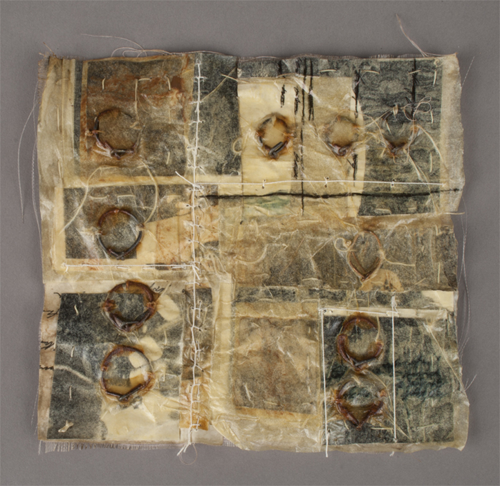
Each piece is assembled from familiar components, including fabric, ink, thread, and metal; these found materials are gathered by Bastian and “live in [her] space for a time until they need to become something else.”2 The rusted metal receptacle of Untitled (Safe II) holds multiple book-like objects, constructed of fabric pages sewn together and encased in thin paper. An earlier iteration, Untitled (Safe I), failed at its ostensible purpose, its contents cascading out of it and spilling onto the floor. The valuables of this second “safe” have been contained and protected, even from our eyes. Our Work, created just a few years later, is an exploded variant of Untitled (Safe II). The pages are no longer bound, but stacked and spread; no longer secure, but visible to all and vulnerable to the whims of the wind. Each square is an accretion of fabric and paper, with steel rings that sometimes puncture the thin upper skin and handwritten lines that face all directions and are frequently crossed-out. None of these layers are discrete. They are physical representations of Bastian’s process of excavating history and then re-forming it—layered and re-layered rock strata. (The artist has remarked that the history is often her own.3)
While the formal qualities of these artworks render them intimate—the found materials, the personal size, the handwritten lines—in their conceptual conclusion Bastian provides the distance of ambiguity. Untitled (Safe II) and Our Work are tantalizing, teasing even, as they simultaneously present and withhold. Looking into Untitled (Safe II) evokes the experience of approaching a tunnel, when what is nearest is prominently clear, and what is immediately beyond is obscured in darkness; a peek under the visible book reveals that it sits on top of a pile of similar volumes bound together in stacks by wire, delicate and inaccessible. The typed text inside (we assume each volume but can only verify the first), which forms a compilation of letters or journal entries, is repeatedly sewn through with a tightly controlled running stitch.
The opening line of the displayed book, Dear indifference, promptly signals that we will not be provided with the explanations that, as Bastian points out, we have come to expect from text4: the epithet is ambiguous on its own, and crossed out provides even more space for uncertainty. As in the bound and unreachable volumes of Untitled (Safe II), the lines we can decipher on the panels of Our Workare often crossed off or pasted over, containing meaning but hindering our apprehension of it. In both of these works the words that would purport to grant understanding are purposefully displayed but conspicuously insufficient; text that, as the artist interprets it, “varies in legibility…surfaces and recedes as a voice might.”5
So much of what I’ve written about Bastian’s work could imply that it is exasperating, but the artist’s intention is to frustrate, not to make us frustrated. She acknowledges the presenting-yet-withholding nature of the work: “just as walking into an old house or coming upon an old object gives us the sense of knowing or familiarity while simultaneously remaining a mystery, so does my work reveal and veil itself at the same time.”6 But this revealing and veiling is meant to open up one’s experience of the art, not to impede it. When asked whether the dual nature in her works is intended to obstruct or simply appears that way as a byproduct of the human imperative to understand, the artist responds that such a situation is “the definition of what memory is—a sometimes blurry piecing together of what we believe has occurred.”7 And it is perhaps this reference to memory that encapsulates the works’ positioning vis-à-vis the binary dialectics of public/private and intimate/strange. Memory dwells in the same stratum as dreams. It is personal, providing a varied, emotion-laden, and unique construction of a series of events or experiences, but also somewhat unknowable, being vulnerable to influence, time’s murkiness, and self-corrective rationalization. The conglomerate character of memory renders it both individual and corporate, a thing-created while a thing-being-created. In these works Bastian has captured the uncanny sensation of déjà vu, that mysterious recognition, and the compelling expression of her objects ultimately emerges from the realization that their past—familiar yet strange—could be ours.
1. Kry Bastian, e-mail message to author, 12 July 2011.
2. Ibid.
3. Ibid.
4. Ibid.
5. Kry Bastian, “Statement,” accessed 17 July 2011, http://www.krybastian.com/statement.aspx.
6. Kry Bastian, e-mail message to author, 12 July 2011.
7. Ibid. Emphasis original.
Kry Bastian Biography
Kry Bastian (b. 1972, Carmel, NY) earned her BFA in Sculpture (1994) and her MPS in Creative Arts Therapy (2002) at the Pratt Institute, Brooklyn. At Pratt, she was the recipient of many academic awards and scholarships, including two Circle Awards for Outstanding Academic Achievement (1994, 2002). Recent solo exhibitions have been held at Phantom Gallery, Baton Rouge, Louisiana (2003), and Jungle Science, Binghamton, New York (2009). Bastian’s work has been included in numerous group shows, most recently at Pierogi, Brooklyn (2008); State Street, Binghamton, New York (2010); City Hall Gallery, Binghamton, New York (2010); the State University of New York at Cortland Memorial Library, New York (2010); and Crest Arts, Brooklyn (2008, 2009, 2010, 2011). Bastian lives and works in Binghamton, New York. More information about her work can be found at www.krybastian.com.
Kristen Gaylord Biography
Kristen Gaylord earned her MA from and is a PhD candidate at the Institute of Fine Arts, New York University. She is interested in modern and contemporary art with an emphasis on postwar America, and also specializes in Latin American modernism and the history of photography. She lives and works in New York City.
References
Kry Bastian, e-mail message to author, 12 July 2011.
Kry Bastian, e-mail message to author, 12 July 2011.
Kry Bastian, e-mail message to author, 12 July 2011.
Kry Bastian, e-mail message to author, 12 July 2011.
One of the principal figures in American conceptual art, Robert Barry has continued to explore the nature of language as a mode of visual communication over the last half-century. Throughout his career, Barry’s work has taken many forms, from typed word lists and playfully circuitous gallery invitations, to large paintings of words on windows and walls. He has even ventured into the invisible with pieces like Prospect 69 (1969), which consists of the ideas that people will have from reading an interview in an exhibition catalog. With an enthusiastic inquisitiveness his work examines, among many things, the relationships between language as a physical object, the context in which it is perceived, and the abstract thoughts it can engender.
In Untitled (ELIMINATE, FORGOTTEN) from 1978, Barry’s pursuit of art’s linguistic capabilities becomes evident. At first glance the drawing appears completely unmarked, which is fitting considering the undertones of annulment in its title. Closer inspection of the pale white surface, however, reveals eight tiny words or word groupings faintly stenciled in light gray ink around the edges of the coarse deckled paper. Words or phrases like DESPITE, NOT AGAIN, and FORGOTTEN resonate in the mind as they are read and begin almost immediately to establish a rather somber mood. But the meaning of the words, along with the mood they establish, is only partly determined by Barry. Freed from any larger linguistic context, the words can assume any number of meanings depending on the interpretation of each individual viewer.
Which isn’t to say that Barry’s construction and placement of the words themselves holds no bearing on the way in which the viewer perceives the work. Because of the minuscule size of the words, it is necessary for the viewer to approach the work from a relatively close distance in order to properly read them. This mandatory proximity forces the viewer to perceive groups of words simultaneously; when reading one word, the faint lettering of another word is always present in the periphery.
The significance of each word is then also influenced by the viewer’s decision whether or not to read the words within the larger context of the entire work. Taken alone, GLORIOUS can evoke immensely positive emotions, but when read along with the NOT QUITE that follows it, the sequence recalls something different entirely. The predilection toward understanding words within sentences becomes quickly apparent when one encounters the fragmented yet potentially contextual syntax in which the words exist.
As a telling example of Barry’s oeuvre, Untitled (ELIMINATE, FORGOTTEN) compels the viewer to examine the ways in which they perceive and interpret art works in a particular setting, not only as singular pieces but as works situated in a larger artistic context. Barry has always considered the viewer part of the work and provides each viewer the opportunity to approach the art individually. These encounters are ultimately as crucial to the establishment of the work’s meaning over time as is the artist himself. Robert Barry speaks through Untitled (ELIMINATE, FORGOTTEN), but the voice we hear is our own.
Robert Barry Biography
Robert Barry (b. 1936, Bronx, NY) received his BFA (1957) and his MA (1963) from Hunter College, The City University of New York. The most recent retrospective of his work was held at the Kunsthalle Nürnberg, Germany and the Aargauer Kunsthaus, Aarau, Switzerland (2003). Recent solo exhibitions have been held at Galerie Jan Mot, Brussels (2008); Ritter/Zamet, London (2008); Galerie Greta Meert, Brussels (2009); Yvon Lambert, Paris and New York (2009, 2012); The Common Guild, Glasgow (2010); Sfeir-Semler Gallery, Hamburg (2010); Galerie Bugdahn und Kaimer, Düsseldorf, Germany (2008, 2011); Galerie Alfonso Artiaco, Naples (2007, 2011); Giacomo Guidi Arte Contemporanea, Rome (2011); Sperone Westwater, New York (2011); and Galleria Massimo Minini, Brescia, Italy (2012). Barry’s work has been included in numerous group exhibitions, most recently at Tate Modern, London (2007); the Hirshhorn Museum and Sculpture Garden, Washington, DC (2008); the KW Institute for Contemporary Art, Berlin (2008); The Museum of Contemporary Art, Los Angeles (2007, 2009, 2012); Centre Georges Pompidou, Paris (2009); the Stedelijk Museum, Amsterdam (2011); Musée du Louvre, Paris (2011); The Museum of Modern Art, New York (2007, 2009, 2010, 2011); and the Hayward Gallery, London (2012). Barry lives and works in Teaneck, New Jersey.
Alex Allenchey Biography
Alex Allenchey (b. 1987, Arlington, VA) is currently pursuing an MFA in Art Criticism and Writing at the School of Visual Arts in New York City. His major interests include the psychology of art, especially the areas of visual perception, context, and aesthetic preference. He lives in Brooklyn.
Is there anything quite so mesmerizing as the rhythmic, repetitive ebb, flow, ebb, flow of waves? When you stand on the edge of the ocean and look out over the shore it is difficult not to get lost in looking, just looking, at the endless motion of the water. It pulls you in. Absorbs your focus. This feeling of complete transfixion is reminiscent of hypnosis. The lure of the waves recalls those spiral circles, a cliché of the hypnotic method, which are forever spinning and captivating our eye, becoming the sole focus of attention.
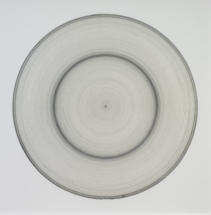
Although Jill Baroff’s Untitled (Tide Drawing) from 2006 does not purport to induce a hypnotic state, the rings of circles are inextricably linked to the ocean waves. Her starting point is something much less aesthetically riveting, but equally fascinating: tide tables. Baroff takes from the Internet numeric information related to the tide levels at a specific location and within a precise timeframe; she then translates this data into circular forms. The distances between the lines refer to recorded changes in the water level at six-minute intervals. These negative spaces are therefore rife with information and meaning. Moving from the innermost circle outwards, the entire composition visualizes the constantly transforming water level over the course of two to three days.
Baroff uses a compass to draw these precise circles and convey exact measurements. Fittingly, her tool of choice is a precision drawing pen, commonly used for highly technical drawings like maps. What appears to be a dense band of ink from afar is revealed up close to be a series of minute fine lines, impossibly close to each other and yet not touching. The mind boggles at the difficulty involved in drawing lines at such close proximity to one another. But these are also irregular lines. While the overall shape of each circle is the same, the quality of the delineating lines is not. There are jumps and breaks in some places and build-ups of ink in others. This variability also imparts meaning. Ocean waves have the strange quality of being simultaneously identical – the inevitable ebb and flow of water coming into shore – and unique. As with two lines of ink, the form and motion of two waves are never the same.
Having spent a significant amount of time in Japan, Baroff’s choice of materials and conceptual outlook is often informed by Japanese practices. Her preferred paper is gampi. Although it is diaphanous in appearance and feel, it provides a durable surface for drawing. Once the drawing is complete, the paper is immersed in water as part of the mounting process. Although it is tempting to draw parallels between this physical submersion and the tidal themes of Baroff’s drawings, the artist has striven to eliminate any obvious associations with water. Over time Baroff has ceased using blue ink in her tide drawings and has replaced it with black, red, and sometimes yellow or green. Her focus on the ocean is significant, but it does not tell the entire narrative.
Just like the hypnotist’s circle or the movement of waves, Untitled (Tide Drawing) has a captivating quality. It is easy to get lost among the lines and to feel entranced by their visual pull. Even though the drawing captures a specific set of moments in time and place, it also, perhaps paradoxically, retains a sense of being entirely timeless. It embodies a place where time no longer follows a linear path. Like the rotation of the earth, the wax and wane of the moon, and the changing tides, the looping circles are suggestive of a cyclical, and therefore infinite, progression of time. The evocation of this endlessness is precisely what allows viewers to lose themselves among the many rings.
Jill Baroff Biography
Jill Baroff (b. 1954, Summit, NJ) received her BFA from Antioch University, Yellow Springs, Ohio (1976), participated in the Artist Seminars Program at the Whitney Museum of American Art, New York (1978), and pursued post-graduate studies at Hunter College, The City University of New York (1980-1981). She has studied and lived in Japan as part of the Japan-US Friendship Commission’s Creative Artists exchange program (1996) and as a visiting artist at the Awagami Factory, Tokushima, Japan (1998). Baroff has been awarded grants and fellowships from the Pollock-Krasner Foundation, New York (1987, 1993); The MacDowell Colony, Peterborough, New Hampshire (1988, 1990); the National Endowment for the Arts, Washington, D.C. (1994, 1996); the New York Foundation for the Arts (1995, 2009); the Adolph and Esther Gottlieb Foundation, New York (2007); and the Field Institute Hombroich, Neuss, Germany (2010, 2011). Her most recent solo exhibitions were held at Galerie Christian Lethert, Cologne (2010, 2011); Bartha Contemporary, London (2011); Kunstraum Metropol, Munich (2012); and Gallery Joe, Philadelphia (2014). Her work has been included in group shows at the Museum Folkwang, Essen, Germany (2010); The Contemporary Museum, Honolulu (2010); the University of Alaska Museum of the North, Fairbanks (2010); the Katonah Museum of Art, Katonah, New York (2011); Museum Wilhelm-Morgner-Haus, Soest, Germany (2012); Kloster Wedinghausen, Arnsberg, Germany (2012); Bartha Contemporary, London (2013); Bowdoin College Museum of Art, Brunswick, Maine (2013); Columbus Museum, Georgia (2014); and Hamburger Kunsthalle, Hamburg, Germany (2014). Baroff lives and works in Brooklyn. More information about her work can be found at www.jillbaroff.net.
Sarah Zabrodski Biography
Sarah Zabrodski (b. 1985, Calgary, Alberta, Canada) holds an MA in Art History from the Institute of Fine Arts at New York University. She works in the Publications Department of the Getty Research Institute in Los Angeles. Zabrodski blogs at emergingartcritic.com.
My drawings start where the spoken word fails and where language breaks down in the attempt to formulate and express my specific perceptions and sensibilities.1
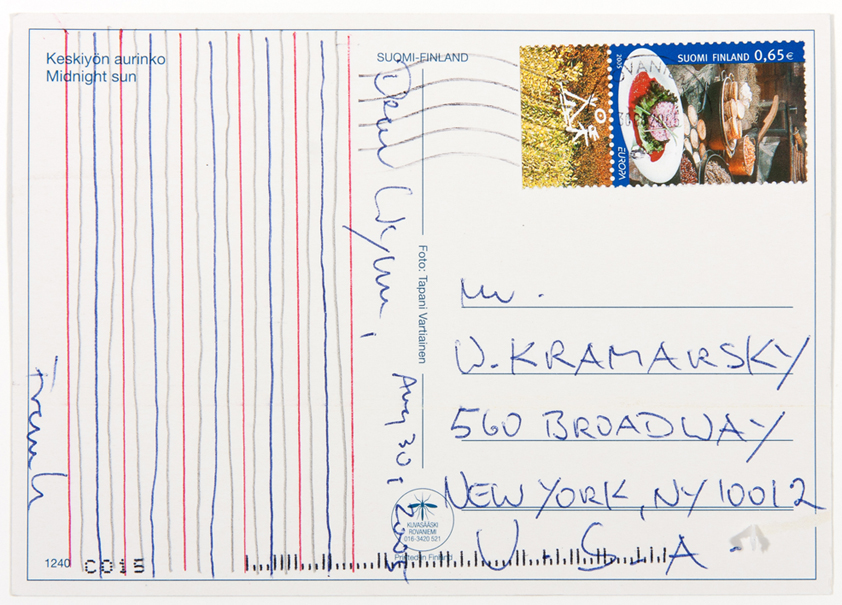
A postcard from an artist, sent in the mail, arrives at the office of a friend. Instead of writing a message, the artist – being an artist – has composed a drawing. This drawing is a series of lines in a pattern. Start with a red line drawn with a ruler. Follow with a freehand line drawn with a pencil. Then another freehand line, this time drawn in blue. Next, another freehand line drawn in pencil. Conclude as started, with a red line made with a ruler. Repeat four times. At the top of the drawing, the artist writes the date, Aug 30, 2005, and the salutation, Dear Wynn. Below the drawn lines, the artist closes with his name, Frank. This small, playful postcard drawing is balanced and symmetrical in its control and repetition.
If viewed closely, Frank Badur’s Untitled is reminiscent of a blank sheet of music. Badur has cited the sound patterns of composer Morton Feldman as a principal catalyst for his drawing process.2 In Matthias Bleyl’s essay, “Frank Badur’s Grid Drawings,” the writer explores Badur’s reference to Feldman’s musical principals: “Terms common to the visual arts such as suspension, proportion, series, structure, and pattern, as well as the issue of symmetry and asymmetry are characteristic of Feldman’s compositions.”3 It is apparent that most of these terms apply to elements of this drawing, a visual reaction to a musical inspiration.
Badur takes his work a step further by focusing on the most fundamental element of drawing – the line. He stated, “The line I draw is a concrete line that defines a concrete space. This line is a fact that represents nothing beyond itself.”4 Evident here is the control Badur has over his freehand lines, made with pencil and blue pen and confined to the space between the two red ruler-drawn lines. No line touches another. Noticeable is the sense of movement the freehand lines lend to the drawing, conceivably linking it to the aforementioned musical influence.
It makes perfect sense for an artist to send a collector a drawing in the body of a postcard, in lieu of a written message. There is no meaning to the lines. They only define the physical space in which they were drawn. The viewer is invited to take a closer look and to determine his or her own interpretation.
1. Frank Badur, “When I Draw in Black I Think in White” (lecture, Georgia State University, Atlanta, GA, 19 March 2007).
2. Ibid.
3. Matthias Bleyl, “Frank Badur’s Grid Drawings,” in Frank Badur Grid Drawings (Stuttgart: Galerie Michael Sturm, 2004), 7.
4. Badur, “When I Draw…”
Frank Badur Biography
Frank Badur (b. 1944, Oranienburg, Germany) studied painting at the School of Fine Arts, Berlin (1963-1969). He was a visiting artist at Georgia State University, Atlanta (2007). Recent solo exhibitions have been held at Hamish Morrison Galerie, Berlin (2009, 2011); Fruehsorge Contemporary Drawings, Berlin (2009); Galerie Jordan Seydoux, Berlin (2009); Galerie Nicole Schlégl, Zürich (2009); Galerie Bernard Jordan, Zürich (2010); Margaret Thatcher Projects, New York (2011); Galerie Michel Sturm, Stuttgart, Germany (2012); and LA Projects, Landshut, Germany (2012). Recent group exhibitions have been held at the Centre for Recent Drawing, London (2012); Anger Museum, Erfut, Germany (2012); Hamish Morrison Galerie, Berlin (2012); and Kunstmuseum Stuttgart, Germany (2012). Badur lives and works in Berlin and in Finland. More information about his work can be found at www.frankbadur.de.
Kathleen McEvily Biography
Kathleen McEvily has been employed by the Sally & Wynn Kramarsky Collection, New York; the Whitney Museum of American Art, New York; and the Peggy Guggenheim Collection, Venice. Presently, she works at Keevily Spero Whitelaw Inc., New York. McEvily currently resides in Yonkers, New York.
References
Frank Badur, “When I Draw in Black I Think in White” (lecture, Georgia State University, Atlanta, GA, 19 March 2007).
Frank Badur, “When I Draw in Black I Think in White” (lecture, Georgia State University, Atlanta, GA, 19 March 2007).
Matthias Bleyl, “Frank Badur’s Grid Drawings,” in Frank Badur Grid Drawings (Stuttgart: Galerie Michael Sturm, 2004), 7.
Frank Badur, “When I Draw in Black I Think in White” (lecture, Georgia State University, Atlanta, GA, 19 March 2007).
This is Alice Aycock, speaking about The Garden of Scripts. At the time, I was interested in language as a visual phenomenon as opposed to a spoken phenomenon. I had this idea that language evolved from people making tracks in the snow or tracks in dirt. They would look back and see the markings that they had made with their feet and body—and also tracking animals—and they began to ascribe significance to those marks, because they were traces of themselves and traces of animals that they hunted. They not only ascribed significance to the marks because they helped them hunt and eat, but these marks also became magical in some way. And they sort of took on these marks or tracks of themselves and animals and made them signs of power, and somehow along the way these sort of signs of power—this is my insignia, this is my mark, this is me, this stands for me, if you come here, into this territory, you will encounter me as a powerful tribe or what have you—then began to be a means of communication amongst themselves. And so there were all these different languages as visual signs, which, if you can’t translate the language, then they become calligraphy and they become like drawings.
When I look at the Roman alphabet, I immediately translate it. I don’t look at it as drawing; I read meaning into it. But when I look at other alphabets, Chinese or Sanskrit or Aztec hieroglyphics, or what have you, because I can’t read them or I can’t decipher them, I encounter them as drawings and as marks that could be three-dimensionalized into sculpture. A lot of the drawings that I made during this period were, in a sense, explorations into configurations that I might someday turn into sculpture. I started to look at all these different ancient languages, which did not use the Roman alphabet or the Greek alphabet, and I looked at them as drawing and as sculpture. Then I thought, wouldn’t it be interesting to take these pictographs and hieroglyphs and other visual languages and make them into a kind of a garden? It would be a topiary, like the grand English and French gardens. So the fantasy was to make this grand garden in which, as you moved through it, you would see these weird topiaries—but if you knew the secret language, you would realize that you were moving through the history of language and the history of human thought. I think language, and particularly written language, may be one of our greatest assets as human beings.
I used all kinds of things: I used parts of the Rosetta Stone, which has always been my favorite. I used a hobo language, I used Sanskrit and Arabic; I found a script that supposedly was the angels’ writings. I’m sure that was made up by some Early Christian who thought he or she had access to how the angels would write, so I put that in. And then I found the devil’s handwriting, and I put that in. And everything that I thought would really make good calligraphy, good drawing, good sculpture, I put in there, that was also mysterious to me in terms of the fact that I could not translate it, I could not decipher it, so it just looked like art. And I used a French garden—which may have been Villandry, I’m not absolutely sure—as my template. And in my megalomaniac fantasies, someday I would like to see the garden made. But it’s not likely, so the drawing exists.
At first glance, Alice Aycock’s The Garden of Scripts (Villandry) from 1986 resembles a drawing by a landscape architect for a potential client. Upon closer examination, one realizes that this garden is filled with characters from various languages. The three-dimensionality of the scripts exposes this drawing as the work of a sculptor. In fact, Aycock drew The Garden of Scripts as a topiary-filled labyrinth, intending fictitious visitors to “walk in and throughall [of] these languages,” which is aligned with the artist’s wish to eventually translate this garden into sculptural form.1
Familiarity with Aycock’s background and work as a sculptor provides additional insight into this particular work on paper. For instance, the spiraling details resemble some of her more iconic structural forms, while the freestanding letters display her consistent curiosity and whimsicality. The artist’s deep interests in history, other cultures, fantasy, and time travel are revealed in her choice of a grand French garden composition—although Aycock later realized that the garden depicted here is not, in reality, the garden at Villandry, as the title suggests. Some of the artist’s earlier works were land pieces that involved reshaping the earth; this history is evident in her delicate portrayal of these linguistic sculptures as seemingly organic forms.
Within this metaphorical garden are a multitude of ancient written languages, including Aztec, Chinese, Sanskrit, Arabic, Hebrew, hobo code, hieroglyphics, and cuneiform. It was important to Aycock that all of the text be significant in some way, which influenced her choice to include parts of the carvings from the Rosetta Stone. Through the architectural translation of language, the artist poses a unique conceptual and visual contradiction by placing scripts within a landscape—encoding one thing within another.
As she mentions in a recording about this work, here Aycock echoes her initial rumination on animal tracks. For the artist, such markings left in the snow or dirt become “magical…signs of power” given their ability to serve as a means of communication between various living creatures. Moreover, tracks that can stand alone—without translation—take on new meaning as symbols and insignias of sorts.2 Aycock once said, “Meaning is always arbitrary, but the sign [i.e. the work of art] stays there and floats until some other arbitrary meaning flows into it.” In this way, Aycock portrays language (like art) as a visual experience, rather than as an arbitrator of objective meaning.3
Alongside her interest in indecipherable languages, Aycock was drawn concurrently to the concept of private gardens and “little worlds” like that of Charles Dickens’s Madame Defarge (Tale of Two Cities) or Hadrian’s Villa. Aycock arranged her personal garden using diagrams of ancient battles, although the plantings have since become overgrown and now lack any evidence of their original order. Similar to the secret code of her own garden, Aycock intended for this fantasy drawing of topiaries in the form of calligraphic figures and pictographs to remain a mystery. The Garden of Scripts is ultimately a place where visitors may stroll through the history of language and human thought—yet remain completely unaware of the meaning embedded within the surrounding vegetation.
1. Jonathan Fineberg, Complex Visions: Sculpture and Drawings by Alice Aycock (Mountainville, NY: Storm King Art Center, 1990), 27.
2. Alice Aycock, audio commentary, 22 June 2011.
3. Robert Hobbs, Alice Aycock: Sculpture and Projects (Cambridge, MA: MIT Press, 2005), 154.
Alice Aycock Biography
Alice Aycock (b.1946, Harrisburg, PA) received her BA from Douglass College, New Brunswick, New Jersey, and her MA from Hunter College, New York. Recent solo exhibitions have been held at Salomon Contemporary Warehouse, East Hampton, New York (2008, 2009); Fredric Snitzer Gallery, Miami (2009); Art Dubai (2009); Galerie Thomas Schulte, Berlin (2010, 2011, 2013); Salomon Contemporary, New York (2011); OMI International Arts Center, Ghent, New York (2011); and Loretta Howard Gallery, New York (2012). Aycock was included in the group exhibition Ends of the Earth: Land Art to 1974, The Museum of Contemporary Art, Los Angeles (2012). Aycock has completed numerous commissions for public sculptures, most recently at the Washington Dulles International Airport, Virginia (2012), at Michigan State University, East Lansing (2012), and at the Park Avenue Malls, New York (2014). A major retrospective of Aycock’s drawings opened in 2013 and was organized by the Parrish Art Museum, Southampton, New York, in conjunction with the Grey Art Gallery, New York University, and the Santa Barbara Museum of Art, California. Aycock lives and works in New York City. More information about her work can be found at www.aaycock.com.
Bradley Wright Ferrarini Biography
Bradley Wright Ferrarini (b. 1983, Nashville, TN) received her MA in Visual Arts Administration from New York University (2011) and her BSBA from the University of Richmond, Virginia (2006). She works at The Museum of Modern Art in New York City.
References
Jonathan Fineberg, Complex Visions: Sculpture and Drawings by Alice Aycock (Mountainville, NY: Storm King Art Center, 1990), 27.
Alice Aycock, audio commentary, 22 June 2011.
Robert Hobbs, Alice Aycock: Sculpture and Projects (Cambridge, MA: MIT Press, 2005), 154.
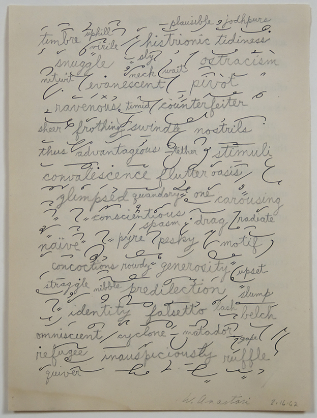
One can’t help but try to read a series of words on white paper as a text. In the case of William Anastasi’s Word Drawing Over Shorthand Practice Page works from 1962, however, this effort is inevitably frustrated. Errant words and intrusive gaps repeatedly force the eye from its habitual left-to-right, top-to-bottom path until it finally wanders free, released from any predetermined direction. That is, the eye begins moving across the page as it would through a text, but ends by moving more as it would across the surface of a drawing.
The title of the work indicates that the composition began with a shorthand practice page: the series of printed loops, squiggles, and circles that intersperse the text throughout. On the one hand, the term shorthand suggests that these apparently illegible marks might be read as words, as communication, if one only knew how to decode them. On the other hand, referring to the sheet as a practice page implies that the order and repetition of the marks are intended to enable the user to improve his or her penmanship rather than to communicate. In the end, each side of the opposition here seems to resonate with one of the two words found in the first half of the title: whereas a drawing was traditionally conceived as a kind of practice page for the composition of a painting, here the negative spaces between the mute shorthand marks act as the compositional frame in which real live words have been placed.
This is regarding a word drawing on a page from a shorthand instruction book. It was done in February of 1962. The thoughts which led to this work were related to the thought that if there were words that most people who know how to read could make out–decipher–we’d have one sort of blind poetry, assuming someone was reading it and not looking at it as a picture without reading it. And if someone familiar with the kind of shorthand this is was reading it from left to right and paid attention to the shorthand signification, it would turn into a different kind of poetry. If that’s not too strong a word. I’m not familiar with the shorthand system on the page, and I realized that if I was familiar with it, very likely a very different sequence of words would probably come out, because that would affect my thinking, obviously, if I’m looking at it and I’m being fed images that mean words. I certainly don’t remember the words; some of them I enjoy. Mosquito, oscillation, I enjoy for some reason, after all these years. Looking at it now after all this time it seems as though I might have found that a word could trigger a word far away from the meaning of the first word. Sepulchral, séance, sourpuss. [laughter] I’m enjoying it more than I usually enjoy my old work, as a matter of fact. Maybe part of what I was doing was being nudged in the poetry department by the ready-made drawing of the people who put together the page of shorthand symbols. Whatever the idea meant for me then, and it’s impossible to be sure that my memory is at all accurate, but whatever it meant after–fifty years, is it?–I would guess that if I could find such a book of shorthand practice, well obviously a very different kind of series of words would come out. My handwriting had not changed very much from I guess about 1942 or ’43, when I was nine or ten, to when I was three times that old. I can remember enough about this to be sure that I wasn’t trying to make a handwriting any different than I would have writing a journal, or a letter…and I think the handwriting is somewhat affected, from the look of it, by the amount of space I had to play with on any given square inch of the page. It seems as though the amount of space between one shorthand symbol and another was begging for letters a bit bigger, maybe twice as big, as certain other letters.
What can one make out of the meanings of these words? Take for example the array of words in the smaller of the two drawings. While some of the words that appear close to one another on the page do appear to be related in terms of meaning – swill and trough, for example, or seesaw and oscillation – no overall patterns emerge in terms of composition. In general, it is hard to see the group of words as sharing underlying commonalities in terms of source or subject matter: that is, they do not seem to form a distinct lexicon, in spite of the presence of that word in the upper center of the drawing.
Perhaps then we ought to look for meaning in more unexpected places. Conspicuous are those moments where the relationship between the meaning of the words and the manner in which they are rendered appears to collapse. The word droopy droops, for example: the loop crowning the letter p appears to sag down, the tail of the letter bowing under its weight. In cases like squrt and tatts, the chains of letters do not in fact add up to words at all. Even so, they manage to read as misspellings – or perhaps shorthand – for the words squirt and tattoos. Some of the more obscure words in the drawing might strike the viewer in a similar way: the word ballon, for example, which means “lightness of step” in ballet, could easily be mistaken as another case of misspelling or shorthand vis-à-vis the word balloon. Indeed, ballon does mean balloon in French; its English meaning is just a conventionally agreed upon instance of metonymy, a “short-handing” not only of spelling but also, as it were, of the word’s reference itself. In such cases, the practice of shorthand – and indeed the drawing itself – come to appear less as a mere means of saving (or in the case of the drawing, wasting) time, and more as one of the principle means by which words come to be born, grow old, and die.
Now this is a drawing of READING A LINE ON A WALL. This piece is all capital letters, and that’s the way it was done for the Dwan Gallery show of works, text works, on a wall. And I remember Robert Morris was in it; I don’t remember who else offhand. But I do remember that Robert Morris was in it. I think maybe Mel Bochner was in it. I’m not sure because she did more than one of these shows. But anyway, this was printing on the wall, and although this shows more or less the complete drawing of a complete one of the walls at Dwan, maybe taken from a photograph of that wall, this was at the same time as the idea of putting a painting on the wall that’s a ten percent or so reduction [in size from] the wall, a picture of the very wall. The READING A LINE ON A WALL I see as related to that idea: the picture of putting a painting on the wall is one way of bouncing the artwork off of the viewer, let’s say. I don’t know whether that’s an accurate way of putting it, but to me it kind of relates with talking to yourself, maybe. READING A LINE ON A WALL also, maybe in an even more direct way, throws the artwork and the viewer together. It’s telling you what you’re doing, as though you needed that. Maybe you need to know what you’re doing. Maybe I had that in my mind. I can walk into a room in a museum, or a room in an art gallery, and I could be saying to myself, what the hell are you doing? And if this was on the wall, at least I would know what I was doing regarding this one work. It is descriptive of the activity that the viewer finds herself or himself doing. It has held up for me as an idea. Some of the ideas hold up and some don’t hold up. Some, as time passes, I find myself saying, what in the world were you thinking of to have done that? To have made that? And this particular idea doesn’t have that effect. It’s as though, for me, it’s still fresh. And now we’re at August 1, 2011, and I’m sitting at a chair, rather comfortable for an office chair, and I had a hesitation about looking at images, reproductions of old work, and trying to find words. But it turns out that words came.
READING A LINE ON A WALL. One thinks of the proverbial half-empty, half-full glass, the difference being that a phrase such as this can in fact be regarded as both completely full and completely empty: empty in the sense of being devoid of all content aside from the facts of its own legibility; full in the sense that during the moment when the reader reads of reading, all distinctions between the content of the work and the activity of the beholder dissolve into a state of self-awareness, immediacy, or, for lack of a better word, truth.
It was just this sort of experience that many leading members of the New York art world sought from abstract works of art in the decades following the Second World War. Similar to the way Anastasi’s drawing positions the viewer to reflect on the implications of reading the word reading, the most highly regarded paintings and sculptures of the day were those that most thoroughly manifested the essence of their own means of expression through various modes of self-reference. However, like many of the most aesthetically rigorous works from the mid- and late 1960s, Anastasi’s drawing meets the criteria of that aesthetic paradigm in a way meant to demonstrate its blind spots rather than to manifest its virtues.
The sparse white wall in the drawing recalls the prototypical appearance of walls in post-World War II art galleries and museums: indeed, the arrangement of air vents, electrical sockets, and molding corresponds quite precisely with their arrangement on one particular wall of the Virginia Dwan Gallery in New York, where Anastasi exhibited during the 1960s. The details of the drawing are composed so that neither the ceiling, the floor, nor any other walls appear, but rather so that the edges of the wall on all four sides correspond closely with the edges of the piece of paper. Purged of any sense of spatial recession other than the shallow, almost trompe l’oeil depiction of the vents and electrical sockets, the physical flatness of the sheet of paper itself participates fully in the imitation of the wall that the drawing depicts – potentially, the very wall on which it would hang.
In one respect, the use of the word line in the text refers to one of the most longstanding cornerstones of the drawing medium. In another, it refers to one of the most basic components of literature, a “line of text.” (Perhaps ironically, the line of text is the only element of the drawing rendered in solid shades rather than lines.) While on one reading the word can be regarded as purely self-referential, on another it refers to a series of physical anchors on which that self-referential status depends: most literally and immediately, to the drawn lines within the drawing that secure the phrase’s legibility even after it has been taken off the wall; on a more figurative level, to the whole institution of the art gallery, whose walls are capable of validating a scrap of paper such as this as a work of fine art.
William Anastasi Biography
William Anastasi (b. 1933, Philadelphia, PA) is a self-taught artist. Anastasi’s four notable early exhibitions opened at the Dwan Gallery (1966-1970). Recent solo exhibitions have been held at Michael Benevento/Orange Group, Los Angeles (2007); Peter Blum Gallery, New York (2008); and Galleria Mazzoli, Modena, Italy (2009). Anastasi has had retrospectives at Moore College of Art & Design, Philadelphia (1995); Nikolaj, Copenhagen Contemporary Art Center, Denmark (2001); The Drawing Center, New York (2007); Peter Blum Gallery, New York (2008); the Esbjerg Kunstmuseum, Denmark (2009); Galerie Jocelyn Wolff, Paris (2013); and The Bertha and Karl Leubsdorf Art Gallery, Hunter College, New York (2013). His work has been included in numerous group exhibitions, including at White Box, New York (2007); Sfeir-Semler Gallery, Hamburg (2008); the Museo de Arte Contemporáneo Esteban Vicente, Segovia, Spain (2009); the Solomon R. Guggenheim Museum, New York (2009); the Katonah Museum of Art, Katonah, New York (2010); the Museum of Contemporary Art, Roskilde, Denmark (2011); Hunter College/Times Square Gallery, New York (2012); The Frances Young Tang Teaching Museum and Art Gallery, Saratoga Springs, New York (2012); the Henry Moore Foundation, London (2012); Galerie Jocelyn Wolff, Paris and LABOR, Mexico City (2013); and Yvon Lambert, Paris (2013). A monograph on Anastasi with text by Richard Milazzo was published by Galleria Mazzoli (2009). He is the 2010 recipient of the biennial John Cage Award from the Foundation for Contemporary Arts. The artist’s book, The Cage Dialogues: A Memoir (2011), was published by Slought Foundation, Philadelphia. Anastasi presented a lecture at the Sorbonne on John Cage entitled “The Cage Dialogues” (2012). Anastasi lives and works in New York City. More information about his work can be found at www.williamanastasi.net.
Robert Brennan Biography
Robert Brennan (b. 1983, Olympia, WA) is a PhD candidate at the Institute of Fine Arts at New York University, where he focuses on twentieth-century art. His research interests range from artistic responses to the Industrial Revolution to German and American art during the Cold War. Robert received a BA in Studio Art and Religious Studies from Seattle University in 2007. He has since lived in China and Germany.