Sarah Zabrodski on Lawrence Weiner

Lawrence Weiner, Polaris, 1990, a) felt-tip pen, pencil, and stamped ink on cut transparentized paper; b) felt-tip pen, pencil, colored pencil, and stamped ink on cut transparentized paper, 2 sheets, each 19 x 23 7/8 inches (48.3 x 60.6 cm). The Museum of Modern Art, New York. Gift of Sally and Wynn Kramarsky, 2001. © 2013 Lawrence Weiner / Artists Rights Society (ARS), New York / Photo: Thomas Griesel

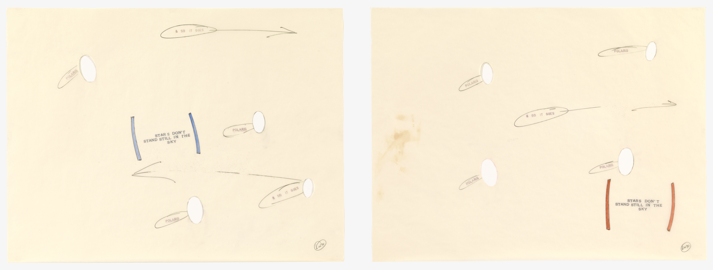
Polaris is a star that goes by many names: North Star, Northern Star, Pole Star, and most significantly, Guiding Star. This last moniker points to the star’s remarkable role in guiding countless sailors, travelers, and adventurous souls across the earth. Polaris remains nearly motionless in the sky as the stars around it rotate with the progression of the night, making it the ideal marker for navigation through an otherwise unnavigable world, in which nothing, not even the sky itself, stands still. By choosing Polaris as the title and subject of these drawings, Lawrence Weiner draws upon the full weight of the history and connotations of this celestial entity. But by a sideways allusion to the star’s most important quality — stability — Weiner also redirects meaning toward more slippery terrain.

Instability is characteristic of the artist, who is best known for his conceptual statements, words, phrases, and directions displayed across walls and other surfaces. For Weiner, language is not merely text or decorative motif – it is a form of sculpture unto itself. The meaning of his words is never stable; depending on context they take on various significances. As Weiner’s sculptures are constantly installed in new locations, they are perceptually elusive, never succumbing to a singular distillation of meaning. Moreover, these words, although physically manifested as pigment on a surface, are meant to be transformed into new forms entirely. According to Weiner, “The work I do is designed for translation. It’s the exact opposite of what poetry is.”1 This statement indicates that Polaris is more than a clever combination of words and shapes; it is a schematic diagram, an illustrated map, or, like the North Star itself, a guide.

Polaris seems to pulsate: arrows and ovals appear hastily drawn, scrappy lines suggest a quickly moving hand and a need for speed. This quality lends a precariousness to the work, as if Weiner needed to capture the movement of the stars as quickly as possible, lest they disappear from the sky. Cut-out holes further destabilize the subject matter and composition – instead of seeing the most geographically constant star, Polaris, we have only negative space. In contrast to these empty holes and quickly drawn lines, the blue and red parentheses along with the phrase STARS DON’T STAND STILL IN THE SKY seem to maintain a sense of weightiness. The boldly stenciled letters and thick colored brackets look firmly placed on the paper, an appearance somewhat at odds with the perceived meaning of the words themselves.

What does it mean when Polaris has lost its stability and, by extension, its guiding ability? Weiner takes us into existential territory, making us question concepts of reliability and consistency, as well as the very truths that make up our reality. There is a certain amount of liberation in shaking off limits and releasing reality from the boundaries of our expectations. In this way, Polaris is not merely a geographical guide. It is a path to alternative ways of thinking and a model for expanding the scope of our minds to encompass greater possibilities for understanding the world around us.


1. Quoted in Phyllis Rosenzweig, Lawrence Weiner: Works with the Passage of Time (Washington, D.C.: Hirshhorn Museum & Sculpture Garden, 1990), n.p.

Lawrence Weiner Biography

Lawrence Weiner (b. 1942, Bronx, NY) received his high school diploma from Stuyvesant High School, New York. During the late 1950s and early 1960s, Weiner traveled throughout the United States, Mexico, and Canada. The first presentation of Weiner’s work was in Mill Valley, California (1960). His most recent solo exhibitions were held at the Marian Goodman Gallery, New York (2007); CAC Málaga, Spain (2008); The Power Plant Contemporary Art Gallery, Toronto (2009); Espai d’art contemporani de Castelló, Spain (2009); House of Art, Budweis, Czech Republic (2010); the Museum of Contemporary Art Antwerp, Belgium (2011); Collection Lambert en Avignon, France (2011); Regen Projects, Los Angeles (2012); Base / Progetti per L’Arte, Florence (2012); Galleria Alfonso Artiaco, Naples (2012); Galerie Hubert Winter, Vienna (2012); Blain|Southern, Berlin (2012); Lisson Gallery, London (2013); Villa e Collezione Panza, Varese, Italy (2013); ArtAids Foundation, Santa Caterina Market, Barcelona (2013); and Museu d’Art Contemporani de Barcelona and the Stedelijk Museum, Amsterdam (2013). Weiner divides his time between his studio in New York City and his boat in Amsterdam.

Sarah Zabrodski Biography
Sarah Zabrodski (b. 1985, Calgary, Alberta, Canada) holds an MA in Art History from the Institute of Fine Arts, New York University. She works in the Publications Department of the Getty Research Institute, Los Angeles. Zabrodski blogs at emergingartcritic.com.

Sarah Zabrodski on John Fraser

John Fraser, Fading Light I, 2003-2011, graphite and acrylic on collaged papers, 9 x 13 inches (22.9 x 33 cm). © John Fraser / Photo: Laura Mitchell

There are plenty of evocative elements embedded in Fading Light I and Fading Light II. These are not works that can be passed over quickly, merely glanced at. They require looking. And processing. Above all, they require time.

First, one notices the medium: aged paper. The patina of age reveals itself in the yellowing, browning, discoloring surfaces. Texture provides another clue. The collaged pieces vary subtly from smooth to worn to ragged. This is not just any paper; it has the unmistakably pulpy fibrous appearance of pages torn or cut from a book. And these are not just the pages–each collage is formed from the endpapers, covers, and spines of books as well. These are the parts of books not normally put on display or appreciated for their aesthetic qualities. One can identify here a patch of hardened glue and the impression of now-missing pages and thread. Each part once constructed a cohesive whole of a very different type. The absence of one particular element is equally conspicuous. These paper collages are devoid of that which typically makes books what they are–text, words, ink on paper. In many ways this absence is apt, because the book itself is not important for Fraser. Although the artist acknowledges that “many of the components come with a history,” for Fraser, meaning ultimately comes from shapes and form, structure and surface.

John Fraser, Fading Light II, 2003-2011, graphite and acrylic on collaged papers, 9 x 13 inches (22.9 x 33 cm). © John Fraser / Photo: Laura Mitchell

The process of invested looking for the subtle nuances of Fading Light I and Fading Light II is a process mirrored by the works’ construction. Fraser describes his selection process as an “act of love and labor.” Guided by sight, touch, and intuition, he handles the materials in a way that evokes both romantic and architectural notions about creating art. He chooses the pieces for their physical properties. In part this selection criteria is based on practical reasoning; the paper must be durable enough to survive the collage process and to emerge as part of a new whole. But Fraser’s process is also based on more abstract principles of feeling and instinct. The methodology of construction is transparent. Looking at the collages, it is possible for one to determine how the systematic yet conscientious layering of paper on paper achieved novel forms. This concept of architectural construction, the “builder’s logic,”1 gives these works a sense of duality, as they are simultaneously two- and three-dimensional. Fraser uses the phrase “shallow relief”2 to characterize this double element. It is exactly this quality that gives these works their sense of tactility and texture. Although the range of color is narrow, the variation of surfaces gives each overall work a complexity and depth that enhances its visual effect.

Fraser believes art should make demands of its audience. The time invested in carefully constructing these collages is echoed in the object’s expectations of the viewer. The titles of these works, Fading Light I and Fading Light II, also reflect this sense of exchange and interaction. They refer to the relationship between interior and exterior, like a window looking out over or into another space. From a purely compositional standpoint, these collages evoke this window through their very form. On a deeper level, the paper acts as a transparent barrier between the viewer and the powerful nuance, subtlety, and beauty of the art. In the words of the artist, “My intent is to arrest a potential viewer, and provide a singular experience, an exchange, a slow passage of time.”3 With their understated allure, Fading Light I and Fading Light II each offer a shared moment, an intimate experience, and a meditation on the capacity of art to change our worldview.


1. John Fraser quoted by Polly Ullrich, “Mapping the Contemporary Sublime” in Restraining Order: John Fraser, Work in Mixed Media, 1991-2010 (Chicago: John Fraser, 2010), 10.
2. Ibid.
3. Ibid.

John Fraser Biography

John Fraser (b. 1952, Chicago, IL) earned his BA from Roosevelt University, Chicago (1975), and his MFA from Northern Illinois University, Dekalb, Illinois (1989). A survey of Fraser’s work was organized at St. John’s University, St. Joseph, Minnesota (2004). Fraser has been a visiting artist at numerous universities, including the Brigham Young University, Provo, Utah (2008), and Grinnell College, Iowa (2009), and he was in residence at Yaddo, Saratoga Springs, New York (2010). Recent solo exhibitions have been held at Scott White Contemporary Art, San Diego (2011); Roy Boyd Gallery, Chicago (2008, 2010, 2012, 2013); William Campbell Contemporary Art, Fort Worth, Texas (2012); Toronto Image Works, Toronto, Ontario (2014); and The Rangefinder Gallery, Chicago (2014). His work has been included in many museum exhibitions, including at the Museo de Arte Contemporáneo Esteban Vicente, Segovia, Spain (2009); the Lancaster Museum of Art, Pennsylvania (2010); the University of Alberta Museums, Edmonton, Canada (2010); the Katonah Museum of Art, Katonah, New York (2011, 2013); QuadrART, Dornbirn, Austria (2012); McNay Art Museum, San Antonio, Texas (2013); Pavel Zoubok Gallery, New York (2013); Cedarhurst Center for the Arts, Mt. Vernon, Illinois (2013); Foster Art Center, Austin College, Texas (2014); and Columbus Museum, Columbus, Georgia (2014). Fraser received Artist Project Grants from the Illinois Arts Council (2011, 2014). Fraser lives and works in St. Charles, Illinois. More information about his work can be found at www.johnfraserstudio.com.
Sarah Zabrodski Biography
Sarah Zabrodski (b. 1985, Calgary, Alberta, Canada) holds an MA in Art History from the Institute of Fine Arts, New York University. She works in the Publications Department of the Getty Research Institute, Los Angeles. Zabrodski blogs at emergingartcritic.com.

Sarah Zabrodski on Jill Baroff

Jill Baroff, Untitled (Tide Drawing), 2006, pigmented ink on Japanese gampi mounted on rag, 31 x 31 inches (78.7 x 78.7 cm). © Jill Baroff / Photo: Ellen McDermott

Is there anything quite so mesmerizing as the rhythmic, repetitive ebb, flow, ebb, flow of waves? When you stand on the edge of the ocean and look out over the shore it is difficult not to get lost in looking, just looking, at the endless motion of the water. It pulls you in. Absorbs your focus. This feeling of complete transfixion is reminiscent of hypnosis. The lure of the waves recalls those spiral circles, a cliché of the hypnotic method, which are forever spinning and captivating our eye, becoming the sole focus of attention.

Although Jill Baroff’s Untitled (Tide Drawing) from 2006 does not purport to induce a hypnotic state, the rings of circles are inextricably linked to the ocean waves. Her starting point is something much less aesthetically riveting, but equally fascinating: tide tables. Baroff takes from the Internet numeric information related to the tide levels at a specific location and within a precise timeframe; she then translates this data into circular forms. The distances between the lines refer to recorded changes in the water level at six-minute intervals. These negative spaces are therefore rife with information and meaning. Moving from the innermost circle outwards, the entire composition visualizes the constantly transforming water level over the course of two to three days.

Baroff uses a compass to draw these precise circles and convey exact measurements. Fittingly, her tool of choice is a precision drawing pen, commonly used for highly technical drawings like maps. What appears to be a dense band of ink from afar is revealed up close to be a series of minute fine lines, impossibly close to each other and yet not touching. The mind boggles at the difficulty involved in drawing lines at such close proximity to one another. But these are also irregular lines. While the overall shape of each circle is the same, the quality of the delineating lines is not. There are jumps and breaks in some places and build-ups of ink in others. This variability also imparts meaning. Ocean waves have the strange quality of being simultaneously identical – the inevitable ebb and flow of water coming into shore – and unique. As with two lines of ink, the form and motion of two waves are never the same.

Having spent a significant amount of time in Japan, Baroff’s choice of materials and conceptual outlook is often informed by Japanese practices. Her preferred paper is gampi. Although it is diaphanous in appearance and feel, it provides a durable surface for drawing. Once the drawing is complete, the paper is immersed in water as part of the mounting process. Although it is tempting to draw parallels between this physical submersion and the tidal themes of Baroff’s drawings, the artist has striven to eliminate any obvious associations with water. Over time Baroff has ceased using blue ink in her tide drawings and has replaced it with black, red, and sometimes yellow or green. Her focus on the ocean is significant, but it does not tell the entire narrative.

Just like the hypnotist’s circle or the movement of waves, Untitled (Tide Drawing) has a captivating quality. It is easy to get lost among the lines and to feel entranced by their visual pull. Even though the drawing captures a specific set of moments in time and place, it also, perhaps paradoxically, retains a sense of being entirely timeless. It embodies a place where time no longer follows a linear path. Like the rotation of the earth, the wax and wane of the moon, and the changing tides, the looping circles are suggestive of a cyclical, and therefore infinite, progression of time. The evocation of this endlessness is precisely what allows viewers to lose themselves among the many rings.

Jill Baroff Biography

Jill Baroff (b. 1954, Summit, NJ) received her BFA from Antioch University, Yellow Springs, Ohio (1976), participated in the Artist Seminars Program at the Whitney Museum of American Art, New York (1978), and pursued post-graduate studies at Hunter College, The City University of New York (1980-1981). She has studied and lived in Japan as part of the Japan-US Friendship Commission’s Creative Artists exchange program (1996) and as a visiting artist at the Awagami Factory, Tokushima, Japan (1998). Baroff has been awarded grants and fellowships from the Pollock-Krasner Foundation, New York (1987, 1993); The MacDowell Colony, Peterborough, New Hampshire (1988, 1990); the National Endowment for the Arts, Washington, D.C. (1994, 1996); the New York Foundation for the Arts (1995, 2009); the Adolph and Esther Gottlieb Foundation, New York (2007); and the Field Institute Hombroich, Neuss, Germany (2010, 2011). Her most recent solo exhibitions were held at Galerie Christian Lethert, Cologne (2010, 2011); Bartha Contemporary, London (2011); Kunstraum Metropol, Munich (2012); and Gallery Joe, Philadelphia (2014). Her work has been included in group shows at the Museum Folkwang, Essen, Germany (2010); The Contemporary Museum, Honolulu (2010); the University of Alaska Museum of the North, Fairbanks (2010); the Katonah Museum of Art, Katonah, New York (2011); Museum Wilhelm-Morgner-Haus, Soest, Germany (2012); Kloster Wedinghausen, Arnsberg, Germany (2012); Bartha Contemporary, London (2013); Bowdoin College Museum of Art, Brunswick, Maine (2013); Columbus Museum, Georgia (2014); and Hamburger Kunsthalle, Hamburg, Germany (2014). Baroff lives and works in Brooklyn. More information about her work can be found at www.jillbaroff.net.

Sarah Zabrodski Biography
Sarah Zabrodski (b. 1985, Calgary, Alberta, Canada) holds an MA in Art History from the Institute of Fine Arts at New York University. She works in the Publications Department of the Getty Research Institute in Los Angeles. Zabrodski blogs at emergingartcritic.com.