Anna Kim on Karen Schiff

Drawing the invisible, speaking the ineffable

It is not what is seen; it is what is known forever in the mind.1
— Agnes Martin

Karen Schiff, Agnes Martin, The Washington Post, 18 December 2004, full through, I, 2005, graphite and charcoal on vellum, 24 x 17 ¼ inches (61 x 43.8 cm). © Karen Schiff / Photo: Ellen McDermott


Audio Transcript
This is Karen Schiff, and I’m looking at my drawing, Agnes Martin, The Washington Post, 18 December 2004, full through, I. There’s a 1 at the end of this title because this is my first go-round at making a tracing of Agnes Martin’s obituary, which was published in the Washington Post two days after she died. Agnes Martin has been one of my favorite artists to refer to over the years. It occurred to me after she died that the shapes of her obituary articles had an aesthetic similarity or resonance with her own work—though she never would have made geometric abstractions using these shapes, in part because she didn’t think artists should read newspapers at all.
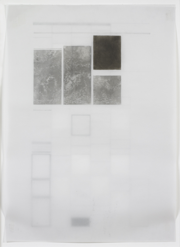
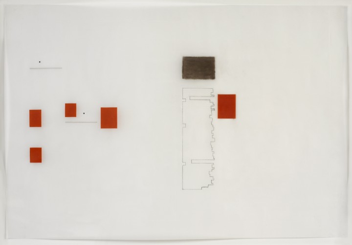
The project started where I was just tracing the articles themselves, but then it occurred to me that you see this kind of news in the context of an entire page or, in the case of this drawing, sometimes the newsprint is thin enough that you also see what’s printed on the other side. So this is called full through because it’s the full page, and also you can see through it to outlines of advertisements on the other side of the page.

Being-in-the-world inevitably leaves traces, some indelible, others more fleeting. A body’s shadow turns a corner just as surely as its torso, briefly painting a sunlit wall. What remains is the stuff of memory, or remembered perception, of a presence felt as truly as the person next to us. Similarly, there is the body of an artist’s work-in-the-world, offering a glimpse of an individual whom we might otherwise never have seen or known, now rendered fully present by our imagination.

In tracing Agnes Martin’s obituaries from newspapers around the world, Schiff also records the effects of her being-in-the-world, the real and remembered presence that persists beyond death. Layered shapes in varying degrees of legibility evoke the structure of memory, the architecture of the mind. Palimpsests of influence, the gridded spaces of Martin’s work, radiate beneath the surface of Schiff’s echoing forms. Stele-like monuments commemorate the greatness of achievement. And cutouts remind us of what is lost or inaccessible: what can neither be spoken nor seen, but perhaps only felt.

Karen Schiff, Agnes Martin, College Art Association News, March 2005, opening, I, 2005, graphite, conté crayon, etching stylus, ink, Rubylith and Letraset tape on vellum, 13 x 19 ¼ inches (33 x 48.9 cm). © Karen Schiff / Photo: Ellen McDermott

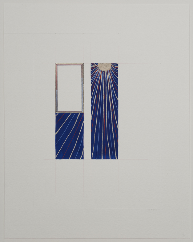
A psalm is a song, but here there is no singer to be seen. Rather than David, we are aware of a blank space, which we ourselves might inhabit, and a great net of radiance that binds together a divided cosmos of azure blue. To beseech God is to cry out to him in prayer or pain, but no groans or shouts can be heard. Instead, a soft music of lines and color floats across the page. Perhaps it is the empty space that cries out, upright and expectant, waiting to be brought into harmony with this wordless music. Is David beseeching God, or is God calling David, seeking to illumine the space that he has opened, but that still remains bounded?

Karen Schiff, fol. 70, Psalm 101 (David Beseeches God), 2010, colored pencil, gouache and inks on watercolor paper, 9 3/8 x 6 ¾ inches (23.8 x 17.1 cm). © Karen Schiff / Photo: Ellen McDermott


Audio Transcript
This is Karen Schiff, and I’m going to talk about my drawing called folio 70, Psalm 101 (David Beseeches God). This is the seventieth page of a book of hours owned by the Duke of Berry of France. I was interested in the patterns that were in the images. In other words, sometimes a blue sky wasn’t blue, but rather it was filled with a pattern of some kind.
So what I did was to reproduce the page layout of the images that interested me, with the patterns that were most compelling. And this is part of a series of seven penitential psalms. The scratched lines at the edges of the drawing are the contours of the page itself. Those are the page dimensions. And then everything you see, I’ve tried to match as closely as possible to what the Limbourg Brothers had done when they were creating their illuminations.
So, this sun with its colored rays was actually inside the frame that’s now empty, and instead, I’ve placed that pattern from the background of the image where the text would have been of this particular psalm. What amazed me about the Limbourg Brothers was that every detail was so carefully considered, so even the inner frame around the blank image I’ve reproduced where the light red and the light blue changed from one to the other. And in this particular image, I like how those end up leading the eye towards the sun, as if David were beseeching God even in this image.

Karen Schiff’s richly suggestive drawing, one in a series, was inspired by the artist’s encounter with a manuscript from the early fifteenth century, the Belles Heures commissioned by Jean of France, Duke of Berry. The Book of Hours, crafted as an aid to prayerful contemplation, is remarkable for the fineness of its illumination and the exquisite detail in which its narratives are rendered. Inverting the logic of the mise-en-page, Schiff foregrounds patterns from the background of the original as her central motif, emptying the frames of their texts even as she reproduces their precise form.

With this radical gesture, we are reminded of the highly personal nature of prayer, and the beautiful variety of modes by which the sacred is invoked. The ancient Greek distinction between kataphasis (what can be said of God or the ultimate reality), and apophasis (what can be discerned only through negation or in silence), comes to mind. This last, the basis of negative theology (Lahoot salbib in Arabic or via negativa in Latin) binds together many worlds of faith now divided. Transforming the Book of Hours, Schiff bridges the space between worlds that share the same sun, beseeching us to share her illuminating vision. (Click here for more images from the Belles Heures Project.).


1. Agnes Martin, “Notes” in ed. Dieter Schwarz, Writings / Schriften (Hatje Cantz, 1992), 15.

Karen Schiff, Untitled (Manuscript), 2007, sumi ink, graphite and colored pencil on paper, diptych: 25 x 37 inches (63.5 x 94 cm). © Karen Schiff / Photo: Ellen McDermott


Audio Transcript
This is Karen Schiff. This drawing, Untitled (Manuscript), is part of a series of laid line drawings that I’ve done for a few years. And laid line refers to the texture of the paper. There’s a kind of paper called laid paper; it’s like resume paper, but it’s also some fine art paper. It has a texture that I’m showing you by tracing those creases with the lines that you see. But I’ve only traced those lines in the spaces where writing would appear in a medieval manuscript. Often, medieval manuscripts were large like this if they were on reading stands, and the way that the artisans would find how to position the calligraphy within the space of the page required some sense of harmony, spatial harmony or proportion, that then could elevate that manuscript to an aesthetic divinity in that way of thinking.
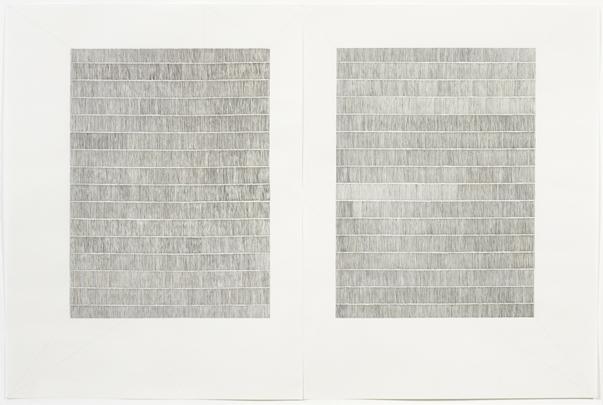
So the red lines that are defining that area where the letters would go are a geometric operation that was devised by a twentieth-century typographer named Jan Tschichold. He’s the one who designed the orange covers for Penguin paperbacks, but actually he designed the page layout for inside those paperbacks as well, and many other things, and he was interested in the formal properties of page design altogether. Which is why he went back to medieval times to see how they might have come up with this kind of geometry that left room for illuminations around the edges, also left room for binding and fingers to turn the pages.
But I was not so interested in having illuminations around the edges be my focus. I wanted a sense that the letters themselves, or the space for the words, could be the space that I was illuminating. And the variation you see in the marks is just how my dip pen and ink were changing with pressure and ink texture, and humidity, and things like that.

Karen Schiff Biography

Karen Schiff (b. 1967, New Haven, CT) earned her MFA in Studio Art at the School of the Museum of Fine Arts, Tufts University, Boston (2006), where she won a Drawing Award from the SMFA faculty (2005). Schiff completed earlier degrees at the University of Pennsylvania, in Philadelphia (PhD in Comparative Literature and Literary Theory, 1998) and Brown University in Providence, Rhode Island (AB/AM in Comparative Literature/English, 1989). Schiff has been resident at the Harwood Museum of Art, Taos, New Mexico (2007); the Edward F. Albee Foundation, Montauk, New York (2007); Anderson Ranch, Snowmass Village, Colorado (2011); Yaddo, Saratoga Springs, New York (2012, 2014); and the Helene Wurlitzer Foundation of New Mexico, Taos (2012, 2014), among other institutions. Schiff contributed an artists’s project, Counter to Type, to the Spring 2014 issue of Art Journal. The project included drawings, an essay, and a video about her process. She lectures and publishes about her work in the word/image field, and she also creates projects about artist Agnes Martin. A recent solo exhibition was held at the Flanagan Campus Art Gallery, Community College of Rhode Island, London (2011). Recent group exhibitions include such venues as Hverfisgallerí, Reykjavik (2014), Hafnarborg Museum, Hafnarfjör∂ur, Iceland (2013); Arkansas Arts Center, Little Rock (2012); Danese, New York (2010, 2011, 2012); the Katonah Museum of Art, Katonah, New York (2011); Galería Astarté, Madrid (2010). In 2013 Schiff curated the group exhibition Winter Reading: Lines of Poetry at Diane Birdsall Gallery, Old Lyme, Connecticut. She lives in New York City and has a studio in Brooklyn. More information about her work can be found at www.karen-schiff.com.
Anna Kim Biography
Anna Kim (b. Columbus, OH) is completing a PhD in the History of Art and Architecture at the University of Virginia, Charlottesville, where she also is an Associate Fellow at the Institute for Advanced Studies in Culture. Her research engages the deep structure of our complex relation to images, from antiquity to the present, focusing on image theory and religious conflict. A member of an international team of scholars, artists, and curators investigating the phenomenon of iconoclasm, she recently collaborated on an exhibition entitled Art Under Attack: Histories of British Iconoclasm at Tate Britain (2013).