Sarah JM Kolberg on Robert Rauschenberg

Robert Rauschenberg, Untitled (Mirror), 1952, transfer drawing, oil, watercolor, crayon, pencil and cut-and-pasted paper on paper, 10 ½ x 8 ½ inches (26.7 x 21.6 cm). The Museum of Modern Art, New York. Gift of Sally and Wynn Kramarsky, 2004. Art © Robert Rauschenberg Foundation/Licensed by VAGA, New York, NY / Photo: The Museum of Modern Art

The consensus culture of Cold War America demanded conformity to a narrow constellation of prescribed behaviors and beliefs. Fear of Communist infiltrators was widespread, making all forms of difference threatening. Homosexuals were singled out as particularly vulnerable to Communist blackmail and thus were considered inherently untrustworthy. The prevailing understanding of homosexuality at this time did not include notions of love, only of deviance. Words such as love, so innocent in a heterosexual framework, became tainted with political threat when employed in a homosexual context. It is little surprise that gay artists were at the vanguard of an art-making practice that was simultaneously resistant to dominant culture’s impositions of power and illegible as such.

In the midst of these social conditions, Abstract Expressionism was the prevailing artistic movement. It entailed the conflation of artist and viewer, in the form of an expression of the artist’s inner self that would be immediately and emotionally understood by the viewer. Planning was to be avoided, and spontaneity, accident, and improvisation were privileged as the unmediated expression of the artist’s psyche. The presumed direct correlation between artist and mark made the gestural brush stroke the hallmark of Abstract Expressionism: gesture and identity became discursively synonymous.

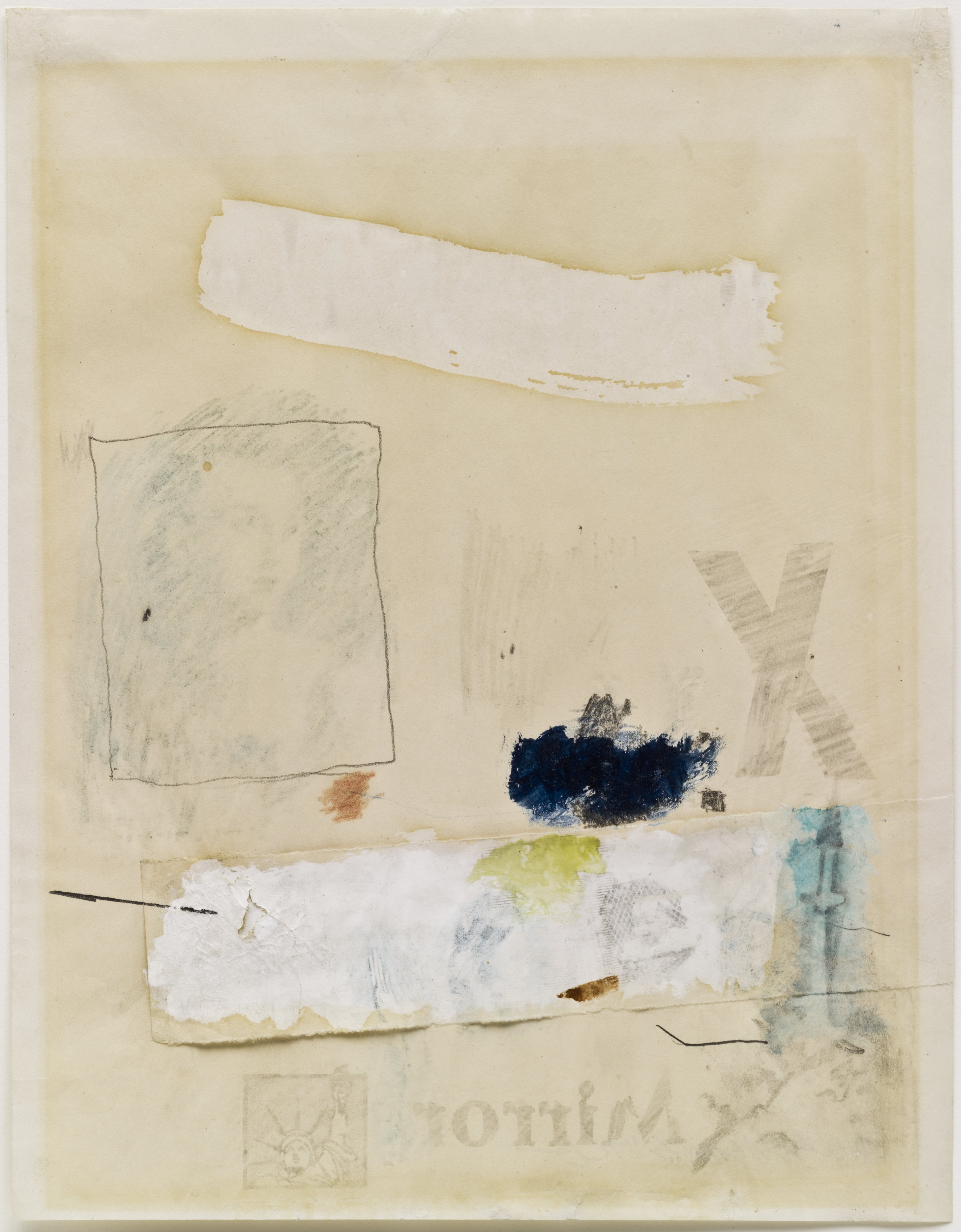
The critical reception of Abstract Expressionism made evident that not all artists can express equally. Personal expression for homosexual artists was dangerous, if not impossible, and challenging the presumption of a recoverable authorial presence became a centerpiece of their formal strategies. In refusing the formal qualities of Abstract Expressionism, gay artists sought to reject and reframe its ideological paradigms as well. In his 1952 work Untitled (Mirror), Robert Rauschenberg utilized a variety of techniques to create the image: oil and watercolor paints, pencil, collaged paper, crayon, and transfer drawings. A wide swath of white paint sweeps across the top of the canvas, below which a transfer drawing from an Old Master work has been framed in colored pencil. A collaged swatch of paper is the base for a variety of media: another solvent transfer, paint, crayon, and colored pencil. In presenting this diverse catalog of mark-making, Rauschenberg opens his canvas to multiple readings and refuses a singular organizing presence. He calls into question the privileging of one form of mark-making over another, challenging the Abstract Expressionist doctrine that valued the gestural mark above all else. That Rauschenberg’s image catalog was primarily drawn from other sources underscores the degree to which expression is always written in forms that originate outside of the self.

Among the solvent transfer images is one of a baby in a playpen. The baby may well be Rauschenberg’s son with Susan Weil, Christopher, who was born the year prior to this work, and who appears in other works such as Canyon (1959). Weil and Rauschenberg met at Black Mountain College, where he also met Cy Twombly; less than a year after he married Weil, Rauschenberg found himself falling in love with Twombly and left Weil and their infant son for a relationship with Twombly. By the time of Untitled (Mirror)’s creation, Rauschenberg and Weil were already separated. It was not an easy break, as Rauschenberg was torn by the conflict between the responsibility of marriage and family and following his heart. Thus even this image of a baby is made to mean multiply, standing as a symbol both of marriage and the heterosexual family unit, and of the dilemma the artist faced in wishing to live a life more true to himself, a life that meant being romantically involved with men.

Rauschenberg includes other images that similarly point to this dilemma, such as the solvent transfer of an Old Master Venus, which is a frequently recurring motif in Rauschenberg’s work. As Kenneth Bendiner notes, Rauschenberg reproduces a Cranach Venus in Levee (1955), a Titian in Odalisk (1955-58), a Velázquez in Barge (1962), a Michelangelo in Estate (1963), and a Rubens in Persimmon (1964), as well as others in Rebus (1955), Short Circuit (1955), Bicycle (1963), and Tracer (1964).1 Bendiner posits that the Venus transfers function “primarily as signs of love,”2 giving them an ironic twist considering Rauschenberg’s romantic interests.

The work’s title is drawn from a headline fragment from England’s daily tabloid, the Daily Mirror, and acts as a signpost to one of the work’s most significant thematics. Mirrors recur frequently in Rauschenberg’s work, adding layers of signification, whether within a transferred image, such as the fragment of Rubens’s Venus with a Mirror in Persimmon (1964); as an actual 3D object affixed to the surface, such as in Charlene (1954); or hanging from the work as in Minutiae (1954). At its most basic, the mirror is a trope of psychological self-awareness, from simple notions of self-reflection to Lacan’s Mirror stage, in which the child develops an awareness of its own subjectivity. For Rauschenberg, mirrors emphasize the individuated encounter rather than a universal or collective experience. In the works that include a physical mirror, the viewer’s reflection is incorporated into the surface of the works, materializing Rauschenberg’s emphasis on the centrality of the viewer. Moreover, since what is reflected changes with every viewing environment, Rauschenberg further destabilizes the idea of a work’s fixed and unchanging meaning, instead opening it up to an endless stream of potential significances. Finally, the mirror ironizes one of the prevailing ways in which homosexuality was then understood. Based on the Greek myth of Narcissus, who fell in love with his own image, Freud proposed that homosexuality was the result of a faulty object-choice in that the homosexual is attracted to someone whose gender matches his own: his mirror image.

As do many titles, the word Mirror serves as an organizing rubric guiding our contemplation of the work. As a word, Mirror is more noticeably reversed than some of the other pictorial elements, which spurs the viewer to consider the import of its reversal. Its adjacency calls our attention to the Statue of Liberty’s reversal, so subtle that one might not notice the flipped position of her arm holding the torch. Untitled (Mirror) is one of Rauschenberg’s earliest works using the solvent transfer method, which would soon become the bedrock of his artistic practice. This method involves the transfer of an image from a printed source – most frequently newspaper and magazines – which is soaked with xylene or other chemical solvents, laid onto a new surface, and rubbed with a burnishing tool, transferring the ink from the source to the receiver. The source image is reversed on the receiver, a consequence which is usually incidental and without any symbolic import. However, the reversal here of the Statue of Liberty—our nation’s symbol of hope, opportunity, and freedom—carries implications of the myriad ways in which those privileges are often denied gay and lesbian individuals.


1. Kenneth Bendiner, “Robert Rauschenberg’s ‘Canyon’,” Arts 56 (1982): 57-59.
2. Ibid, 57.

Robert Rauschenberg Biography

Robert Rauschenberg (b. 1925, Port Arthur, TX; d. 2008, Captiva Island, FL) was renowned for his work in the 1950s period between Abstract Expressionism and Pop Art. Rauschenberg was studying pharmacology at the University of Texas, Austin when he was drafted into the U.S. Navy: he served as a neuropsychiatric technician in the U.S. Navy Hospital Corps, San Diego. He then studied at the Kansas City Art Institute (1947) and at the Académie Julian, Paris (1948). Rauschenberg returned to the United States to study under Josef Albers at Black Mountain College, Asheville, North Carolina (1948). He attended courses at the Arts Student League, New York (1949-1951) and had his first solo exhibition at the Betty Parsons Gallery, New York (1951). His first retrospective, organized by the Jewish Museum, New York (1963), was awarded the Grand Prize for painting at the 1964 Venice Biennale: other awards and honors include the National Medal of Arts Award, Washington, DC (1993); the Leonardo Da Vinci World Award of Arts, World Cultural Council, Museo del Palacio de Bellas Artes, Mexico City (1995); and the Lifetime Achievement Award in Contemporary Sculpture, International Sculpture Center, Washington, DC (1996). In 1966, Rauschenberg co-founded the non-profit organization Experiments in Art and Technology (E.A.T.) with Robert Whitman, Billy Klüver, and Fred Waldhauer. The Guggenheim Museum organized the largest retrospective of his work to date (1997), which traveled to the Menil Collection, Houston; Contemporary Arts Museum, Houston; the Museum of Fine Arts, Houston; Museum Ludwig, Cologne; and the Guggenheim Museum Bilbao. In 1998, The Vatican commissioned (and then refused) a Rauschenberg work based on the Apocalypse for Renzo Piano’s pilgrimage church in Foggia, Italy. More information may be found at http://www.rauschenbergfoundation.org/.

Sarah JM Kolberg Biography
Sarah JM Kolberg is a PhD candidate in the Department of Visual Studies at the University at Buffalo specializing in the American and French post-WWII period, with additional areas of focus in narratology, queer theory, and queer subjectivity in experimental film. Her dissertation will focus on the Nouveaux Réalistes. She has won numerous awards as both a writer and independent film producer, holds a joint MA in English and Film, and will complete her MFA in Media Study this year.

Sarah JM Kolberg on Ray Johnson

Ray Johnson, BOO[K], ca. 1955, artist’s book: collage on cardboard cover with hand-sewn binding; handwritten text and drawing in black and red inks on cut paper pages, 8 x 6 inches (20.3 x 15.2 cm), closed. © Ray Johnson Estate, Courtesy Richard L. Feigen & Co. / Photo: Ellen McDermott

Ray Johnson’s BOO[K] (ca. 1955) exemplifies the intellectual investigation of many homosexual artists of the period—mobilizing words’ polysemic qualities to challenge and undermine dominant culture’s power to dictate meaning. An interest in the multiplicity of meanings is central to the work of Johnson’s fellow homosexual artists, such as Robert Rauschenberg, Jasper Johns, Robert Indiana, Jess, and Cy Twombly, for whom, in the highly homophobic atmosphere of the Cold War, the prospect of authorial expression was fraught with danger. As such, they created highly developed strategies for mediating expressivity—self-conscious strategies, which in every instance called into question the very notion of the authorial.

This hand-crafted artist’s book, consisting of cardboard-mounted collaged images and black and red inked letters on translucent cut paper. Johnson’s use of translucent paper allows words on underlying pages to show through both sides of the page, enabling readers to create their own readings; subverting the traditional notion that the author fixes the meaning and the reader merely receives it. In its ability to be read forward or backwards, and on multiple pages simultaneously, BOO[K] decenters the conventional linearity of reading. Alternate readings are always present, which one can either attend to or ignore.

Johnson called his collaged works moticos, an anagram of the word osmotic, which conveying ideas of permeability and transmission emphasizes the works’ fluid verbo-visual qualities. In BOO[K], Johnson employs the paper’s transparency to play with notions of primary and secondary content. For example, on the right-hand page, behind the words Mother has a picture book we can read the ghosted words from the following page: May I see and mother? We can interpret this phrase as a request to see mother’s book or as an inquiry about the presence of the mother. Through strategically placed cutouts, Johnson alternately obscures and reveals text, evoking a tension between hidden and visible meanings. On the right-hand page, a rectangular opening has been cut into the page such that the fragment boo, in red ink, is revealed from the underlying page, while the k, in black ink, is present on the topmost page. In dividing the word in this fashion, Johnson ironically echoes these artists’ lived experience: bifurcated and differently legible according to one’s point of view.

The use of language as a tool of power was viscerally palpable to Cold War-era homosexuals, for whom this identificatory label was not merely descriptive, but a scarlet letter used to police and persecute them. Certain terms, such as heterosexual, became coterminous with normalcy and others, such as homosexual, coterminous with deviance. Revealing the dynamics of the process by which these ideological mystifications took place was a central problematic for these artists. In making clear that words mean differently in different contexts, they sought ways to demonstrate that all such labels – and the qualities they name – are mythologized as natural and enduring, rather than being recognized as the shifting and arbitrary product of social construction. As Slavoj Žižek explains, “one of the fundamental stratagems of ideology is the reference to some self-evidence – ‘Look, you can see for yourself how things are!’ ‘Let the facts speak for themselves’ is perhaps the arch-statement of ideology – the point being, precisely, that facts never ‘speak for themselves’ but are always made to speak by a network of discursive devices.”1

BOO[K]’s physical qualities literalize these artists’ interests by showing how language itself is never fixed but instead a layering of meanings upon which the reader draws. BOO[K] is literally read through its pages, making visible the way in which a text always draws upon references that are external to it, becoming, as Roland Barthes claimed, a “tissue of citations.” By highlighting each individual’s agency in meaning-making, BOO[K] facilitates the reader’s recognition that vision is neither passive nor purely receptive—that what you see depends on where you sit. For homosexual artists in the Cold War consensus culture, this possibility was key toward their larger goal of destructuring a homophobic culture organized around a very particular angle of vision concerning the “natural.”


1. Slavoj Žižek, “The Spectre of Ideology” in Mapping Ideology, ed. Slavoj Žižek and Nicholas Abercrombie (London, Brooklyn: Verso, 2012), 11.

Ray Johnson Biography

Ray Johnson (b. 1927, Detroit, MI; d. 1995, Long Island, NY) studied at Black Mountain College, North Carolina (1945-1948). The most recent retrospective of Johnson’s work opened at Raven Row, London (2009), and traveled to Museu d’Art Contemporani de Barcelona. Recent solo exhibitions in 2014 have been held at Sidney Mishkin Gallery, Baruch College, New York; Museo Thyssen-Bornemisza, Madrid; and The Museum of Modern Art Library, New York. Group exhibitions have been held at Centre Georges Pompidou, Paris (2009); Max Ernst Museum, Brühl, Germany (2011); the Smithsonian Archives of American Art, Washington, D.C. (2011); Berkeley Art Museum, Berkeley, California (2012); the Walker Art Center, Minneapolis (2012); the Brooklyn Art Museum, New York (2012); the Pollock-Krasner House and Study Center, East Hampton, New York (2012); the Musée Denys-Puech, Rodez, France (2012); the Krannert Art Museum, Champaign, Illinois (2013); The Morgan Library & Museum, New York (2014); and Paul Kasmin Gallery, New York (2014). More information about his work can be found at www.rayjohnsonestate.com.
Sarah JM Kolberg Biography
Sarah JM Kolberg is a PhD candidate in the Department of Visual Studies at the University at Buffalo specializing in the American and French post-WWII period, with additional areas of focus in narratology, queer theory, and queer subjectivity in experimental film. Her dissertation will focus on the Nouveaux Réalistes. She has won numerous awards as both a writer and independent film producer, holds a joint MA in English and Film, and will complete her MFA in Media Study this year.

Sarah JM Kolberg on Dom Sylvester Houédard

Some of the 1960s’ most important visual poetry came from an exceptionally unlikely source: a Benedictine monk from England’s Prinknash Abbey. Dom Sylvester Houédard, or dsh, as he signed his works, was one of the period’s most prominent concrete and visual poets. Houédard published extensively in small press literary journals, including Ian Hamilton Finlay’s Poor. Old. Tired. Horse., and maintained a correspondence with many of the leading poets and language innovators of his day, even collaborating with some of them, including John Cage, Gustav Metzger, and Yoko Ono. Educated at Oxford before ordination, Houédard evinces a profound intellectual engagement in his critical writings, citing Postmodern theorist Rosalind Krauss and philosopher Ludwig Wittgenstein with as much facility as biblical verse.

Dom Pierre Sylvester Houédard, typikon by, September 6, 1963, carbon copy, 13 x 8 inches (33 x 20.3 cm). The Poetry Collection of the University Libraries, University at Buffalo, The State University of New York. © Estate of Dom Pierre Sylvester Houédard, courtesy Prinknash Abbey Trustees / Photo: The Poetry Collection of the University Libraries, University at Buffalo, The State University of New York

Dom Pierre Sylvester Houédard, bombombomb…, September 15, 1963, carbon copy, 13 x 8 inches (33 x 20.3 cm). The Poetry Collection of the University Libraries, University at Buffalo, The State University of New York. © Estate of Dom Pierre Sylvester Houédard, courtesy Prinknash Abbey Trustees / Photo: The Poetry Collection of the University Libraries, University at Buffalo, The State University of New York


Almost all of Houédard’s works were composed on his portable Olivetti Lettera 22 typewriter, many on Abbey letterhead, and often using the different colored ribbons available for this model, an aspect of his work that was frequently lost in publication. Houédard’s use of the typewriter gave rise to the neologism “typestracts” to describe his poems, and he is recognized as one of the leading practitioners of typewriter art. Like Finlay, he alternated between concrete poetry, such as bombombomb… and typikon by, and visual poetry, such as cover cased / case covered and prayer poetry, all from 1963.

bombombomb… illustrates concrete poetry’s precept that the image created by the poem’s words serves as a visual analogue to the idea expressed by the poem. As such, the arrangement of the words takes precedence over syntactical concerns, and traditional poetic values such as rhythm, meter, and metaphor give way to spatial arrangement, negative space, and visual architecture. bombombomb… consists of the arrangement of ten letters and three words: bomb, bomber, and bombsite. Arranged horizontally across the top of the page, four rows of varying length spell out bombombombomber, each word running into the next, evoking the anxiety of a sky filled with planes arranged in the finger-four tactical formation of the Luftwaffe. A steady stream of BOMBs drops vertically from three of the bombers to the bombsite on the ground.

While a work like bombombomb… relies on the direct relation of word to image, many of Houédard’s visual poems relied on what he referred to as the work’s “pluritotality” – the sum of its multivalent meanings, both denotative and connotative, sincere and ironic. Houédard was a great admirer of the Beats, read extensively in and corresponded with Jack Kerouac, William S. Burroughs, and Allen Ginsburg, and his writing reflects the jazz-inflected syntax and frank, often homoerotic, sexuality of the Beat aesthetic. Houédard’s prayer poetry links a variety of experiences—poetry, jazz, and sex—to the sublime quality of prayer.

Dom Pierre Sylvester Houédard, prayer poetry, July 1, 1963, typewriting on paper, 8 x 5 inches (20.3 x 12.7 cm). The Poetry Collection of the University Libraries, University at Buffalo, The State University of New York. © Estate of Dom Pierre Sylvester Houédard, courtesy Prinknash Abbey Trustees / Photo: The Poetry Collection of the University Libraries, University at Buffalo, The State University of New York

This poem emphasizes the degree to which Houédard, and others of the time, were invested not in determining meaning for the reader, but in making readers aware of their freedom to discover new meanings. As he wrote in the catalog for the 1965 exhibition Between Poetry and Painting at London’s Institute of Contemporary Arts, in which his work was featured: “dictionary(convention) as language coffin – this word/poem means the WAY we use it – we (not them) convene its meaning”.1 As an example, consider the word pair prayer/jrzz which pivots off of the shared r. We must assume that Houédard intended the dual reading of jazz/jizz, considering that he could easily have shifted the vertical word one letter to the right, creating the word jazz and avoiding the suggestion of any sexual meaning. But that would have hewed too closely to fixing the word in the “language coffin” that he wished to avoid.

Are we to assume that the poem refers to the pleasures of mutual or solitary sexual satisfaction? It could easily be either, but the decidedly masculine sexual slang facilitates a homoerotic interpretation of the poem as a whole. Similarly, cover cased / case covered undertakes an investigation that, while not overtly sexual, is nevertheless all sexual innuendo and longing. The inventory of sizes (long, medium, short) and tumescence (soft, medium, hard) bracketed at the top and bottom by yes and mmm mark this work as a catalog of male homoerotic desire.

Dom Pierre Sylvester Houédard, cover cased / case covered, August 19, 1963, typewriting on paper, 5 x 8 inches (12.7 x 20.3 cm). The Poetry Collection of the University Libraries, University at Buffalo, The State University of New York. © Estate of Dom Pierre Sylvester Houédard, courtesy Prinknash Abbey Trustees / Photo: The Poetry Collection of the University Libraries, University at Buffalo, The State University of New York

That we can read the words in cover cased / case covered in a sexual manner, against their common meanings as simple adjectives describing the physical qualities of objects, demonstrates Houédard’s investment in opening language to a “pluritotality” of meaning, even, and perhaps especially, if some of these meanings run counter to those privileged by dominant culture. Just as the alternate readings of jazz/jizz pivot on the r, the words in cover cased / case covered pivot on the totality of each individual word in relation to the whole. By enabling each word to convey both a traditional and a dissident meaning, Houédard shows that it is possible to escape the language coffin. Like his collaborator Cage, Houédard facilitates our understanding of language as an instrument of control wielded by dominant culture and the discovery of a radical freedom precipitated on our redeployment of language against it. His minimalist typestracts exemplify his desire to create “jewel-like semantic areas where poet and reader meet in maximum communication with minimum words”2: areas in which we can discover the power to create meaning, and with it, the power to create new realities.


1. Dom Sylvester Houédard, “Statement by Dom Sylvester Houédard” in Between Poetry and Painting (London: Institute of Contemporary Arts and W. Kempner, 1965), 55.
2. D.S.H., Charles Verey, and Ceolfrith Gallery, Dom Sylvester Houédard (Sunderland, Durham: Ceolfrith Arts Centre, 1972), 47.

Dom Pierre Sylvester Houédard Biography

Dom Pierre Sylvester Houédard (b. 1924, Bailiwick of Guernsey; d. 1992, Great Britain), also known as dsh, attended Jesus College, Oxford (1942-1944, 1947-1949), and served in the British Army Intelligence (1944-1947). He became a monk at Prinknash Abbey, Gloucestershire (1949) and was ordained as a priest (1959). dsh made major theological contributions and was considered to be a luminary in the ecumenical movement. He was a renowned translator of religious texts: he published his translation of the Office of Our Lady (1962), and he served as the literary editor of the Jerusalem Bible (1961). He was Co-Founder of the Eckhart Society and an Honorary Member of the Muhyiddin Ibn ‘Arabi Society. dsh became one of the most notable British concrete poets: his work occupied the space between poetry and visual art. His so-called “typestracts,” created with an Olivetti typewriters, often incorporated color by way of carbon paper or ribbons. His most renowned work poem, entitled Frog-Pond-Plop, was an English translation of a zen Japanese haiku by Matsuo Basho. dsh contributed to magazines and exhibitions throughout the 1960s. His first solo exhibition was held at Artists for Democracy’s Cultural Centre, London (1976).
Sarah JM Kolberg Biography
Sarah JM Kolberg is a PhD candidate in the Department of Visual Studies at the University at Buffalo specializing in the American and French post-WWII period, with additional areas of focus in narratology, queer theory, and queer subjectivity in experimental film. Her dissertation will focus on the Nouveaux Réalistes. She has won numerous awards as both a writer and independent film producer, holds a joint MA in English and Film, and will complete her MFA in Media Study this year.

Sarah JM Kolberg on Ian Hamilton Finlay

Ian Hamilton Finlay, stones stones stones Questions, 1966, typewriting on paper, 10 x 8 inches (25.4 x 20.3 cm). The Poetry Collection of the University Libraries, University at Buffalo, The State University of New York. © by courtesy of the Estate of Ian Hamilton Finlay / Photo: The Poetry Collection of the University Libraries, University at Buffalo, The State University of New York

Merging the visual with the textual, concrete poetry presents a coterminous relationship between text and image: reading the words is not sufficient for understanding; one must see the words in order to apprehend the poem. In many cases, were one to read the text aloud the meaning of the poem would be lost. Early forms of concrete poetry used the positioning of words to create visual images, whether simple geometric shapes or objects that reflect the poem’s concepts, such as Ian Hamilton Finlay’s stones stones stones (1966). The positioning of the word stones, eight of them forming a squared arch, and the single word clouds in the upper right corner immediately creates an unmistakable image in our mind: a small garden hut with a window to the sky.

This work illustrates concrete poetry’s investment in the totality of meaning that emerges out of the intersection of word and image. Finlay’s stones stones stones is accompanied in the University at Buffalo’s Poetry Collection archive by a page of questions, inviting reader response and providing his address for the return of replies: “answers to: Ian Hamilton Finlay, Coaltown of Collange, Ceres, by Cupar, Fife, Scotland.” Some questions refer back to the poem’s words, reinforcing the notion that the image and its constituent text are coequal: “The subject of the poem is a small hut: what is the hut made of?” Others invite the reader to contemplate aspects of the work external to its content: “Does it seem to be a) in a valley b) by a river c) on top of a hill?” and “Might there be weeds around the hut? If so, why has the author not mentioned them?” These questions demonstrate that for Finlay, despite his work’s structural emphasis on the image/word relationship, even a concrete poem was not quite as closed to interpretation as one might initially assume.

Ian Hamilton Finlay, roundandRoundand, n.d., typewriting on paper, 8 x 5 inches (20.3 x 12.7 cm). The Poetry Collection of the University Libraries, University at Buffalo, The State University of New York. © by courtesy of the Estate of Ian Hamilton Finlay / Photo: The Poetry Collection of the University Libraries, University at Buffalo, The State University of New York

In addition to traditional concrete poems, Finlay experimented with a wide range of other poetic forms, including anagrams, one-line and even one-word poems, and other poetic fragments. In many of these works, he shifted away from an emphasis on the creation of a visual object toward an emphasis on investigating the process of signification and the networks of correspondence that constitute meaning. In these visual poems, the investment is in the variety of meanings available within the work and in the system of relationships across the entire work, as opposed to the relationship between one line or verse and the next, as in more traditional poetic forms. Finlay frequently materializes these relationships by employing a single word read in multiple directions or by pivoting multiple words around a single letter, much like in a crossword puzzle. As they require one to read multiply, these poems make manifest the ways in which such a text – and by extension, all texts – may be opened to multiple meanings. In refusing the hierarchical succession of lines we generally assume in reading, these poems can seem closer to art than text.

Ian Hamilton Finlay, y-o-u y-e-s, n.d., typewriting on paper, 8 x 5 inches (20.3 x 12.7 cm). The Poetry Collection of the University Libraries, University at Buffalo, The State University of New York. © by courtesy of the Estate of Ian Hamilton Finlay / Photo: The Poetry Collection of the University Libraries, University at Buffalo, The State University of New York

Finlay’s y-o-u y-e-s offers an example. Two iterations of the word -r-o-s-e-s- appear horizontally, while on the left, two instances of the word -y-o-u- traverse the page diagonally, one reading from top to bottom, the other from bottom to top. In a mirrored configuration to the right is the word -y-e-s-. In the space between the two horizontal -r-o-s-e-s- the u from -y-o-u- and the s from -y-e-s- lie adjacent. The o in -y-o-u- is equally the o in -r-o-s-e-s-, while the e in -y-e-s- becomes the e in -r-o-s-e-s-. In addition to the words that are given to us by use of connecting lines, we read between the lines to discover the unconnected us. This unmarked word, emerging from the heart of the work, is the key to its meaning. The unrelated you, roses, and the Molly Bloom-esque yes all coalesce around us, clearly marking this as a love poem.

Such decentering of authorial control and focus on networks of correspondence allow each reader to determine their individual experience of the poem. In Finlay’s y-o-u y-e-s, rather than following the traditionally prescribed left-to-right, top-to-bottom flow, the reader can choose which line to read first and how to travel through the poem. Reading the poem puts the reader in the position of contravening the conventional rules of reading, which awakens the awareness that alternatives are possible. This awareness lies at the heart of the work’s political potential. When we are able to recognize that it is possible to read against conventional norms, we realize that other norms may be similarly challenged, other rules similarly breached, and it becomes possible for us to imagine other relationships with power.

Ian Hamilton Finlay Biography

Ian Hamilton Finlay (b. 1925, Nassau, Bahamas; d. 2006, Edinburgh, Scotland) was sent to Scottish boarding school at the age of 6. As a teenage, Finlay briefly attended Glasgow School of Art, Scotland. He joined the Royal Army Service Corps (1942). Following the war, he was employed as a shepherd, during which time he generated paintings, plays and short stories. Along with Jessie McGuffie, Finlay co-founded the Wild Hawthorn Press (1961). Finlay soon emerged as a leader of the concrete poetry movement, becoming one of Scotland’s most renowned artists. Finlay and his wife relocated to a Stonypath farm and transformed the surrounding hillside into a garden so-named Little Sparta (1966). Other examples of Finlay’s garden work include the Secret Grove at Kröller-Müller Sculpture Park, Otterlo, Netherlands; Improvement Garden at Stockwood Discovery Centre, Luton, England; and Fleur de L’Air at Provence, France. Finlay was short-listed for Britain’s Turner Prize (1985) and received the honorary appointment of a Commander of the British Empire (2002). Recent solo exhibitions took place at The Scottish National Gallery of Art, Edinburgh (2001); Victoria Miro Gallery, London (2003, 2007, 2011); David Nolan Gallery, New York (2009, 2013); Tate Britain, London (2013); and the DeCordova Sculpture Park and Museum, Lincoln, MA (2014). In addition, Finlay’s work was included in the Tate Triennial at Tate Britain, London (2006). More information about his work may be found at http://www.ianhamiltonfinlay.com/.

Sarah JM Kolberg Biography
Sarah JM Kolberg is a PhD candidate in the Department of Visual Studies at the University at Buffalo specializing in the American and French post-WWII period, with additional areas of focus in narratology, queer theory, and queer subjectivity in experimental film. Her dissertation will focus on the Nouveaux Réalistes. She has won numerous awards as both a writer and independent film producer, holds a joint MA in English and Film, and will complete her MFA in Media Study this year.

Sarah JM Kolberg on Jim Dine

Jim Dine, The Crash #2, 1960, lithograph on paper, 29 ⅞ x 22 inches (75.9 x 55.9 cm). University at Buffalo Art Galleries: Gift of the David K. Anderson Family, 2003. © 2014 Artists Rights Society (ARS), New York / Photo: UB Art Galleries

“People sometimes say about my painting, ‘That’s a real Happening.’” — Jim Dine1

In the early 1960s, Jim Dine was one of the leading artists of a new inter-media performance art. Combining performance, visual art, spoken word, and music, these Happenings trace their origins to an event staged in 1952 by John Cage at Black Mountain College. Cage read excerpts from Zen texts, selections from Meister Eckhart, and played a radio; Robert Rauschenberg displayed his White Paintings, upon which shadows fell and random images were projected; dancer Merce Cunningham led dancers through the audience aisles; musician David Tudor played a prepared piano and poured water between two buckets; while poets Charles Olson and M. C. Richards read poetry. Although Cage organized the event, the performers were free to structure the time that they were given.

When Cage began teaching at the New School for Social Research in 1956, among his students was Allan Kaprow, who would later meet Dine in 1959. Together they pioneered the Happenings movement. The Crash #2 and The End of the Crash belong to a series of lithographs Dine created to accompany his 1960 Car Crash happening, which recalled two crashes Dine had suffered: the first, in which Dine was thrown from the car, was precipitated by the shock of hearing news on the radio of the death of a friend in an accident; and the second, in which his wife, Nancy, broke her arm while securing their son, who was riding in the backseat. The Car Crash performance was an emotional exorcism in which Dine, assisted by three others, attempted to recount the events’ terror to the audience.

From November 1 to 6, 1960, Dine performed the fifteen- to twenty-minute Car Crash six times at New York’s Reuben Gallery. The anteroom of the gallery was filled with paintings, drawings, and lithographs—including these two—displaying a shared imagery of tire-like circles and crosses. The gallery room was filled with various tubes, belts, cords, and other debris, all of which was whitewashed. From the ceiling hung a silver foil-covered cross; additional crosses hung or were painted on various surfaces. In the dark, accompanied by recordings of honking and other traffic noises, Dine entered the room wearing a silver jumpsuit, a bandage wrapped around his head, white face paint with black eyeliner and lipstick accentuating his features, and two lights attached to his head. While emitting a stream of guttural sounds and despairing moans, Dine frantically drew, erased, and redrew a car on a blackboard. Dine represented the car itself, while two flashlight-bearing collaborators represented other cars, repeatedly re-enacting the accidents by “crashing” their beams into him. A third collaborator recited a Dada-esque stream-of-consciousness recounting of the crash, which sounded extemporaneous but had actually been carefully scripted by Dine.

Jim Dine, The End of the Crash, 1960, lithograph on paper, 40 x 26 inches (101.6 x 66 cm). University at Buffalo Art Galleries: Gift of the David K. Anderson Family, 2003. © 2014 Artists Rights Society (ARS), New York / Photo: UB Art Galleries

Akin to the operation of concrete poetry, here words and images combine to evoke a comprehensive account of the crash. The word crash functions as both a noun and a verb: the energetic scribbling conveys the action of the crash, while the cross designates the site of the crash itself. The tangled black lines and spider-like arrangement import an ominous quality to the work, which underscores the inherent violence of the event. In contrast to The Crash #2, in which the word is enmeshed within a web of black lines, in The End of the Crash the word crash materializes seemingly out of nowhere, emphasizing the frightening suddenness of the event. The presence of the cross (an iconic red in The End of the Crash) helps shape our interpretation of the word crash, as it implies the presence of victims. The Crash series is, as Jean Feinberg noted, “a potent metaphor for danger, tragedy, and the omnipresent specter of death that Dine sensed in American life.”2

The chaotic scribbling represents the snarl of Dine’s emotions and echoes the Abstract Expressionists’ gestural brushstroke, that indexical trace of the maker’s body. Dine materializes this boundary between body and memory, between what we can see and what we cannot. In tracing the lines with our eyes, we recreate the action of Dine’s hand as he created them. The black lines additionally call to mind the dizzying trajectory of the crash. Whereas Rauschenberg and Jasper Johns ironized the gestural brushstroke, revealing the fraudulence of its promised authenticity, Dine embraces it, putting it in service to the work’s deeply personal and emotional import.

The Crash series helps illustrate the complex interplay between word and image that was under investigation at this time. While the totality of the work evokes the idea of a crash, Dine’s use of nonsensical language underscores the impossibility of accurately communicating the individual truth of such an experience. At its heart the work challenges the notion of a totalizing meaning fixed by the maker, requiring viewers to draw upon their own unique experiences to complete the work.


1. Michael Kirby, Happenings: An Illustrated Anthology (New York: Dutton, 1966), 203.
2. Jean E. Feinberg and Jim Dine, Jim Dine (New York: Abbeville Press, 1995), 16.

Jim Dine Biography

Jim Dine (b. 1935, Cincinnati, OH) attended the University of Cincinnati and the Boston Museum School, and received his BFA from Ohio University, Athens, where he also studied in the graduate program. Dine moved to New York in 1958 and had his first group show at The City Gallery (1959) and his first solo shows at Judson Gallery and Reuben Gallery (1960). He staged many of the first “Happenings” in New York with artists such as Robert Whitman and Claes Oldenburg. Dine’s works have been the subject of almost 300 solo exhibitions worldwide: his most recent solo exhibitions were held at The Morgan Library and Museum, New York (2011); Galerie Daniel Templon, Paris (2012); Cincinnati Museum of Art (2012); LeeAhn Gallery, Seoul (2013); Galerie de Bellfeuille, Montreal (2014); Alan Cristea Gallery, London (2013); and Galerie Daniel Templon, Brussels (2014). Since 1976, Dine has been represented by Pace Gallery, New York.

Sarah JM Kolberg Biography
Sarah JM Kolberg is a PhD candidate in the Department of Visual Studies at the University at Buffalo specializing in the American and French post-WWII period, with additional areas of focus in narratology, queer theory, and queer subjectivity in experimental film. Her dissertation will focus on the Nouveaux Réalistes. She has won numerous awards as both a writer and independent film producer, holds a joint MA in English and Film, and will complete her MFA in Media Study this year.

Sarah JM Kolberg on Bruce Conner

Bruce Conner, #114, 1970, offset lithograph on paper, 8 ½ x 11 inches (21.6 x 27.9 cm). University at Buffalo Art Galleries: Gift of the David K. Anderson Family, 2000. © 2014 Artists Rights Society (ARS), New York / Photo: UB Art Galleries

In the 1950s, San Francisco was experiencing a renaissance led by a vibrant counter culture that spanned the literary, film, and artistic communities, with many participants active in more than one medium. In Secret Exhibition: Six California Artists of the Cold War Era, Rebecca Solnit’s exploration of San Francisco’s mid-century artistic subculture, she notes that the rebellious spirit that would sweep the country in the 1960s as a reaction to the repressive culture of the ‘50s had its origins in San Francisco. As she writes, “the art of this California underground constituted an assault on the neat boundaries of formalism and convention, and its tactics included explicit language and imagery and forays into mixed and new media.”1

Bruce Conner embodied the spirit of this time, working in a wide variety of mediums: film, sculpture, collage, drawing, painting, printmaking, photography, and assemblage. #114 is from a 1970 edition of lithographs on paper, reproducing the intricate black and white drawings that he made in the 1960s using a felt-tipped pen, then a relatively recent innovation. The artwork’s overall edge-to-edge surface and gestural marks call to mind the visual syntax of Abstract Expressionism, while its arrangement suggests the pages of a book and collaborative relationships between artists and writers. Indeed, Book Pages is the title of a similar felt-tipped pen drawing that resembles this one. The white and black lines mimic scribbled writing, though there is a distinct difference between Conner’s lexicon and the similar investigations included in this exhibition by Frank Badur, Elena del Rivero, and Mary McDonnell. In these works, other forms of mark-making are substituted for writing, but in ways that facilitate their interpretation as writing. For example, the marks are distinct from their backgrounds, and the convention of leaving margins around the writing is maintained. Although we can’t actually read what the artists have “written,” the works suggest that we might be able to do so. Conner abandons these conventions. His marks meander across the page, extending all the way to the edges. He creates no distinction between the “writing” and the background, such that we can barely determine what constitutes each, whereas Badur, del Rivero, and McDonnell offer a lexis that stands in for the personal intimacy of writing.

At first glance, the image evokes certain frames in Stan Brakhage’s 1963 hand-processed experimental film Mothlight, in which moth’s wings pressed between two layers of celluloid reveal their intricate webbing. Conner was a student at the University of Colorado at Boulder when he met Brakhage, who had recently returned to Colorado from San Francisco after lodging for several years with Jess and Robert Duncan. Brakhage, too, had participated in San Francisco’s cross-pollinated arts scene and was an early pioneer of American experimental film.

The black and white palette recalls Conner’s own work in experimental film. Given the prohibitive expense of purchasing, shooting, and developing new film, Conner worked entirely from found footage using old newsreels, other existing films, and the discarded leaders that he was able to collect from developers, to which he added a completely unrelated soundtrack. Conner made about two dozen of these non-narrative films, including 1958’s A MOVIE; a 1960 collaboration with Jess, THE FORTY AND ONE NIGHTS OR JESS’ DIDACTIC NICKELODEON which focused on Jess’s collages; 1961’s COSMIC RAY; and 1967’s REPORT, the heavily politicized satire of the Kennedy assassination and media culture. He experimented with other hand-processed image-making techniques, such as puncturing, slicing, and scratching the film.

These techniques were intended to breach the conventions of Hollywood editing, in which editing is meant to be invisible, enabling the viewer to seamlessly enter the world of the film, suspending any disbelief that what we are watching is a construction. As film scholar Bill Nichols notes, experimental and structural films mobilize the medium of film itself to underscore an ideological agenda: the radical form “distances viewers from a purely realist style and engages them in the process of understanding how productive, material forces actually construct a social reality.”2 The radical politics of the ‘60s, characterized by civil rights struggles for African Americans, women, and gays and lesbians, was grounded in exposing the falsity of many ideological constructs previously upheld as natural and inevitable. By conflating notions of surface and depth, and by flattening the binary relationships that Badur, del Rivero, and McDonnell preserve, Conner invites the viewer to consider these relations anew.


1. Rebecca Solnit, Secret Exhibition: Six California Artists of the Cold War Era (San Francisco: City Lights Books, 1990), x.
2. Bill Nichols, Engaging Cinema (New York: W.W. Norton, 2010), 315.

Bruce Conner Biography
Bruce Conner (b. 1933, McPherson, KS; d. 2008, San Francisco, CA) attended Wichita State University, Kansas, and earned his BFA from the University of Nebraska (1956). He received a scholarship to attend the Brooklyn Museum Art School, New York (1956) for a semester. Conner had his first solo exhibition at the Rienzi Gallery, New York (1956). Conner then continued his education through a scholarship to the University of Colorado (1957). He soon moved to San Francisco, where he became associated with artists and poets such as Wallace Berman, Jay Defeo, and Michael McClure. The first retrospective of Conner’s work was held at the Walker Art Center, Minneapolis (2000). Recent solo exhibitions took place at Gagosian Gallery, New York (2002); Susan Inglett, New York (2003, 2004, 2007, 2010); SFMOMA, San Francisco (2004, 2005, 2010); Miyake Fine Art, Tokyo (2008); and Creative Time, New York (2010). Recent group exhibitions were held at the Carnegie Museum of Art, Pittsburgh (2008); the Hirshhorn Museum and Sculpture Garden, Washington, D.C. (2008); The Museum of Modern Art, New York (2009); Thomas Dane Gallery, London (2010); and The Katonah Museum of Art, New York (2011).
Sarah JM Kolberg Biography
Sarah JM Kolberg is a PhD candidate in the Department of Visual Studies at the University at Buffalo specializing in the American and French post-WWII period, with additional areas of focus in narratology, queer theory, and queer subjectivity in experimental film. Her dissertation will focus on the Nouveaux Réalistes. She has won numerous awards as both a writer and independent film producer, holds a joint MA in English and Film, and will complete her MFA in Media Study this year.

Sarah JM Kolberg on John Cage

John Cage, Lithograph B from Not Wanting to Say Anything About Marcel, 1969, a group of 10 related works comprising two lithographs and 8 sets of plexigrams; lithograph hand painted on black Fabriano rag paper, 27 ½ x 40 inches (69.9 x 101.6 cm). University at Buffalo Art Galleries: Promised Gift of David K. Anderson. © Courtesy of the John Cage Trust / Photo: UB Art Galleries

The work shown here is just one element of John Cage’s Not Wanting to Say Anything About Marcel (1969), a series of compositions comprising eight Plexigrams—each itself eight sheets of silk-screened Plexiglas, mounted in a slotted wooden base and accompanied by one of two different lithographs. Fragments of words, letters, and images are scattered across the surface of each component, as seen the lithograph on view here. Depending on the viewer’s angle before the assembled work, aspects of each pane line up with or fall away from those on other panes. Not only does each viewer’s experience of the work differ, but one individual viewer can have multiple experiences of the work depending on the angle of view, a metaphor as much about politics as it is about art.

Created by Cage as a memorial to fellow artist and friend Marcel Duchamp, Not Wanting to Say Anything About Marcel echoes Cage’s practice of mobilizing silence in his musical compositions to erase the typical power relationship between artist and viewer. By allowing silence to enter the performance, Cage brings the unique circumstances of each listening context into play, thereby letting sounds he cannot control supersede those he can. For Cage and his fellow homosexual artists, silence served another crucial function: as a form of covert resistance to the dominant culture’s totalizing control. Recognizing that any actions perceived as openly oppositional would only elicit further repressive impositions of power, Cage and his cohort developed strategies, like silence, that allowed forms of camouflaged dissent, evading control by not being openly resistant.

As Cold War-era homosexuals learned to disguise their authentic selves behind a publicly acceptable front of heteronormativity, a less pernicious form of this self-silencing strategy was being adopted by legions of “men in grey flannel suits.” As William H. Whyte’s best-selling book of the era The Organization Man explores, the code of conformity imposed on American life in the ‘50s, particularly in corporate culture, necessitated if not actual conformity, then at least the outward appearance of it. Corporate workers quickly learned that to get ahead they must cultivate a carefully crafted public self that might be quite different from one’s more authentic private self. As a result, Jonathan D. Katz argues, heteronormative America was being similarly trained in the value of the closet as a mode of survival.1

The Cold War politics of selfhood demanded a practice of not saying. In the opening of his 1949 essay “Lecture on Nothing,” Cage writes, “I am here, and there is nothing to say,” and then, in typical Cageian fashion, continues for 575 more lines. His point, however, is not that there is literally nothing to say, but rather that he wants to draw our attention to the dynamics of power inherent in language and, in relinquishing this power, to transfer agency for meaning-making to the reader. At the heart of Cage’s aesthetic is a deeply ethical political project. In refusing the normal majority/minority operative binaries, Cage erases the prevailing hierarchical dialectic of power, creating the possibility of multiple and shifting hierarchies. Elsewhere, Cage speaks against communication, in favor of conversation. Communication entails a unidirectional flow of ideas, a message to be conveyed and received, as opposed to conversation, which allows for the free exchange of ideas. Not Wanting to Say Anything About Marcel is a conversation with the viewer, who creates meaning from the various word and image fragments Cage has provided.

Cage frequently used chance operations in creating his works in order to eliminate his personal tastes, which he saw as necessarily delimited by what he already knew. Here the placement of words and images, their size, and their color were determined by the I Ching, an ancient Chinese chance-based system of divination. Devoid of any specific focus or narrative, the resulting surface invites the viewer’s eye to wander, taking in word and image fragments and reworking them in endless combinations. In this way Cage silences his own voice and allows the viewer to complete the work. In the context of the Cold War, the notion of individual freedom was a conservative fundamental idea, one that ideologically differentiated us from the Soviet Union’s forced collectivity. By offering the viewer freedom to make meaning, Cage deftly camouflages his radical freedom in the terms of America’s most fundamental claim about itself.

Whether in his musical or visual compositions, Cage created opportunities for the production of a new form of subjectivity, one in which the viewer is not merely a consumer, but an active producer of meaning. This is the element that gives these works such subversive power. Cage enables viewers to perceive themselves and their relation to power in new ways and, in imagining these new relations, to discover new means of eluding power’s control. As is often the case with Cage, not saying anything at all said more than saying something in the first place, since the absence of statement forced the audience to embrace the freedom to make meanings on their own. As he wrote, “I have nothing to say, and I’m saying it.”


1. Jonathan D. Katz, “Passive Resistance: On the Success of Queer Artists in Cold War American Art” L’image 3 (December 1996): 119-142.

John Cage Biography

John Cage (b. 1912, Los Angeles, CA; d. 1992, New York, NY) was a singularly inventive, highly influential, and much beloved American composer, writer, philosopher, and visual artist. For two years he attended Pomona College, Claremont, California (1930). Beginning around 1950, and throughout the passing years, he departed from the pragmatism of precise musical notation and circumscribed ways of performance. His principal contribution to the history of music is his systematic establishment of the principle of indeterminacy: by adapting Zen Buddhist practices to composition and performance, Cage succeeded in bringing both authentic spiritual ideas and a liberating attitude of play to the enterprise of Western art. His most enduring, indeed notorious, composition, influenced by Robert Rauschenberg’s all-black and all-white paintings, is the radically tacet 4’33″ (1952). Cage held his first solo exhibitions at the Stable Gallery, New York (1958), and at Galleria Schwarz, Milan (1971). Subsequently, exhibitions were organized on his work at The Museum of Modern Art, New York (1977), at the Whitney Museum of American Art, New York (1982), and at the Philadelphia Museum of Art, Pennsylvania (1982). Cage collaborated with the Carnegie International to create Changing Installation (1991) for the Mattress Factory in Pittsburgh. Cage curated a ground-breaking show of his own work entitled Rolywholyover A Circus at the Los Angeles Museum of Contemporary Art, California (1993) that traveled to the Menil Collection, Houston; Solomon R. Guggenheim Museum of Art, New York; the Art Tower Mito, Japan; and the Philadelphia Museum of Art, Pennsylvania. Cage’s most recent solo exhibitions have been held at Galerie Stihl, Waiblingen, Germany (2009); the New Arts Program, Kutztown, Pennsylvania (2009); Henie Onstad Art Centre, Høvikodden, Norway (2010); the Hunterian Museum and Art Gallery, Glasglow, Scotland (2010); BALTIC Centre for Contemporary Art, Newcastle, United Kingdom (2010); Museu d’Art Contemporani, Barcelona (2010); SCHUNCK, Heerlen, Holland (2010); National Academy Museum, New York (2012) and traveled to the Taubman Museum of Art, Roanoke, Virginia; and The Museum of Modern Art, New York (2014). More information about his work can be found at http://johncage.org/.

Sarah JM Kolberg Biography
Sarah JM Kolberg is a PhD candidate in the Department of Visual Studies at the University at Buffalo specializing in the American and French post-WWII period, with additional areas of focus in narratology, queer theory, and queer subjectivity in experimental film. Her dissertation will focus on the Nouveaux Réalistes. She has won numerous awards as both a writer and independent film producer, holds a joint MA in English and Film, and will complete her MFA in Media Study this year.

Sarah JM Kolberg on Richard Bassett

Each artwork in Richard Bassett’s Art Titles series was made using a standard Braillewriter and reproduces in Braille the title of another artist’s work, such as Marcel Duchamp’s L.H.O.O.Q., Robert Rauschenberg’s Erased de Kooning Drawing, Robert Mapplethorpe’s Self-Portrait, and, in the case of the work shown in this exhibition, Felix Gonzalez-Torres’s Untitled (Perfect Lovers) (1987-1990). In order to make this series, Bassett frequented his local Braille academy and interviewed staff and students to learn about Braille’s stylistic conventions and production methods. A Braillewriter is akin to a manual typewriter but has only six keys—one for each of the six possible positions that make up the Braille system, and three function keys: a line return, a space key, and a backspace key. Using a paper template with blank dots arranged in the six positions, Bassett carefully translated onto the template the words and punctuation that he wanted to reproduce in Braille. Once proper layouts of the source text were determined, Bassett typed with the Braillewriter onto a piece of heavy embossing paper, creating an object in relief.

Although learning to work with the Braillewriter delighted Bassett, according to his partner, Donald Bradford, the artist felt that simply typing Braille was too easy. He relished the technical challenge of reproducing realistic Braille through drawing. One of a series of approximately two dozen works drawn by hand rather than typed with a Braillewriter, Porn Clip #5 (1999) is based on a passage from the erotic short story “Night Bus to Reno,” which was published in the December 1990 issue of the gay porn magazine Inches. Bassett selected roughly a paragraph of text, translated it into Braille, and painstakingly rendered the Braille with graphite in hyperrealist style. According to Bradford, Bassett chose stories and passages based on his fantasies. This particular story involves a protagonist named Richard, a young soldier on leave who experiences his first gay sexual encounter. As Bradford recalls, Bassett was amused by the fact that his own work’s lewd and graphic depiction of this encounter hides in plain sight—visible but not legible—and subversively introduces an illicit element into the rarefied air of the gallery.

Richard Bassett, Porn Clip #5, 1999, graphite on paper, 20 ½ x 17 ⅝ inches (52.1 x 44.8 cm). © Estate of Richard Bassett / Photo: Peter Muscato

In selecting methods that yield text legible only to some, Bassett plays with the dialectics of optics, which here become a metaphor for the negotiation between visibility and invisibility in homosexuality. Porn Clip #5 is a visual paradox: an accurate translation that might be legible to a sighted person with knowledge of Braille, but which is frustratingly illegible to the blind because the marks are drawn, not embossed. This illegibility speaks to the inadequacy of both language and art to convey authentic experience, an inadequacy that was at the heart of many Cold War-era artists’ rejection of Abstract Expressionism’s gestural mark. Gesture was understood as the visual trace of the artist’s presence, phenomenologically linked to the body that produced it. Jasper Johns and Robert Indiana relied on stencils to expose the fraudulence inherent in the idea of gestural authenticity, demonstrating that the appearance of the gesturally authentic can be manufactured and reproduced. Bassett performs a similar negation, reducing an intimate physical experience to a series of regulated dots in a grid. And while Porn Clip #5 initially promises a return to the phenomenological in evoking Braille’s tactility, this return is frustrated by its two-dimensional surface. This twinned negation functions to sever the work’s formal qualities from its socio-historical meaning.

Richard Bassett, Untitled (Perfect Lovers), Felix Gonzalez-Torres, 1987-1990, 2001, Braille on paper, 13 ⅝ x 11 x 1 ⅛ inches (34.6 x 27.9 x 2.9 cm). In the collections of the Leslie-Lohman Gay Art Foundation and the University at Buffalo Art Galleries: Gift of Donald Bradford and Jack Fischer Gallery, San Francisco, CA. © Estate of Richard Bassett / Photo: Branden Charles Wallace

Bassett uses the theme of invisibility in his work to political effect, as did his subject Felix Gonzalez-Torres. Untitled (Perfect Lovers), the piece by Gonzalez-Torres that Bassett references in this work from the Art Titles series, was made in tribute to Gonzalez-Torres’s lover, Ross Laycock, as so many of his works were. It consists of two identical battery-operated commercial office wall-clocks, such as might be seen on a news bureau wall, hung side by side, their casings touching. At the time of installation the clocks are synchronized, but as the batteries run down, they eventually drift out of synch and stop. The clocks can be read as a metaphor about the synchronization between lovers, a notion supported by a letter Gonzalez-Torres wrote to Laycock in 1988, in which he wrote, “we are synchronized, now and forever,” and at the top of which he drew two synchronized clock-faces.1 But the clocks’ eventual slowing and stopping would also come to metaphorize the couple’s literal de-synchronization as a result of Laycock’s death from AIDS in 1991, preceding by five years Gonzalez-Torres’s own AIDS-related death.

As a gay Cuban man with AIDS, Gonzalez-Torres inhabited three minoritized identity categories, yet reference to and representation of these identifications is notably absent in his work. His titling convention further distances the work from any self-identificatory signification. Nearly all of his works are titled Untitled, followed by a parenthetical referent “suggesting a meaning related to experiences of the artist’s life, but always open and multivalent,”2 allowing the titles to be both personal and widely inclusive of his audience. José Muñoz argues that Gonzalez-Torres employs a strategy of “disidentification,” which Muñoz describes as “the survival strategies the minority subject practices in order to negotiate a phobic majoritarian public sphere that continuously elides or punishes the existence of subjects who do not conform to the phantasm of normative citizenship.”3

Gonzalez-Torres was openly queer, and his HIV-positive status was a well-known subject of his work. His avoidance of these identifications in his art was not a self-protective move, as were the self-distancing strategies of this exhibition’s Cold War-era homosexual artists. Rather, he intended to short-circuit a conservative American museum culture that had refused to address AIDS, in part to avoid drawing fire from a resurgent religious right intent on policing the art world and erasing all representations of both homosexuality and AIDS. With an increasingly bellicose political right in Congress willing to serve as the religious right’s handmaiden, the stakes were clear, as exemplified by the Corcoran Museum of Art’s pre-emptive cancellation of a 1989 Robert Mapplethorpe retrospective in order to avoid the loss of public funding. Gonzalez-Torres’s rejection of these discursive terms was thus a way to produce art fully informed by his status as an HIV-positive gay man, but not explicitly so. His work functioned as a “virus” within the museum world, a term he used advisedly: capable of seeding dissident meanings without being visible as itself dissident. This dialectic would become a central thematic in Richard Bassett’s work as well. That these investigations take place in the culturally symbolic space of the art gallery only brings into sharper relief their metaphoric reminder of how thoroughly homosexuality has been excluded from and rendered invisible within the public realm.


1. Julie Ault, Félix González-Torres (Göttingen: SteidlDangin, 2006), 155.
2. Monica Amor, “Félix González-Torres: Towards a Postmodern Sublimity” Third Text 30 (1995): 73.
3. José Muñoz, Disidentification (Minneapolis: University of Minnesota Press, 1999), 4.

Richard Bassett Biography

Richard Bassett (b. 1947, New Haven, CT; d. 2013, Oakland, CA) received his BFA from Ohio Wesleyan University, Delaware (1969). He attended the California College of Arts & Crafts, Oakland (1970), and was apprenticed to the sculptor Tom Doyle through the Great Lakes College Association Apprenticeship Program, New York. His first solo shows took place at the Triangle Gallery, San Francisco (1985, 1987), followed by a one-man show at Rena Bransten Gallery, San Francisco (1997). Recent group shows were held at the Aldrich Museum of Contemporary Art, Ridgefield, Connecticut (1987); the Berkeley Art Center, California (1997); Texas Fine Art Association, Dallas (1999); Patricia Sweetow Gallery, San Francisco (2001); LIMN Gallery, San Francisco (2003); and Tatar Gallery, Toronto, Canada (2005). Bassett’s work is included in the public and private collections of The di Rosa Preserve, Napa, California; Tom & Jane Doyle, Roxbury, Connecticut; Marcia Tanner, Berkeley, California; and Barbara & Kenneth Juster, New York. More information about his work can be found at www.richardbassettart.com

Sarah JM Kolberg Biography
Sarah JM Kolberg is a PhD candidate in the Department of Visual Studies at the University at Buffalo specializing in the American and French post-WWII period, with additional areas of focus in narratology, queer theory, and queer subjectivity in experimental film. Her dissertation will focus on the Nouveaux Réalistes. She has won numerous awards as both a writer and independent film producer, holds a joint MA in English and Film, and will complete her MFA in Media Study this year.