Usually the phrase “reading into things” means something slightly negative: we impose our interpretations on what we experience, inventing ill-fitting meanings. This week, I want to twist the phrase and unearth a positive sense: we can use the act of reading to generate actual “things” (that is, artworks). Usually, we think of words as generating only ideas, but in some languages, the same word means both “word” and “thing.” And what is writing, after all, but a series of squiggles — a complex line drawing, which is a sort of object — that we’ve all agreed about how to interpret?
This transformation from language into art can take many paths. In this exhibition, Elena del Rivero makes forms out of her letters (and here “letters” means both individual characters and the communiqués that she creates from them). Stefana McClure makes ghostly wisps out of the residue of written/typed language — one kind of “impression” leads to another. And I’m endlessly moved by the scrawling drawings of Cy Twombly and Christine Hiebert, in which writing is palpably implied.
What is the feeling you get from your reading, and how can that feeling manifest in a visual form? What feelings — or “readings” — do we get from textual forms themselves? What are the effects of different fonts, and how does the role of typeface as an advertising tool intersect with its role as an artistic medium? What is the impact of textual layout, in its different cultural configurations? Altogether, how can we “read” the “thingness” — or visual dynamism — of material texts? I’m interested in how such questions play out in the artworks (in this exhibition or not), and in our daily lives.
Karen Schiff (b. 1967, New Haven, CT) earned her MFA in Studio Art at the School of the Museum of Fine Arts, Tufts University, Boston (2006), where she won a Drawing Award from the SMFA faculty (2005). Schiff completed earlier degrees at the University of Pennsylvania, in Philadelphia (PhD in Comparative Literature and Literary Theory, 1998) and Brown University in Providence, Rhode Island (AB/AM in Comparative Literature/English, 1989). Schiff has been resident at the Harwood Museum of Art, Taos, New Mexico (2007); the Edward F. Albee Foundation, Montauk, New York (2007); Anderson Ranch, Snowmass Village, Colorado (2011); Yaddo, Saratoga Springs, New York (2012, 2014); and the Helene Wurlitzer Foundation of New Mexico, Taos (2012, 2014), among other institutions. Schiff contributed an artists’s project, Counter to Type, to the Spring 2014 issue of Art Journal. The project included drawings, an essay, and a video about her process. She lectures and publishes about her work in the word/image field, and she also creates projects about artist Agnes Martin. A recent solo exhibition was held at the Flanagan Campus Art Gallery, Community College of Rhode Island, London (2011). Recent group exhibitions include such venues as Hverfisgallerí, Reykjavik (2014), Hafnarborg Museum, Hafnarfjör∂ur, Iceland (2013); Arkansas Arts Center, Little Rock (2012); Danese, New York (2010, 2011, 2012); the Katonah Museum of Art, Katonah, New York (2011); Galería Astarté, Madrid (2010). In 2013 Schiff curated the group exhibition Winter Reading: Lines of Poetry at Diane Birdsall Gallery, Old Lyme, Connecticut. She lives in New York City and has a studio in Brooklyn. More information about her work can be found at www.karen-schiff.com.
Susan L. Miller is a Russell Teaching Fellow at Writers House in the English Department at Rutgers University, New Brunswick, New Jersey. She teaches poetry and expository writing. Miller has previously published poems in Iowa Review, Meridian, Commonweal, Sewanee Theological Review, Black Warrior Review, and in the anthology Collective Brightness: LGBTIQ Poets on Faith, Religion, and Spirituality. More poems are forthcoming in Voices in Italian Americana, The Journal of Feminist Studies in Religion, and Image. Her prose has been published in Literature and Medicine. She lives in Brooklyn with her husband.
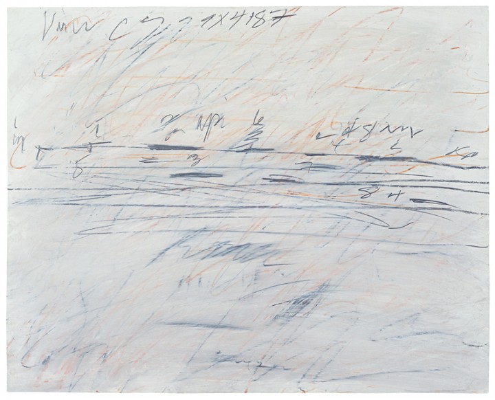
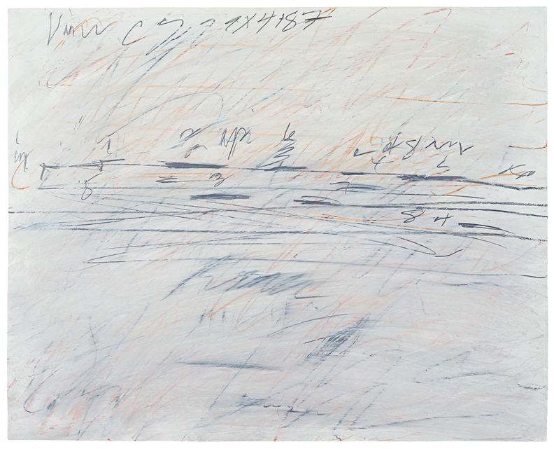
I hope my discussion will swerve partly away from that, though, into the more common assumption of arguments as clashes of different views. Take, for example, the obvious quarrel between the graphic elements of Cy Twombly’s Untitled (1971). Is it territorial–an actual battle to determine which of the two should control the field of play? Or is “game” a better term, since the work certainly conveys a sense of playing a game or sport (which often concern gaining territory)? I hope our discussion of the works I’ve chosen will lead to our own (useful!) quarrels as to which side involved is the “winner” of each work, aesthetically, or if instead a tie results.
Bob Grumman is a retired substitute teacher living in Port Charlotte, Florida. He has been active as a visual poet, specializing in what he calls “visiomathexpressive poetry.” His major collection of such poems is April to the Power of the Quantity Pythagoras Times Now (2008). He writes a guest column on the Scientific American website, where he addresses various kinds of mathematical poems. A contributing editor to Small Press Review with a regular column about poetry, Grumman has also written two books of criticism: Of Manywhere-at-Once (3rd ed. 1998) and From Haiku to Lyriku (2007). One of Grumman’s central interests is what he calls “plurexpressive art,” or art which makes significant aesthetic use of two or more expressive modalities, such as words and visual images. More information about his poetry may be found at poeticks.com/internet-homes-of-poems-by-bob-grumman/ and on his Wikipedia entry.
I frequently go through times when I commit to writing every day for an entirely different reason: for delight, for curiosity to see what emerges from my mind via my fingertips on a keyboard or my right hand sliding a pen or pencil across a page. This writing is an adventure into myself, the same as creating a drawing. I know where I am and know which road I am taking but I don’t know where I’ll end up: just enough structure and just enough serendipity. The results of these periodic commitments are rich once I sort through the pages, keeping what I can expand into a bigger piece of writing, and leaving the rest. The end result is significant.
The second type of writing is a creative ritual with an artistic goal, whereas the first type of writing I mention is more connected to employing worry beads, a mala, or a rosary. The physicality of the act is key. The meaning is in the process not in the product.
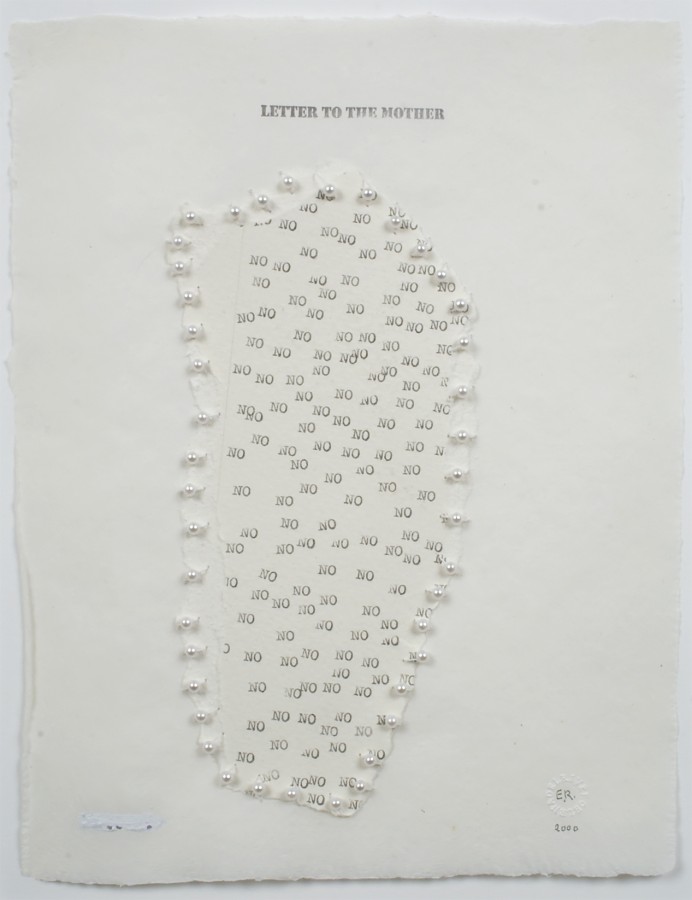
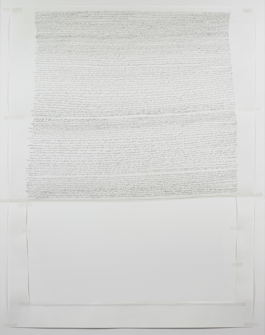
Elena del Rivero’s Letters explore this ongoing ritual of extracting and purging, the results of which are often obscured or beautifully obliterated: the act of writing as compulsion. In a different way, Annabel Daou’s Constitution plays with a process of recording language in which meaning breaks down but the process of writing and recording develops its own poetic presence, with meanings sprouting out in a multiplicity of confused directions. In both, the act is key, but the visual evidence of the act is lyrical.
When is the act of writing a meditation that produces meaning? And when can the point of writing be the ritual itself?
Susanna Harwood Rubin (b. New Jersey) has held artist residencies at the OMI International Arts Center in Ghent, New York (1998) and the American Academy, Rome (2002). Recent solo exhibitions have been held at the Hofstra University Museum, Hempstead, New York (2000); De Chiara/Stewart Gallery, New York (2000); Addison Gallery of American Art, New York (2003); artMovingProjects, New York (2006); Matin, Los Angeles (2007); and Museo de Arte Contemporáneo Esteban Vicente, Segovia, Spain (2009). Harwood Rubin has participated in many group exhibitions, including shows associated with the Sally & Wynn Kramarsky Collection, New York. She lives and works in New York. More information about her work can be found at www.susannaharwoodrubin.com.
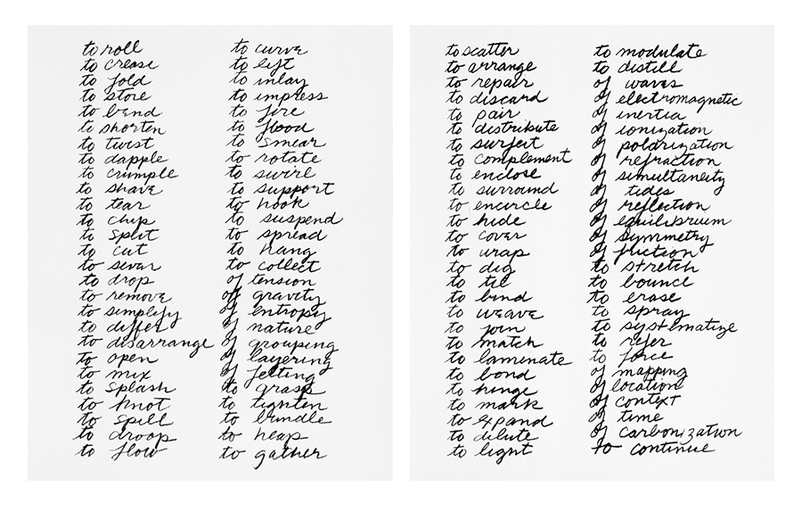
Then there is the sound of reading some of these artworks, either in one’s head or aloud. Suzanne Delehanty notes that the cadence of Richard Serra’s Verb List recalls the rhythmic compositions of the artist’s friend Philip Glass. And like Glass, just when things become predictable [“to support” “to hook” “to suspend”], Serra exchanges one note for another, [“of tension” “of gravity” “of entropy”]. We can also consider the sound of a ghostly narrator. I can’t help but imagine the reader of Molly Springfield’s Chapter IX sounding a little like a less strident Winston Churchill. And an audible element is critical to the full experience of Annabel Daou’s Constitution, in which Arabic letters are sequenced not to become a literal translation of the landmark US document but to somewhat awkwardly mimic the sounds of the English text when read out loud.
I could go on and on. And on. But I would prefer to discuss whether this audible connection exists in all types of artwork or if the construct of “text in art” particularly lends itself towards this interpretation? As an artist, do you ever notice or pay special attention to the sounds emitted when you make art? As a viewer, do you ever translate the visual into the auditory? And do you ever wonder what an artist was hearing when she made the work that you stand in front of?
N. Elizabeth Schlatter is the Deputy Director and Curator of Exhibitions at the University of Richmond Museums, Virginia, where she has organized exhibitions of modern and contemporary art since 2000. Previously she worked at the Smithsonian Institution Traveling Exhibition Service, Washington, DC, and the Contemporary Arts Museum, Houston. Elizabeth also organizes exhibitions independently and writes about art for various publications and websites. She has a BA in Art History from Southwestern University, Georgetown, Texas, and an MA in Art History from George Washington University, Washington, DC. Elizabeth lives and works in Richmond, Virginia.
John Waters’s 35 Days shows a grid of index cards on which he wrote his daily plans for 35 random days. Each day, Waters writes an itemized list of tasks on an index card, and as each task is completed, he crosses it out. The first thing you may ask yourself about this piece is, “Why is this art?” A little context might help you understand something more about Waters himself and the project this photograph embodies.
Waters is probably most famous for writing and directing a movie called Hairspray, in which a chubby teenager competes on a dancing show in 1960s Baltimore and racially integrates her community in the process. The second thing he’s most famous for is getting the actor Divine to eat dog excrement in a film called Pink Flamingos. There are lots of things that Waters has done, though, that have flown under the radar of mainstream America. He’s a very entertaining writer, a collector of artwork by such notable artists as Cy Twombly and Mike Kelley, a stand-up comedian, and a hobbyist hitchhiker. He’s the leader of a renegade band of actors known as the Dreamlanders, many of whom have pre-purchased tombstones in an area of a Baltimore graveyard they refer to as Disgraceland. He’s a justice activist who has repeatedly petitioned to get repentant criminals out of prison. He’s been sued for obscenity in multiple countries and has never won a case. He’s a provocateur, a raconteur, and an all-around hero of the most “under” of the underdogs in our society. All this from a man who was raised to be a good Catholic boy in upper-middle-class Lutherville, Maryland!
If this description hasn’t intrigued you, I’d like to add that he’s arguably one of the funniest people alive. If you’d like proof, you have only to check YouTube for the public service announcement he made for movie theaters: “No Smoking.” Smoking a cigarette throughout the announcement, he purrs and drawls: “I’m supposed to announce that there is no smoking in this theater, which I think is one of the most ridiculous things I’ve ever heard of in my life. How can anyone sit through the length of a film, and especially a European film, and not have a cigarette? But–don’t you wish you had one right now? Mmmmmmmmmm-mmm-mmm-mm.” He takes an enormous drag off his cigarette and then French-inhales the smoke right back up his nose, taunting the audience.
Here’s the kicker about this work of art. This piece is a record of the days and tasks of a man who is perhaps the preeminent symbol of anti-bourgeois, countercultural effrontery in American film, and he’s the most organized fellow! Each of these 35 index cards represents one day’s tasks, all neatly written down in a list; each task is crossed off upon its completion. Our culture often promotes particular notions about what it means to be an artist, usually a collection of stereotypes: the artist must be a moody, brilliant person led by flashes of inspiration and sudden whims. He can’t possibly be methodical, ordinary, or bound by routine in any way. His genius comes from his unconventional way of life. For example, the Surrealist artist Salvador Dalí claimed to sleep for brief moments with a key in his hand, which would bang into a pie plate once his sleeping hand released its hold. The pie plate’s clanging noise would wake him up, and he would continue his madcap pace of painting and profound psychological exploration. (Dalí himself promoted this idea, perhaps in a reaction of deep shame to his extremely traditional–and excellent–art education. How could one possibly be a Surrealist with a conventional life?)
As a writer myself, I know that any creative project I want to accomplish takes a lot more than inspiration. It also necessitates careful planning, deep thought, organization, hard work, and revision. Art doesn’t really make itself out of some magic fairy dust exuded (or, for that matter, snorted) by naturally talented artists. It’s a process, a plan, and a system of execution. Even obscene art needs a plan. That plan is what Waters allows us to see and understand in this work of art–which encompasses not only the visual aspects of the photograph, but the experiential work that those little index cards represent. Each of the 35 cards is the symbol of a day in the life of this artist–his plan, his system of collating and prioritizing the things he needs to do to make the art-machine go. As he wrote about the work of Cy Twombly, “This exclusive, violent, erotic handwriting that may seem illegible to others can be read if you just give it a chance.”1 This statement applies equally to Waters’s work here. Look closely. Under the spastic scribbling and crossing out, you can see some of the details of his days. Among them are friends to call, speeches to develop, and even “3 pills.” Try to find all the references to cameras. You might even discover your own name beside Ricki’s and Patty’s. I only wish that the note “Call NY apt for Susan” referred to me! You can ask yourself, where did that red pen come from, and does it designate something important, or did it just come to hand? What goes on in Waters’s brain, and how does he put this life together, and why did he turn out so deliciously different from the rest of us if his day, just like ours, merely depends on a little list on an index card?
Or you could just ask yourself, as Waters does in the essay “Roommates” in his 2010 book Role Models, “Isn’t art supposed to transpose even the most banal detail of our lives?”
1. John Waters, Role Models (New York: Farrar, Straus & Giroux, 2010), 247.
John Waters Biography
John Waters (b. 1946, Baltimore, MD) is a filmmaker and visual artist. Recent solo exhibitions have been held at the Laumeier Sculpture Park, St. Louis (2008); Marianne Boesky Gallery, New York (2009, 2015); Gagosian Gallery, Los Angeles (2009); Albert Merola Gallery, Provincetown, Massachusetts (2009); C. Grimaldis Gallery, Baltimore (2010); Rena Bransten Gallery, San Francisco (2010); Arthur Roger Gallery, New Orleans (2011); McClain Gallery, Houston (2012, 2013); Film Society of Lincoln Center, New York (2014); and Sprüth Magers, Berlin (2014). Recent group exhibitions have been held at Carnegie Museum of Art, Pittsburgh (2010); the Baltimore Museum of Art (2011); the Walker Art Center, Minneapolis (2011); McClain Gallery, Houston (2013); Boca Museum of Art, Boca Raton (2014); and the Edgewood Gallery, Yale School of Art, New Haven (2014). Waters lives and works in Baltimore, Maryland.
Susan Miller Biography
Susan L. Miller is a Russell Teaching Fellow at Writers House in the English Department, Rutgers University, New Brunswick, New Jersey. She teaches poetry and expository writing. Miller has previously published poems in Iowa Review, Meridian, Commonweal, Sewanee Theological Review, Black Warrior Review, Image, and in other journals. She also has poems in the anthologies Collective Brightness: LGBTIQ Poets on Faith, Religion, and Spirituality and in St. Peter’s B-List. Her prose has been published in Literature and Medicine. She lives in Brooklyn with her husband and daughter.
References
John Waters, Role Models (New York: Farrar, Straus & Giroux, 2010), 247.
For any artist or writer, a blank piece of paper offers the possibility of expression, which is part of the reason it can be terrifying. The drawing Suspended Sheet Stained with Ivy (1973) by Ed Ruscha allows us to reflect not just on art as text, but on art as the absence of text, which has the potential to strike fear into any artist.
During the time when he was making this drawing, Ruscha was experimenting with new pigment materials, so he used gunpowder and crushed a common ivy plant to create a stain for this work. This process demonstrates an attempt to change methods of production, and perhaps also to see things anew. In discarding his usual tools, pen and ink or brush and paint, Ruscha forced himself to regain a sense of play. The drawing also evokes a return to the origin of art itself–the first impulse to create which caused ancient people to invent basic methods of production. In the cave paintings at Lascaux, for example, pigments formed from minerals allowed early humans to record their world. In the present, we often use materials made in factories–fine papers, special paints–but Ruscha, in a rare act of primitivism, decided to go back to the natural sources of those materials, in order to create his art in an unfamiliar way.
It’s compelling that his subject here is the blank page, since it is at the center of the artist’s practice. There’s something witty about drawing the image of a piece of paper on a piece of paper, but it’s the kind of wit that exposes an anxiety about the artist’s potential to create. The term horror vacui means “fear of an empty space,” and it’s a familiar feeling both to painters and to writers. (This feeling has been blamed for a proliferation of imagery and for an obsessively decorative approach to the visual arts.) The tabula rasa or “blank slate” of a clean piece of paper can be paralyzing to an artist who is searching for something to communicate. As a poetry teacher, I often hear the question, “What can I do about writer’s block?” Almost anyone who’s ever wanted to write has faced a blank page–or the blinking cursor on a computer screen–with the feeling that nothing he or she could write would be worthy of being written. The great French writer Colette thought her father had written a dozen books with exotic titles–My Campaigns, Elegant Algebra, Zoave Songs–which he kept on a shelf in his office. After his death, she opened them, and except for a dedication to her mother, every page was completely blank.
The poet William Stafford, in correspondence with Ursula K. Leguin, a poet and science fiction writer, said something along the lines of: There’s no such thing as writer’s block. Lower your standards. On a practical level, this is good advice. It soothes the fear of having to make work that matters, and it allows the work to regain its proper shape and size. But for a blocked writer, that empty page can seem like a monolith, and instead of a clean slate to be filled, it can seem like an impermeable barrier between the self and the writing that one wishes to do.
Ruscha’s drawing, however, lightens this subject–literally. His piece of paper is floating in air, weightless, defying gravity’s pull not for a moment, but indefinitely. It’s an illusion made real, and it’s delightful because it allows us to share his act of imagination. The piece of paper, which can seem so heavy if you don’t know what to do with it, is weightless in this depiction. Ruscha, in the process of liberating himself from traditional methods of drawing, allows us to see that approaching the means of art making with curiosity can infuse a certain levity into our existence. Without the baggage of our writing, our experiences, our depictions and imitations, this piece of paper defies all the false weight with which we’ve invested it. It floats, and we wonder at its potential. Fear is replaced by new feelings–disorientation, maybe, but also a sense of awe, or even a sense of the humor in our own intimidation by a simple piece of paper.
One of my hopes for this exhibition is that it will help people to apprehend their own relationships to art and text. So often we think of art as something outside of ourselves, practiced by “real artists” or “real writers,” usually people whose work has been bought and paid for by others. A gallery show or a publication, we think, is the mark of a “real” creator, and how are we supposed to match that? But art making and writing are as approachable and immediate as any piece of paper in front of you. If a child draws a picture, it’s no less an act of art making than the Ruscha piece you’re currently viewing. Anyone can do it, if he or she chooses to, and the practice of writing, painting, drawing, sculpting, or photographing is a life-long pleasure. It allows you to express the things that are truly unique about you: your perspective, your experience, your understanding of the world. When you leave the museum today, challenge yourself. Pick up a piece of paper–not a computer or a cell phone. Return to the ancient process of writing or drawing the first thing that comes to mind. Give yourself permission to care about it, and equal permission to give it away. You’ll be surprised at what you’re capable of creating, if you give yourself the chance.
And if you have trouble? Lower your standards.
Ed Ruscha Biography
Edward Ruscha (b. 1937, Omaha, NE) studied at the Chouinard Art Institute, Los Angeles (1960). He has received grants and fellowships from the National Council on the Arts (1967); the National Endowment for the Arts (1969, 1978); the Tamarind Lithography Workshop (1969); and the John Simon Guggenheim Memorial Foundation (1971). Ruscha has been awarded the Skowhegan School of Painting and Sculpture Award in Graphics (1974); the Achievement in Printmaking Award from the Graphic Arts Council, Los Angeles County Museum of Art (1988); and the Achievement in Visual Arts Award from the California Arts Council (1995). He was elected to the American Academy of Arts and Letters (2001) and was the United States representative at the 51st Venice Biennale (2005). A major exhibition of Ruscha’s work was organized by the Whitney Museum of American Art, New York (2004) and traveled to The Museum of Contemporary Art, Los Angeles, and to the National Gallery of Art, Washington, DC. A retrospective of his work took place at the Hayward Gallery, London (2009) and traveled to Haus der Kunst, Munich, and to Moderna Museet, Stockholm. Other recent solo and group exhibitions have been held at Wetterling Gallery, Stockholm (2010); Sprüth Magers, Berlin (2010); the Modern Art Museum of Fort Worth, Texas (2011); Gagosian Gallery, Beverly Hills, California (2011); the Hammer Museum, Los Angeles (2011); Kunsthaus Bregenz, Austria (2012); Peter Lund Gallery, Los Angeles (2012); Gagosian Gallery, New York (2012, 2014); the Los Angeles County Museum of Art, California (2012) and traveled to the Rose Art Museum of Brandeis University, Waltham, Massachusetts (2012); Brandhorst Museum, Munich, Germany (2013); Kunstmuseum Basel, Switzerland (2013); and The Getty Center, Los Angeles (2013). Ruscha lives and works in Los Angeles. More information about his work can be found at www.edruscha.com.
Susan Miller Biography
Susan L. Miller is a Russell Teaching Fellow at Writers House in the English Department, Rutgers University, New Brunswick, New Jersey. She teaches poetry and expository writing. Miller has previously published poems in Iowa Review, Meridian, Commonweal, Sewanee Theological Review, Black Warrior Review, Image, and in other journals. She also has poems in the anthologies Collective Brightness: LGBTIQ Poets on Faith, Religion, and Spirituality and in St. Peter’s B-List. Her prose has been published in Literature and Medicine. She lives in Brooklyn with her husband and daughter.
Nancy Haynes is a conceptual artist. Her practice is to follow an idea, with such care and attention that the artworks resulting from this extended intellectual consciousness often seem to have materialized as a matter of nature. When Haynes’s paintings and drawings arrive at completion, each one comprises not only the artist’s initial thought and the myriad potentialities for the viewer’s perception, but also, knitted somewhere in between, the painstaking work of the object’s making.
Any image generally contains some interpretable component—call it information, whether it takes the form of language, thought, sensation, or visible material element. Access to this information is a primary concern of the viewer when addressing a work of art. More than anything, we want to feel that we can know something about an object.
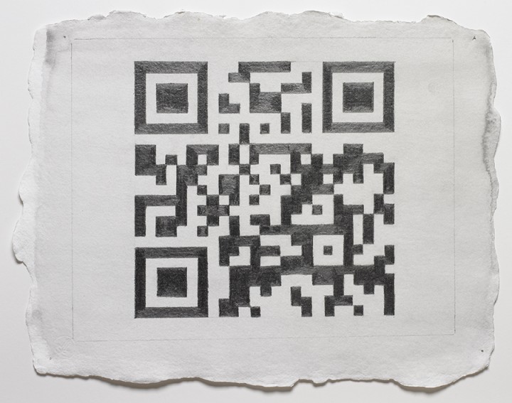
In recent years, Haynes has found herself intrigued by the strange, square-shaped black-and-white images that have appeared with growing frequency on surfaces ranging from the most public to the most intimate—from street posters to the insoles of running shoes. These images, known as Quick Response (QR) codes, were originally developed by programmers in the mid-1990s as a solution to the standard linear bar code’s limited capacity to contain data. Readable in both horizontal and vertical directions, the grid of the QR code allows its creator to convey significantly more valuable information to any user with an appropriate code reader application. Since its inception as a tracking tool in warehouses, the QR code has entered our visual awareness as a primary medium through which we access consumer products, supported in part by the rapid advent of the smartphone in the past decade. Each day, more people know what QR codes are and how to use them; in tandem with this expanding recognition comes expanding access, as increasing numbers of us carry our personal QR code readers at all times.
Haynes knew little of the QR code’s latent function at first.1 Yet in observing the structured modularity of the image and its adherence to the square format—not to mention its reductive palette—Haynes found elements of the modernist grid, the cool seriality of Minimal art, the organic geometry of Mimbres pottery, and the cerebral puzzle of the chessboard. In the occasional alignment of the small black squares, Haynes saw hints of the “plus” shape, or balanced cruciform, which she had used in many of her own early panel constructions. In the QR code’s alternating moments of graphic cohesion and dispersion, Haynes quite intuitively read a sort of contemporary hieroglyphics. Upon learning more about these images, notably about their ability to manifest complex information in a digitally determined visual format, it seemed to Haynes that the QR code would lend itself neatly to conceptual art making. She went to work.
The creator of a QR code determines his or her literal subject matter by selecting as a referent a certain URL, image, or passage of text. A unique visual layout corresponding to that data is then determined by a QR code generator program. Haynes enlists her husband, the sculptor Mike Metz, to print QR codes for the subject matter she chooses, thus depersonalizing any compositional activity. Haynes accepts the generated image as it is presented to her. She cannot alter the composition of the QR code without breaking the inherent digital link to its subject. This restriction is enforced not by conceptual philosophy so much as by function.
Upon receiving the specific QR code image, Haynes works diligently to replicate it on handmade linen paper. She uses a traditional graphite transfer process to map the QR code pattern from computer printout to linen paper sheet, and from this initial tracery she undertakes the darkening of each black square with equal deliberation. This is an exacting activity involving rulers and T-squares. Care is taken to ensure that the edges of the image remain crisp enough to be legible to the QR code reader.
While she works, Haynes is aware of the subject matter to which she is manually linking—but only because she chose it. Beyond that, her literal comprehension of what she draws is quite limited. Here, Haynes writes in an alien language, as if the image is transmitted through her; she can only determine whether her transcription is visually faithful. Knowing what her drawing will say, but not how it will say it, Haynes all the while understands that what she is creating will present a paradox of the unknowable.
When viewing this drawing, perhaps you first notice the sheen of the dense graphite or the nubby texture of the linen paper. Perhaps your eyes linger on the deckled edge of the sheet, the pinholes in each of its four corners, or the distinctive shape of the papermaker’s impression at the lower left. A loose, light wash of grey watercolor has spread to the edges of the paper, the pigment collecting into coastal tidemarks. In places, we can observe the shallow grooves in the graphite where the artist has worked and re-worked the pointed tip of her pencil into the support.
Twenty years ago, a viewer may have looked at this graphic image and wondered what this drawing could possibly communicate, either on its own or in reference to the artist’s conceptual agenda. He or she would have mentally categorized the drawing as abstract or representative, random or composed, worth time spent looking or not—based on what could be seen within it. Yet today, many of us will look at this drawing and experience a distracting sensation of recognition. We recognize immediately that there is something in this drawing to be read and, almost simultaneously, we recognize that we (alone) are incapable of reading it.
Many of us will know where to turn for a translation. Our smartphones see the QR code as a series of binary toggles. Each square can be either dark or light; sufficient contrast and clarity of edges are, to the smartphone, equivalent to legibility. Many of us carry the tool we need to read this drawing right in our pockets. Yet to opt to read the drawing is in some ways to remove ourselves from it: we step back physically in order to frame the QR code in the viewfinder of our smartphone (it is too large to scan up close),2 and in placing a device between our eyes and the object, we extricate ourselves intellectually from the activity of looking at it. We choose between knowing what this object is and knowing what this object says, and either way we each make this choice consciously.
A smartphone can only understand a QR code insofar as it can establish optical contrast. If the edges of the squares are not clear enough to be scanned, the image is rejected. The smartphone’s version of visual criticism is, much like its method of vision, binary—the image functions, or it does not. Imagine that! A smartphone is even wise enough to know its own limitations, and whenever it cannot read an image, it is saddled with no lingering drive toward self-reflection. For now, we humans respond differently, and perhaps it is in part this difference that Haynes’s drawings celebrate.
The beauty of this drawing is that it pauses the viewer just below its surface. Here, Haynes asks us to acknowledge our own partial blindness in the face of this object by making a choice. If we choose to distance ourselves by scanning the drawing with a smartphone, we can access its obscured meaning, and that may be satisfying on a (quite valid) literal level. But if we choose to move past what we cannot know, we allow the object to draw us further inward. We resume our examination of graphite, pigment, and paper—materials we can hope to know directly. The confrontation with the unknowable that Haynes encourages indeed harbors the potential for the great relief of a different kind of understanding: an intimate congress with this remarkable object and with the physicality of drawing.
1. I am grateful to Nancy Haynes for several conversations in 2012 regarding the QR code drawings and what Haynes refers to as their “unknowable quality.”
2. Wynn Kramarsky provided this very helpful observation.
Nancy Haynes Biography
Nancy Haynes (b. 1947, Waterbury, CT) has exhibited in the United States and internationally since the 1970s. In 2000, Haynes was a Visiting Artist at Ohio State University, Columbus, a Visit Artist at Kent State University, Kent, Ohio, and a Visiting Lecturer at Princeton University, Princeton, NJ. Recent solo exhibitions of her work were held at Galerie Hubert Winter, Vienna, Austria (2002, 2006); Elizabeth Harris Gallery, New York (2009); George Lawson Gallery, San Francisco (2010); George Lawson Gallery, Los Angeles (2012); and 3A Gallery, New York (2012). Her work is included in the public collections of numerous major museums, including The Museum of Modern Art, New York; The Metropolitan Museum of Art, New York; the Whitney Museum of American Art, New York; the Brooklyn Museum, New York; the National Gallery of Art, Washington, D.C.; and the Museum of Fine Arts, Houston. She lives and works in Red Hook, Brooklyn, and in the Huerfano Valley, Colorado. More information about her work can be found at http://www.nancyhaynes.net.
Rachel Nackman Biography
Rachel Nackman (b. 1985, White Plains, NY) is the curator of the Kramarsky Collection, where she has worked since graduating from Tufts University, Medford, MA, in 2007. In 2011, she completed her MA in Art History at the Institute of Fine Arts, New York University. Nackman is the founding editor of the Contemporary Art Consortium blog and an associate art editor for the Brooklyn Rail. She lives in Brooklyn.
References
I am grateful to Nancy Haynes for several conversations in 2012 regarding the QR code drawings and what Haynes refers to as their “unknowable quality.”
Wynn Kramarsky provided this very helpful observation.
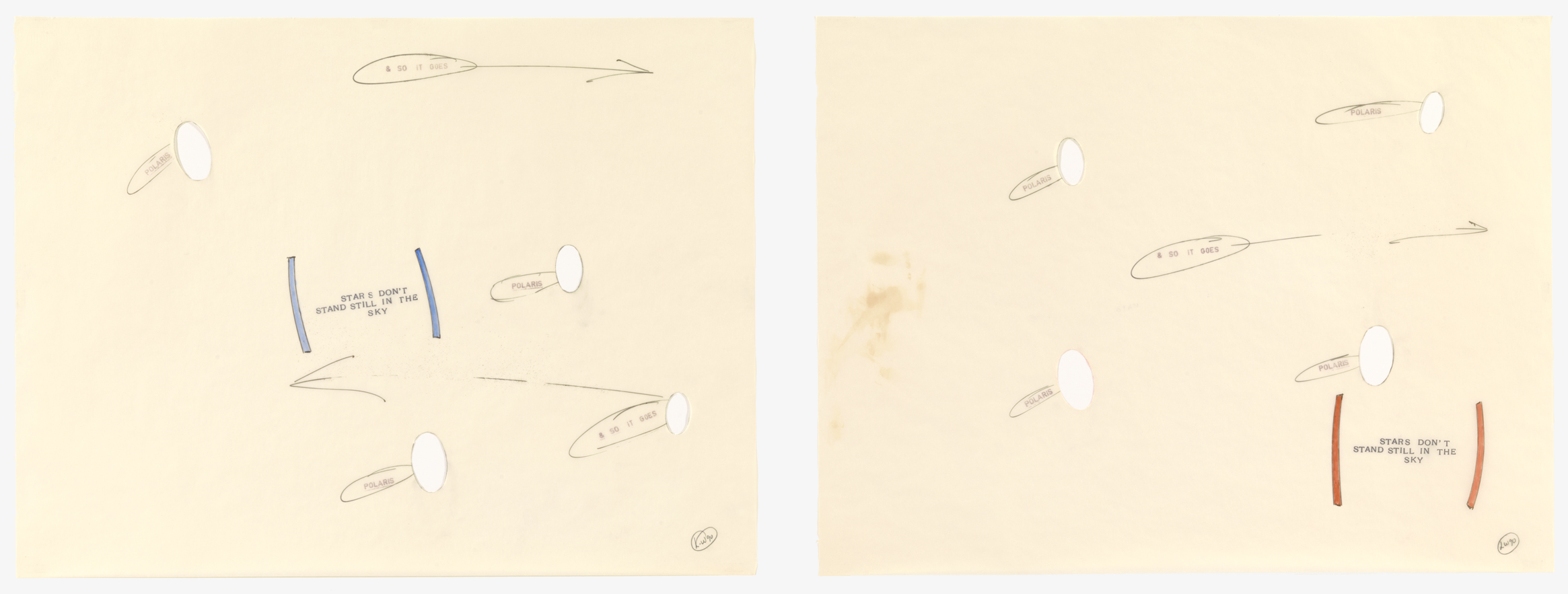
Polaris is a star that goes by many names: North Star, Northern Star, Pole Star, and most significantly, Guiding Star. This last moniker points to the star’s remarkable role in guiding countless sailors, travelers, and adventurous souls across the earth. Polaris remains nearly motionless in the sky as the stars around it rotate with the progression of the night, making it the ideal marker for navigation through an otherwise unnavigable world, in which nothing, not even the sky itself, stands still. By choosing Polaris as the title and subject of these drawings, Lawrence Weiner draws upon the full weight of the history and connotations of this celestial entity. But by a sideways allusion to the star’s most important quality — stability — Weiner also redirects meaning toward more slippery terrain.
Instability is characteristic of the artist, who is best known for his conceptual statements, words, phrases, and directions displayed across walls and other surfaces. For Weiner, language is not merely text or decorative motif – it is a form of sculpture unto itself. The meaning of his words is never stable; depending on context they take on various significances. As Weiner’s sculptures are constantly installed in new locations, they are perceptually elusive, never succumbing to a singular distillation of meaning. Moreover, these words, although physically manifested as pigment on a surface, are meant to be transformed into new forms entirely. According to Weiner, “The work I do is designed for translation. It’s the exact opposite of what poetry is.”1 This statement indicates that Polaris is more than a clever combination of words and shapes; it is a schematic diagram, an illustrated map, or, like the North Star itself, a guide.
Polaris seems to pulsate: arrows and ovals appear hastily drawn, scrappy lines suggest a quickly moving hand and a need for speed. This quality lends a precariousness to the work, as if Weiner needed to capture the movement of the stars as quickly as possible, lest they disappear from the sky. Cut-out holes further destabilize the subject matter and composition – instead of seeing the most geographically constant star, Polaris, we have only negative space. In contrast to these empty holes and quickly drawn lines, the blue and red parentheses along with the phrase STARS DON’T STAND STILL IN THE SKY seem to maintain a sense of weightiness. The boldly stenciled letters and thick colored brackets look firmly placed on the paper, an appearance somewhat at odds with the perceived meaning of the words themselves.
What does it mean when Polaris has lost its stability and, by extension, its guiding ability? Weiner takes us into existential territory, making us question concepts of reliability and consistency, as well as the very truths that make up our reality. There is a certain amount of liberation in shaking off limits and releasing reality from the boundaries of our expectations. In this way, Polaris is not merely a geographical guide. It is a path to alternative ways of thinking and a model for expanding the scope of our minds to encompass greater possibilities for understanding the world around us.
1. Quoted in Phyllis Rosenzweig, Lawrence Weiner: Works with the Passage of Time (Washington, D.C.: Hirshhorn Museum & Sculpture Garden, 1990), n.p.
Lawrence Weiner Biography
Lawrence Weiner (b. 1942, Bronx, NY) received his high school diploma from Stuyvesant High School, New York. During the late 1950s and early 1960s, Weiner traveled throughout the United States, Mexico, and Canada. The first presentation of Weiner’s work was in Mill Valley, California (1960). His most recent solo exhibitions were held at the Marian Goodman Gallery, New York (2007); CAC Málaga, Spain (2008); The Power Plant Contemporary Art Gallery, Toronto (2009); Espai d’art contemporani de Castelló, Spain (2009); House of Art, Budweis, Czech Republic (2010); the Museum of Contemporary Art Antwerp, Belgium (2011); Collection Lambert en Avignon, France (2011); Regen Projects, Los Angeles (2012); Base / Progetti per L’Arte, Florence (2012); Galleria Alfonso Artiaco, Naples (2012); Galerie Hubert Winter, Vienna (2012); Blain|Southern, Berlin (2012); Lisson Gallery, London (2013); Villa e Collezione Panza, Varese, Italy (2013); ArtAids Foundation, Santa Caterina Market, Barcelona (2013); and Museu d’Art Contemporani de Barcelona and the Stedelijk Museum, Amsterdam (2013). Weiner divides his time between his studio in New York City and his boat in Amsterdam.
Sarah Zabrodski Biography
Sarah Zabrodski (b. 1985, Calgary, Alberta, Canada) holds an MA in Art History from the Institute of Fine Arts, New York University. She works in the Publications Department of the Getty Research Institute, Los Angeles. Zabrodski blogs at emergingartcritic.com.
References
Quoted in Phyllis Rosenzweig, Lawrence Weiner: Works with the Passage of Time (Washington, D.C.: Hirshhorn Museum & Sculpture Garden, 1990), n.p.
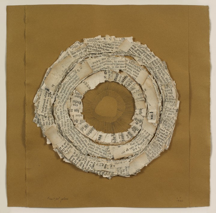
Lenore Tawney’s Fruitful Place (1966) has a delicate tactility, built up in layer upon layer of torn and cut paper, and augmented by the close, careful hatching of the artist’s pen strokes at its center. Concentric paper rings recede into and project from an imagined perspectival depth until the woven form of a basket eventually begins to suggest itself. This shape is offered to the viewer as a receptacle in which to “place all the fruits,” as dictated by a line of visible text. Torn from an assortment of antique hymnals, the included fragments are poetic puzzle pieces of a spiritual message, given new physical consequence through Tawney’s simple, but deft, manipulation of medium.
Among certain circles, Tawney is lauded as a pioneer of the resurgent fiber arts movement of the mid twentieth century. Creating narrative lines with weft thread or crafting monumental hanging tapestries of totemic presence, she blurred the boundaries between weaving, sculpture, and drawing. While best known as a weaver, Tawney was equally prolific in drawing, collage, and assemblage. She produced a persistently innovative body of work over the course of a five-decade career as an artist while returning to a coherent set of inspirational sources, many of which are brought to bear in Fruitful Place. Tawney’s collages and assemblages are reliquaries of natural and man-made ephemera, from shells and feathers, to found boxes and manuscripts. These works especially are often equated with ritualistic offerings, described in terms of visual poetry, or endowed with sacred connotations.
It is helpful to consider her work as the expression of a dynamic process. In her weavings, Tawney choreographed thread in order to conduct three-dimensional space in the same way that musical notes form a composition; she saw woven threads “like music moving in air.”1 Consistently driven by the desire to make things reach “out and up,”2 she uses strips of paper here much as she used thread. When considered in this light, Tawney’s activity of cyclically pasting the strips of torn hymnal acquires a rhythmic tone.
1. Quoted in Vestures of Water: The Work of Lenore Tawney (Allentown, PA: Allentown Art Museum, 1997), 2.
2. Quoted in Lenore Tawney: A Personal World (Brookfield, CT: Brookfield Craft Center, 1978), 11.
Lenore Tawney Biography
Lenore Tawney (b. 1907, Lorain, OH; d. 2007, New York) was a student at the Institute of Design, Chicago (1946-1947). She studied tapestry at the Penland School of Crafts, North Carolina (1954) and then joined a community of artists working in Coenties Slip in Lower Manhattan. She studied gauze weaving with Lili Blumenau in New York (1961). During the mid-1960s, Tawney began to work in drawing, collage, and assemblage, a practice she continued throughout her life. She was an artist-in-residence at the University of Notre Dame, Indiana (1978), and at the Fabric Workshop, Philadelphia (1982). Tawney was a guest lecturer for Visual Arts and Fiber at The Banff Center, Alberta, Canada (1983), and a distinguished lecturer at the University of Arizona, Tucson (1987). She has received awards from the American Craft Council, the James Renwick Alliance, and the American Craft Museum, in addition to an honorary degree from the Maryland Institute College of Art, Baltimore. Her first major retrospective was held at the Museum of Arts and Design, New York (1990). Recent solo exhibitions were held at the Maryland Institute College of Art, Baltimore (2012-2013) and the University of the Arts, Philadelphia (2013). Her work is housed in the public collections of The Museum of Modern Art, New York; The Metropolitan Museum of Art, New York; The Art Institute of Chicago; and the Cooper-Hewitt National Design Museum, New York.
Ingrid Langston Biography
Ingrid Langston (b. 1983, Seattle, WA) received her MA from the Institute of Fine Arts at New York University. She is currently a curatorial assistant in the Department of Drawings and Prints at The Museum of Modern Art, New York.
References
Quoted in Vestures of Water: The Work of Lenore Tawney (Allentown, PA: Allentown Art Museum, 1997), 2.
Quoted in Lenore Tawney: A Personal World (Brookfield, CT: Brookfield Craft Center, 1978), 11.