I’m interested this week in looking closely at artists who make a mark, then erase or cross it out. In this time and place of abundance, the purposeful act of removing, erasing, eliminating, crossing out, or discarding lines that have been drawn or written suggests any number of things. Are these instances of self-editing, thoughtful re-considerations, or a tantalizing tease? How does the act of erasing, concealing, or crossing out differ from an empty page or tabula rasa? How is the physical presence of that which once was different from that which has not yet become? A drawing or line of text that has been expressed and then removed leaves a trace that seems more poignant than the empty page. The temptation is always to try to read what has been excised, to reconstruct the drawing that has been erased, to imagine what lies beneath the censor’s black lines. It strikes me as I write that the physical memory of clarifying thoughts is lost to me as I delete and rewrite this text on a computer screen, not physically making marks on paper.
Rauschenberg famously erased a drawing by Willem de Kooning in 1953; it is now in the collection of SFMOMA. Through what the museum’s website describes as “digital capture and process technologies” the museum has discovered the erasures that de Kooning himself enacted in the process of creating the original drawing. How does erasure measure against mark making?
Donna Gustafson is the Andrew W. Mellon Liaison for Academic Programs & Curator at the Zimmerli Art Museum. She is also a member of the graduate faculty in the Department of Art History at Rutgers.
In reading the discussions so far, I’m struck by how little talk there has been about how much of the work in this exhibition functions as drawing. That’s especially interesting to me because the work comes from a collection well known for its focus on the contemporary practice of drawing. So I’d like to talk about how the drawings in Art=Text=Art both exist within traditional parameters and expand the boundaries of drawing.
In his The Elements of Drawing (1885), John Ruskin—the father of modern drawing instruction—said that one of the acceptable aims for the serious drawing student was to “be able to set down clearly, and usefully, records of such things as cannot be described in words.” What would John Ruskin, with his Victorian notions of drawing, make of the drawings in Art=Text=Art? My guess is that he’d be fairly scandalized since what he has in mind are beautifully rendered images of important architecture and sublime landscapes drawn from life or faithfully copied from a master artist’s work.
But many of the drawings here are recording “such things as cannot be described in words.” They just happen to be doing so with words. I’m thinking of work like Susanna Harwood Rubin’s 102 boulevard Haussmann and William Anastasi’s Untitled (READING A LINE ON A WALL). At first glance they may seem like dry, conceptual statements. But those statements—carefully rendered in graphite using methods not so different from the ones Ruskin espouses in The Elements of Drawing—conjure real physical spaces within in the viewer’s mind. So could they be thought of as observational? In what other ways do the drawings in Art=Text=Art exist within and expand the traditional modes of drawing?
Molly Springfield (b. 1977, Columbia, SC) earned her BA magna cum laude from Queens College, Charlotte, North Carolina (1999). She received her Post-Baccalaureate Certificate from the Maryland Institute College of Art, Baltimore (2000), and her MFA from the University of California, Berkeley (2004). She took part in the Skowhegan School of Painting and Sculpture, Skowhegan, Maine (2006). Springfield was a resident at the Millay Colony for the Arts, Austerlitz, New York (2008). She has thrice received a Visual Artist Fellowship from the D.C. Commission on Arts & Humanities / National Endowment for the Arts (2009, 2011, 2014). Recent solo exhibitions have been held at Mireille Mosler, New York (2008); Steven Wolf Fine Arts, San Francisco (2009, 2013); Thomas Robertello Gallery, Chicago (2009, 2012); and the Center Art Gallery at Calvin College, Grand Rapids, Michigan (2011). Recent group exhibitions have been held at the Portland Museum of Art, Portland, Maine (2010); the University of Buffalo Art Gallery, Center for the Arts, Buffalo, NY (2012); the Indianapolis Museum of Art (2012); Tracy Williams, Ltd., New York, NY (2013); Galerie Thomas Zander, Cologne, Germany; and The Drawing Center, New York, NY (2013). Springfield lives and works in Washington, D.C., where she is a Professorial Lecturer in the Department of Art at American University. More information about her work can be found at www.mollyspringfield.com.
“The proposition is a picture of reality. The proposition is a model of the reality as we think it is.”
We picture reality to ourselves-–that’s what it means to “make sense” in the picture theory of meaning. One interpretation of this theory, extremely significant for the history of science, is that “[a]nything normative, supernatural or (one might say) metaphysical must, it therefore seems, be nonsense.” (IEP) Since we can’t picture things that are “metaphysical,” like God, morals, or existence-as-such (things beyond what we can observe), then it is impossible to make sense when talking about them.
This is generally called “the problem of unobservables” and was present in the positivist and empiricist traditions both before and after Wittgenstein’s early work. A common response to this problem, and Wittgenstein’s view of it, is that the things we can’t observe–-God, morality, even knowledge itself–-seem very real to us, perhaps more real than the things we observe!
Here is a fascinating occasion of tension, particularly between art and text. On the one hand, the picture theory of meaning prioritizes images. Without images we can’t understand what we mean when we communicate with one another. On the other hand, this same theory rejects the possibility that we can make sense when communicating about what seems the most real: God, morality, and what it means to exist. My questions, huge as they may be, are: What is reality? Is it what we picture or what we observe? In other words, is it possible to make sense when speaking about things we can’t observe? What role do images play here?
David Backer is a writer and teacher living in Brooklyn. He is a Graduate Coordinator at New Community College, City University of New York. Backer also edits fictiondaily.org, and is pursuing a doctorate in Philosophy and Education at Teachers College, Columbia University, New York. He blogs at davidbacker.com.
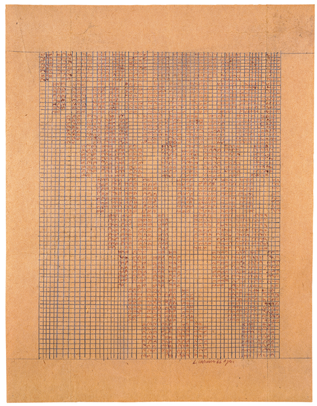
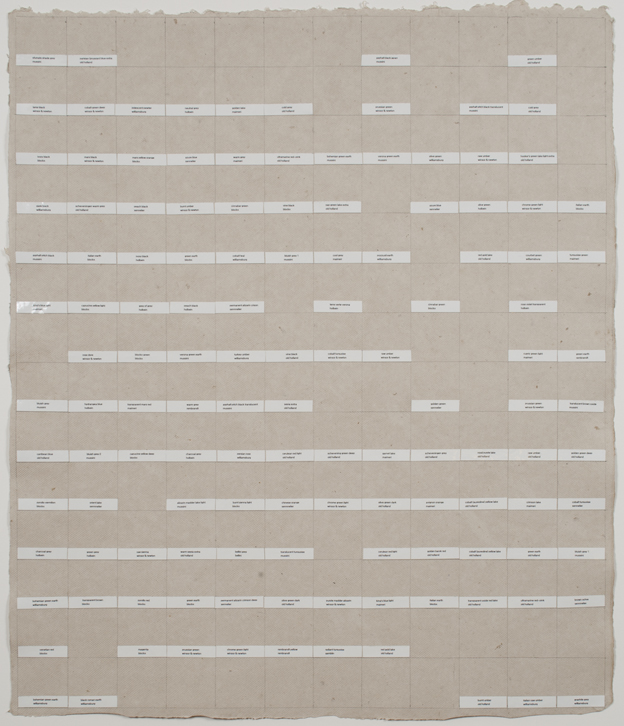
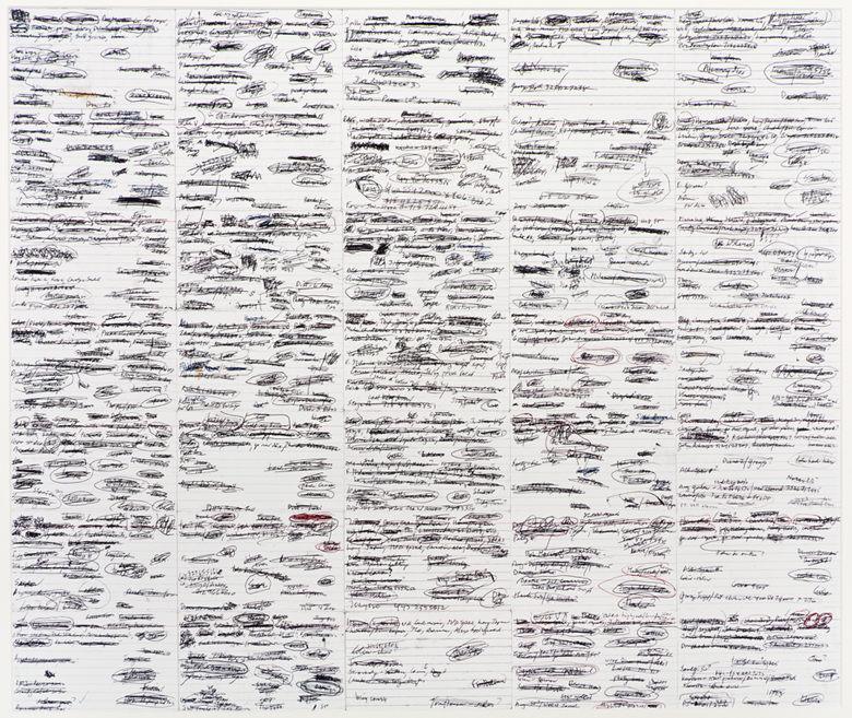
The artworks featured in Art=Art=Text employ charts, graphs, and tables as structures for organizing both ideas and tangible things. In some cases, such as Christine Hiebert’s Brand Drawings (1998-1999), they reveal how humans organize the world around them. In others, such as Lawrence Weiner’s Polaris (1990), they show how extraordinarily relative our perception of the world is. And yet other works, like Alice Aycock’s Garden of Scripts (1986) adopt these devices for playful ends.
1. What can be considered a chart, graph, or table? How do the artists in this exhibition expand on traditional definitions of these tools?
2. Charts, graphs, and tables are modes of communication that are considered scientific and even objective, but many of the works in Art=Text=Art clearly reflect the subject positions and opinions of their creators. How do artists use these frameworks for persuasive ends, to change our perception of the ideas or objects within them?
Kate Scott is a PhD candidate in the Department of Art History at Rutgers University, Newark, New Jersey, where she specializes in American art and the history of photography. She is a Graduate Curatorial Assistant at the Zimmerli Art Museum.
Building on Nathan Langston’s fascinating discussion of ekphrasis, the act of translation of ideas from the visual to the textual, I’d like to re-focus on his mention of “information.” As Nathan put it, “the very premise of the show concerns the relationship (or sometimes disconnect) between information communicated as text and information communicated visually. There are both differences and similarities between the ways these two forms convey information…”. I’d like to delve a little bit deeper into this idea of “information communicated visually.”
It’s a cliché by now to point out that we currently live our lives surrounded by “information,” right? We have Wikipedia at our fingertips and newsflashes beamed across our buildings. We have so much information available to us that we have to organize it into charts, graphs, and color-coded maps. This sea of visual information is only going to get deeper as we get closer to the November elections. We’ve all had to become experts at recognizing these charts and digesting them.
I’m interested in how these skills at extracting data from the visual translate when we turn our gaze to the art object. I’m especially interested in artists whose works use the trappings of the chart or the graph to encourage us to try to decode their work, only to frustrate us by not providing clear answers and data as such. My impression is that it’s this frustration of expectation that makes these works so powerful, though I’m still trying to puzzle out exactly how this works.
What do you think — is there an overlap in how we read a newspaper graph and how we read a work of art? Is there a difference between how we approach a drawing like Mark Lombardi’s or Lawrence Weiner’s and how we might approach another drawing? Do you try to read information into Stefana McClure’s and Stephen Dean’s work? Is that “reading” a part of the viewer’s experience of the work? How do these works, even at their most informational, manage to expand beyond the informational?
Emily Sessions (b. 1980, Philadelphia, PA) is a PhD student in the History of Art at Yale University, New Haven, Connecticut. She received her BA in Psychology and Anthropology from Brandeis University, Waltham, Massachusetts, and her MA in Art History from the Institute of Fine Arts, New York University. She has worked at such institutions as the Brooklyn Museum, New York; the Rose Art Museum, Brandeis University; and the Colección Patricia Phelps de Cisneros, New York. Sessions has published and presented on subjects ranging from medieval mappaemundi to relational aesthetics. She lives and works in New York City.
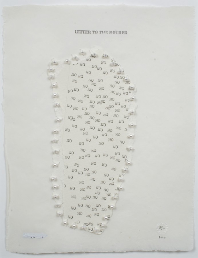
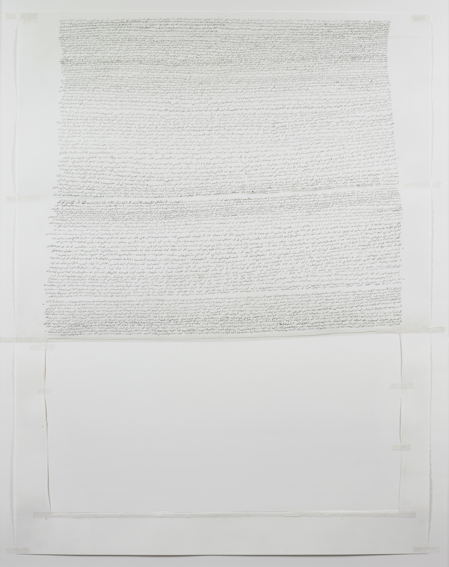
I would like to discuss the issues surrounding authorship and its relationship to public and private identity as raised by selected works in Art=Text=Art, including those by Nancy Haynes and Karen Schiff. What does it mean to credit an artist as the creator of an art object if that artist uses/adapts a text authored/originated by another? Or if an artist appropriates imagery produced by another? Or incorporates found objects/materials? What is the currency of a name and how does it vary depending on our public versus private identity?
Raised in rural Maine, Patricia Brace (b. 1983, Cherryfield, Maine) is an interdisciplinary artist whose work includes performance art, video, drawing, installation, and textiles. Her work addresses ideas of performativity and basic comparative psychology. In the past, Brace taught as a part-time lecturer at Mason Gross School of the Arts, at Rutgers University, New Brunswick, New Jersey. She is now working primarily as a performance artist in New York. Recently Brace’s work has been shown at White Box, Gary Snyder Project Space, and SOHO 20 in New York and Trestle Gallery in Brooklyn. She is the recipient of the Giza Daniels Endesha Award, the Ray Stark Film Prize, and the Leon Golub Scholarship. More information about Patricia’s work may be found at http://vimeo.com/m/patriciabrace.
Usually the phrase “reading into things” means something slightly negative: we impose our interpretations on what we experience, inventing ill-fitting meanings. This week, I want to twist the phrase and unearth a positive sense: we can use the act of reading to generate actual “things” (that is, artworks). Usually, we think of words as generating only ideas, but in some languages, the same word means both “word” and “thing.” And what is writing, after all, but a series of squiggles — a complex line drawing, which is a sort of object — that we’ve all agreed about how to interpret?
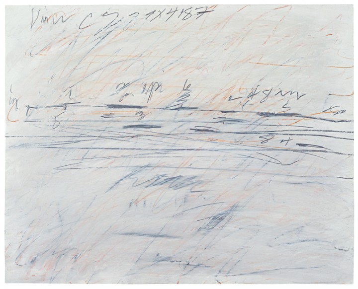
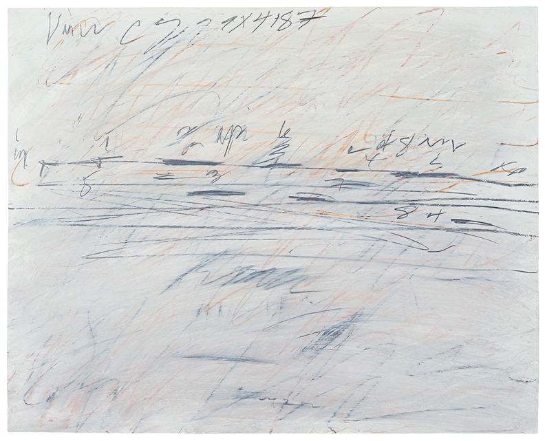
This transformation from language into art can take many paths. In this exhibition, Elena del Rivero makes forms out of her letters (and here “letters” means both individual characters and the communiqués that she creates from them). Stefana McClure makes ghostly wisps out of the residue of written/typed language — one kind of “impression” leads to another. And I’m endlessly moved by the scrawling drawings of Cy Twombly and Christine Hiebert, in which writing is palpably implied.
What is the feeling you get from your reading, and how can that feeling manifest in a visual form? What feelings — or “readings” — do we get from textual forms themselves? What are the effects of different fonts, and how does the role of typeface as an advertising tool intersect with its role as an artistic medium? What is the impact of textual layout, in its different cultural configurations? Altogether, how can we “read” the “thingness” — or visual dynamism — of material texts? I’m interested in how such questions play out in the artworks (in this exhibition or not), and in our daily lives.
Karen Schiff (b. 1967, New Haven, CT) earned her MFA in Studio Art at the School of the Museum of Fine Arts, Tufts University, Boston (2006), where she won a Drawing Award from the SMFA faculty (2005). Schiff completed earlier degrees at the University of Pennsylvania, in Philadelphia (PhD in Comparative Literature and Literary Theory, 1998) and Brown University in Providence, Rhode Island (AB/AM in Comparative Literature/English, 1989). Schiff has been resident at the Harwood Museum of Art, Taos, New Mexico (2007); the Edward F. Albee Foundation, Montauk, New York (2007); Anderson Ranch, Snowmass Village, Colorado (2011); Yaddo, Saratoga Springs, New York (2012, 2014); and the Helene Wurlitzer Foundation of New Mexico, Taos (2012, 2014), among other institutions. Schiff contributed an artists’s project, Counter to Type, to the Spring 2014 issue of Art Journal. The project included drawings, an essay, and a video about her process. She lectures and publishes about her work in the word/image field, and she also creates projects about artist Agnes Martin. A recent solo exhibition was held at the Flanagan Campus Art Gallery, Community College of Rhode Island, London (2011). Recent group exhibitions include such venues as Hverfisgallerí, Reykjavik (2014), Hafnarborg Museum, Hafnarfjör∂ur, Iceland (2013); Arkansas Arts Center, Little Rock (2012); Danese, New York (2010, 2011, 2012); the Katonah Museum of Art, Katonah, New York (2011); Galería Astarté, Madrid (2010). In 2013 Schiff curated the group exhibition Winter Reading: Lines of Poetry at Diane Birdsall Gallery, Old Lyme, Connecticut. She lives in New York City and has a studio in Brooklyn. More information about her work can be found at www.karen-schiff.com.
Susan L. Miller is a Russell Teaching Fellow at Writers House in the English Department at Rutgers University, New Brunswick, New Jersey. She teaches poetry and expository writing. Miller has previously published poems in Iowa Review, Meridian, Commonweal, Sewanee Theological Review, Black Warrior Review, and in the anthology Collective Brightness: LGBTIQ Poets on Faith, Religion, and Spirituality. More poems are forthcoming in Voices in Italian Americana, The Journal of Feminist Studies in Religion, and Image. Her prose has been published in Literature and Medicine. She lives in Brooklyn with her husband.
I hope my discussion will swerve partly away from that, though, into the more common assumption of arguments as clashes of different views. Take, for example, the obvious quarrel between the graphic elements of Cy Twombly’s Untitled (1971). Is it territorial–an actual battle to determine which of the two should control the field of play? Or is “game” a better term, since the work certainly conveys a sense of playing a game or sport (which often concern gaining territory)? I hope our discussion of the works I’ve chosen will lead to our own (useful!) quarrels as to which side involved is the “winner” of each work, aesthetically, or if instead a tie results.
Bob Grumman is a retired substitute teacher living in Port Charlotte, Florida. He has been active as a visual poet, specializing in what he calls “visiomathexpressive poetry.” His major collection of such poems is April to the Power of the Quantity Pythagoras Times Now (2008). He writes a guest column on the Scientific American website, where he addresses various kinds of mathematical poems. A contributing editor to Small Press Review with a regular column about poetry, Grumman has also written two books of criticism: Of Manywhere-at-Once (3rd ed. 1998) and From Haiku to Lyriku (2007). One of Grumman’s central interests is what he calls “plurexpressive art,” or art which makes significant aesthetic use of two or more expressive modalities, such as words and visual images. More information about his poetry may be found at poeticks.com/internet-homes-of-poems-by-bob-grumman/ and on his Wikipedia entry.
I frequently go through times when I commit to writing every day for an entirely different reason: for delight, for curiosity to see what emerges from my mind via my fingertips on a keyboard or my right hand sliding a pen or pencil across a page. This writing is an adventure into myself, the same as creating a drawing. I know where I am and know which road I am taking but I don’t know where I’ll end up: just enough structure and just enough serendipity. The results of these periodic commitments are rich once I sort through the pages, keeping what I can expand into a bigger piece of writing, and leaving the rest. The end result is significant.
The second type of writing is a creative ritual with an artistic goal, whereas the first type of writing I mention is more connected to employing worry beads, a mala, or a rosary. The physicality of the act is key. The meaning is in the process not in the product.
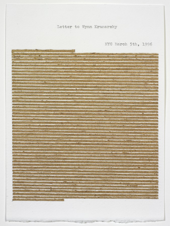
Elena del Rivero’s Letters explore this ongoing ritual of extracting and purging, the results of which are often obscured or beautifully obliterated: the act of writing as compulsion. In a different way, Annabel Daou’s Constitution plays with a process of recording language in which meaning breaks down but the process of writing and recording develops its own poetic presence, with meanings sprouting out in a multiplicity of confused directions. In both, the act is key, but the visual evidence of the act is lyrical.
When is the act of writing a meditation that produces meaning? And when can the point of writing be the ritual itself?
Susanna Harwood Rubin (b. New Jersey) has held artist residencies at the OMI International Arts Center in Ghent, New York (1998) and the American Academy, Rome (2002). Recent solo exhibitions have been held at the Hofstra University Museum, Hempstead, New York (2000); De Chiara/Stewart Gallery, New York (2000); Addison Gallery of American Art, New York (2003); artMovingProjects, New York (2006); Matin, Los Angeles (2007); and Museo de Arte Contemporáneo Esteban Vicente, Segovia, Spain (2009). Harwood Rubin has participated in many group exhibitions, including shows associated with the Sally & Wynn Kramarsky Collection, New York. She lives and works in New York. More information about her work can be found at www.susannaharwoodrubin.com.
,\" 1967/1977")