Suzanne Delehanty on Richard Serra

Richard Serra, Verb List, 1967, graphite on paper, 2 sheets, each 10 x 8 ½ inches (25.4 x 21.6 cm). The Museum of Modern Art, New York. Gift of the artist in honor of Wynn Kramarsky, 2011. © 2013 Richard Serra / Artists Rights Society (ARS), New York / Photo: John Wronn

Verb List is far more than it seems at first glance.

Verb List holds the kernels not only of the artistic revolution brewing in American art during the 1960s, but of the monumental body of work that Richard Serra has been creating ever since. Serra made Verb List shortly after he moved to New York in 1966, following two years of travel and study in Europe. Living in New York’s then rough-and-ready SoHo district, he was part of a circle of artists, musicians, dancers, and filmmakers who were breaking down the boundaries between painting, sculpture, drawing, performance, and film to create works of art that directly reflect the artist’s actions and engage the viewer.

Serra was in his late twenties when he created Verb List in 1967–68. At the time, he did not consider it a work of art but thought of it as a way of figuring out his own direction as a young artist. In a recent interview, Serra said: “The Verb List gave me a subtext for my experiments with materials. The problem I was trying to resolve in my early work was: How do you apply an activity or a process to a material and arrive at a form that refers back to its own making? That reference was mostly established by line. In a sense you can’t form anything without drawing.”1

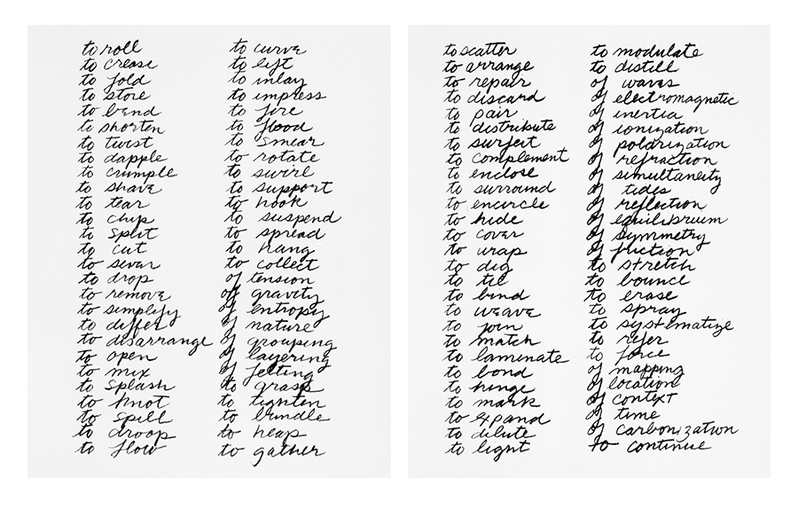
For Verb List, Serra wrote out in an assertive hand, well trained in the Palmer Method of penmanship, four evenly spaced lists of words on two ordinary eight-by-ten-inch sheets of paper. The words he selected were muscular and task oriented, and they show his kinship with the choreographer Yvonne Rainer, whom he considers an important influence on his early development as a visual artist. In fact, Serra’s choice of words—to roll, to fold, to bend—echoes Rainer’s 1965 manifesto in which she bravely states: “No to spectacle no to virtuosity no to transformations and magic…,” in her search for a new dance based on ordinary tasks rather than dramatic movement.2 Read out loud, the repetitive cadence of Verb List recalls the innovative music of the composer Philip Glass, a longstanding friend and, at the time, Serra’s neighbor and sometime collaborator in the moving business he started to make ends meet.

Regardless of the media, Serra and other vanguard artists of the 1960s were dedicated to the process of making art rather than to the creation of expressive objects or performances. Actually called Process art, this new approach changed the course of art in the past 50 years and gained early public exposure in three landmark exhibitions held in 1968–69: Square Pegs in Round Holes, or Op Losse Schroeven at the Stedelijk Museum in Amsterdam; Anti-Illusion: Procedures/Materials at the Whitney Museum of American Art in New York; and Live in Your Head: When Attitudes Become Form: Works – Concepts – Processes – Situations – Information, which opened at the Kunsthalle Bern, Switzerland, and traveled to two other venues in Europe. Featuring the work of 69 American and European artists, When Attitudes Become Form focused on works that showed the artist’s activity—forever transforming the relation of the artist, the audience, and the museum. Serra showed three sculptures, including a piece he made on site in the museum by splashing lead against a wall.3

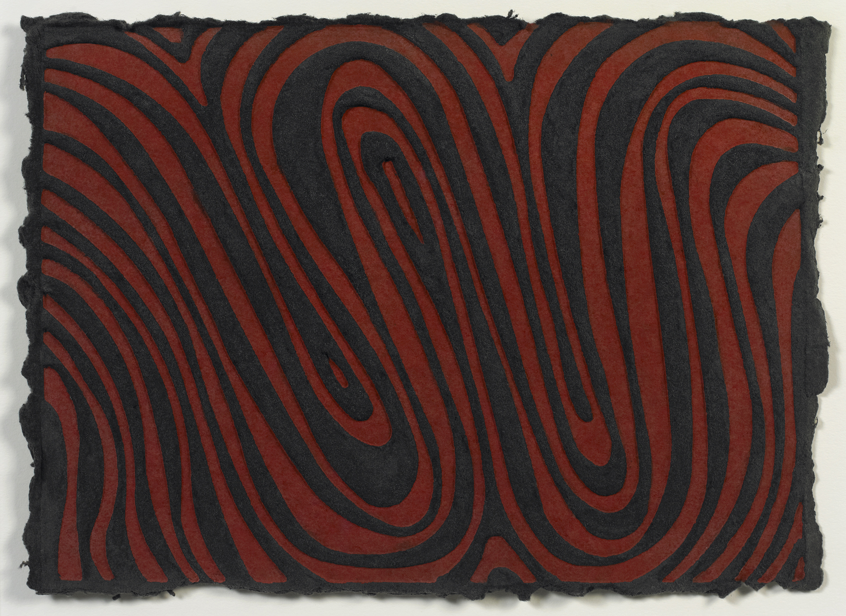
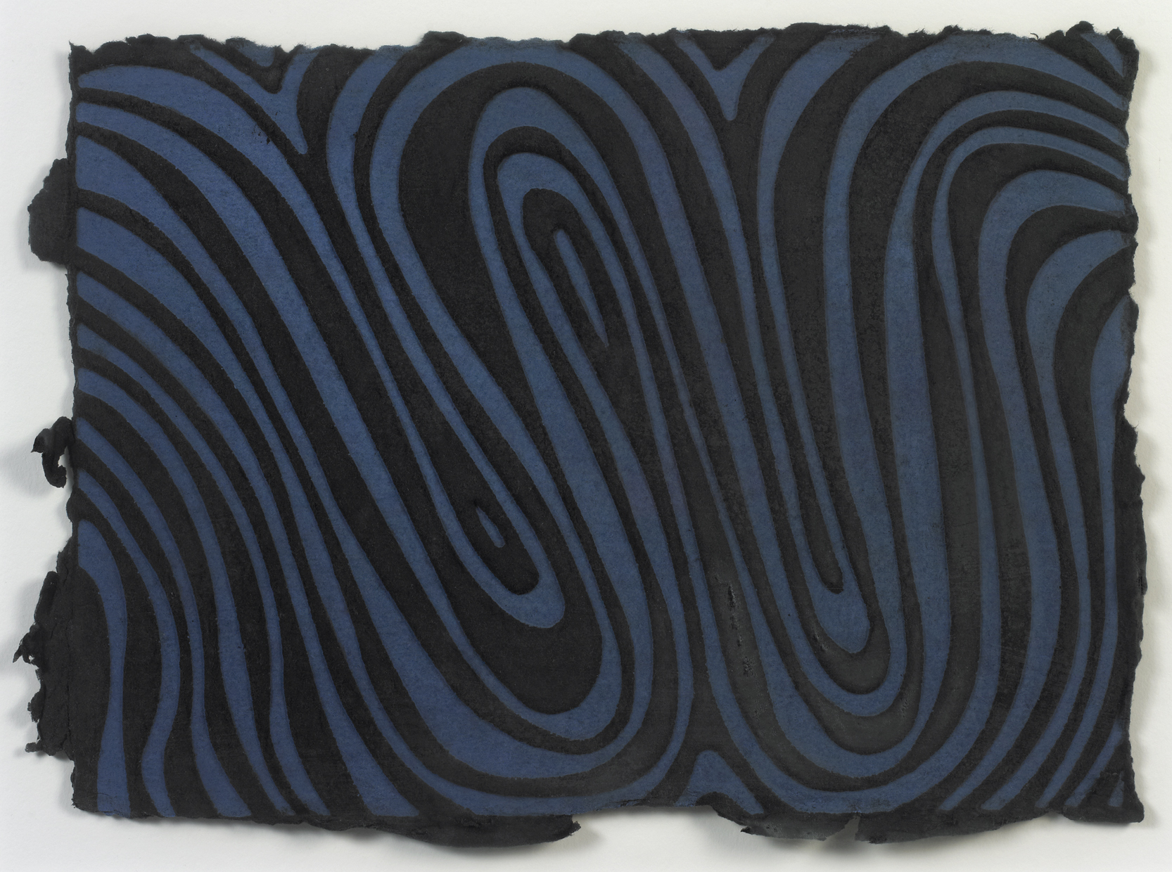
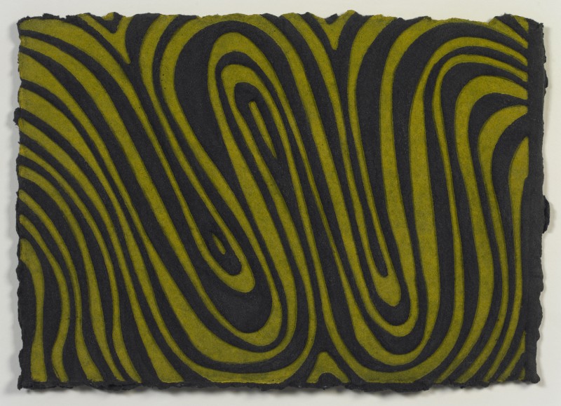
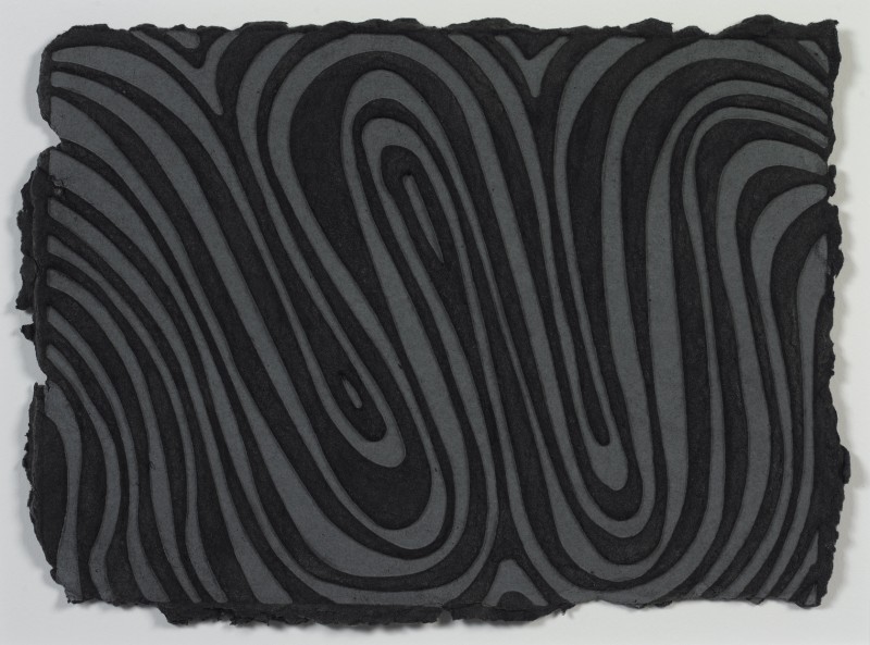
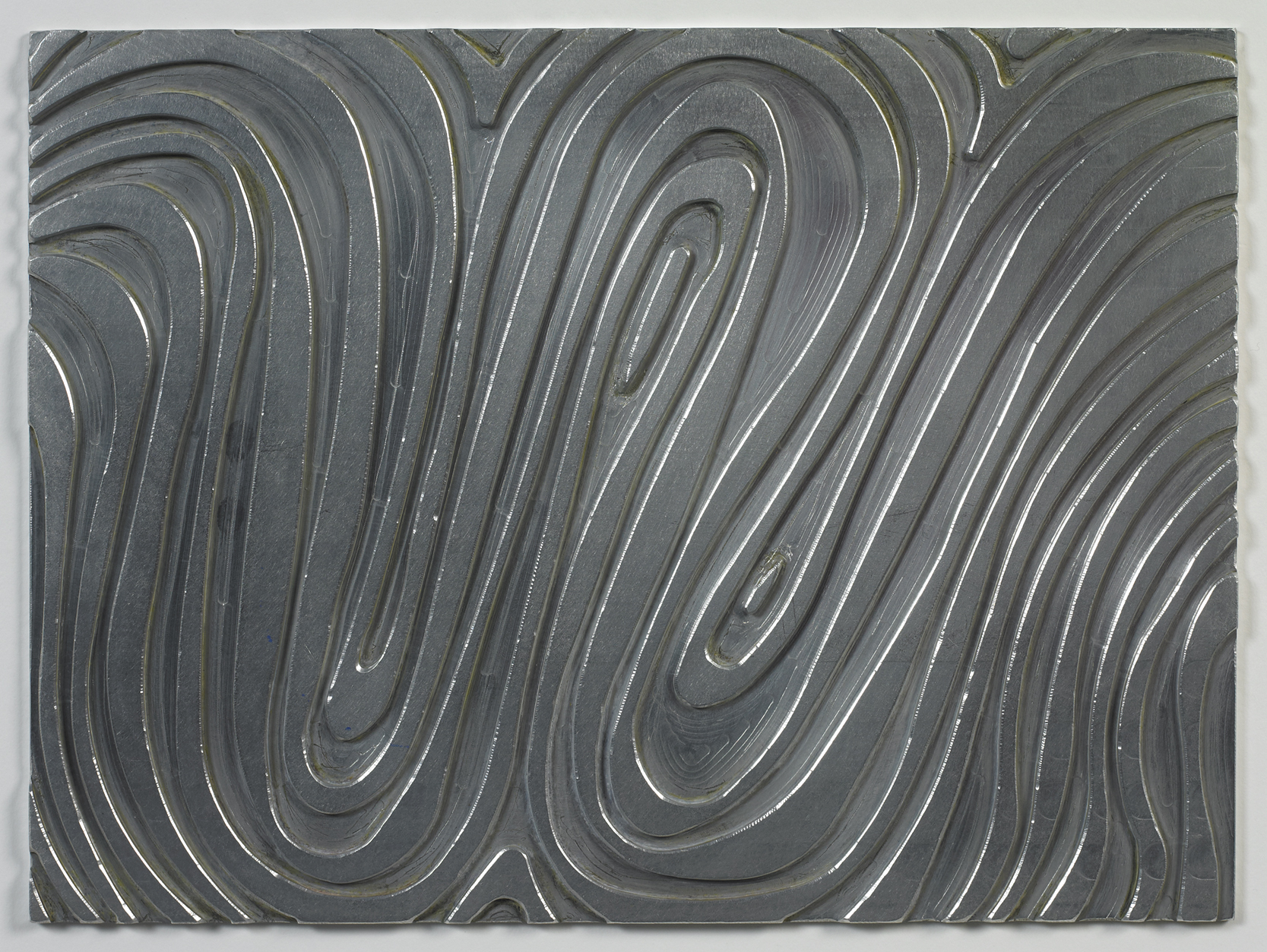
Since those heady days in the sixties and the birthing of Process art, Serra has created a powerful body of large-scale installation drawings with oil stick and monumental steel sculptures that continue to embody the possibilities that he mapped out in Verb List, impacting the way a viewer experiences the passage of time and the physical act of moving through space. As he continues to create masterful sculptures around the world, Serra also keeps sketching, as he did as a boy growing up in California: “Drawing for me is a way to keep my hand and eye conditioned and to keep my mind nimble.”4

Today, nearly fifty years after Serra made Verb List, this seemingly unassuming work is considered an iconic art object. Verb List was the earliest work included in the major retrospective of Serra’s drawings shown in New York, San Francisco, and Houston in 2011–12. Serra kept Verb List in his personal collection until 2012, when he gave it to New York’s Museum of Modern Art in honor of Wynn Kramarsky—a tribute to their enduring friendship and mutual respect for machine shops, “shop talk,“ and the well-made object.5


1. Richard Serra quoted by Gary Garrels in “An Interview with Richard Serra (2010)” in Richard Serra Drawing: A Retrospective (Houston: The Menil Collection, 2011), 61.
2. Yvonne Rainer, Feelings Are Facts: A Life (Cambridge, Massachusettes: MIT Press, 2006), 263.
3. See Christian Rattemeyer et al., Exhibiting the New Art: ‘Op Losse Schroeven’ and ‘When Attitudes Become Form’ 1969 (London: Afterall Books, 2010).
4. Serra quoted in Garrels, 81.
5. Wynn Kramarsky in conversation with the author in July 2012.

Richard Serra Biography

Richard Serra (b. 1938, San Francisco, CA) worked in steel mills across the West Coast before receiving his BA in English Literature from the University of California, Berkeley (1960). Serra earned his MFA in Painting from Yale University, New Haven, Connecticut (1964). He has received awards and fellowships from Yale University; the Fulbright Program; the Carnegie Museum of Art; the Japan Art Association; the American Academy of Arts and Letters; and the Prince of Asturias Foundation. His work has been celebrated with two retrospectives at The Museum of Modern Art, New York (1986, 2007), and one at the Metropolitan Museum of Art (2011) that traveled to the San Francisco Museum of Modern Art and to the Menil Collection, Houston. Recent solo exhibitions have been held at Gagosian Gallery, New York (2008); Monumenta, Galeries nationales du Grand Palais, Paris (2008); Kunsthaus Bregenz, Austria (2008); Gagosian Gallery, Rome (2010); Fondation Beyeler, Riehen/Basel, Switzerland (2011) and traveled to Guggenheim Museum Bilbao; and Courtauld Gallery, London (2014). His work is part of the public collections of The Museum of Modern Art, New York; Dia Art Foundation, New York; and the Guggenheim Museum, Bilbao, Spain. Serra lives and works in New York City and Nova Scotia.
Suzanne Delehanty Biography
Suzanne Delehanty is principal of Suzanne Delehanty LLC, a consulting firm founded in 2006 that provides strategic planning and art advisory services for initiatives that bring art, artists and communities together. An internationally known museum leader, Delehanty has an outstanding record of achievements in the museum field. She led the transformation of what was the Center for the Fine Arts into the Miami Art Museum, Florida, from 1995 to 2005. She launched its collection of international art of the 20th and 21st centuries, making it one of the largest museum educational programs in the state of Florida. Delehanty also secured a prime waterfront site and $100 million county bond funding for the construction of a new facility; today the museum is called the Perez Art Museum Miami, and is housed in the highly acclaimed building designed by Swiss architects, Herzog and DeMueron. She also has served as Director of the following institutions: the Zimmerli Art Museum, Rutgers University; the Contemporary Arts Museum, Houston; the Neuberger Museum of Art, Purchase College, State University of New York; and the Institute of Contemporary Art, the University of Pennsylvania, Philadelphia. As a curator, Delehanty is known for spearheading seminal monographic exhibitions on such artists as Agnes Martin, Robert Morris, George Segal, Richard Artschwager, Cy Twombly, Paul Thek, and Fred Sandback. She has also worked on a number of notable thematic exhibitions and publications, including Video Art (1975), Soundings (1981) and The Window in Twentieth-Century Art (1988). Currently she is a member of the Association of Art Museum Directors, serves on the advisory council for the PBS series Art in the Twenty-First Century, and serves on the Board of Tunnels and Towers, Inc., New York. Delehanty holds a BA in Art History from Skidmore College, Saratoga Springs, New York, and has pursued graduate studies in the History of Art at the University of Pennsylvania, Philadelphia and post-graduate studies at Harvard, Columbia and Yale. She lives in Miami.

David Lasry on Sol LeWitt

Sol LeWitt, W, 1995, relief print on handmade Twinrocker paper, 9 x 12 ½ inches (22.9 x 31.8 cm). Special edition published by Two Palms, New York. © 2013 The LeWitt Estate / Artists Rights Society (ARS), New York / Photo: Ellen McDermott

Two Palms had been open for less than a year when I was invited to produce this small series of embossed prints with Sol LeWitt in 1994. Sally Kramarsky called me and asked if there was an artist with whom I could secretly produce a print for Wynn Kramarsky’s 70th birthday. Since Wynn and I were both in love with Sol’s work, it seemed natural to approach Sol for this project. He readily agreed, with his usual economy of language: he said yes, and the matter was settled.

Having recently embarked on a print project with Mel Bochner, my former professor at the Yale University School of Art, I was thrilled to be working simultaneously with two revered pioneers of minimal and conceptual art. Seasoned pros at project-oriented collaborations, both artists instantly knew how to take advantage of the new set of tools I offered and to make something unique within their oeuvre.

Sol LeWitt, W, 1995, relief print on hand dyed, handmade Twinrocker paper, 9 x 12 ½ inches (22.9 x 31.8 cm). Special edition published by Two Palms, New York. © 2013 The LeWitt Estate / Artists Rights Society (ARS), New York / Photo: Ellen McDermott


The first time he visited my studio, Sol quietly ambled about, feeling paintbrushes and picking up printing plates. He was fiercely intellectual, but notoriously reserved. After a few minutes, he stopped and gazed at the monolithic industrial hydraulic press occupying an altar-like position in the room. “Could you show me how it works?” I ran the press up and down so he could see how the lower platen came straight up and contacted the top platen, the needle on the pressure gauge climbing slowly to 350 tons.

Sol went to the edge of the room and peered through his glasses at a freshly printed Bochner piece pinned to the wall. The print had deep embossment and was caked with juicy red ink. Sol couldn’t resist the impulse to feel its surface. Of course the ink was wet, and he smeared the line. “Sorry,” he said. “Sorry,” I replied, handing him a paper towel. “I should have warned you it was wet.” (I still have the smudged Bochner print.) Sol looked around a bit more while wiping his hand, and he felt through the raw slabs of thick white handmade paper made especially for us by Twinrocker. “I have some ideas; I know what I want to do,” he said.

Sol LeWitt, W, 1995, relief print on hand dyed, handmade Twinrocker paper, 9 x 12 ½ inches (22.9 x 31.8 cm). Special edition published by Two Palms, New York. © 2013 The LeWitt Estate / Artists Rights Society (ARS), New York / Photo: Ellen McDermott


A few days later, I arrived at the studio early in the morning, and a drawing lay waiting in the inbox of my fax machine. It had arrived at around 6 A.M. Wavy lines formed a W with color notations inside the lines. Instructions were added in the lower margin, along with his signature: solwith a circle drawn around it. We were to dye paper certain colors, create a deeply engraved plate based on his drawing, roll the plate with colored ink, and print it on the hydraulic press. Sol knew the colored paper would push down into the engraved grooves and, when hung on the wall, would physically pop off.

Producing the plates was a problem; this was before the use of lasers to cut plates was a practical consideration. Hand carving plates from wood was an option, but tests showed us that the wood would break down quickly under pressure from the hydraulic press. It was not a solution for an edition. Finally, we had an engineer make computer-aided design (CAD) renderings of Sol’s drawings, and using these he generated a tool path for a computer-controlled milling machine. The plates were precisely and deeply milled out of aluminum. Today our in-house laser engraving machines allow us to achieve the same results, only faster and cheaper.

Sol LeWitt, W, 1995, machine milled aluminum plate, 8 ¾ x 11 ¾ inches (22.2 x 29.8 cm). Published by Two Palms, New York. © 2013 The LeWitt Estate / Artists Rights Society (ARS), New York / Photo: Ellen McDermott

Sol made use of our unique press and our custom paper to add physicality to the visual opulence of his original drawing. When he came to see the proofs, he again ran his hand over the surface of the print, feeling every crevice and raising it up to his nose, smelling the dye. The materiality of the object seemed to give him pleasure. He told me he was also working on an installation project for the Lighthouse International, a research center for the blind in New York City, and he wanted to make a piece that we could see and the blind could feel.1

In light of his earlier rational, ordered, idea-driven works, with written instructions referencing the path from idea to artwork, I asked Sol if he was now somehow embracing a kind of chaos theory in all its intelligible disorder. Perhaps, in his wizened years, he was appealing more to the eye than to the mind? He responded simply, “No.”


1. Sol constructed his Styrofoam Installation #32 behind the information desk at the Lighthouse on East 59th Street in 1996.

Sol LeWitt Biography

Sol LeWitt (b. 1928, Hartford, CT; d. 2007, New York, NY) earned his BFA at Syracuse University, Syracuse, New York (1949). LeWitt’s work was first publicly exhibited in a group show at the Kaymar Gallery, New York (1964), and has since been the subject of hundreds of solo exhibitions. The most recent retrospective of the artist’s wall drawings was installed in 2008 at the Massachusetts Museum of Contemporary Art (MASS MoCA), North Adams, in partnership with the Yale University Art Gallery, New Haven, Connecticut, and with the Williams College Museum of Art, Williamstown, Massachusetts, and will be on view for 25 years. His work is represented in museum collections worldwide, including: The Museum of Modern Art, New York; the Solomon R. Guggenheim Museum, New York; Dia:Beacon, New York; the National Gallery of Art, Washington, D.C.; Tate Modern, London; Centre Georges Pompidou, Paris; Australian National Gallery, Canberra, Australia; and the National Museum of Serbia, Belgrade. LeWitt lived and worked in New York City, where an installation of his three-dimensional structures, organized by the Public Art Fund, was on view in City Hall Park through 2011. Pace Gallery has represented the estate of LeWitt since 2007.
David Lasry Biography
David Lasry received an MFA from Yale University School of Art, New Haven, Connecticut. In 1994, he founded Two Palms, a collaborative studio in New York City that publishes and produces prints, multiples, sculpture and other objects. Two Palms has worked with artists such as Mel Bochner, Chuck Close, Cecily Brown, Peter Doig, Carroll Dunham, Ellen Gallagher, Per Kirkeby, Sol Lewitt, Chris Ofili, Elizabeth Peyton, Richard Prince, Matthew Ritchie, Dana Schutz, Jessica Stockholder and Terry Winters. Two Palms works have been acquired by numerous institutions including the Albertina, Vienna; The Baltimore Museum of Art; The Broad Art Foundation, Los Angeles; the Fogg Art Museum, Harvard University, Cambridge, Massachusetts; the Armand Hammer Museum of Art and Culture Center, University of California, Los Angeles; The Metropolitan Museum of Art, New York; the Museum of Fine Arts, Boston; The Museum of Modern Art, New York; the National Gallery of Art, Washington, DC; Princeton University Art Museum, Princeton, New Jersey; The Studio Museum in Harlem, New York; the Tate Modern, London; the Walker Art Center, Minneapolis; the Whitney Museum of American Art, New York; and Yale University Art Gallery, New Haven, Connecticut.

Joan Witek on Sol LeWitt

Sol LeWitt, Postcard, 1996, felt-tip marker on postcard, 4 x 6 inches (10.2 x 15.2 cm). © 2013 The LeWitt Estate / Artists Rights Society (ARS), New York / Photo: Ellen McDermott
Verso of Sol LeWitt, Postcard, 1996, felt-tip marker on postcard, 4 x 6 inches (10.2 x 15.2 cm). © 2013 The LeWitt Estate / Artists Rights Society (ARS), New York / Photo: Ellen McDermott


It was said that Sol didn’t like vacations. His pleasure was being in his studio. He explained that he had worked out his life as he wanted it to be, so why take a vacation from it?1

Perhaps this postcard to Wynn Kramarsky from October 1996 may have been sent during Sol’s slip from a life of rigorous non-vacationing.

Sol and Carol LeWitt sent this postcard from the Brazilian town of Ouro Preto (Portuguese for “black gold”), just over 500 kilometers from Rio de Janeiro. Ouro Preto is a well-known historic center, famous for its 17th- and 18th-century art and architecture. Grand monuments were created here as testaments to the town’s wealth, which was derived from the rich gold deposits in the area.

The mid 18th-century font pictured on the front of Sol’s postcard is located in the Chapel of Padre Faria, and it echoes the Pre-Columbian style within a Baroque format — the bastard child of these two prominent movements in the Americas.

The elaborate curves of the font, twirling alongside an evocative, fearsome carved face, seem to have intrigued Sol. If we imagine his work prior to this period of the mid-1990s — a stricter geometry of straight lines–perhaps we can see that it would not have complimented the font as well as the loose drawing here does. Now, the images speak to one another through the screen of many centuries.

When the stamp was placed on this postcard, did Sol put it there, or did the post office? We notice that the classical head on the stamp is staring at Sol’s drawing, enraptured!

Sol LeWitt Biography

Sol LeWitt (b. 1928, Hartford, CT; d. 2007, New York, NY) earned his BFA at Syracuse University, Syracuse, New York (1949). LeWitt’s work was first publicly exhibited in a group show at the Kaymar Gallery, New York (1964), and has since been the subject of hundreds of solo exhibitions. The most recent retrospective of the artist’s wall drawings was installed in 2008 at the Massachusetts Museum of Contemporary Art (MASS MoCA), North Adams, in partnership with the Yale University Art Gallery, New Haven, Connecticut, and with the Williams College Museum of Art, Williamstown, Massachusetts, and will be on view for 25 years. His work is represented in museum collections worldwide, including: The Museum of Modern Art, New York; the Solomon R. Guggenheim Museum, New York; Dia:Beacon, New York; the National Gallery of Art, Washington, D.C.; Tate Modern, London; Centre Georges Pompidou, Paris; Australian National Gallery, Canberra, Australia; and the National Museum of Serbia, Belgrade. LeWitt lived and worked in New York City, where an installation of his three-dimensional structures, organized by the Public Art Fund, was on view in City Hall Park through 2011. Pace Gallery has represented the estate of LeWitt since 2007.
Joan Witek Biography
Joan Witek (b. 1943, New York, NY) earned her BFA from Hofstra University, Hempstead, New York (1964), and continued her studies at the Brooklyn Museum Art School, New York (1964-1968), and the Art Students League, New York (1969-1973). Witek was a Curatorial Assistant at the Brooklyn Museum in Primitive Art and New World Cultures (1964-1968) and she worked as an Assistant Curator at the Metropolitan Museum of Art, New York, in the Rockefeller Wing (1971-1978). Witek attended City University and Hunter College, New York, for graduate coursework in Art History (1977-1981). Recent solo exhibitions have been held at the Carnegie Museum of Art, Pittsburgh (1984); Rosa Esman Gallery (1984, 1985); 560 Broadway, New York (1997); Sean Scully Studio, New York (2000); CDS Gallery, New York (2001); and Gallery Niklas von Bartha, London (2000, 2003, 2005, 2009). Witek’s work has been included in group exhibitions at the San Francisco Museum of Modern Art (1991); the PS1 Museum, Long Island City (1977, 1992); the Metropolitan Museum of Art, New York (1982, 1983, 2003, 2007); the National Museum of Women in the Arts, Washington, DC (1996); the Harvard Art Museums, Cambridge, Massachusetts (1997); the Albright-Knox Gallery, Buffalo, New York (2005, 2007, 2008, 2009); the San Diego Museum of Art (2008); the Museo de Arte Contemporaneo Esteban Vicente, Segovia, Spain (2009); Bartha Contemporary, London (2009, 2012); Gallerie Weinberger, Copenhagen (2010); Sammlung Schroth, Kloster Wedinghausen, Arnsberg, Germany (2011, 2012); and Kunstmuseum Wilhelm-Morgner-Haus, Soest, Germany (2013). She lives and works in New York City. More information about her work can be found at www.joanwitek.com.

Mary Mann on Ray Johnson

Ray Johnson, BOO[K], ca. 1955, artist’s book: collage on cardboard cover with hand-sewn binding; handwritten text and drawing in black and red inks on cut paper pages, 8 x 6 inches (20.3 x 15.2 cm), closed. © Ray Johnson Estate, Courtesy Richard L. Feigen & Co. / Photo: Ellen McDermott

Jack wrote a letter.

He spent days writing it. First, the salutation. Then, the closing. And then, Jack puzzled over the middle. He dreamed of what he could write. He considered all the possibilities. He ended up writing his letter backwards, which is how he liked to read magazines. He pasted in some pictures from an actual magazine for emphasis.

He signed the letter very carefully and folded it into thirds. He selected a green felt pen to address the envelope, and he sealed it with a bitter lick of glue.

Then Jack walked to the United States Post Office, taking a left on Fifth Avenue and a right at the bottom of Madison Square Park. On the way he gave sixty-seven cents to an old homeless woman with a McDonald’s cup in her hand. He stepped out of the way of a tot, on a trike, who was followed closely by a hovering father. He saw: a young couple kissing on a bench; many people on cell phones, striding this way and that; a woman stroking a squirrel on its side.

The line at Shake Shack snaked around the southern section of the park. It was cool and dark inside the post office. Jack waited in line in order to buy the stamps in order to mail the letter that he had taken so long to write.

“Anything liquid, perishable, or potentially hazardous?” asked the postman as he took Jack’s letter.

“Just words,” said Jack.

The postman put a stamp on the envelope and took Jack’s money. Then the letter went into the big blue sorting bin, and Jack went back outside and began to walk. He heard: sirens, trucks, people talking, cabbies honking. He smelled: falafel carts and taco vendors, ladies’ perfumes, car exhaust.

Jack thought about his letter. Born in the big city, it would soon ride in its first truck, bound for its first flight. It would soar high above: the bustling cities and gentle green hills of the East; the long expanses of wheat and corn and soybeans of the Midwest; the mountains and valleys and deserts of the West.

The plane would land in the Far West, and Jack’s letter would travel in another truck that would rumble along beneath the shade of tall redwoods and sequoias. Red and green, red and green: the whole landscape would be like a Christmas postcard. The whoosh of quiet. The clean smell of dirt. The spicy smell of pine.

Jack’s letter would be placed in a mailbox on the side of a dirt road. Jack leaned against a storefront on 13th Street and closed his eyes. A particular pine grew next to that mailbox—a Ponderosa pine, very tall and straight, red and rough, with thick clusters of needles shooting out of its high branches. The tree, when you buried your face in the furrows of its bark, smelled like vanilla cake.

Ray Johnson Biography

Ray Johnson (b. 1927, Detroit, MI; d. 1995, Long Island, NY) studied at Black Mountain College, North Carolina (1945-1948). The most recent retrospective of Johnson’s work opened at Raven Row, London (2009), and traveled to Museu d’Art Contemporani de Barcelona. Recent solo exhibitions in 2014 have been held at Sidney Mishkin Gallery, Baruch College, New York; Museo Thyssen-Bornemisza, Madrid; and The Museum of Modern Art Library, New York. Group exhibitions have been held at Centre Georges Pompidou, Paris (2009); Max Ernst Museum, Brühl, Germany (2011); the Smithsonian Archives of American Art, Washington, D.C. (2011); Berkeley Art Museum, Berkeley, California (2012); the Walker Art Center, Minneapolis (2012); the Brooklyn Art Museum, New York (2012); the Pollock-Krasner House and Study Center, East Hampton, New York (2012); the Musée Denys-Puech, Rodez, France (2012); the Krannert Art Museum, Champaign, Illinois (2013); The Morgan Library & Museum, New York (2014); and Paul Kasmin Gallery, New York (2014). More information about his work can be found at www.rayjohnsonestate.com.
Mary Mann Biography
Mary Mann (b. 1985, FL) is an MFA candidate in creative writing at Columbia University, New York. She is the associate editor of the book collaboration Woman in Clothes (Penguin, 2014), and her writing has appeared in The Believer, The New Inquiry, The Rumpus, The Hairpin, Matter, Salon, and New York Magazine.

N. Elizabeth Schlatter on Jasper Johns

Generally the drawings have been made just to make the drawing, and the simplest way for me to do it was to base it on a painting which existed, although they generally don’t follow the painting very closely.

– Jasper Johns, interviewed by Walter Hopps, 1965 1

Jasper Johns distinguishes himself from other artists by almost exclusively drawing after the motif has been rendered in painting or sculpture.

– David Shapiro, from Jasper Johns: Drawings 1954-1984 2

Jasper Johns, No, 1964, graphite, charcoal, gouache and liquid graphite on paper, 20 ¼ x 17 ½ inches (51.4 x 44.5 cm). The Museum of Modern Art, New York. Gift of Sally and Wynn Kramarsky, 2004. Art © Jasper Johns/Licensed by VAGA, New York, NY / Photo: Ellen McDermott

What does it mean to make a drawing after a painting? Chronologically speaking, Johns made this drawing titled No in 1964, three years after he made a painting also titled No, dated 1961. The drawing is one of a pair with similar content that the artist created while living and working in Tokyo for about two months in 1964. The two drawings and the 1961 painting were shown together at the Minami Gallery in Tokyo in 1965, and both drawings were listed in the exhibition catalogue with the same title: Drawing for “No.” These drawings relate to notes found in the artist’s sketchbook from that period, in which he references the idea that the Japanese phonetic “no” signifies the possessive “of.”3

Traditionally, the relationship between drawing and painting is one of progression. That is, ideas are “worked out” in preliminary drawings, and the conclusions manifest in a final painting. Barbara Rose was one of the first critics to analyze Johns’s reversal of this order. She wrote that his drawings and prints, created after paintings and sculptures with similar iconography, allowed him to push certain ideas to their aesthetic conclusions, enabled largely by the inherent flatness of the surface of paper.4

Comparing the 1961 painting No and the 1964 drawing No confirms Johns’s own comments to the curator Walter Hopps (cited above) regarding his atypical approach to the relationship between the two mediums. Although the drawing and painting both share a grayish tone and the appearance of the word NO in the artist’s favored stencil font, the drawing features a combination of additional motifs that the artist was using in his paintings from around this time.5 These include a ruler being dragged across the surface; the word scrape drawn above the ruler, with a vertical line running from the top of the paper to the word; and an arrow from the e in scrape down to the top of the ruler. In his paintings Passage (1962) and Out the Window Number 2 (1962), for example, Johns attached actual rulers to the canvases, incorporated arrows, and scribed the word scrape.

However, unlike the physical rulers fastened to Johns’s canvases, the ruler in the drawing No is a visual representation composed of three lines, a band of lighter gray gouache and liquid graphite, and some numbers written in pencil, spaced appropriately to denote centimeters.6 There is no rendered dimensionality to the object, but the viewer recognizes this form as a ruler through linear and textual clues and through its perceived activity, ostensibly measuring the width of the paper and scraping the liquid medium down the piece of paper and onto the word NO.

Around the time he made this drawing, Johns was interested in the Austrian-British philosopher Ludwig Wittgenstein’s assertions that a word derives meaning through the context of its use and, likewise, that an object can be identified by its use versus its name. In the drawing No, the ruler, much like Johns’s flags and targets in earlier works, is a tool rendered useless; it cannot perform its intended function because it is part of an artwork. Here we experience an optical fallacy—that is, the illusion of the object pressed into service. However, Johns was neither scraping nor measuring with this ruler. Instead he was drawing the process of drawing, creating a completely self-conscious artwork that refers to itself in image and in word. As a tautology, the visual and textual scrape is both a verb (an explanatory word, an action, and a command) and a noun (a picture, a result of an action, and a caption), describing what is happening, what we see, and what we read.

Akin to words within a language, which can be employed independently but are reliant upon their interrelatedness to create meaning, Johns’s No from 1964 and many of the drawings made after his paintings and sculptures operate simultaneously as hermetic works of art and as pieces fully woven within the context of Johns’s overall creative output.


1. Walter Hopps, “An Interview with Jasper Johns,” Artforum, 3 no. 6 (March 1965), included in Jasper Johns: Writings, Sketchbook Notes, Interviews, edited by Kirk Varnedoe and compiled by Christel Hollevoet (New York: The Museum of Modern Art and Harry N. Abrams, Inc., 1996), 112.
2. David Shapiro, Jasper Johns: Drawings 1954-1984 (New York: Harry N. Abrams, Inc., 1984) 23. The italicized “after” appears in the original text.
3. from Johns’s sketchbook, Book A, p. 53, 1964, as reproduced as Plate 9 in Jasper Johns: Writings, Sketchbook Notes, Interviews.
4. Barbara Rose, “The Graphic Work of Jasper Johns, Part One,” Artforum (March 1970), 39-45 and “Part Two,” Artforum (September 1970), 65-74.
5. Johns is known for altering paintings even after they have been exhibited, as was the case with No from 1961. It is difficult to determine whether the painting we see today is dramatically different than when Johns first considered it completed.
6. Interestingly, both of the 1964 No drawings feature images of metric rulers with centimeter units rather than inches, which was more typical of Johns’s work at this time. This suggests that Johns worked from rulers available to him in Japan, where he made the drawings.

Jasper Johns Biography

Jasper Johns (b. 1930, Augusta, GA) was raised in Allendale, South Carolina. He briefly attended the University of South Carolina, Columbia (1947-48) before moving to New York in 1949, where he studied for a few months at Parsons School of Design. Johns’s first solo exhibition was at Leo Castelli Gallery, New York (1958), which brought him renown as well as several purchases by The Museum of Modern Art, New York. Johns was the subject of retrospectives in New York at the Whitney Museum of American Art (1977) and The Museum of Modern Art (1996), both of which traveled internationally. Most recently Johns’s work was shown in Jasper Johns/In Press: The Crosshatch Works and the Logic of Print, Harvard Art Museums, Cambridge, Massachusetts (2012); Jasper Johns: Variations on a Theme, Phillips Collection, Washington, DC (2012); Jasper Johns: Seeing with the Mind’s Eye, San Francisco Museum of Modern Art (2012); and Jasper Johns: Regrets, The Museum of Modern Art (2014). Johns’s most recent award was the Presidential Medal of Freedom (2011), which he received from President Obama.

N. Elizabeth Schlatter Biography
N. Elizabeth Schlatter is the Deputy Director and Curator of Exhibitions at the University of Richmond Museums, Virginia, where she has organized exhibitions of modern and contemporary art since 2000. Previously she worked at the Smithsonian Institution Traveling Exhibition Service, Washington, DC, and the Contemporary Arts Museum, Houston. Elizabeth also organizes exhibitions independently and writes about art for various publications and websites. She has a BA in Art History from Southwestern University, Georgetown, Texas, and an MA in Art History from George Washington University, Washington, DC. Elizabeth lives and works in Richmond, Virginia.

Kristen Gaylord on Russell Crotty

Russell Crotty, Hale Bopp Over Acid Canyon, 1999, ink and graphite on paper, 48 x 48 inches (121.9 x 121.9 cm). © Russell Crotty / Photo: Ellen McDermott

Russell Crotty’s work seems self-evidently “amateur,” in the etymological sense of the term1 : he is a surfer who doodles the surf, a hobbyist astronomer who sketches the stars. Crotty’s transcription of the natural world conveys a straightforward fascination with its marvels: crashing waves, haunting landscapes, and sublime universes. Yet a drawing such as Hale Bopp Over Acid Canyon (1999) conceals a complex infrastructure. As is often true of talented artists, apparent simplicity is achieved only through technical mastery and conceptual diligence.

Hale Bopp was one of the brightest comets ever recorded. Although Crotty’s tondo format mimics the view through the telescope he uses to stargaze, Hale Bopp was in fact perceptible by the naked eye from May 1996 to December 1997. The artist has captured the celestial phenomenon as he may have seen it over Acid Canyon, a county park in Los Alamos, California.

In Crotty’s drawing, he has reversed the intuitive behavior of matter. To human eyes, outer space is always the backdrop, the emptiness against which focal points are determined. But in Hale Bopp Over Acid Canyon the comet becomes negative space, and the dark sky is filled with the artist’s residual ink. Crotty circumscribes the comet and accompanying stars, defining them through the absence of ballpoint pen marks. Instead of amenably fading into the background, Crotty’s empty spaces push forward, asserting presence amidst the tightly controlled marks of a concentrated scribble. At the bottom of the drawing, that darkness—not the uniform jet-black of comic books but the gradated expanse visible in every night’s sky—collides into teeming handwritten reiterations of the drawing’s title. Whether intended as a continuation of space or an indicator of the transition to land, this textual element corroborates the work’s subjective existence: this is not a photograph of the comet, but a record of it translated by the idiosyncratic human observer.

Crotty is well aware that his drawings could hardly serve astronomers attempting elaborate calculations. He has explained, “At some point I just start putting stars in. It goes from being ardently empirical to something else: it’s not so much that these drawings have a foundation in reality as that they have an experience in reality.”2 David Frankel aptly summarizes Crotty’s approach as “a humanistic version of science, perhaps informed by the Victorian gentleman astronomer.”3 Not only is the artist’s approach humanistic—in the sense that he emphasizes the perception of astral events over the gathering of quantifiable data—but his naturalist’s interests provide the occasion for philosophical ruminations.

Our perception of events in outer space is always delayed; it could be called “reactionary.” Crotty has alluded to his fascination with the element of time as it affects his astronomical observations: “A telescope is like a time machine. When you look at Saturn you’re looking at light that’s an hour and a half old. When you’re looking at some galaxies, you’re looking at something 50 million light years away.”4 In Hale Bopp Over Acid Canyon, he synthesizes and tangles the complicated relationship between humanity and the celestial, a relationship that challenges the strictures of time. Herein is the time distant past, which the stars experienced prior to our viewing of them; the time present, as the comet streaks over the canyon; and the time extended, during which the artist laboriously writes out his lines of text. The work sets forth its own history, and the layers of experience were all Crotty’s before they were belatedly relayed to us. The stars that had shone long before they shined to Crotty are now shown to us. The comet that once streaked now streaks, and the artist wrote words that we now read.

Crotty has described how, through observation, “You start realizing [the] distances and ages of these things.”5 “These things” encompasses the natural and ancient systems whose appeal to the artist preceded his idiosyncratic artistic treatment of them. He admits a “bit of sentimentality” about “deep time,” which substantiates the amare root of his amateurism. But Crotty’s love, rendered with a schoolboy’s delight, is actually the devotion of a mature artist, whose homage to his muses takes the form of beautiful and complicated visual explorations of the natural world: finite, but, from our perspective, boundless.


1. amateur, n. Etymology: < French amateur < Latin amātōr-em, n. of agent < amā-re to love. One who loves or is fond of; one who has a taste for anything. Oxford English Dictionary, 2012.
2. Quoted in David Frankel, “Russell Crotty” in Russell Crotty (Seattle: Marquand Books, 2006): 8.
3. Frankel, “Russell Crotty,” 10.
4. Ibid, 12.
5. In Ian Berry, “A Dialogue with Karen Arm, Russell Crotty, and John Torreano at the Tang Museum on February 5, 2005” in A Very Liquid Heaven by Ian Berry, Margo Mensing, and Mary Crone Odekon (Saratoga Springs, New York: The Frances Young Tang Teaching Museum and Art Gallery at Skidmore College, 2005): 125.

Russell Crotty Biography

Russell Crotty (b. 1956, San Rafael, CA) earned his BFA from the San Francisco Art Institute (1978) and his MFA at the University of California, Irvine (1980). His continued interest in astronomy and the natural world influences his drawing. Crotty has been awarded fellowships by the National Endowment for the Arts (1991), the Peter S. Reed Foundation, New York (1999), and the Artists’ Fellowship Programme, The Ballinglen Arts Foundation, Ballycastle, County Mayo, Ireland (2008). He has served as a Visiting Assistant Professor at the University of California, Los Angeles (1998-1999), and as a Visiting Artist at the California Institute of the Arts, Valencia (2001, 2003). Recent solo exhibitions took place at Hosfelt Gallery, San Francisco (2006, 2010); CRG Gallery, New York (2006); Aurobora Press, San Francisco (2008); Galerie Ulrike Schmela, Düsseldorf, Germany (2008); Shoshana Wayne Gallery, Santa Monica (2009); Michel Soskine, Inc., Madrid, Spain (2010); Left Coast Books, Goleta, California (2011); and Galerie Suzanne Tarasieve, Paris, France (2011). Crotty lives and works in Ojai and Upper Lake, California. More information about his work can be found at www.russellcrotty.com.

Kristen Gaylord Biography
Kristen Gaylord earned her MA from and is a PhD candidate at the Institute of Fine Arts, New York University. She is interested in modern and contemporary art with an emphasis on postwar America, and also specializes in Latin American modernism and the history of photography. She lives and works in New York City.

Delia Solomons on Carl Andre

Carl Andre, Untitled, 1960, typewriting on paper, 11 x 8 ½ inches (27.9 x 21.6 cm). The Museum of Modern Art, New York. Gift of Sally and Wynn Kramarsky. Art © Carl Andre/Licensed by VAGA, New York, NY / Photo: John Wronn

Using the Typewriter as a Lathe or Saw:1 Carl Andre’s Poetry

Carl Andre is best known for the gridded floor pieces he developed in the mid-1960s—flat arrangements of identical unjoined units of industrial material, which defy sculpture’s conventional verticality and stability (see 144 Lead Square, 1969). Also at that time, he began to describe sculpture in novel terms; he conceived of the object as a cut in space and the artwork as a place or site.2 Such radical forms and ideas seem to have appeared quite suddenly. They bear little resemblance to Andre’s totemic Brancusi-esque works of 1958–59 and he had made little sculpture in the interim. To explain his abrupt conceptual and formal advances, scholars have often contented themselves with biographical myths propagated by the artist himself. For example, Andre’s use of “clastic” (i.e. unjoined) units is often credited to his experience working as a brakeman on the Pennsylvania Railroad from 1960–64. In another origin story, Andre devised the concept of flat sculpture while canoeing on a lake in New Hampshire, where he suddenly “realized his sculpture had to be as level as the water.”3 Both of these anecdotes, which Andre employed to clarify his unconventional sculpture, have been canonized as quasi-religious epiphanies explaining the artist’s major formal and conceptual shift.

Carl Andre, red red, 1967, typewriting on paper mounted on colored paper, 9 7/8 x 9 ¼ inches (25.1 x 23.5 cm). The Museum of Modern Art, New York. Gift of Sally and Wynn Kramarsky. Art © Carl Andre/Licensed by VAGA, New York, NY / Photo: John Wronn

However, we need not be satisfied by reductive biographical explanations to characterize Andre’s sculptural development. While he produced little sculpture in 1960–64, he was far from inactive creatively. During this period, he tirelessly explored unconventional forms of poetry, a pursuit that served as a laboratory for experimentation through which he formulated some of his most innovative artistic forms and concepts.4 Before his sculptural grids, Andre devised text-based grids like Untitled (1960). The mechanical found grid of the typewriter was the system within which Andre worked as a poet, applying numbers and words as he would later apply squares of copper, lead, and magnesium. In his 100 Sonnets (1963), Andre even made grids of the words “copper,” “lead,” and “magnesium” before he did so sculpturally. Andre’s refusal to connect his words in sentences (i.e. his denial of syntax as communicative glue) is a direct precursor to his rejection of joints or rivets to connect his clastic units, which would have stabilized his sculptures.5

In Andre’s early poetry we find not only morphological precedents to his mature sculpture (grids, scatters, rows, and clastic units), but also the origins of conceptual tenets often attributed to the 1965–67 period. One such breakthrough is the idea of the object as a cut in space, which inverts our traditional notion of positive and negative space; Andre explained, “A thing is a hole in a thing it is not.”6 The seed of this principle is visible in his poetry before it appears in his sculpture. In 1963, he began work on the poem American Drill, in which the text is demarcated by the white of the page within a field of black ink, thereby reversing the typical positive presence of typed words on the negative space of the page. This is a direct precedent to his installation Cuts (1967), in which a single layer of concrete capstones covered the floor of the Dwan Gallery, with six rectangular recesses corresponding to his earlier sculpture Equivalents (1966). Although bearing a slightly later date, red red (1967) also comprises a field of text serving as the background, while the white of the page articulates a foregrounded figure.

Carl Andre, now now, 1967, typewriting and ink on paper, 8 ¼ x 8 inches (21 x 20.3 cm). The Museum of Modern Art, New York. Gift of Sally and Wynn Kramarsky, 1980. Art © Carl Andre/Licensed by VAGA, New York, NY / Photo: John Wronn


The third work included in this exhibition, now now (1967), exemplifies another central concept often attributed to Andre’s sculpture, but first found in his poetry of the early 1960s: artwork as place or site. This idea activates the viewer’s awareness that the page and the gallery, while often neglected as neutral backgrounds, are forceful components of a work of art. In now now, Andre shows four iterations that are ostensibly identical: a single word now within a square. However, he clearly demonstrates that the word’s placement within space affects how one sees it. As a sculptor, Andre similarly draws attention to the space of the gallery by not only replicating the floor with his flat sculptures and encouraging viewers to physically traverse these pieces, but also by situating his works so that they have a dynamic relationship with the space they inhabit; they jut out from the wall, nestle into corners, and occupy the middle of the room sanspedestal.

Andre’s text-based work belongs to the phenomenon of artists’ writings of the 1960s and should be studied alongside and in contrast to those of Robert Smithson, Mel Bochner, Robert Morris, and Donald Judd, to name a few. As study of Andre’s poetry increases, we should consider it not as a facile equivalent to his sculpture, but rather ought to situate it more carefully on a continuum in his development as an artist.


1. When explaining his poetry to Robert Morris in 1975, Carl Andre stated, “I have used the typewriter as a machine or lathe or saw, to apply letters on the page. I really do feel very tactile using a typewriter.” Cited in Carl Andre, Cuts: Texts 1959–2004, ed. James Meyer (Cambridge: MIT Press, 2005), 212.
2. Andre articulated both the “use of the material as a cut in space” and “sculpture as place” in David Bourdon, “The Razed Sites of Carl Andre” Artforum 5 (October 1966): 15.
3. Andre underscored the biographical stories of both the railroad and the lake to Bourdon in ibid, 15-17.
4. Attention has been paid to Andre’s poetry throughout his career. Recent studies include: Liz Kotz, Words to Be Looked At: Language in 1960s Art (Cambridge: MIT Press, 2007); Dominic Rahtz, “Literality and Absence of Self in the Work of Carl Andre” Oxford Art Journal (27, 1 2004): 61-78; Alistair Rider, Carl Andre: Things and Their Elements (New York: Phaidon Press, 2011); and James Meyer in Cuts: Texts 1959–2004.
5. Andre’s obliteration of meaning and communication in his poetry has been discussed by Robert Smithson “A Museum of Language in the Vicinity of Art” Art International (March 1968), 21; and Kotz, 142.
6. Andre in Bradford College Symposium in 1968; cited in Lucy Lippard, Six Years: The Dematerialization of the Art Object from 1966 to 1972 (Berkeley: University of California press, 1997), 40.

Carl Andre Biography

Carl Andre (b. 1935, Quincy, MA) attended public school in Quincy, Massachusetts, and graduated from Phillips Academy Andover, Massachusetts (1953). Recent solo exhibitions have been held at Konrad Fischer Galerie, Berlin (2008); Paula Cooper Gallery, New York (2008, 2009); Galerie Tschudi, Zuoz, Switzerland (2008, 2009); Galerie Greta Meert, Brussels (2008); Yvon Lambert, Paris (2008); Alfonso Artiaco, Naples (2008, 2010); Sadie Coles HQ, London (2009, 2011); Konrad Fischer Galerie (2009, 2011); the Chinati Foundation, Marfa, Texas (2010); Museum Kurhaus Kleve, Germany (2011); Museion, Bolzano, Italy (2011); and Galería Cayón, Madrid (2011). The most recent traveling retrospective of Andre’s work, accompanied by a catalogue raisonné of the artist’s poetry, opened at Dia:Beacon, New York (2014). Andre lives and works in New York City. More information about his work can be found at www.carlandre.net.
Delia Solomons Biography
Delia Solomons (b. 1984, Savannah, GA) is a PhD candidate at the Institute of Fine Arts, New York University, specializing in twentieth-century art from Latin America, the United States, and Europe. Her dissertation examines the 1960s boom of Latin American art in the United States as sparked by the Cuban Revolution. She has worked as an Adjunct Instructor at New York University, Writer/Researcher/Editor for the Solomon R. Guggenheim Museum, New York, and Curatorial Assistant at the Grey Art Gallery, New York University. She lives in New York City.

Vaughn Whitney Garland on Ray Johnson

Inside the System: Ray Johnson as New Media Artist

Conventional definitions of digital media posit the ever-expanding interconnectivity between people as the crowning achievement of technology.1 These same definitions often celebrate the Internet as the place where anyone—at any time—can communicate with everyone else. Not only does the Internet enable access to the world in real time, but it also facilitates and improves participation and communication among users. Many of the outspoken theorists who have been instrumental in defining the field of new media make a clear distinction between digital and traditional media—separating the world along technological lines. According to this line of thought, new media began with the development of computers and with the appearance of code, database structures, and online user collaboration.2 This argument suggests that new media is defined fundamentally by interconnectivity and access–to information and to other users. Yet I counter not only that the term “new media” should encompass works created before the computer, but also that the mail art project devised by the artist Ray Johnson should be recognized as a primary example of new media art.

Between 1972 and 1994, Johnson challenged the concepts of ownership and originality by looking to a community in order to produce finished works of art. Johnson’s mail art practice resulted in artworks centered on his personal and shared communication with others. He would send handmade collages to friends, often with directions for the recipient to forward the work to an acquaintance after making modifications to the original object. Among other elements, these artworks included photocopies, found objects, newspaper and magazine clippings, written or typed notes, and detailed drawings. As a body of work, Johnson’s mail art manifests a web of interconnectivity and participation within a community—a practice initiated decades before the development of Internet culture. The series of correspondence currently on view in the exhibition Art=Text=Art: Works by Contemporary Artists at the University of Richmond’s Joel & Lila Harnett Museum of Art reveals how Johnson sought connection with others through a process of creative collaboration.

Johnson’s mail art fostered a collaborative relationship between sender and receiver, occasionally implicating the passive recipient as a creator in turn by asking him or her to add information and send the work to a third party. Through this participatory activity, Johnson highlighted the interface between various subjects and related references, as well as that between participants and subsequent viewers. In this way, his project anticipated the hyperlinks that now direct an online viewer or reader in search of further information. Within computer culture, hyperlinks allow us to search by jumping from place to place, discovering new information as we move through various outlets. Hyperlinks thus facilitate the construction of webs of information based on complex layers of association, enabling users to extend exploration beyond an original or singular object of interest. Similarly, Johnson’s intermixing of visual and textual references encourages the viewer to look past the object. Interpretation of this the work involves accessing external information from mass culture, as well as delving into the dialogue between sender and recipient(s).

Much like contemporary artists who use online resources, databases, community chat rooms, or listservs to create and present works of art, Johnson also located his power in the appropriation of a large-scale municipal service. Rather than relying on a digital system of interconnectivity, Johnson’s work required an analogous system of physical connection, namely the United States Postal Service. Through the USPS, everyone is accessible to everyone else. Only an address or PO box number, along with an intermediary in the form of a mail carrier, is needed to establish a tangible connection. Johnson’s use of the mail service as a creative tool sheds light on how much these connections mattered to the finished product.

Because interconnectivity was clearly essential to Johnson’s mail art, it is instructive to consider its bearing on how the work is interpreted. In order to find meaning in the work, the viewer must examine Johnson’s use of referential media, including script, drawings, abstract found objects, photographs or photocopies. In one work included in Art=Text=Art, Johnson began with a sheet of letterhead, reading “Shelley Duvall Fan Club,” which serves as a base of information on which to build the work of art. This particular piece includes ink-stamped references–hyperlinks in analog–to the Paloma Picasso Fan Club and the Claude Picasso Fan Club. Combined, these three references to popular figures serve to codify this particular work of art, encouraging viewers to make mental connections between the sheet at hand and these exterior subjects. Since Johnson addressed and sent these particular items to an art collector, Wynn Kramarsky, we can imagine that Johnson was additionally commenting on his own fan club of sorts—those who acquired his work.

In this and other examples from the Kramarsky correspondence archive, the participatory aspect of Johnson’s work is clearly evidenced and can be considered within the context of the “shared experience” typically associated with new media. In Johnson’s mail art, the shared experiences are the initial receipt of and the (possible) additions to the object. Yet Johnson’s work is also shared beyond the interaction of the sender and recipient, through the postal service. The mailing of the work facilitates the relationship of the artist to his recipients, and in new media art, this type of relationship has evolved in proportion to the expanding ease of high-speed communication. The shared community additionally relies on an abstract language: that of the nebulous “database” built of mass cultural associations. Passage of Johnson’s work through the postal service leads to the artwork’s manipulation in the physical sense, yet it also effects the decoding of the artwork vis-à-vis each individual’s access to the collective cultural understanding.

Johnson asks the viewer or receiver to “plug in” to a database in order to decode his work. His instructions encouraged sampling and mass-culture mash-ups that reconfigured collective definitions of popular topics, as exemplified by the Shelley Duvall Fan Club letter. The artist often included hand-made logos and symbols, like the cartoon bunny seen in the same collage. (This bunny is often referred to as a self-portrait, frequently serving as Johnson’s signature or commercial insignia.) The information included in each piece is in fact part of a code, a way of accessing the universal language shared by the participants. In order to understand what it means to be in Shelley Duvall’s Fan Club one must know, and be excited by, the work of Shelley Duvall. This means that the viewer must have direct knowledge of what it means to be Duvall’s spectator or must be in a situation such that he or she can understand what fan clubs are about in general. Either way, the recipient must be plugged into the databank: he or she must possess knowledge of the underlying structures that define the text and images used in the collage.

In approaching Johnson’s mail art, the recipient is asked to rearrange the scattered elements of each piece in order to decode the message. This act of decoding—actively discerning links between media and associations—is a primary characteristic of new media technology. When technology is used to combine media and associations, the resulting message is both understandable and presentable to others. The ability to link seemingly unrelated constructions is, from my perspective, what defines a practice as new media. While digital theory tends to place new media exclusively within the context of the computer, a more nuanced definition of the term should also be applied to artworks in traditional, pre-technological media. Ray Johnson’s work is a textbook example of an analog medium–collaged mailings—constituting a landmark technological achievement within a certain period. Digital theorists have commented on the unique ability of the Internet to foster connectivity, yet it is critical that we recognize how Johnson’s mail art achieved quite a similar thing. Once a recipient opens a Ray Johnson envelope, they have the opportunity to dive into a wide range of links in order to access its meaning. Through this interactive process, the viewer becomes a critical collaborator and generator, in that he or she retains the key to a system of understanding shared by a distinct community. Mail art practice is built, in part, on this shared understanding and on the continuous “logging” of the world by artist, sender, and receiver. While Johnson initiates the activity, it is the network that guides the creation of an original work of art. It is within this system that Ray Johnson’s work takes form, thus drawing the artist into alignment with the contemporary movement of new media.


Vaughn Whitney Garland received an M.F.A. in Painting and Printmaking from Virginia Commonwealth University in 2003. He is a practicing artist and is currently a Ph.D. student in the interdisciplinary Media, Art, and Text program at Virginia Commonwealth University. More information about his work can be found at http://www.vaughngarland.com/.

Michael Straus on Lawrence Weiner

Lawrence Weiner, Untitled, 1966, graphite and ink on brown paper, 11 1/16 x 8 3/8 inches (28.1 x 21.3 cm). © 2013 Lawrence Weiner / Artists Rights Society (ARS), New York / Photo: Johansen Krause

What does he mean by all those “Statements” he writes, anyway?

That words occupy space? Well, obviously.

That words signify objects that occupy space? Sure.

That nothing exists that doesn’t occupy space? I guess, as long as there’s

something to the nothing.

And for his drawings, no explanations needed, of course: they live or die on their own.

So is that what the one drawing is, not exactly letters, just squiggles occupying a grid/

slanted in boxes like angular sheets of rain/

like curtains/

like upside-down stairs dis a ppe ar in g

o f f    t h e

p   a   g     e

Lawrence Weiner, Paradigmatic Scheme for a Book About Books, ArtMetropole Catalog, 1984, ink, graphite, paint and collage on paper, 9 5/16 x 8 5/8 inches (23.7 x 21.9 cm). © 2013 Lawrence Weiner / Artists Rights Society (ARS), New York / Photo: Laura Mitchell

Disappearing off the page, I say, but infinitely continuing.

Word-strings that pierce walls,

Lines begun on a page but now objects fallen into space?

Discuss among yourselves.

And what if he built a home for his words but put no words in it,

Just bars and lines, maybe musical, maybe just space dividers,

And then a title, something about a home for a “Book About Books”?

But what kind of space is that?

Can you touch it or feel it or find it?

Or maybe it’s just lines occupying space,

words assumed to have meaning

but rejecting explanation.

I guess that’s okay. Text=Art, right?

Words freed from meaning; freed from explanation; even freed from commerce!

That’s why I can copy Larry’s work and it’s just the same as if he had made it.

He said that.

Years ago.

And the great thing is that now I’ve got an empty wall at my home.

It’s full of space.

Empty space.

It only needs some words to be a home for words.

Words that anyone can use.

Words that occupy space.

Like these:

          TO THE SEA

          ON THE SEA

          FROM THE SEA

          AT THE SEA

          BORDERING THE SEA

I’m going to stencil them on my wall.

Won’t even have to pay him.

Larry won’t mind.

I know he won’t.

Lawrence Weiner Biography

Lawrence Weiner (b. 1942, Bronx, NY) received his high school diploma from Stuyvesant High School, New York. During the late 1950s and early 1960s, Weiner traveled throughout the United States, Mexico, and Canada. The first presentation of Weiner’s work was in Mill Valley, California (1960). His most recent solo exhibitions were held at the Marian Goodman Gallery, New York (2007); CAC Málaga, Spain (2008); The Power Plant Contemporary Art Gallery, Toronto (2009); Espai d’art contemporani de Castelló, Spain (2009); House of Art, Budweis, Czech Republic (2010); the Museum of Contemporary Art Antwerp, Belgium (2011); Collection Lambert en Avignon, France (2011); Regen Projects, Los Angeles (2012); Base / Progetti per L’Arte, Florence (2012); Galleria Alfonso Artiaco, Naples (2012); Galerie Hubert Winter, Vienna (2012); Blain|Southern, Berlin (2012); Lisson Gallery, London (2013); Villa e Collezione Panza, Varese, Italy (2013); ArtAids Foundation, Santa Caterina Market, Barcelona (2013); and Museu d’Art Contemporani de Barcelona and the Stedelijk Museum, Amsterdam (2013). Weiner divides his time between his studio in New York City and his boat in Amsterdam.

Michael Straus Biography
Michael Straus (b. 1949, Newark, NJ) resides in Birmingham, Alabama. He earned AB and MA degrees from Columbia University, New York, a JD from the New York University School of Law and, most recently, an MPhil in Ancient Greek from the University of Cambridge, England. He is an occasional writer for The Brooklyn Rail; a member of the Drawings Committee of the Whitney Museum of American Art, New York; a Trustee of the Birmingham Museum of Art, Alabama; and Board Chair of The Andy Warhol Foundation for the Visual Arts.

Billy Jacobs on John Waters

John Waters, 35 Days, 2003, Color Durst Lambda digital photographic print, 27 ½ x 31 ¼ inches (69.9 x 79.4 cm). © John Waters, Courtesy the artist and Marianne Boesky Gallery, New York / Photo: Taylor Dabney

35 Days, from 2003, is a photographic print of a drawing comprised of thirty-five index cards. Each card appears to be a random blast of names, phone numbers, and references. It is unclear if there is a hierarchy or order to how the information is written onto each card. The discord of each card is amplified and echoed by the larger composition. Instead of creating a linear narrative, the grid creates a rhythm, one that honors the mundane. Unable to focus on the individual written items, we are unclear on the specific details of John Waters’s day. Instead we get an understanding of how he works.

Waters believes he was introduced to the index card in elementary school, through the library’s card catalogue. In the 1970s, Waters began his daily practice of writing a to-do list on a single 4×6 index card.1 When he completes a task, he crosses out the corresponding text on the card. Anything that is unresolved at the end of the day gets assimilated into the following day’s card. Once Waters procured an art studio, he began to accumulate the cards in a pile on his floor. After multiple permutations, Waters chose to organize the cards into a grid based solely on visual appeal. Once he is satisfied with the layout, he glues the cards to a board and photographs the final composition. The ensuing photographic print is titled based on the number of days–and cards–shown.

In the director’s commentary for one of his films, Waters mentioned that some Baltimoreans refer to his films as documentaries. Waters has used Baltimore’s eccentric characters as inspiration for and occasionally as the subjects of his films. These cards operate in a similar way. Though they function initially as tools to help Waters accomplish tasks throughout his day, once a card becomes outdated, it can only function thereafter as raw material. Each card becomes a unit that is both a record of a day and a drawing. It can now be combined with other units, which complement and embolden each other. Much like a film’s–even a documentary’s–raw footage, these modules can be assembled into whatever format achieves the desired aesthetic effect.

Interestingly, the information contained within each card is largely incomprehensible to the viewer. The writing is difficult to decipher, and when it is legible, it is often just a first name or a phone number. The lack of chronology removes context, as we are unable to make inferences based on nearby information. These obstacles create a tension for the viewer. Our brains want to interpret the text, but Waters has denied us the fulfillment of a linear narrative of his day. Instead he has given us an artificial one. Like his films, the subject matter may have roots in Waters’s real life, but this presentation evolves into something much more compelling than a clear delineation of his day. Rather, we are given a visual cacophony not unlike the work of the Abstract Expressionist painters whom Waters greatly admires. As in those mid-twentieth-century paintings, here too the form is the content–only instead of using paint mediated by emotion (or emotion mediated by paint?), John Waters expresses himself with file cards.


1. John Waters, in discussion with the author, 9 August 2011.

John Waters Biography

John Waters (b. 1946, Baltimore, MD) is a filmmaker and visual artist. Recent solo exhibitions have been held at the Laumeier Sculpture Park, St. Louis (2008); Marianne Boesky Gallery, New York (2009, 2015); Gagosian Gallery, Los Angeles (2009); Albert Merola Gallery, Provincetown, Massachusetts (2009); C. Grimaldis Gallery, Baltimore (2010); Rena Bransten Gallery, San Francisco (2010); Arthur Roger Gallery, New Orleans (2011); McClain Gallery, Houston (2012, 2013); Film Society of Lincoln Center, New York (2014); and Sprüth Magers, Berlin (2014). Recent group exhibitions have been held at Carnegie Museum of Art, Pittsburgh (2010); the Baltimore Museum of Art (2011); the Walker Art Center, Minneapolis (2011); McClain Gallery, Houston (2013); Boca Museum of Art, Boca Raton (2014); and the Edgewood Gallery, Yale School of Art, New Haven (2014). Waters lives and works in Baltimore, Maryland.
Billy Jacobs Biography
Billy Jacobs (b. 1985, Boston, MA) is a painter who lives and works in New York City. He earned his BFA from Parsons, The New School of Design, New York (2008). More information about his work can be found at www.thebillyjacobs.com.