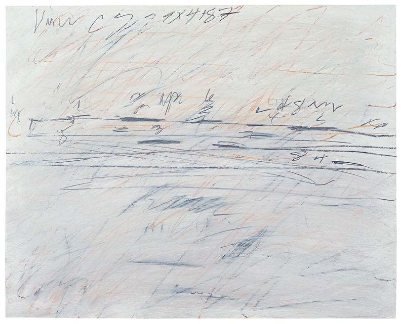
Cy Twombly’s genius as an artist lies in creating intuitive, emotional forms that investigate both the process of drawing and its relationship with writing and language. His work often incorporates textual references to Greek and Roman mythology and engages the techniques of Surrealist-inspired automatic writing, through which Twombly studies the physical act of mark making. Individual characters, words, or phrases can occasionally be extrapolated from within the fury of Twombly’s dynamic line, yet in Untitled (1971) it is difficult to decipher precisely his scrawling notations. When viewing the drawing, one can pick out the numbers 8 and 4; here and there an X or a C rise to surface. Is that the letter P and the word of or up? Can we make out the word lightly smeared across the center of the paper? As with much of Twombly’s early work, here too it is impossible to avoid searching for recognizable letters or trying to make out the coded language he seems to convey. Because Untitled does feature some identifiable characters, it is only natural for the viewer to read these markings as signifiers of language and thus innately to assign meaning to the image.
Untitled is related to Twombly’s “Treatise on the Veil” paintings, a series of works made between 1966 and 1971, which feature broad grey-ground planes spanned with marks resembling either mathematical measurements or musical notation. As a sort of study after his larger “Veil” paintings, Twombly included some of the same cryptic markings in Untitled. How did Twombly intend these works to be deciphered? Did he intend his works to be understood at all? Does his inclusion of familiar characters and letters imply that the viewer must interpret the drawing as one would a text? Perhaps the viewer is meant to explore Twombly’s writing as just another form of mark making, like hatch marks in an engraving or brushstrokes in a painting. The marks in Untitled are not necessarily meant to be read concretely, but rather provide an opportunity to explore the intricacies of language and the very process by which we associate meaning with the written word.
As John Berger writes of Twombly’s work: “[His] paintings are for me landscapes of this foreign and yet familiar terrain. Some of them appear to be laid out under a blinding noon sun, others have been found by touch at night. In neither case can any dictionary of words be referred to, for the light does not allow it. Here in these mysterious paintings we have to rely upon other accuracies: accuracies of tact, of longing, of loss, of expectation.”1 Indeed, Twombly’s work is not clear or legible; the mystery of his mark making affords viewers the opportunity to examine their individual relationships with language.
1. John Berger, “Post-Scriptum” in Audible Silence: Cy Twombly at Daros, eds. Eva Keller and Regula Malin (Zürich: Scalo Publishers, 2002).
Cy Twombly Biography
Cy Twombly (b. 1928, Lexington, VA; d. 2011, Rome) attended the School of the Museum of Fine Arts, Boston (1947-1949), the Art Students League, New York (1950-1951), and Black Mountain College, North Carolina (1951-1952). He was awarded a grant from the Richmond Art Museum, Virginia (1952), and from the Golden Lion for Contemporary Art, the Venice Biennale (2001). A selection of Twombly’s work was installed permanently in the Cy Twombly Gallery at the Menil Collection, Houston (1995), and at the Musée du Louvre, Paris (2010). In 2001, he was elected to the American Academy of Arts and Letters. Recent solo exhibitions took place at the Museo del Prado, Madrid (2008); the Guggenheim Bilbao, Spain (2008); the Art Institute of Chicago (2009); the Galleria Nazionale d’Arte Moderna, Rome (2009); Museum Moderner Kunst, Vienna (2009); Gagosian Gallery, New York (2009); Gagosian Gallery, Paris (2010); The Museum of Modern Art, New York (2011); The Museum of Contemporary Art, Los Angeles (2011); and Gagosian Gallery, London (2012). Retrospectives have recently been held at the Pinakothek der Moderne, Munich (2006), and at Tate Modern, London (2008). Twombly lived and worked in Rome and Gaeta, Italy.
Dayle Wood Biography
Dayle Wood (b. 1989, Chicago, IL) received her BA with departmental honors in Art History at the University of Richmond in Virginia. She was the 2010 Joel and Lila Harnett Summer Research Fellow at the University of Richmond Museums. Dayle lives and works in New York City.
References
John Berger, “Post-Scriptum” in Audible Silence: Cy Twombly at Daros, eds. Eva Keller and Regula Malin (Zürich: Scalo Publishers, 2002).
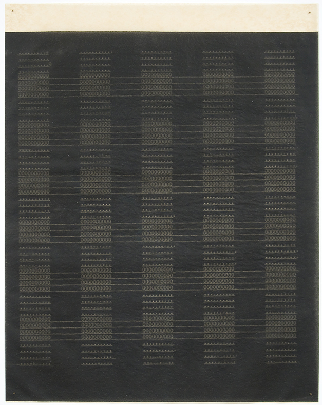
Allyson Strafella (b. 1969, Brooklyn, NY) earned her BFA at Tufts University, Medford, Massachusetts, in partnership with the School of the Museum of Fine Arts, Boston (1993). She participated in the Summer Program at the Skowhegan School of Art, Madison, Maine (1995). Strafella has received grants and fellowships from the Pollock-Krasner Foundation (1999); the New York Foundation for the Arts (2001, 2011); and the John Simon Guggenheim Memorial Foundation (2002). She has completed residencies at the Fine Arts Work Center, Provincetown, Massachusetts (1996); The MacDowell Colony, Peterborough, New Hampshire (2001, 2002); and Yaddo, Saratoga Springs, New York (2001). Strafella participated in the Workspace Program at Dieu Donné Papermill, New York (2007). Recent solo exhibitions have been held at GRIDSPACE, Brooklyn (2009); Von Lintel Gallery, New York (2011); and Gallery Joe, Philadelphia (2011, 2013). Strafella’s work also has been included in numerous group exhibitions at such venues as Von Lintel Gallery, New York (2007, 2013); Josée Bienvenu Gallery, New York (2008); The San Diego Museum of Art, California (2008); Dieu Donné, New York (2008); Judi Rotenberg Gallery, Boston (2009); the Museo de Arte Contemporáneo Esteban Vicente, Segovia, Spain (2009); the University Art Museum, Albany, New York (2010); Gallery Joe, Philadelphia (2010, 2012, 2013, 2014); the Katonah Museum of Art, Katonah, New York (2011); and the Hamish Morrison Gallery, Berlin, Germany. Strafella lives and works in Hudson, New York. More information about her work can be found at www.allysonstrafella.info.
Nathan Altice Biography
Nathan Altice (b. 1979, Roanoke, VA) received a PhD in Media, Art + Text from Virginia Commonwealth University, Richmond. Nathan has been writing and recording music for over fifteen years. He plays guitar and sings in The Silent Type and records electronic music as Circuit Lions. Nathan lives and works in Richmond, Virginia, and writes at www.metopal.com.
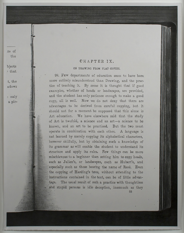
Molly Springfield’s Chapter IX from 2008 first appears to be a careless photocopy of a dry academic text: haphazardly cropped and poorly executed, the gutter is overly saturated with toner and the scanning bed is visible around the book’s edges. But close looking quickly belies this pretense. After noting the sheet’s neat border, we begin to observe the telltale signs of a work of graphite on paper: the burnished quality of the darkest areas, the subtle grain of the fine quality paper visible in the lighter strokes. This work is an original masquerading as a copy, a skilled drawing painstakingly rendered by hand and displayed in a handsome frame, yet faithfully resembling a document created in haste for reference and destined for disposal. With an added wink to the viewer, Springfield’s photorealistic rendering allows us to read the text—a treatise on the practice of drawing from flat copies.
For several years Springfield has been preoccupied with depicting photocopied pages from books on art and philosophy. Her sources are carefully chosen for their relevance to shifting notions of mediated representation. Past projects have replicated photocopied editions of William Henry Fox Talbot’s The Pencil of Nature, Walter Benjamin’s “The Work of Art in the Age of Mechanical Reproduction,” and Sol LeWitt’s “Sentences on Conceptual Art.” The present work is part of a series titled “Drawings about Drawing.” The text is an excerpt from the obscure late nineteenth-century British Handbook of Drawing by William Walker, a contemporary of John Ruskin’s (whose 1857 The Elements of Drawing provides the source for the second work in the series). This series continues Springfield’s exploration of the interchange between writing and drawing, reading and viewing, theory and practice. Ultimately, her work prompts questions regarding the traditional hierarchy of the precious (original) and the ephemeral (copy).
Around the same time that Walker and Ruskin were penning their works on the practice of drawing, a wave of cultural nostalgia for the handcrafted object was cresting across Europe and America. The Industrial Revolution was ushering in the age of mass production, the backlash of which has been the ascendancy—especially in art—of the concept of ‘the original.’ Ensuing technologies from the twentieth century, including the photocopy, have contributed to our current culture of disposability by facilitating low-cost and low-quality reproduction. An object’s cultural value is often directly proportional to its rarity, and facsimiles are more valued the less they betray their status as such. The utilitarian black and white photocopy occupies the lowest rung on this representational ladder.
From the 1960s onward, conceptual artists began to subvert this logic, creating ephemeral works with quotidian media, like the photocopy, that defied commercial motives and concerns of uniqueness. On the one hand, Springfield pays homage to this ethos, by literally reproducing the words and works of artists such as Mel Bochner, Mary Kelly, and Adrian Piper, and by mimicking their chosen forms of distribution. Yet the artist’s own labor-intensive process has more in common with the work of a traditional draftsman than with the anti-materialist practice often associated with conceptual art.
In Springfield’s current investigation of “the historical trajectory of drawing instruction,”1 she professes an ambivalent relationship to Walker’s Victorian emphasis on rote draftsmanship. Why then enact it? Through Springfield’s process, Chapter IX manifests the cyclical tensions of both art and technology. Walker’s tenets of artistic instruction are as antiquated as the Xerox has now become in the era of the digital scan, and as the notion of the original in the wake of conceptual art. Yet we are constantly negotiating how to move forward without leaving anything behind.
Consider the chain of events by which Walker’s text is transmuted into the present work: originally composed by hand and published via the printing press, a version of which was then photocopied and finally manually re-transferred to the page. Is the final product a drawing or a document? Springfield offers a reproduction of the text equally legible to that of the book and the photocopy, and yet it is a distorted version as well. As we choose to ‘read’ or ‘view’ the work, the graphic marks slide between text and image; though we can read them as words, they have the physicality of depiction, not inscription.
1. Molly Springfield, “Drawings About Drawing,” http://www.mollyspringfield.com/section/47712_Drawings_About_Drawing.html.
Molly Springfield Biography
Molly Springfield (b. 1977, Columbia, SC) earned her BA magna cum laude from Queens College, Charlotte, North Carolina (1999). She received her Post-Baccalaureate Certificate from the Maryland Institute College of Art, Baltimore (2000), and her MFA from the University of California, Berkeley (2004). She took part in the Skowhegan School of Painting and Sculpture, Skowhegan, Maine (2006). Springfield was a resident at the Millay Colony for the Arts, Austerlitz, New York (2008). She has thrice received a Visual Artist Fellowship from the D.C. Commission on Arts & Humanities / National Endowment for the Arts (2009, 2011, 2014). Recent solo exhibitions have been held at Mireille Mosler, New York (2008); Steven Wolf Fine Arts, San Francisco (2009, 2013); Thomas Robertello Gallery, Chicago (2009, 2012); and the Center Art Gallery at Calvin College, Grand Rapids, Michigan (2011). Recent group exhibitions have been held at the Portland Museum of Art, Portland, Maine (2010); the University of Buffalo Art Gallery, Center for the Arts, Buffalo, NY (2012); the Indianapolis Museum of Art (2012); Tracy Williams, Ltd., New York, NY (2013); Galerie Thomas Zander, Cologne, Germany; and The Drawing Center, New York, NY (2013). Springfield lives and works in Washington, D.C., where she is a Professorial Lecturer in the Department of Art at American University. More information about her work can be found at www.mollyspringfield.com. www.mollyspringfield.com.
Ingrid Langston Biography
Ingrid Langston (b. 1983, Seattle, WA) received her MA from the Institute of Fine Arts at New York University. She is currently a curatorial assistant in the Department of Drawings and Prints at The Museum of Modern Art, New York.
Sara Sosnowy is known primarily for her paintings, which are beautiful and expansive, unfurling exuberant color across the walls. Blue, an artist’s book from 1995, is different. While this book showcases Sosnowy’s interest in intricate pattern and retains traces of her sensitive hand, it also works on another level: it conceals rather than displays.
When Blue is in its chrysalis-like box, only a shimmer of color in the taupe fabric exterior and the embossed word BLUE hint at the expressive color inside. Only when one removes the book from its box and opens it does this color assert itself. The blue expands to fill each page, sometimes with a soft dusty wash of color, sometimes with a rich velvety coat. The compositions change from page to page as well. Some of the drawings in the book consist of a single element, a circle or a line, but most pages are covered with undulating waves, lines, grids, and dots. These patterns and elements are either built up with collage elements under the blue pastel or scratched into the thick surface of the pages. The heaviness of the pages as you turn them and the heady scent of the oil stick that Sosnowy uses add to the richness of our experience with the book. The lines and dots shift and dance as one turns the pages; the color flows in and out like waves.
For me, that’s the most exciting aspect of this work, that our interaction is so necessary. We need to open the book, to turn the pages, for it to fully exist. Through this page turning we reenact the seriality that plays such a major role in Sosnowy’s work. For many years, Sosnowy has created sets of paintings and drawings in which each work grows from a particular color, pattern, or rule. Through turning the pages of this book we immerse ourselves in the poetry of this seriality; we help to re-create it.
Sosnowy told me that one interesting aspect of making this book was the need to take the binding process into account when planning the drawings. The book is composed of long sheets of paper, each with two drawings on its front and two on its back. These long sheets were stacked, folded in half, and bound together. This means that Sosnowy’s drawings appear in the book in a different order from that in which she made them. This disordering happens again as we open the book: by turning the pages, we can skip ahead and we can return to earlier drawings. We become a part of the artistic process; we create our own series and become aware of the relation of the works to each other, how the patterns shift and expand and contract throughout the book.
When I looked at the book and turned its pages, part of me wanted to read these shifting patterns as a story–not because there’s any hint of representation in these works in the traditional sense, but because the act of turning pages in a book feels so charged and natural, because that deep blue is so significant-feeling. The book becomes a story of the color blue, a spell-book, a family photo album of blueness. Sosnowy has often talked of the meditative aspects of her works, and others who discuss her paintings and drawings use phrases like “trance” or “dream-like state.” But to me, never is this state more accessible to us as viewers, never do we come closer to sharing in the artistic trance that must accompany the creation of these intricate works, than when turning the pages of this book, when reading and telling the story of the blue and the blue and the blue.
Sara Sosnowy Biography
Sara Sosnowy (b. 1957, Texas City, TX) received her BFA from Stephen F. Austin State University, Nacogdoches, Texas (1981), and her MFA from the Pratt Institute, Brooklyn (1989). Sosnowy has been awarded grants and fellowships by The Drawing Center, New York (1994); the Mid Atlantic Arts Foundation, Baltimore (1996); and the Fifth Floor Foundation, New York (1999). Recent solo exhibitions have been held at Lesley Heller Gallery, New York (2006, 2009). Sosnowy’s work has been included in numerous group exhibitions, most recently at such venues as the Nielsen Gallery, Boston (2007); the Museo de Arte Contemporáneo Esteban Vicente, Segovia, Spain (2009); the Delaware Center for the Contemporary Arts, Wilmington (2010); the Katonah Museum of Art, Katonah, New York (2011); and the Mattatuck Museum, Waterbury, Connecticut (2012). Sosnowy lives and works in New York City. More information about her work can be found at www.sarasosnowy.com.
Emily Sessions Biography
Emily Sessions (b. 1980, Philadelphia, PA) is a PhD student in the History of Art at Yale University, New Haven, Connecticut. She received her BA in Psychology and Anthropology from Brandeis University, Waltham, Massachusetts, and her MA in Art History from the Institute of Fine Arts, New York University. She has worked at such institutions as the Brooklyn Museum, New York; the Rose Art Museum, Brandeis University; and the Colección Patricia Phelps de Cisneros, New York. Sessions has published and presented on subjects ranging from medieval mappaemundi to relational aesthetics. She lives and works in New York City.
Known primarily for his sculpture and formalist style, the artist Joel Shapiro explores in this drawing a different approach–mark-making. Untitled, from 1969, is one of a series of fingerprint works that Shapiro made during the late 1960s and early 1970s. Dating to relatively early in his career, these drawings suggest the exploration of new materials and techniques by an artist who has yet to settle fully into a primary method of expression.
Regarding his fingerprint works, the artist has said said, “I was interested in mark–making. Not using an instrument, but using my finger to make the mark, was very emphatic and direct and there was nothing mediating the image. It was factual. Rather than sit around and make fingerprints that became some other image, the fingerprint–the mark–was an image of itself. So I sort of really didn’t care what it ended up looking like. I was more interested in the process of doing it.”1
The work that results is an example of such experimentation with process from early in Shapiro’s career. Even in this drawing, however, one can discern the sculptor at work. Shapiro has taken a literally “hands-on” approach, forming the image with his own skin, much like he would sculpt a malleable material such as clay.
Untitled features marks that are non-illusionistic yet instantly evocative. It is imbued with an almost childlike excitement, reminiscent of the fascination often observed in children completely engrossed in making their marks on anything they can. Making fingerprints is the first way most children create art. The pride that comes with this activity tends to wear off as children mature, but here Shapiro legitimizes it, advancing those early expressions of creativity into something more structured. That structure is reinforced in this drawing in particular through the use of graph paper. We can read the grid as a symbol of the uniform structure that people often apply to their lives as they age. Shapiro’s juxtaposition of this rigidity with his own fingerprints may recall the childhood desire to claim ownership over objects, to make things one’s own–a desire that develops over time yet still resides within every individual. Every once in a while, Shapiro’s fingerprints stray from the grid. Every once in a while, we all like to make a mark outside the lines.
1. Joel Shapiro, “MoMA2000: Open Ends (1960-2000)” (audio program excerpt, Museum of Modern Art, New York, NY, 28 September 2000 to 4 March 2001), http://www.moma.org/collection/browse_results.php?criteria=O%3AAD%3AE%3A5373&page_number=1&template_id=1&sort_order=1.
Joel Shapiro Biography
Joel Shapiro (b. 1941, New York, NY) received his BA and MA degrees from New York University. He was elected to the American Academy of Arts and Letters (1998), was honored with the Chevalier dans l’Ordre des Arts et des Lettres by the French Ministry of Culture (2005), and was elected to membership in the National Academy (2012). Since his first exhibition at the Paul Cooper Gallery (1970), his work has been the subject of many one-person shows and retrospectives throughout the world, including recently at: Pace Gallery, New York (2010, 2014); Galerie Karsten Greve, Köln (2010); the Museum Ludwig, Köln (2011); Rice University Art Gallery, Houston (2012); Craig F. Starr Gallery, New York (2013); Galerie Karsten Greve, Paris (2014); and Portland Art Museum, Oregon (2014). Shapiro’s work can be found in numerous public collections such as: The Museum of Modern Art, New York; the Whitney Museum of American Art, New York; The Metropolitan Museum of Art, New York; Tate Gallery, London; and Centre Georges Pompidou, Paris. Prominent commissions include: Loss and Regeneration for the United States Holocaust Memorial Museum, Washington, DC; Conjunction by the Foundation for Art and Preservation in Embassies (FAPE) for the United States Embassy, Ottawa, Canada; Verge for 23 Savile Row, London; For Jennifer by the Denver Art Museum; and Now by FAPE for the U.S. Consulate, Guangzhou, China. Shapiro lives and works in New York City.
Michael Davis Biography
Michael Davis resides in Shizuoka City, Japan, where he is an adviser for the Shizuoka City Board of Education. He has lived and worked in Japan for the last four years, but previously studied Art History and Fine Arts Management at the University of Richmond in Virginia.
References
Joel Shapiro, “MoMA2000: Open Ends (1960-2000)” (audio program excerpt, Museum of Modern Art, New York, NY, 28 September 2000 to 4 March 2001), http://www.moma.org/collection/browse_results.php?criteria=O%3AAD%3AE%3A5373&page_number=1&template_id=1&sort_order=1.
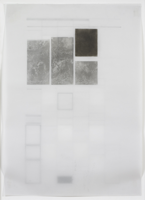
This is Karen Schiff, and I’m looking at my drawing, Agnes Martin, The Washington Post, 18 December 2004, full through, I. There’s a 1 at the end of this title because this is my first go-round at making a tracing of Agnes Martin’s obituary, which was published in the Washington Post two days after she died. Agnes Martin has been one of my favorite artists to refer to over the years. It occurred to me after she died that the shapes of her obituary articles had an aesthetic similarity or resonance with her own work—though she never would have made geometric abstractions using these shapes, in part because she didn’t think artists should read newspapers at all.
The project started where I was just tracing the articles themselves, but then it occurred to me that you see this kind of news in the context of an entire page or, in the case of this drawing, sometimes the newsprint is thin enough that you also see what’s printed on the other side. So this is called full through because it’s the full page, and also you can see through it to outlines of advertisements on the other side of the page.
Being-in-the-world inevitably leaves traces, some indelible, others more fleeting. A body’s shadow turns a corner just as surely as its torso, briefly painting a sunlit wall. What remains is the stuff of memory, or remembered perception, of a presence felt as truly as the person next to us. Similarly, there is the body of an artist’s work-in-the-world, offering a glimpse of an individual whom we might otherwise never have seen or known, now rendered fully present by our imagination.
In tracing Agnes Martin’s obituaries from newspapers around the world, Schiff also records the effects of her being-in-the-world, the real and remembered presence that persists beyond death. Layered shapes in varying degrees of legibility evoke the structure of memory, the architecture of the mind. Palimpsests of influence, the gridded spaces of Martin’s work, radiate beneath the surface of Schiff’s echoing forms. Stele-like monuments commemorate the greatness of achievement. And cutouts remind us of what is lost or inaccessible: what can neither be spoken nor seen, but perhaps only felt.
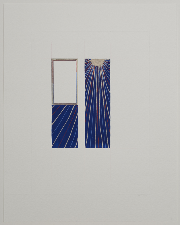
A psalm is a song, but here there is no singer to be seen. Rather than David, we are aware of a blank space, which we ourselves might inhabit, and a great net of radiance that binds together a divided cosmos of azure blue. To beseech God is to cry out to him in prayer or pain, but no groans or shouts can be heard. Instead, a soft music of lines and color floats across the page. Perhaps it is the empty space that cries out, upright and expectant, waiting to be brought into harmony with this wordless music. Is David beseeching God, or is God calling David, seeking to illumine the space that he has opened, but that still remains bounded?
This is Karen Schiff, and I’m going to talk about my drawing called folio 70, Psalm 101 (David Beseeches God). This is the seventieth page of a book of hours owned by the Duke of Berry of France. I was interested in the patterns that were in the images. In other words, sometimes a blue sky wasn’t blue, but rather it was filled with a pattern of some kind.
So what I did was to reproduce the page layout of the images that interested me, with the patterns that were most compelling. And this is part of a series of seven penitential psalms. The scratched lines at the edges of the drawing are the contours of the page itself. Those are the page dimensions. And then everything you see, I’ve tried to match as closely as possible to what the Limbourg Brothers had done when they were creating their illuminations.
So, this sun with its colored rays was actually inside the frame that’s now empty, and instead, I’ve placed that pattern from the background of the image where the text would have been of this particular psalm. What amazed me about the Limbourg Brothers was that every detail was so carefully considered, so even the inner frame around the blank image I’ve reproduced where the light red and the light blue changed from one to the other. And in this particular image, I like how those end up leading the eye towards the sun, as if David were beseeching God even in this image.
Karen Schiff’s richly suggestive drawing, one in a series, was inspired by the artist’s encounter with a manuscript from the early fifteenth century, the Belles Heures commissioned by Jean of France, Duke of Berry. The Book of Hours, crafted as an aid to prayerful contemplation, is remarkable for the fineness of its illumination and the exquisite detail in which its narratives are rendered. Inverting the logic of the mise-en-page, Schiff foregrounds patterns from the background of the original as her central motif, emptying the frames of their texts even as she reproduces their precise form.
With this radical gesture, we are reminded of the highly personal nature of prayer, and the beautiful variety of modes by which the sacred is invoked. The ancient Greek distinction between kataphasis (what can be said of God or the ultimate reality), and apophasis (what can be discerned only through negation or in silence), comes to mind. This last, the basis of negative theology (Lahoot salbib in Arabic or via negativa in Latin) binds together many worlds of faith now divided. Transforming the Book of Hours, Schiff bridges the space between worlds that share the same sun, beseeching us to share her illuminating vision. (Click here for more images from the Belles Heures Project.).
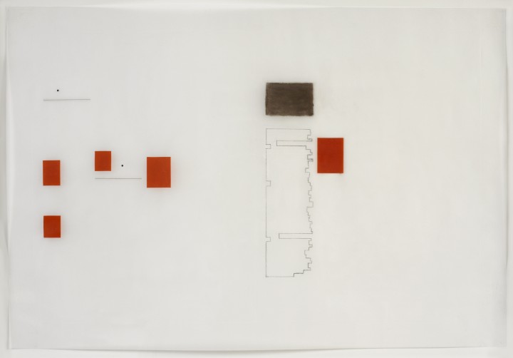
This is Karen Schiff. This drawing, Untitled (Manuscript), is part of a series of laid line drawings that I’ve done for a few years. And laid line refers to the texture of the paper. There’s a kind of paper called laid paper; it’s like resume paper, but it’s also some fine art paper. It has a texture that I’m showing you by tracing those creases with the lines that you see. But I’ve only traced those lines in the spaces where writing would appear in a medieval manuscript. Often, medieval manuscripts were large like this if they were on reading stands, and the way that the artisans would find how to position the calligraphy within the space of the page required some sense of harmony, spatial harmony or proportion, that then could elevate that manuscript to an aesthetic divinity in that way of thinking.
So the red lines that are defining that area where the letters would go are a geometric operation that was devised by a twentieth-century typographer named Jan Tschichold. He’s the one who designed the orange covers for Penguin paperbacks, but actually he designed the page layout for inside those paperbacks as well, and many other things, and he was interested in the formal properties of page design altogether. Which is why he went back to medieval times to see how they might have come up with this kind of geometry that left room for illuminations around the edges, also left room for binding and fingers to turn the pages.
But I was not so interested in having illuminations around the edges be my focus. I wanted a sense that the letters themselves, or the space for the words, could be the space that I was illuminating. And the variation you see in the marks is just how my dip pen and ink were changing with pressure and ink texture, and humidity, and things like that.
Karen Schiff Biography
Karen Schiff (b. 1967, New Haven, CT) earned her MFA in Studio Art at the School of the Museum of Fine Arts, Tufts University, Boston (2006), where she won a Drawing Award from the SMFA faculty (2005). Schiff completed earlier degrees at the University of Pennsylvania, in Philadelphia (PhD in Comparative Literature and Literary Theory, 1998) and Brown University in Providence, Rhode Island (AB/AM in Comparative Literature/English, 1989). Schiff has been resident at the Harwood Museum of Art, Taos, New Mexico (2007); the Edward F. Albee Foundation, Montauk, New York (2007); Anderson Ranch, Snowmass Village, Colorado (2011); Yaddo, Saratoga Springs, New York (2012, 2014); and the Helene Wurlitzer Foundation of New Mexico, Taos (2012, 2014), among other institutions. Schiff contributed an artists’s project, Counter to Type, to the Spring 2014 issue of Art Journal. The project included drawings, an essay, and a video about her process. She lectures and publishes about her work in the word/image field, and she also creates projects about artist Agnes Martin. A recent solo exhibition was held at the Flanagan Campus Art Gallery, Community College of Rhode Island, London (2011). Recent group exhibitions include such venues as Hverfisgallerí, Reykjavik (2014), Hafnarborg Museum, Hafnarfjör∂ur, Iceland (2013); Arkansas Arts Center, Little Rock (2012); Danese, New York (2010, 2011, 2012); the Katonah Museum of Art, Katonah, New York (2011); Galería Astarté, Madrid (2010). In 2013 Schiff curated the group exhibition Winter Reading: Lines of Poetry at Diane Birdsall Gallery, Old Lyme, Connecticut. She lives in New York City and has a studio in Brooklyn. More information about her work can be found at www.karen-schiff.com.
Anna Kim Biography
Anna Kim (b. Columbus, OH) is completing a PhD in the History of Art and Architecture at the University of Virginia, Charlottesville, where she also is an Associate Fellow at the Institute for Advanced Studies in Culture. Her research engages the deep structure of our complex relation to images, from antiquity to the present, focusing on image theory and religious conflict. A member of an international team of scholars, artists, and curators investigating the phenomenon of iconoclasm, she recently collaborated on an exhibition entitled Art Under Attack: Histories of British Iconoclasm at Tate Britain (2013).
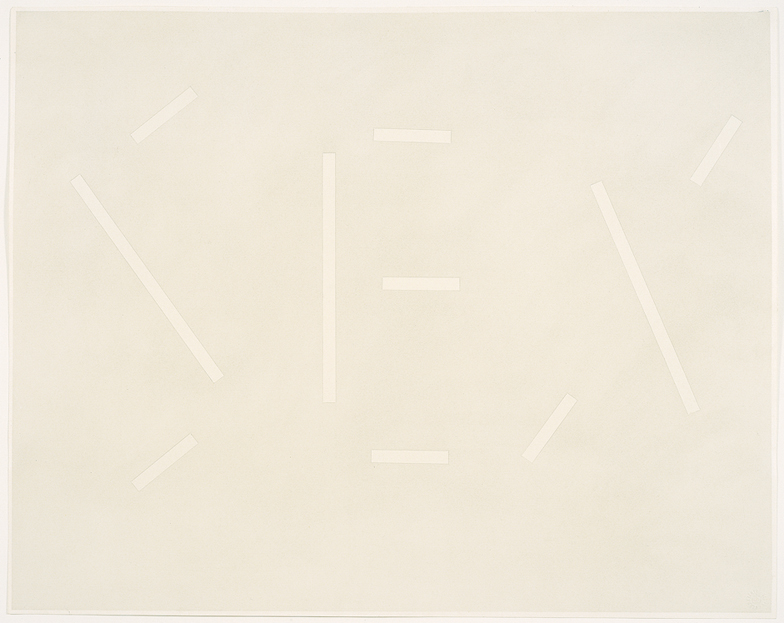
While Ruscha’s rendering within this series of the words l’amour, desire, and fuck may denote undertones of sensuality, the artist insists that there is no one prescribed way to read the drawings. It is integral to Ruscha’s intentions that “the drawing not reflect the meaning of the words”–a goal he achieves in Gray Sex.1 In this drawing, the word SEX is suggested by the disconnected lines that form the three letters. Instead of drawing the word directly, Ruscha used tape to form each letter, applying pastel over the tape before removing it to reveal legible negative spaces. The end result is a work providing no impression of depth: the word is flat and blends into the monochromatic background. Rather then relying on the provocative and erotic associations identified with sex, Ruscha presents a neutralized version. While this depiction is somewhat at odds with the suggestive connotations of the word sex, the artist creates a different context in which to understand multiple meanings of the word. For the artist, definitions are of secondary importance once words have become abstract objects divorced from reference. Much like the early twentieth-century Surrealists, Ruscha is fascinated by the implications of words and by the various associations they elicit, rather than by their literal translations. As Ruscha explains, “I [like] the idea of a word becoming a picture, almost leaving its body,” so that the amorphous form of the word itself can become a blank canvas, upon which a viewer can project his or her own meaning.2
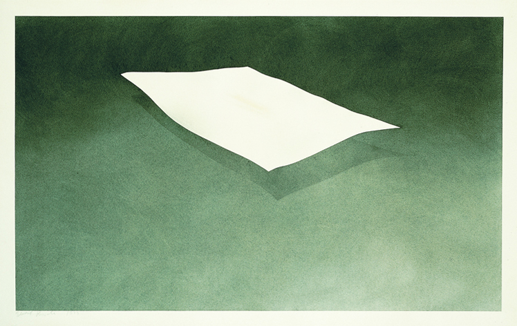
In the early 1970s, Ruscha became dissatisfied with traditional painting and began staining stretched fabrics with various liquids and natural materials, including blood, grass, chocolate, fruits, and eggs.3 In a drawing from this same period, Suspended Sheet Stained with Ivy (1973), Ruscha stained the center of a large sheet of paper with the juice of a crushed ivy plant. Surrounding this central stain, the artist rendered a sheet of paper floating in a darkened dimensional space. On one level, the physical ivy stain lies directly on the drawing surface: it is a sheet stained with ivy. Yet on another level, this is also a drawing of a sheet stained with ivy.4 Here too, the artist plays with perception and the idea of illusion. Ruscha is attracted to things that cannot be explained, ultimately believing that “art has to be something that makes you scratch your head.”5
1. Oliver Berggruen, Ed Ruscha: Ribbon of Words (Vero Beach, FL: The Gallery at Windsor, 2003), iv.
2. Ibid.
3. Sarah Louise Eckhardt, “Ed Ruscha” in Drawings of Choice from a New York Collection, eds. Josef Helfenstein and Jonathan Fineberg (Champaign, IL: Krannert Art Museum, 2002), 128.
4. Ibid.
5. Richard D. Marshall, Ed Ruscha (London: Phaidon Press Limited, 2003), 135.
Ed Ruscha Biography
Edward Ruscha (b. 1937, Omaha, NE) studied at the Chouinard Art Institute, Los Angeles (1960). He has received grants and fellowships from the National Council on the Arts (1967); the National Endowment for the Arts (1969, 1978); the Tamarind Lithography Workshop (1969); and the John Simon Guggenheim Memorial Foundation (1971). Ruscha has been awarded the Skowhegan School of Painting and Sculpture Award in Graphics (1974); the Achievement in Printmaking Award from the Graphic Arts Council, Los Angeles County Museum of Art (1988); and the Achievement in Visual Arts Award from the California Arts Council (1995). He was elected to the American Academy of Arts and Letters (2001) and was the United States representative at the 51st Venice Biennale (2005). A major exhibition of Ruscha’s work was organized by the Whitney Museum of American Art, New York (2004) and traveled to The Museum of Contemporary Art, Los Angeles, and to the National Gallery of Art, Washington, DC. A retrospective of his work took place at the Hayward Gallery, London (2009) and traveled to Haus der Kunst, Munich, and to Moderna Museet, Stockholm. Other recent solo and group exhibitions have been held at Wetterling Gallery, Stockholm (2010); Sprüth Magers, Berlin (2010); the Modern Art Museum of Fort Worth, Texas (2011); Gagosian Gallery, Beverly Hills, California (2011); the Hammer Museum, Los Angeles (2011); Kunsthaus Bregenz, Austria (2012); Peter Lund Gallery, Los Angeles (2012); Gagosian Gallery, New York (2012, 2014); the Los Angeles County Museum of Art, California (2012) and traveled to the Rose Art Museum of Brandeis University, Waltham, Massachusetts (2012); Brandhorst Museum, Munich, Germany (2013); Kunstmuseum Basel, Switzerland (2013); and The Getty Center, Los Angeles (2013). Ruscha lives and works in Los Angeles. More information about his work can be found at www.edruscha.com.
Kathryn Given Biography
Kathryn Given is an alumna of the University of Richmond, Virginia.
References
Oliver Berggruen, Ed Ruscha: Ribbon of Words (Vero Beach, FL: The Gallery at Windsor, 2003), iv.
Oliver Berggruen, Ed Ruscha: Ribbon of Words (Vero Beach, FL: The Gallery at Windsor, 2003), iv.
Sarah Louise Eckhardt, “Ed Ruscha” in Drawings of Choice from a New York Collection, eds. Josef Helfenstein and Jonathan Fineberg (Champaign, IL: Krannert Art Museum, 2002), 128.
Sarah Louise Eckhardt, “Ed Ruscha” in Drawings of Choice from a New York Collection, eds. Josef Helfenstein and Jonathan Fineberg (Champaign, IL: Krannert Art Museum, 2002), 128.
Richard D. Marshall, Ed Ruscha (London: Phaidon Press Limited, 2003), 135.
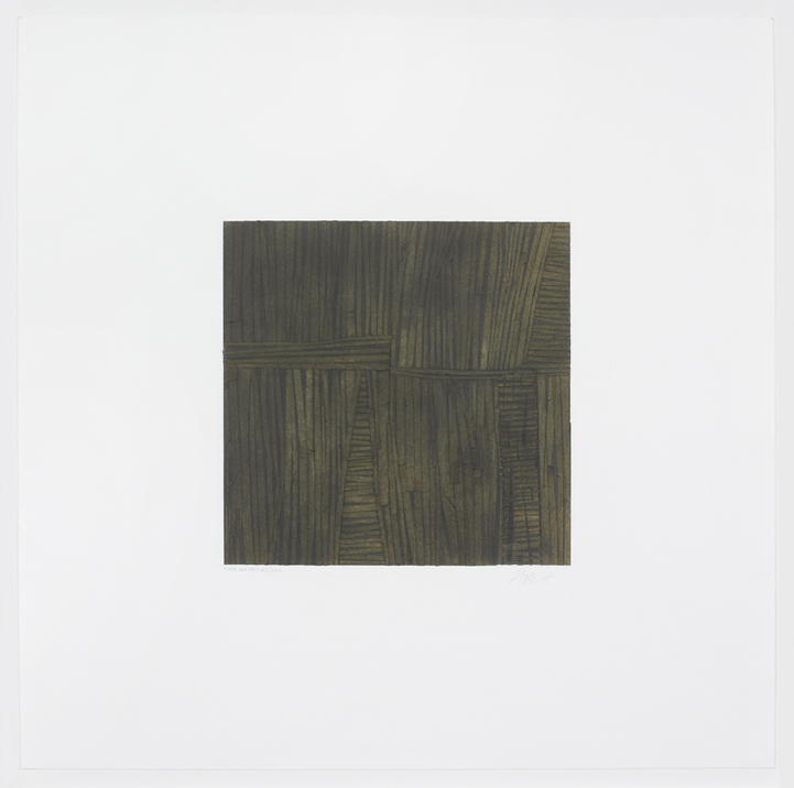
A single action repeated over and over: such is the basis of Gloria Ortiz-Hernández’s aptly titled series, “Over and Over.” As in many of her previous works, these drawings adopt the format of a square within a square, in which the central worked image is balanced by the unworked surface of its paper support. Yet while Ortiz-Hernández’s earlier drawings were shaped by her controlled application of graphite and charcoal, the ”Over and Over” series marks the artist’s shift to tape as primary material. Ortiz-Hernández begins each drawing by adhering a single strip of tape within the boundaries of a demarcated central square. Characteristic of her working method, which depends upon a guiding gesture, this single strip provides the artist with a foundation for the drawing. Performing this initial action over and over, Ortiz-Hernández applies additional strips of freely cut lengths of tape, piece by individual piece, finishing each drawing with a thin coat of charcoal pigment and colored pencil.
In this series, each strip of tape becomes a line that forms the drawing’s overall structure. Yet while all of the drawings in the “Over and Over” series conform to the same process of production, every piece exhibits a unique result. This variability derives from Ortiz-Hernández’s practice of working with a combination of intuition and control, such that the repetitive process of applying tape strips is neither automatic nor conditioned by what was previously done. As one piece of tape follows another, Ortiz-Hernández strives to preserve the individual nature of each strip, often moving from one area of the paper to another in the process of creating each piece. Such handling causes the surprising diagonals, shifts in direction, and irregular spacing between lines in the drawings of this series.
In the case of Over and Over #5 (2010), areas of horizontally oriented pieces of tape disrupt the vertical strips that dominate the structure of the work. Three of these areas – two located along the square’s bottom axis and the third hovering in its top right corner – expand inward to meet along the length of two additional sets of horizontal lines which extend across the square’s central axis. Together, these areas appear like bound or reinforced apertures in the drawing’s structure, which, because of the charcoal’s dark organic tones, bring to mind thatching or basketry. In her own discussion of Over and Over #5, Ortiz-Hernández describes these horizontal lines as “accents.” Further alluding to language is Ortiz-Hernández’s explanation that the intent of her drawings is to give “voice” to her materials. If this is the case, what do the materials say and how can they be understood?
Interestingly, an answer can perhaps be found by considering Over and Over #5 as a text, a concept that in fact reconciles the seemingly disparate references of thatch-work and language. Returning to the original Latin, the word “text” originally derived from the past participle of texere, meaning to weave or to fabricate.1 Placing emphasis on the act of making, such linguistic roots suggest that the process and structure of Over and Over #5 is essential to reading the work as a form of text. Yet although the methods responsible for the creation of Ortiz-Hernández’s drawings are known, the precise point at which the artist initiated, continued, or finished the piece cannot be determined due to the accumulation of the tape strips. With each piece of tape placed over and over onto the page without any established beginning or end, Over and Over #5 must therefore be approached as a non-narrative text. Indeed, viewers of the drawing must be converted into readers in order to notice how the delicate fold of a strip of tape refuses to lay flat; how shadows and contours are formed by soft tonal highlights; how wisps of charcoal powder escape from the boundaries of the square. The materials’ subtleties are only revealed when Over and Over #5 is closely read, examined, analyzed, over and over.
1. The American Heritage Dictionary of the English Language, 4th ed., s.v. “Text.”
Gloria Ortiz-Hernández Biography
Gloria Ortiz-Hernández (b. 1943, Cali, Colombia) is an artist whose work has been shown in numerous museum exhibitions, most recently at the Davis Museum and Cultural Center, Wellesley, Massachusetts (2004); The University Galleries at Texas State University, San Marcos (2009); and the Katonah Museum of Art, Katonah, New York (2011). Recent group and solo exhibitions were held at Galería Casas Riegner, Bogotá, Colombia (2012); Josée Bienvenu Gallery, New York (2012); and artBO International Art Fair, Bogotá, Colombia (2012). Her work may be found in a variety of museum collections, including The Museum of Modern Art, New York; the Harvard Art Museums, Cambridge, Massachusetts; The Morgan Library and Museum, New York; Yale University Art Gallery, New Haven; the Seattle Art Museum, Washington; the Museum of Fine Arts, Houston; and the Museum of Fine Arts, Boston, among others. Ortiz-Hernández works in Bogotá and New York.
Susanna Temkin Biography
Susanna V. Temkin (b. 1985, Miami, FL) is a PhD candidate at the Institute of Fine Arts, New York University, where her research focuses on modern art in the Americas. Temkin is currently working on her doctoral dissertation about the artist Marcelo Pogolotti, a key figure from the first generation of modern artists in Cuba and a participant in the international avant-garde. In addition to her academic work, Temkin is the Research and Archive Specialist at Cecilia de Torres, Ltd., New York, where she is helping to produce the catalogue raisonné of Uruguayan artist Joaquín Torres-García. Prior to these experiences, Temkin worked in various positions at the Solomon R. Guggenheim Museum, New York; El Museo del Barrio, New York; and The Wolfsonian-Florida International University, Miami Beach, Florida.
References
The American Heritage Dictionary of the English Language, 4th ed., s.v. “Text.”
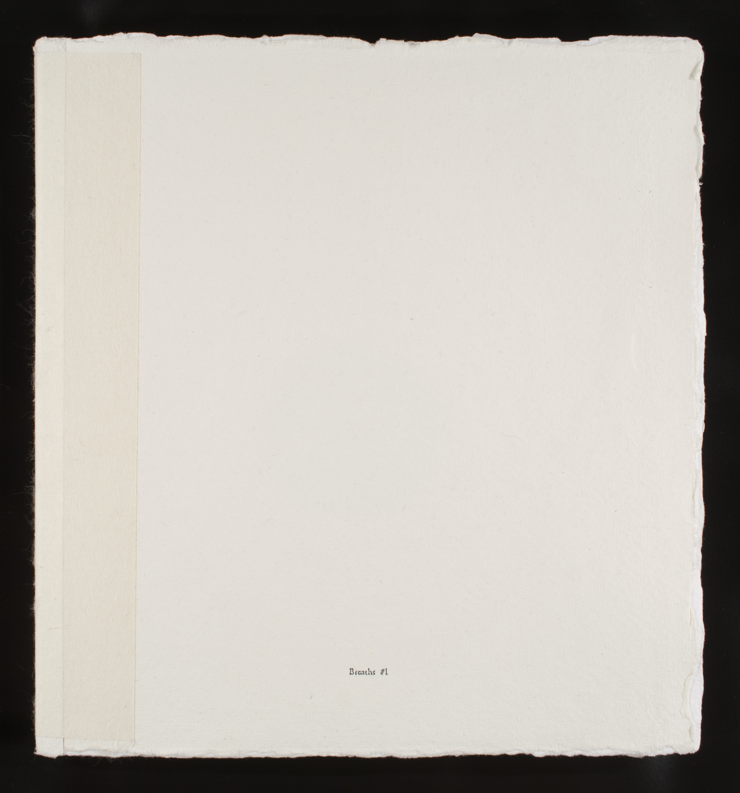
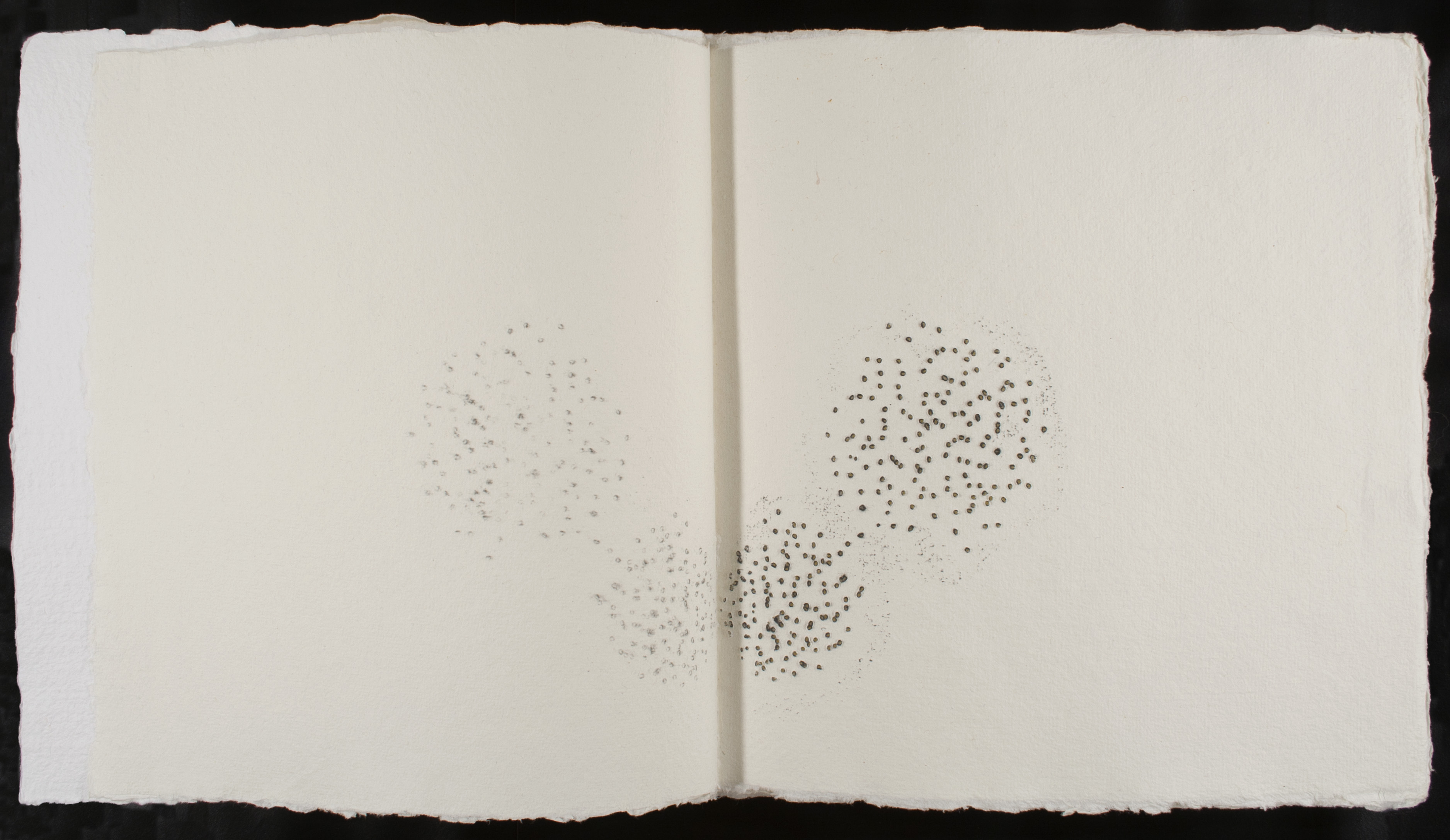
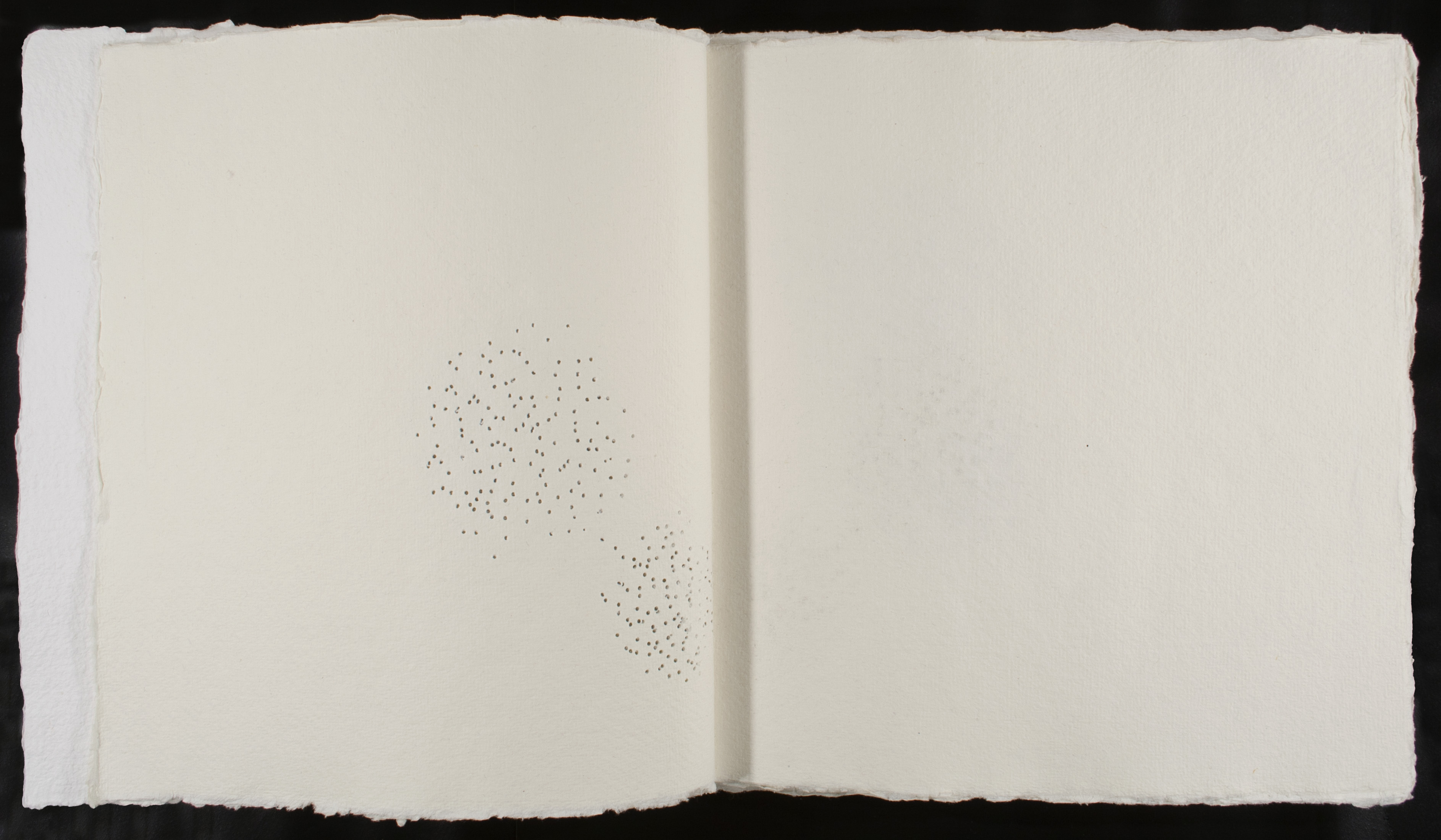
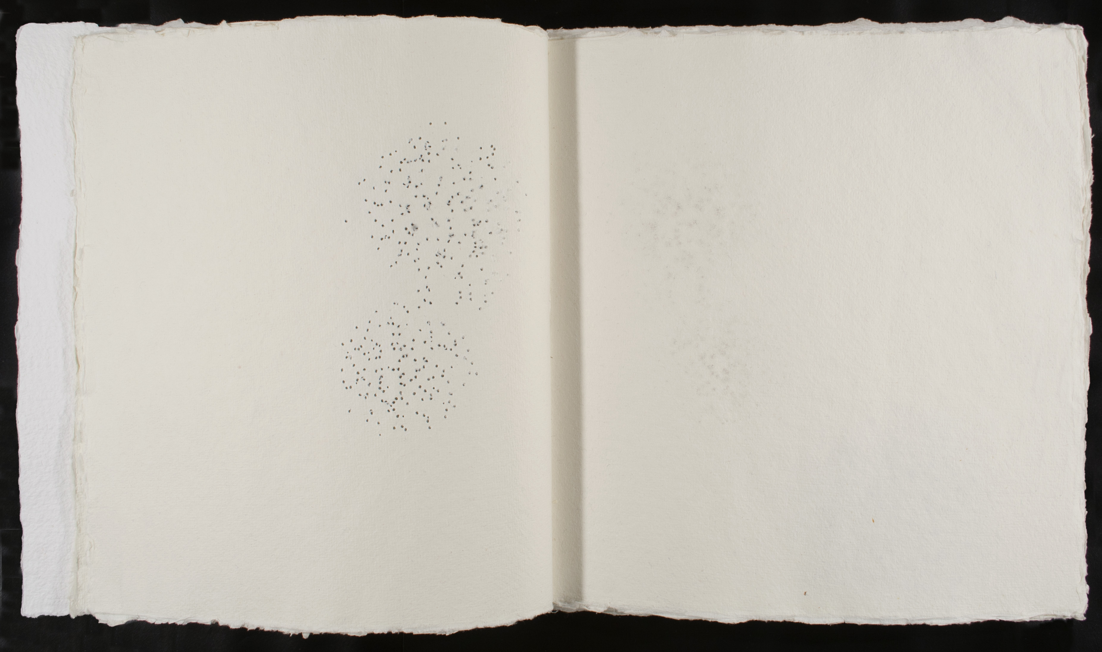
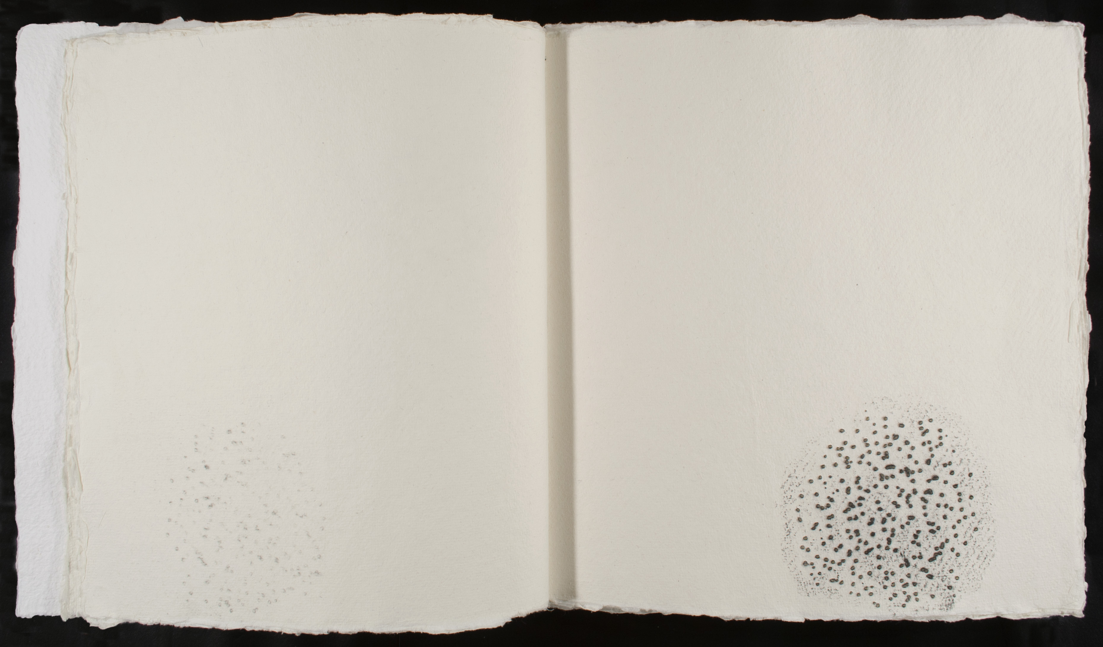
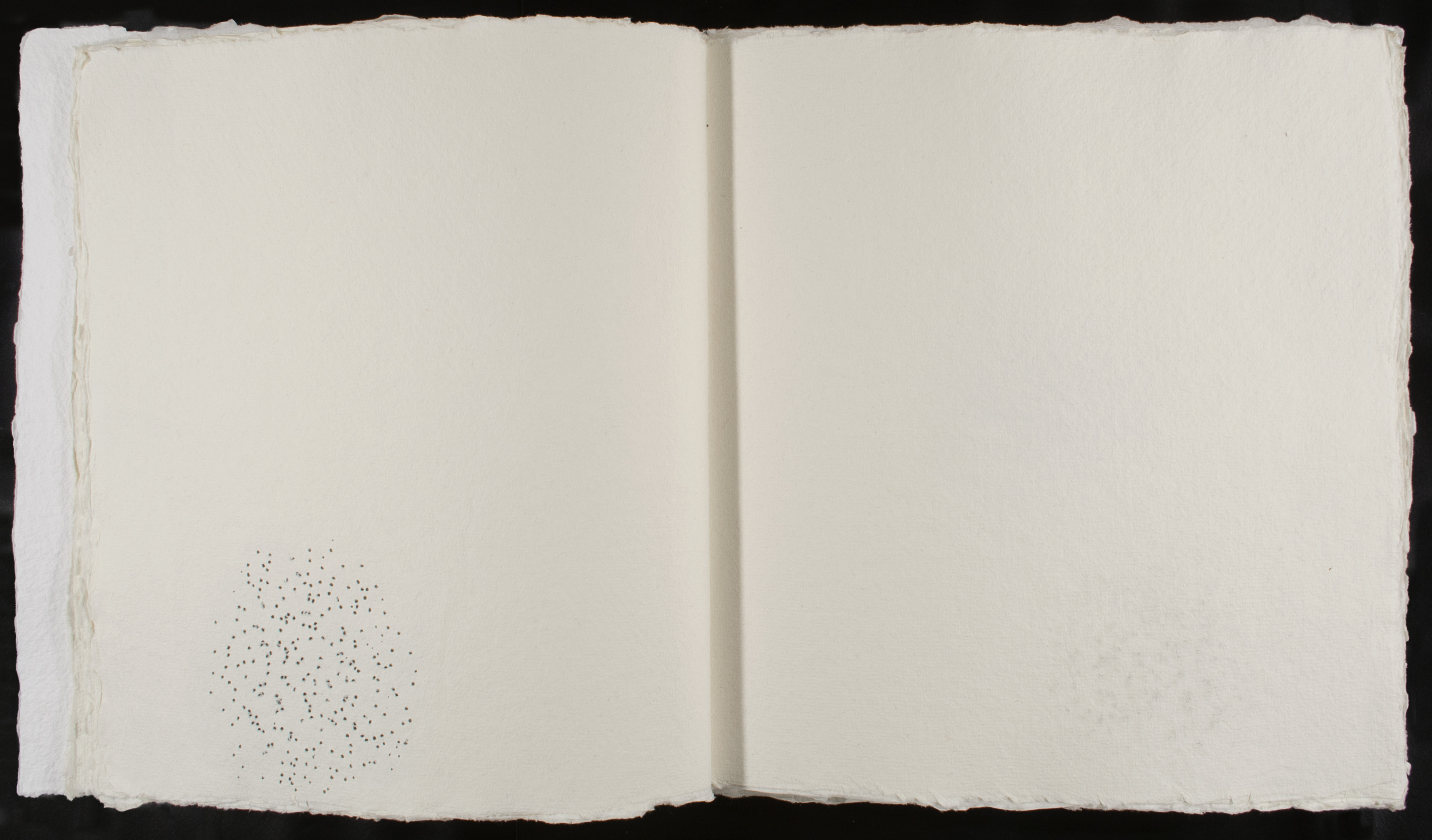
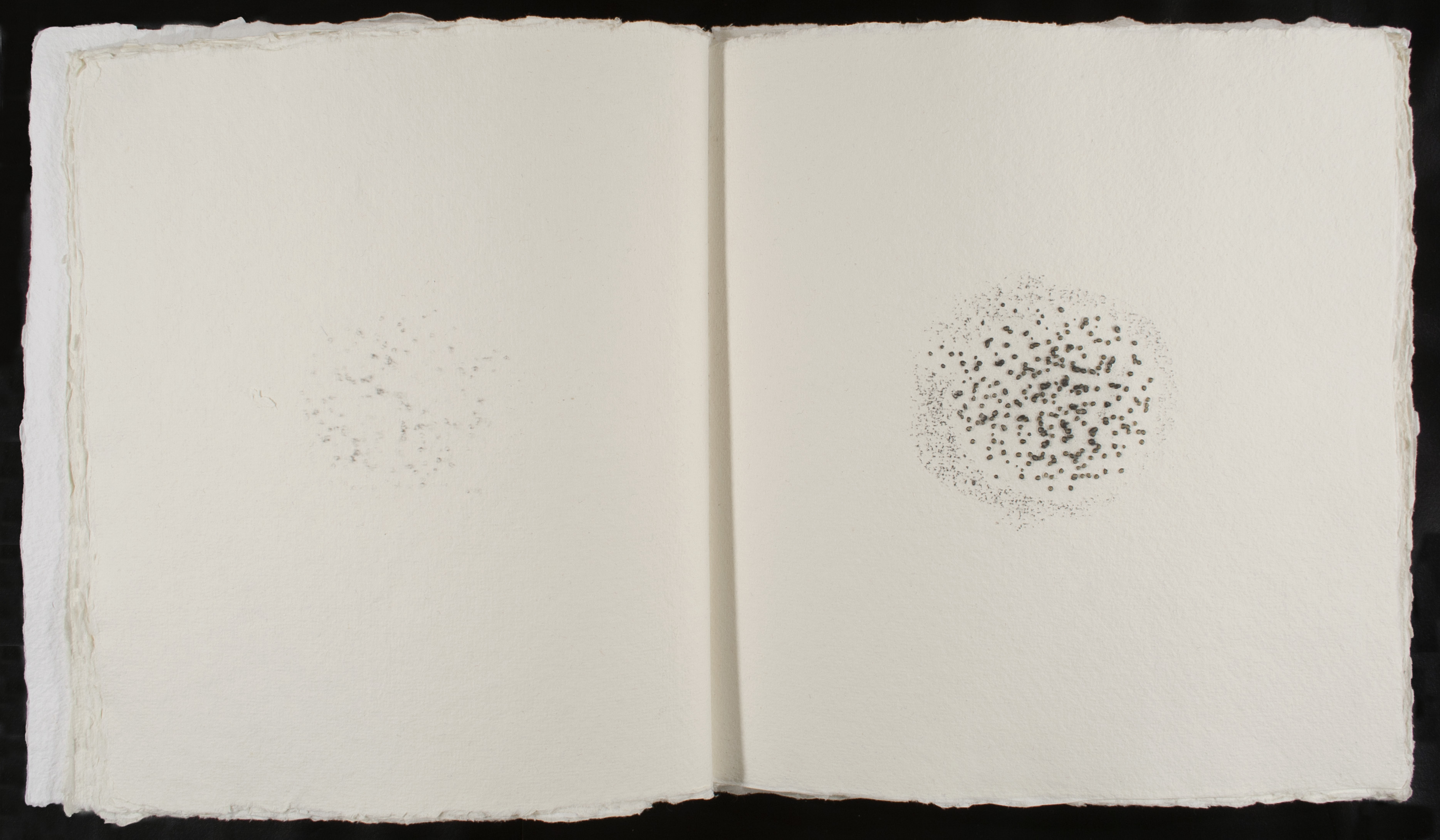
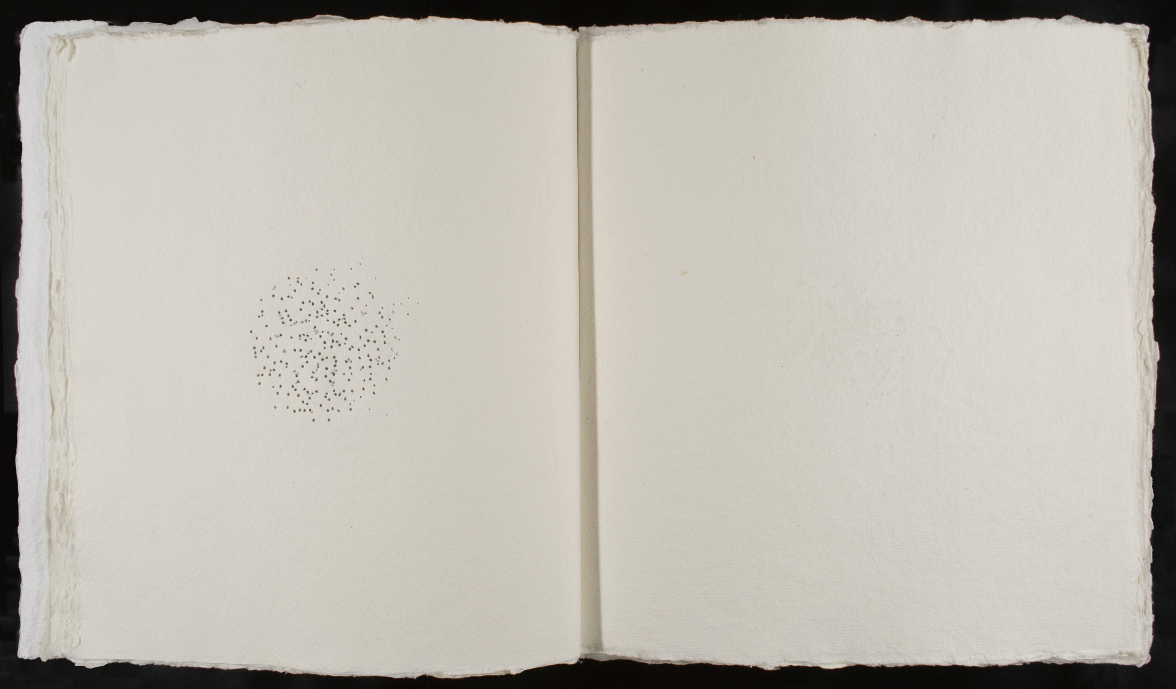
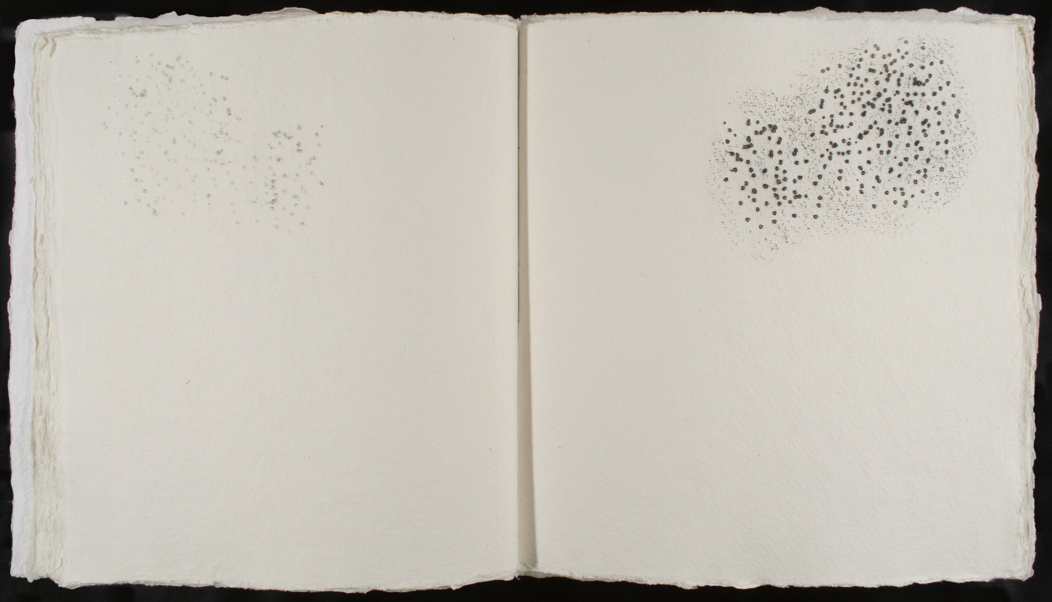
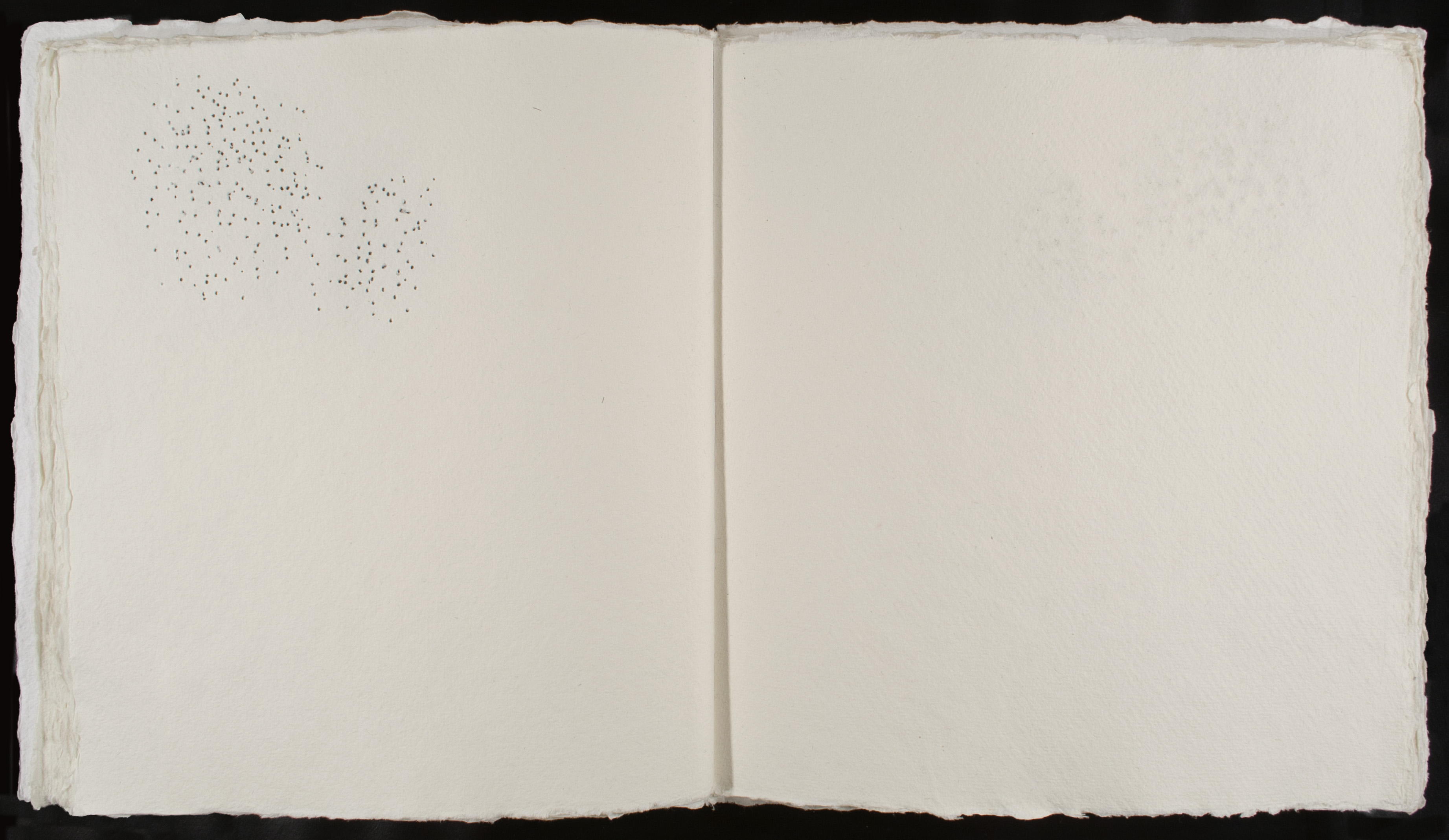
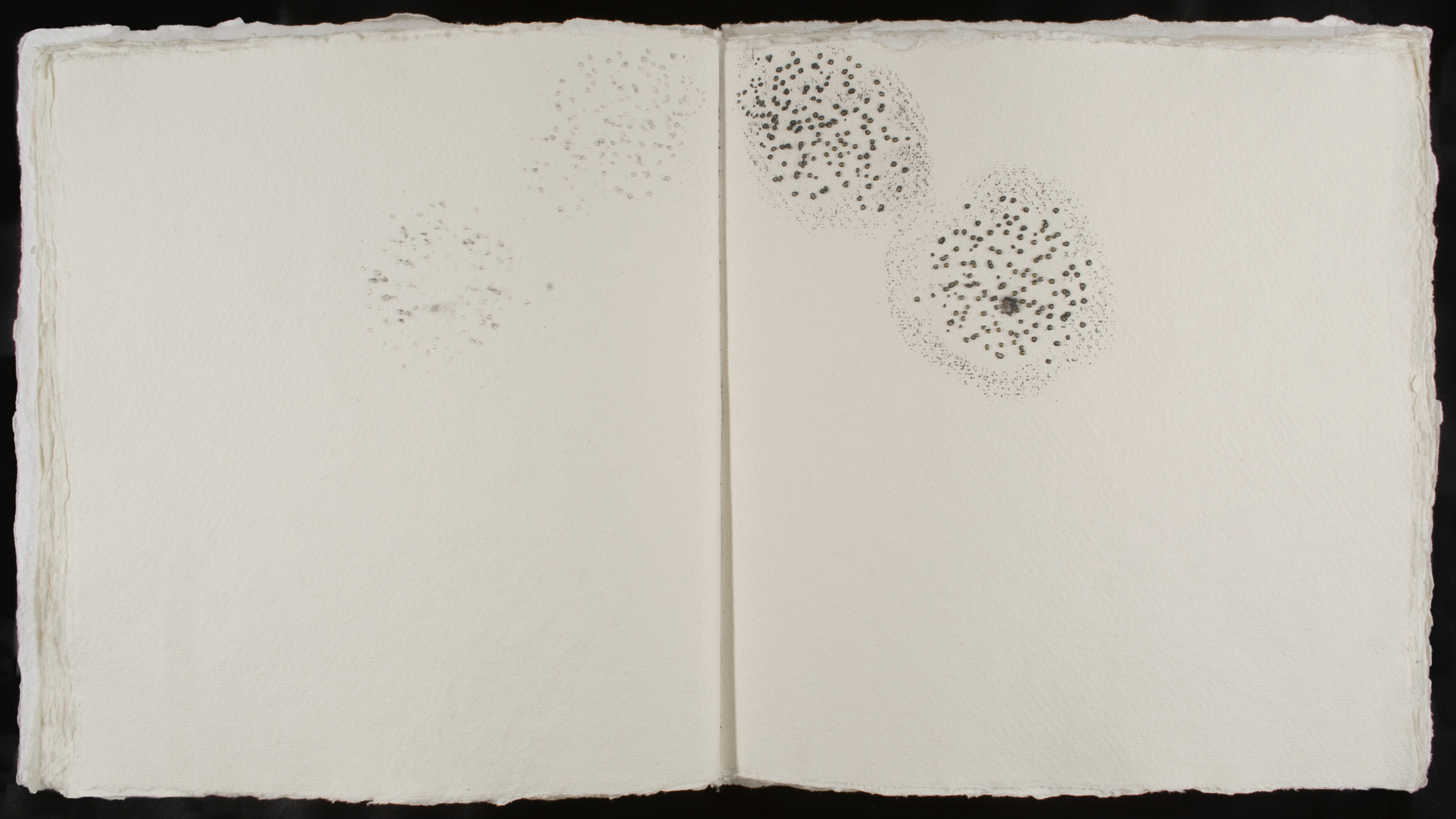
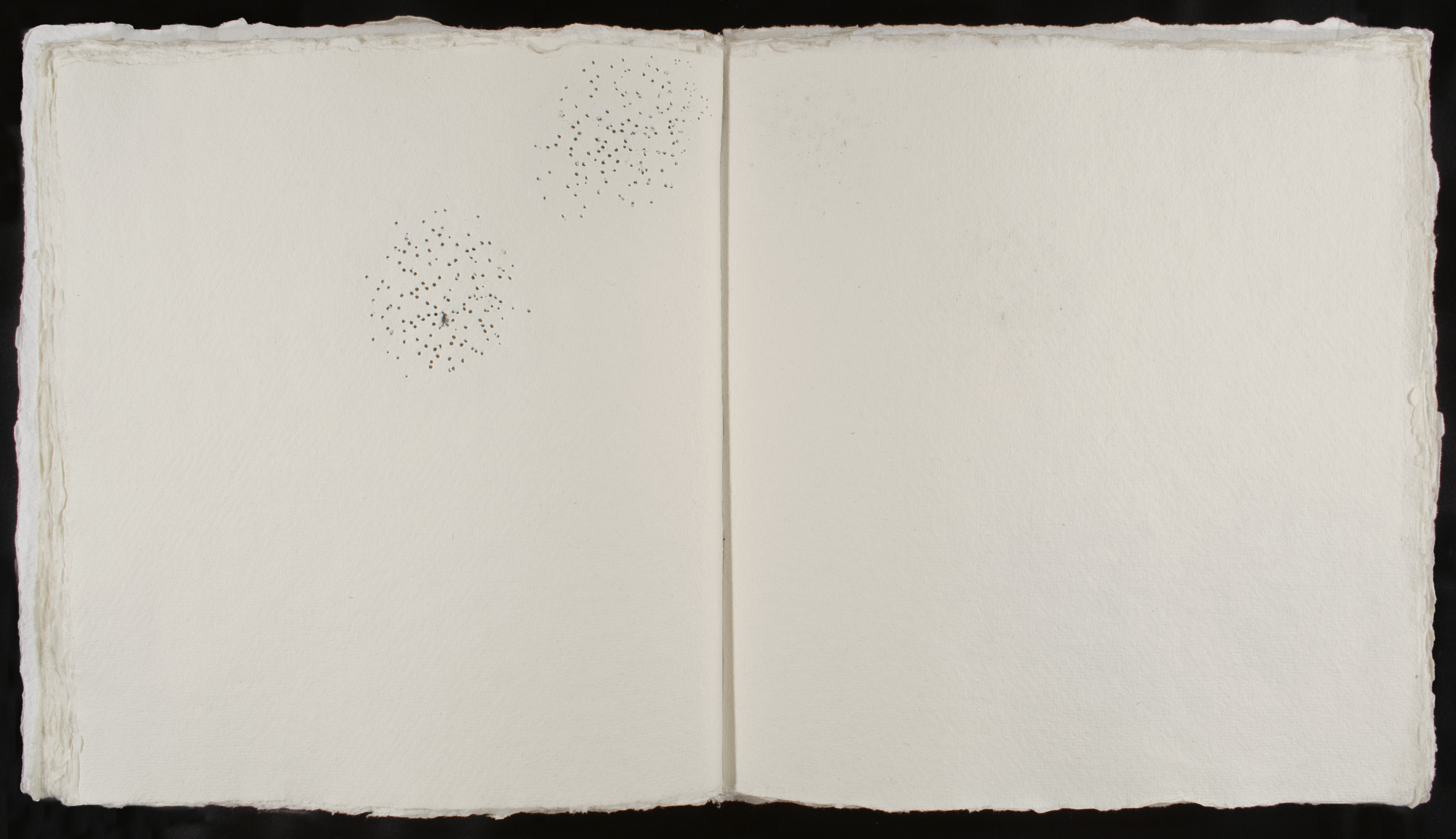
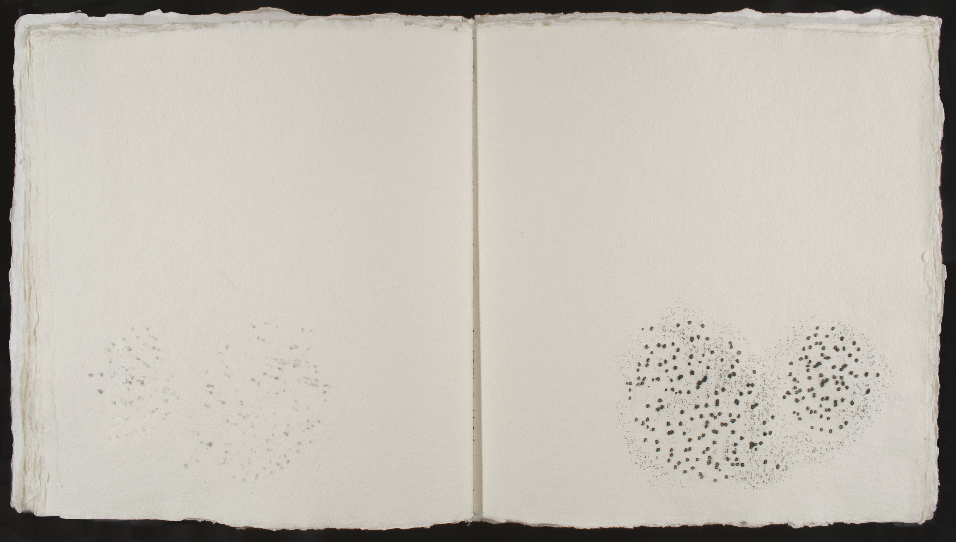
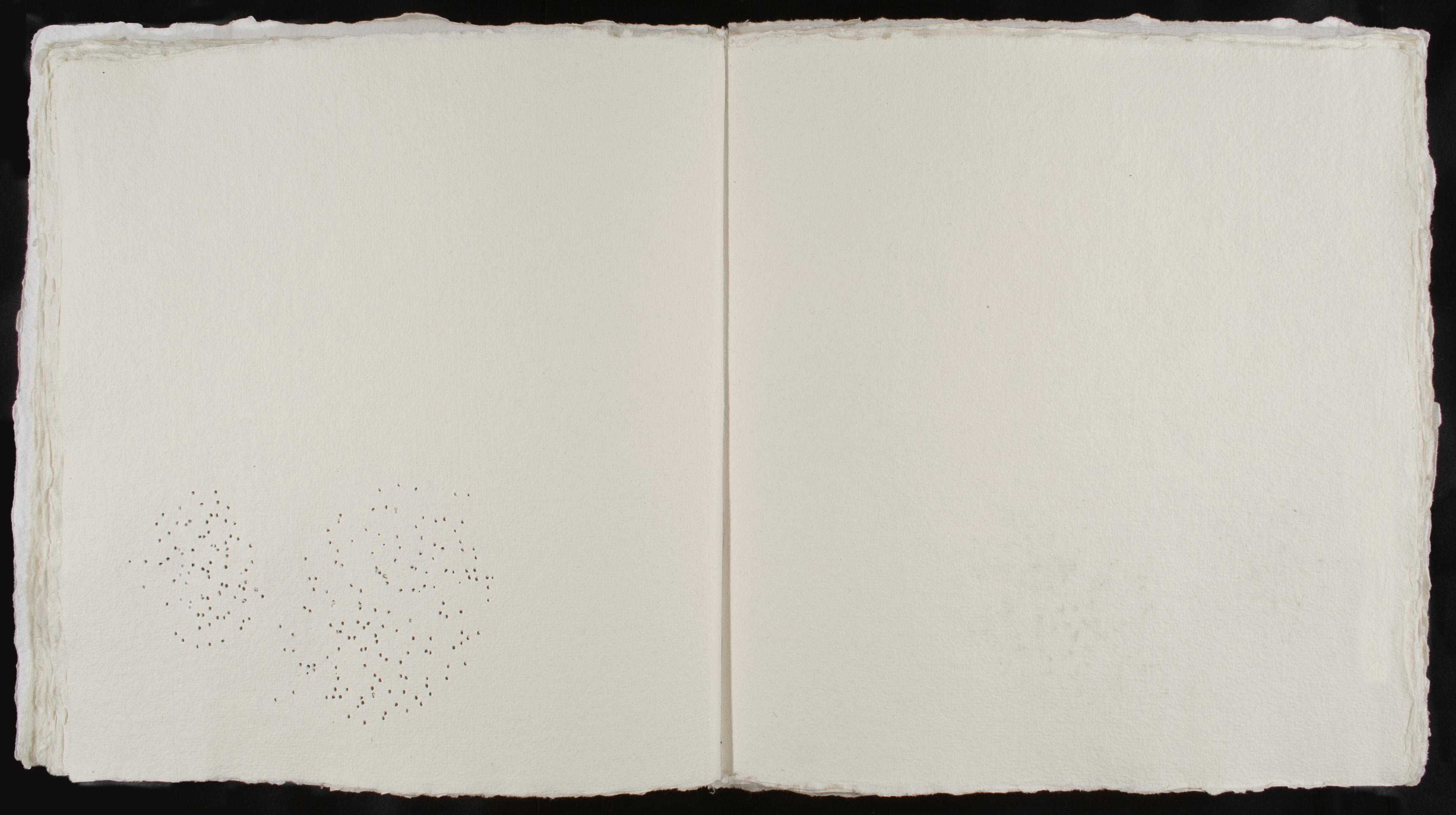
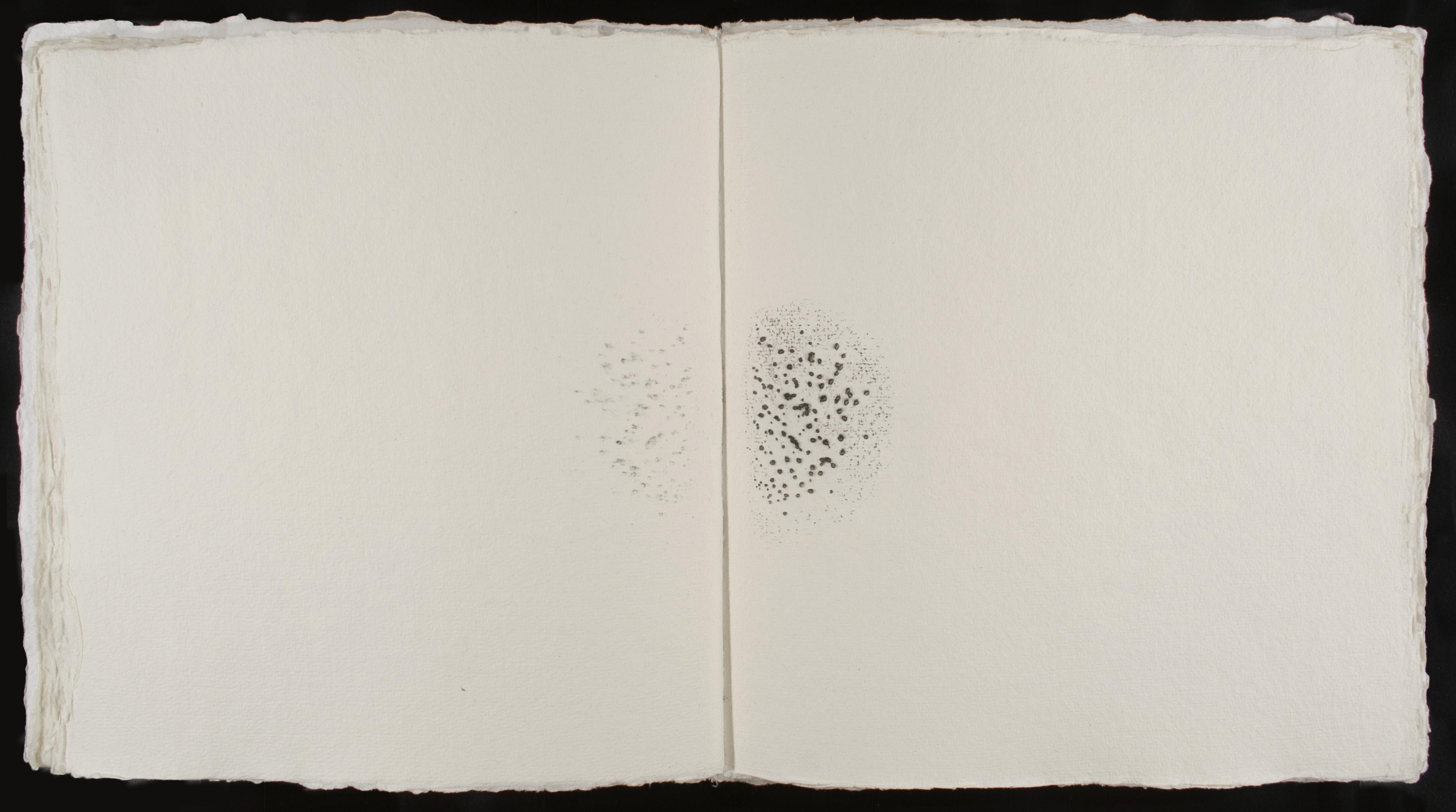
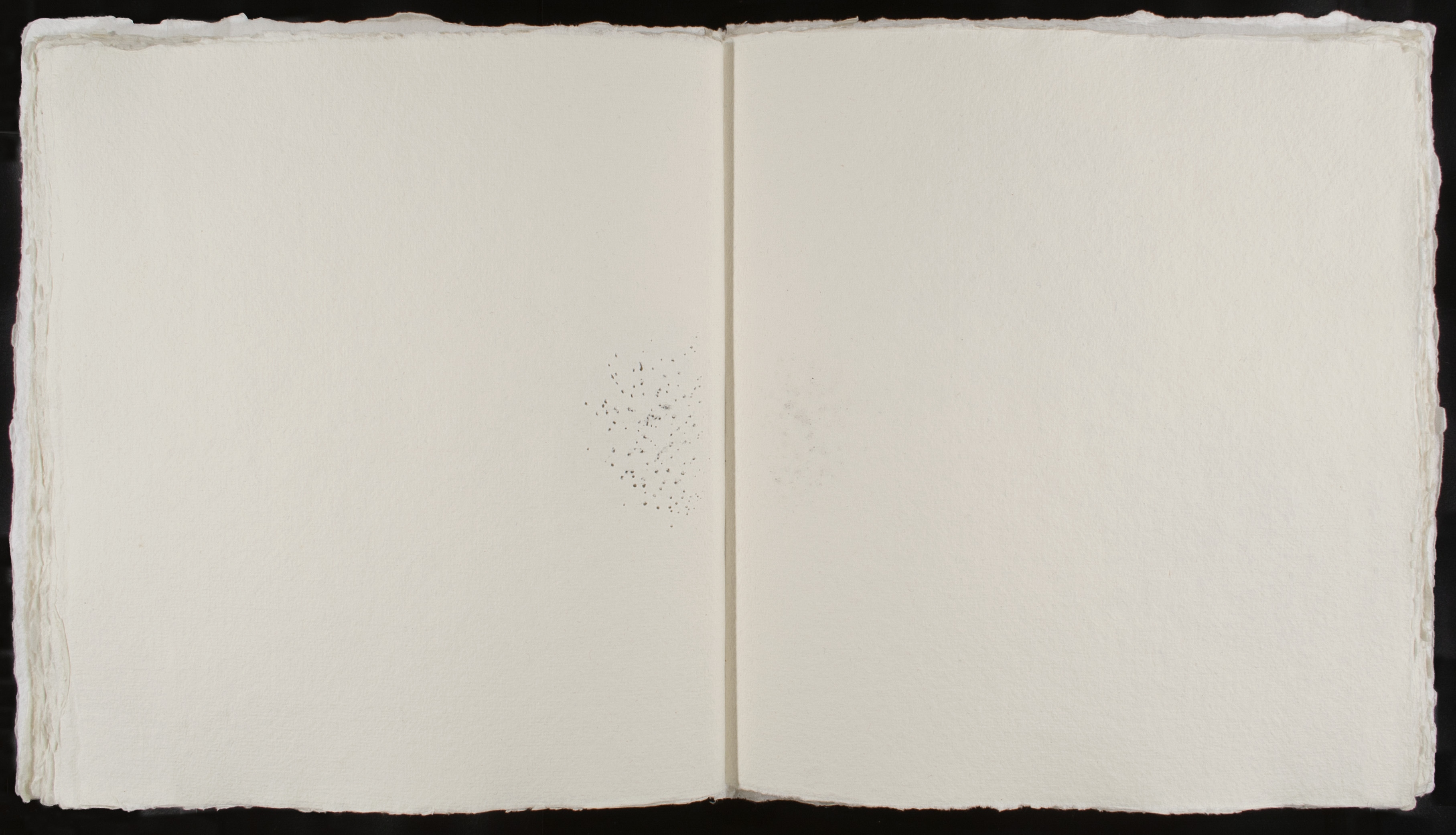
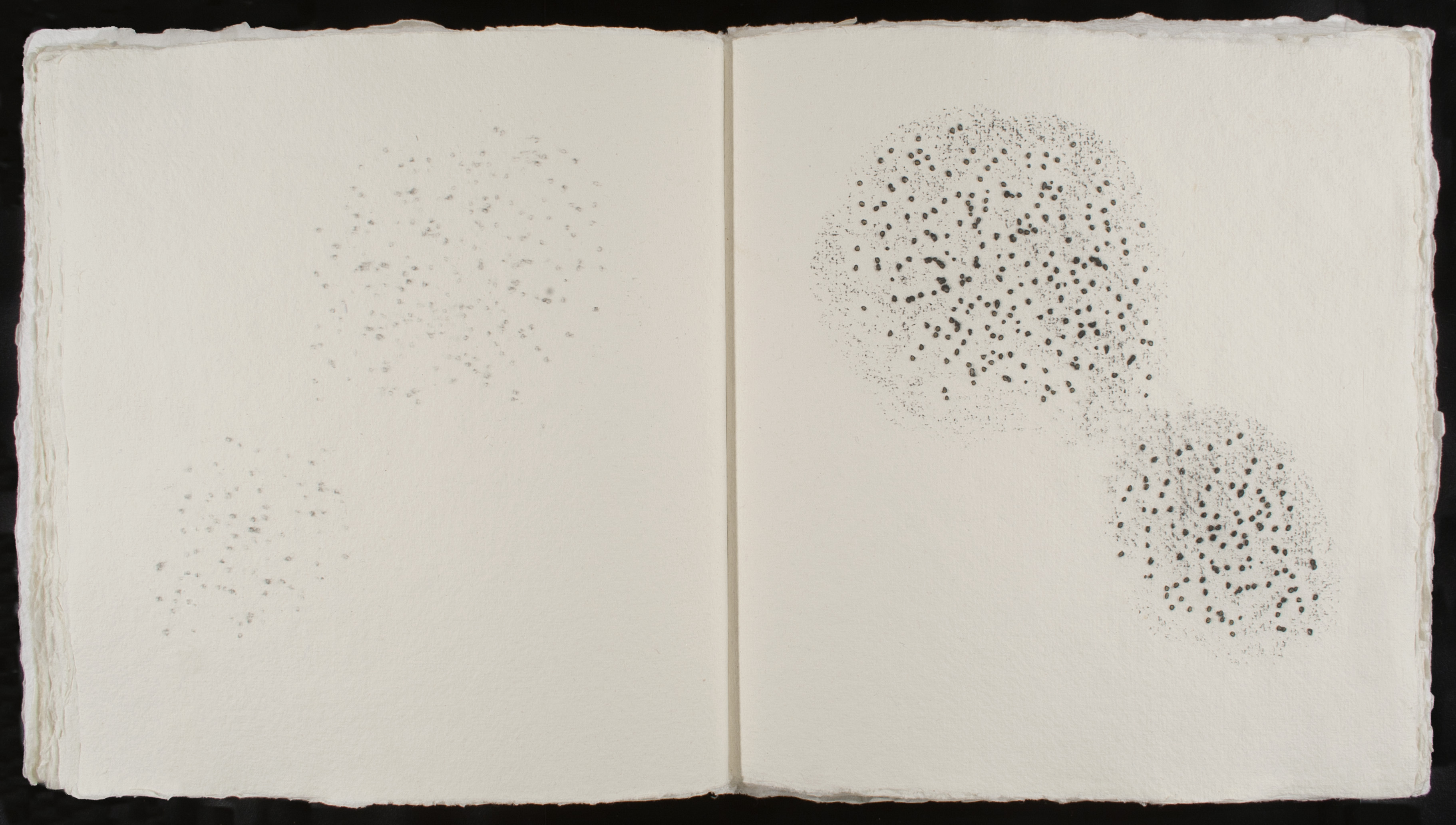
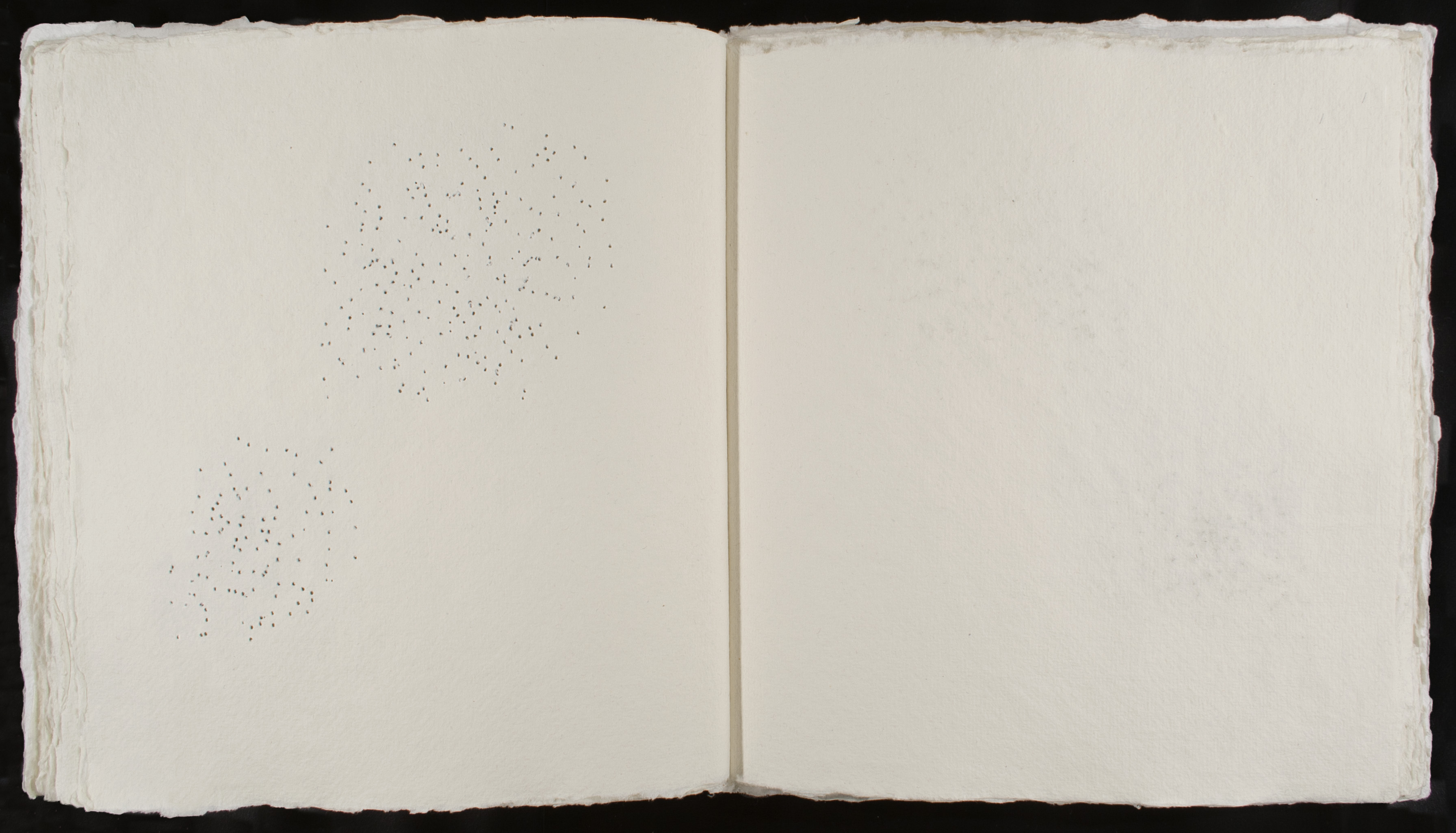
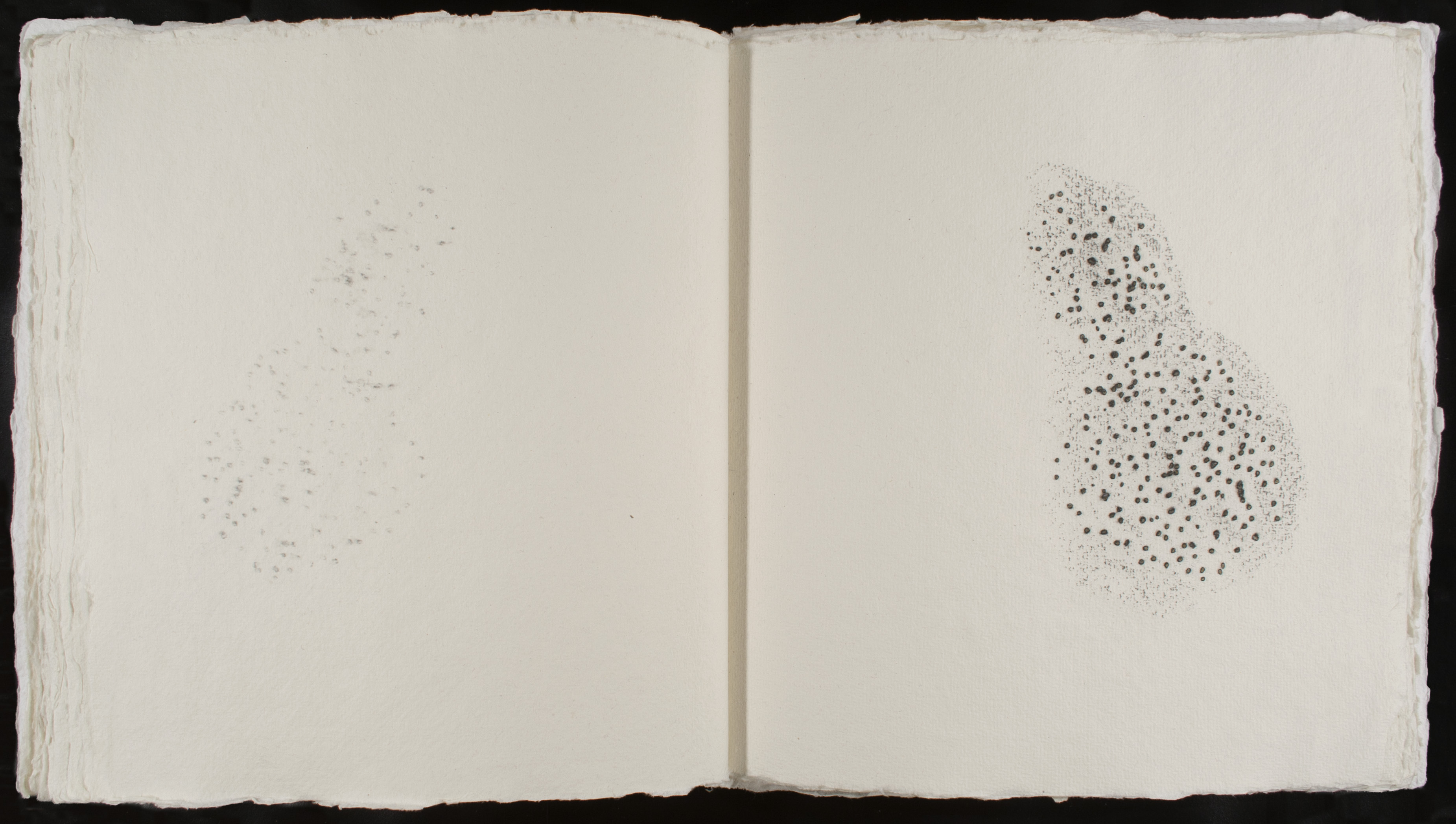
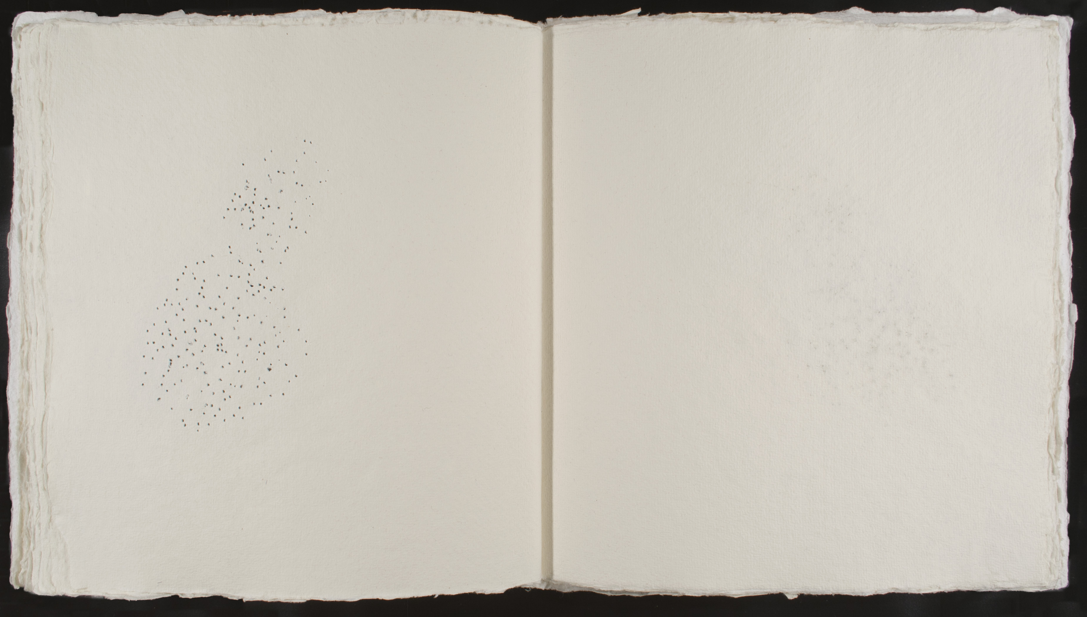
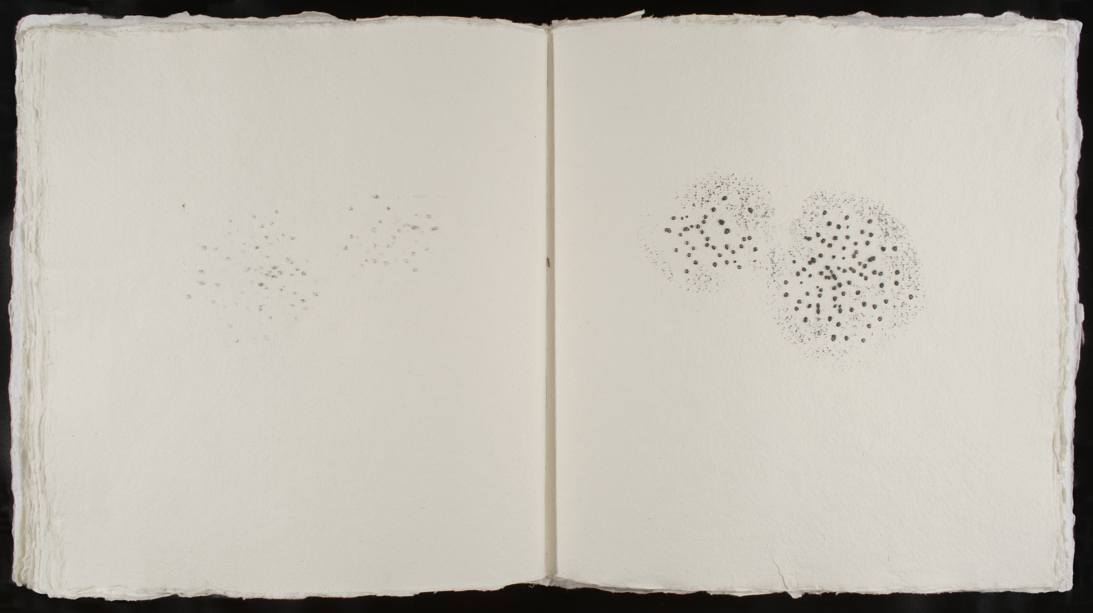
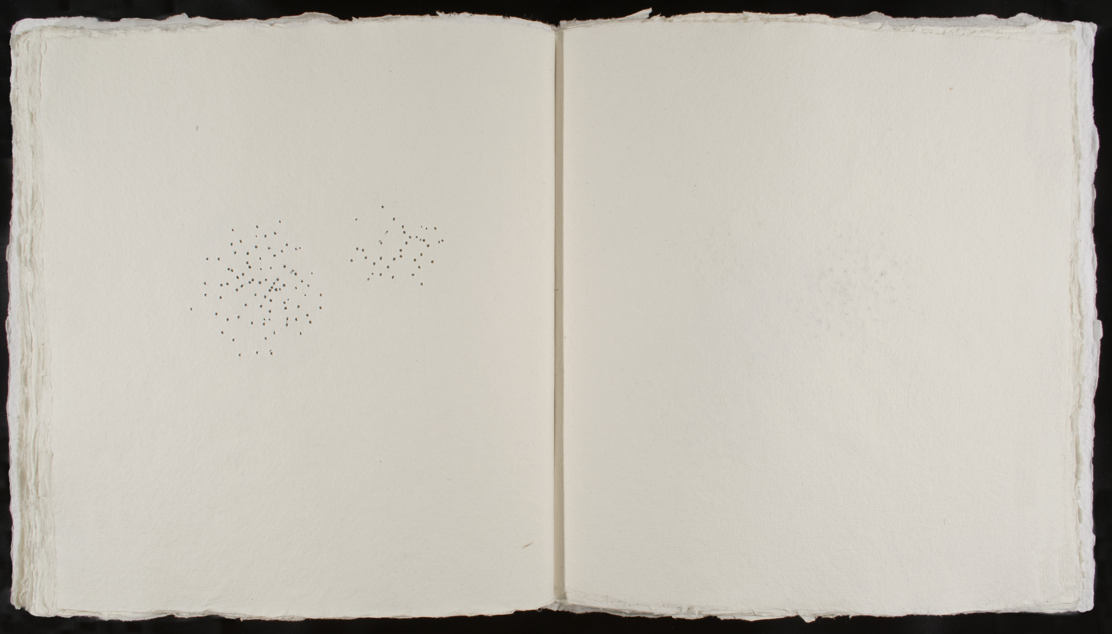
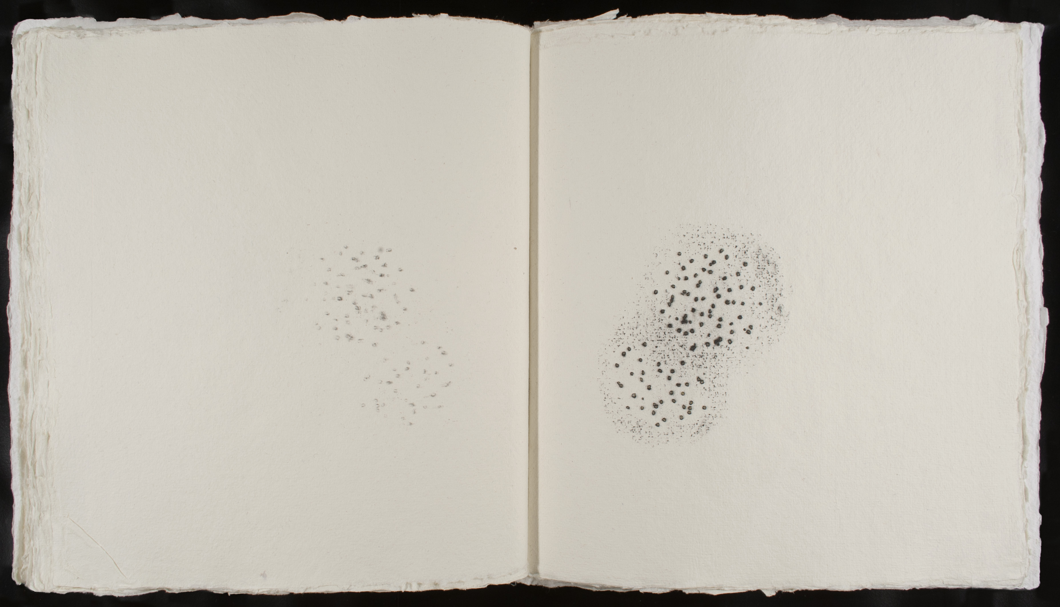
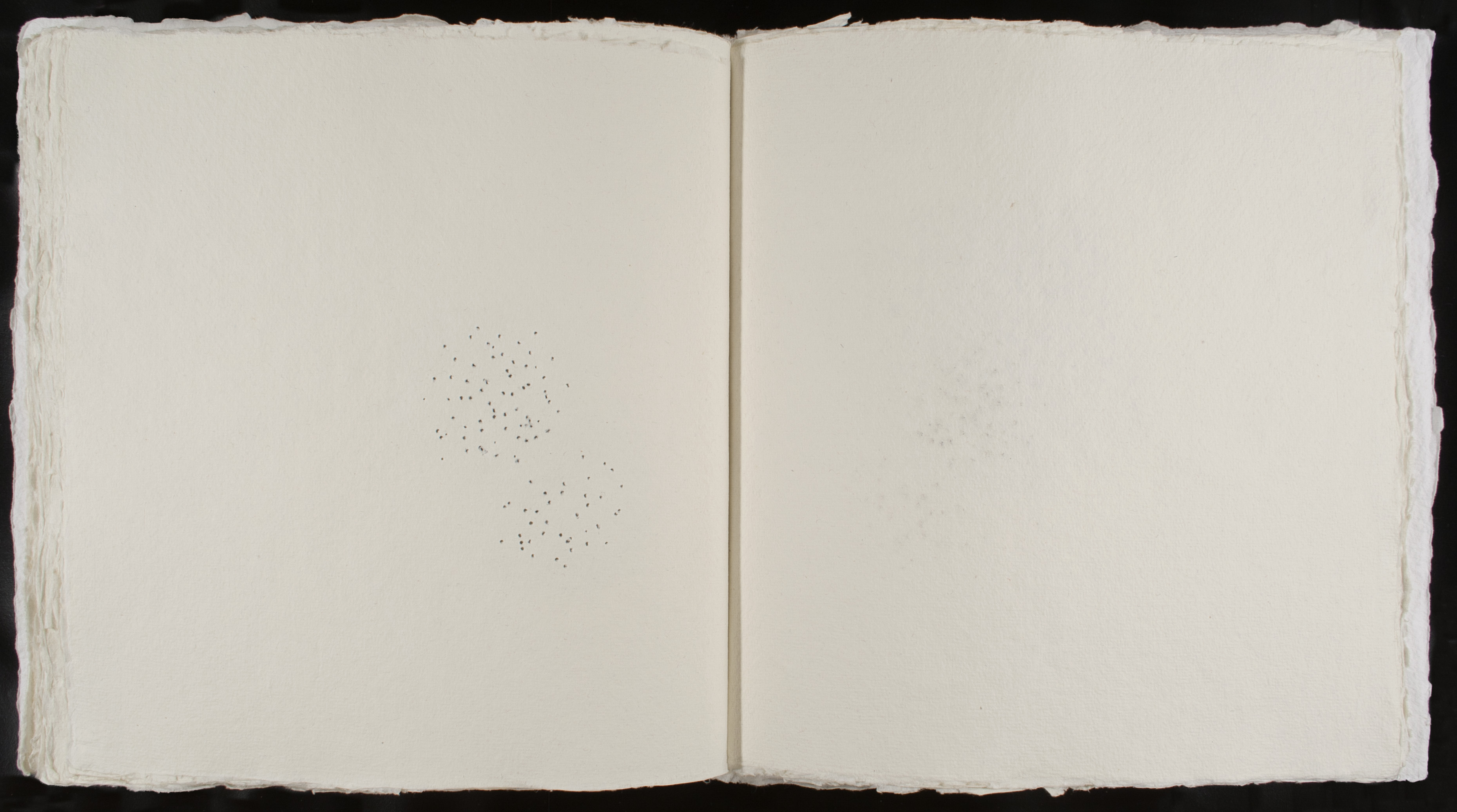
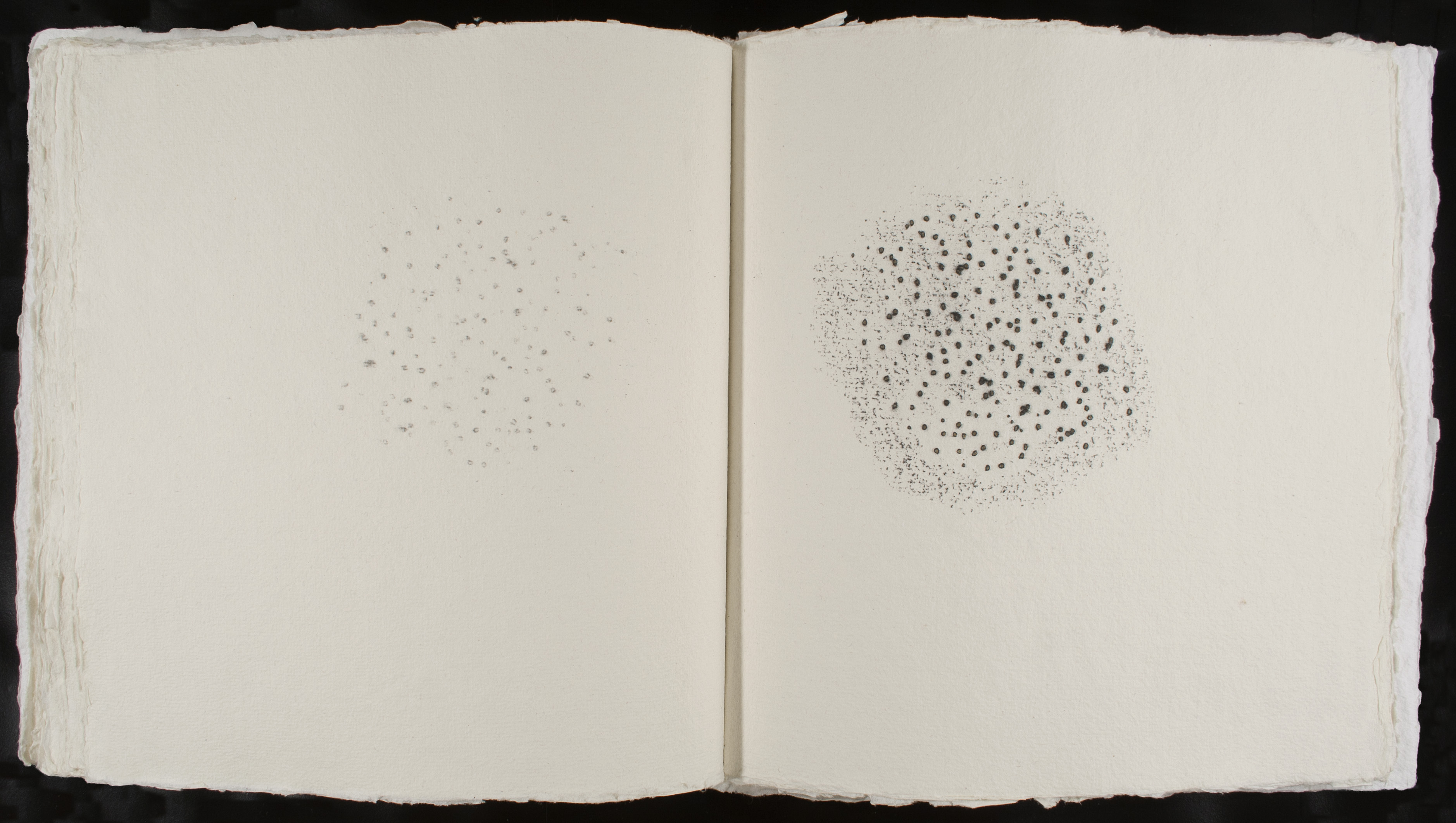
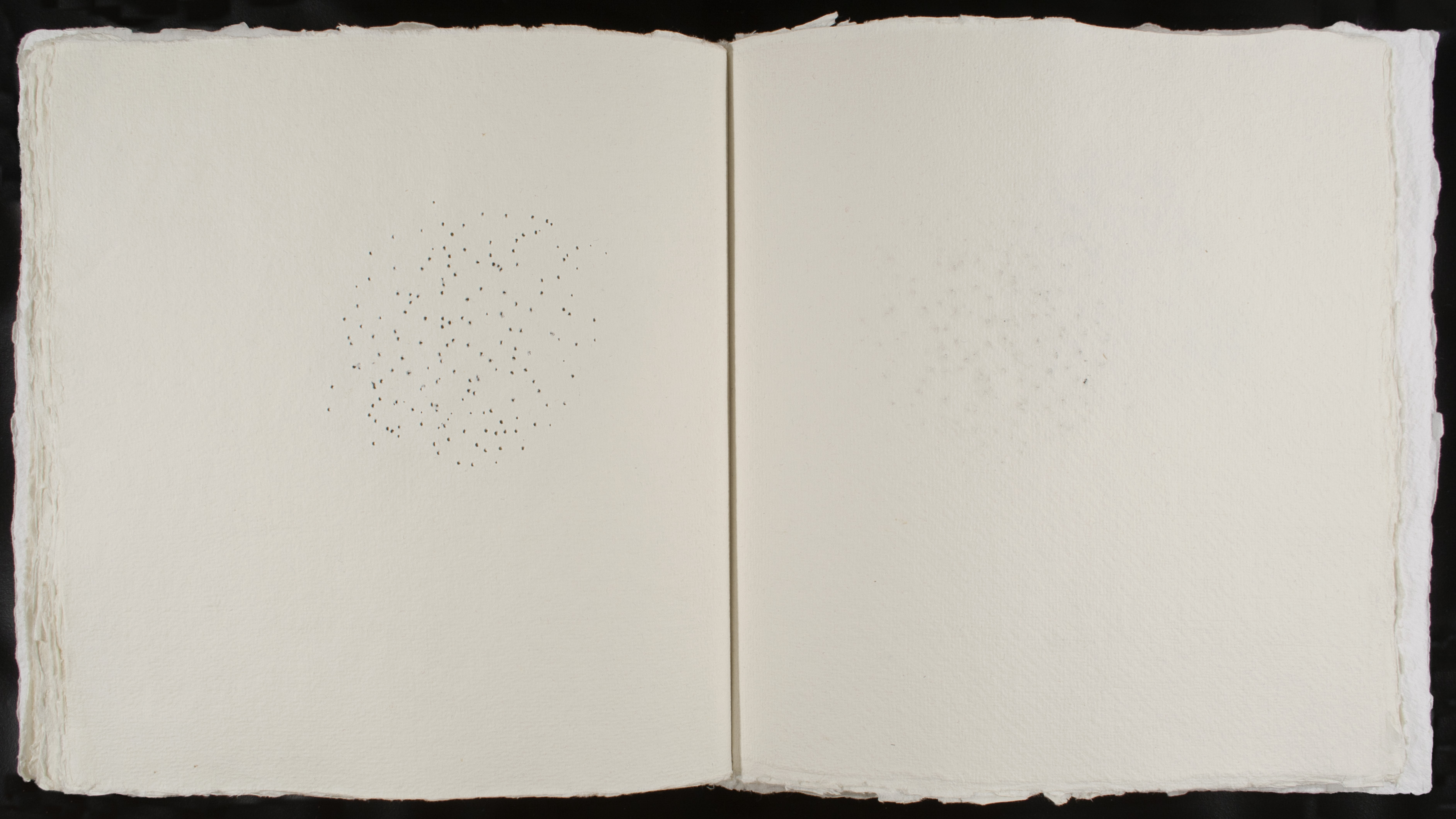
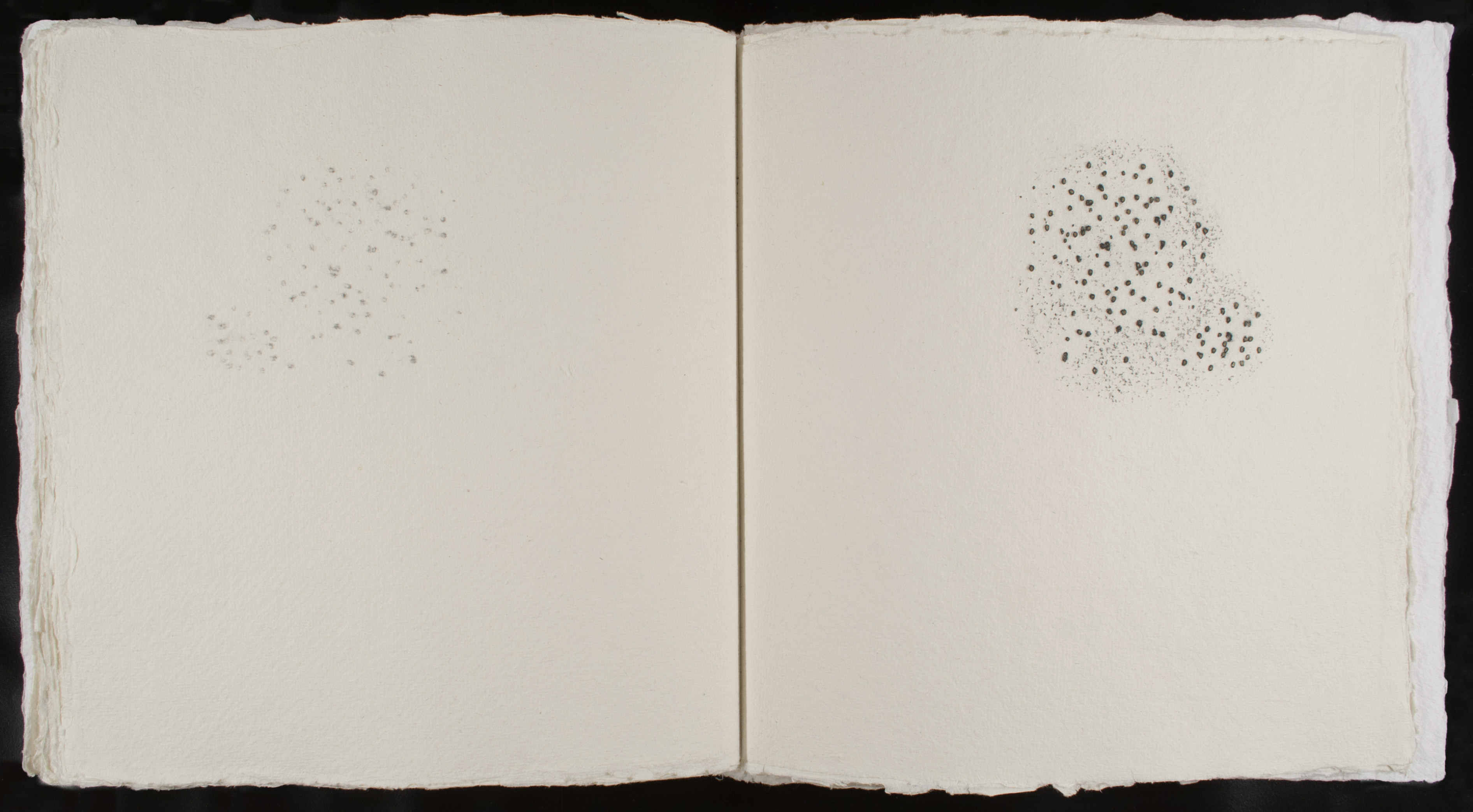
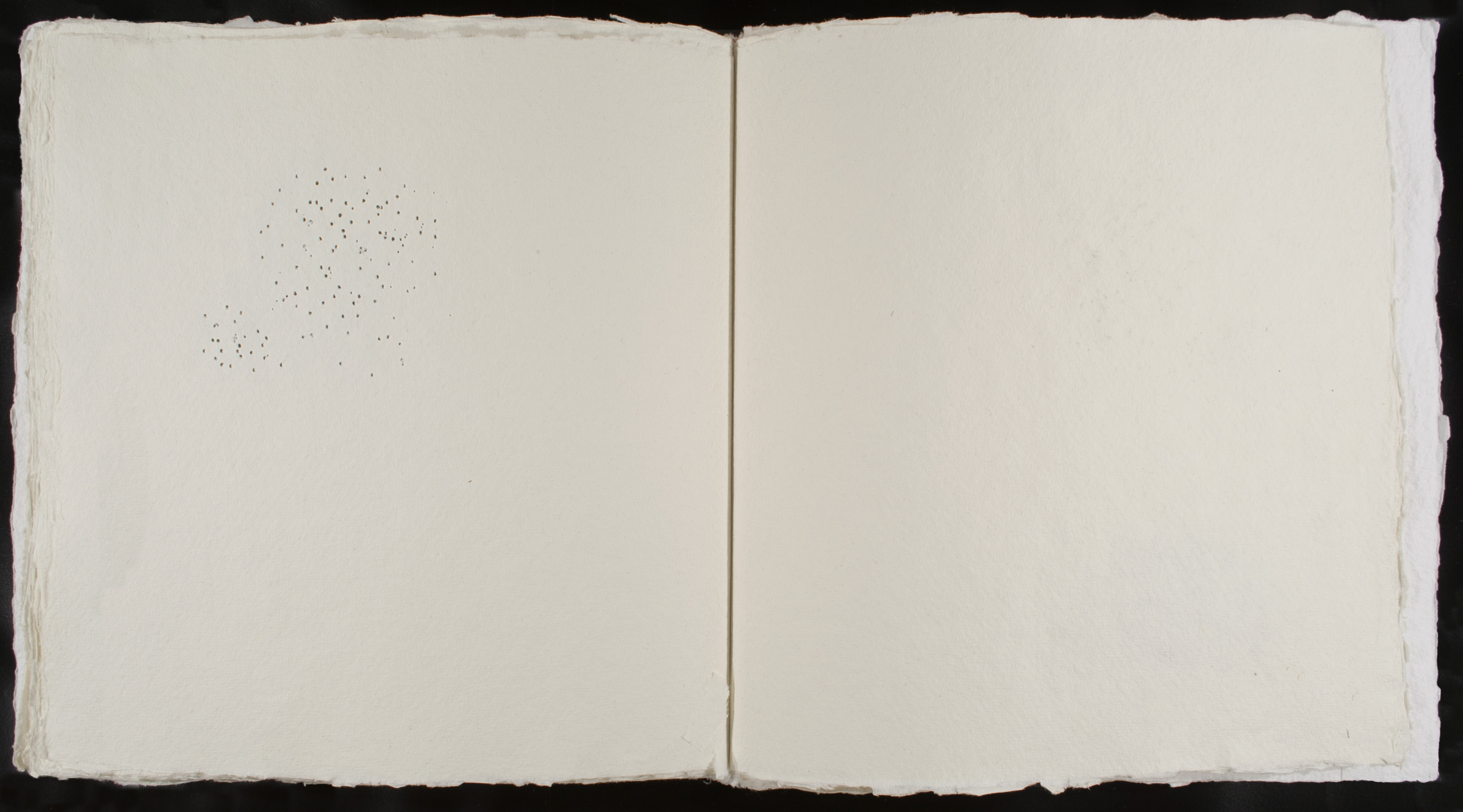
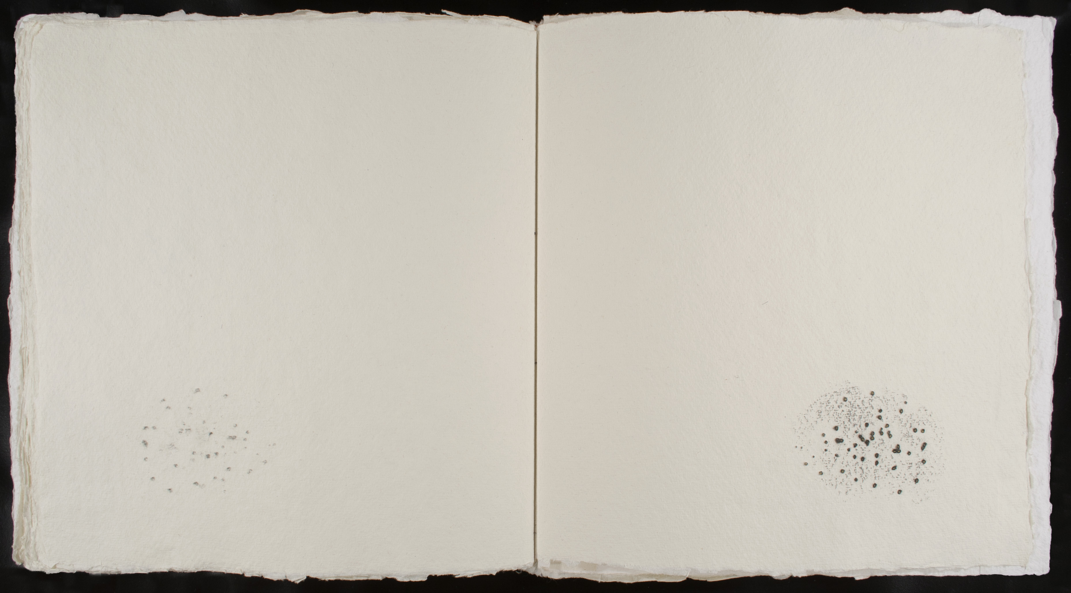
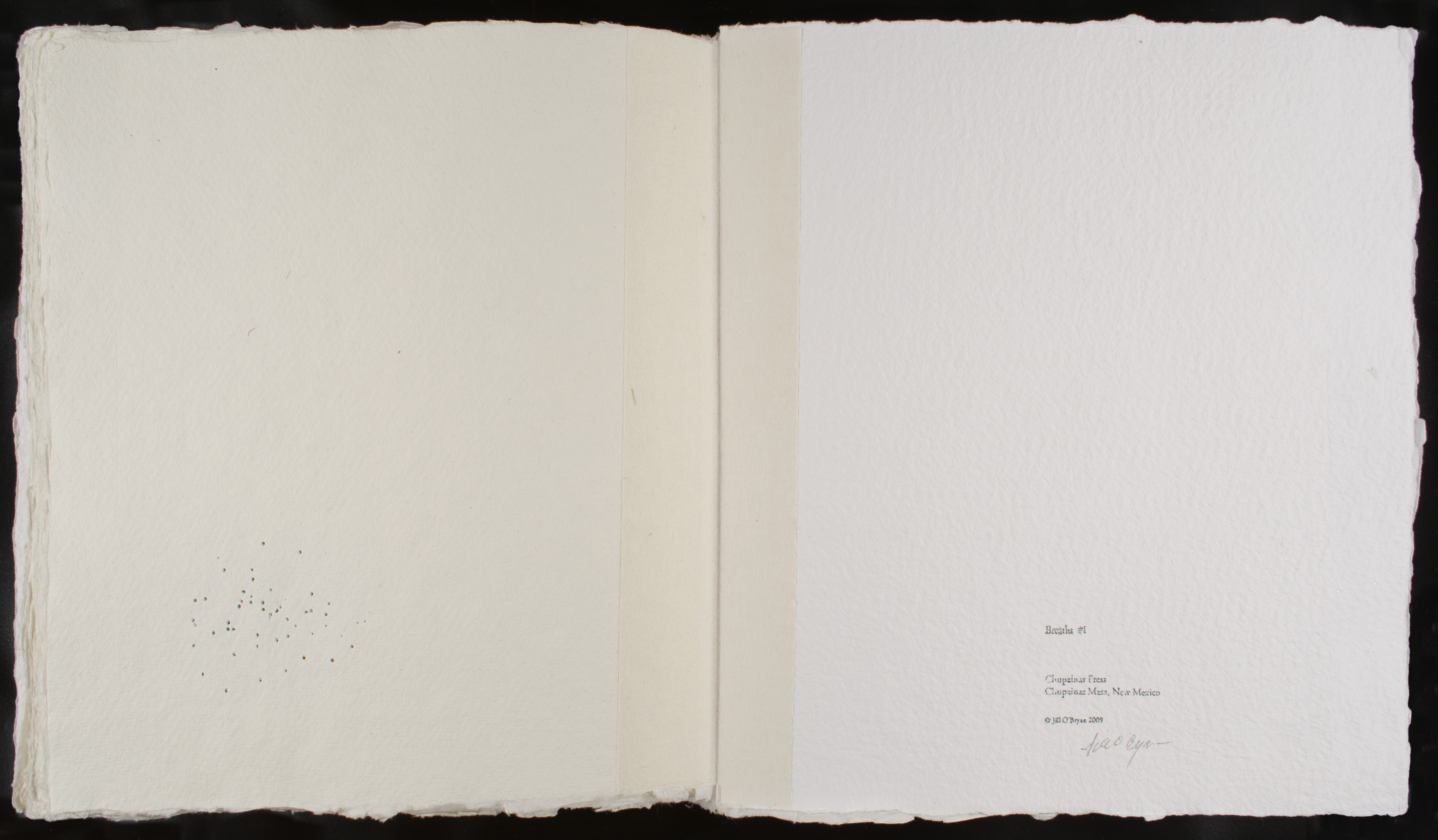
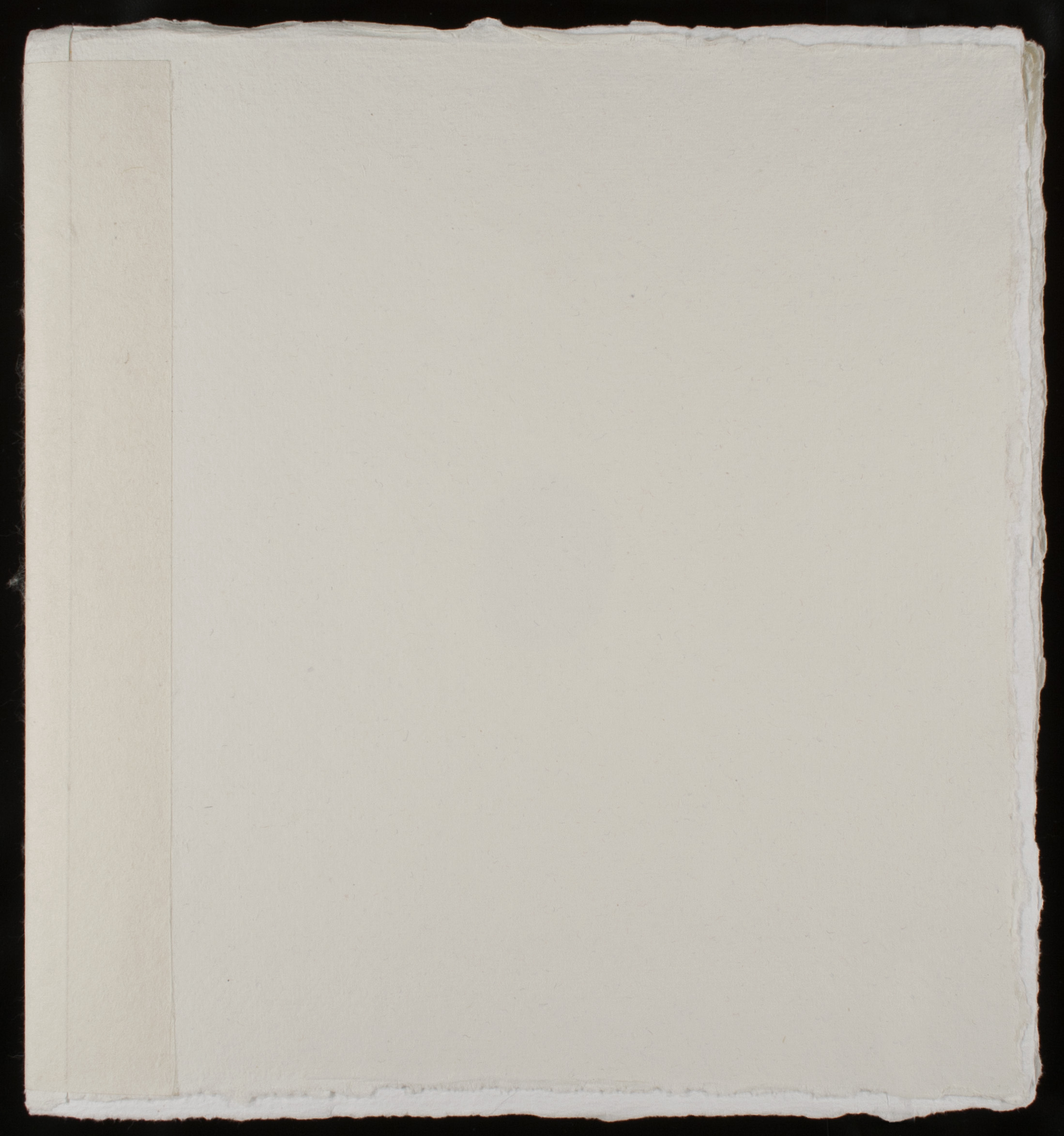
The pages in Breaths #1 are pierced with pinholes. Each pinhole was made in the time it takes to breathe one breath. The process is one of meditation. The resulting images are of breaths, as if they are visible. Graphite was rubbed over the embossed paper so the graphite dust fell through the pinholes onto the following page. So each pinhole drawing is followed by a drawing that is its shadow. The book is one continuous drawing–a participatory drawing, if you will–because I’ve noticed that it is completely natural to view the book at a pace that also coincides with breathing. One page, a pause, a breath, and then the next page. The space that’s created between the viewer and the book is intended to catch the eye, but also catches the breath.
Jill O’Bryan’s delicate and thoughtful artist’s book, Breaths #1 from 2009, continues her longstanding investigation of aesthetics, meditation, and personal endurance. On each page of Breaths #1, the viewer can observe the amorphous forms composed of collected puncture marks and transferred graphite–each hole representing one breath taken by the artist. O’Bryan’s drawings usually have a spare, minimal quality to them and involve serially repeating colors, materials, and shapes. Throughout her oeuvre, O’Bryan uses the repetitive mark in various forms to represent the duration of individual breaths. In some of her other “Breaths” works she has astonishingly accumulated such representative marks into the tens of thousands. The patterns that arise from her breath markings are never intentional but rather emerge organically as fluid and dynamic shapes, here resembling seeds or tumbleweeds moving through air.
In Breaths #1, each page-spread of pulpy, unrefined white paper bears one or two groups of gathered puncture marks on a blank background, rubbed over with graphite. Each shape is similar in form and content, seemingly floating or turning across the page, but also unique–each differing slightly in size, placement, and number of holes. Having usually worked in singular drawings on paper, O’Bryan felt that this particular concept most appropriately called for the format of an artist’s book. In a book, she could present a continuum of drawings united by one theme; additionally, a book enables individual handling and encourages a personal, intimate encounter with her work. Furthermore, while O’Bryan does not think of the markings or punctures in her drawings as literal text, they initially related to her doctoral dissertation. After temporarily diverting her attention from her studio work to finish her dissertation in 2000, O’Bryan was searching for a way to return to drawing and the visual arts. She began to make marks as a symbolic erasure of her dissertation, with each mark eliminating a word, one by one. Eventually the artist’s original impetus dissipated, and her markings now explore the notions of breathing, endurance, and meditation. In this book format, however, a reference to early associations with text nevertheless remains present.
While the display of Breaths #1 under a plastic case does not allow for direct participation during the exhibition, the viewer will ideally turn the pages and see O’Bryan’s drawings in succession. Through the punctured holes of Breaths #1, O’Bryan allows air to move in and out of the pages as they are turned. In this way, O’Bryan translates the action of her breathing into both a physical and visual representation. The holes and graphite leave traces of the artist and her process; each grouping creates a mirror image on the verso of the page, playing with notions of exterior and interior, inhaling and exhaling. As a kind of therapy or meditation, O’Bryan establishes a natural rhythm of drawing with her body–a process as important as the final visual result.
Jill O'Bryan Biography
Jill O’Bryan (b. 1956, Chicago, IL) received her BA from Macalester College, St. Paul, Minnesota (1978), and her MFA from the San Francisco Art Institute, California (1990). She completed her PhD in the Department of Art and Art Professions at New York University (2000). O’Bryan was one of the first recipients of the Marie Walsh Sharpe Space Program Fellowship (1991-1992). She was a Graduate Assistant at New York University (1993-1995) and received several New York University Graduate Students Organization Travel Grants during her studies (1997, 1998, 2000). Her work was featured in a solo show at Gallery Joe, Philadelphia (2012). A notable recent work, entitled A billion breaths (2013), is a billboard on I-25 between Las Vegas and Santa Fe, New Mexico. O’Bryan has participated in group shows at the Museo de Arte Contemporáneo Esteban Vicente, Segovia, Spain (2009); the Katonah Museum of Art, Katonah, New York (2011); Danese, New York (2011); the Zimmerli Art Museum at Rutgers University, New Brunswick, New Jersey (2012); the University of Richmond Museums, Virginia (2012); Gallery Joe, Philadelphia (2010, 2013); and Elizabeth Street Garden, New York (2014). O’Bryan is also active as a writer. She lives and works in New York City and Las Vegas.
Amy Raffel Biography
Amy Raffel (b. 1985, Madison, NJ) earned her BA with honors from Pennsylvania State University, University Park (2007) and completed her MA in Contemporary Art at the Institute of Fine Arts, New York University (2010). She currently is an PhD Candidate (AbD) in Contemporary Art at the City University of New York Graduate Center and is teaching Introduction to Modern Art at Lehman College, New York. In addition, Raffel works part-time for Art History Teaching Resources and Artsy. She lives and works in New York City.
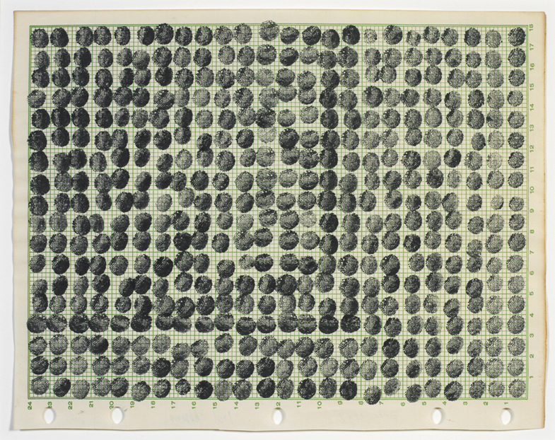
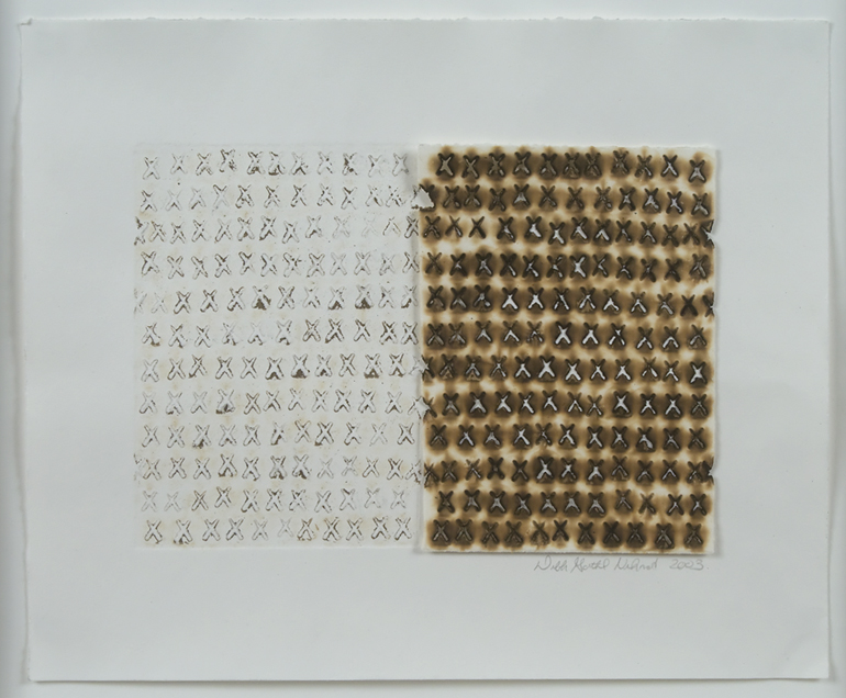
Deborah Gottheil Nehmad’s Untitled, from 2003, is a study in obsession, pain, and the relationship between the two. Nehmad’s path to art has been an unlikely one. After an accident that resulted in severe injury, Nehmad was prevented from continuing her successful law practice. To keep herself productive and to facilitate the healing process, Nehmad took up the M.F.A. program in printmaking at the University of Hawai’i Manoa, from which she graduated in 1998. Since that time, her work has represented her attempts to quantify, categorize, and communicate the sensations of pain inflicted by her injury. Nehmad’s repetitive use of numerical figures has its origins in the oft-used system of describing pain on a scale of one to ten. In her work these numbers appear as an obsessive element repetitively scored onto the surface, thus including the viewer in Nehmad’s personal experience of chronic pain.
Nehmad’s interest in creating a visual vocabulary for pain has also influenced her choice of printmaking and drawing processes. In the painstakingly placed X markings of Untitled, the viewer can observe Nehmad’s expert use of pyrography, the application of a heated object to create burnt marks, and collagraphy, in which a substrate of various textural materials is used to print either in intaglio or relief. These two processes combined create an even stronger relationship between the paper and the body of the viewer. The imprint of the burning technique evokes a searing sensation, as if the heated object is being applied to one’s skin rather than to the surface of the paper. This technique is particularly evocative in Untitled, in which the symbol Nehmad chooses to repeat is an X. The letter X brings certain images and ideas to mind, many of which seem applicable to Nehmad’s attempts to visually represent physical pain. For example, the phrase “X marks the spot” feels pertinent here, as the continual scoring of the letter X could be seen as an attempt to give pain a location, both on the body and on the paper. Additionally, an X can symbolize danger or inaccuracy–something to steer clear of or something wrong. In using this particular character, Nehmad demonstrates both the desire to locate her pain and the deep emotional toll of the body’s betrayal of the mind.
Deborah Gottheil Nehmad Biography
Deborah Gottheil Nehmad (b. 1952, Brooklyn, NY) received her BA in Government from Smith College, Northampton, Massachusetts (1974), and her JD from the Georgetown University Law Center, Washington, DC (1982). After beginning a career as a lawyer, she earned her MFA in Printmaking from the University of Hawaii at Manoa (1998). Nehmad is a recipient of the Individual Artist Fellowship in Visual Arts from the Hawaii State Foundation on Culture and the Arts (2008), from which she has also received numerous Recognition and Purchase Awards, the most recent being in 2011. Nehmad’s work has been included in group exhibitions at such venues as the Hawaii State Art Museum, Honolulu (2007, 2010, 2011-13); The Contemporary Museum, Honolulu (2008); the Museo de Arte Contemporáneo Esteban Vicente, Segovia, Spain (2009); the Katonah Museum of Art, Katonah, New York (2011); The Contemporary Museum at First Hawaiian Center, Honolulu (2011); and the Honolulu Museum of Art (2012). Nehmad lives and works in Honolulu. More information about her work can be found at www.deborahnehmad.com.
Lindsay Casale Biography
Lindsay Casale (b. 1987, FL) spent her formative years in Chapel Hill, North Carolina. She received her BA in English with a minor in Art History from James Madison University, Harrisonburg, Virginia. Casale currently resides in Brooklyn and works as a fundraising consultant for arts and culture and education institutions.