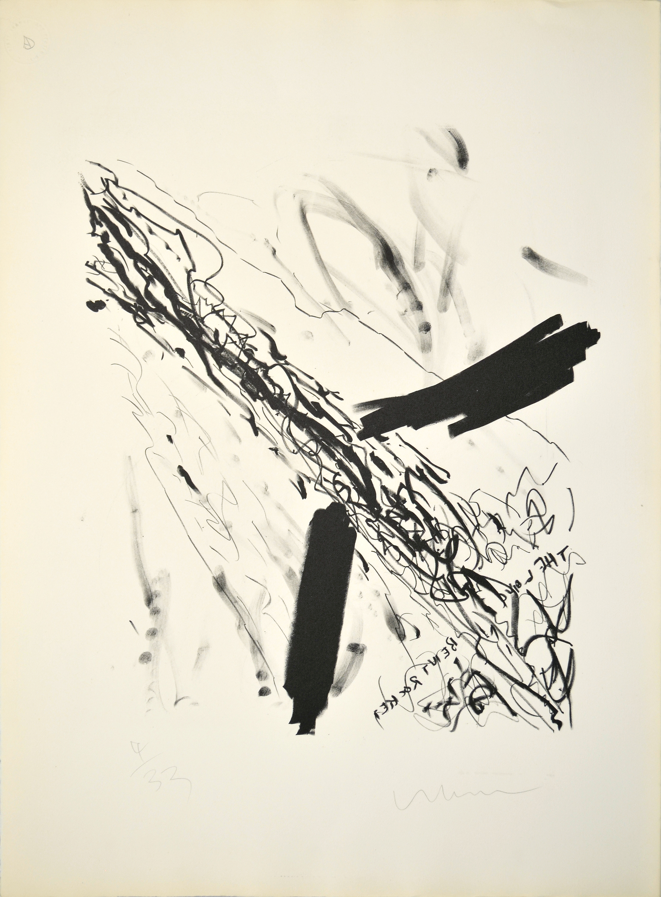
Long Bent Rocket (1960) is an early lithograph by Robert Whitman of a rocket moving through the air. Short, staccato lines constitute the body of the rocket, while dense marks extending from either side of the lower shaft suggest fins. The words the long bent rocket, framed by the fins below the length of the rocket, appear backwards—a result of the lithographic process—and long, airy lines surrounding the body of the rocket suggest movement.
Whitman surrounded himself with artists who, like him, were working partially in reaction to the work of Abstract Expressionism, which emphasized the direct connection between the hand of the artist and the surface of the work. This focus manifested itself in a wide variety of brushwork and mark-making techniques. Here, Whitman references the multiplicity of gestural strategies of Abstract Expressionism by making marks with a number of different tools, including lithographic crayons and his fingers. However, lithography is a multi-step process that builds significant distance between the hand of the artist and the finished product, presenting a challenge to Abstract Expressionist formal strategies.
Whitman is best known for his theatrical works, which he began making in the early 1960s, blending aspects of performance art and traditional theater with technological innovations involving sound and light. In 1967, along with Robert Rauschenberg, Billy Klüver, and Fred Waldhauer, Whitman founded Experiments in Art and Technology (E.A.T.), a group focused on bringing new technologies to artists looking to fold new media into their practice. The ongoing Space Race with the U.S.S.R. would have placed space technology at the forefront of American culture at this time, and images of rockets also appear in work by Whitman’s associates, including Rauschenberg’s Untitled (Mirror) (1952). Though Long Bent Rocket antedates the majority of Whitman’s mature oeuvre, we can understand this lithograph as a work through which the artist processed the movement that preceded him, while imagining his own role in formal and conceptual developments to come.
Robert Whitman Biography
Robert Whitman (b. 1935, New York, NY) received a BA in Literature at Rutgers, The State University of New Jersey, New Brunswick (1957), where his first solo exhibition was held in 1958. He studied Art History at Columbia University, New York (1958), and created and staged many of his first “Happenings” performances on the Lower East Side alongside artists like Allan Kaprow, Lucas Samaras, Red Grooms, Jim Dine, and Claes Oldenburg. Whitman co-founded the non-profit organization Experiments in Art and Technology (E.A.T.) (1966) with Billy Klüver, Fred Waldhauer, and Robert Rauschenberg. The most recent traveling retrospective on Whitman’s work opened at Dia:Chelsea, New York (2003). Recent solo exhibitions were held at the Williams Center for the Arts, Lafayette College, Easton, Pennsylvania (2007); PaceWildenstein, New York (2007); Eyebeam Art + Technology Center, New York (2012); and Broadway 1602, New York (2013). Whitman also made several films included in his work, such as Window (1963), Dressing Table (1964), Shower (1964), Sink (1964), and Room (1974). Whitman lives and works in Warwick, New York and is represented by Pace Gallery, New York.
Cat Dawson Biography
Cat Dawson is a doctoral candidate (ABD) in Visual Studies at the University at Buffalo specializing in art of the American post-war postmodern. Her particular interests include the interplay between text and language, conceptual art and theories of the body, mid-century painting and the sexuality of abstraction, and psychoanalysis. Her dissertation is on sexuality and difference in American post-war painting.
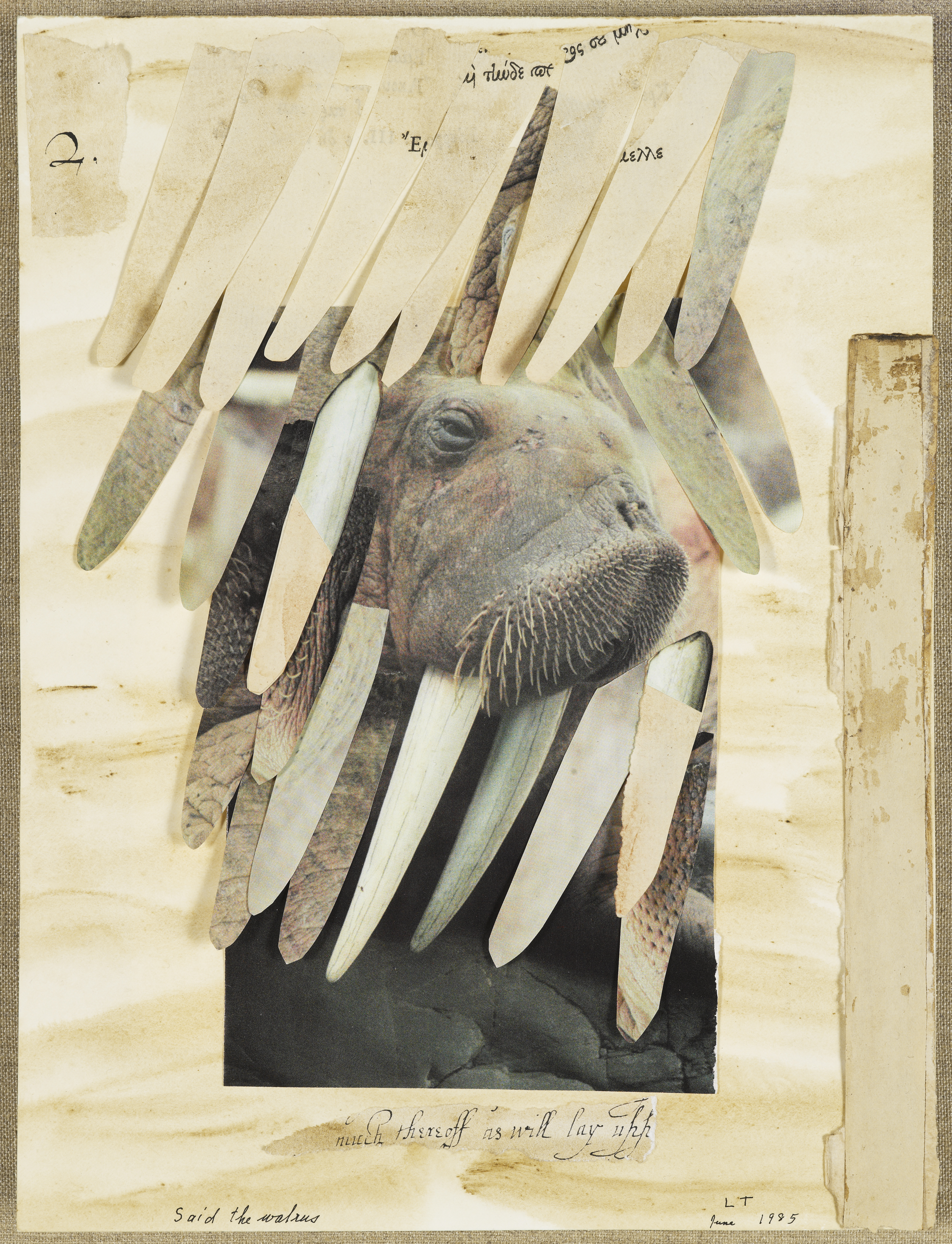
Said the Walrus to the Carpenter, It Would Be Very Nice (1985), a collage by Lenore Tawney, features an image of a walrus that protrudes through a curtain of oblong shapes. One of Tawney’s later collages, Said the Walrus is a reference in both title and subject to “The Walrus and the Carpenter,” a narrative poem from Lewis Carroll’s 1871 book Through The Looking Glass, which explores the theme of deception through meaning in language. In the poem, the Walrus uses word play to trick a spat of oysters into attending a feast at which they all are eaten. The Walrus in Carroll’s poem is complacent in carrying out his deceit, but he expresses reservation about the trickery in which he engages. By exposing the implications of the plot afoot, the Walrus becomes the mediator between the audience and the events in the story.
The image of a walrus in Tawney’s piece is framed by a cut-out square, which, in concert with the shapes collaged over the top, suggests a stage. Tawney’s contextualization of this image in a stage-like frame introduces an element of performance, a form of play between language and action. Play is associated with the mobility of meaning – the combination of two elements that are not usually put together – which presents a challenge to fixed meaning. Alternative meanings enable the possibility of difference, and the Walrus in this work is the character that exposes an alternative to the story: letting the oysters go, rather than perpetuating the trap.
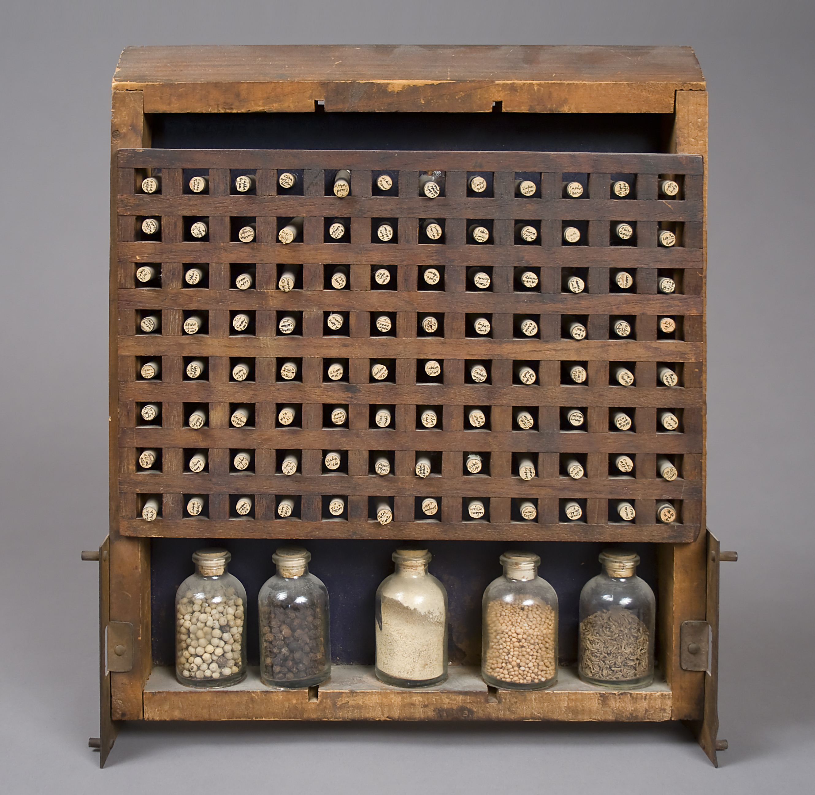
Challenges to authoritative meaning are common throughout Tawney’s work, and she often looked to artists around her for material, taking the formal strategies of others and processing them through her own personal referential vocabulary. A striking element of Tawney’s work is its almost diametric opposition, in its personal inflections, to that of her once-partner, Agnes Martin.1 One of the foremost figures in geometric abstraction in the post-war period, Martin’s artworks offer little in the way of external or personal referents beyond her meticulously handcrafted grids. Tawney’s Biblioteca Chemica (1966) consists of a wooden rack of square compartments filled with small vials of material. This work echoes Martin’s formal vocabulary, but in lieu of carefully rendered lines, Tawney employs a found object as the grid formation. The small vials, labeled by hand in tiny script, contained within infuse the work with a sense of the personal; we can read the artist’s handwriting on the tops of the rubber stoppers. By deploying handwriting and hand-collected materials alongside the grid—which is associated with uniformity and yet, somewhat paradoxically, is also the signature formal strategy of her once-partner—Tawney performs a complex conflation of the personal and the impersonal. Thus she makes the mechanisms that bridge or challenge distinctions between public and private meaning the subject of her work.
1. There is no evidence in the Lenore G. Tawney Foundation archives of the relationship between Lenore Tawney and Agnes Martin. However, given the social strictures of the time, such an omission is hardly surprising. Several other sources in the Smithsonian Institution’s Archives of American Art nonetheless address their relationship. For further information, please consult Jonathan D. Katz, “Agnes Martin and the Sexuality of Abstraction,” in Agnes Martin, eds. Lynne Cooke and Karen Kelly (New Haven: Yale University Press, 2012), 92-121.
Lenore Tawney Biography
Lenore Tawney (b. 1907, Lorain, OH; d. 2007, New York) was a student at the Institute of Design, Chicago (1946-1947). She studied tapestry at the Penland School of Crafts, North Carolina (1954) and then joined a community of artists working in Coenties Slip in Lower Manhattan. She studied gauze weaving with Lili Blumenau in New York (1961). During the mid-1960s, Tawney began to work in drawing, collage, and assemblage, a practice she continued throughout her life. She was an artist-in-residence at the University of Notre Dame, Indiana (1978), and at the Fabric Workshop, Philadelphia (1982). Tawney was a guest lecturer for Visual Arts and Fiber at The Banff Center, Alberta, Canada (1983), and a distinguished lecturer at the University of Arizona, Tucson (1987). She has received awards from the American Craft Council, the James Renwick Alliance, and the American Craft Museum, in addition to an honorary degree from the Maryland Institute College of Art, Baltimore. Her first major retrospective was held at the Museum of Arts and Design, New York (1990). Recent solo exhibitions were held at the Maryland Institute College of Art, Baltimore (2012-2013) and the University of the Arts, Philadelphia (2013). Her work is housed in the public collections of The Museum of Modern Art, New York; The Metropolitan Museum of Art, New York; The Art Institute of Chicago; and the Cooper-Hewitt National Design Museum, New York.
Cat Dawson Biography
Cat Dawson is a doctoral candidate (ABD) in Visual Studies at the University at Buffalo specializing in art of the American post-war postmodern. Her particular interests include the interplay between text and language, conceptual art and theories of the body, mid-century painting and the sexuality of abstraction, and psychoanalysis. Her dissertation is on sexuality and difference in American post-war painting.
References
There is no evidence in the Lenore G. Tawney Foundation archives of the relationship between Lenore Tawney and Agnes Martin. However, given the social strictures of the time, such an omission is hardly surprising. Several other sources in the Smithsonian Institution’s Archives of American Art nonetheless address their relationship. For further information, please consult Jonathan D. Katz, “Agnes Martin and the Sexuality of Abstraction,” in Agnes Martin, eds. Lynne Cooke and Karen Kelly (New Haven: Yale University Press, 2012), 92-121.
Throughout this exhibition, translation emerges as one of the central points of engagement for Conceptual and proto-Conceptual artists. To think through translation is to come to understand the complexities of communication: that some things can be transferred from one language to another, while other things cannot.
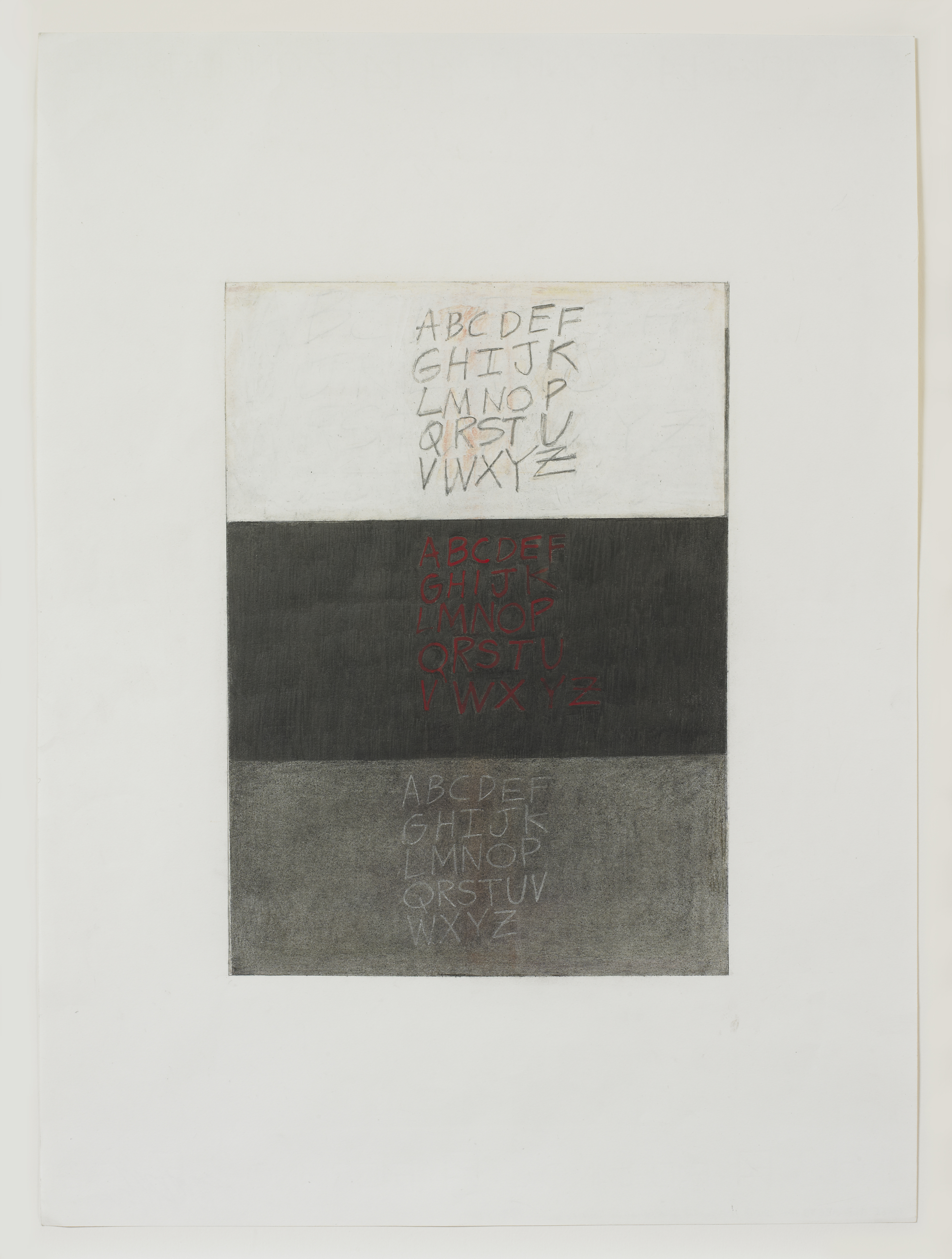
In Three Alphabets (2013), Gloria Ortiz-Hernández juxtaposes three versions of the English alphabet. The first is written in pencil on a ground of white oil pastel, the second in red pastel on charcoal, and the third in white pencil on charcoal. The upper register, which in its use of graphite on white recalls the work of Cy Twombly, suggests lightness in contradistinction to the middle register, which with its red and black palette stands in simple opposition to its neighbor. Ortiz-Hernández abuts two permutations of the same thing, revealing both similarity and the possibility of difference. The pale text on grey background found in the lower register serves to mediate the first and second alphabets, collapsing the two into one another.
This work is anachronistic, in that the play between the three alphabets harkens back to a time when translation across myriad languages was less consistent than it is today. Yet through her visual strategy of thesis/antithesis/synthesis, Ortiz-Hernández speaks to the continued relevance of dialectical speech and thinking, which remain integral to the process of meaning-making.
Gloria Ortiz-Hernández Biography
Gloria Ortiz-Hernández (b. 1943, Cali, Colombia) is an artist whose work has been shown in numerous museum exhibitions, most recently at the Davis Museum and Cultural Center, Wellesley, Massachusetts (2004); The University Galleries at Texas State University, San Marcos (2009); and the Katonah Museum of Art, Katonah, New York (2011). Recent group and solo exhibitions were held at Galería Casas Riegner, Bogotá, Colombia (2012); Josée Bienvenu Gallery, New York (2012); and artBO International Art Fair, Bogotá, Colombia (2012). Her work may be found in a variety of museum collections, including The Museum of Modern Art, New York; the Harvard Art Museums, Cambridge, Massachusetts; The Morgan Library and Museum, New York; Yale University Art Gallery, New Haven; the Seattle Art Museum, Washington; the Museum of Fine Arts, Houston; and the Museum of Fine Arts, Boston, among others. Ortiz-Hernández works in Bogotá and New York.
Cat Dawson Biography
Cat Dawson is a doctoral candidate (ABD) in Visual Studies at the University at Buffalo specializing in art of the American post-war postmodern. Her particular interests include the interplay between text and language, conceptual art and theories of the body, mid-century painting and the sexuality of abstraction, and psychoanalysis. Her dissertation is on sexuality and difference in American post-war painting.
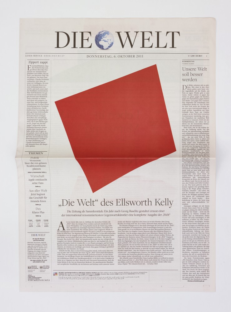
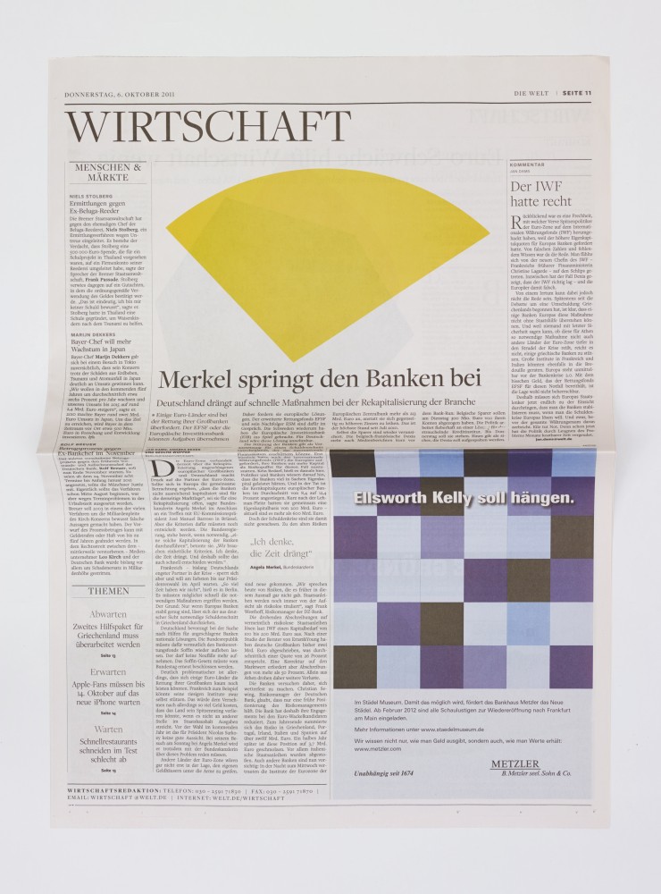
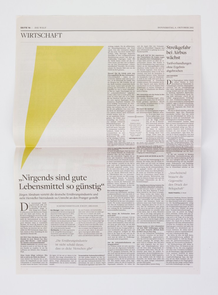
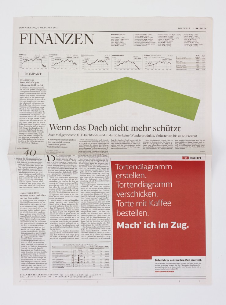
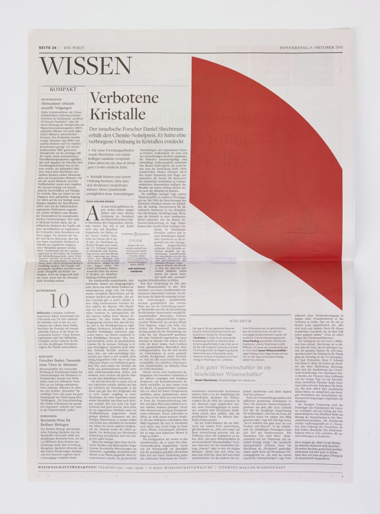
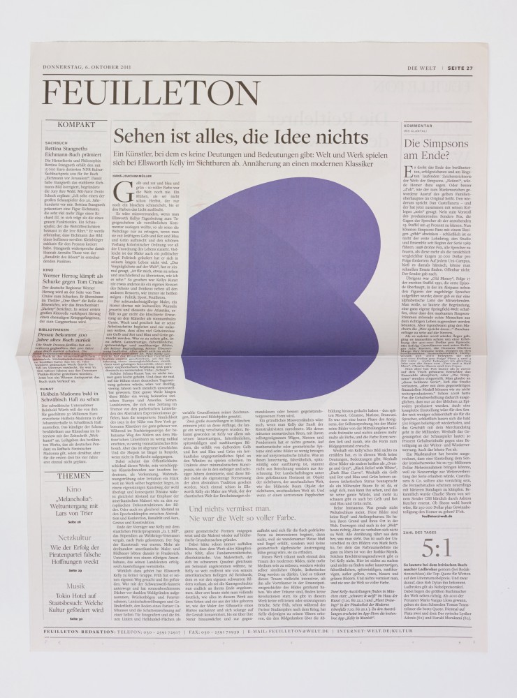
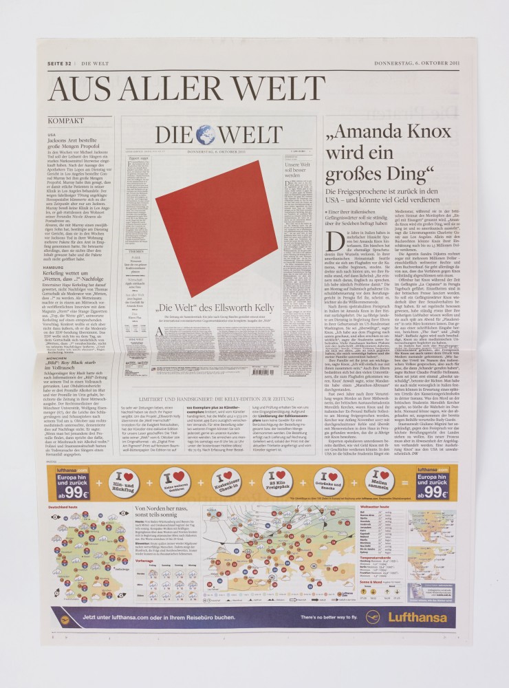
Ellsworth Kelly is famous for his work in hard-edge abstraction: primarily large shapes, often but not exclusively sculptural, sporting one uniform color surface—or sometimes two colors on adjacent shapes, which almost touch but never do. Hard-edge abstraction, in Kelly’s vernacular, is surprisingly sensual. The tension between a single color field and a wall, or between two sculptural shapes, suggests proximity with a prohibition against actual touching.
As part of a series organized by Die Welt, the leading conservative German newspaper, Kelly designed an edition of the paper to feature his signature abstract shapes where readily digestible photojournalistic images would usually be found. Images found in newspapers are customarily in conversation with text, often glimpsed as supplements rather than examined on their own. Photojournalism, however, is uniquely situated as the practice of capturing a precise moment and telling a story without words—an important component of reportage that, in daily periodicals such as Die Welt, might otherwise go unnoticed. Kelly’s intervention challenges the relationship between image and text in a specific context, while also raising questions about the ability of abstract art to speak directly to experience.
Unlike other queer artists of his generation, such as Robert Rauschenberg and Robert Indiana, who routinely incorporate language into their work, Kelly leaves his surfaces devoid of legible words or recognizable images. This marked absence gestures toward Kelly’s acute awareness of the risks taken in suggesting sexuality in his work, and this awareness serves as one explanation for his according decision to avoid suggestion wholesale. But in Die Welt, Kelly quite consciously brings his images into play with text, suggesting that his work need not contain words or pictures in order to speak volumes about society.
In placing abstract forms where we expect to find illustrative images, Kelly asks the viewer to consider how form, line, and color might resonate with people, and how it might formulate the information we use each day to understand one another and to make ourselves understood.
Ellsworth Kelly Biography
Ellsworth Kelly (b. 1923, Newburgh, NY) is regarded as one of the most important abstract painters, sculptors and printmakers working today. His career is marked by the independent route his art has taken from any formal school or art movement, and by his innovative contribution to 20th century painting and sculpture. Following two years of study at the Pratt Institute, Brooklyn, New York (1941-1942), Kelly served in the United States Army during World War II, and then resumed his education at the Boston Museum School (1946-1948). Kelly’s first one-man exhibition was at the Galerie Arnaud, Paris (1951). In recognition of his lifetime achievements and contributions, Kelly was promoted to Officier of the French Legion by the French Consulate. His first major retrospective exhibition was held at The Museum of Modern Art, New York (1973), followed by retrospectives at The Metropolitan Museum of Art, New York (1979); the Whitney Museum of American Art, New York (1982); and the Solomon R. Guggenheim Museum, New York (1996). Kelly’s works have been exhibited in conjunction with artists such as Cézanne and Beyond, the Philadelphia Museum of Art, Pennsylvania (2009); Monet and Abstraction, the Museo Thyssen-Bornemisza, Madrid (2009); Jean Auguste Dominique Ingres / Ellsworth Kelly, the Villa Medici’s Académie de France, Rome (2010); and Malevich and the American Legacy, Gagosian Gallery, New York (2011). Recent solo exhibitions were held in 2013 at The Phillips Collection, Washington, D.C.; The Museum of Modern Art, New York; Matthew Marks Gallery, New York; The Barnes Foundation, Philadelphia; Mnuchin Gallery, New York; and the Madison Museum of Contemporary Art, Madison, Wisconsin, traveling to Detroit Institute of Arts, Michigan. He lives and works in upstate New York.
Cat Dawson Biography
Cat Dawson is a doctoral candidate (ABD) in Visual Studies at the University at Buffalo specializing in art of the American post-war postmodern. Her particular interests include the interplay between text and language, conceptual art and theories of the body, mid-century painting and the sexuality of abstraction, and psychoanalysis. Her dissertation is on sexuality and difference in American post-war painting.
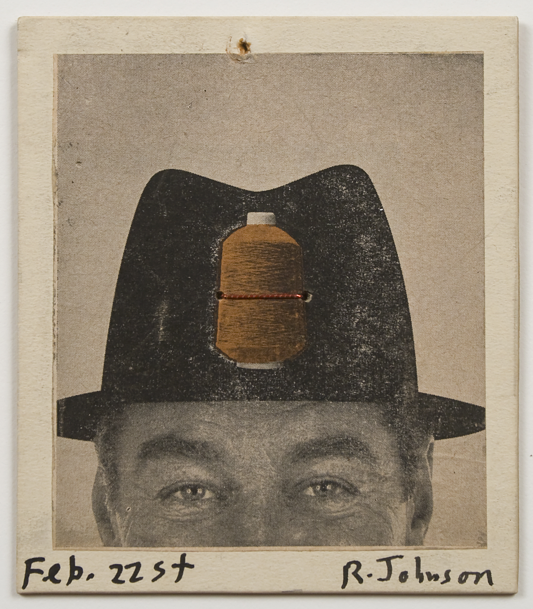
Best known for his work in collage and correspondence art, Ray Johnson remains an enigmatic figure in the post-war American landscape. His use of time- and community-based media—such as objects sent through the US Postal Service—added a dimension to his work that differentiated him from his cohort. Correspondence art resonated primarily with the practices of a slightly older generation of artists, including John Cage, whose work followed principles of conversation rather than communication, the former implying egalitarian involvement and the latter more closely associated with dictation. Ever curious about meaning, Johnson often turned to puns and homonyms as a way of introducing multiple simultaneous meanings into a picture. In Untitled (Man In Hat) from 1960, Johnson uses a found image of a man wearing a hat, onto which is superimposed a spool of thread. Though the spool looks like a collage element, it is in fact native to the printed image; Johnson has added only the thread, which appears to be wound around the spool in the picture. This is a classically Johnsonian conceit: a visual play between what is appropriated and what is inserted, and also a linguistic rhyme (head/thread).
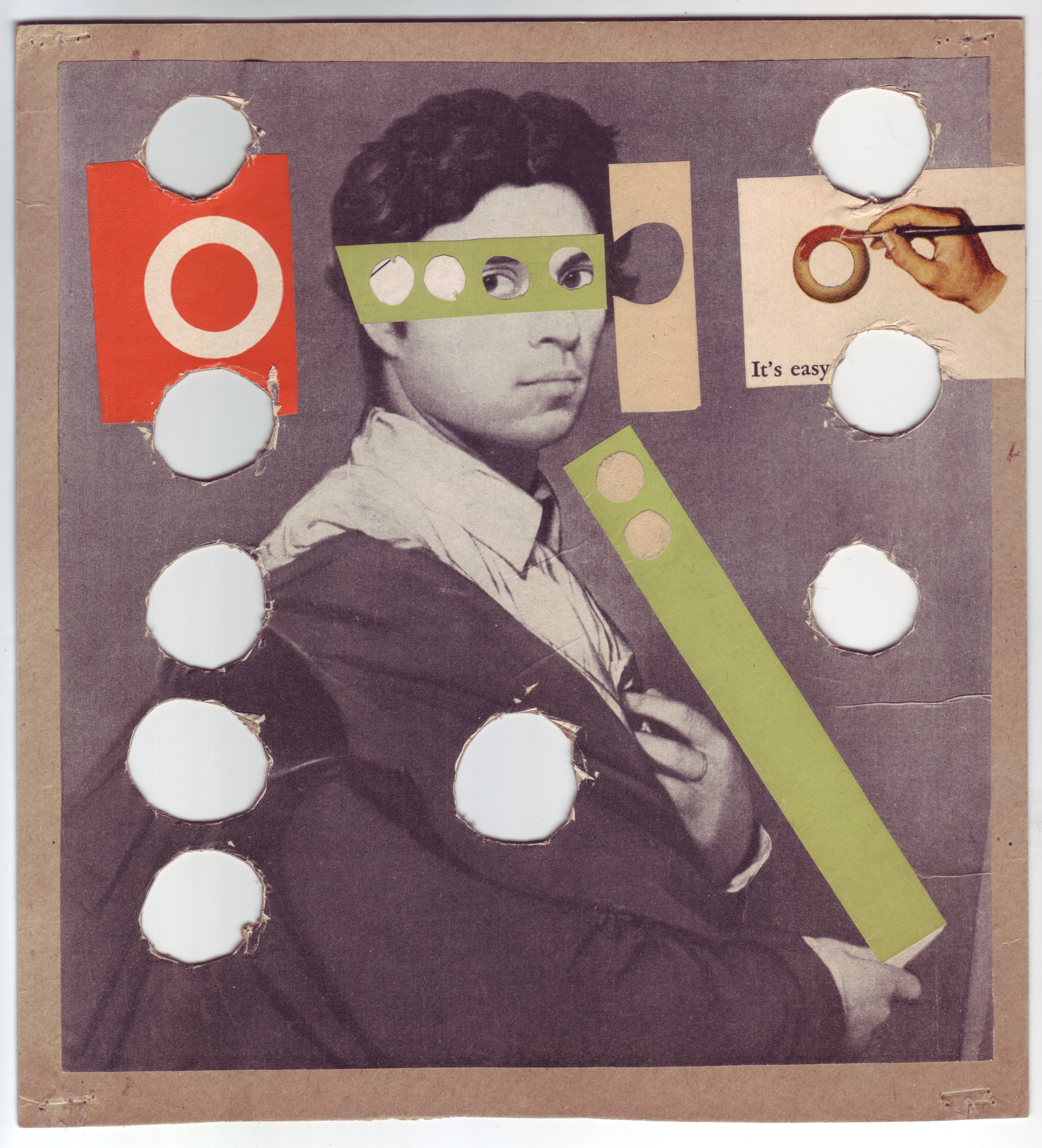
Two later collages in the Poetry Collection of the University Libraries, University at Buffalo, suggest Johnson’s exploratory engagement with the historical evolution of meaning in fine art. Both pieces, undated but likely made in the 1970s, use images cut from art catalogues of the time. One of these collages features a reproduction of an 1804 self-portrait by French Neoclassical painter Jean-August-Dominique Ingres, excised from a magazine and mounted on cardboard. Circular holes have been cut out of the picture and cardboard, echoed by similar holes cut into the strips of paper collaged over various parts of the composition. A collage element affixed toward the right edge, also cut from a magazine, bears a picture of a hand painting a circular shape red, with the words, It’s easy, printed below.
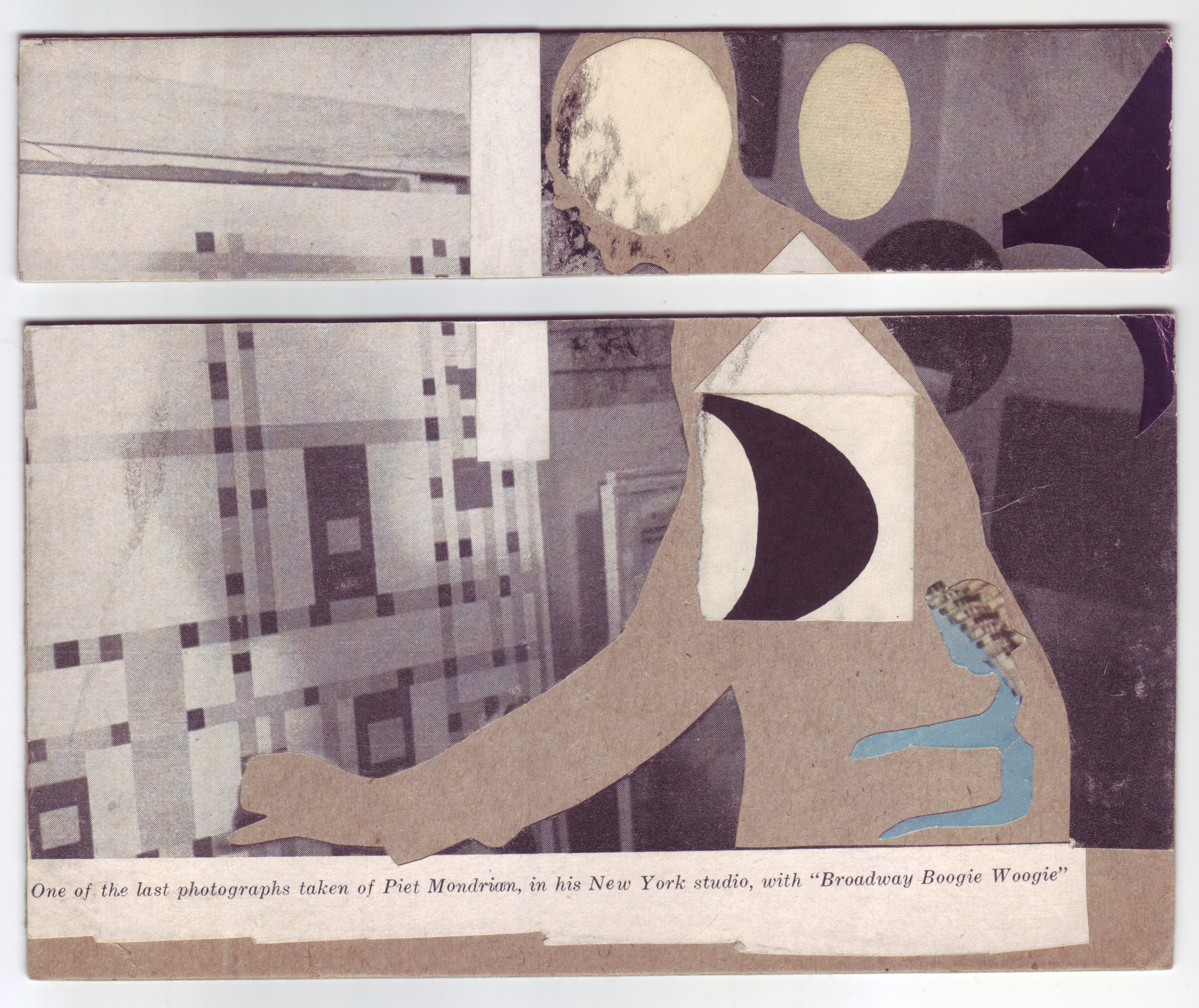
Ingres, one of the early forebears of Modernism, is renowned for his renderings of complex spatial relationships, which served as examples for later generations of artists, including Piet Mondrian, whose work Johnson repeatedly referenced. Indeed, the other collage on view here features a photograph of Mondrian in front of Broadway Boogie Woogie, arguably his most famous late painting. Johnson has cut Mondrian’s body out of the picture, leaving only the artist’s outline to suggest his presence. By making Mondrian conspicuously absent and by partially covering Ingres’s face, Johnson puts particular pressure not just on the relationship of artist to artwork, but also on the authorial presence and visibility of the artist within a finished work of art. If we can understand the inclusion of Ingres as Johnson’s protest against dismissal of artworks on the basis of form without consideration of conceptual depth, the physical absence of Mondrian can in turn be understood as Johnson’s investigation of the presence of the artist – or lack thereof – and its effect on the terms of reception for a particular work or idea.
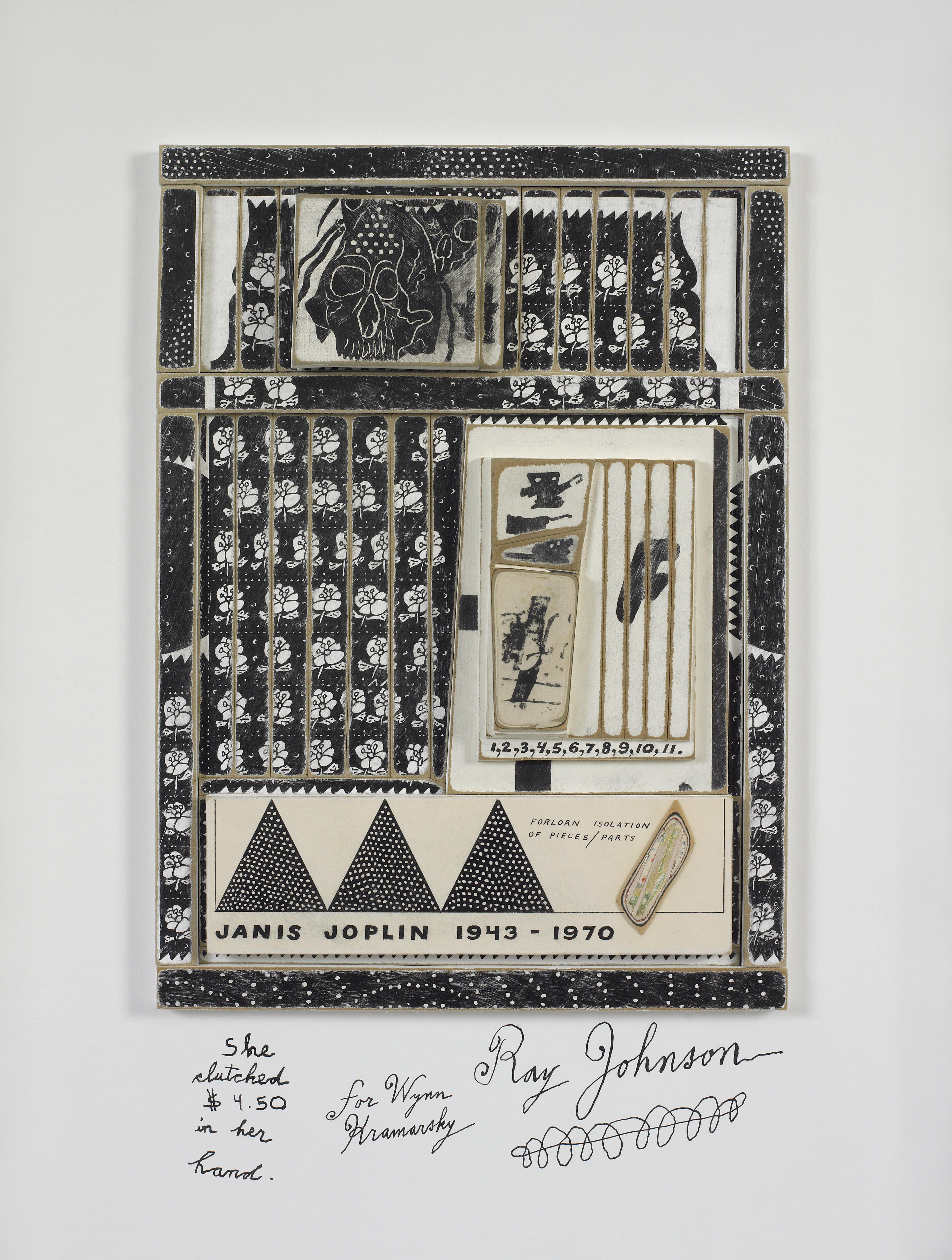
Johnson’s primary medium was collage, but unlike in the objects discussed above, the majority of his collages comprise a cut-and-pasted combination of found images and the artist’s own repetitive drawings—of snakes, for instance, or of bunnies. By excising images and words from their usual contexts and re-inserting them in other, less frequently used spaces, Johnson coaxes these fragments to assume various new meanings – a practice that opened the door to alternative interpretations. This working method became central to Johnson, Rauschenberg, and other post-war artists. In Janis Joplin (1971), Johnson uses the theme of Joplin’s death that same year as a referent, but the effect of the resulting “portrait” transcends both Joplin and death. It is Johnson’s presence—made known through the hand-drawn moticos and sequences of numbers and shapes—that seems to dominate, not that of his ostensible subject. Johnson is his moticos: we know him by these visual signs, rather than by his biography. The use of imagery linked primarily to Johnson in a work about Joplin in effect collapses the two. What Johnson calls to mind, here and elsewhere in his work, is the way a subject is constituted not by some essential fact, but by its relationship to other subjects. In foregrounding this paradox, Johnson enables the possibility of new and different thinking around identity and its networks.
Ray Johnson Biography
Ray Johnson (b. 1927, Detroit, MI; d. 1995, Long Island, NY) studied at Black Mountain College, North Carolina (1945-1948). The most recent retrospective of Johnson’s work opened at Raven Row, London (2009), and traveled to Museu d’Art Contemporani de Barcelona. Recent solo exhibitions in 2014 have been held at Sidney Mishkin Gallery, Baruch College, New York; Museo Thyssen-Bornemisza, Madrid; and The Museum of Modern Art Library, New York. Group exhibitions have been held at Centre Georges Pompidou, Paris (2009); Max Ernst Museum, Brühl, Germany (2011); the Smithsonian Archives of American Art, Washington, D.C. (2011); Berkeley Art Museum, Berkeley, California (2012); the Walker Art Center, Minneapolis (2012); the Brooklyn Art Museum, New York (2012); the Pollock-Krasner House and Study Center, East Hampton, New York (2012); the Musée Denys-Puech, Rodez, France (2012); the Krannert Art Museum, Champaign, Illinois (2013); The Morgan Library & Museum, New York (2014); and Paul Kasmin Gallery, New York (2014). More information about his work can be found at www.rayjohnsonestate.com.
Cat Dawson Biography
Cat Dawson is a doctoral candidate (ABD) in Visual Studies at the University at Buffalo specializing in art of the American post-war postmodern. Her particular interests include the interplay between text and language, conceptual art and theories of the body, mid-century painting and the sexuality of abstraction, and psychoanalysis. Her dissertation is on sexuality and difference in American post-war painting.
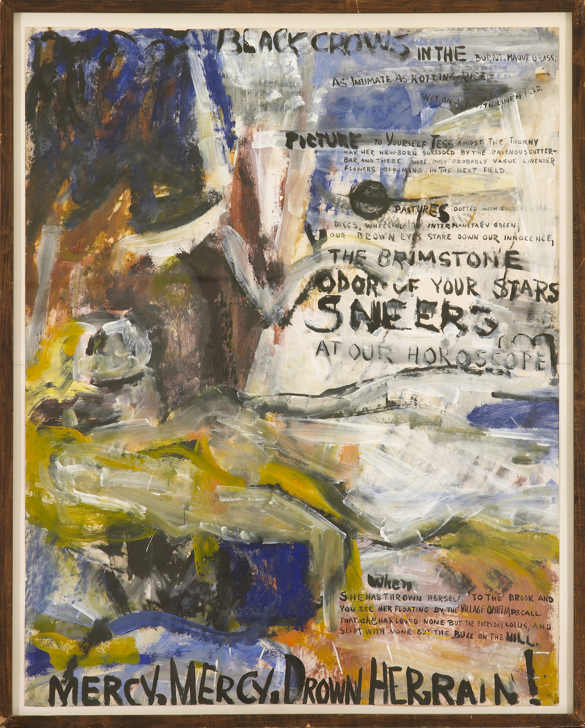
Perhaps the most striking thing about Grace Hartigan’s Black Crows (Oranges No. 1) (1958) is the tension between the gestural surface and the phrases that emerge from the background of the work, at times overtaking the paint. A busy abstract surface is characteristic of Hartigan’s style, but whereas in much of her other work she allows imagery to form, here Hartigan intersperses her painterly strokes with selections of text taken from Frank O’Hara’s “Oranges No. 1.” The poem is one in a collection of twelve published in 1949 by O’Hara, in response to which Hartigan produced twelve canvases, each featuring excerpted text from the corresponding poem.
One of the defining traits of Abstract Expressionism was the emphasis put on immediacy, and Hartigan’s gestural abstractions are a product of this era. In a parallel vein, O’Hara is known as a master of occasional poetry—the kind of thing jotted down on a cocktail napkin at a party just before a toast is to be given. His ability to infuse language with an acute sense of immanence and a breadth of emotion strikes a similar chord to that of Hartigan’s urgency. Close social and intellectual relationships between painters and poets during any given period have often proven professionally fruitful for both parties. The post-war period is particularly notable for a proliferation of these intimacies and the resulting work that grew out of them.
A 1957 poem by O’Hara entitled “Why I Am Not A Painter” opens with the lines, “I am not a painter, I am a poet. / Why? I think I would rather be / a painter, but I am not.” O’Hara goes on to describe working on his “Oranges” poems while his friend, the painter Michael Goldberg, works on a painting called Sardines (1955). As O’Hara tells it, both artist and poet begin with a word that serves as the title, but which does not figure prominently—or at all, in O’Hara’s case—within the finished work. This poem speaks to the close relationship between painter and poet, enumerating similarities in their intellectual approaches to their practice, while also making clear how these two artists, working in two mediums, ultimately produced two very different works.
O’Hara’s poem articulates the difference between painting and poetry as having to do with expressivity: “All that’s left is just / letters, “It was too much,” Mike says. / But me? (…) / There should be / so much more, not of orange, of / words, of how terrible orange is / and life.” O’Hara brings the tension between too much and not enough into the same field, suggesting that duality and contradiction are central to expressivity. By exploring the different valences of language across painting and poetry, we come to understand that though the two differ in some medium-specific ways, there is no hard and fast distinction between them. As often as difference is brought to bear as a way of producing hierarchies of value, when examined closely, it is not always so black and white.
Black Crows (Oranges No. 1) can be understood as a continuation of the conversation begun by Goldberg and O’Hara. Hartigan processes O’Hara’s poetry by augmenting the dimension and shape of the words, such that they seem to undulate with the flow of paint in three dimensions. Whereas O’Hara, in crafting a poem about difference, folds in Goldberg’s language relating to his own practice, Hartigan brings language out of O’Hara’s work and into the painterly realm. In Hartigan’s hands, O’Hara’s words become visually expressive in a manner more akin to painting than to poetry. The resulting painting, like O’Hara’s poem, works the divide between visual art and poetry, demonstrating difference while simultaneously showing the tenuousness of any distinctions that can be made.
Grace Hartigan
Grace Hartigan (b. 1922, Newark, NJ; d. 2008, Baltimore, MD) sought employment as a mechanical draughtsman when her first husband was drafted in World War II, and trained at the Newark College of Engineering. She took art courses from the painter Isaac Lane Muse and, in 1945, relocated with Muse to Manhattan. She quickly became associated with the New York School of Abstract Expressionist artists emerging in the 1940s and ‘50s. Her first group exhibition took place at the Samuel Kootz Gallery, New York (1950), while her first solo exhibition was held at Tibor de Nagy Gallery, New York (1951). In the early 1950’s, Hartigan began to collaborate with several poets: for example, her series entitled Oranges (1952-53) is based on a number of O’Hara’s prose poems. Hartigan was the only female artist included in The Museum of Modern Art’s touring exhibition entitled The New American Painting (1958-59). In the 1960s, Hartigan moved to Baltimore, Maryland: she became the Director of the Hoffberger Graduate School of Painting, Maryland Institute College of Art (1967-2008), and the Avery Chair of Bard College, Annandale-on-Hudson (1983). Other recent solo exhibitions were held at the Susquehanna Museum (2000); Amarillo Museum of Art, Texas (2008); and C. Grimaldis Gallery (2008, 2009). Hartigan’s work is included in the public collections of The Metropolitan Museum of Art, New York; The Museum of Modern Art, New York; the Philadelphia Museum of Art, Philadelphia; and the Walker Art Center, Minneapolis, among others.
Cat Dawson
Cat Dawson is a doctoral candidate (ABD) in Visual Studies at the University at Buffalo specializing in art of the American post-war postmodern. Her particular interests include the interplay between text and language, conceptual art and theories of the body, mid-century painting and the sexuality of abstraction, and psychoanalysis. Her dissertation is on sexuality and difference in American post-war painting.
Post-war America saw the notable development of many close relationships between painters and poets. Joe Brainard remains among the few figures of that fruitful period remembered for shifting deftly between visual and narrative media, and for playing both roles successfully. Living in New York City in the 1960s and ’70s, Brainard became part of a thriving group of creative thinkers – visual artists and poets, many of them gay men – whose very public work made intimate address its central concern. Yet legal and social mandate required these men to obfuscate the details of their most intimate associations and desires, lest they expose themselves as gay. Collage became a defining mode of expression for these artists.
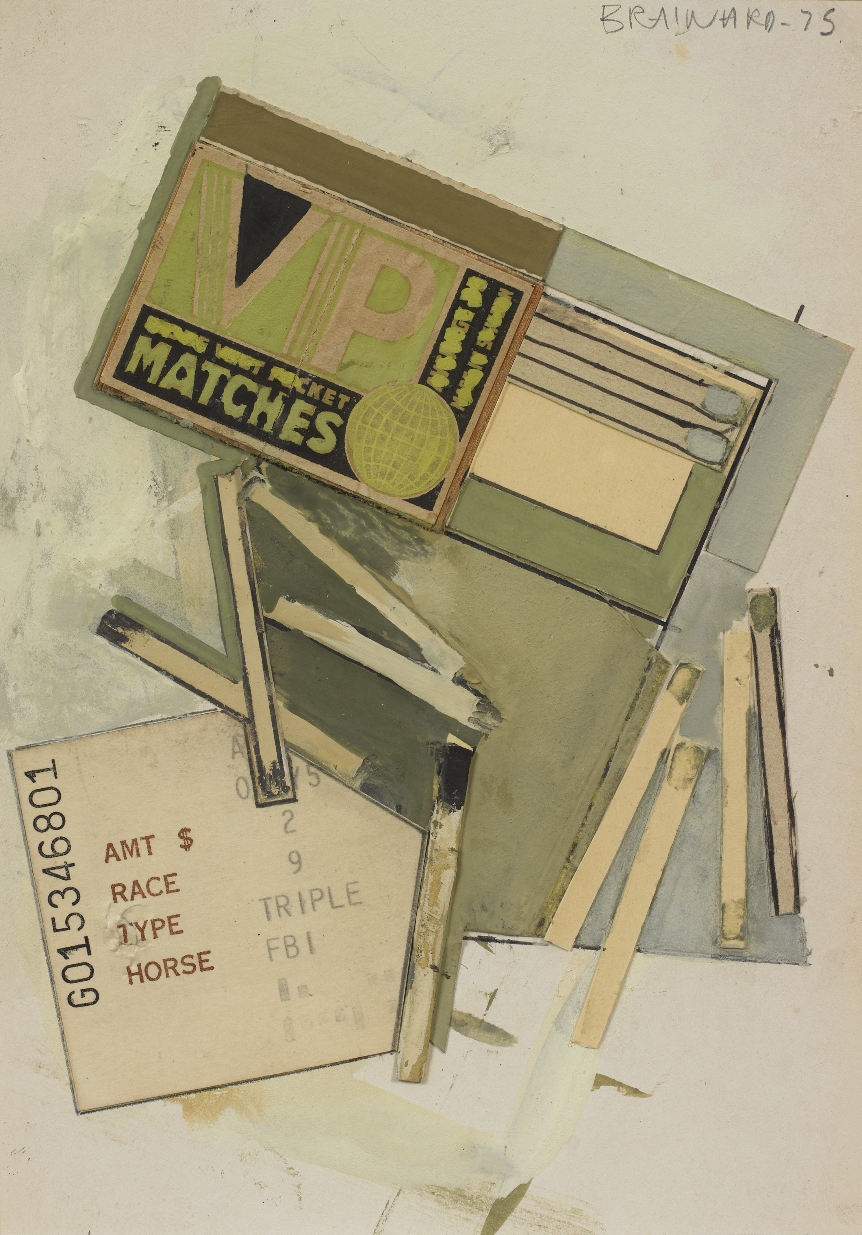
We associate particular concepts with certain words and images, but the flexible medium of collage allows artists to recontextualize both image and text, producing new connections and meanings. Brainard’s Matches (1975) features a horseracing ticket pasted beneath a book of matches, mostly spent, with gouache dampening or accentuating particular elements of the composition. The combination of the spent matches and ticket imply the duration of an activity – perhaps a day at the track – and thus the artwork becomes an eminently recognizable record of a moment of leisure passed.
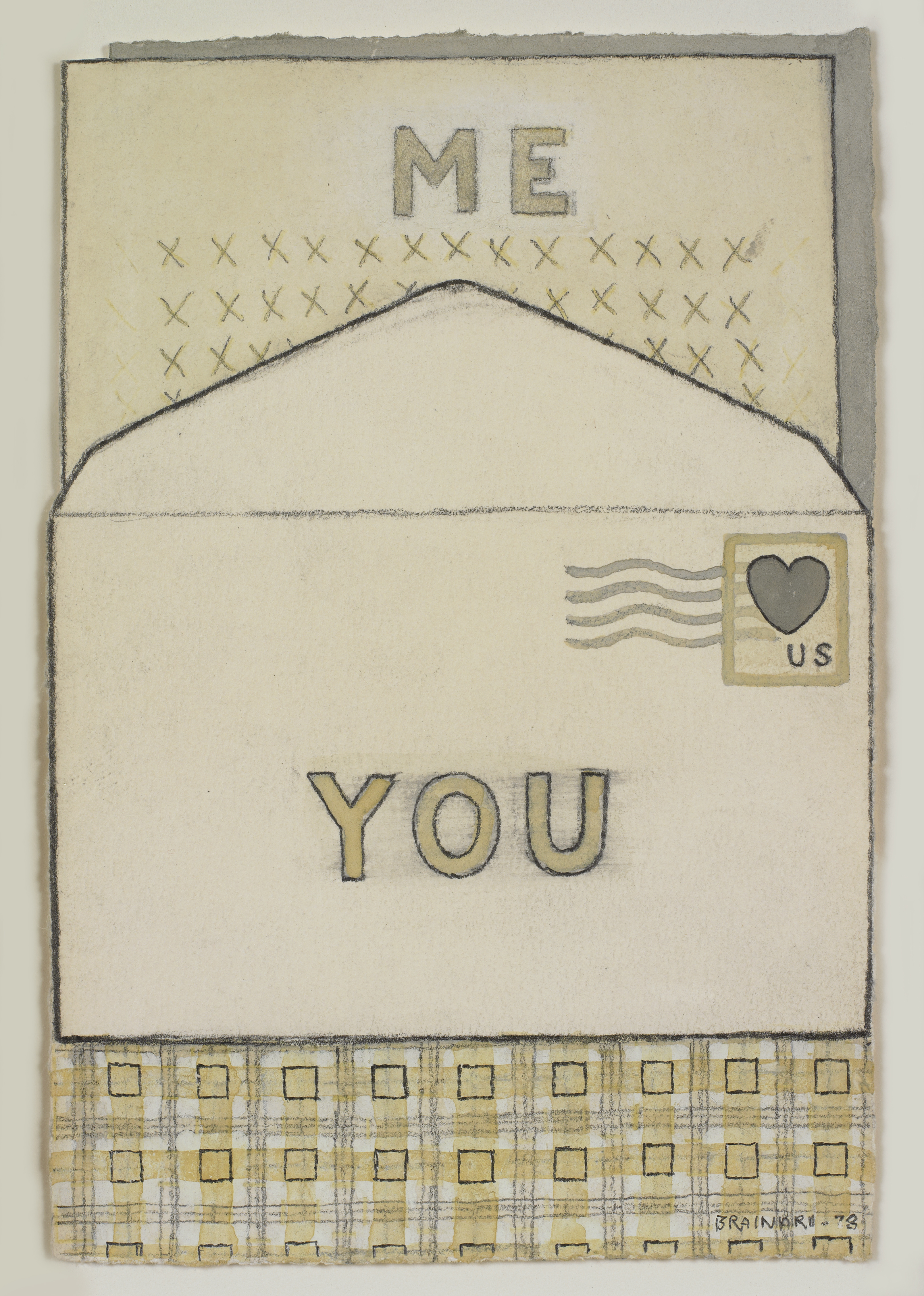
Brainard’s greatest strength lay in the production of artworks that, like Matches, suggest a familiarity or intimacy that cannot be completely articulated. In Untitled (1978), Brainard cultivates a sense of intimacy among artist, object, and audience with what appears to be an outgoing letter to a universal recipient – you. That the recipient of the letter is simply you implicates a romantic relationship, without regard to the gender of the recipient. This presents a subtle challenge to the fixedness of normative male–female sexuality. By producing a work that looks like a letter, Brainard situates himself within the vernacular of mail art – a network of mostly gay male artists and their patrons, which began to circulate small-scale work through the United States Postal Service during the post-war period. Untitled, in particular, points to the artist’s lasting interest in fostering community through communication, whether subtle or overt.
In Untitled (XXX…) (1977), Brainard has collaged a blue heart and a strip of handwritten X’s over assorted patterned papers. We assume that this strip of X’s stands in for an emotive message, but the meaning of this message is not communicated and cannot be accessed; the X’s only insinuate intimate expression to the viewer. The jumble of collaged papers serving as background displays both decorative floral patterns and straitlaced grids, a formal juxtaposition that produces a subtle tension underneath the opaque X’s. It is through careful consideration of these three works as a whole that we can come to understand how Brainard, engaged as he was with questions of language, intimacy, and communication, found the conceptual mobility of collage and universally-addressed language so compelling as he traversed the challenges of what could and could not be said.
Joe Brainard Biography
Joe Brainard (b. 1942, Salem, AR; d. 1994, New York, NY) was raised in Tulsa, Oklahoma. In high school, Brainard produced an art and literary magazine entitled The White Dove Review with Ron Padgett, Dick Gallup, Ted Berrigan and Patricia Mitchell. After graduation, Brainard was granted a full scholarship to attend the Dayton Art Institute, where he studied for a few months. Brainard first moved to New York City at the age of 19: he quickly became associated with a community of New York School poets and painters with whom he often collaborated artistically, including Frank O’Hara, Alex Katz, Jane Freilicher and, later, Andy Warhol and Jasper Johns. He most frequently collaborated with the writer Kenward Elmslie, his longtime partner. Brainard was selected by Larry Rivers to participate in a group show at the Finch College Museum (1964), and his first solo exhibition took place at the Alan Gallery, New York (1964). Other recent solo exhibitions were held at the Utah Museum of Fine Arts, Salt Lake City (1973); Fischbach Gallery, New York (1975, 2007); Tibor de Nagy Gallery, New York (1997, 2001, 2007, 2008, 2012); and the University of Buffalo Art Galleries, New York (2007). Brainard’s work may be found in the collections of the Berkeley Art Museum, the Harvard Art Museums/Fogg Museum, The Metropolitan Museum of Art, The Museum of Modern Art, and the Whitney Museum of American Art, among others. More information about his work can be found at www.joebrainard.org.
Cat Dawson Biography
Cat Dawson is a doctoral candidate (ABD) in Visual Studies at the University at Buffalo specializing in art of the American post-war postmodern. Her particular interests include the interplay between text and language, conceptual art and theories of the body, mid-century painting and the sexuality of abstraction, and psychoanalysis. Her dissertation is on sexuality and difference in American post-war painting.