by Maddie Phinney
The origins of the phrase “the personal is political” are contested, though it is most often attributed to radical feminist Carol Hanisch. In 1969, Hanisch drafted a memo for the women’s caucus of the Southern Conference Educational Fund (SCEF) in response to a claim that consciousness raising, organizing meetings of women in small groups, wasn’t a “political” project but rather a form of group therapy. Hanisch writes, “One of the first things we discover in these groups is that personal problems are political problems. There are no personal solutions at this time. There is only collective action for a collective solution.”1 The relationship between the personal and the political is central to the cultural history of 1960s America, which saw polarizing mobilizations for civil rights, women’s liberation, and equality for gays and lesbians.
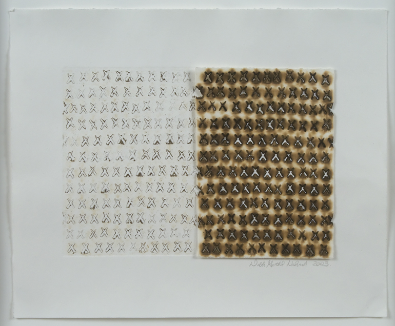
In terms of art practice, the 1960s are notable for a shift away from the conventions of High Modernism, which naturalized the distinction between individual and collective concerns by maintaining the myth of the artist’s isolation from his or her social context. Responding to the turbulent social conditions of the time, American artists at the margins began to address the relationship between the individual and the collective, grounding the systematization of Minimal and Conceptual art in the immediacy of social life as lived. In the decades that followed, artists maintained an investment in the complicated political relationship between the individual and the community, using the trope to speak to questions of veiled ideological interests or institutional inequity. It is precisely at this intersection between the personal and the political that a number of artists included in this exhibition— namely, Ed Ruscha, Robert Indiana, Ray Johnson, Buster Cleveland, Deborah Gottheil Nehmad, and Annabel Daou—have made some of their most powerful works.
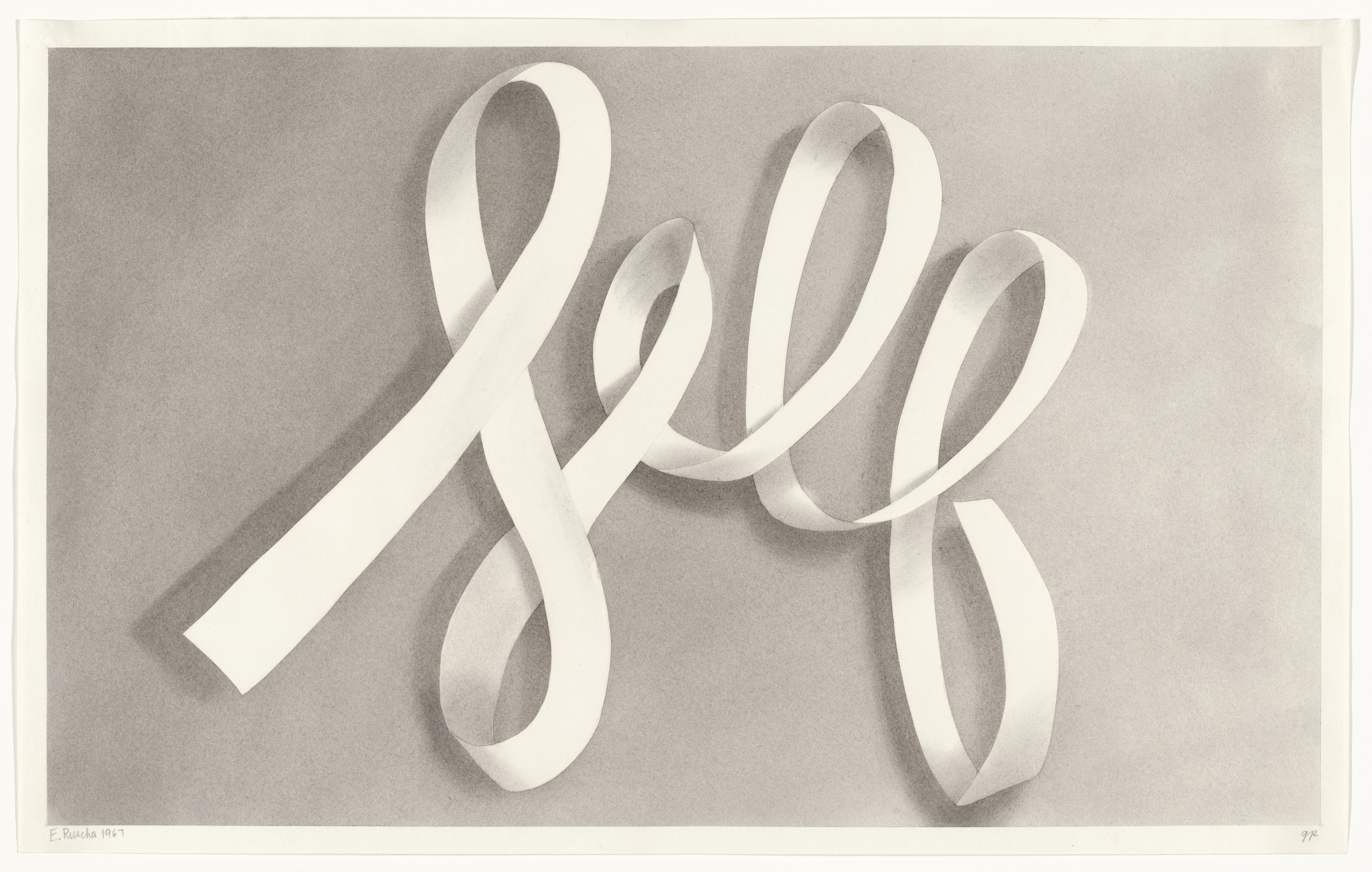
In the 1960s, language began to re-enter the vocabulary of American artists, supplanting High Modernism’s four-decade promotion of abstraction. Pop is frequently theorized as an ironic response to Abstract Expressionism, which insisted on the autonomy of the image as evidence of the artist’s singular encounter with his materials.2 Pop images, when placed in dialogue with text, instead pointed to interpretative frames as referential and contingent, indicating our own deep engagement with popular culture. With Self, Ruscha enlists the political potential of Pop to speak to the constructedness of individual identity. By rendering the word Self in script, Ruscha gestures toward the autographic: the stable “truth” of the self as understood by High Modernism becomes a mere citation, a word, necessarily different in its shadings to anyone who reads it. By rendering the text in reserve and giving it the illusion of three-dimensionality, Ruscha turns this word into a scroll to be written on: the self as a screen. The drawing is part of Ruscha’s gunpowder series, which the artist began in the 1960s because he found graphite and charcoal lacking in their evocative potential. In 1967, at the height of the Vietnam War, Ruscha raises questions of individual responsibility for violence by illustrating the self with the materials of combat. In Self, text becomes image and image becomes text, allowing the word to act both as a physical object and as a conveyor of meaning.
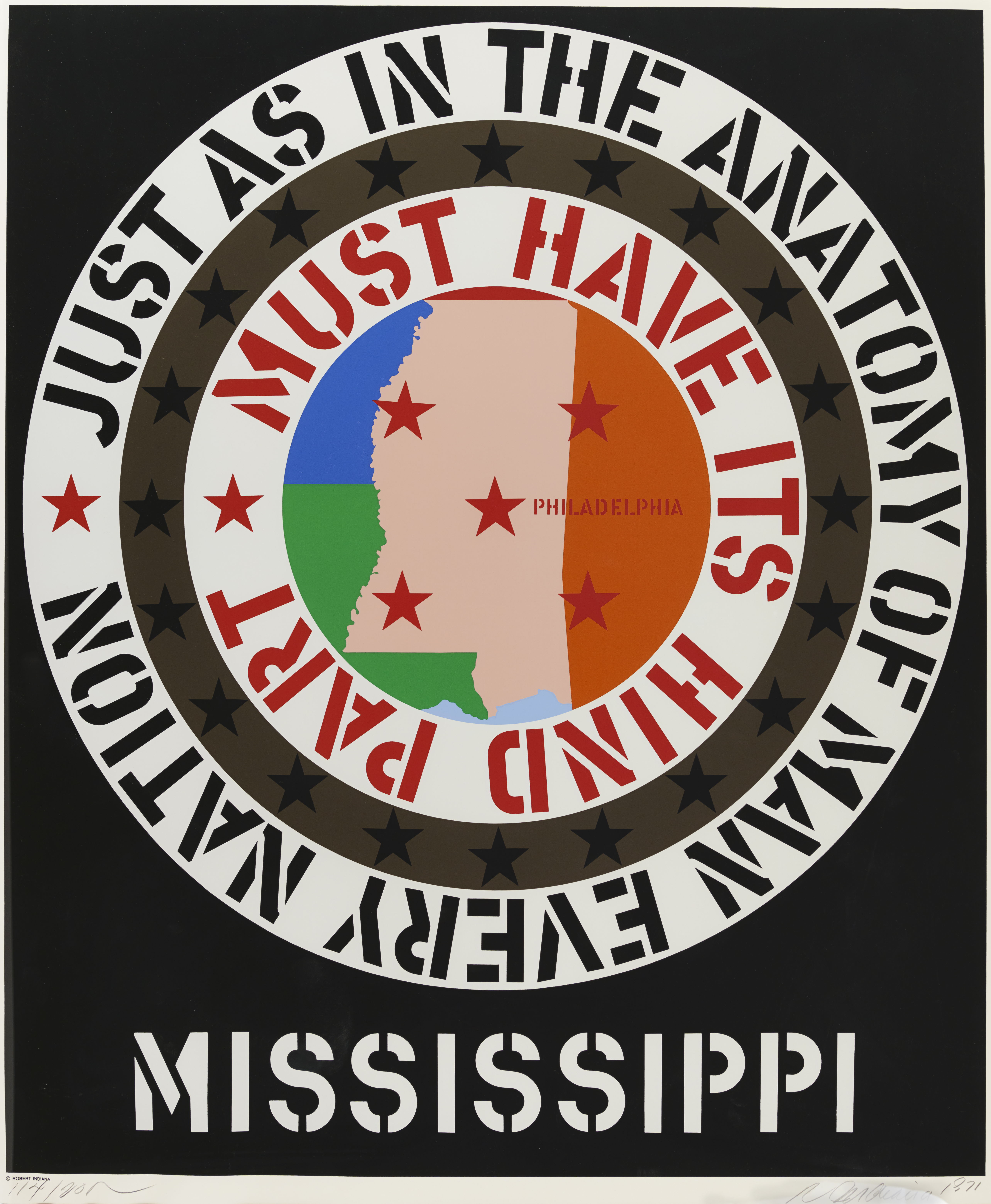
By 1971, Indiana’s iconography had become widely recognizable: stenciled uppercase lettering, five-pointed stars, circles, squares, and diamonds, all applied in bright, flat paint. While Mississippi follows the artist’s established formal conventions, the Confederacy series inaugurated an important departure for Indiana. His earlier work, while deeply engaged in questions of queer representation, escaped overt references to politics. The artist’s 1963 painting Figure Five draws formally from Charles Demuth’s 1928 painting The Figure Five in Gold, a work that Indiana has described as his “favorite American painting,” and which was dedicated to Demuth’s friend, William Carlos Williams. The work is titled after Williams’s 1916 poem, “The Great Figure.”4 Taking its place within this heredity of queer visual language, Indiana’s early artwork speaks to the formation of individual identity as a product of collective, historical experience. While his early works were coded, in Mississippi, Indiana is explicit about his political critique, incorporating the statement, “just as in the anatomy of man every nation must have its hind part.” In the early 1960s, Indiana established a set of formal conventions to speak to a queer visual history, placing himself within a lineage of artists working in code. By using this same visual language in 1971 to draw attention to institutionalized racism, Indiana draws a relationship between his personal struggle and that of a diverse community working actively toward social change.
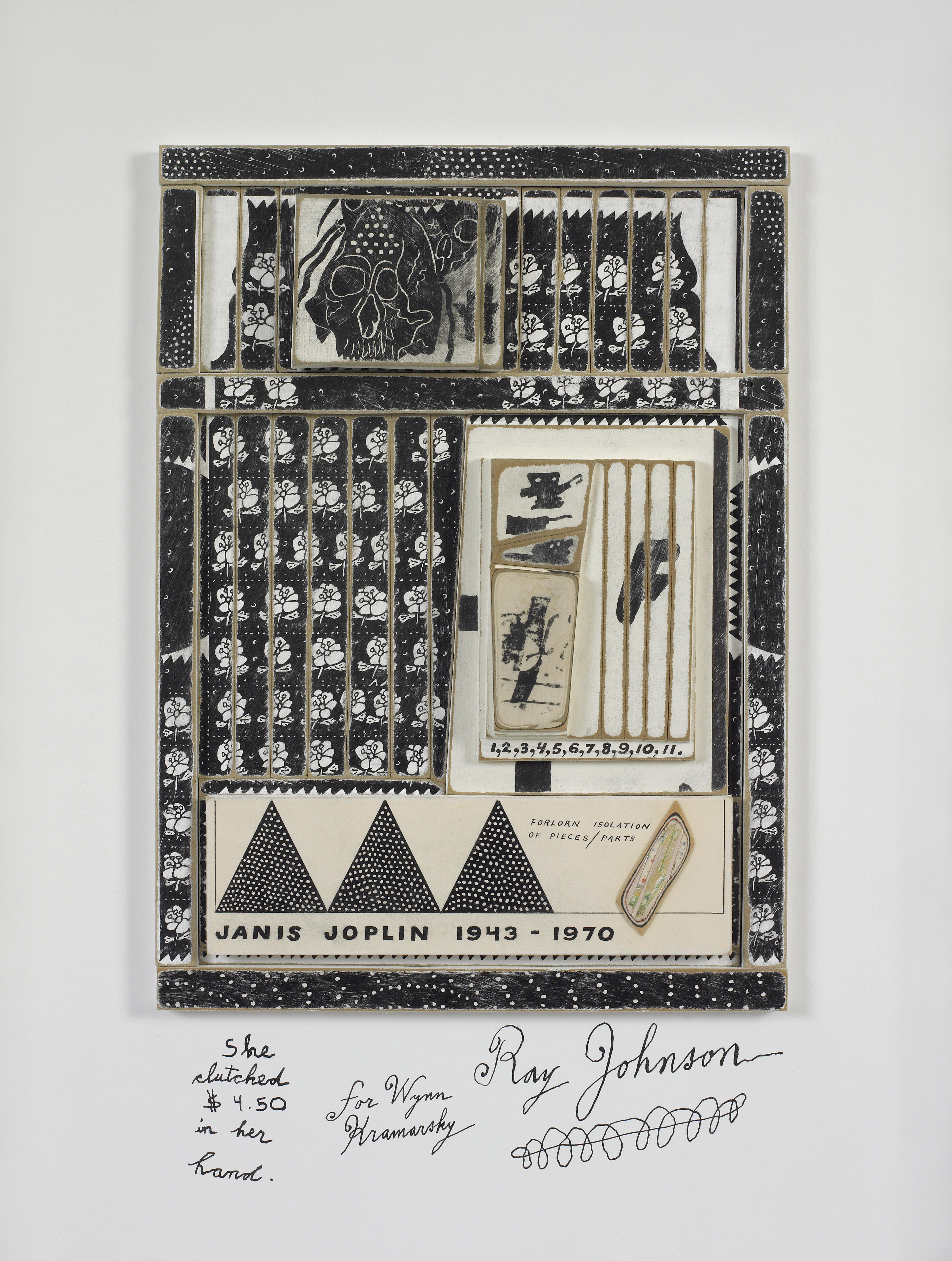
The work of mail artist Buster Cleveland exhibits the clear influence of his mentor, Ray Johnson, whom Cleveland memorialized in a 1993 portrait that differs notably from Johnson’s earlier homage to Joplin. In Ray Johnson, Cleveland pastes one of the artist’s signature bunny head drawings onto the cover of a 1967 issue of Artforum featuring a painting by Ad Reinhardt. Prior to his better-known work in abstraction, Reinhardt produced political cartoons for the daily newspaper, PM, the Saturday Evening Post, and Glamour. Art historian Robert Storr notes that, in his career as a cartoonist, “[Reinhardt] uses language against its original intention.”7 Cleveland plays upon this fact by encasing the entire magazine in resin, creating a work of sculpture readable as a sort of fossil or relic—the $1.50 price tag in the top right corner clearly indicates a bygone time. The image of the bunny is immediately recognizable to a viewer familiar with Johnson’s work, creating a portrait of his public persona, unlike Johnson’s memorial for Joplin, which gives the viewer insight into her interiority. Turning again to Artforum as medium, Cleveland created his ART FOR UM series between 1993 and 1998. The work as collected here comprises 62 five-inch squares of foam core, each collaged with a different cover of Artforum and scaled down with a laser printer. The social conditions of the 1990s were turbulent: the art market crashed after a money-obsessed decade, in which art auction prices had soared. This was also the height of the Culture Wars, a clash between a conservative United States Administration and “controversial” artists over national funding for the arts. Collusion between the media, the religious right, and the government was established and maintained in the early part of the decade, creating a reactionary matrix of power that was reinforced by a conservative museum structure and by curators who abstained from exhibiting “controversial” artworks. In ART FOR UM, Cleveland addresses each piece of the series to a recipient on his subscriber list, creating an intimate relationship between artist and viewer that subverts the impersonal, market-driven structure of art’s exhibition and reception. Artforum, a publication also distributed by the US Postal Service, acts as a sort of stage upon which the artist’s narratives play out: the glossy magazine as a commercial project in direct contrast with his inexpensive mail art works. With the series, Cleveland works outside the art world to speak to the repressive politics of art’s exhibition and reception.
A particularly striking piece of ART FOR UM features an issue of Artforum dedicated to what was widely understood as the “political” 1993 Whitney Biennial. The cover spotlights a controversial work entitled Museum Tags: Second Movement by Latino artist Daniel J. Martinez. During the run of the Biennial, Whitney Museum attendants handed out one of six aluminum admission tags designed by Martinez, which read all or part of the sentence, “I can’t imagine ever wanting to be white.” Martinez’s tags created an arbitrary means of classification, making each visitor complicit in a predetermined system; this political relationship of the individual to the group allowed for Martinez to map the politics of race onto the experience of attending a museum exhibition. In a bold move, Cleveland pastes images of the Lucky Strike cigarette logo and Joe Camel directly over Martinez’s tag, rendering it not just illegible, but nearly invisible. Cleveland intentionally mutes an effective commentary on the politics of racial identity with a seductive image of consumerism, pointing to the market forces guiding the politics of art’s display. Much like Martinez’s site-specific series, Cleveland’s works are designed as a personal exchange, outside of oppressive museum and market structure.
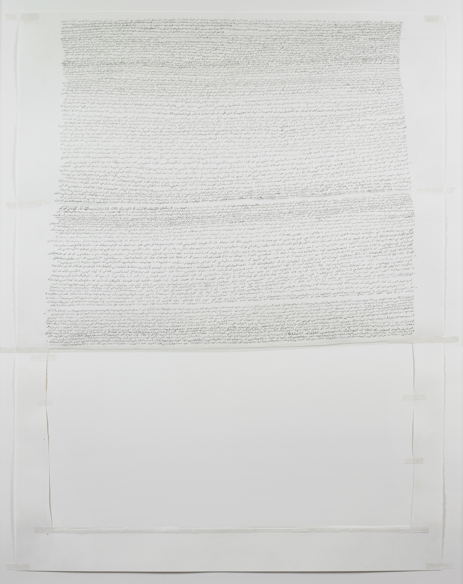
Each of Lebanese-born artist Annabel Daou’s text-based pieces draws upon the discursive relationship between the viewer, the artist, and her community. Daou notes that she stopped painting during the US invasion of Iraq, turning to an interrogation of language as a means of wading through the meaninglessness of words like we, freedom, person, and united as spoken by American politicians: how could those words reflect her own experience as an Arab-American woman? In her 2006 work entitled The Declaration of the Causes and Necessity of Taking Up Arms, Daou hand-copies the 1775 declaration in script so small as to render the text illegible. Part of Daou’s larger project America, the drawing originally was displayed alongside nineteen other transcribed United States historical documents, each one smaller than a half sheet of paper. Since the original documents that Daou copied for America were handwritten as well, the autographic quality of the script is inherent to the records she reproduces. This declaration was a particularly pertinent document to consider three years after the US invasion of Iraq, and the same year as the reprehensible Mahmudiyah killings and the execution of Saddam Hussein.8 It was also in 2006 that a new wave of Abu Ghraib abuse photos surfaced: the necessity of violent warfare (and the abuses of power that came with it) had yet to be established, as no evidence of weapons of mass destruction were found in Iraq. Daou’s appropriation of United States historical documents ingeniously plays upon questions of individual and collective ethical identity without commentary. Declaration points to the question of address in these documents: who exactly is speaking and who is spoken to? Through the process of rearticulating the language of 1775, Daou voices these words herself and signs them in her own penmanship, tactically suffusing her replicas with political message. In this way, Daou makes her own subjectivity as a post-9/11 Arab-American foundational to her transcriptions.
Understanding personal issues in terms of political concerns, Ruscha, Indiana, Johnson, Cleveland, Nehmad, and Daou each engage the connotative power of language to illuminate social relationships as contingent and malleable, creating works that challenge the fixity of interpretive frames.
1. Paul D. Buchanan, Radical Feminists: A Guide to an American Subculture (Santa Barbara: ABC-CLIO, 2011), 123.
2. Harold Rosenberg, “The American Action Painters” from Tradition of the New, originally in Art News 51/8, December 1952: 22.
3. Anna C. Chave, “Minimalism and the Rhetoric of Power. “ Arts January 1990: 45.
4. http://robertindiana.com/works/the-demuth-american-dream-5/ First published in Robert Indiana (Philadelphia: Institute of Contemporary Art, University of Pennsylvania, in collaboration with the Marion Koogler Mc Nay Art Institute, San Antonio, and the Herron Museum of Art, Indianapolis, 1968).
5. Willis, E., “Don’t Turn Your Back on Love,” Introduction to Janis triple CD, Sony Music Entertainment Inc., 1993, p. 24.
6. Holland Cotter. “Notes to the World (or Bend, Fold, and Spindle).” Art in America 83 (1995): 100-105.
7. Mouly, Francoise. “Ad Reinhardt’s Cartoons.” New Yorker 10 December 2013: web. http://www.newyorker.com/online/blogs/culture/2013/12/slide-show-ad-reinhardts-cartoons-make-an-appearance-at-at-david-zwirner.html#slide_ss_0=1
8. The Mahmudiyah killings were the gang-rape and murder of 14-year-old Iraqi girl Abeer Qassim Hamza al-Janabi, and the murder of her family, perpetrated by US Army soldiers on March 12, 2006.